Home>Interior Design>15 Unbreakable Rules For Displaying Artwork, Say Designers

Interior Design
15 Unbreakable Rules For Displaying Artwork, Say Designers
Modified: October 18, 2024
Discover the 15 unbreakable rules for displaying artwork, as recommended by top interior designers. Enhance your interior design with these essential tips.
(Many of the links in this article redirect to a specific reviewed product. Your purchase of these products through affiliate links helps to generate commission for Storables.com, at no extra cost. Learn more)
Introduction
Welcome to the world of interior design, where every detail matters and can significantly impact the overall aesthetic and ambiance of a space. One crucial element of interior design is the display of artwork. Whether it’s a painting, a photograph, or a sculpture, how you choose to showcase your artwork can make a profound difference in the overall visual appeal of your home or office.
Designers understand that displaying artwork is not just about randomly hanging a piece on the wall. It requires thought, consideration, and adherence to certain principles to create a harmonious and visually pleasing arrangement. In this article, we will delve into the unbreakable rules that designers swear by when it comes to displaying artwork.
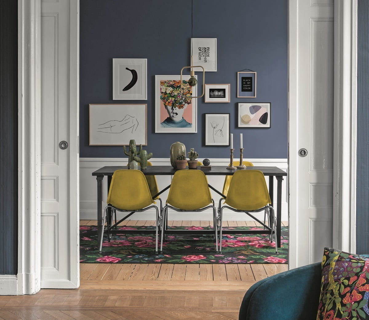
These rules are based on years of experience and expertise in the field of interior design. By following these guidelines, you can make the most of your artwork and transform your space into a showcase of creativity and beauty.
So, let’s dive into the world of art display and uncover the fifteen unbreakable rules that designers recommend for showcasing artwork.
Key Takeaways:
- Create a visually captivating and harmonious artwork display by considering space, size, framing, colors, and focal points. Use appropriate lighting, balance, and symmetry to enhance the overall aesthetic and atmosphere of your space.
- Regularly update and rotate your artwork to keep your space dynamic and visually stimulating. Consider the room’s function, viewing angles, and surrounding decor to ensure a cohesive and engaging display that reflects your unique style and personality.
Rule 1: Consider the Space
When it comes to displaying artwork, the first rule is to consider the space in which it will be showcased. Take into account the size, shape, and layout of the room to determine the best placement for your artwork.
If you have a small room, opt for smaller pieces of artwork that won’t overwhelm the space. On the other hand, if you have a large room with high ceilings, choose larger pieces or a series of artworks to fill the wall adequately.
Consider the existing furniture and decor in the room as well. The artwork should complement the overall style and theme of the space. For example, if you have a modern and minimalist living room, choose artwork with clean lines and abstract designs that align with the room’s aesthetic.
Additionally, consider the distance between the artwork and the furniture. Avoid placing the artwork too high or too low; it should be at eye level when standing or sitting in the room. This ensures that the artwork is easily visible and accessible for viewers.
Keep in mind that the space around the artwork is just as important as the artwork itself. Leave sufficient wall space around the artwork to allow it to breathe and be appreciated. Avoid crowding the artwork with other pieces or cluttering the wall with unrelated objects.
By carefully considering the space in which your artwork will be displayed, you can create a cohesive and visually pleasing arrangement that enhances the overall atmosphere of the room.
Rule 2: Choose the Right Size
Choosing the right size for your artwork is essential to create a balanced and visually appealing display. The size of the artwork should be proportionate to the size of the wall and the surrounding furniture.
If you have a large wall, consider opting for a statement piece or a larger artwork that can serve as a focal point. This can add drama and visual impact to the room. On the other hand, if you have a smaller wall or limited space, choose smaller artworks or create a gallery wall with a collection of smaller pieces.
When selecting the size of the artwork, also consider the height of the ceilings and the placement of other elements in the room. Aim to create a sense of balance and harmony between the artwork and the surrounding elements. If you have high ceilings, you can opt for taller or vertically oriented artworks to make the space feel more proportionate. For lower ceilings, consider horizontal or wider artworks to create a visually balanced composition.
Moreover, the size of the artwork should also be appropriate for the furniture it will be placed above or near. For example, when displaying artwork above a sofa or bed, make sure it is not wider than the furniture itself. The artwork should ideally be two-thirds to three-quarters the width of the furniture to maintain balance.
Remember that size can also impact the visual impact of the artwork. A larger piece will naturally draw more attention, while a smaller piece may be better suited for creating a subtle accent or complementing an existing focal point in the room.
Ultimately, choosing the right size for your artwork is about achieving balance, proportion, and visual harmony. It should seamlessly integrate into the space and enhance the overall aesthetic appeal of the room.
Rule 3: Pay Attention to Framing
Framing plays a crucial role in the presentation and preservation of artwork. The right frame can enhance the overall aesthetic of the artwork and complement the style of the room. When displaying your artwork, it’s important to pay attention to the framing choices.
Firstly, consider the material and color of the frame. Wood frames are a popular choice as they provide a timeless and classic look. However, metal frames can add a more contemporary touch. Choose a frame color that complements the colors in the artwork and blends well with the surrounding decor.
Additionally, consider the style of the frame. Traditional artwork often suits ornately carved or beaded frames, while more modern and minimalist pieces may benefit from sleek and simple frames. The frame style should enhance the overall visual impact of the artwork without overpowering it.
Another factor to consider is the size of the frame. The frame should be proportionate to the artwork, neither too small nor too large. A frame that is too small can make the artwork look cramped, while a frame that is too large may overshadow the artwork itself.
Furthermore, consider the matting, if applicable. A mat can add depth and dimension to the artwork while providing a visual border between the artwork and the frame. Choose a mat color that complements the colors in the artwork and enhances its overall presentation.
Lastly, pay attention to the quality of the framing materials. Use acid-free mats and UV-protective glass to ensure the longevity and preservation of your artwork. These materials help prevent discoloration and damage caused by light exposure.
The framing choices you make can significantly impact the overall presentation of your artwork. It can elevate the artwork’s visual appeal, protect it from environmental factors, and tie it seamlessly into the surrounding decor. Take the time to choose the right frame to enhance and preserve your artwork for years to come.
Rule 4: Select Compatible Colors
Color harmony is vital when it comes to displaying artwork. Choosing compatible colors can help create a cohesive and visually pleasing arrangement that enhances the overall impact of your artwork.
Start by analyzing the colors present in your artwork. Look for dominant colors and secondary hues that can guide your selection process. Consider the mood and tone of the artwork – whether it is vibrant and energetic or calm and soothing – and use that as a basis for selecting compatible colors.
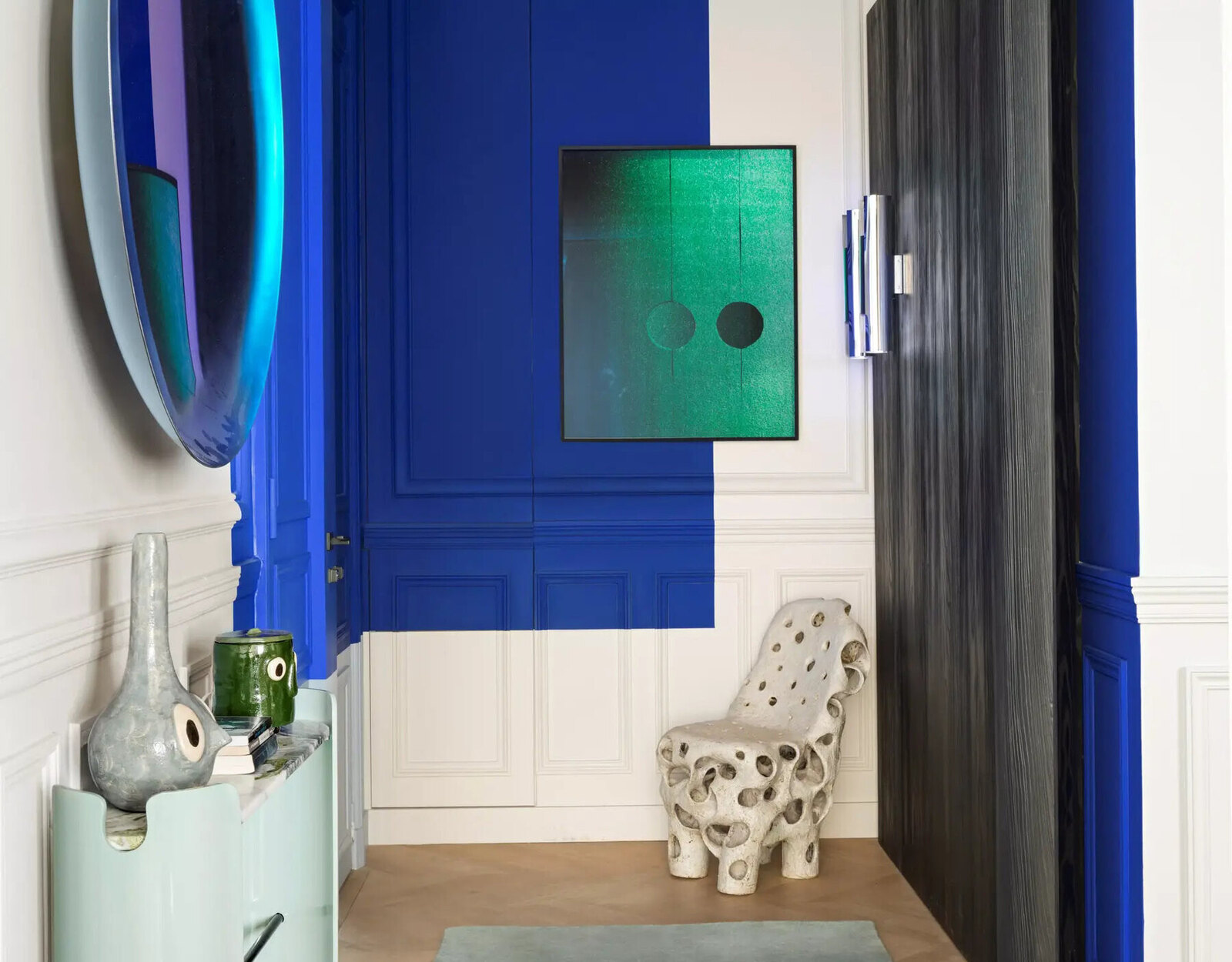
A common approach is to choose a neutral or complementary wall color that allows the artwork to stand out. Neutral colors such as white, beige, or gray provide a calm backdrop that doesn’t distract from the artwork. Complementary colors, on the other hand, add visual interest and create a dynamic interplay between the artwork and the surrounding space.
Take into account the existing color scheme of the room as well. If the room features warm tones like reds, oranges, and yellows, consider selecting artwork with similar warm hues or complementing cool tones like blues and greens to create balance. Conversely, if the room is dominated by cool tones, opt for artwork with warm tones to add visual contrast.
Consider the psychology of colors as well. Each color has its own emotional impact and can evoke specific feelings and moods. For example, blues and greens are known to create a sense of calm and tranquility, while reds and oranges elicit energy and warmth. Choose colors that resonate with the intended atmosphere and ambiance of the room.
Remember that selecting compatible colors goes beyond just the artwork and the wall color. Consider the surrounding decor, furniture, and accessories in the room. The colors should complement and harmonize with the overall color scheme of the space, creating a unified and coherent look.
By selecting compatible colors, you can create a visually pleasing and harmonious display of artwork that enhances the overall aesthetic of your space. It allows the artwork to shine while seamlessly integrating into the surrounding environment.
Read more: How To Store Artwork
Rule 5: Understand the Artwork’s Focal Point
Every artwork has a focal point, which is the element or area that attracts the viewer’s attention. Understanding and highlighting this focal point is crucial when it comes to displaying artwork effectively.
Start by analyzing the artwork and identifying its main focal point. It could be a prominent subject, a specific area of interest, or a combination of colors and shapes that draw the viewer’s eye. Once you have determined the focal point, you can use it as a guide for placement and arrangement.
When displaying a single piece of artwork, ensure that the focal point is at eye level. This allows viewers to have a direct and clear view of the primary focus of the artwork. If the artwork is relatively large, you may need to adjust the placement slightly higher to maintain the focal point at eye level.
If you have multiple artworks to display, consider how the focal points interact with each other. Ensure that the primary focal points of the artworks are not competing for attention. You can do this by creating visual hierarchy through size, placement, or spacing. The artwork with the strongest focal point should take center stage, while the others complement and support it.
Additionally, consider the placement of other elements in the room that may compete with the artwork’s focal point. Avoid placing furniture, decorative items, or architectural features that detract or distract from the main focal point. Create a clear and unobstructed view of the artwork to allow it to command attention.
Understanding the artwork’s focal point enables you to showcase it in the best possible way, highlighting its unique qualities and capturing the viewer’s attention. By keeping the focal point in mind, you can create a visually engaging and impactful display of your artwork.
Rule 6: Create Balance and Symmetry
Balance and symmetry are fundamental principles in art and design. When displaying artwork, creating a sense of balance and symmetry can bring harmony and visual appeal to your arrangement.
One way to achieve balance is through symmetrical placement. Symmetry involves mirroring the arrangement of elements on either side of a central point or axis. For example, you can hang two identical pieces of artwork on either side of a fireplace or console table to create a symmetrical display. This creates a sense of equilibrium and order.
If you have an odd number of artworks or objects to display, achieving balance can be challenging. In this case, you can opt for asymmetrical placement, which creates balance through visual weight and composition. Balance the weight of larger or visually heavier artwork by grouping smaller or lighter pieces nearby.
Consider the scale and placement of the artworks to achieve visual balance. If you have a large artwork on one side, balance it out by placing a group of smaller pieces on the other side. Distribute the visual weight evenly to create a harmonious composition.
Balance can also be achieved through the use of color and texture. If you have a bold and colorful artwork on one side, balance it with another artwork or object that incorporates similar hues or complementary colors.
Furthermore, consider the visual flow of your display. Arrange the artwork in a way that leads the viewer’s eye smoothly across the arrangement. This can be achieved by creating a diagonal or horizontal alignment, or by placing a focal point artwork at the center and arranging others around it in a circular or radial pattern.
Remember that balance doesn’t necessarily mean everything has to be symmetrical or evenly distributed. It’s about finding a visual equilibrium that is pleasing to the eye. Allow some room for creativity and experimentation while maintaining a sense of visual balance.
By creating balance and symmetry in your artwork display, you can achieve a visually pleasing and cohesive arrangement that adds a sense of harmony to your space.
Rule 7: Use Appropriate Lighting
Lighting plays a crucial role in showcasing artwork. Proper lighting not only enhances the visibility of the artwork but also sets the mood and ambiance of the space. When it comes to displaying artwork, it’s important to use appropriate lighting techniques to highlight and accentuate your pieces.
Start by considering the type of lighting that would work best for your artwork. Natural light can be a great option if you have ample windows or skylights that provide even, diffused lighting. However, be mindful of potential issues such as glare, fading, and changes in natural light throughout the day.
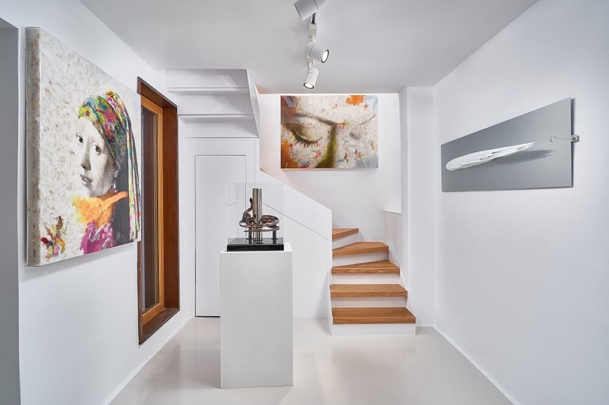
If natural light is not sufficient or reliable, consider incorporating artificial lighting. Track lighting, recessed lighting, or wall sconces with adjustable fixtures can be effective in spotlighting artwork. Use bulbs with the appropriate color temperature (often referred to as 2700-3000 Kelvin) to ensure accurate color rendition.
When positioning lights, aim to create an even distribution of light across the artwork. Avoid casting shadows or causing uneven lighting that may distract from the artwork’s details. Experiment with different angles and distances to find the most flattering and effective lighting setup.
Dimmable lighting is also a valuable option as it allows you to adjust the brightness based on the desired ambiance and the artwork’s specific requirements. Dimming the lights can create a more intimate and focused atmosphere when viewing the artwork.
Consider using accent lighting techniques such as wall-washing or spot lighting to draw attention to specific artworks or focal points. This can add drama and create a captivating visual impact.
It’s essential to keep in mind the preservation of your artwork when it comes to lighting. Ultraviolet (UV) radiation can fade and damage artwork over time. Consider using UV-protective glazing on framed pieces and avoid placing artworks in direct sunlight.
Lastly, don’t forget to regularly check and maintain your lighting fixtures. Clean bulbs and fixtures to ensure optimal lighting performance, and replace bulbs as needed to maintain consistent illumination.
By utilizing appropriate lighting techniques, you can enhance the visibility and impact of your artwork. Thoughtful lighting choices can elevate the overall aesthetic and create a captivating display that showcases your pieces in their best light.
Rule 8: Mind the Height and Placement
When it comes to displaying artwork, the height and placement of your pieces are essential factors to consider. The proper positioning and placement can greatly impact the visual impact and accessibility of your artwork.
Start by determining the ideal height for your artwork. As a general rule, artwork should be placed at eye level. This ensures that viewers can comfortably see and appreciate the details of the piece without straining their necks or looking down. Eye level generally falls within the range of 57-60 inches from the floor, although it may vary depending on the average height of the people who will be viewing the artwork.
If you have multiple artworks to display, ensure that they are all placed at a consistent height to create a cohesive and balanced arrangement. Consistency in height helps to maintain a uniform visual flow and prevents the display from appearing disjointed.
Consider the scale and dimensions of the artwork when deciding on placement. Larger pieces may require more space and be better suited for prominent, standalone positions. Smaller pieces can be grouped together or placed in smaller niches or gaps.
When placing artwork above furniture such as sofas or consoles, leave a gap between the top of the furniture and the bottom of the artwork. Aim for a distance of around 8-10 inches to create breathing room and avoid the artwork looking cramped or overcrowded.
Take into account the overall composition of the room and the adjacent elements. Ensure that there is enough visual space around the artwork to allow it to shine and stand out. Avoid placing the artwork too close to windows, doors, or architectural features that may distract or detract from its impact.
When positioning multiple pieces of artwork, consider the relationship between them. Ensure that there is an appropriate amount of space between each piece to create a sense of balance and allow each artwork to be appreciated individually.
Lastly, consider the viewing angles from different parts of the room. Arrange the artwork in a way that allows it to be seen and appreciated from multiple vantage points. This ensures that no matter where one is standing or sitting in the room, the artwork is easily visible and enjoyable.
By minding the height and placement of your artwork, you can create a visually pleasing and accessible display that enhances the overall aesthetic of your space. Thoughtful consideration of these factors ensures that your artwork is showcased in the best possible way.
When hanging artwork, use the center of the piece as the focal point and hang it at eye level (approximately 57-60 inches from the floor) for optimal viewing.
Rule 9: Group Similar Pieces Together
Grouping similar pieces of artwork together can create a cohesive and impactful display. When you have a collection of artworks that share a common theme, style, or visual element, grouping them together can enhance their overall impact and create a visually captivating arrangement.
Start by selecting artworks that share a similar theme, such as abstract art, landscapes, or portraits. Grouping these pieces together creates a visual narrative and allows viewers to make connections and explore the cohesive story that the artworks tell. This can create a sense of unity and coherence in your display.
You can also group artworks based on a specific visual element, such as color or texture. If you have a collection of artwork that features predominantly blue tones, grouping them together can create a stunning visual impact. Similarly, grouping artworks with similar textures or materials can create a cohesive and tactile display.
When grouping similar pieces, consider the size and placement of each artwork. Aim for a balanced composition, ensuring that the artworks are evenly spaced and that no one piece overwhelms the others. Experiment with different arrangements and configurations to find the most visually pleasing and harmonious grouping.
Consider using a common element, such as a large mat or a consistent frame style, to visually tie the artworks together. This creates a sense of continuity and allows the pieces to be seen as a unified collection. However, be mindful of not making the grouping seem too repetitive or monotonous. Variation in size, orientation, or style can add visual interest and prevent the display from appearing too uniform.
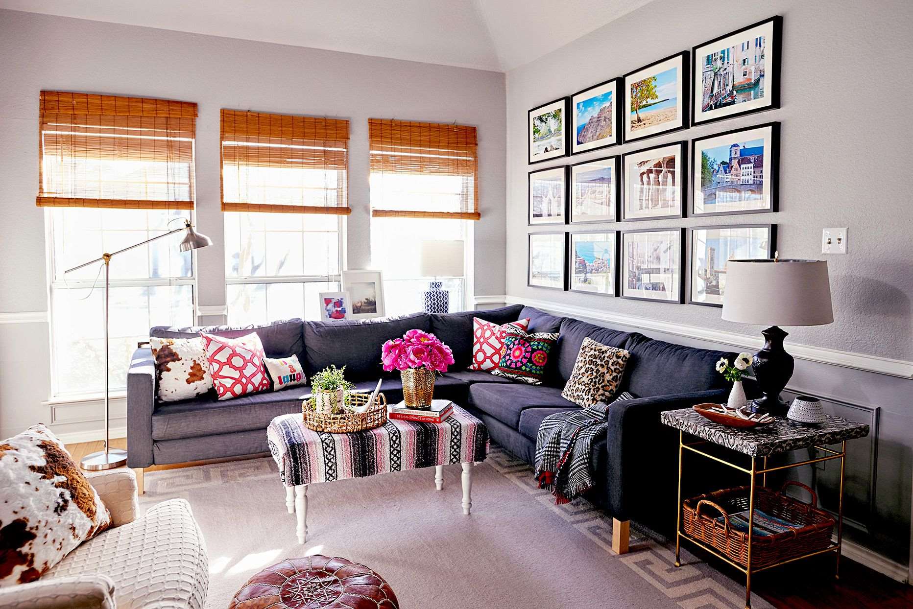
Grouping similar pieces can also be beneficial when you have limited wall space. By grouping smaller pieces together, you can create a larger visual impact and make the most of the available space. This technique is particularly useful when curating a gallery wall or salon-style arrangement.
Remember to leave enough breathing room between each artwork within the grouping. Avoid overcrowding the pieces, as this can diminish the impact of each individual artwork. Provide enough space for each piece to be appreciated and to allow the viewers’ eyes to rest between the artworks.
By grouping similar pieces of artwork together, you can create a visually striking and cohesive display that highlights the shared elements and adds depth and interest to your space.
Rule 10: Avoid Overcrowding
When it comes to displaying artwork, it’s important to give each piece the space it deserves. Avoiding overcrowding is crucial in creating a visually pleasing and impactful arrangement that allows each artwork to shine.
Overcrowding occurs when there is too much artwork clustered together on a wall or in a space, resulting in a cluttered and chaotic appearance. It can overwhelm the viewer and make it difficult to appreciate the individual beauty and details of each piece.
Start by assessing the size of the wall or the available space where you plan to display the artwork. Aim for a balanced composition that allows each piece to have its own visual presence. Avoid placing too many artworks in a confined area, as this can create a visually overwhelming effect.
Consider the size and scale of each artwork and how they relate to one another. Leave enough space between each piece to allow the eye to rest and appreciate the individual artwork. As a general guideline, aim for a gap of approximately 2-3 inches between each piece.
When creating a gallery wall or salon-style arrangement, be mindful of the overall composition. Vary the sizes and orientations of the artworks to create visual interest and avoid a repetitive or monotonous display. Use larger, statement pieces as anchor points and fill in the remaining space with smaller complementary pieces to achieve a harmonious balance.
Be selective in choosing which pieces to display. Avoid the temptation to showcase every single artwork you own in one space. Instead, curate a thoughtful selection that is cohesive and representative of your style or theme. Remember, less is often more when it comes to art display.
Allow sufficient white space or empty wall space around the artwork to give it room to breathe. This helps to draw attention to the artwork and prevents the display from feeling crowded. It also creates a sense of visual balance and allows the individual pieces to become focal points.
Regularly reassess your display and make adjustments as needed. If you notice that the artwork is starting to look crowded or cluttered, consider removing or relocating some pieces to maintain a more balanced and spacious arrangement.
By avoiding overcrowding, you can create a visually appealing and harmonious display that allows each artwork to be appreciated on its own merit. Embrace simplicity, spaciousness, and thoughtful curation to create a captivating display that exudes elegance and artistic impact.
Rule 11: Establish a Visual Flow
Creating a visual flow in your artwork display helps guide the viewer’s eye and allows for a cohesive and engaging viewing experience. By establishing a sense of visual movement and continuity, you can enhance the overall impact of your arrangement.
Start by considering the arrangement and placement of your artworks. Aim to create a natural progression or a path for the viewer’s eye to follow. You can achieve this by arranging the artworks in a diagonal, horizontal, or vertical alignment, depending on the shape of the wall or the desired effect.
Consider the lines, shapes, and forms within each artwork and how they interact with one another. Arrange the pieces in a way that allows these visual elements to flow seamlessly from one artwork to the next. For example, if you have a series of landscape paintings, you can arrange them in a way that creates a sense of continuous movement across the wall.
Pay attention to the color scheme and tones of the artworks as well. Gradually transition from one color to another or create a subtle ombre effect by arranging the artworks in a way that creates a visual spectrum. This creates a smooth and pleasing visual flow.
Consider using directional elements such as arrows or lines to establish a clear visual flow. These elements can be incorporated into the artwork itself or added as a decorative feature on the wall. They act as a guide for the viewer’s gaze, directing their attention from one piece to the next.
Additionally, be mindful of the placement of focal point artworks within your arrangement. These pieces should be strategically placed to attract attention and create visual interest. They can act as anchor points or visual landmarks that establish the primary flow within the display.
Don’t forget to regularly step back and assess the visual flow of your arrangement. Walk through the room and observe how your eye naturally moves across the artwork. Make adjustments as needed to ensure a smooth and uninterrupted flow.
By establishing a visual flow in your artwork display, you create a dynamic and engaging viewing experience. It adds a sense of movement, continuity, and harmony to your arrangement, capturing the viewer’s attention and making a lasting impression.
Rule 12: Consider the Surrounding Decor
When displaying artwork, it’s important to consider the surrounding decor to create a cohesive and harmonious arrangement. The artwork should complement and enhance the overall style and aesthetic of the space.
Start by assessing the existing decor in the room. Consider the colors, textures, and materials used in the furniture, walls, and accessories. Choose artwork that aligns with the overall color scheme and style of the room. The artwork should either harmonize with the existing decor or provide a contrasting element that adds visual interest.
Consider the style and theme of your artwork as well. If your space has a modern and minimalist decor, choose artwork that reflects this aesthetic through clean lines, abstract compositions, or contemporary subject matter. Similarly, if your decor is more traditional or antique-inspired, opt for artwork with classic themes or vintage allure.
Take into account the scale and proportion of the surrounding decor. Ensure that the artwork is neither too small nor too large in relation to the furniture or other decorative elements. Aim for a balanced composition that allows the artwork to be a focal point without overpowering the rest of the room.
Consider the placement of the artwork in relation to other design elements. For example, if you have a gallery wall above a sofa, ensure that the arrangement is properly centered and scaled to the furniture. If you have a sculptural artwork, place it on a pedestal or in a designated area that allows it to be seen and appreciated without obstruction.
Integrate the artwork into the overall design scheme by using complementary materials and textures. For instance, if your space features a lot of natural wood, consider artwork that incorporates wood or has a similar warm and organic feel. This creates continuity and a seamless visual flow throughout the room.
Lastly, be mindful of the room’s overall atmosphere and purpose. If it’s a calm and serene space, consider artwork that evokes a sense of tranquility. If it’s a vibrant and energetic space, opt for artwork with bold colors and dynamic compositions.
Considering the surrounding decor when displaying artwork ensures a cohesive and visually pleasing arrangement. By harmonizing the artwork with the existing elements in the room, you create a seamless and unified design that elevates the overall aesthetic of your space.
Rule 13: Think About the Viewing Angle
Considering the viewing angle is an important aspect of displaying artwork effectively. The way artwork is positioned and angled can significantly impact how it is perceived and appreciated by viewers.
Start by considering the primary viewing angle in the room. This is the angle from which the artwork will be most often seen and admired. It could be the entrance to the room, a seating area, or a specific focal point. Position the artwork in a way that ensures it is easily visible and accessible from this angle.
When determining the ideal viewing angle, take into account the eye level of viewers. The artwork should be at a height that allows for comfortable viewing without straining the neck. As mentioned before, a common guideline is to place the center of the artwork at eye level, which is typically around 57-60 inches from the floor.
Consider the position of furniture and other elements in the room that may obstruct the viewing angle. Avoid placing artwork behind tall objects, such as tall lamps or large plants, that may hinder visibility. Ensure that viewers have a clear and unobstructed view of the artwork from the primary viewing angle.
Think about secondary viewing angles as well. As people move around the space, they may have different perspectives on the artwork. Position the artwork in a way that allows for appreciation from multiple angles, ensuring that it looks visually pleasing and engaging from different vantage points.
Take into account the lighting in the room and how it affects the viewing angle. Lighting can create highlights, shadows, and reflections that may change the perception of the artwork. Experiment with lighting positioning and angles to enhance the visibility and impact of the artwork from different viewing angles.
Consider the inherent characteristics of the artwork itself. Sculptures or three-dimensional pieces may require viewing from different angles to fully appreciate their form and details. Ensure that viewers have the opportunity to explore and engage with the artwork from various perspectives.
Finally, don’t forget to regularly evaluate and adjust the positioning of the artwork based on the viewing angle. As the composition of the room changes or new elements are added, it may be necessary to reposition the artwork to maintain optimal visibility and impact.
By considering the viewing angle, you can ensure that your artwork is positioned and angled in a way that allows viewers to fully appreciate its beauty and details. Effective positioning enhances the overall viewing experience and allows the artwork to be the center of attention in your space.
Rule 14: Take into Account the Room’s Function
When it comes to displaying artwork, it’s important to consider the function of the room in which it will be showcased. Different rooms serve different purposes, and the artwork should align with and enhance the overall function and atmosphere of the space.
Start by identifying the primary function of the room. Is it a living room meant for relaxation and entertainment, a bedroom for rest and rejuvenation, a home office for productivity, or a dining room for gathering and dining? Understanding the purpose of the room will help guide the selection and placement of artwork.
If the room is intended for relaxation, such as a bedroom or a cozy reading nook, consider artwork that evokes a sense of calm and tranquility. Choose soothing colors and serene imagery that promotes a peaceful atmosphere. Abstract or nature-inspired artwork can work well in these spaces.
In rooms focused on productivity or creative work, such as a home office or an art studio, look for artwork that is inspiring and energizing. Abstract, bold, or thought-provoking pieces can stimulate creativity and enhance the ambiance of the space. Consider incorporating motivational quotes or artwork that reflects the purpose of the room.
In social spaces like the living room or dining room, choose artwork that sparks conversation and adds a touch of personality to the room. Consider placing artwork that represents your interests or reflects the style and theme of the room. Groupings of smaller artworks or a gallery wall can create a dynamic and engaging display.
Consider the scale and placement of the artwork in relation to the function of the room. In rooms meant for relaxation, place artwork at eye level from a seated or reclining position. In social spaces, ensure that the artwork is easily visible to guests and becomes a focal point of conversation.
Take into account the overall mood and ambiance you want to create in the room. If you desire a cozy and intimate atmosphere, choose warm and inviting artwork. If you want to create a more formal or sophisticated feel, opt for elegant and refined pieces.
Lastly, be mindful of the practical aspects of the room’s function. Avoid placing delicate or valuable artwork in high-traffic areas that may be prone to accidents or damage. Consider the lighting needs of the room and ensure that the artwork is well-lit to be appreciated and enjoyed.
By taking the room’s function into account when displaying artwork, you can create a visual experience that aligns with the purpose and ambiance of the space. Thoughtful selection and placement of artwork can enhance the overall functionality and enrich the atmosphere of your room.
Rule 15: Regularly Update and Rotate Artwork
One of the key aspects of displaying artwork is to keep the arrangement fresh and dynamic. To prevent visual monotony and revitalize your space, it’s important to regularly update and rotate your artwork collection.
Start by periodically evaluating your existing artwork display. Take a step back and assess the arrangement with a fresh perspective. Consider if the placement, composition, and overall look still resonate with you and the style of your space. If not, it may be time for a change.
Consider rotating your artwork seasonally or annually. This allows you to showcase different pieces and create a sense of renewal in your space. As the seasons change, you can reflect the mood and atmosphere of each season through the artwork you choose to display.
This rotation can be as simple as swapping out a few key pieces or completely rearranging the entire display. Experiment with different combinations and placements to create a new visual impact and keep your space feeling dynamic.
Rotate artwork based on special occasions, themes, or events as well. For example, during the holiday season, you can incorporate festive artwork or decorative elements that add a touch of celebration to your space. This keeps your display relevant and engaging.
Consider the availability of storage space to safely store artwork when it’s not on display. Properly store and protect your artwork to maintain its quality and condition. Make sure to handle the artwork with care when taking it down or hanging it back up.
When rotating and updating your artwork, take the opportunity to curate new pieces that align with your evolving taste and style. Don’t be afraid to introduce new artists or experiment with different mediums and styles. This helps keep your display interesting and allows you to continuously explore and appreciate the world of art.
Involve others in the process of selecting and rotating artwork. Encourage family members or roommates to contribute their ideas and preferences. This not only adds variety and diversity to your display but also fosters a sense of collaboration and shared expression.
Regularly updating and rotating your artwork keeps your space visually stimulating and allows you to fully appreciate the range of your collection. It allows you to infuse new energy into the room and maintain a vibrant and ever-changing aesthetic.
Remember, displaying artwork is a personal and creative process. Embrace your own unique style and preferences, and let your arrangement reflect your personality and artistic journey.
Conclusion
Displaying artwork is both an art and a science, requiring careful consideration and attention to detail. By following the fifteen unbreakable rules of displaying artwork, you can create a visually stunning and harmonious arrangement that transforms your space into a showcase of creativity and beauty.
From considering the space and choosing the right size and framing to paying attention to colors, focal points, and balance, each rule carries its own significance. Considering the room’s function, the viewing angle, and the surrounding decor ensures that the artwork integrates seamlessly into the overall aesthetic and atmosphere of the space.
Other rules, like using appropriate lighting, minding the height and placement, and avoiding overcrowding, enhance the visibility of the artwork and create a comfortable viewing experience. Establishing a visual flow and regularly updating and rotating the artwork keep the arrangement fresh, dynamic, and engaging.
Remember, as you follow these rules, infuse your own creativity and style. Let your personal taste and artistic journey guide your choices. The rules provide a framework, but the ultimate goal is to create a display that speaks to you and reflects your unique personality.
By carefully considering each of these rules and letting your creativity shine through, you can create an artwork display that captivates and inspires. Whether it’s in your home, office, or any other space, a thoughtfully curated and displayed artwork collection adds a touch of elegance and personal expression to your surroundings.
So, embrace the rules, infuse your imagination, and let the artwork become a reflection of your true artistic spirit. With these unbreakable rules as your guide, your space will be transformed into a haven of artistic beauty that has a lasting impact on all who enter.
Frequently Asked Questions about 15 Unbreakable Rules For Displaying Artwork, Say Designers
Was this page helpful?
At Storables.com, we guarantee accurate and reliable information. Our content, validated by Expert Board Contributors, is crafted following stringent Editorial Policies. We're committed to providing you with well-researched, expert-backed insights for all your informational needs.




0 thoughts on “15 Unbreakable Rules For Displaying Artwork, Say Designers”