Home>Ideas and Tips>How To Choose The Right Paint Colors For A 1960s Retro Living Room

Ideas and Tips
How To Choose The Right Paint Colors For A 1960s Retro Living Room
Modified: November 2, 2024
Discover how to choose the perfect paint colors for a 1960s retro living room with our expert tips and color suggestions. Create a vibrant, nostalgic space!
(Many of the links in this article redirect to a specific reviewed product. Your purchase of these products through affiliate links helps to generate commission for Storables.com, at no extra cost. Learn more)
Choosing the right paint colors for a 1960s retro living room can be both an exciting and daunting task. The era is known for its vibrant and bold color palette, which often included a mix of organic and synthetic hues. To achieve that retro look, you need to delve into the color schemes of the 1960s and understand how to incorporate them into your modern space. In this article, we will guide you through the process of selecting the perfect paint colors that will transport your living room back to the fabulous era of the 1960s.
Understanding the Color Palette of the 1960s
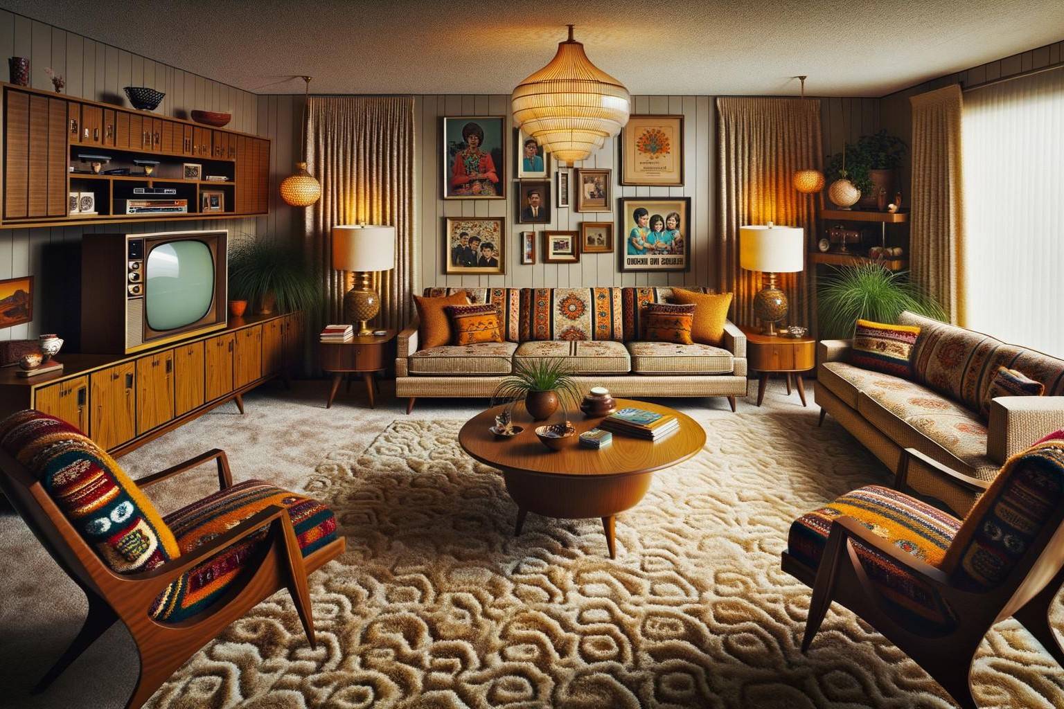
The 1960s were a time of great change and innovation in design. The color palette of the era was characterized by a blend of organic and synthetic hues. Here are some key color trends from the 1960s that you can draw inspiration from:
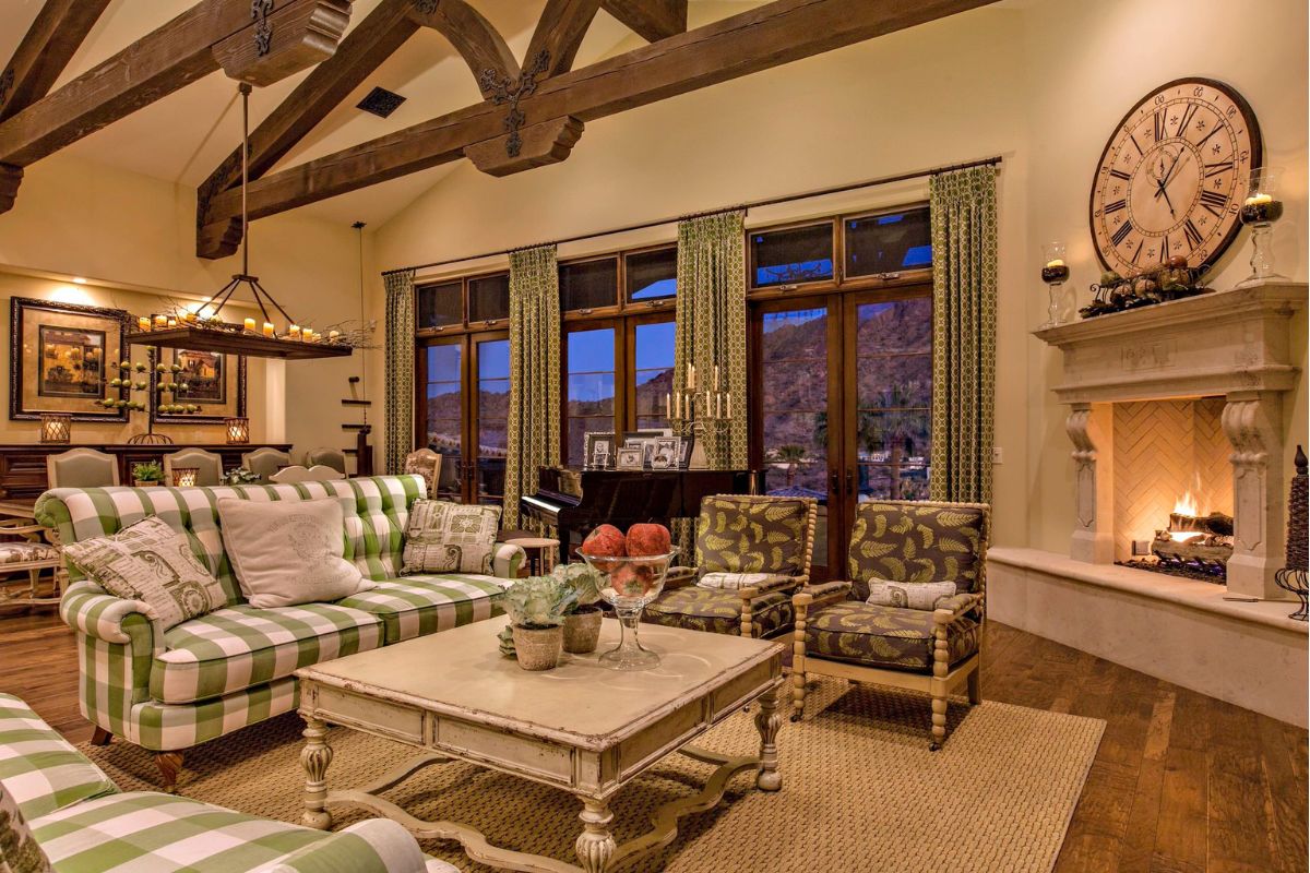
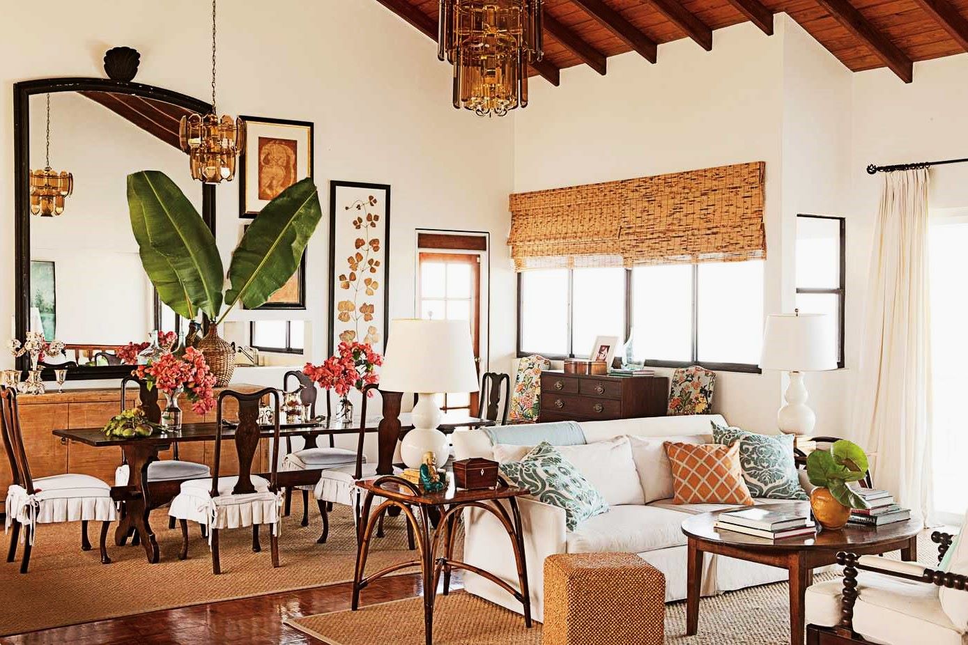
- Organic Colors: These include earthy tones such as greens, browns, and beiges. These colors were often used in conjunction with natural materials like wood and wicker.
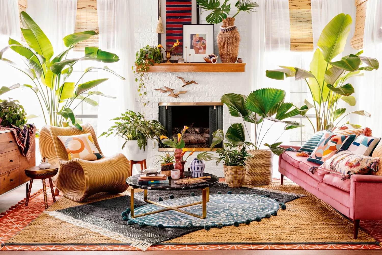
- Synthetic Hues: Bright and bold colors like oranges, teals, and yellows were popular. These colors were often used in combination with each other to create vibrant and dynamic spaces.
- Mid-Century Modern Vintage Décor: This style often featured a mix of amped-up earth tones and synthetic hues. For example, the 1960s saw a rise in the use of avocado green and harvest gold, which became iconic colors of the era.
Tips for Choosing Paint Colors
-
Don’t Choose Your Paint Colors First
Before selecting your paint colors, make sure all your other decor is chosen. The paint is made up of several base colors, and those will show through in what is called undertones. If you can identify the undertones in a paint color, you’ll be better able to choose one that works with your decor. -
Use the Largest Test Swatch Possible
When testing paint colors, use the largest test swatch possible and test at home with accurate lighting. This will give you a better sense of how the color will look in different lighting conditions. Look at all those large samples in all kinds of light, even move them around the room if you need to see what they’ll look like on different walls. -
Consider Natural Lighting
The lighting in the room—lamps, ceiling lights, and natural lighting from windows—will change how that paint swatch looks at different times of day. South-facing rooms tend to have warmer light due to the sun coming in every day, while north-facing rooms have cooler blue or gray natural lighting. -
Match Colors to an Inspiration Piece
If you’re stumped on what paint color to choose, match colors to an inspiration piece like an area rug, a piece of art, or a fabric you love and are planning to use in the room you’re painting. This will help ensure that your paint color complements your overall decor.
Specific Color Suggestions for a 1960s Retro Living Room
-
Avocado Green
Avocado green was one of the most iconic colors of the 1960s. It’s a soft, muted green that pairs well with natural materials like wood and wicker. You can use this color for walls, furniture, or even accessories like throw pillows and rugs. -
Harvest Gold
Harvest gold is another classic color from the 1960s. It’s a warm, golden hue that complements earthy tones and adds a touch of vintage charm to any room. You can use this color for lighting fixtures, furniture, or even accents like vases and picture frames. -
Teal
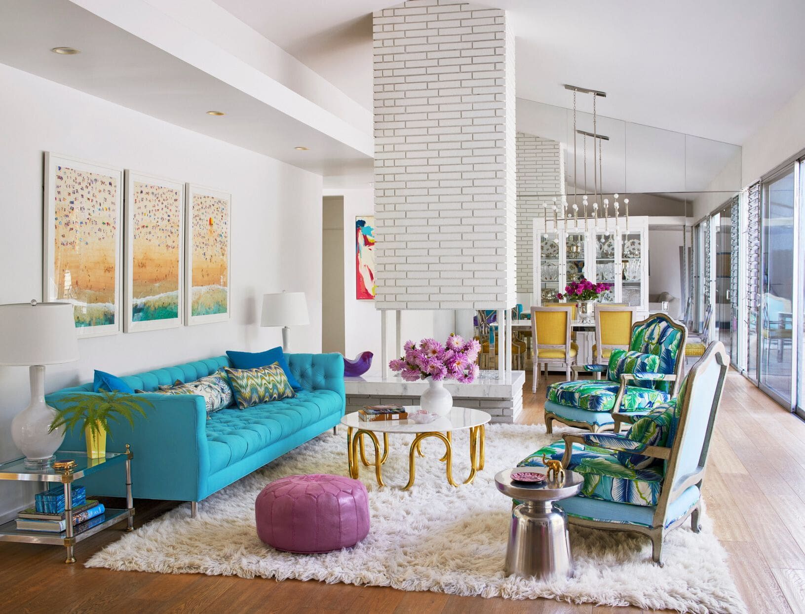
Teal is a vibrant and dynamic color that was popular in the 1960s. It pairs well with other bold colors like orange and yellow, creating a lively and retro atmosphere. You can use teal for walls, furniture, or even accessories like throw pillows and rugs. -
Orange
Orange was another bold color that dominated the 1960s. It’s a vibrant hue that adds energy and warmth to any room. You can use orange for walls, furniture, or even accessories like throw pillows and rugs. -
Seafoam Green
Seafoam green is a softer, more muted version of green that was also popular in the 1960s. It pairs well with natural materials like wood and wicker, creating a calming yet retro atmosphere. You can use seafoam green for walls, furniture, or even accessories like throw pillows and rugs.
How to Incorporate Retro Colors into Your Modern Space
Incorporating retro colors into your modern space requires a thoughtful approach. Here are some tips to help you achieve that perfect blend of old and new:
-
Start with a Neutral Base
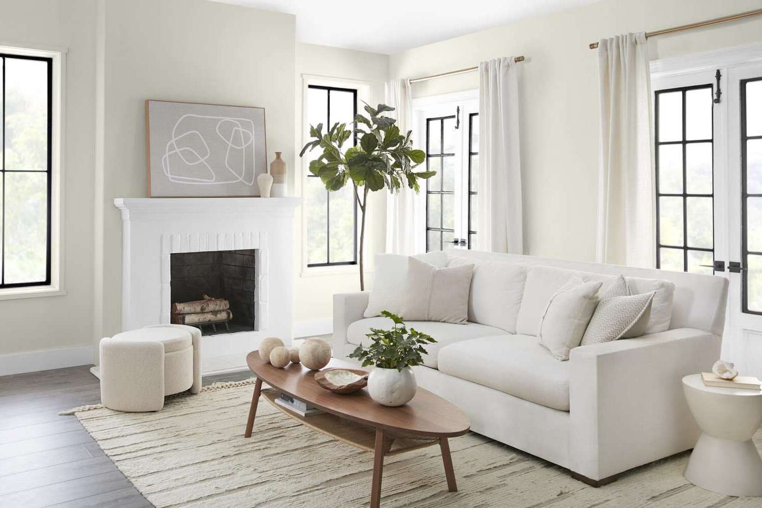
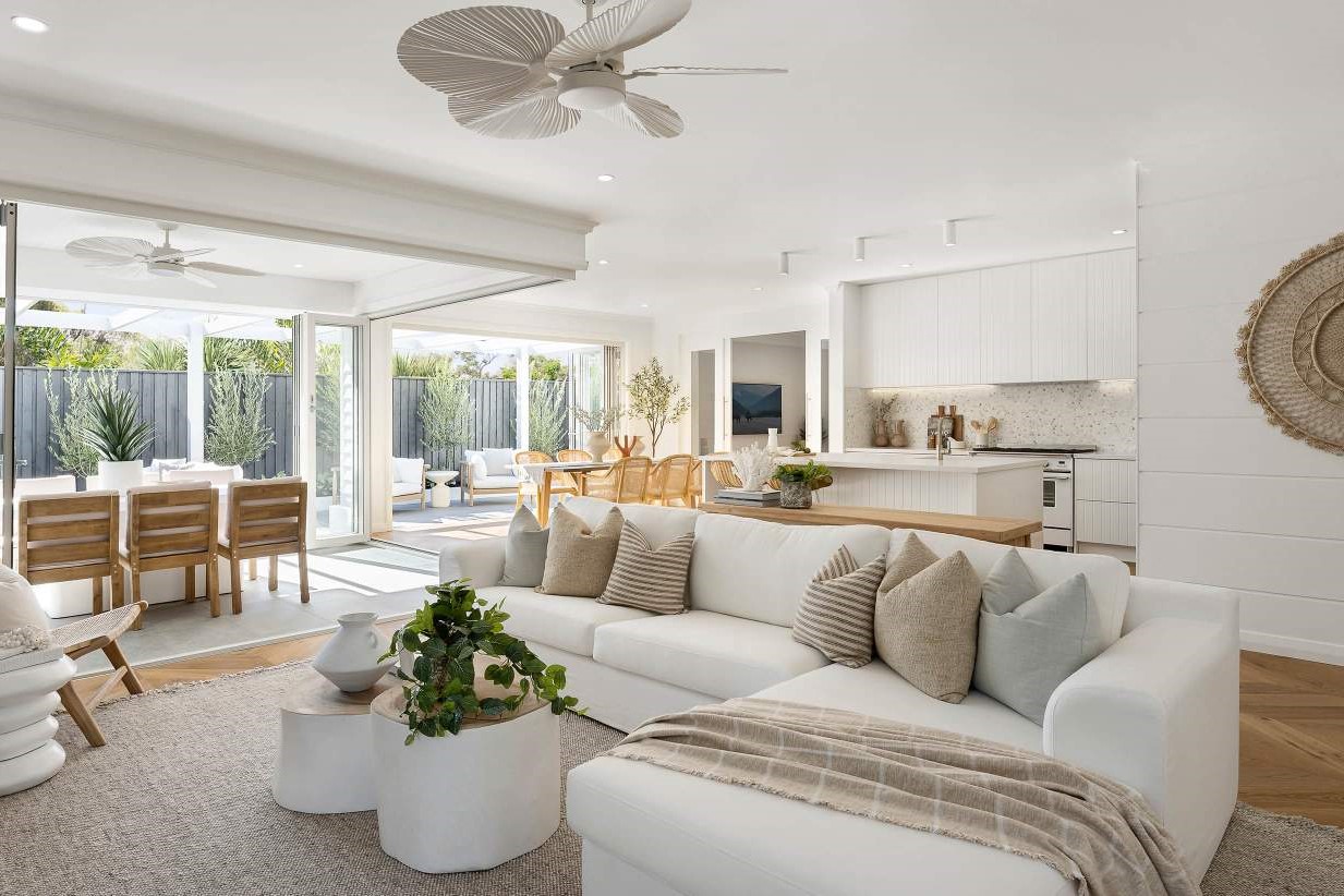
Begin by painting the walls a neutral color like beige or gray. This will provide a clean canvas for your retro colors. You can then add pops of color through furniture, accessories, or even accent walls. -
Add Retro Accents
Once you have your neutral base, start adding retro accents like avocado green furniture, harvest gold lighting fixtures, or teal throw pillows. These accents will help bring the room back to the fabulous era of the 1960s. -
Use Colorful Rugs
Rugs are an excellent way to add color and texture to your room. Choose a rug that reflects the retro colors you want to incorporate. For example, an avocado green rug or a teal and yellow striped rug can instantly transform your space. -
Incorporate Vintage Decor
Vintage decor items like vintage posters, retro-themed artwork, and antique furniture pieces can help create a cohesive retro look. These items not only add color but also historical context to your space. -
Balance Bold Colors
When using bold colors like orange or teal, balance them with neutral elements to avoid overwhelming the space. For example, pair a bold wall color with neutral furniture and accessories to create a harmonious look.
Conclusion
Choosing the right paint colors for a 1960s retro living room is all about understanding the color palette of the era and incorporating those colors in a way that complements your modern space. By following these tips and suggestions, you can create a vibrant and dynamic space that captures the essence of the fabulous 1960s. Remember to start with a neutral base, add retro accents, use colorful rugs, incorporate vintage decor, and balance bold colors to achieve that perfect blend of old and new. Happy decorating
Was this page helpful?
At Storables.com, we guarantee accurate and reliable information. Our content, validated by Expert Board Contributors, is crafted following stringent Editorial Policies. We're committed to providing you with well-researched, expert-backed insights for all your informational needs.


0 thoughts on “How To Choose The Right Paint Colors For A 1960s Retro Living Room”