Home>Ideas and Tips>How To Choose The Right Paint Colors For A Cohesive Home
Ideas and Tips
How To Choose The Right Paint Colors For A Cohesive Home
Published: August 28, 2024
Learn how to choose the right paint colors for a cohesive home with tips on mood, lighting, and color theory to create a harmonious living space.
(Many of the links in this article redirect to a specific reviewed product. Your purchase of these products through affiliate links helps to generate commission for Storables.com, at no extra cost. Learn more)
Choosing the right paint colors for your home can be a daunting task, especially when you want to achieve a cohesive look throughout your entire living space. A cohesive color palette is essential for creating a harmonious and visually appealing home that reflects your personality and style. In this article, we will guide you through the process of selecting the perfect paint colors to ensure your home looks beautiful and cohesive from room to room.
Understanding Your Home’s Architectural Style and Era
Before diving into the world of paint colors, it's crucial to understand your home's architectural style and era. Different architectural styles have distinct characteristics that can guide your color choices. For instance, Victorian homes often complement dark, rich colors, while mid-century modern styles look best with bold, contrasting shades. Similarly, the era of your home may hint at colors that were popular at the time of its construction.
Researching and understanding the palette that best suits your home's style and age is essential. This doesn't mean you must strictly adhere to these traditional choices, but they can provide an excellent starting point for your color selection process. For example, if you have a mid-century modern home, you might consider using bold colors like turquoise or avocado green, which were popular during that era. However, you can always mix and match these colors with more modern shades to create a unique and cohesive look.
Identifying the Mood You Want to Create
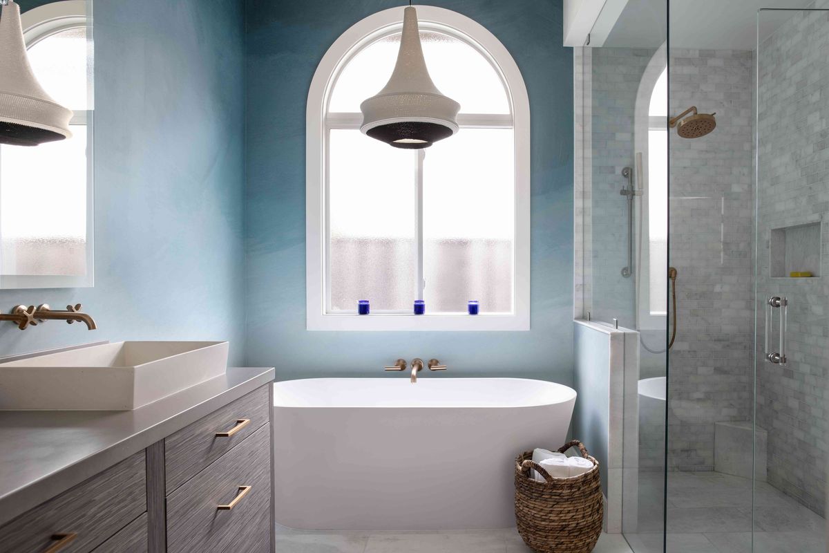
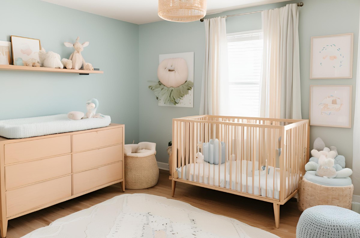
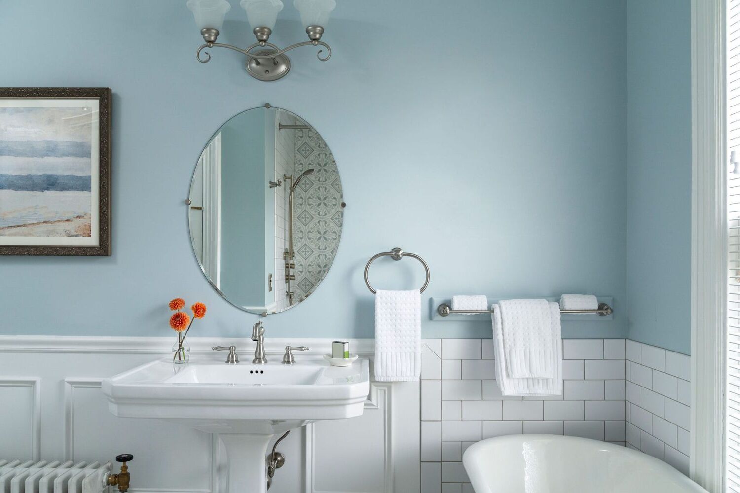
Identifying the mood you want to create in each room is a significant part of the paint selection process. Every color invokes a unique emotional response. For instance, blue is often associated with calm and serenity, while yellow may evoke feelings of happiness and energy. Painting the bedroom wall with a calming color like soft blue or green can set the tone for relaxation, making it a perfect oasis for unwinding.
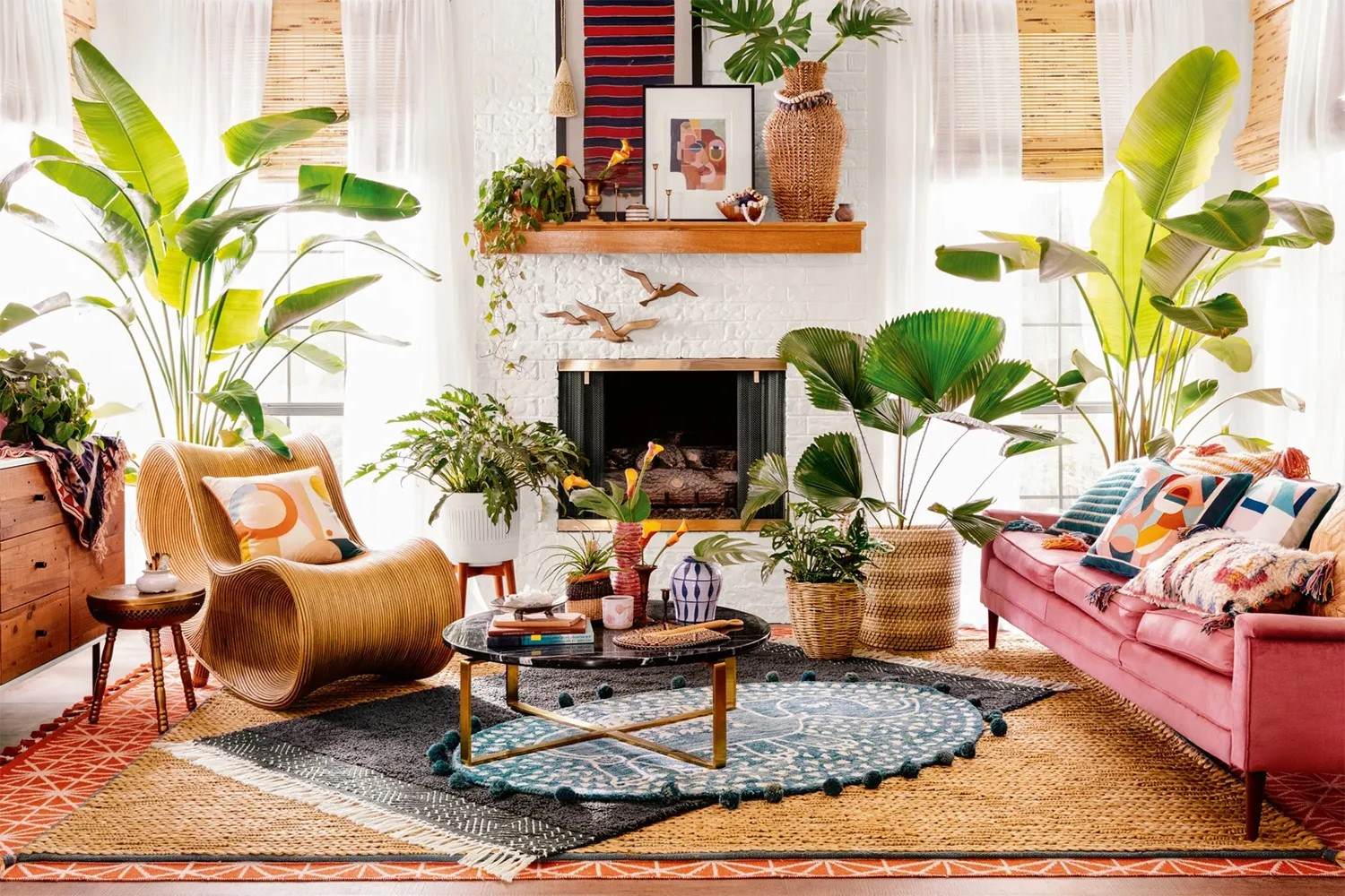
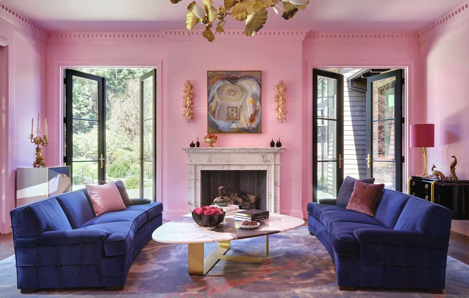
In contrast, for spaces like the living room or kitchen, where you desire a more vibrant and energetic atmosphere, warmer hues like oranges or reds can be the ideal choice. The key is to match your color selection with the mood and functionality of each room. For example, if you have a family room where you spend most of your time watching movies or playing games, you might choose bold colors like red or orange to create an energetic atmosphere.
Considering the Size and Lighting of the Room
The size and lighting of a room are also crucial factors to consider when choosing the right paint colors. For smaller or darker rooms, lighter shades can help create the illusion of more space and brightness, effectively opening up the room. On the other hand, if you have a large, well-lit room, you have more freedom to experiment with darker or bolder colors.
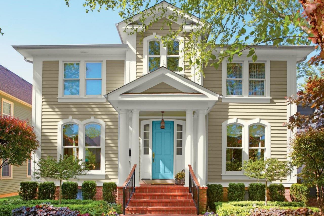
However, caution is advised with the use of bold colors; while they may add personality and depth to your room, they can make selling the home difficult in the future as they may not appeal to everyone’s taste. It’s a delicate balance between creating the space you love and considering the potential for future resale.
Using the Color Wheel
Understanding basic color theory can offer valuable guidance in harmonizing colors. The color wheel is an incredible visual representation of how different colors relate to each other. You can go in several directions with the color wheel:
- Complementary Colors: These are colors opposite each other on the wheel, which can create a vibrant, high-contrast look. For example, pairing blue with orange can create a striking combination.
- Analogous Colors: These are colors next to each other on the wheel, which can provide a more harmonious feel. For instance, using shades of blue, green, and yellow can create a soothing palette.
- Monochromatic Colors: This involves using different shades of the same color, which can lend a sleek, modern touch to your space. For example, using different shades of blue from light sky blue to navy can create a cohesive look.
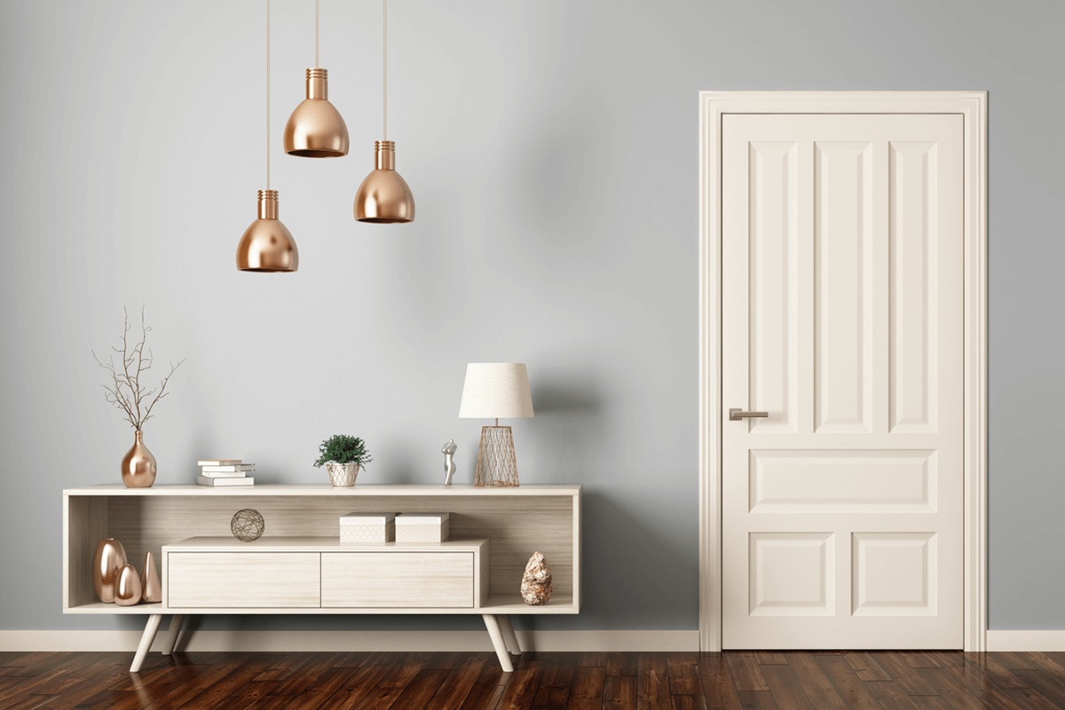
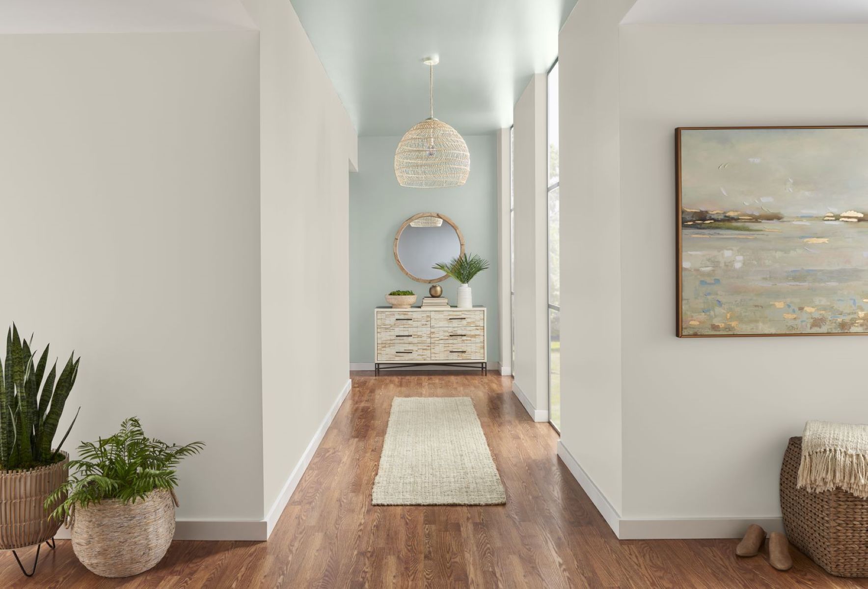
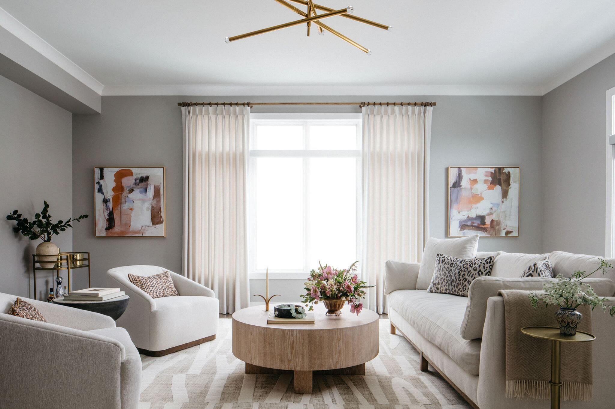
Creating a Cohesive Color Palette
Creating a cohesive color palette involves selecting a few key colors that work well together. Here’s how you can do it:
-
Collect Inspiration:
Start by creating an inspiration board. This will help you visualize which colors you are most drawn to. Collect images from magazines, websites, or social media platforms that showcase your desired color palette. -
Choose a White:
The colors you select don’t have to be paint but can be present in furniture, decor, trim, windows, doors, etc. Choosing the right temperature white for your space is critical. Try out multiple whites to see which one works best in your home. -
Pick a Neutral:
A neutral color is likely heavily present in hard furniture and your wall color. It doesn’t have to be a neutral or a gray tone but could be a very subtle shade or hue of a color. Neutrals provide a solid foundation for your color palette and help tie everything together. -
Pick One Saturated Color:
This color will be a jumping-off point for the rest of your design. It can play a minor or major part in your design but should grab your attention. For example, if you're going for a bold look in your living room, you might choose a saturated color like red or orange. -
Pick a Secondary Color:
If you're going monochromatic, this color will be lighter than your primary color. If analogous, it will be next to your primary color on the color wheel. If complementary, it will be across from your primary color. -
Pick an Accent Color:
This color can be used in a variety of ways big or small and could be used to connect one room to another in your home. Typically, this is another neutral or neutral adjacent color like gray or green. -
Mind The 60, 30, 10 Rule:
The secret to evenly distributing color throughout your space is following the 60, 30, 10 rule:- 60%: Of the room should be a dominant color with walls, accent pieces, sofas, rugs, etc. The easiest thing to do is have this be neutrals.
- 30%: Should be your secondary accent color or texture – this would be in curtains, armchairs, ottomans, or perhaps rugs.
- 10%: This is your accent color to use in throw pillows, artwork, texture, vases, flowers, accessories, etc.
Tips for Overthinkers
Choosing paint colors can be overwhelming, especially if you're an overthinker. Here are some tips to help you through the process:
-
Don’t Ask Friends for Their Opinions:
While it's tempting to ask friends for their opinions, it can make the decision-making process harder. Most opinions are swayed by personal tastes and perceptions rather than actual knowledge. -
Do Your Research Before You Start Looking at Paint Colors:
Once you’ve removed some of the emotion from the decision-making process, you’ll pay less attention to yourself and more to your home. Researching what your home’s interior finishes are really asking for will make it easier to step back and view your space with more curiosity. -
Start Small:
Commit to painting one wall or section that butts up directly with the finishes you’re trying to coordinate with. This will give you a small test area before committing to larger areas. -
Consider Your Countertops and Trim:
Pay attention to your countertops and trim when choosing paint colors. These elements can significantly influence how colors look in a room. -
Experiment with Samples:
Use paint samples to test different colors in various lighting conditions. This will help you see how colors change throughout the day and ensure they look good in different environments.
Examples of Cohesive Color Palettes
Let’s look at some examples of cohesive color palettes:
-
Neutral with Bold Accent:
- Primary Color: Soft Gray (walls)
- Secondary Color: Cream (furniture)
- Accent Color: Navy Blue (accents)
-
Monochromatic:
- Primary Color: Light Blue (walls)
- Secondary Color: Sky Blue (furniture)
- Accent Color: Navy Blue (accents)
-
Analogous:
- Primary Color: Green (walls)
- Secondary Color: Yellow-Green (furniture)
- Accent Color: Blue-Green (accents)
-
Complementary:
- Primary Color: Red (walls)
- Secondary Color: Yellow (furniture)
- Accent Color: Green (accents)
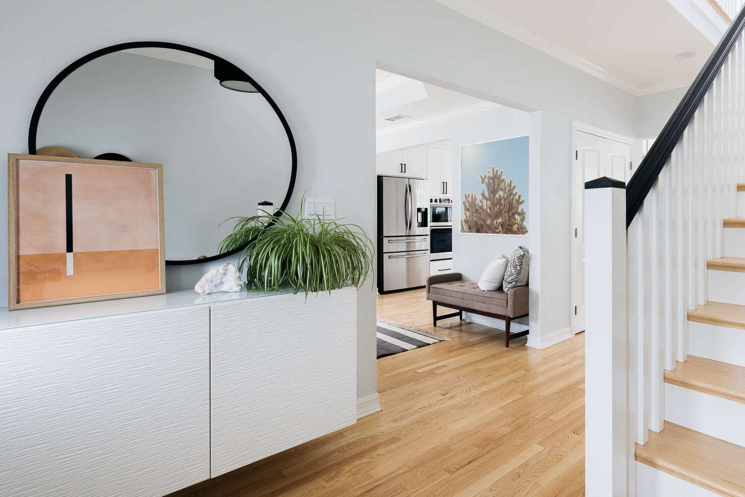
Pulling Color from Room to Room
Pulling color from room to room is essential for creating a cohesive look throughout your home. Here’s how you can do it:
-
Identify Prominent Colors:
Identify prominent colors in each room and use them differently in other rooms. For example, if you have a bold red accent wall in your living room, you might use a lighter shade of red in your dining room. -
Use Color Consistently:
Use your color palette consistently throughout your home but vary the amount used in each room according to its function and mood. For instance, you might use more bold colors in high-traffic areas like the living room but softer shades in bedrooms. -
Create Flow:
Create flow between rooms by using similar colors or shades in adjacent spaces. This will help tie everything together and make your home feel cohesive.
Conclusion
Choosing the right paint colors for a cohesive home involves understanding your home’s architectural style and era, identifying the mood you want to create in each room, considering the size and lighting of the room, using the color wheel, creating a cohesive color palette, and pulling color from room to room. By following these steps and tips, you can create a harmonious and visually appealing home that reflects your personality and style.
Remember that there are no hard rules when it comes to choosing paint colors; each situation is unique, and it’s all about finding what works best for you and your home. With patience, research, and experimentation, you can achieve a cohesive color palette that makes your home shine from every corner.
By following these guidelines and tips, you’ll be well on your way to creating a beautiful, cohesive home that you’ll love for years to come. Happy decorating
Was this page helpful?
At Storables.com, we guarantee accurate and reliable information. Our content, validated by Expert Board Contributors, is crafted following stringent Editorial Policies. We're committed to providing you with well-researched, expert-backed insights for all your informational needs.

0 thoughts on “How To Choose The Right Paint Colors For A Cohesive Home”