Home>Ideas and Tips>How To Choose The Right Paint Colors For A Mid-Century Modern Living Room

Ideas and Tips
How To Choose The Right Paint Colors For A Mid-Century Modern Living Room
Modified: October 20, 2024
Discover how to choose the perfect paint colors for a mid-century modern living room, blending earth tones, vibrant hues, and timeless design principles.
(Many of the links in this article redirect to a specific reviewed product. Your purchase of these products through affiliate links helps to generate commission for Storables.com, at no extra cost. Learn more)
Choosing the right paint colors for a mid-century modern living room can seem like a daunting task, but it doesn't have to be. The key is to understand the core principles of mid-century modern design and how to apply them to your space. This style, which emerged in the 1930s and flourished through the 1960s, is all about sleek lines, organic shapes, and an emphasis on functionality. By selecting the right paint colors, you can create a retro-chic look that's both exciting and calming.
Understanding Mid-Century Modern Design
Mid-century modern design is not just about aesthetics; it's also about functionality and innovation. The post-World War II era saw a significant shift in architecture and interior design as people moved from urban centers to suburban areas. The need for quick, affordable housing led to the development of new building materials like steel, glass, and concrete. These materials allowed architects to create structures that were not only modern but also sustainable and efficient.
Mid-century modern design is often associated with iconic architects like Frank Lloyd Wright and Eero Saarinen. Their work featured open floor plans, large windows, and an emphasis on natural light. The interior design of the time incorporated elements like wood accents, geometric patterns, and bold color schemes. These elements combined to create spaces that were both stylish and practical.
Earth Tones and Neutral Colors
One of the defining characteristics of mid-century modern design is its use of earth tones and neutral colors. These hues provide a calm backdrop for the bold geometric patterns and vibrant accents that are hallmarks of this style. Here are some of the most popular neutral colors:
- Ochre: This golden yellow-brown color is one of the most iconic mid-century modern paint colors. It can range from a muted tan to a vibrant yellow and pairs well with red and orange accents.
- Olive Green: A fun and versatile color, olive green creates a striking backdrop for original artwork or unique furniture pieces. It meshes well with various bright colors, making it a great choice for DIY enthusiasts.
- Brick Red: This classic color was all the rage in mid-century modern design. It pairs well with other earth tones and can be complemented by fun trims like Farrow & Ball's Nancy's Blushes.
- Mustard Yellow: For those who want to go bold, mustard yellow is a very mid-century choice. It adds a fun and exciting pop to any room and pairs well with dark wood and brown leather.
Vibrant Pops of Color
While neutral colors provide a solid foundation, mid-century modern design thrives on vibrant pops of color. These hues add excitement and personality to the space without overwhelming it. Here are some popular vibrant colors:
- Turquoise: This bright blue-green color is another staple of mid-century modern design. It works well in brighter rooms and can be paired with lighter or more olive-like greens for a cohesive look.
- Teal: For those who prefer a more serene vibe, deep teal is an excellent choice. It adds interest without being too drastic and works beautifully in bedrooms or bathrooms.
- Reds and Oranges: These colors were all the rage in mid-century modern design. From brick red to cayenne red, these hues complement earth tones perfectly and can be used as accent walls or bold furniture pieces.
Complementary Color Schemes
Mid-century modern design often employs complementary color schemes to create visually appealing spaces. Here are some popular combinations:
- Blue and Orange: These complementary colors look great together and can be used in various shades to create a cohesive look.
- Red, Orange, and Yellow: For those who love color, this palette is perfect. Warm, muted shades of yellow, orange, and red make up the primary color palette while white and wood tones provide balance.
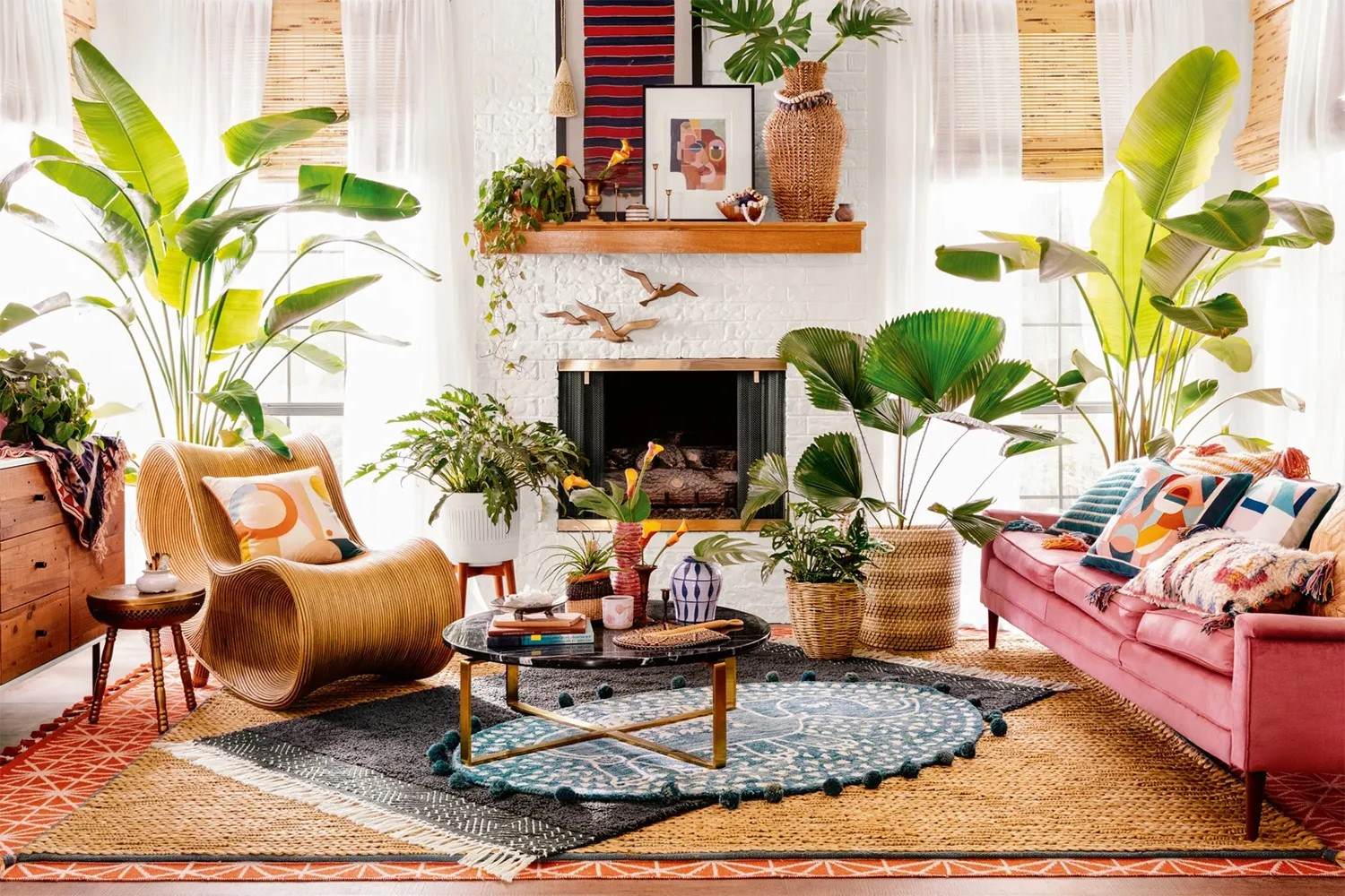
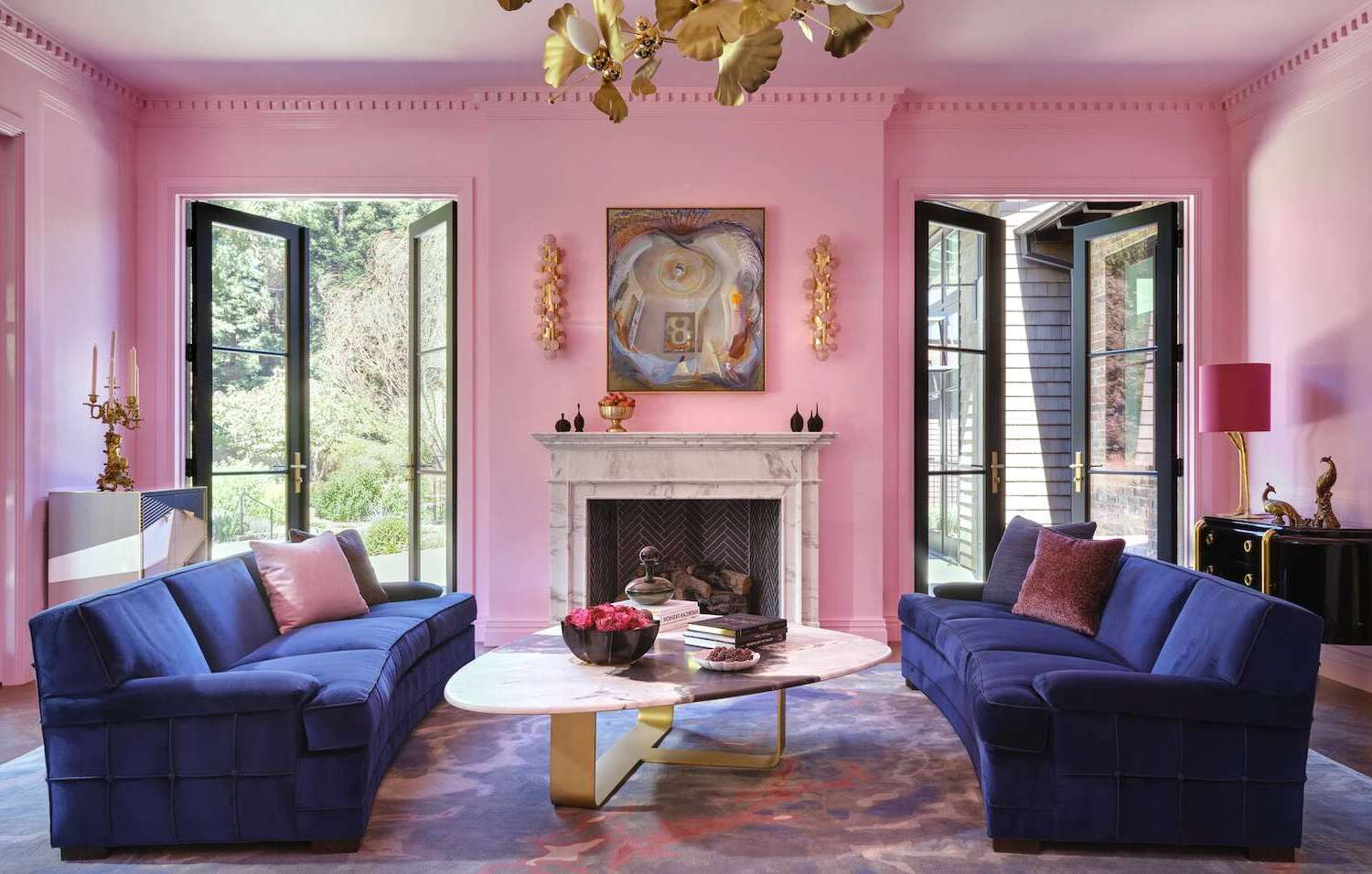
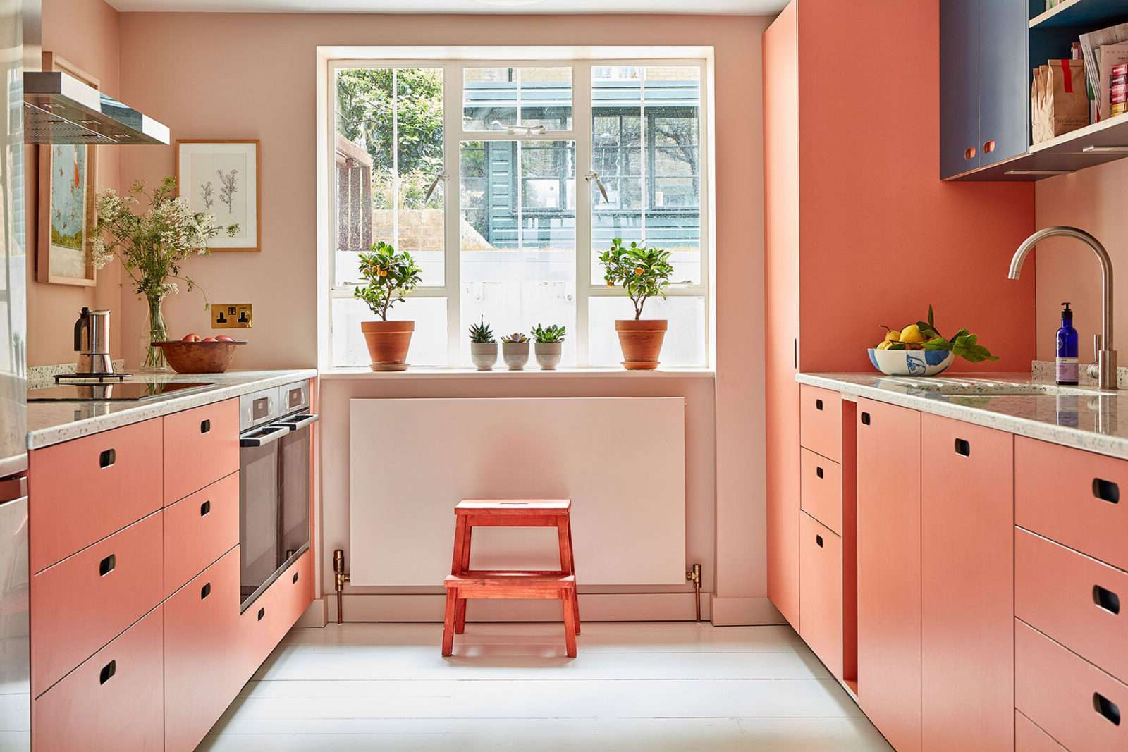
- Pink and Teal: This playful combination adds a charming retro feel to any space. Try going all out with a color-drenched maximalist look or test out the color palette using a few items of decor first.
Black and White
While earth tones and vibrant colors are essential to mid-century modern design, black and white are also common combinations. These colors emphasize bold geometric patterns and stay consistent with the idea of simplicity. Here’s how you can incorporate black and white into your design:
- Shoji White: This industrial white is a classic choice for mid-century modern homes. It pairs well with natural wood tones and creates a clean backdrop for other design elements.
- Tricorn Black: This sleek black adds contrast to any space and works beautifully with geometric patterns and bold accents.
Practical Tips for Choosing Paint Colors
Choosing the right paint colors for your mid-century modern living room can be overwhelming, especially with so many options available. Here are some practical tips to help you make the right choice:
-
Start with Inspiration:
- Find an inspiration piece that already has a color palette that works (rug, pillow, barkcloth curtains, pottery, painting, etc.). Pull colors from that piece to create your own unique palette.
-
Consider the Room’s Purpose:
- Different rooms have different purposes. For example, a living room might require more vibrant colors to create a lively atmosphere, while a bedroom might benefit from calmer hues for better sleep.
-
Think About Natural Light:
- Natural light can greatly affect how colors appear in a room. Brighter rooms can handle bolder colors, while darker rooms might require more muted tones.
-
Experiment with Samples:
- Before committing to a specific color, get samples and test them in the room. This will give you a better idea of how the color will look in different lighting conditions.
-
Balance Bold Colors:
- If you're using bold colors like mustard yellow or brick red, balance them with neutral elements like white or black furniture and decor.
-
Incorporate Patterns:
- Mid-century modern design often incorporates geometric patterns and bold textiles. Use these elements to add depth and interest to your space without overwhelming it with too many colors.
Real-Life Examples
To better understand how these color palettes work in practice, let's look at some real-life examples:
-
Ochre and Red Accents:
- Using ochre as the primary wall color and adding red accents through furniture or decor creates a harmonious and stylish space. For instance, Dunn-Edwards Alameda Ochre paired with Benjamin Moore’s Autumn Gold would be an excellent choice.
-
Olive Green and Bright Colors:
- Olive green as the backdrop allows you to play with bright colors like turquoise or teal. For example, Sherwin-Williams Relentless Olive paired with Valspar’s Classic Teal would create a striking contrast.
-
Brick Red and White Trim:
- Brick red as the wall color paired with white trim gives you the ability to have fun complements like Farrow & Ball’s Nancy’s Blushes for your trim.
-
Mustard Yellow and Neutrals:
- Mustard yellow as an accent wall or bold furniture piece works well when balanced with mostly neutrals like white or black furniture and decor. For instance, Benjamin Moore’s Golden Bounty paired with neutral elements would keep it interesting without becoming busy.
Conclusion
Choosing the right paint colors for your mid-century modern living room is an art that requires careful consideration of both aesthetics and functionality. By understanding the core principles of mid-century modern design—earth tones, neutral colors, vibrant pops of color—and practical tips for choosing paint colors, you can create a space that is both stylish and inviting. Whether you opt for ochre and red accents or mustard yellow and neutrals, remember that juxtaposition of materials is everything when it comes to designing a mid-century space. With these guidelines in mind, you'll be well on your way to transforming your living room into a retro-chic haven that embodies the spirit of mid-century modern design.
Additional Resources
For further inspiration and guidance on mid-century modern paint colors, consider the following resources:
- Mid-Century Modern Color Palettes: The Spruce offers 20 perfect mid-century modern color palettes ranging from vibrant to calming hues.
- Mid-Century Modern Paint Colors: Angi provides ten timeless mid-century modern paint colors that capture the essence of retro-chic design.
- Mid-Century Modern Style Home: Onit Painting offers recommendations for timeless shades like Shoji White and Tricorn Black that are perfect for transforming your home into a mid-century modern masterpiece.
By combining these resources with practical tips and real-life examples, you'll be able to create a living room that not only reflects your personal style but also honors the timeless principles of mid-century modern design.
Was this page helpful?
At Storables.com, we guarantee accurate and reliable information. Our content, validated by Expert Board Contributors, is crafted following stringent Editorial Policies. We're committed to providing you with well-researched, expert-backed insights for all your informational needs.
0 thoughts on “How To Choose The Right Paint Colors For A Mid-Century Modern Living Room”