Home>Ideas and Tips>How To Choose The Right Paint Colors For Small Spaces
Ideas and Tips
How To Choose The Right Paint Colors For Small Spaces
Published: September 3, 2024
Discover how to choose the perfect paint colors for small spaces to make them feel larger and more inviting. Tips for light, bold, and neutral colors.
(Many of the links in this article redirect to a specific reviewed product. Your purchase of these products through affiliate links helps to generate commission for Storables.com, at no extra cost. Learn more)
Choosing the right paint colors for small spaces can be tricky, but it’s not impossible. The key is to understand how different colors affect the perception of space and use that knowledge to your advantage. Light colors can make a room feel bigger and brighter, while dark colors can create a cozy, intimate atmosphere. Bold colors can add depth and interest, and neutral colors can be calming and sophisticated. By testing colors in the space and considering lighting conditions, you can find the perfect color scheme for your small space.
Understanding the Basics
Before diving into the specifics of paint color selection, it’s essential to understand the fundamental principles that govern how colors affect our perception of space. Here are a few key points to keep in mind:
-
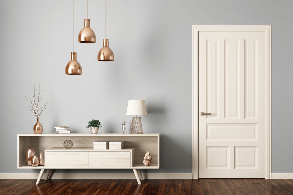
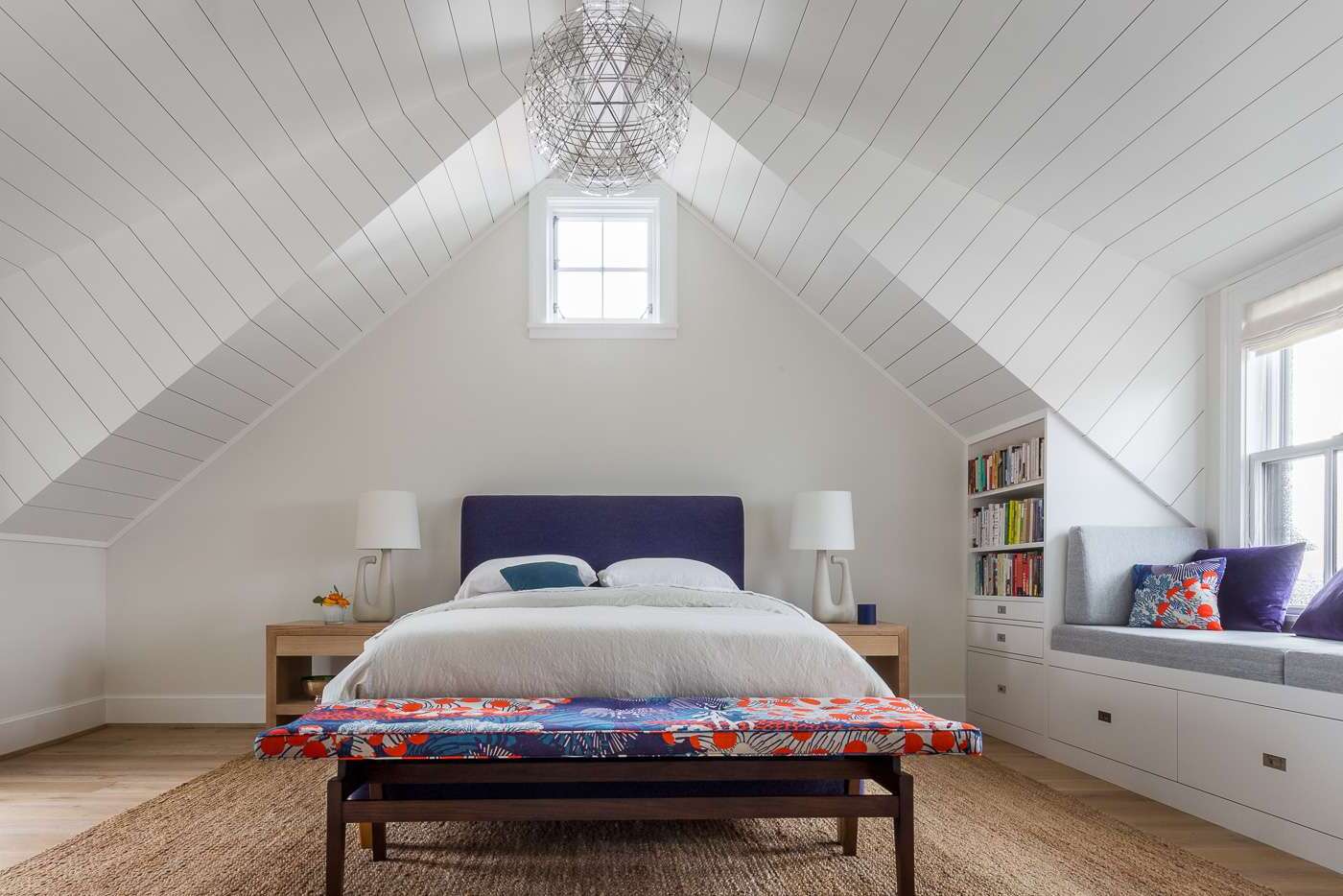
Light Colors for Spaciousness: Light colors reflect more light, making a room feel brighter and more open. Shades of white, cream, and beige are classic choices for this reason. They create an airy, open feeling by bouncing light around the space, thereby making it appear larger than it actually is.
-
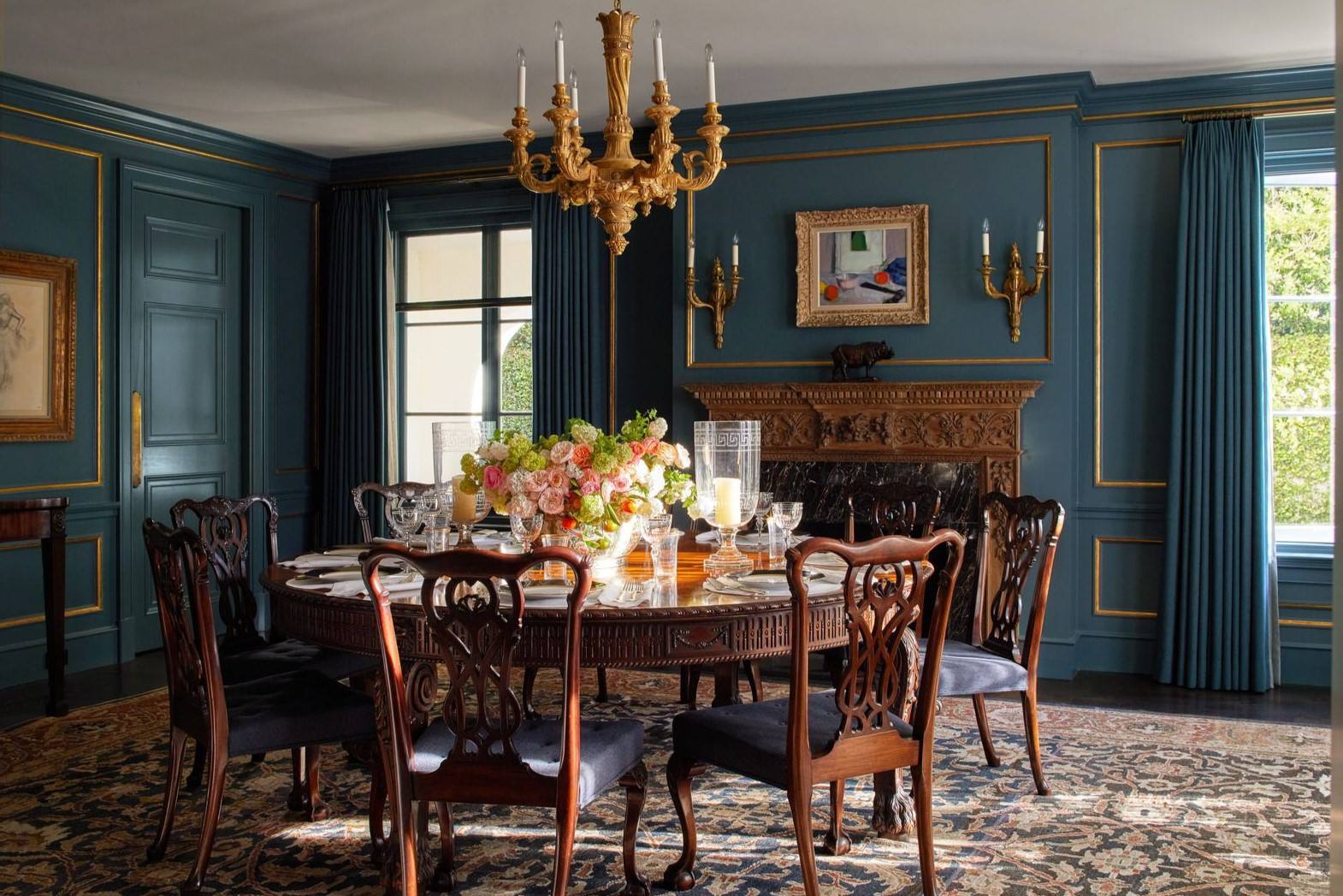
Dark Colors for Coziness: While designers traditionally recommend light colors for small spaces, dark colors can create a cozy and intimate atmosphere. In spaces like powder rooms, studies, or small bedrooms where you want to develop a sense of warmth and enclosure, deeper hues such as hunter green, navy blue, or rich burgundy can be excellent choices. However, it’s crucial to balance these darker tones with lighter furnishings and plenty of good lighting to prevent the room from feeling too cramped or gloomy.
-
Contrasting Colors: Using contrasting colors can create the illusion of depth and dimension in a small room. For example, painting the trim or molding in a different color than the walls can add visual interest and make the space feel larger. Darker colors can be used sparingly, such as in the corners of the room, to create this illusion.
The Role of Color in Small Spaces
Color plays a significant role in how we perceive the size of a room. Here are some specific color strategies that can help make small spaces feel larger:
Light Colors
Light colors are perhaps the most obvious choice for making small spaces feel larger. These colors reflect more light and create an airy, open feeling. Here are some popular light colors that work well in small rooms:
-
White: A crisp white can make any room feel larger and more inviting. It’s a versatile color that works well with various decorating styles and can be paired with almost any other color.
-
Cream: A soft cream color adds warmth to a room without making it feel too dark. It’s an excellent choice for creating a cozy yet spacious atmosphere.
-
Beige: Beige is another neutral color that reflects light well and makes a room feel larger. It’s also a calming color that can create a peaceful environment.
Bold Colors
While light colors are a safe bet, don’t be afraid to go bold with your paint color choice. Bright, bold colors can add depth and interest to a small room and create the illusion of more space when used strategically. Here are some bold colors that work well in small spaces:
-
Navy Blue: Navy blue paint adds personality to small spaces like bathrooms. It can be used for custom vanity bases and walls to create a cohesive look without overwhelming the space.
-
Olive Green: An earthy tone like olive green can set a soothing backdrop in small rooms. It works well in allover treatments and can add a natural touch to the space.
-
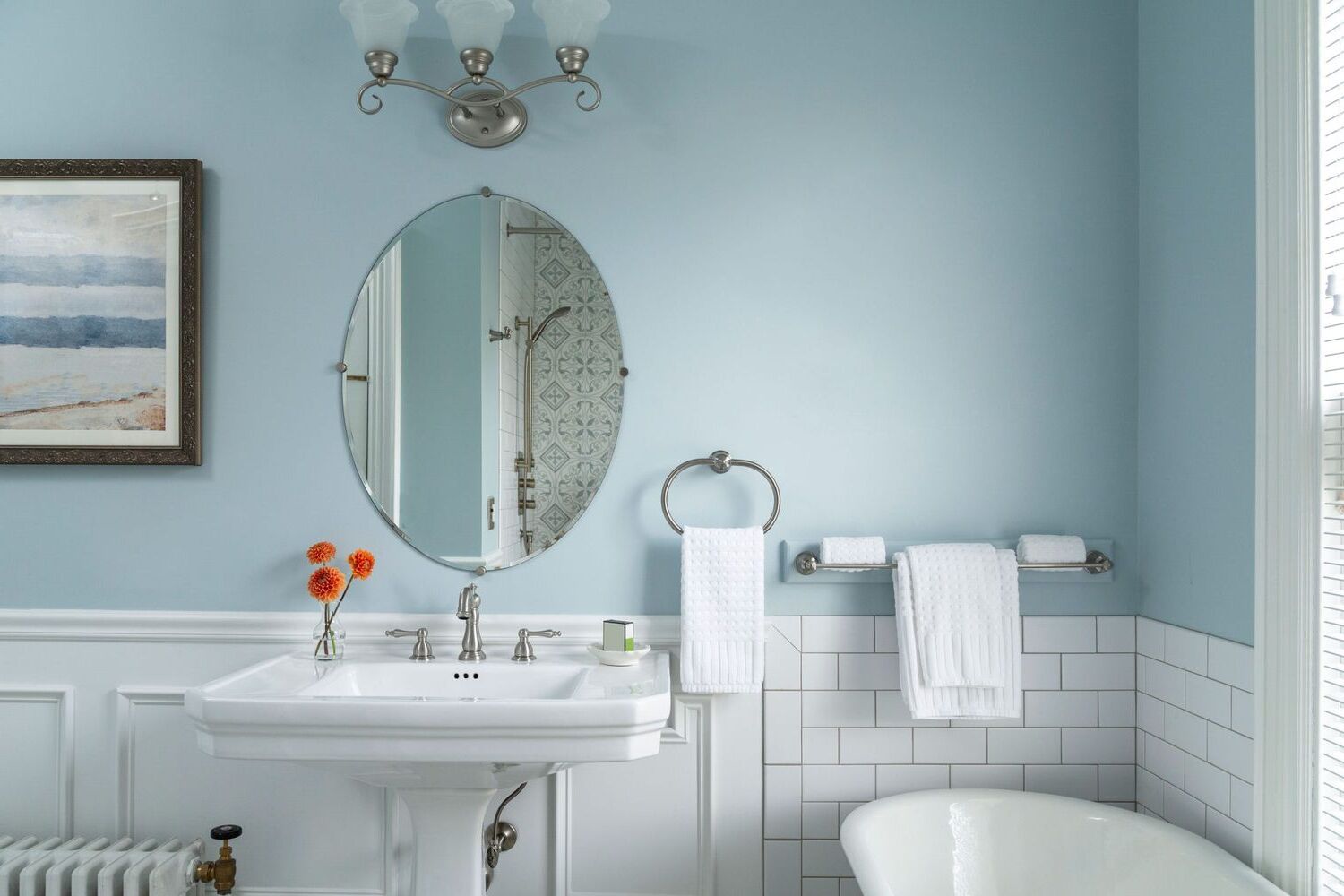
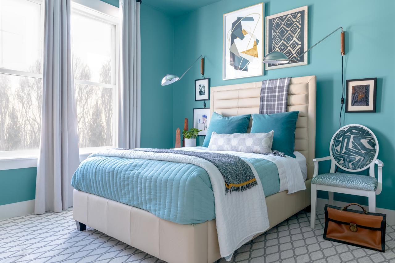
Sky Blue: A soft sky blue tone helps a room feel more expansive and peaceful. It’s an excellent choice for creating a serene environment without overwhelming the space.
Neutral Colors
Neutral colors like gray or taupe are great choices for small rooms because they can be both calming and sophisticated. Here are some tips for choosing neutral colors:
-
Warm Tones: When choosing a neutral color, opt for a warm tone rather than a cool one. Warm tones tend to be more inviting and cozy, making them perfect for small spaces.
-
Gray: Gray is a versatile neutral color that works well in various decorating styles. It can create a sense of calmness while also making the room feel larger.
Dark Colors
Dark colors can create a cozy and intimate atmosphere in small spaces. Here are some tips for using dark colors effectively:
-
Balance with Lighter Furnishings: When using dark colors in small spaces, it’s crucial to balance them with lighter furnishings and plenty of good lighting. This prevents the room from feeling too cramped or gloomy.
-
Use Sparingly: Darker colors should be used sparingly, such as in the corners of the room or on accent walls. This creates the illusion of more space without overwhelming the room.
Practical Tips for Choosing Paint Colors
Choosing the right paint color involves more than just picking a color you like. Here are some practical tips to help you make the best decision:
Test Colors in the Space
One of the biggest mistakes homeowners make is rushing the color selection process. It’s essential to test paint colors in the space before committing to them. Here’s how you can do it:
-
Large Swatches: Paint large swatches (at least 4-by-4-foot) on the wall and observe them for a day or two. This allows you to see how the color looks in different lights throughout the day and how it interacts with your furnishings and flooring.
-
Sample Pots: Use sample pots to paint pieces of poster board that you can move around the room. This approach gives you a much better idea of how the color will actually look in your space.
Consider Lighting Conditions
Lighting conditions play a significant role in how colors appear in a room. Here are some tips for considering lighting conditions:
-
Natural Light: If your room receives plenty of natural light, you may be able to get away with bolder colors. However, if the room is dimly lit, it’s better to stick with lighter shades that reflect more light.
-
Indoor Lighting: Indoor lighting can also affect how colors appear. Consider how different lighting fixtures will impact the color scheme you choose.
Use Color to Define Spaces
In open floor plans, using color to define different areas can be very effective. Here are some strategies for zoning different areas with paint color:
-
Different Colors for Different Areas: Use one color for the kitchen area and a complementary color for the adjoining living space. This technique helps separate the spaces while maintaining a harmonious look overall.
-
Similar Undertones: Use colors with similar undertones throughout your space to create a sense of flow in an open floor plan. This doesn’t mean you have to stick to a single color or even a single color palette, but choosing colors that share warm or cool undertones helps create a cohesive look.
Case Studies: Best Paint Colors for Small Spaces
Let’s look at some case studies where designers have successfully used various paint colors to make small spaces feel larger and more inviting:
Bronze Red by Little Greene
Bronze Red by Little Greene is a bold and cozy color that connects users to their Mexican roots. It feels personal and cozy but can also create the feeling of a tropical escape in Paris.
Saged by Backdrop
Saged by Backdrop creates a feeling of being surrounded by nature. It paired well with dark oak in a bathroom, adding warmth and vibrancy to the space.
Kendall Charcoal by Benjamin Moore
Kendall Charcoal from Benjamin Moore was used in a tiny 100-year-old cottage kitchen to unify varied doors and trim. The dark, dramatic color visually simplified the space and provided a clean backdrop.
Symphony Blue by Benjamin Moore
Symphony Blue is a deeply saturated dark blue paint that creates the illusion that your walls are receding. This tricks the eye into perceiving that a small room is larger. The luxurious texture of the Aura collection ensures smooth drying.
Brinjal by Farrow & Ball
Brinjal is a dark aubergine that is dramatic and moody but not too heavy. It was the perfect choice for a Lady’s Study in New York City, contrasting beautifully with the client’s armorial China collection.
Red Earth by Farrow & Ball
Red Earth is a lightly hued and warm terra-cotta red that brings a warm and earthy feel to any home. It has brilliant mix of red and yellow pigments giving it a soft sunbaked appearance during daylight hours, becoming deeper and cozier as the sun sets.
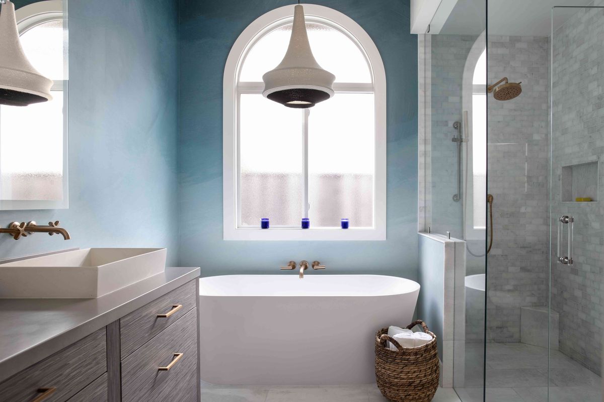
Borrowed Light by Farrow & Ball
Borrowed Light is a perfect subdued and enduring light blue that brings tranquility into an environment. It’s refreshingly classic, serene, and almost neutral all at once.
Conclusion
Choosing the right paint colors for small spaces involves understanding how different colors affect spatial perception and using practical tips to test colors in the space. Light colors reflect more light, creating an airy open feeling, while bold colors add depth and interest. Neutral colors like gray or taupe can be both calming and sophisticated. Darker colors should be used sparingly to create the illusion of more space without overwhelming the room. By following these strategies and considering lighting conditions, you can transform any small space into a beautiful and inviting area that feels larger than it actually is.
Remember, color selection isn’t an exact science, and there’s room for creativity and personal expression. Don’t be afraid to experiment with different colors and techniques to find what works best for your home and lifestyle. With some planning and a willingness to test different options, you can create a color scheme that enhances your home’s beauty and fits your personality perfectly.
Was this page helpful?
At Storables.com, we guarantee accurate and reliable information. Our content, validated by Expert Board Contributors, is crafted following stringent Editorial Policies. We're committed to providing you with well-researched, expert-backed insights for all your informational needs.
0 thoughts on “How To Choose The Right Paint Colors For Small Spaces”