Home>Interior Design>Furniture Arranging Mistakes

Interior Design
Furniture Arranging Mistakes
Modified: October 27, 2024
Avoid these common furniture arranging mistakes in your interior design. Create a harmonious and functional space with proper placement and balance.
(Many of the links in this article redirect to a specific reviewed product. Your purchase of these products through affiliate links helps to generate commission for Storables.com, at no extra cost. Learn more)
Introduction
Welcome to our comprehensive guide on furniture arranging mistakes! When it comes to interior design, arranging furniture is a crucial aspect that can make or break the overall look and functionality of a room. A well-arranged space not only enhances the aesthetic appeal but also creates a harmonious and balanced atmosphere.
However, even seasoned interior designers can fall prey to common furniture arranging mistakes. Whether you’re revamping a living room, bedroom, or any other space in your home, understanding these mistakes can help you avoid them and create a visually stunning and functional environment.
In this article, we will explore ten furniture arranging mistakes that people often make and provide you with insights and tips on how to rectify them. So, let’s dive in and discover the dos and don’ts of furniture arrangement!
Key Takeaways:
- Avoid common furniture arranging mistakes to create a visually stunning and functional environment. Pull furniture away from walls, consider flow, and define zones within a room for a harmonious layout.
- Pay attention to balance, symmetry, and the room’s function when arranging furniture. Choose the right rug size and create a focal point to enhance the overall aesthetic and functionality of the space.
Mistake #1: Pushing Furniture Against the Walls
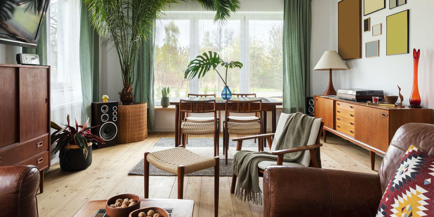
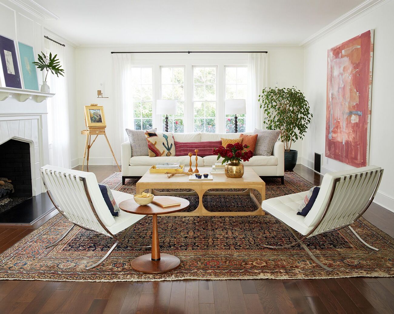
One of the most common furniture arranging mistakes is pushing all the furniture against the walls. While this may seem like a logical way to create more floor space, it can actually make the room feel cold and impersonal. Instead, consider pulling furniture away from the walls to create a sense of balance and intimacy.
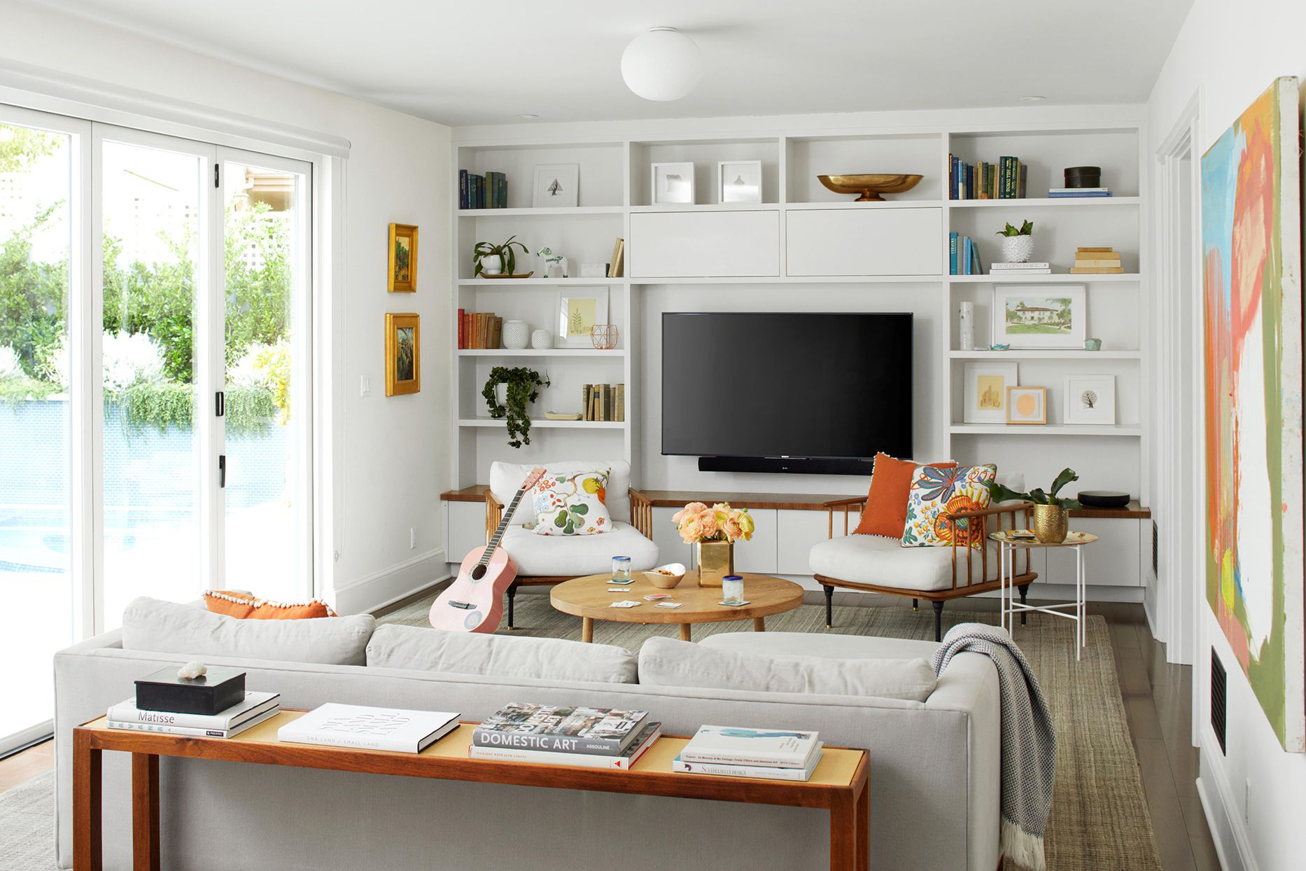
By creating a conversation area in the center of the room with seating arrangements, you encourage a more social and inviting atmosphere. This arrangement allows for easier interaction among guests and makes the room feel cozier.
Additionally, pulling furniture away from the walls can also help define different zones within a room. For example, in a living room, you can create a seating area near the fireplace, a reading nook by a window, and a small workspace in a corner. This enhances the functionality of the space and makes it more versatile.
When repositioning furniture away from the walls, pay attention to traffic flow. Ensure there is enough space for people to move freely between furniture pieces without feeling cramped or obstructed. This creates a more functional and comfortable environment.
While it may take some trial and error to find the perfect placement, avoid the temptation to place all the furniture against the walls. Instead, experiment with different arrangements and find a configuration that encourages conversation, defines spaces, and enhances the overall flow of the room.
Remember, the goal is to create a balanced and harmonious feel in the room, and pushing furniture against the walls can hinder that. So, dare to pull your furniture away from the walls and embrace a more dynamic and inviting arrangement.
Mistake #2: Not Considering the Flow of the Room
When arranging furniture in a room, it’s essential to consider the flow of the space. Flow refers to how people move and navigate within the room, and it greatly impacts the functionality and comfort of the space.
One common mistake is blocking natural pathways or creating obstacles that hinder movement. This can make the room feel cramped and impractical. To avoid this, carefully plan the placement of furniture in a way that allows for easy movement and traffic flow.
Start by mapping out the main pathways and circulation routes in the room. Consider the natural entry and exit points, as well as any focal points or architectural features that may dictate flow. Arrange your furniture in a way that doesn’t obstruct these pathways and allows for smooth movement from one area to another.
For example, in a living room, ensure there is enough space to walk around the seating area without bumping into furniture. In a bedroom, make sure there is a clear path from the bed to the door and other key areas, such as the wardrobe or bathroom.
Another aspect to consider is the relationship between furniture and doorways or openings. Avoid placing furniture right in front of doorways, as this can create a visual and physical barrier. Instead, position furniture in a way that complements the flow of the room and maintains a sense of openness.
By paying attention to the flow of the room, you can create a more functional and harmonious space. This will not only improve the overall usability of the room but also contribute to a more pleasant and enjoyable experience for everyone who enters it.
Mistake #3: Overcrowding the Space
One of the most common furniture arranging mistakes is overcrowding the space. It’s easy to get carried away with adding furniture and accessories, especially if you have a lot of items you love. However, crowding a room with too much furniture can make it feel cluttered, cramped, and overwhelming.
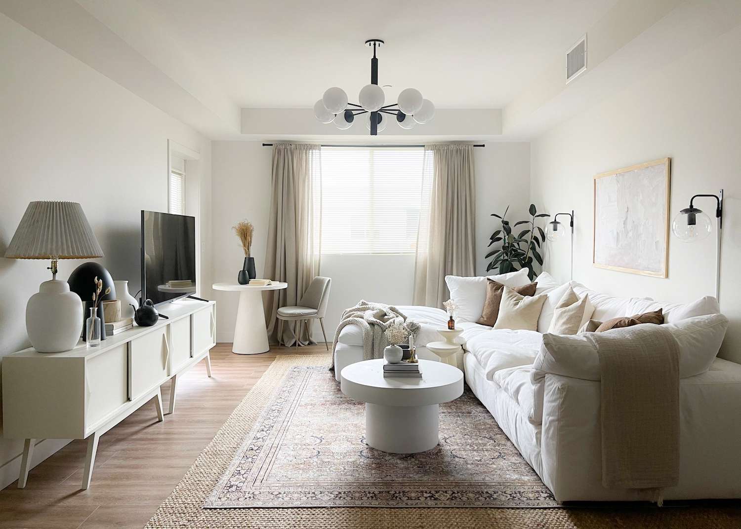
When it comes to furniture arrangement, less is often more. Give your furniture and accessories some breathing room by leaving enough space between each piece. This not only creates a visually appealing layout but also allows for better movement and functionality within the room.
Start by assessing the size of the room and the scale of your furniture. If you have a small space, consider using multipurpose furniture or opting for smaller-scale pieces that don’t overpower the room. Remember, it’s better to have a few well-placed, properly proportioned pieces than a room full of mismatched and crowded furniture.
When arranging furniture, leave enough clearance for easy movement. Chairs and sofas should be placed with enough space around them so that people can comfortably sit down and get up without feeling cramped. Allow for ample walking space between furniture pieces to avoid feeling confined.
Additionally, be mindful of the visual weight of furniture. Balance heavier pieces with lighter ones to create an equilibrium within the room. This helps prevent the space from feeling top-heavy or overly crowded.
By decluttering and leaving some breathing room in your furniture arrangement, you create a more open and inviting space. This not only enhances the overall aesthetic but also adds a sense of relaxation and tranquility to the room.
So, resist the urge to overcrowd your space and embrace a more minimalist and thoughtful approach. Your room will feel much more spacious, functional, and visually pleasing as a result.
Mistake #4: Neglecting Proper Lighting
Lighting is a vital aspect of interior design, yet it is often overlooked when arranging furniture. Neglecting proper lighting can negatively impact the ambiance, functionality, and overall aesthetic of a room. To avoid this common mistake, it’s important to consider the lighting needs of each space and incorporate the right mix of lighting sources.
One mistake people make is relying solely on overhead lighting. While overhead lighting provides general illumination, it can create harsh and unflattering shadows. To create a more inviting and well-lit space, incorporate a combination of ambient, task, and accent lighting.
Ambient lighting, such as recessed lighting or a central pendant light, provides overall illumination and sets the mood for the room. Task lighting, such as desk lamps or reading lights, serves a specific purpose and helps with activities like reading or working. Accent lighting, such as wall sconces or picture lights, adds visual interest and highlights specific features or objects in the room.
When arranging furniture, consider the placement of outlets and the types of lighting fixtures you plan to incorporate. Ensure that there are enough outlets to accommodate your lighting needs and that they are conveniently located near furniture that requires task lighting, such as a desk or reading chair.
Additionally, be mindful of natural lighting. Utilize windows and natural light sources to their fullest potential. When arranging furniture, avoid blocking windows or covering them with heavy curtains that hinder the flow of natural light into the room. Instead, position furniture in a way that takes advantage of natural light and enhances the overall brightness and openness of the space.
By giving attention to the lighting needs of your room and incorporating a thoughtful mix of lighting fixtures, you can create a warm, inviting, and well-lit space. This not only affects the ambiance and functionality of the room but also enhances the beauty and overall aesthetic.
So, don’t forget the power of proper lighting when arranging furniture. It can truly transform a room into a welcoming and visually pleasing environment.
Read more: How To Arrange Furniture In Bedroom
Mistake #5: Ignoring the Scale and Proportion of Furniture
When it comes to furniture arranging, paying attention to the scale and proportion of furniture is crucial. Ignoring these aspects can result in a room that feels off-balance, visually unappealing, and uncomfortable. To create a harmonious and well-designed space, it’s essential to consider the scale and proportion of each piece of furniture.
One common mistake is choosing furniture that is out of proportion with the size of the room or other furniture pieces. For example, placing oversized furniture in a small room can make the space feel cramped and claustrophobic. On the other hand, using small furniture in a large room can make the space appear empty and lacking in substance.
When arranging furniture, take into account the size of the room and its architectural features. Determine the focal points and use them as a guide for selecting appropriately sized furniture. For example, a large sofa might be suitable for a spacious living room, while a smaller loveseat or armchairs might be more suitable for a cozy den or study.
Consider the relationship between different furniture pieces as well. Ensure that each piece complements the others in terms of scale and proportion. For example, if you have a large, statement-making coffee table, balance it out with appropriately sized side tables.
Another aspect to consider is the height of furniture. Variations in height add visual interest and create a sense of depth within the room. Don’t be afraid to mix different heights of furniture to create a more dynamic and visually appealing arrangement.
Lastly, when arranging furniture, leave enough space between pieces to allow for easy movement and functionality. Crowding furniture together not only affects the flow of the room but also makes it harder to appreciate each piece individually.
By paying attention to the scale and proportion of furniture, you can create a balanced, visually pleasing, and comfortable space. Properly-sized furniture enhances the flow of the room, creates a sense of harmony, and improves the overall aesthetic.
So, next time you’re arranging furniture, remember to consider both the scale of the room and the proportion of each piece. Your space will thank you for it!
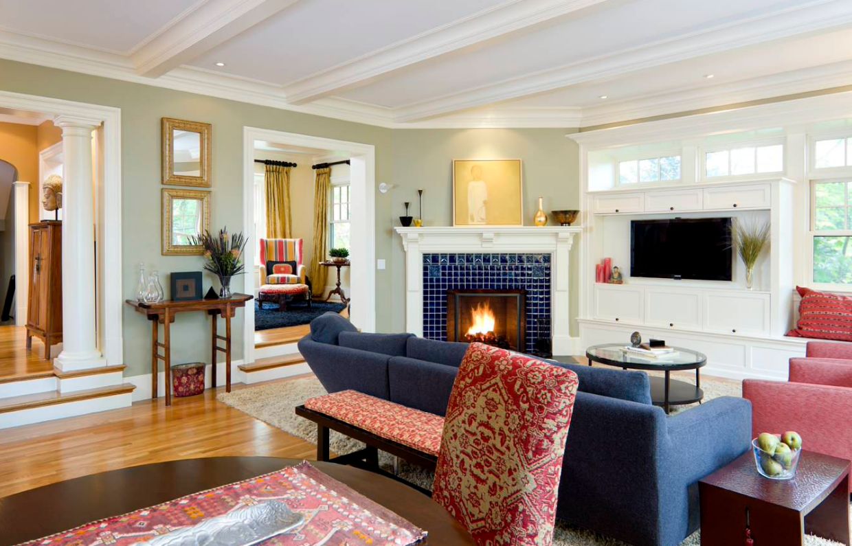
When arranging furniture, avoid pushing everything against the walls. Instead, create cozy conversation areas by pulling furniture away from the walls to create a more intimate and inviting space.
Mistake #6: Failing to Create a Focal Point
Creating a focal point is an essential element of furniture arranging that is often overlooked. A focal point serves as the centerpiece of a room and draws attention, creating a sense of visual interest and cohesion. Failing to establish a focal point can result in a room that feels scattered and lacks a clear design direction.
One common mistake is spreading furniture and accessories evenly throughout the room without designating a central focus. This can make the space feel disjointed and lacking a visual anchor. Instead, identify a prominent feature or area in the room that can serve as the focal point.
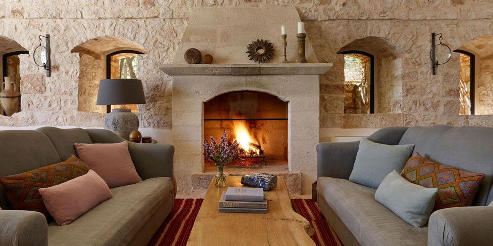
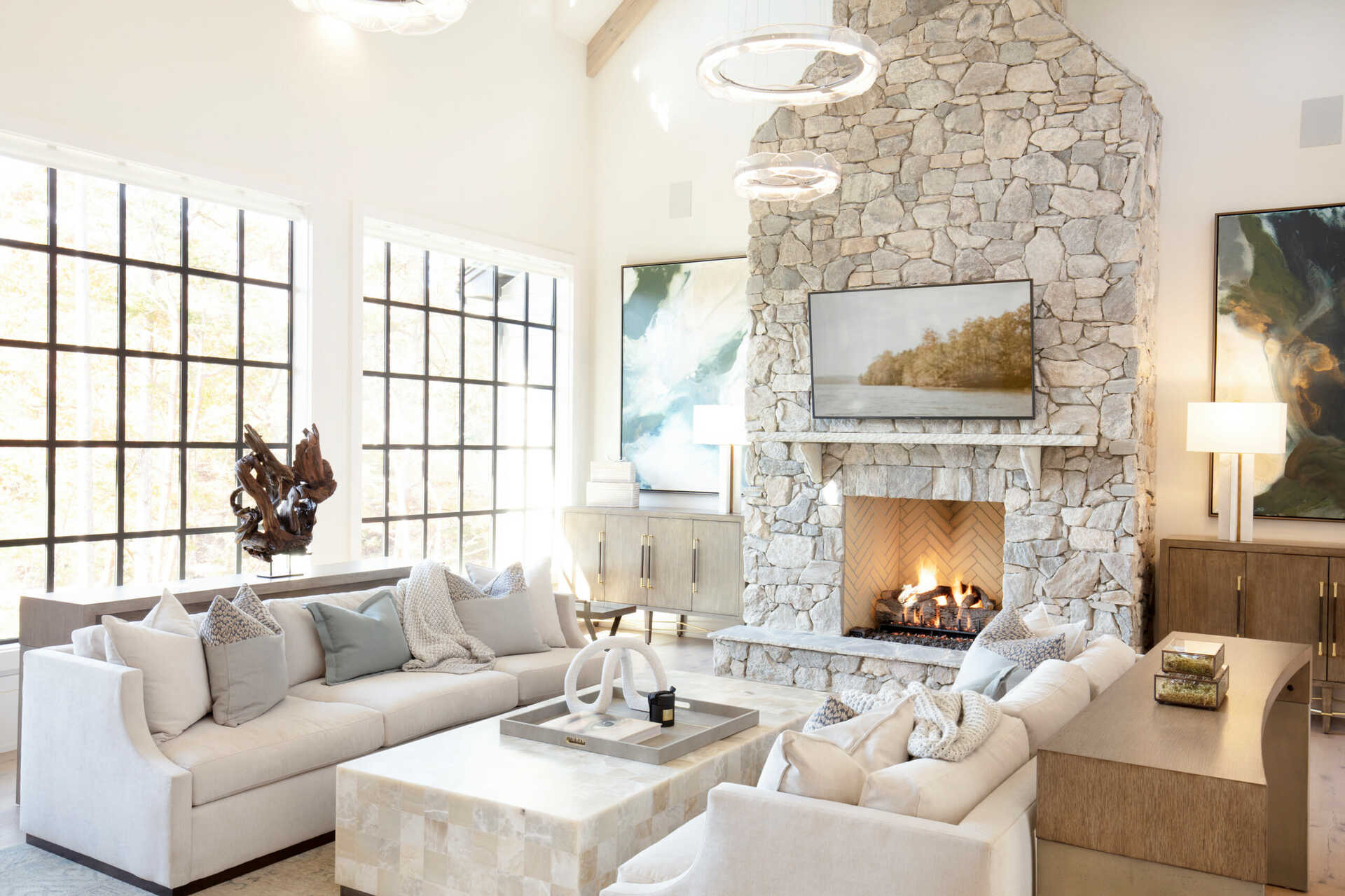
A focal point can be created by highlighting architectural features such as a fireplace, a large window, or a beautiful piece of artwork. It can also be achieved by arranging furniture in a way that directs attention to a central piece, like a statement sofa, a grand dining table, or a bed with an eye-catching headboard.
Once you have established the focal point, arrange furniture around it in a way that complements and enhances its prominence. For example, in a living room, position seating arrangements facing the focal point, creating a cozy and inviting conversation area. In a bedroom, place the bed against a wall or in a central position to emphasize it as the focal point.
When accessorizing the room, be mindful of the focal point and choose decor that supports and enhances its presence. This could include accent pieces, artwork, or lighting fixtures that draw attention to the focal point and contribute to the overall visual impact.
A well-defined focal point not only adds visual interest to a space but also helps guide the furniture arrangement and establishes a sense of purpose and unity. It creates a focal point that anchors the room and provides a clear focus for the eye.
So, don’t overlook the importance of creating a focal point when arranging furniture. It sets the tone for the entire space and adds a layer of sophistication and intentionality to your interior design.
Mistake #7: Disregarding the Function of the Room
When arranging furniture, it’s crucial to consider the function of the room. Each space in your home serves a specific purpose, whether it’s a living room for entertaining, a bedroom for relaxation, or a home office for work. Disregarding the function of the room can result in a layout that is impractical and doesn’t meet your needs.
One common mistake is using furniture that does not align with the intended function of the room. For example, placing a bulky desk and office chair in a living room designed for relaxation and casual socializing can disrupt the overall flow and comfort of the space.
Take some time to evaluate the primary function of the room and determine the essential furniture pieces that serve that purpose. Consider how you want the room to be used and arrange furniture accordingly. For instance, in a bedroom, prioritize a comfortable bed and bedside tables for functionality and relaxation.
Additionally, think about the activities that will be carried out in the room and how the furniture arrangement can support them. If you enjoy hosting dinner parties, ensure there is ample dining space and seating in your dining room. If you use your home office for creative work, allow for enough workspace and storage solutions.
Furthermore, consider the flow and movement within the room based on its function. Arrange furniture in a way that allows for easy navigation and promotes a smooth workflow. Minimize obstacles and ensure that essential pieces are within reach.
By understanding and honoring the function of the room, you can create a space that is both practical and visually appealing. The furniture arrangement will be tailored to meet your specific needs and enhance the functionality of the room.
So, before arranging your furniture, always keep the function of the room at the forefront of your mind. Your space will be better organized, more efficient, and ultimately more enjoyable to use.
Mistake #8: Forgetting About Balance and Symmetry
One key aspect of furniture arranging that is often overlooked is the importance of balance and symmetry. Achieving a sense of balance and symmetry in your room can create a visually pleasing and harmonious space. However, forgetting about these principles can result in a room that feels off-balance and lacks a cohesive design.
A common mistake is placing all the furniture on one side of the room or clustering it in one area, which creates an unbalanced and visually awkward arrangement. To avoid this, strive for a sense of balance by distributing furniture evenly throughout the space.
Start by identifying the centerline of the room and use it as a reference point for arranging furniture. Place larger furniture pieces, such as sofas or beds, along this centerline to create a sense of balance. Then, arrange smaller furniture pieces or accessories on either side to maintain symmetry.
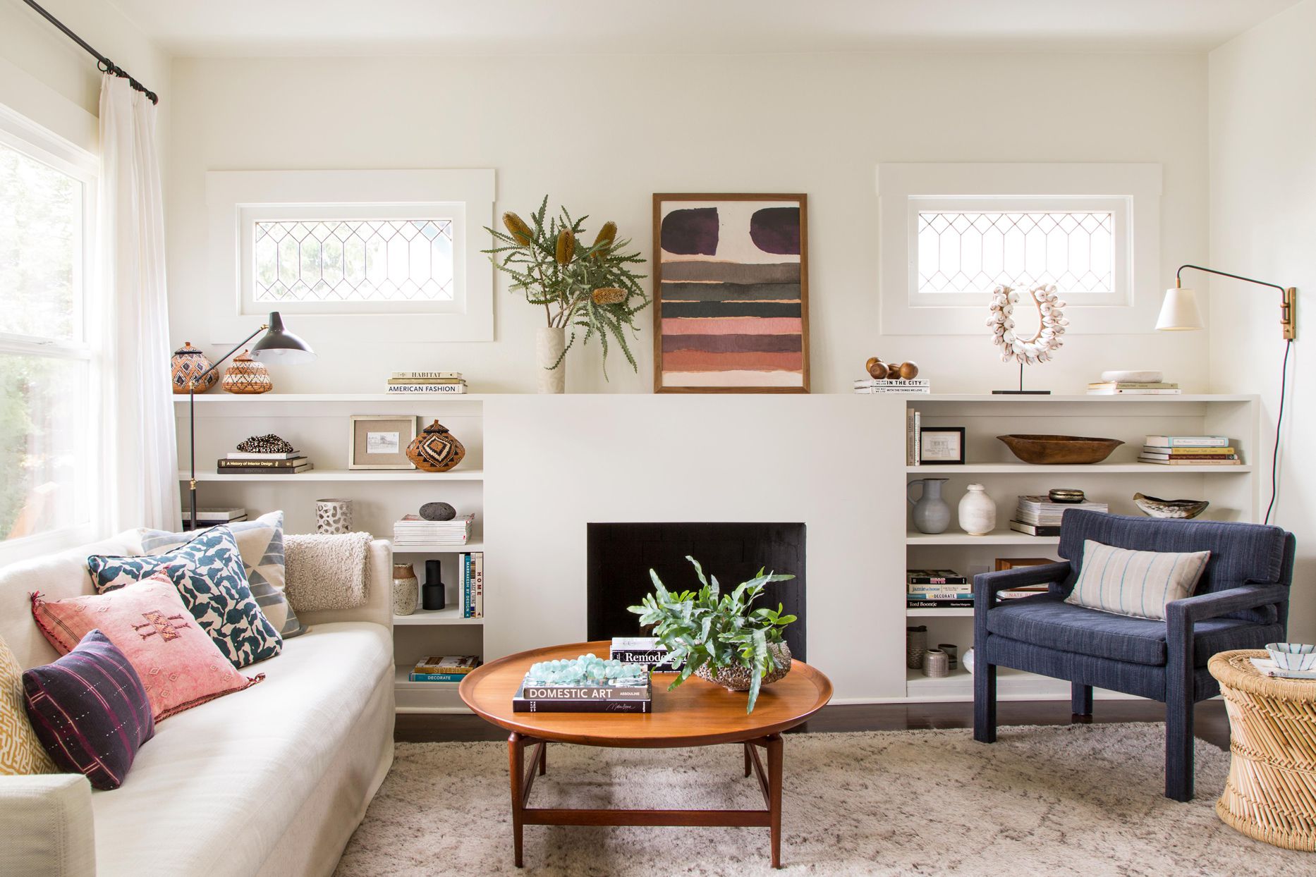
However, balance and symmetry don’t mean that everything has to be perfectly mirrored or identical. You can achieve visual balance by using pieces of similar size, shape, or visual weight. For example, if you have a large piece of artwork on one side of the room, you can balance it out with a group of smaller framed prints on the other side.
It’s important to note that balance and symmetry don’t have to be strictly symmetrical. You can also create a sense of balance through asymmetry by placing furniture and accessories in a way that visually balances each other out. The key is to ensure that the arrangement feels well-proportioned and visually pleasing.
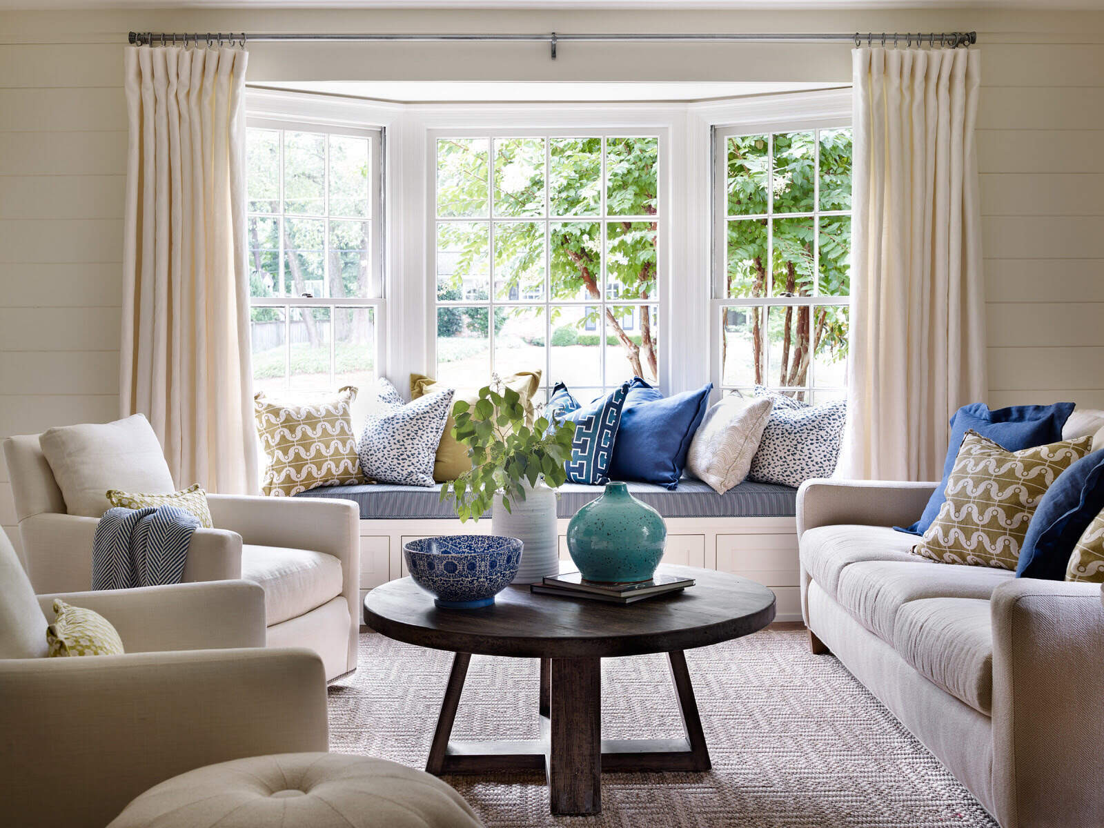
Another way to achieve balance and symmetry is through the use of pairs. Pairing furniture or decor elements on either side of a room or near a focal point can provide a sense of cohesion and balance. This can be done with matching armchairs, side tables, or table lamps.
By paying attention to balance and symmetry, your furniture arrangement will feel more intentional, visually pleasing, and cohesive. It creates a sense of equilibrium and order that enhances the overall aesthetic of the room.
So, before finalizing your furniture arrangement, step back and assess the balance and symmetry of the space. With a well-balanced layout, your room will radiate a sense of harmony and create a visually striking environment.
Read more: How To Arrange Patio Furniture On A Deck
Mistake #9: Neglecting to Define Different Zones Within a Room
When arranging furniture, it’s important to consider the functionality of the room and define different zones within the space. Neglecting to create distinct zones can result in a room that feels undefined and lacks purpose. By defining zones, you can maximize the functionality and versatility of the room, creating separate areas for different activities.
One common mistake is treating the entire room as a single open space without any designated areas. This can lead to a lack of organization and make it challenging to establish a cohesive design. Instead, identify the different activities or functions that will take place in the room and assign specific areas for each.
For example, in a living room, you could create a seating area for conversations and relaxation, a reading nook with a comfortable chair and bookshelf, and a media area with a TV and entertainment center. By defining these zones, you can create a more dynamic and purposeful layout.
When defining zones, make use of furniture placement, rugs, lighting, or even room dividers to visually separate each area. This helps create a sense of structure and delineation within the room. For instance, a large area rug can anchor a seating area, while pendant lights can define a dining space in an open-concept living room.
Consider the flow and accessibility of each zone when arranging furniture. Ensure that there’s enough space to move between the different areas without feeling cramped or obstructed. This promotes a seamless transition from one zone to another and enhances the overall functionality of the room.
Defining zones within a room allows you to make the most of the available space and creates a more organized and purpose-driven environment. Each area can be tailored to its specific function, providing a more enjoyable and efficient experience for you and your guests.
So, the next time you’re arranging furniture, don’t forget to define different zones within the room. It will not only optimize the functionality of the space but also add depth and character to your interior design.
Mistake #10: Choosing the Wrong Rug Size
When it comes to arranging furniture, the size of your rug plays a crucial role in determining the overall look and feel of the room. Choosing the wrong rug size is a common mistake that can throw off the balance and proportions of the space. To create a well-designed and harmonious layout, it’s important to select a rug size that complements the furniture and the room’s dimensions.
One common mistake is choosing a rug that is too small for the space. A small rug can make the room feel disjointed and the furniture appear as though it is floating in the space. Ideally, the rug should be large enough to anchor the furniture and create a cohesive grouping.
When selecting a rug size, consider the dimensions of the room and the furniture placement. In a living room, for example, a good rule of thumb is to choose a rug that is large enough to accommodate all the furniture legs or at least the front legs of major pieces, such as the sofa and chairs. This creates a sense of connection and unity between the furniture pieces.
Furthermore, consider the shape of the room and the arrangement of furniture. Rectangular rugs are a popular choice for rectangular or square rooms, as they help define the seating area and bring a sense of order. Alternatively, round rugs can work well in rooms with circular or curved furniture arrangements.
In dining rooms, ensure that the rug is large enough to accommodate not only the dining table but also the chairs when they are pulled out. This allows for comfortable movement and avoids the chairs catching on the edge of the rug.
Another aspect to consider is the placement of the rug in relation to the walls. Ideally, there should be a border of flooring visible around the rug, which helps create a visually balanced and proportioned space. If the rug is wall-to-wall, ensure that there is an even margin around the room to maintain a sense of openness and proportion.
By choosing the right rug size, you enhance the overall aesthetic and functionality of the room. The rug becomes a focal point that ties the furniture together, adds warmth and texture, and defines and anchors the space.
So, take the time to measure your room and furniture carefully before selecting a rug size. It will make a significant difference in the overall appearance and cohesiveness of your furniture arrangement.
Conclusion
Arranging furniture is a crucial aspect of interior design that can greatly impact the functionality, aesthetics, and overall atmosphere of a room. By avoiding common furniture arranging mistakes, you can create a space that is visually pleasing, organized, and tailored to your needs.
In this comprehensive guide, we’ve explored ten common mistakes that people often make when arranging furniture. We’ve learned about the importance of pulling furniture away from the walls, considering the flow of the room, avoiding overcrowding, and incorporating proper lighting. We also discussed the significance of scale and proportion, creating a focal point, defining different zones within a room, and selecting the right rug size.
By paying attention to these crucial elements and incorporating them into your furniture arrangement, you can transform your space into a harmonious, functional, and visually captivating environment.
Remember, balance, symmetry, and a clear understanding of the room’s function are key to a successful furniture arrangement. Don’t be afraid to experiment, but keep in mind the principles of design and the needs of the space.
When arranging furniture, think beyond function and consider the overall ambiance you want to create in the room. Infuse your personal style, explore different textures and colors, and incorporate elements that make the space uniquely yours.
Lastly, keep in mind that furniture arranging is not a one-size-fits-all process. Every room is unique, and what works for one space may not necessarily work for another. Trust your instincts, listen to your intuition, and enjoy the process of creating a space that reflects your personality and meets your needs.
So, go ahead and apply these tips and strategies to your own furniture arrangement. You’ll be amazed at the difference it makes in transforming your space into a beautifully arranged and inviting haven.
Frequently Asked Questions about Furniture Arranging Mistakes
Was this page helpful?
At Storables.com, we guarantee accurate and reliable information. Our content, validated by Expert Board Contributors, is crafted following stringent Editorial Policies. We're committed to providing you with well-researched, expert-backed insights for all your informational needs.




0 thoughts on “Furniture Arranging Mistakes”