Articles
How To Choose Quilt Colors
Modified: January 5, 2024
Learn how to choose quilt colors for your next project with these helpful articles. Get tips and advice on selecting the perfect color scheme to bring your quilt to life.
(Many of the links in this article redirect to a specific reviewed product. Your purchase of these products through affiliate links helps to generate commission for Storables.com, at no extra cost. Learn more)
Introduction
Choosing quilt colors can be an exciting but challenging task. The colors you select will play a major role in the overall look and feel of your quilt. Whether you are a seasoned quilter or a beginner, understanding how to choose the right quilt colors will help you create a visually pleasing and harmonious design.
Color plays a significant role in our lives. It has the power to evoke emotions, create moods, and influence our perception of a space. When it comes to quilting, selecting the perfect colors can transform a simple patchwork into a stunning masterpiece.
But where do you start when it comes to choosing quilt colors? Should you follow color theory principles? Consider the overall mood and theme? or even evaluate the room’s color scheme? In this article, we will explore these factors and provide you with practical tips on how to choose quilt colors that will make your project stand out.
So let’s dive into the world of color theory and explore how it can guide you in selecting the perfect quilt colors.
Key Takeaways:
- Understanding color theory and considering the mood, theme, and room’s color scheme are crucial in choosing quilt colors. Experiment with contrast and harmonizing colors to create visually appealing and harmonious designs.
- Assess personal preferences, seasonal changes, quilt patterns, and designs to make informed color choices. Testing swatches and samples is essential to fine-tune your quilt color selections and ensure they align with your vision.
Read more: How To Choose A Quilt
Understanding Color Theory
Color theory is the study and application of how colors interact with one another. It helps us understand the relationships between different colors and their impact on our perception. By understanding color theory, you can make informed decisions when choosing quilt colors.
One fundamental aspect of color theory is the color wheel. The color wheel consists of primary colors (red, blue, and yellow), secondary colors (orange, green, and purple), and tertiary colors (created by mixing primary and secondary colors).
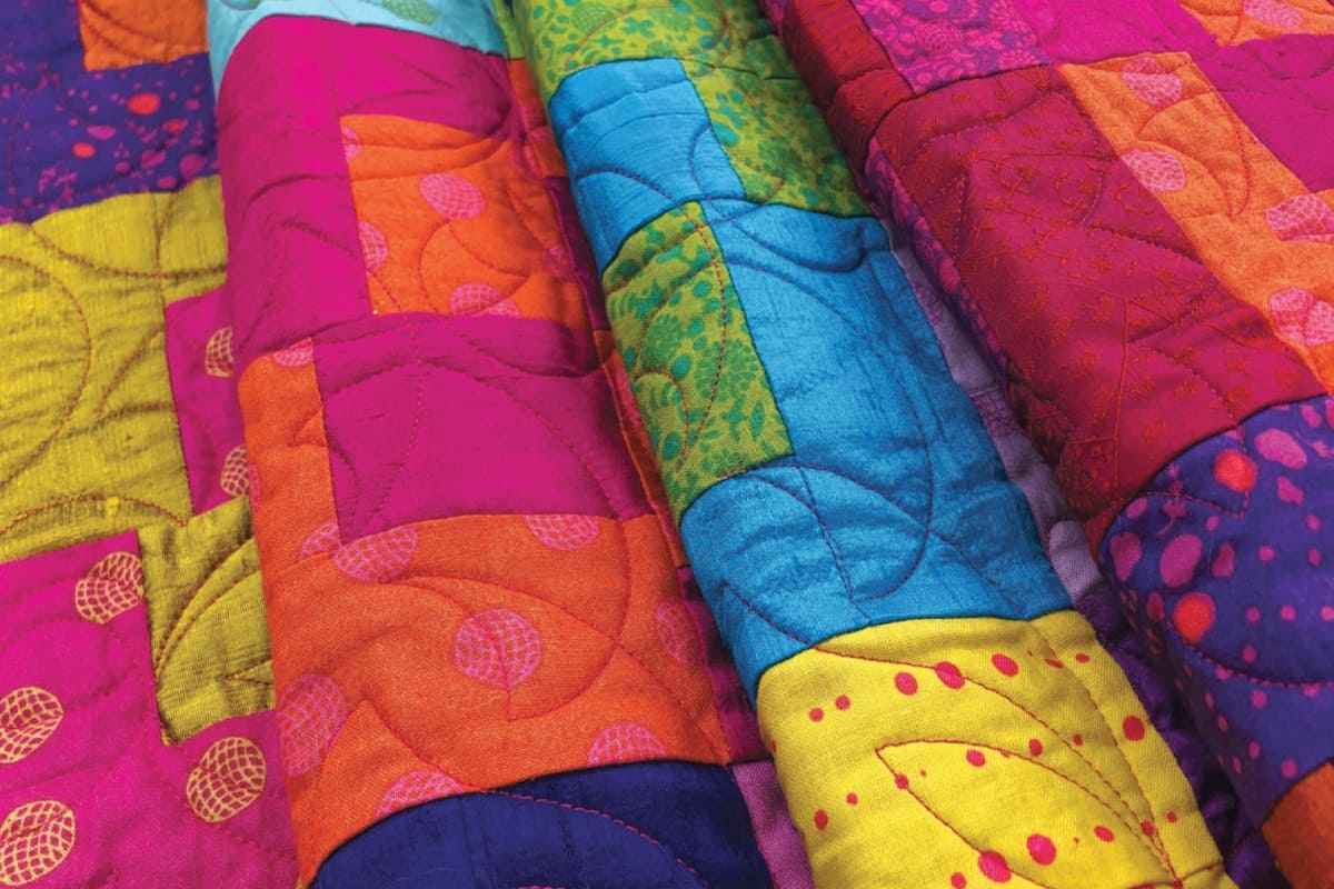
Complementary colors are opposite each other on the color wheel, such as blue and orange or red and green. These colors create a high contrast and can add visual interest to your quilt. Analogous colors are adjacent to each other on the color wheel, such as blue, green, and yellow. These colors create a harmonious and calming effect.
When choosing quilt colors, you can use the principles of color harmony, such as complementary or analogous colors, to create a visually pleasing design. However, don’t be afraid to experiment with contrasting colors or unexpected color combinations. Adding a pop of color can make your quilt unique and eye-catching.
Remember that colors can also have different meanings and symbolism. For example, blue is often associated with calmness and serenity, while red is associated with energy and passion. Consider the emotions and mood you want to convey through your quilt and choose colors that align with those intentions.
Now that you have an understanding of color theory, let’s move on to the next step in choosing quilt colors: considering the mood and theme of your quilt.
Consider the Mood and Theme
When choosing quilt colors, it’s essential to consider the mood and theme you want to convey through your design. The colors you select can greatly impact the overall feel of your quilt and evoke specific emotions.
Think about the purpose of your quilt. Is it intended to be a cheerful and vibrant piece that adds a pop of color to a room? Or are you aiming for a soothing and calming ambiance? The mood you want to create will guide your color choices.
If you’re creating a quilt for a child’s room or a playful space, you might opt for bright and bold colors that spark joy and energy. Consider using a mix of primary and secondary colors to create a vibrant and lively quilt design.
On the other hand, if you’re looking to create a quilt that exudes a calming and serene vibe, you might choose soft pastel colors or cool tones like blues and greens. These colors have a soothing effect and can create a peaceful atmosphere.
Additionally, the theme of your quilt can also influence your color choices. If you’re creating a quilt for a beach-themed room, you might incorporate shades of blue, sandy beige, and coral colors to reflect the coastal aesthetic. For a nature-inspired quilt, earthy tones like greens, browns, and yellows can help bring the outdoor atmosphere into your design.
By considering the mood and theme of your quilt, you can ensure that your color choices align with the desired ambiance and overall concept you want to convey.
Next, let’s explore how you can analyze the room’s color scheme to ensure your quilt seamlessly fits into its surroundings.
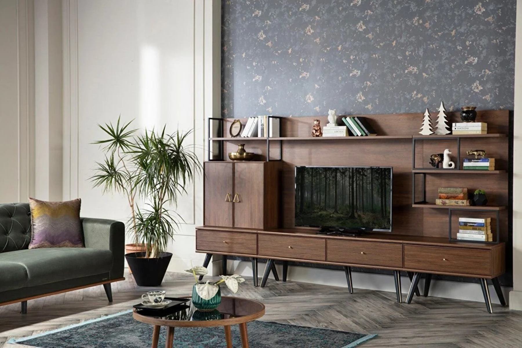
Analyze the Room’s Color Scheme
When choosing quilt colors, it’s essential to take into account the existing color scheme of the room where the quilt will be displayed. By analyzing the room’s color scheme, you can ensure that your quilt harmoniously blends in with its surroundings.
Start by observing the dominant colors in the room. Look at the walls, furniture, and other decorative elements. Take note of the colors that catch your attention and consider incorporating them into your quilt design. This will create a cohesive and unified look between the quilt and the room’s decor.
If the room already has a well-defined color palette, you can either choose quilt colors that complement the existing scheme or opt for contrasting colors to add visual interest. Complementary colors, as we discussed earlier, are those that are opposite each other on the color wheel. They can create a dynamic and eye-catching contrast when used together.
On the other hand, if you prefer a more harmonious look, choose quilt colors that are analogous to the dominant colors in the room. Analogous colors are adjacent to each other on the color wheel and create a smooth and cohesive effect.
Remember, while it’s important to consider the room’s color scheme, you don’t have to strictly adhere to it. Adding a pop of contrasting color or introducing a new shade can bring a fresh and exciting element to the room. Use your creativity and intuition to strike the right balance between complementing the existing color scheme and adding your personal touch.
By analyzing the room’s color scheme, you can ensure that your quilt enhances the overall aesthetic and seamlessly integrates into its surroundings.
Next, let’s discuss the importance of assessing your personal preferences when choosing quilt colors.
Assess Personal Preferences
When it comes to choosing quilt colors, your personal preferences play a significant role. After all, quilting is a creative and personal endeavor, and the colors you choose should reflect your own style and taste.
Take some time to reflect on the colors that you naturally gravitate towards. Consider the colors that make you feel happy, calm, or excited. Think about the colors that you enjoy wearing or that you have used in your home decor. These personal preferences can serve as a guide when selecting quilt colors.
If you have a favorite color, consider incorporating it into your quilt design. This will make your quilt feel special and personal to you. Additionally, if there are certain colors that you dislike or find unappealing, it’s best to avoid using them in your quilt as they may detract from your enjoyment of the finished piece.
Keep in mind that your personal preferences can evolve over time. Don’t be afraid to explore new colors or step out of your comfort zone. Quilting is a journey of self-expression, and experimenting with different colors can lead to exciting discoveries and unique creations.
Another aspect to consider when assessing your personal preferences is your color saturation preference. Some individuals prefer bold and saturated colors, while others may lean towards softer and muted tones. Determine where you fall on the color saturation spectrum and choose quilt colors that align with your preferences.
Ultimately, the goal is to choose quilt colors that you love and that bring you joy. Trust your instincts and allow your personal style to shine through in your quilt design.
Next, let’s explore how seasonal changes can influence your quilt color choices.
Read more: How To Choose A Tablecloth Color
Take Seasonal Changes into Account
Seasonal changes can have a significant impact on our environment and the colors that surround us. When choosing quilt colors, considering the seasons can add an extra layer of depth and seasonal charm to your design.
Start by thinking about the season during which your quilt will be used or displayed. For example, if your quilt will be showcased during the spring, you might want to incorporate pastel colors that evoke the freshness and blooming flowers of the season. Soft pinks, lavender, and light greens can create a lovely springtime vibe.
In contrast, if your quilt is intended for the cozy winter months, you might opt for deeper, rich colors like burgundy, navy blue, or warm earth tones. These colors can evoke a sense of warmth and comfort during the colder months.
Don’t forget about the vibrant hues of summer! Using bright and bold colors like vibrant oranges, yellows, and tropical blues can capture the energy and joy of the sunny season. Alternatively, for the soothing ambiance of autumn, consider incorporating warm tones such as deep oranges, rusty reds, and golden yellows.
By reflecting the colors of the seasons in your quilt, you can create a design that feels timely, relevant, and visually appealing throughout the year. It can also add a touch of seasonal charm to your home decor or make a thoughtful gift for someone special.
Next, let’s delve into how quilt patterns and designs can influence your choice of colors.
Consider the mood you want to create in the room. Warm colors like red and orange can create a cozy atmosphere, while cool colors like blue and green can bring a sense of calm. Choose colors that complement your existing decor for a cohesive look.
Consider Quilt Patterns and Designs
Quilt patterns and designs can greatly influence the color choices for your quilt. Different patterns and designs can lend themselves to particular color schemes, and understanding this can help guide your color selection process.
For example, if you’re working with a traditional quilt pattern, you may want to choose colors that evoke a sense of nostalgia and heritage. Earthy tones like browns, deep reds, and warm neutrals can enhance the traditional feel of the quilt and create a timeless aesthetic.
On the other hand, if you’re working with a modern or contemporary quilt pattern, you might opt for bold and vibrant color choices. Bright pops of color or contrasting color schemes can add a modern twist to the design and make it visually striking.
Consider how the different elements of the quilt pattern interact with the colors you choose. Are there specific areas or blocks that you want to highlight? How do the colors enhance the overall design and create visual interest?
In addition to the quilt pattern itself, think about the size and complexity of the design. Larger quilt patterns with intricate details may be better suited for a more limited color palette to prevent overwhelming the eye. On the other hand, smaller quilt patterns or simpler designs can afford more variety in color choices.
Remember that the primary objective is to create a cohesive and balanced design. Consider how the colors interact with the quilt pattern and how they contribute to the overall aesthetic appeal.
By carefully considering quilt patterns and designs, you can make informed color choices that enhance the visual impact of your quilt.
Next, let’s explore the importance of contrast when choosing quilt colors.
The Importance of Contrast
When it comes to choosing quilt colors, one crucial aspect to consider is contrast. Contrast refers to the difference in color between different elements within a design. It adds visual interest and can make your quilt design truly stand out.
Contrast can be achieved in various ways, including using colors that are opposite each other on the color wheel (complementary colors), combining light and dark shades, or using colors with varying levels of saturation.
High contrast color combinations, such as black and white or navy blue and bright yellow, create a bold and impactful visual statement. They draw attention and make the different quilt elements pop. These combinations work well when you want to create a dynamic and visually striking design.
On the other hand, low contrast color combinations, such as different shades of the same color or analogous colors, create a more subtle and harmonious effect. These combinations are soothing to the eye and can give your quilt a cohesive and unified look.
Contrast not only adds visual appeal but also aids in defining the different sections or blocks within your quilt. It helps highlight the intricate details and adds depth to your design.
When considering contrast, it’s important to strike a balance. Too much contrast can overpower the design and make it appear chaotic, while too little contrast can make the quilt appear flat and dull. Experiment with different color combinations and assess the level of contrast that best suits your quilt design.
Remember that contrast extends beyond color alone. You can also incorporate contrast through the use of different fabric patterns, textures, or even stitching techniques. An interplay of contrasting elements can create a visually captivating and dynamic quilt that truly stands out.
Now that you understand the importance of contrast, let’s explore the concept of harmonizing colors in your quilt design.
Harmonizing Colors
While contrast is important, achieving color harmony is equally essential when choosing quilt colors. Harmonizing colors means selecting colors that work well together, creating a pleasing and balanced composition.
There are various ways to achieve color harmony in your quilt design. One approach is to use analogous colors, which are colors that are adjacent to each other on the color wheel. For example, combining shades of blue, green, and purple creates a calming and harmonious color palette.
Another method is to use a monochromatic color scheme, which involves using different shades and tints of the same color. This creates a unified and sophisticated look. For example, using different shades of blue, from light baby blue to deep navy, can create a serene and elegant quilt design.
You can also create color harmony by using a limited color palette. This involves selecting a small number of colors that work well together and using them consistently throughout your quilt design. This creates a sense of unity and cohesiveness.
When harmonizing colors, it’s important to consider the balance between warm and cool tones. Warm colors, like reds, oranges, and yellows, create a sense of energy and vibrancy. Cool colors, like blues, greens, and purples, create a soothing and calming effect. Balancing warm and cool tones can create a visually pleasing and well-rounded quilt design.
Take into account the intensity and saturation of the colors as well. Using colors with similar levels of intensity creates a harmonious look, while incorporating shades with varying levels of saturation can add depth and visual interest to your quilt.
Ultimately, achieving color harmony in your quilt design comes down to your personal preferences and the emotions you want to evoke. Trust your instincts and select colors that resonate with you and create a sense of harmony.
Now that you understand how to harmonize colors, let’s move on to the practical aspect of testing swatches and samples.
Read more: How To Choose Bed Frame Color
Test Swatches and Samples
Before committing to your final quilt color choices, it is always recommended to test swatches and samples. This step allows you to see how the colors interact with each other and how they appear in different lighting conditions.
Start by gathering small fabric swatches or scraps in the colors you are considering for your quilt. Lay them out next to each other to evaluate how they look together. Notice if the colors complement each other or if they clash. Pay attention to the overall balance and harmony of the color combination.
It’s a good idea to view the swatches and samples in different lighting situations. Colors can appear differently depending on natural daylight, artificial lighting, or the direction of light sources. Take note of how the colors appear in various lighting conditions and make adjustments if necessary.
Testing swatches and samples can also help you determine if the colors you have chosen convey the desired mood and theme for your quilt. If the colors do not align with your vision, you can make modifications and try out different combinations until you achieve the desired effect.
Additionally, testing swatches and samples allows you to assess how the colors interact with the quilt pattern or design. Consider the overall impact on the different elements of the quilt to make sure they stand out appropriately. Adjustments may be needed to ensure the quilt design shines.
Remember to step back and take breaks while evaluating the swatches and samples. This will give you a fresh perspective and allow you to make more objective decisions about the color combinations.
By testing swatches and samples, you can fine-tune your quilt color choices and ensure that the final result matches your vision and expectations.
Now that you have gathered all the necessary information on choosing quilt colors, let’s wrap up this article.
Conclusion
Choosing quilt colors is an exciting and creative process that can greatly impact the overall look and feel of your quilt. By considering various factors such as color theory, the mood and theme, the room’s color scheme, personal preferences, seasonal changes, quilt patterns, and contrast, you can make informed decisions that result in a visually pleasing and harmonious design.
Understanding color theory will guide you in selecting colors that work well together and create a pleasing visual composition. Analyzing the mood and theme of your quilt will help you convey the desired atmosphere and emotion through your color choices. Assessing the room’s color scheme ensures that your quilt seamlessly integrates into its surroundings. Taking your personal preferences into account allows your quilt to reflect your own style and taste.
Considering seasonal changes adds an extra layer of depth and relevance to your quilt design. Examining quilt patterns and designs guides your color choices and highlights the intricate details of the quilt. And finally, understanding the significance of contrast and harmonizing colors brings balance and visual interest to your quilt.
Remember to test swatches and samples to see how the colors interact and appear in different lighting conditions. This step allows you to make any necessary adjustments and ensures that the final quilt color choices align with your vision.
Ultimately, the key is to trust your instincts, have fun, and enjoy the process of choosing quilt colors. Let your creativity shine through and create a quilt that is not only visually stunning but also reflects your own unique style and personality.
Now armed with the knowledge and tips in this article, it’s time to start selecting your quilt colors and embark on your quilting adventure!
Frequently Asked Questions about How To Choose Quilt Colors
Was this page helpful?
At Storables.com, we guarantee accurate and reliable information. Our content, validated by Expert Board Contributors, is crafted following stringent Editorial Policies. We're committed to providing you with well-researched, expert-backed insights for all your informational needs.


0 thoughts on “How To Choose Quilt Colors”