Home>Construction & Tools>Building Materials>What Colors Look Good With Brick
Building Materials
What Colors Look Good With Brick
Modified: February 18, 2024
Discover the best color combinations for building materials like brick. Find out how to enhance the look of your home with the perfect color scheme.
(Many of the links in this article redirect to a specific reviewed product. Your purchase of these products through affiliate links helps to generate commission for Storables.com, at no extra cost. Learn more)
Introduction
Brick has long been a staple in architectural design, adding warmth, character, and a timeless appeal to buildings. Whether it’s the exterior facades of homes or the interior walls of commercial spaces, the rich texture and earthy tones of brick create a distinct aesthetic. When it comes to choosing colors that complement or accentuate brick, there are numerous options to consider. Understanding the basics of brick, exploring complementary and neutral color palettes, and even incorporating bold hues can all contribute to a stunning visual impact. In this article, we’ll delve into the art of pairing colors with brick, offering insights and tips to help you make informed and inspired design choices.
Key Takeaways:
- When choosing colors to go with brick, consider the undertones of the brick and balance warm and cool tones for a dynamic and harmonious color scheme. Experiment with samples and seek inspiration from nature’s color palettes.
- Incorporate complementary, neutral, or bold colors to enhance the timeless appeal of brick. Consider the architectural style, surrounding elements, and the role of natural light when selecting colors for brick exteriors and interiors.
Understanding the Basics of Brick
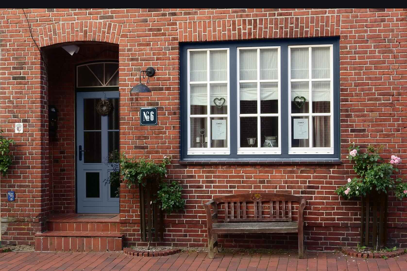
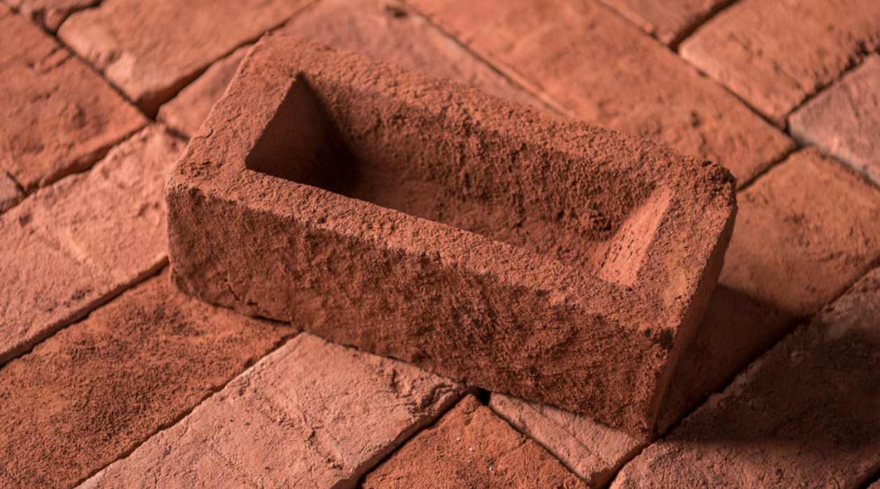
Brick, a versatile and durable building material, is available in a spectrum of earthy hues, ranging from warm reds and oranges to subtle browns and grays. The color of brick is influenced by various factors, including the type of clay used, the firing process, and any added pigments. Understanding the inherent characteristics of brick can guide the selection of complementary colors for surrounding elements.
Brick’s natural color variations and texture play a crucial role in determining the ideal color schemes. For instance, red bricks with hints of orange may evoke a traditional, rustic charm, while darker bricks with a weathered appearance can exude a more aged and vintage feel. The mortar joints, whether light or dark, also contribute to the overall aesthetic and should be considered when choosing complementary colors.
It’s important to assess the undertones present in the brick. Some bricks may have subtle undertones of purple, while others lean towards a more yellow or pink hue. Identifying these undertones can aid in selecting colors that harmonize with the brick’s inherent shades.
Furthermore, the architectural style of the structure must be taken into account. A historic brick building may call for a different color palette compared to a modern brick-clad residence. By recognizing the nuances of brick and its contextual surroundings, one can effectively navigate the realm of color combinations to enhance the visual impact of the architectural elements.
Complementary Colors for Brick
Pairing brick with complementary colors can create a harmonious and visually appealing exterior or interior design. Understanding the color wheel and its relationships can guide the selection of hues that enhance the natural beauty of brick.
One approach is to opt for colors that lie opposite the brick’s undertones on the color wheel. For instance, if the brick exhibits warm, reddish tones, complementing it with cooler shades such as sage green or slate blue can create a striking contrast. This interplay of warm and cool tones can infuse the space with depth and balance.
Another strategy involves selecting colors adjacent to the brick’s undertones. If the brick leans towards a warm, earthy spectrum, embracing analogous colors like terracotta or ochre can create a cohesive and inviting ambiance. These adjacent hues resonate with the brick’s natural warmth, resulting in a unified color scheme.
When exploring complementary colors for brick exteriors, it’s essential to consider the surrounding landscape and architectural elements. For instance, lush greenery can complement red brick, while a backdrop of neutral stone or stucco can harmonize with earthy-toned bricks.
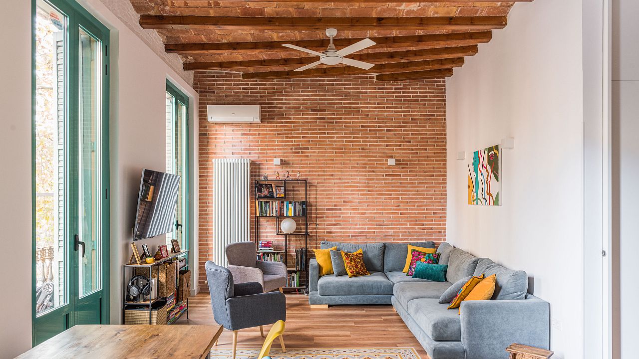
For interior spaces, the furniture, decor, and flooring should be taken into consideration when choosing complementary colors. Soft, neutral tones like cream or taupe can provide a serene backdrop for red brick accents, while incorporating pops of complementary colors through artwork or furnishings can add vibrancy and visual interest to the space.
Ultimately, the goal of selecting complementary colors for brick is to create a cohesive and dynamic color palette that accentuates the unique character of the brick while harmonizing with its surroundings.
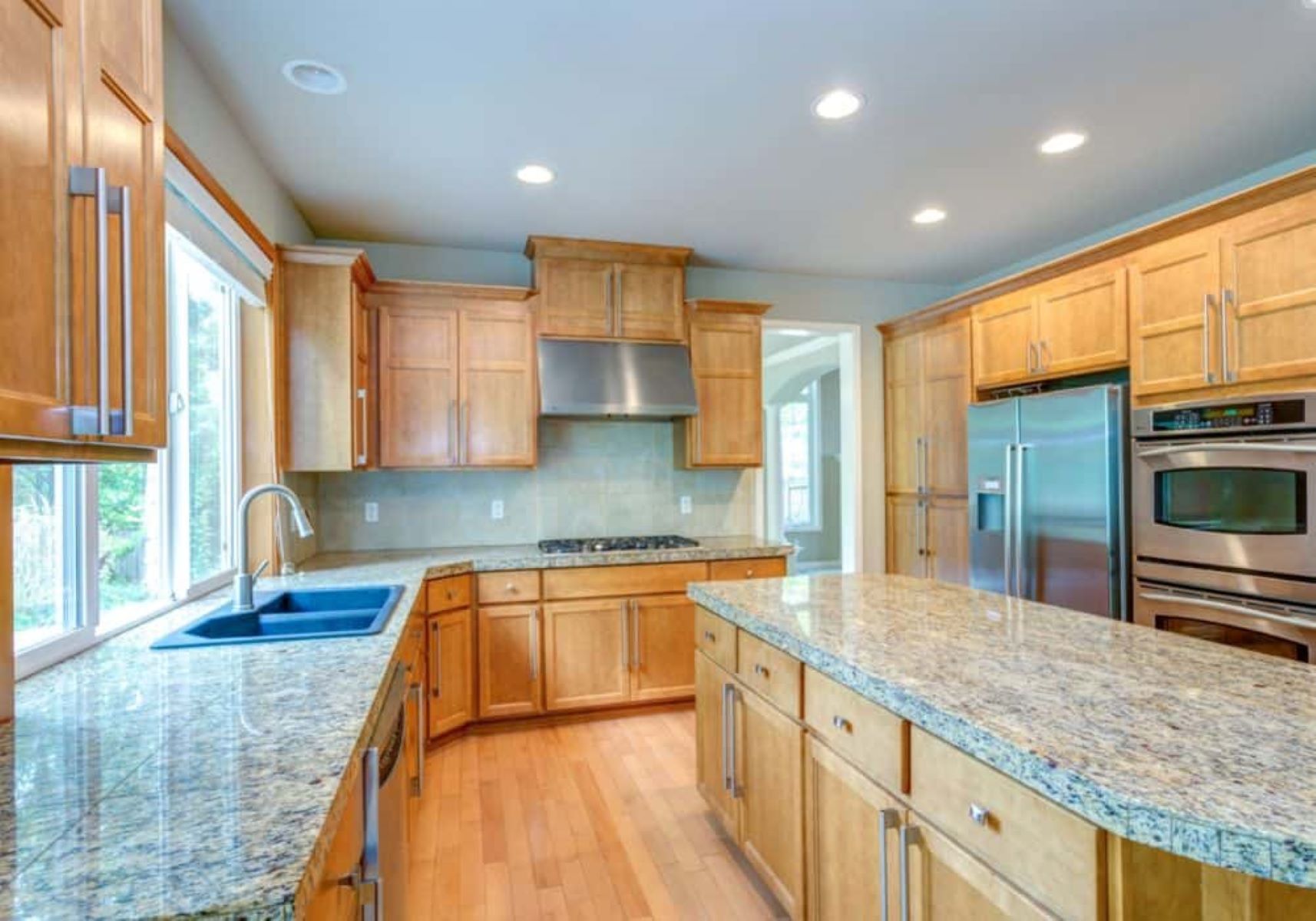
Neutral Colors for Brick
Neutral colors serve as a versatile and timeless complement to brick, offering a sophisticated and balanced aesthetic. When considering neutral palettes, various shades of white, cream, beige, and gray can seamlessly integrate with the inherent warmth and texture of brick.
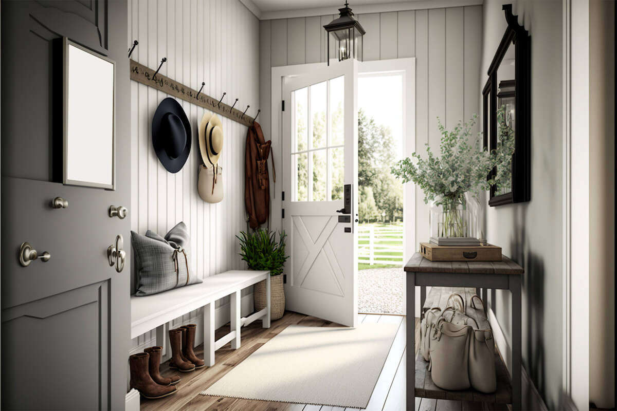
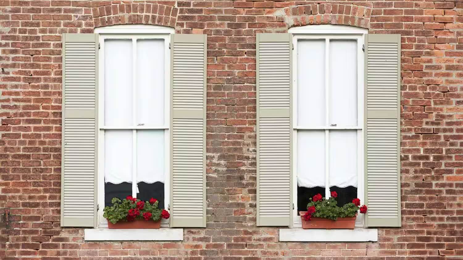
White, a classic choice, can accentuate the richness of brick and create a clean, timeless look. Whether used as trim against red brick or as the primary color for a brick-clad interior, white imparts a sense of freshness and elegance. Additionally, off-white tones such as ivory or linen can soften the contrast between brick and surrounding elements, fostering a serene atmosphere.
Beige, with its warm and earthy undertones, harmonizes effortlessly with brick, creating a cohesive and inviting ambiance. From light sandy hues to deeper tans, beige complements the natural color variations found in brick, offering a comforting and balanced color scheme.
Gray, ranging from soft dove gray to deeper charcoal, presents a contemporary and versatile option when paired with brick. Lighter shades of gray can provide a subtle backdrop that allows the brick to stand out, while darker grays can create a sense of depth and modernity, especially in interior spaces.
When integrating neutral colors with brick, it’s important to consider the role of natural light. The interplay of light and shadow can influence how neutral hues interact with the brick, impacting the overall visual effect. Additionally, the texture and finish of the brick, whether smooth or rough, can influence how neutral colors are perceived in relation to the brick’s surface.
Neutral colors can extend beyond paint and encompass materials such as natural wood, metal accents, and stone, further enhancing the timeless appeal of brick. By thoughtfully incorporating neutral colors, one can achieve a harmonious and enduring design that celebrates the inherent beauty of brick while providing a versatile backdrop for various design styles.
Consider using warm, earthy tones like olive green, navy blue, or mustard yellow to complement the natural red tones of brick. These colors create a harmonious and inviting look when paired with brick.
Bold Colors for Brick
Exploring bold and vibrant color palettes can infuse brick-clad spaces with energy, personality, and contemporary flair. While neutral and complementary colors offer timeless elegance, bold hues can make a striking statement when paired with brick.
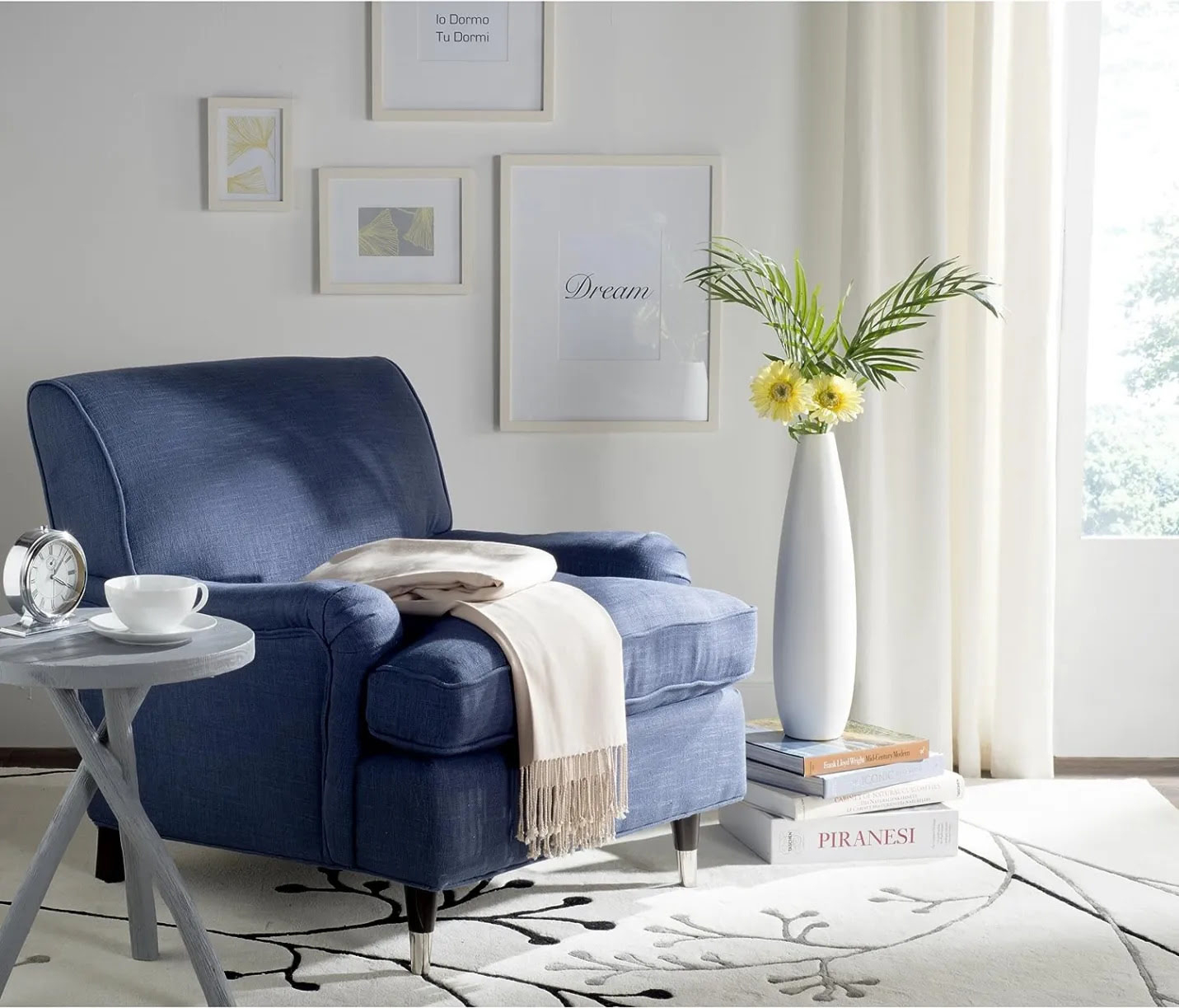
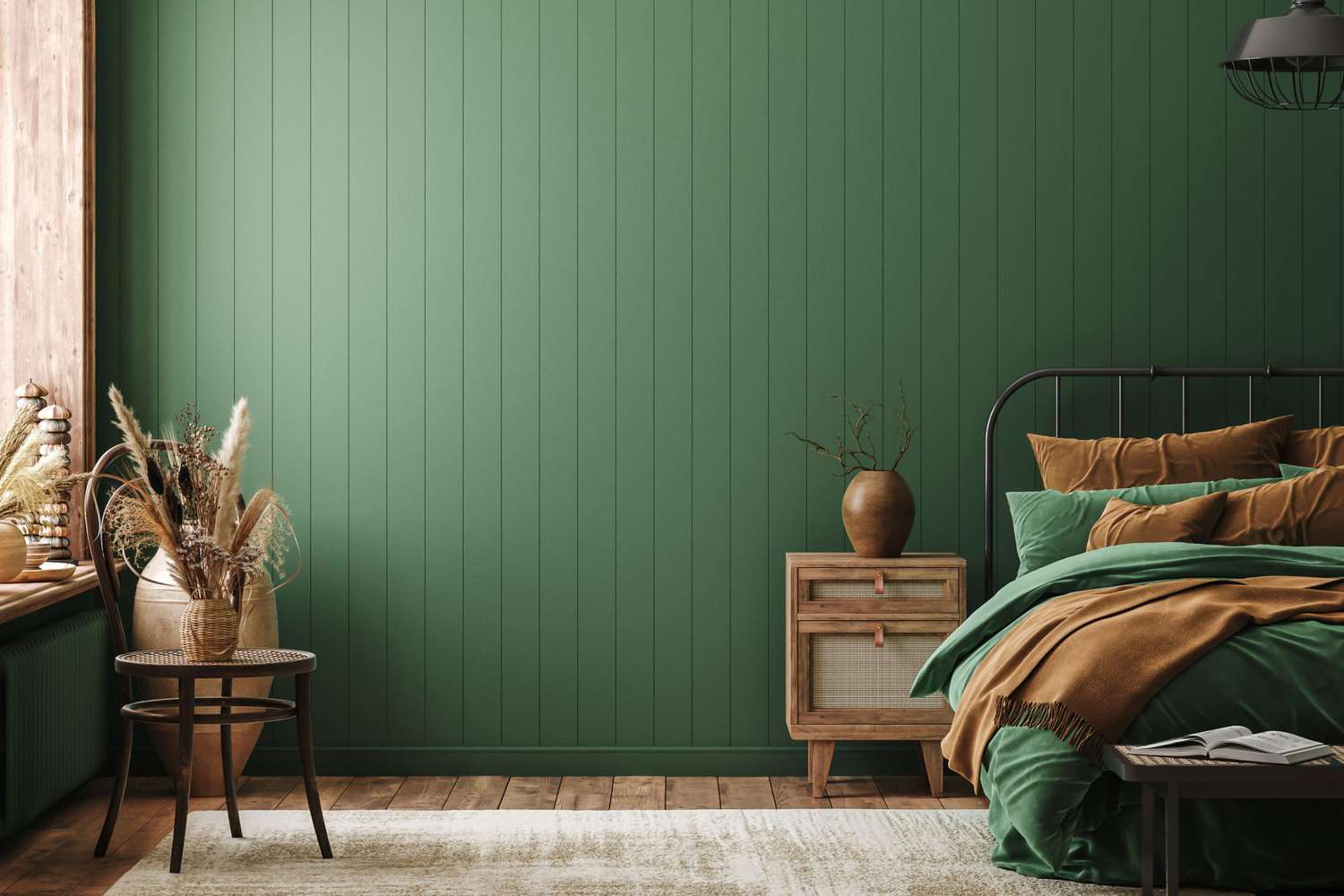
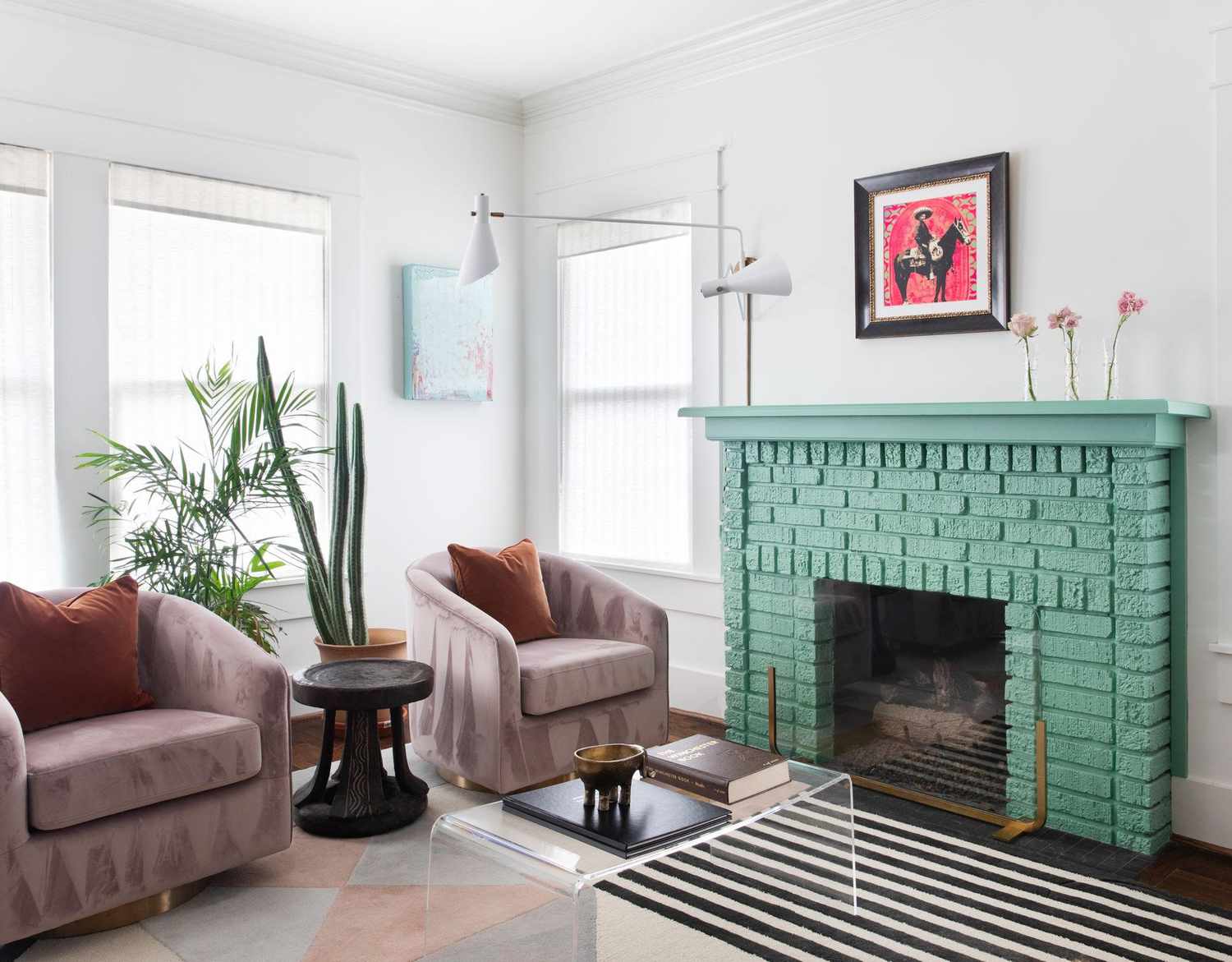
One approach to incorporating bold colors with brick involves embracing rich jewel tones such as deep emerald green, sapphire blue, or amethyst purple. These luxurious hues can create a sense of opulence and drama, particularly when used as accent colors against a backdrop of brick. Whether through furnishings, drapery, or accent walls, bold jewel tones can enliven the space and add a touch of regal sophistication.
Incorporating vibrant reds, oranges, or yellows can further amplify the warmth and vibrancy of brick. These warm, fiery hues can create a dynamic and energetic ambiance, especially in spaces adorned with red brick. From fiery red accents to sun-kissed yellow furnishings, these bold colors can harmonize with the earthy tones of brick, creating a captivating visual interplay.
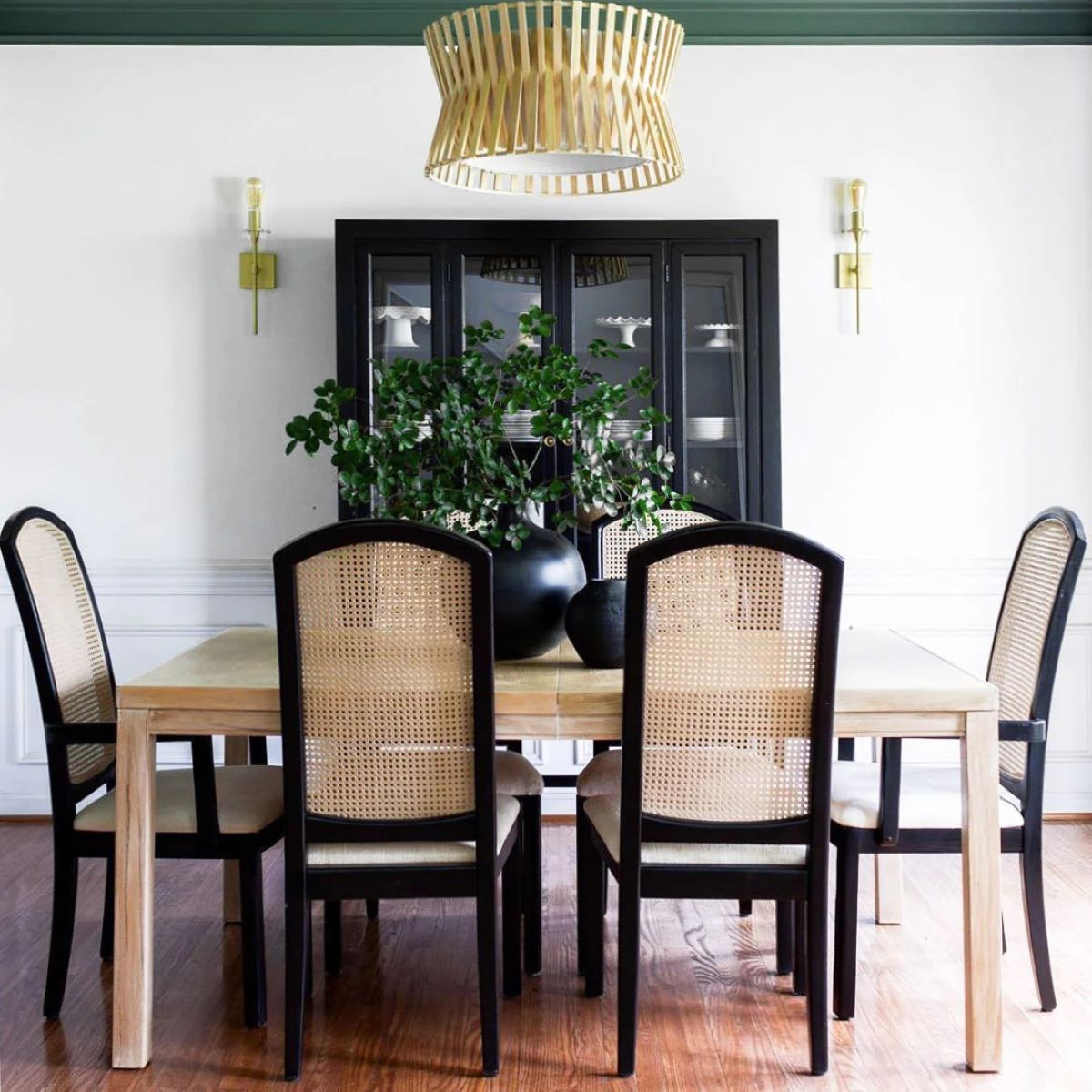
For a modern and daring aesthetic, consider bold contrasts such as black or navy blue against red brick. These deep, dark hues can create a sense of depth and contemporary edge, offering a dramatic juxtaposition that highlights the textural and tonal qualities of the brick.
When incorporating bold colors with brick, it’s essential to strike a balance and prevent overwhelming the space. Using bold colors strategically as accent elements, focal points, or in moderation can ensure a harmonious and visually engaging result.
Furthermore, the use of bold colors can extend beyond interior design and into outdoor spaces. Boldly painted doors, shutters, or trim can add a playful and inviting touch to brick exteriors, creating a memorable and distinctive curb appeal.
By embracing bold colors, one can inject personality and contemporary vibrancy into brick-clad spaces, creating a dynamic interplay of color and texture that celebrates individuality and creativity.
Read more: What Is The Color Of Brick
Tips for Choosing Colors for Brick
When selecting colors to complement or accentuate brick, several tips can guide the decision-making process, ensuring a cohesive and visually impactful result.
- Consider the Undertones: Pay attention to the undertones present in the brick, whether they lean towards warm, cool, or neutral hues. This can inform the selection of complementary colors that harmonize with the brick’s inherent shades.
- Assess the Surroundings: Take into account the architectural style, landscaping, and surrounding elements when choosing colors for brick exteriors. The colors should harmonize with the overall aesthetic and blend seamlessly with the environment.
- Balance Warmth and Coolness: Strive for a balance of warm and cool tones to create depth and visual interest. Pairing warm brick with cooler complementary colors, or vice versa, can result in a dynamic and harmonious color scheme.
- Experiment with Samples: Test paint swatches or fabric samples against the brick in different lighting conditions to gauge how the colors interact. Natural and artificial lighting can influence the perceived appearance of colors, so sampling is essential.
- Consider Interior Elements: When choosing colors for interior spaces with brick accents, take into account the existing furniture, decor, and flooring. The colors should complement the overall interior design and create a cohesive atmosphere.
- Embrace Texture and Finish: Consider the texture and finish of the brick when selecting colors. Smooth, glossy bricks may interact with colors differently than rough, matte surfaces, impacting the overall visual effect.
- Utilize Accent Colors: Incorporate accent colors strategically to add pops of vibrancy and personality. Bold accent colors can inject energy and creativity into the space, creating focal points and visual intrigue.
- Seek Inspiration from Nature: Draw inspiration from nature’s color palettes, such as the changing seasons or natural landscapes. Earthy greens, serene blues, and warm autumnal hues can provide guidance for selecting complementary colors.
- Consult with Design Professionals: If uncertain about color choices, consider consulting with interior designers or color specialists. Their expertise can provide valuable insights and help navigate the nuances of color selection.
By incorporating these tips into the color selection process, one can make informed and inspired choices that enhance the beauty of brick while creating captivating and harmonious living spaces.
Conclusion
Choosing colors that complement and enhance the timeless appeal of brick involves a delicate balance of understanding the material’s nuances and exploring creative color palettes. Whether it’s the exterior facade of a home, the interior walls of a commercial space, or the accents within a garden, the interplay of colors with brick can significantly impact the overall aesthetic.
By understanding the basics of brick, including its inherent tones, textures, and architectural context, one can embark on a journey of color exploration. Complementary colors, neutral palettes, and bold accents each offer unique opportunities to elevate the visual impact of brick-clad spaces.
From the understated elegance of neutral tones to the vibrant energy of bold hues, the art of pairing colors with brick allows for endless possibilities. Whether seeking a classic, timeless look or a modern, daring aesthetic, the interplay of colors with brick opens the door to creativity and individual expression.
Through thoughtful consideration of undertones, surrounding elements, and the role of natural light, one can craft cohesive and visually engaging color schemes. Experimenting with samples, embracing texture, and seeking inspiration from nature further enrich the process of choosing colors for brick.
Ultimately, the fusion of colors with brick is a testament to the artistry of design, where the interplay of hues and textures creates spaces that resonate with warmth, character, and style. By incorporating the tips and insights offered in this article, individuals can embark on a journey of color exploration, unlocking the potential to transform brick-clad environments into captivating and harmonious settings.
Embracing the beauty of brick and the boundless realm of color possibilities, one can embark on a journey of creativity, resulting in spaces that exude timeless elegance and individuality.
Frequently Asked Questions about What Colors Look Good With Brick
Was this page helpful?
At Storables.com, we guarantee accurate and reliable information. Our content, validated by Expert Board Contributors, is crafted following stringent Editorial Policies. We're committed to providing you with well-researched, expert-backed insights for all your informational needs.


0 thoughts on “What Colors Look Good With Brick”