Home>Garden Essentials>What Is Color In Landscape Design
Garden Essentials
What Is Color In Landscape Design
Modified: March 7, 2024
Learn how color plays a significant role in garden design, enhancing the beauty and visual appeal of your landscape. Discover the secrets to creating a vibrant garden with harmonious color combinations
(Many of the links in this article redirect to a specific reviewed product. Your purchase of these products through affiliate links helps to generate commission for Storables.com, at no extra cost. Learn more)
Introduction
Welcome to the colorful world of landscape design! When it comes to creating stunning outdoor spaces, color plays a vital role in capturing attention and setting the desired mood. Whether you’re designing a small backyard garden or a large public park, understanding the importance of color and how to use it effectively is key to achieving visually appealing and harmonious results.
Color has the power to evoke emotions, create focal points, and enhance the overall aesthetic appeal of a landscape. By strategically incorporating different colors, you can transform a mundane outdoor space into a vibrant and inviting environment that will leave a lasting impression on any visitor.
This article will explore the various elements of color in landscape design, including the color wheel, warm and cool colors, complementary and analogous color schemes, as well as tips on using color to create depth and perspective. Additionally, we will delve into the concept of color harmony and how it can be utilized to enhance the emotions associated with a particular landscape.
So, whether you’re a seasoned landscape designer looking to brush up on your color knowledge or a gardening enthusiast eager to learn how to make your outdoor space more visually appealing, this article will provide you with valuable insights and practical tips to elevate your landscape design skills.
Key Takeaways:
- Color is a powerful tool in landscape design, creating visually stunning and impactful outdoor spaces. Understanding color elements and harmonies can transform ordinary landscapes into captivating environments.
- By strategically using warm and cool colors, creating depth and perspective, and considering emotional impact, landscape designers can evoke specific moods and enhance the overall experience of outdoor spaces.
Read more: What Color Rocks For Landscaping
Importance of Color in Landscape Design
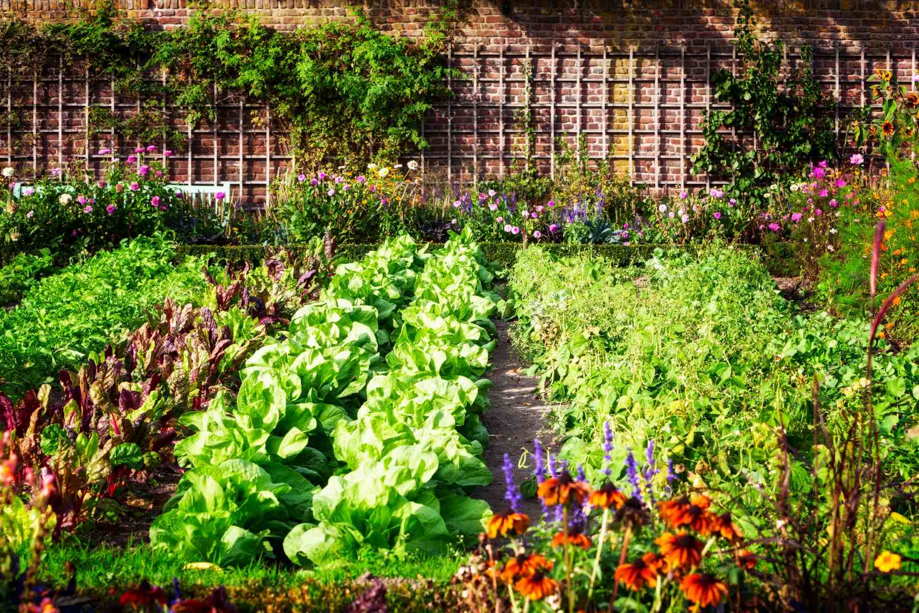
Color is a powerful tool in landscape design, and it plays a crucial role in creating visually stunning and captivating outdoor spaces. The thoughtful use of color can evoke emotions, create focal points, and enhance the overall aesthetic appeal of a landscape. Here are some key reasons why color is important in landscape design:
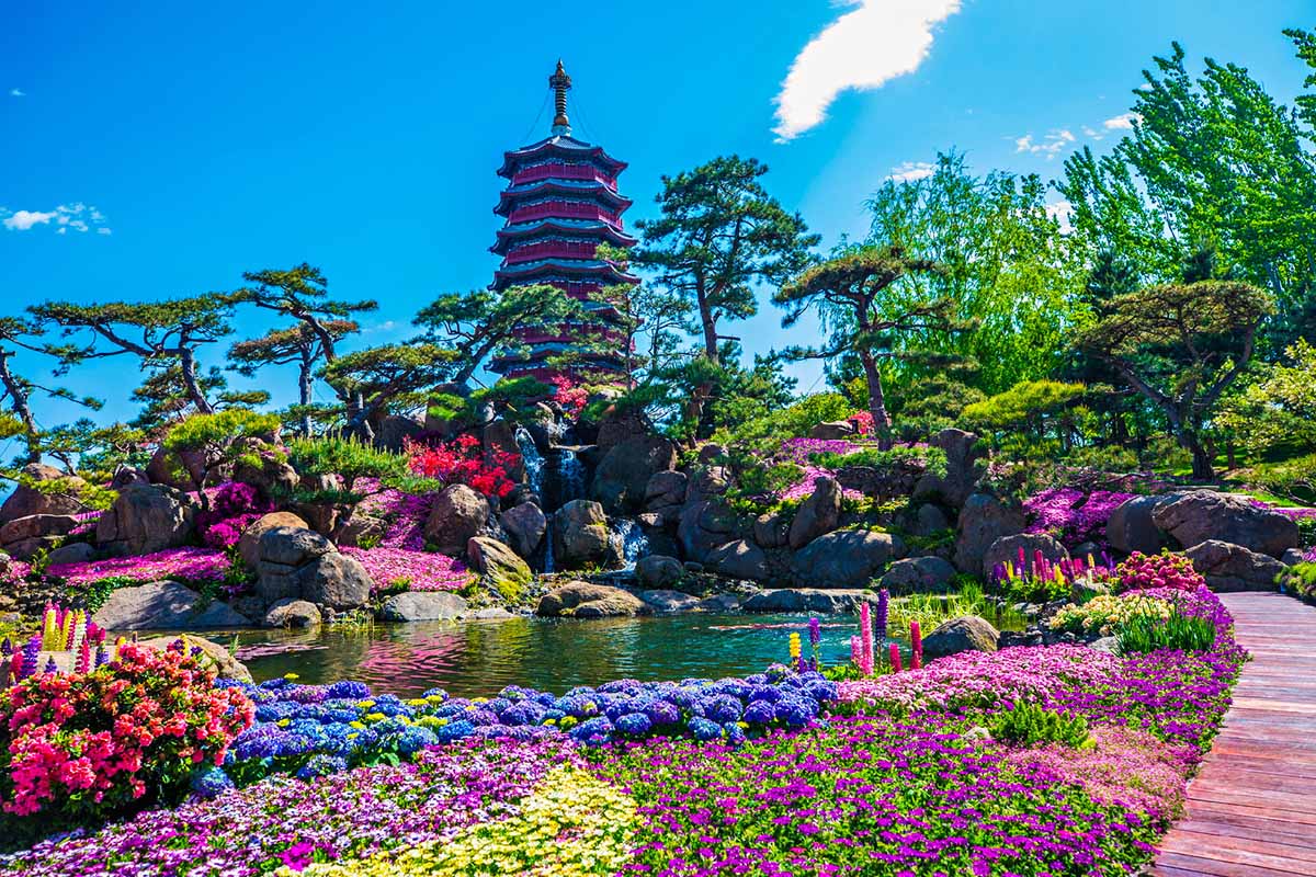
- Enhances Visual Appeal: Color adds visual interest and excitement to an outdoor space. By incorporating a wide range of colors, you can create a vibrant and dynamic landscape that catches the eye and engages the senses.
- Creates Mood and Atmosphere: Different colors have the power to evoke specific emotions and set the desired mood in a landscape. Warm colors like red, orange, and yellow create a vibrant and energetic atmosphere, while cool colors like blue and green promote a sense of calmness and tranquility.
- Defines Spaces and Elements: Color can be used to differentiate between different areas or elements in a landscape. By using contrasting colors, you can clearly define pathways, seating areas, and focal points, making the overall design more organized and visually appealing.
- Provides Seasonal Interest: In a garden or landscape, color can change with the seasons. By carefully selecting plants and flowers that bloom at different times of the year, you can create a landscape that is constantly evolving and providing visual interest throughout the seasons.
- Attracts Wildlife: Certain colors are known to attract wildlife, such as birds and butterflies, to your garden. Brightly colored flowers and plants can serve as natural attractions, creating a lively and vibrant ecosystem in your outdoor space.
- Reflects Personal Style: Color is a way to express your personal style and taste in your landscape design. Whether you prefer bold and vibrant colors or a more muted and soothing palette, color allows you to transform your outdoor space into a true reflection of your personality.
Understanding the importance of color in landscape design is essential for creating a visually pleasing and harmonious outdoor space. By harnessing the power of color, you can create a landscape that not only looks beautiful but also elicits positive emotions and enhances the overall experience for anyone who spends time in it.
Elements of Color in Landscape Design
When it comes to color in landscape design, there are several key elements to consider. Understanding these elements will help you create a harmonious and visually pleasing outdoor space. Let’s explore the elements of color in landscape design:
- Hue: Hue refers to the purest form of a color. It is what we typically think of when we think of colors – red, blue, yellow, etc. Choosing the right hues is crucial in creating the desired mood and atmosphere in your landscape.
- Value: Value refers to the lightness or darkness of a color. It is important to consider the value when designing a landscape, as it can affect the overall contrast and balance of the space. Lighter values tend to create a sense of openness and brightness, while darker values can create a more intimate and cozy atmosphere.
- Saturation: Saturation, also known as intensity or chroma, refers to the purity or intensity of a color. Highly saturated colors are bold, vibrant, and eye-catching, while desaturated colors are more subdued and muted. Choosing the right level of saturation is crucial in creating a balanced and visually appealing landscape.
- Tone: Tone refers to the mix of hue and gray. Adding gray to a color creates a toned-down version of that color, which can be useful for creating subtle variations in a landscape design. Tones can add depth and dimension to a color scheme.
- Color Temperature: Color temperature refers to whether a color is warm or cool. Warm colors such as red, orange, and yellow create a sense of energy and vibrancy, while cool colors such as blue and green evoke a feeling of calmness and serenity. Consider the desired mood and atmosphere when selecting warm or cool colors for your landscape.
- Color Contrast: Color contrast is the relationship between different colors in a design. It can create visual interest, draw attention to focal points, and define different areas or elements in a landscape. There are various types of color contrast, including complementary, analogous, and triadic, which we will explore later in this article.
By understanding and considering these elements of color, you can make more informed decisions when it comes to selecting and combining colors in your landscape design. A thoughtful use of hue, value, saturation, tone, color temperature, and contrast will help create a visually harmonious and captivating outdoor space.
Understanding the Color Wheel
The color wheel is a valuable tool in understanding the relationship between different colors and how they can be used effectively in landscape design. It consists of a circular arrangement of colors that are organized in a way that helps identify color harmonies and combinations. Let’s take a closer look at the color wheel and its significance in landscape design:
At its most basic, the color wheel is divided into three main categories:
- Primary Colors: These are the three colors that cannot be created by mixing other colors together. The primary colors are red, blue, and yellow.
- Secondary Colors: These are the colors that are created by mixing two primary colors together. The secondary colors are orange (red + yellow), green (blue + yellow), and purple (red + blue).
- Tertiary Colors: These are the colors that are created by mixing a primary color with a secondary color. The tertiary colors are yellow-orange, red-orange, red-purple, blue-purple, blue-green, and yellow-green.
By understanding the relationships between these colors, you can create a cohesive color scheme that is visually appealing and harmonious. Here are a few common color harmonies on the color wheel:
- Analogous Colors: Analogous colors are located next to each other on the color wheel. For example, yellow-orange, orange, and red-orange. This color scheme creates a sense of harmony and is commonly used in landscape design.
- Complementary Colors: Complementary colors are located directly across from each other on the color wheel. For example, red and green, or blue and orange. This color scheme creates a vibrant contrast and is commonly used to draw attention to focal points in a landscape.
- Split-Complementary Colors: Split-complementary colors are a variation of the complementary color scheme. In this scheme, instead of using one direct complementary color, you choose the two colors on either side of the complementary color. For example, if the complementary color to red is green, the split-complementary colors would be red, yellow-green, and blue-green.
- Triadic Colors: Triadic colors are evenly spaced around the color wheel, creating a triangular relationship. For example, yellow, blue, and red. This color scheme provides a balanced and visually striking effect.
Understanding the color wheel and the relationships between colors allows you to make informed decisions when selecting colors for your landscape design. By utilizing various color harmonies, you can create a visually appealing and harmonious outdoor space that is sure to impress.
Warm Colors in Landscape Design
Warm colors are those that are associated with heat, energy, and vitality. Using warm colors in landscape design can create a lively and vibrant atmosphere. Let’s explore some popular warm colors and how they can be effectively incorporated into your outdoor space:
The warm colors on the color wheel include shades of red, orange, and yellow. Here’s a closer look at each of these warm colors:
- Red: Red is a bold and attention-grabbing color. It exudes energy, passion, and intensity. Incorporating red flowers or foliage in your landscape design can create a focal point that immediately catches the eye and adds a sense of drama. Red can also be used to create a sense of depth in a garden, as it visually appears closer than cooler colors.
- Orange: Orange is a warm and cheerful color that symbolizes enthusiasm and creativity. It can create a sense of warmth and excitement in your outdoor space. Orange flowers, such as marigolds or poppies, can brighten up a garden and add a splash of color. Additionally, using orange foliage in conjunction with other warm or cool colors can create a visually striking contrast.
- Yellow: Yellow is associated with joy, happiness, and sunshine. It evokes a sense of warmth and positivity in a landscape. Yellow flowers, such as sunflowers or daffodils, can bring a burst of energy and brightness to your garden. Yellow can also be used strategically to draw attention to specific areas or elements in your landscape.
When using warm colors in landscape design, consider the following tips:
- Balance: While warm colors can create a vibrant and energetic atmosphere, it’s important to balance them with cooler and more neutral colors to maintain visual harmony.
- Seasonal Interest: Incorporate warm-colored plants that bloom at different times throughout the year. This will allow you to enjoy the warmth and vibrancy of the colors in your landscape no matter the season.
- Contrast: Pair warm colors with complementary or contrasting colors to create visual interest and depth in your landscape. For example, combine red and green for a striking contrast, or orange and blue for a bold and dramatic effect.
- Scale and Proportion: Consider the size and scale of your outdoor space when working with warm colors. Using too many warm colors in a small area can be overwhelming, while using them sparingly in a larger area may appear insignificant. Find the right balance to create a visually pleasing design.
By incorporating warm colors into your landscape design, you can create a lively and inviting outdoor space that radiates energy and vitality. Experiment with different shades and combinations of red, orange, and yellow to find the perfect balance for your unique landscape.
Read more: How To Add Color To Landscaping
Cool Colors in Landscape Design
Cool colors are known for their calming and soothing effect. They can create a sense of tranquility and serenity in your outdoor space. Incorporating cool colors in landscape design can help create a relaxing and refreshing atmosphere. Let’s delve into some popular cool colors and how they can be effectively utilized in your landscape:
The cool colors on the color wheel include shades of blue, green, and purple. Here’s a closer look at each of these cool colors:
- Blue: Blue is often associated with the sky and the sea, creating a sense of calmness. It is a cool color that promotes relaxation and serenity. Using blue flowers or foliage in your landscape can create a tranquil and peaceful ambiance. Blue can also create a sense of depth and distance, making your outdoor space appear more expansive.
- Green: Green is the color of nature and is inherently calming. It represents growth, harmony, and renewal. Incorporating green plants in your landscape design can create a sense of balance and serenity. Green foliage serves as a neutral backdrop and can complement other colors in your landscape. Different shades of green can also add depth and texture to your outdoor space.
- Purple: Purple is a unique and mysterious color that can add an element of intrigue to your landscape. It is often associated with creativity and spirituality. Purple flowers, such as lavender or lilacs, can create a sense of elegance and sophistication. They can also act as eye-catching focal points in your garden.
When using cool colors in landscape design, consider the following tips:
- Contrast: Combine cool colors with warm or complementary colors to add visual interest and balance to your outdoor space. For example, pair blue flowers with orange foliage for a striking contrast.
- Creating Serenity: Utilize cool colors in spaces where tranquility and relaxation are desired. Cool-colored plants and features can be particularly effective around areas such as seating areas, meditation zones, or water features.
- Shades and Tones: Experiment with different shades and tones of cool colors to create depth and dimension in your landscape. Lighter shades can create an airy and open atmosphere, while darker shades can add a sense of intimacy and coziness.
- Balance: Similar to warm colors, it’s important to balance cool colors with other colors to maintain overall harmony in your landscape design. Incorporating a mix of warm and cool colors can create a well-rounded and visually appealing outdoor space.
By incorporating cool colors into your landscape design, you can create a serene and tranquil oasis that provides a refreshing escape from the hustle and bustle of daily life. Experiment with different shades of blue, green, and purple to find the perfect balance and ambiance for your landscape.
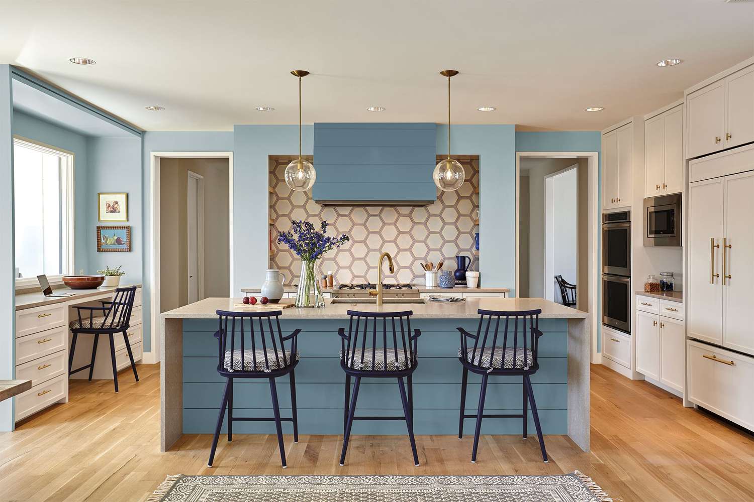
Complementary Colors in Landscape Design
In landscape design, complementary colors are pairs of colors that are opposite each other on the color wheel. Using complementary colors in your outdoor space can create a vibrant and visually striking effect. Let’s explore how complementary colors work and how they can be effectively incorporated into your landscape design:
Complementary color pairs include:
- Red and Green: Red and green are opposite each other on the color wheel, creating a high-contrast and attention-grabbing combination. Using red flowers or foliage against a backdrop of lush greenery can create a visually stunning display in your landscape.
- Blue and Orange: Blue and orange are complementary colors that create a powerful contrast. Blue flowers against a backdrop of vibrant orange foliage can create a striking and energetic display in your outdoor space.
- Purple and Yellow: Purple and yellow are a classic complementary color pair that creates a sense of drama and visual interest. Pairing purple flowers with vibrant yellow accents or foliage can add a bold and vibrant touch to your landscape design.
The use of complementary colors in landscape design can create balance, harmony, and visual impact. Here are some tips for incorporating complementary colors effectively:
- Focal Points: Use complementary colors to draw attention to specific areas or elements in your landscape. By placing complementary colors next to each other, you can create a focal point that immediately catches the eye.
- Balance: While complementary colors create a high-contrast effect, it’s important to balance them with other colors to maintain overall harmony in your design. Incorporate neutral or monochromatic colors to provide a visual break and create a cohesive look.
- Proportion: Consider the proportion of complementary colors in your landscape design. Using equal amounts of both colors can create a bold and dynamic look, while using one color as the dominant hue with the other as an accent can create a more subtle impact.
- Seasonal Interest: Incorporate plants that bloom at different times of the year to ensure that you have a continual display of complementary colors throughout the seasons.
Using complementary colors in your landscape design can add drama, visual interest, and a sense of vibrancy to your outdoor space. Experiment with different combinations and find the complementary color pair that speaks to you and enhances the overall aesthetic of your landscape.
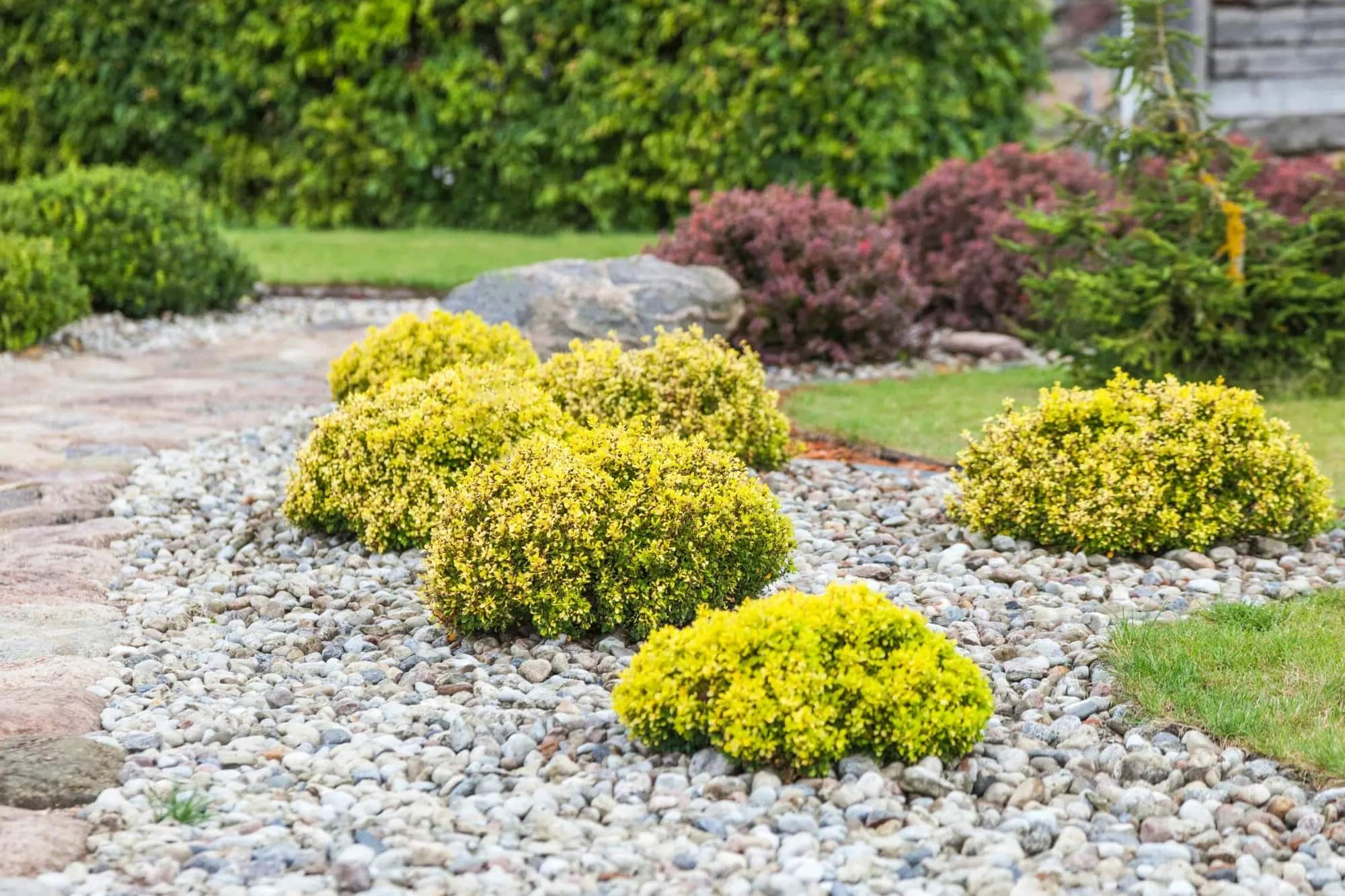
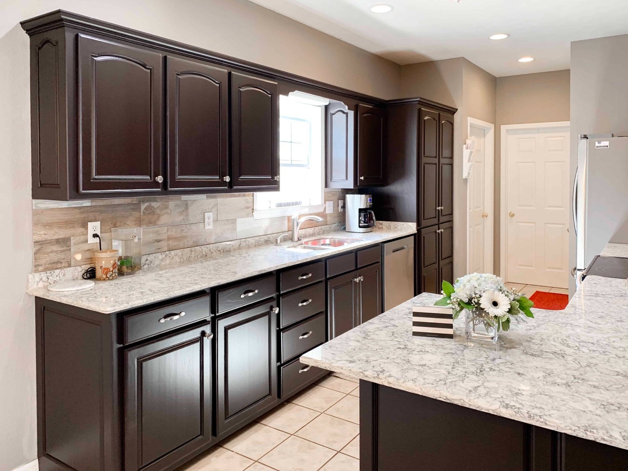
Monochromatic Color Schemes in Landscape Design
Monochromatic color schemes in landscape design involve using variations of a single color to create a harmonious and visually appealing outdoor space. This approach can create a serene and sophisticated look, allowing for a cohesive and calming atmosphere. Let’s explore the concept of monochromatic color schemes and how they can be effectively incorporated into your landscape design:
A monochromatic color scheme typically starts with selecting a base color and then using different shades, tints, and tones of that color. This creates a sense of unity and simplicity in your outdoor space. Here are a few reasons why monochromatic color schemes can be a powerful choice in landscape design:
- Elegance and Sophistication: A monochromatic color palette can lend an air of elegance and sophistication to your landscape. By focusing on variations of a single color, your outdoor space can exude a sense of refinement and tranquility.
- Visual Cohesion: Using a monochromatic color scheme creates a sense of unity and cohesiveness within your landscape design. This approach allows for a seamless flow from one area to another, giving your outdoor space a polished and well-planned appearance.
- Subtle Variation: Within a monochromatic color scheme, you can utilize the different shades, tints, and tones of your chosen color to add depth and interest to your landscape. This subtle variation creates visual intrigue while maintaining a sense of overall harmony.
- Highlighting Texture and Form: A monochromatic color scheme can draw attention to the textures and forms of plants, structures, and other elements in your landscape design. By eliminating the distraction of contrasting colors, the focus shifts to the intricate details and shapes within your outdoor space.
When working with a monochromatic color scheme, consider the following tips:
- Explore Different Shades: Experiment with the various shades, tints, and tones of your chosen color. This will add depth and dimension to your landscape design. Lighter shades can create an airy and open atmosphere, while darker tones can add a cozy and intimate feel to your outdoor space.
- Introduce Contrasting Textures: Enhance the visual interest of your monochromatic color scheme by incorporating plants or elements with contrasting textures. This will create a dynamic interplay between the different surface types, adding richness and variety to your landscape.
- Use Neutrals for Balance: Introduce neutral colors such as white, gray, or black to balance out the monochromatic color scheme. Neutrals can help create a sense of visual relief and prevent the design from appearing monotonous.
- Consider Seasonal Variation: Keep in mind that the appearance of your monochromatic color scheme may change with the seasons. Select plants and elements that offer different shades or foliage colors at various times of the year to ensure year-round interest.
A monochromatic color scheme offers a refined and cohesive approach to landscape design. By utilizing different shades, tints, and tones of a single color, you can create a serene and visually stunning outdoor space that radiates simplicity and elegance.
When using color in landscape design, consider the mood you want to create. Warm colors like red and yellow create energy, while cool colors like blue and green create a sense of calm. Use color strategically to evoke the desired atmosphere in your outdoor space.
Analogous Color Schemes in Landscape Design
In landscape design, analogous color schemes involve using colors that are adjacent to each other on the color wheel. This approach creates a sense of harmony and unity, as these colors share similar undertones. Analogous color schemes can be a versatile and visually pleasing choice for your outdoor space. Let’s explore how to effectively incorporate analogous color schemes into your landscape design:
Analogous color schemes typically consist of three to five colors that are adjacent to each other on the color wheel. These colors can be warm, cool, or a mix of both. Here are a few reasons why analogous color schemes can be a powerful choice in landscape design:
- Harmonious and Balanced: Analogous color schemes create a natural sense of harmony and balance in your landscape. The colors seamlessly blend together, creating a cohesive and visually pleasing outdoor space.
- Subtle Variation: While the colors in an analogous color scheme share similar undertones, there is room for subtle variation. This allows you to introduce depth and interest into your landscape, as you can utilize different shades, tints, and tones of the chosen colors.
- Natural and Serene: Analogous colors often mimic those found in nature. Depending on the chosen colors, an analogous color scheme can create a calming and serene environment reminiscent of a tranquil natural landscape.
- Dynamic Interplay: Analogous color schemes offer the opportunity to create a visually interesting interplay of colors. By carefully selecting the placement and proportion of the colors, you can direct attention to focal points or define different areas within your outdoor space.
When working with an analogous color scheme, consider the following tips:
- Choose a Dominant Color: Select one color from the analogous group to serve as the dominant hue in your landscape design. This color will provide the foundation for the overall aesthetic and can be used in larger areas, such as walls or large plant beds.
- Utilize Variation: Incorporate different shades, tints, and tones of the chosen colors to create variation and depth in your landscape. This can be achieved by selecting plants with foliage or flowers that offer a range of tones within the analogous color group.
- Add Contrast: Introduce contrasting elements to add visual interest and prevent the design from appearing monotonous. This can be done by incorporating neutral colors or using complementary colors as accents within the analogous color scheme.
- Consider Color Intensity: Play with the intensity or saturation of the analogous color scheme to create different moods or atmospheres in different areas of your outdoor space. For example, a more saturated color may create a vibrant and energetic ambiance, while a softer shade can evoke a sense of calmness.
Analogous color schemes can create a visually harmonious and inviting outdoor space. By carefully selecting and arranging colors that are adjacent on the color wheel, you can achieve a landscape design that is visually striking and aesthetically pleasing.
Split-Complementary Color Schemes in Landscape Design
A split-complementary color scheme in landscape design is a variation of the complementary color scheme. It involves choosing a base color and then using the two colors adjacent to its complementary color on the color wheel. This approach offers a balanced yet vibrant palette that allows for creativity and visual interest. Let’s explore how to effectively incorporate split-complementary color schemes into your landscape design:
In a split-complementary color scheme, the three main colors used will consist of a base color and the two adjacent colors to its complementary color. For example, if the base color is blue, its complementary color is orange, and the split-complementary colors would be blue-green and blue-violet.
Here are a few reasons why split-complementary color schemes can be an appealing choice in landscape design:
- Visual Interest: Split-complementary color schemes offer a visually interesting and dynamic combination that can enliven your outdoor space. The use of three colors instead of two creates a sense of depth and variety in your design.
- Balance and Harmony: By using colors that are adjacent to the complementary color, your landscape design will achieve a balanced and harmonious look. The split-complementary scheme brings a level of complexity and interest while still maintaining a sense of cohesion.
- Color Contrast: The split-complementary color scheme allows for vibrant contrast and visual impact without the potential for overwhelming or clashing colors that can occur with complementary color schemes.
When working with a split-complementary color scheme, consider the following tips:
- Choose a Dominant Color: Select the base color as the dominant color in your landscape design. This color will serve as the main focus and can be applied to larger elements such as walls, furniture, or tall plants.
- Use Variation and Proportion: Incorporate different shades, tints, and tones of the split-complementary colors to create depth and interest. Experiment with the proportion of each color to achieve the desired visual impact and balance.
- Consider Neutrals: Introduce neutral colors such as white, gray, or black to balance out the intensity of the split-complementary colors and to provide visual relief. Neutrals can be used in hardscapes, pathways, or as accents to create a sense of harmony within the color scheme.
- Placement and Proximity: Consider the placement and proximity of the split-complementary colors within your landscape. Use the colors strategically to create focal points or guide the eye through the space. For example, consider using the split-complementary colors to draw attention to specific areas, such as seating areas or plant beds.
Split-complementary color schemes offer a creative and visually engaging option for landscape design. By carefully selecting and arranging the base color and its adjacent colors on the color wheel, you can achieve a landscape that showcases a harmonious yet dynamic color palette.
Triadic Color Schemes in Landscape Design
In landscape design, a triadic color scheme involves using three colors that are evenly spaced on the color wheel. This approach creates a visually striking and balanced palette that can add vibrancy and interest to your outdoor space. Let’s explore how to effectively incorporate triadic color schemes into your landscape design:
In a triadic color scheme, the three main colors chosen will be evenly spaced on the color wheel. Examples of triadic color schemes include the primary colors (red, blue, and yellow) and the secondary colors (orange, green, and purple).
Here are a few reasons why triadic color schemes can be a successful choice in landscape design:
- Visual Impact: Triadic color schemes offer a visually dynamic and harmonious combination. The use of three colors creates a sense of complexity and interest that can make your outdoor space stand out.
- Balance and Contrast: Triadic color schemes ensure a balanced distribution of hues, providing visual balance and preventing one color from overpowering the others. The three colors work together to create a harmonious and visually pleasing composition.
- Color Variety: The use of three colors in a triadic scheme allows for a broad range of possibilities and variations. By considering different shades, tints, and tones within each color, you can add depth and texture to your landscape design.
When working with a triadic color scheme, consider the following tips:
- Choose a Dominant Color: Select one color from the triadic group to serve as the dominant hue in your landscape design. This color will provide the foundation for the overall aesthetic and can be used in larger areas, such as walls, fences, or taller plants.
- Harmonize Intensity: Balance the intensity or saturation of the chosen colors to ensure they harmonize well together. Experiment with different shades and tones within the triadic scheme to achieve the desired effect. You can increase or decrease intensity to create contrast or harmony as needed.
- Proportion and Placement: Consider the proportion and placement of each color within your landscape. Avoid using equal amounts of each color, as this can create a visually chaotic result. Instead, aim for an asymmetrical distribution to achieve a more balanced and visually pleasing outcome.
- Consider Neutrals and Accents: Introduce neutral colors such as white, gray, or black to balance the vibrancy of the triadic color scheme. Neutrals can be used in hardscapes, pathways, or as a backdrop to allow the triadic colors to pop. Additionally, you can incorporate accent colors to add depth and highlight specific elements in your landscape design.
Triadic color schemes offer a bold and dynamic option for landscape design. By carefully selecting and arranging three colors that are evenly spaced on the color wheel, you can achieve a visually striking and cohesive landscape that captures attention and creates a visually balanced composition.
Using Color to Create Depth and Perspective in Landscape Design
Color is a powerful tool in landscape design, not only for adding visual interest but also for creating depth and perspective in your outdoor space. By strategically using color, you can manipulate the perception of space and create a more dynamic and immersive landscape. Here are some techniques for using color to enhance depth and perspective in your landscape design:
- Warm and Cool Colors: Utilize the contrast between warm and cool colors to create an illusion of depth. Cool colors such as blues and greens tend to recede and create a sense of distance, while warm colors like reds and oranges appear closer. By incorporating these colors strategically, you can create a visual hierarchy and guide the eye through your landscape.
- Color Gradation: Use color gradation to create a sense of depth in your outdoor space. Gradually transitioning from lighter to darker shades of the same color in your garden beds or plantings can create a visual progression from foreground to background. This technique adds layers and depth to your landscape.
- Contrasting Colors: Explore the use of contrasting colors to create focal points and draw attention to specific areas within your landscape. By placing complementary or high-contrast colors near each other, you can create a sense of depth and visual interest. This technique can be especially effective in highlighting key features such as sculptures, seating areas, or architectural elements.
- Color Placement: Consider the placement of colors within your landscape design to create a sense of perspective. Placing brighter, more vibrant colors in the foreground and gradually transitioning to softer or more muted colors in the background can simulate the effect of objects receding into the distance.
- Color Consistency: Maintain consistent color palettes throughout your landscape design to create a cohesive visual experience. By repeating colors in different areas of your outdoor space, you establish a sense of continuity and reinforce the perception of depth.
- Background and Foreground: Use color to define the background and foreground in your landscape. Lighter, cooler colors are ideal for creating a background that recedes, while warmer and darker colors can be used for elements in the foreground to create a sense of prominence and depth of field.
When using color to create depth and perspective, it’s important to consider the scale and proportion of your outdoor space. Pay attention to how color choices and placement interact with the size and shape of different elements. Experiment with different color combinations and techniques to find the best approach that suits your landscape design objectives.
By strategically incorporating color and employing these techniques, you can add depth and perspective to your landscape design, making your outdoor space more visually engaging and inviting. The careful use of color has the power to transform your landscape into a dynamic and immersive environment.
Color Harmony in Landscape Design
Color harmony is essential in landscape design as it creates a sense of balance, unity, and visual appeal. When colors harmonize, they work together to create a cohesive and pleasing aesthetic in your outdoor space. Here are some key principles to consider when achieving color harmony in landscape design:
- Complementary Colors: Complementary colors, which are opposite each other on the color wheel, can create a harmonious balance in your landscape design. Pairing warm and cool colors or colors that sit opposite each other on the color wheel can generate a visually striking and balanced composition.
- Analogous Colors: Analogous colors, which are adjacent to each other on the color wheel, offer a harmonious and cohesive color palette. Using neighboring colors can create a sense of unity and flow within your outdoor space. This color scheme works well for creating a serene and calming atmosphere.
- Monochromatic Colors: Monochromatic color schemes involve using different shades, tints, and tones of a single color. This creates a harmonious and unified look in your landscape design. Monochromatic schemes are versatile and offer opportunities for depth and variation within a single color family.
- Color Proportion: Consider the proportion of different colors used in your landscape design. Balancing colors in terms of amount and intensity is crucial for creating harmony. Avoid overwhelming your space with one dominant color. Distribute colors evenly and proportionally throughout your design.
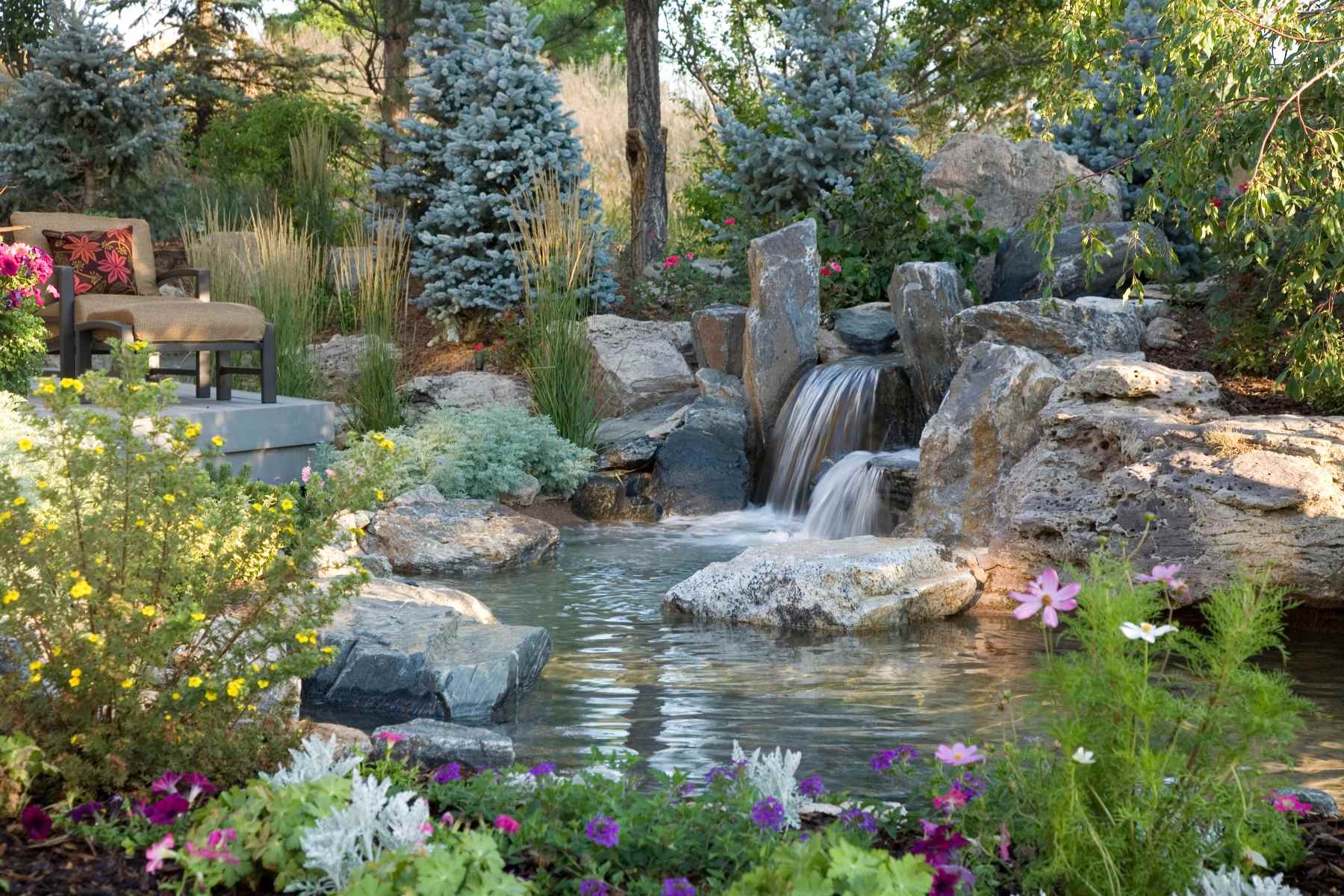
- Nature as Inspiration: Take cues from nature when it comes to color harmony. Look at the colors that naturally occur together in the environment you are working with. For instance, a coastal landscape might offer a harmonious combination of blues, greens, and sandy neutral tones.
- Consider Surroundings: Look at the existing colors and elements in your outdoor space. Consider the colors of existing plants, structures, and hardscapes when selecting new colors. Harmonizing the new colors with the surroundings creates a unified and seamless look.
- Atmosphere and Mood: Consider the atmosphere and mood you want to create in your landscape design. Warmer colors evoke energy and vibrancy, while cooler colors create a sense of calmness and serenity. Choose harmonious colors that align with the desired mood and ambiance of your outdoor space.
When achieving color harmony, it’s important to strike a balance between creating visual interest and maintaining a cohesive look. Experiment with different color combinations, taking into account the principles of color harmony, and observe how they work together in your landscape design.
By employing color harmony techniques, you can create a visually pleasing and aesthetically balanced outdoor space. Harmonious colors will create a sense of unity and enhance the overall enjoyment and impact of your landscape design.
Enhancing Emotions with Color in Landscape Design
Color has the remarkable ability to evoke emotions, set moods, and create powerful impressions. In landscape design, the strategic use of color can enhance the desired atmosphere and create a truly impactful outdoor space. Here’s how you can effectively enhance emotions with color in your landscape design:
- Red: Red is a color associated with energy, passion, and excitement. It can evoke feelings of warmth, intensity, and power. Incorporating red flowers, foliage, or architectural elements in your landscape design can create a sense of vitality and evoke strong emotions.
- Orange: Orange is a color that exudes energy, enthusiasm, and optimism. It can add a sense of playfulness and vibrancy to your outdoor space. Incorporating orange flowers or vibrant orange accents can create a joyful and uplifting atmosphere.
- Yellow: Yellow is a color associated with happiness, optimism, and brightness. It can create a sense of warmth and cheerfulness in your landscape. Incorporating yellow flowers or using yellow accents can bring a burst of positivity and evoke feelings of joy.
- Green: Green is a color that symbolizes growth, harmony, and renewal. It is restful to the eyes and can create a sense of tranquility and relaxation. Utilizing green foliage and plants in your landscape design can create a soothing and refreshing atmosphere.
- Blue: Blue is a color known to evoke feelings of calmness, serenity, and tranquility. It can create a sense of spaciousness and depth. Incorporating blue flowers or hardscape elements with shades of blue can establish a peaceful and serene ambiance in your outdoor space.
- Purple: Purple is a color associated with luxury, creativity, and spirituality. It can add a touch of elegance and opulence to your landscape design. Purple flowers or accents can evoke a sense of mystery and intrigue, creating a unique and captivating atmosphere.
When enhancing emotions with color in landscape design, consider the following tips:
- Balance: Use colors in moderation and balance to achieve the desired emotional impact. Too much of a vibrant color can be overpowering, while too little may not create the intended effect.
- Contrast: Combine colors with contrasting emotions to create dynamic tension and visual interest. For example, pair calming blue with energizing orange to create a balanced and invigorating atmosphere.
- Harmony: Create a harmonious color palette that aligns with the desired emotions and atmosphere of your outdoor space. Colors that work well together and complement each other will enhance the overall mood and impact.
- Consider Personal Preferences: Your personal preferences and the emotions you want to evoke should guide your color choices. Consider how certain colors personally resonate with you and the emotions they evoke for you and others.
- Seasonal Considerations: Incorporate colors that are associated with different seasons to enhance the emotional experience throughout the year. For example, warm colors like red and orange can create a cozy ambiance in the fall, while cool blues and purples can evoke a sense of tranquility in the summer.
By strategically utilizing color in your landscape design, you can evoke the desired emotions and create an immersive and emotionally captivating outdoor space. Understanding the impact of color on emotions allows you to design an environment that resonates with the feelings and experiences you want to inspire.
Conclusion
In the world of landscape design, color plays a vital role in creating visually stunning and impactful outdoor spaces. Understanding the importance of color and how to use it effectively can transform an ordinary landscape into a captivating and harmonious environment. By incorporating the various elements of color, such as hue, value, saturation, and tone, you can create a visually appealing and balanced design.
The color wheel serves as a valuable tool in selecting and combining colors in landscape design. Whether you choose complementary colors for a vibrant contrast, analogous colors for a harmonious blend, or monochromatic colors for a refined and unified look, the color wheel provides guidance on creating a cohesive color palette.
Additionally, the use of warm and cool colors allows you to create specific moods and atmospheres within your outdoor space. Warm colors like red, orange, and yellow can evoke energy and vibrancy, while cool colors like blue and green promote a sense of calmness and serenity. By understanding the emotional impact of colors, you can design landscapes that evoke the desired feelings and enhance the overall experience.
Color in landscape design can go beyond aesthetics and visual interest. It can be used strategically to create depth, perspective, and even influence the perception of space. Whether it’s through color gradation, contrasting colors, or thoughtful placement, color can transform a flat landscape into a three-dimensional experience.
Creating color harmony is key to achieving a visually pleasing and cohesive landscape design. Whether you choose complementary, analogous, or monochromatic color schemes, aiming for a balance between colors and considering their proportions will result in a harmonious and well-rounded composition.
In conclusion, color is a powerful tool in landscape design that can evoke emotions, create focal points, enhance depth, and set the desired mood. By harnessing the potential of color, you can create vibrant, harmonious, and emotionally captivating outdoor spaces that leave a lasting impression. So, let your creativity bloom, and paint a beautiful landscape with the wonderful palette of colors at your disposal.
Frequently Asked Questions about What Is Color In Landscape Design
Was this page helpful?
At Storables.com, we guarantee accurate and reliable information. Our content, validated by Expert Board Contributors, is crafted following stringent Editorial Policies. We're committed to providing you with well-researched, expert-backed insights for all your informational needs.
0 thoughts on “What Is Color In Landscape Design”