Home>Ideas and Tips>How To Choose The Right Paint Colors For A Dining Room
Ideas and Tips
How To Choose The Right Paint Colors For A Dining Room
Modified: September 2, 2024
Discover how to choose the perfect paint colors for your dining room with tips on color psychology, lighting, and creating a balanced palette.
(Many of the links in this article redirect to a specific reviewed product. Your purchase of these products through affiliate links helps to generate commission for Storables.com, at no extra cost. Learn more)
Choosing the right paint colors for your dining room can be a daunting task, especially with the numerous options available. However, with some guidance and understanding of color psychology, lighting, and room function, you can create a space that is both inviting and stylish. In this article, we will delve into the process of selecting the perfect paint colors for your dining room, covering various tips and considerations to ensure you make the best decision.
Understanding Color Psychology
Before diving into specific color choices, it's essential to understand how colors can affect the mood and atmosphere of your dining room. Color psychology, which dates back to W. Goeth’s Theory of Color in 1810, associates colors with emotions and psychological effects. For instance, warm colors like reds, oranges, and yellows can stimulate appetite and encourage social interaction, making them ideal for dining rooms where family and friends gather to share meals.
On the other hand, cool colors such as blues and greens can create a more serene and calming environment, which might be beneficial for those who prefer a more relaxed dining experience. Understanding these psychological effects can help you choose colors that align with your desired mood and functionality of the space.
Considering Lighting
Lighting plays a crucial role in how colors appear in your dining room. Natural light changes throughout the day, affecting color perception. Different types of artificial lighting can also alter color appearance. For example, warmer whites or light colors can brighten rooms with limited natural light, while abundant natural light allows for more flexibility in experimenting with both light and dark shades.
When selecting paint colors, it's important to consider the lighting conditions in your dining room. If you have limited natural light, opt for lighter shades that will reflect the available light and make the space feel more spacious. Conversely, if your dining room receives plenty of natural light, you can experiment with deeper, richer colors that might otherwise appear too dark in less lit environments.
The 60-30-10 Rule
One of the most effective ways to create a balanced and appealing color scheme is by following the 60-30-10 rule. This principle suggests that 60% of a room should be a dominant color, 30% a secondary color, and 10% an accent color. This distribution typically translates to walls being the dominant color, upholstery or flooring as the secondary color, and accessories or artwork providing the accent color.
For example, if you choose a warm beige for your walls (60%), you could use a rich wood tone for your furniture (30%), and add pops of vibrant red through accessories like vases or table runners (10%). This balanced approach ensures that your room’s color palette doesn’t feel over- or underwhelming.
Developing a Color Palette from Existing Decor
Another effective method for choosing a color scheme is to start with an existing object in your home. According to architectural color consultant Bonnie Krims, take an object like a pillow from your family room sofa, your favorite tie or scarf, or a painting that conveys comfort or has an emotional connection for you. Bring this object to the paint store and find three sample strips with those colors. Each sample strip typically contains six paint colors, giving you an instant palette of 15–18 colors to use.
Krims also offers a pro tip: If you find yourself stuck and unable to choose your color sample cards, look at the darkest color at the bottom of the strip. If you can live with that one, you know you’ll like the middle and top. However, if you choose by looking at the top lightest colors, all the cards in that category start to look the same.
Selecting Colors for Different Room Types
Each room in your home serves a unique purpose, and the colors you choose should reflect and enhance that function. Here’s how we recommend approaching color selection for various room types:
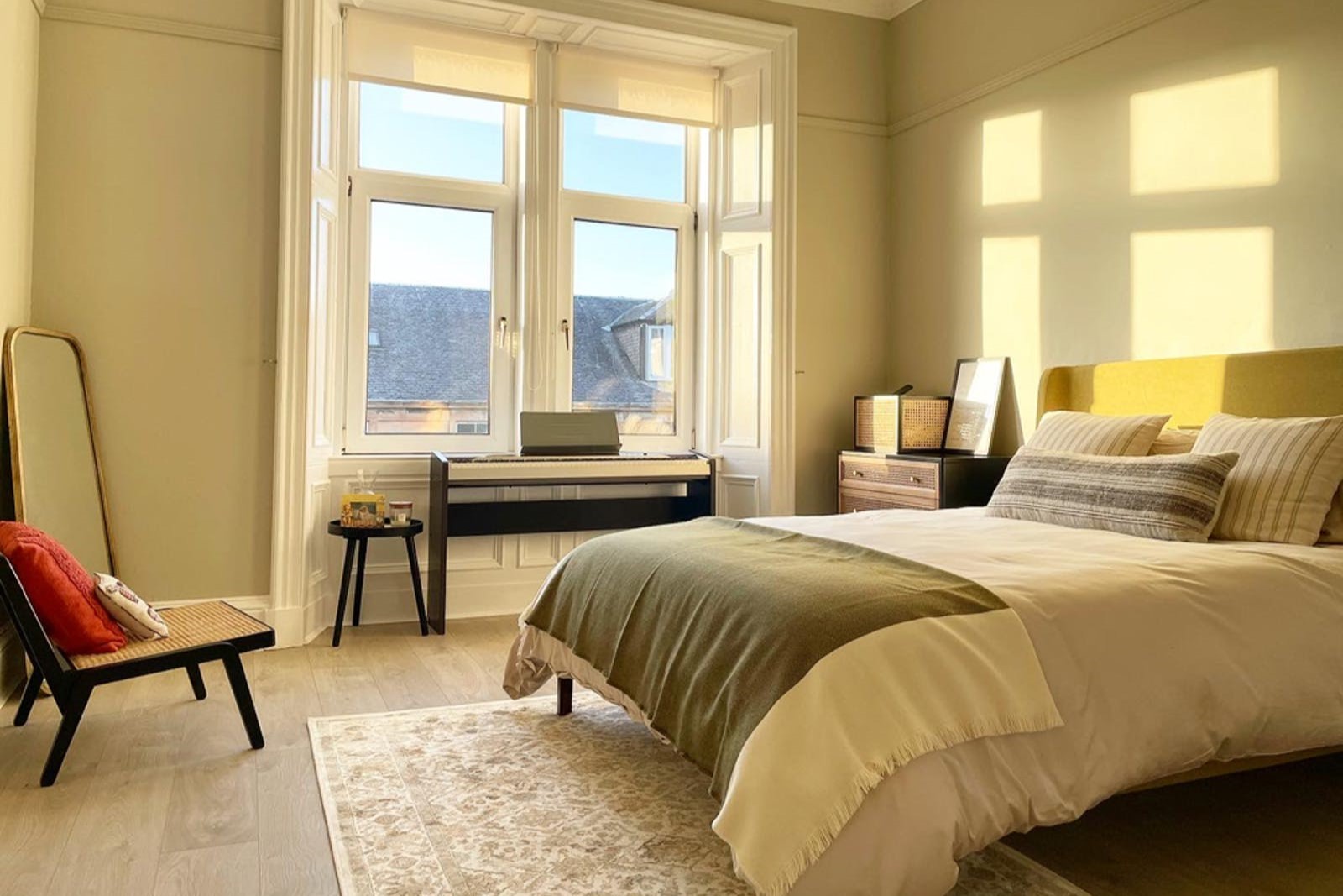
Selecting Colors for Bedrooms
Bedrooms should promote relaxation and restfulness. Soft, cool colors such as pale blues, lavenders, and greens can create a soothing environment conducive to sleep. If you prefer warmer tones, consider muted versions of colors like terracotta or pale yellow. Remember that darker colors make a room feel cozier, which might be valuable in a large bedroom.
Selecting Colors for Kitchens and Dining Rooms
Kitchens and dining rooms benefit from colors that stimulate appetite and conversation. Warm colors such as reds, oranges, and yellows can be effective in these spaces. However, be cautious with intense shades that might be overwhelming in large doses. Consider using these colors as accents against a neutral backdrop. Soft greens or blues can create a fresh, clean feel for a more serene kitchen.
Selecting Colors for Living Rooms
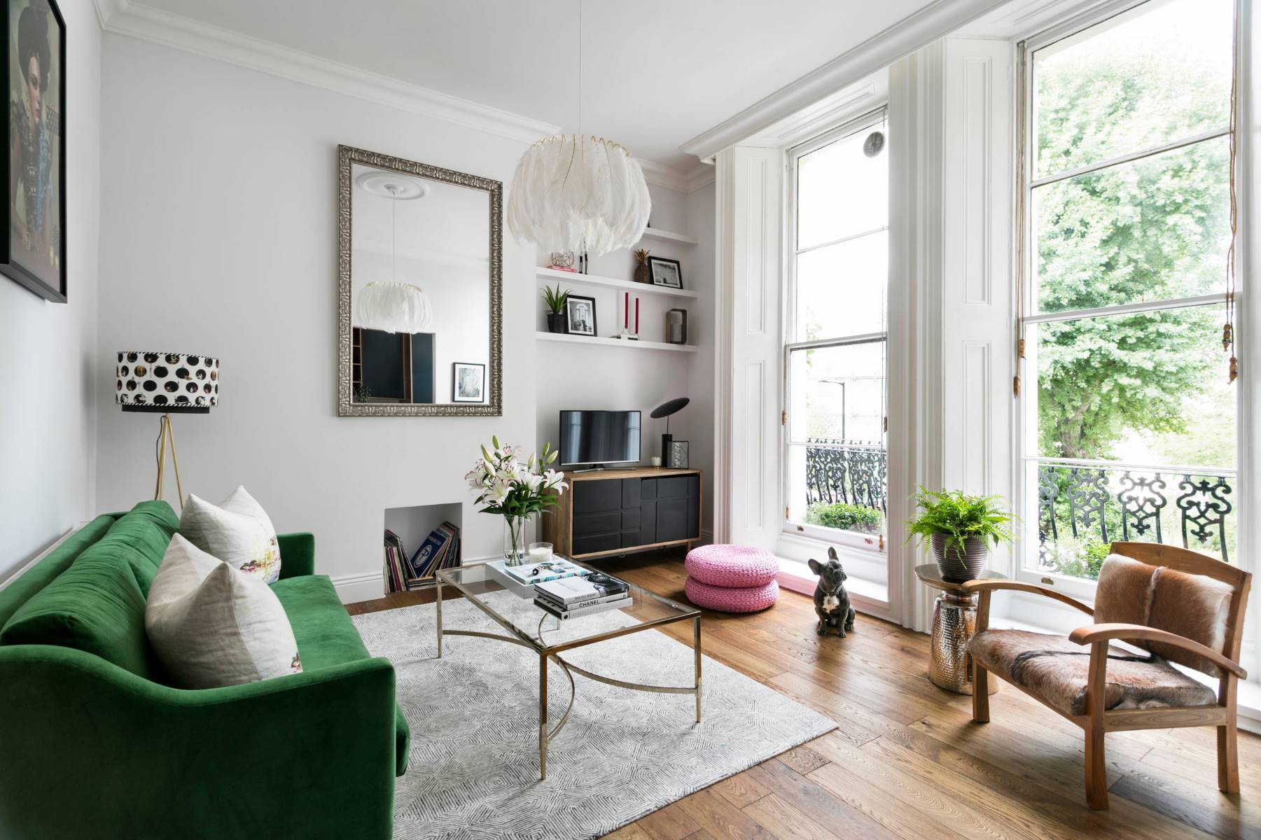
Living rooms often serve as the heart of the home where family and friends gather. To create a welcoming atmosphere, use earthy tones such as warm browns, soft greens, or muted oranges. If you want to make a statement, an accent wall in a bolder hue can add visual interest without overwhelming the space.
Selecting Colors for Dining Rooms
Dining rooms are unique spaces that require careful consideration of color choices. Here are some tips specifically tailored for dining rooms:
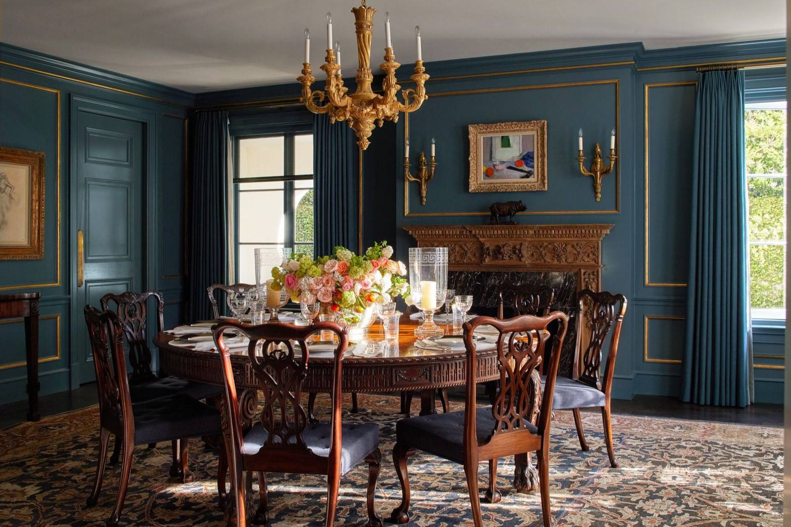
Bold Dining Rooms
Instantly update a dining room with a bright, bold color. A bold paint color is a great way to incorporate personal style into the home. Choose stimulating colors like variations of red, orange, yellow, or corals. These colors promote social interaction, encourage conversation, and stimulate appetite—all of which make for the perfect family setting for celebrations and get-togethers.
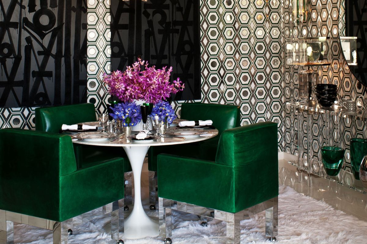
Modern Schemes
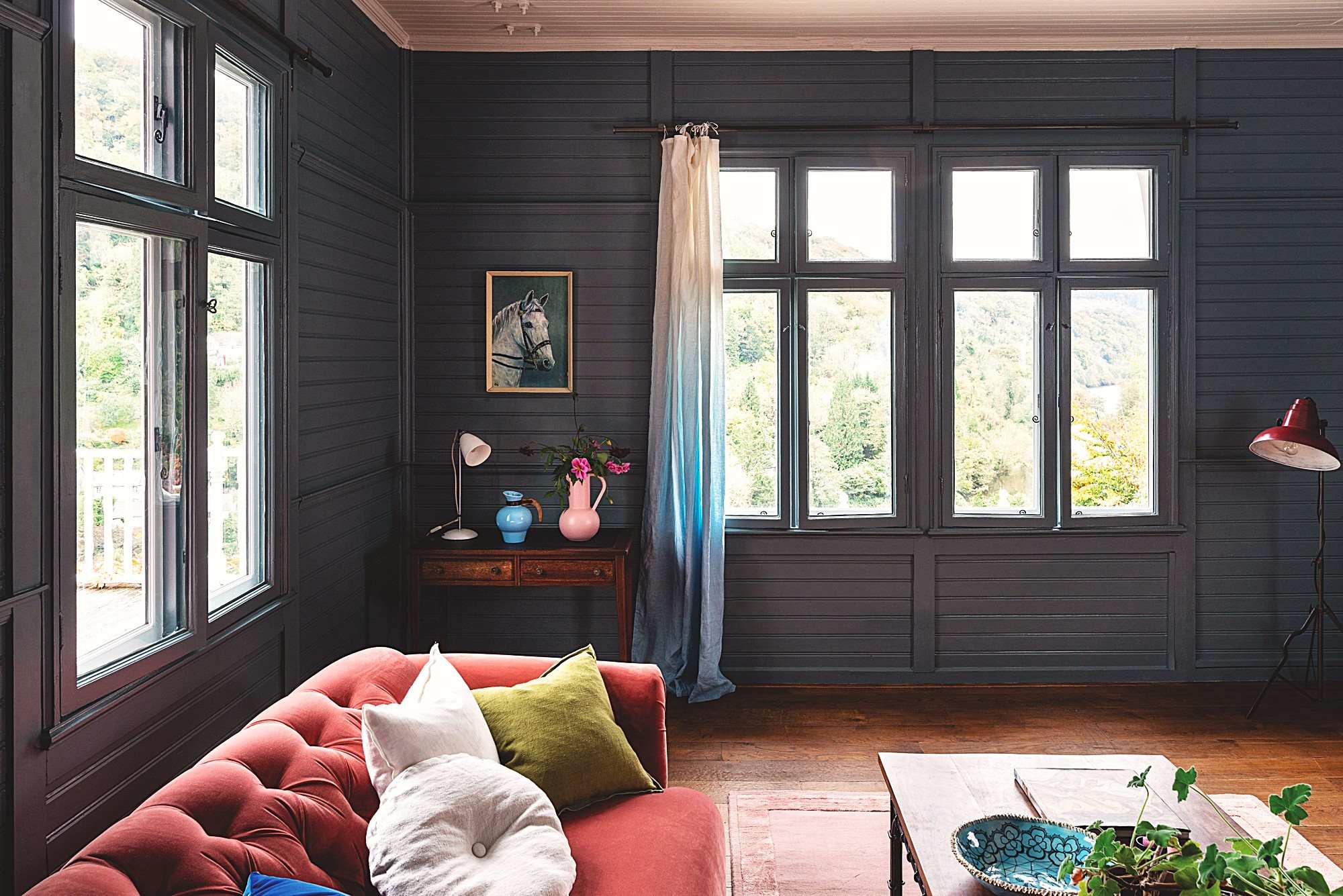
A stylish, trendy, and modern dining room can be achieved with the right paint color. Today, many homeowners are foregoing traditional paint colors in favor of unexpected choices that create memorable family dinners. Such modern palettes include deep purples, charcoal grays, as well as muted blues for a dining room that has personality.
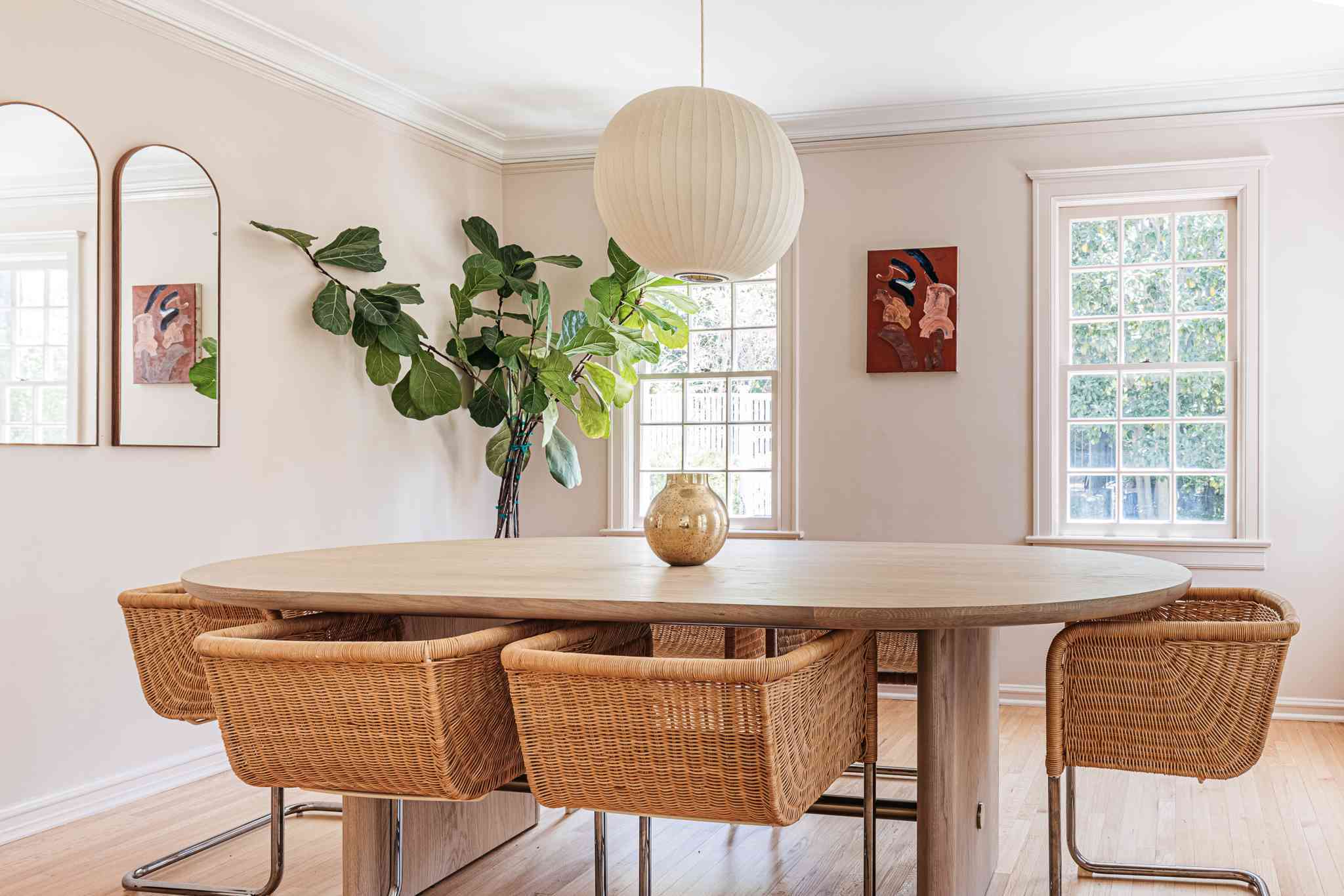
Relaxing Dining Rooms
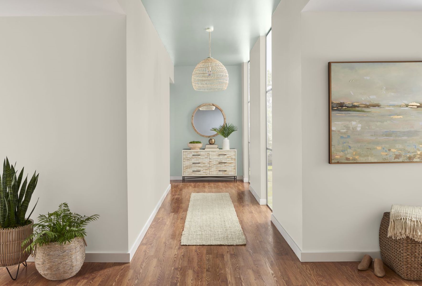
A relaxed dining room atmosphere is also becoming a favorite choice for homeowners seeking a warm, welcoming experience. Colors like cream, beige, white, off-white, and cool blues are excellent choices that help create an airy ambiance. These colors are refreshing and promote an open, harmonious flow within the dining room.
Creating Drama with a Painted Ceiling
A painted ceiling is a brilliant way to add contrast and dimension to any dining room space. Ceilings are often forgotten elements when it comes to room décor, but painted ceilings have become increasingly popular. Hues like aqua, celery green, and deep burgundy are all good color choices for a dramatic and stylish dining room.
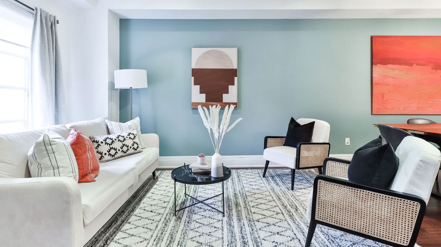
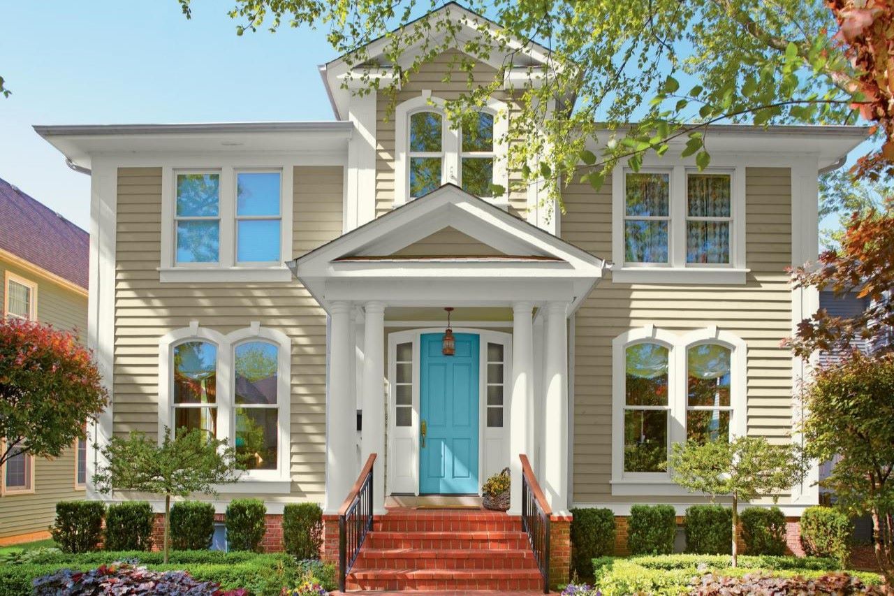
Accent Walls
Sometimes painting an entire dining room may be too daring for some homeowners—especially if the color is bright or spectacular. For those who are not committed to a room full of color, try an accent wall. By painting one wall and leaving the rest neutral-colored, you can create a breathtaking look in your dining room without overwhelming it. Accent walls come in any variety and serve as the perfect backdrop for other focal points within the room including striking buffets, china cabinets, and beautiful paintings.
Common Paint Color Mistakes to Avoid
When choosing paint colors for your home, it's essential to avoid common pitfalls that can lead to poor results. Here are some mistakes to steer clear of:
Rushing the Decision Process
One of the biggest mistakes homeowners make is rushing through the decision process. Taking time to consider various factors such as lighting conditions, color psychology, and room function can help ensure that you choose colors that are both aesthetically pleasing and functional.
Ignoring Lighting Conditions
Failing to consider lighting conditions can result in colors appearing differently than expected. Always test paint samples under various lighting conditions—morning, noon, and night—to get an accurate representation of how they will look in your dining room.
Overlooking Undertones
Undertones play a significant role in how colors appear. Darker colors on a paint swatch can show what undertone other colors on the strip have. If you're struggling to understand undertones, grab a friend or take your paint strip to your hardware store for assistance.
Not Sampling Enough
Sampling only one or two colors might not give you an accurate representation of how they will look together. Always sample multiple colors on all four walls before making a final decision.
Conclusion
Choosing the right paint colors for your dining room involves considering several factors including color psychology, lighting conditions, and room function. By following these tips and avoiding common mistakes, you can create a space that is both inviting and stylish. Remember that selecting paint colors is not just about aesthetics; it's also about creating an environment that enhances your dining experience.
Whether you prefer bold and modern or soft and relaxing colors, there's a perfect shade out there waiting for you. Take your time, do your research, and don't hesitate to seek professional advice if needed. With patience and persistence, you'll find the perfect paint color that transforms your dining room into a beautiful and functional space where memories are made.
Additional Tips from Experts
-
Nicole from Color Caravan emphasizes knowing your lighting and understanding undertones when selecting paint colors. She recommends sampling on all four walls and checking colors morning, noon, and night before making a final decision.
-
Bonnie Krims suggests starting with an existing object in your home to develop a color palette. This method helps ensure that the chosen colors have an emotional connection and can be easily matched with other elements in the room.
-
Residential house painters recommend using colors that stimulate appetite and conversation in kitchens and dining rooms. They advise against intense shades that might be overwhelming and suggest using bold colors as accents against neutral backdrops.
-
Decorating Den Interiors suggests avoiding certain colors like most shades of blue which can suppress appetite, pastel pink which grows outdated quickly, orange popsicle which evokes an unappealing "wow" factor, and poppy red which is known as an anger-inducing color.
By incorporating these expert tips into your decision-making process, you'll be well-equipped to choose the perfect paint colors for your dining room that enhance both its aesthetic appeal and functional purpose.
In conclusion, choosing the right paint colors for your dining room is an art that requires careful consideration of various factors including color psychology, lighting conditions, room function, and expert advice. By following these guidelines and avoiding common pitfalls, you can create a space that is not only beautiful but also functional and inviting. Remember that selecting paint colors is an investment in creating memories with family and friends in your home.
Was this page helpful?
At Storables.com, we guarantee accurate and reliable information. Our content, validated by Expert Board Contributors, is crafted following stringent Editorial Policies. We're committed to providing you with well-researched, expert-backed insights for all your informational needs.

0 thoughts on “How To Choose The Right Paint Colors For A Dining Room”