
Articles
What Colours Go Together In A Living Room
Modified: December 7, 2023
Discover expert tips and advice on choosing the perfect color combinations for your living room in our articles.
(Many of the links in this article redirect to a specific reviewed product. Your purchase of these products through affiliate links helps to generate commission for Storables.com, at no extra cost. Learn more)
Introduction
Choosing the right colors for your living room can have a significant impact on the overall ambiance and atmosphere of the space. The colors you select should not only reflect your personal style and preferences but also create a harmonious and inviting environment.
Understanding color theory and the principles of color harmony is essential when it comes to putting together a cohesive color scheme for your living room. By combining colors in a thoughtful and intentional way, you can create a visually appealing space that is both pleasing to the eye and promotes a sense of well-being.
In this article, we will explore various color schemes and combinations that work well in a living room setting. Whether you are looking for a bold and vibrant look or a more subdued and calming ambiance, we will provide you with the guidance and inspiration needed to transform your living room into a space that truly reflects your style and personality.
Before diving into the different color schemes, it’s important to have a basic understanding of color theory. Let’s take a closer look at the fundamentals of color and how they interact with each other.
Key Takeaways:
- Understanding color theory and the different color schemes, such as complementary, analogous, and monochromatic, can help you create a visually appealing and harmonious living room that reflects your personal style and evokes the desired atmosphere.
- Incorporating neutrals, accent colors, and patterns, along with strategic lighting considerations, can add depth, personality, and versatility to your living room’s color scheme, creating a welcoming and well-designed space.
Understanding Color Harmony
Color harmony refers to the aesthetic balance and pleasing combination of colors in a design or space. It involves the careful selection and arrangement of colors to create a sense of unity and coherence. When colors harmonize, they work together to create a visually appealing and balanced composition.
Color harmony is achieved by considering various aspects of color, including hue, saturation, value, and temperature. By understanding how these elements interact, you can create a harmonious color palette that evokes specific moods and emotions.
There are several different color harmonies or schemes to choose from, each with its own unique characteristics and visual impact. These schemes include complementary, analogous, split-complementary, triadic, tetradic, and monochromatic color schemes. Let’s explore each of these in more detail.
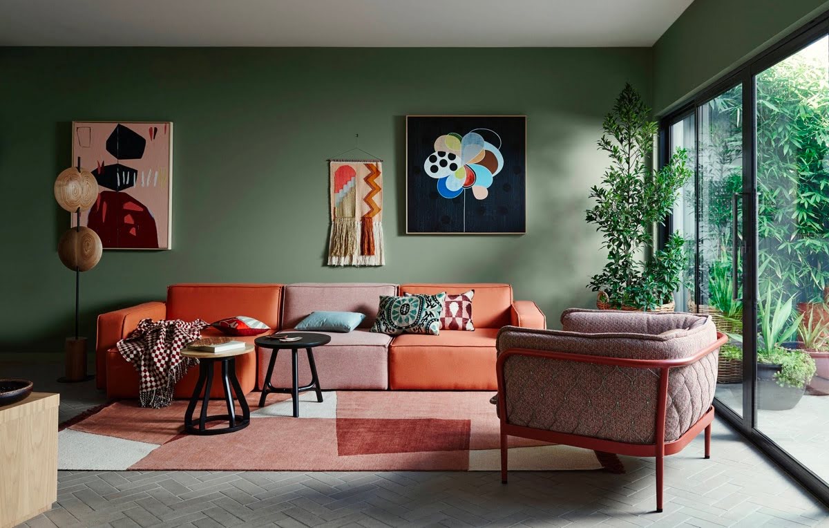
In a complementary color scheme, colors that are opposite each other on the color wheel are used together. For example, pairing shades of blue with orange or yellow with purple. This creates a high contrast and vibrant look. Complementary colors can be used to create a focal point or add a pop of color to a neutral space.
An analogous color scheme involves using colors that are adjacent to each other on the color wheel. For instance, combining shades of blue, green, and purple. This creates a harmonious and soothing effect, ideal for creating a calm and relaxing atmosphere in a living room.
In a split-complementary color scheme, instead of using the direct opposite color, you choose a color and then use the two colors on either side of its complement. This creates a balance between contrast and harmony. For example, pairing green with red-orange and red-violet.
A triadic color scheme uses three colors that are evenly spaced around the color wheel. This creates a vibrant and dynamic look. For example, using yellow, blue, and red together. Triadic color schemes are ideal for adding energy and interest to a living room.
A tetradic color scheme involves using four colors that are evenly spaced around the color wheel, forming a rectangle. This provides a lot of versatility and allows for a wide range of color combinations. For example, using yellow, green, blue-violet, and red-orange.
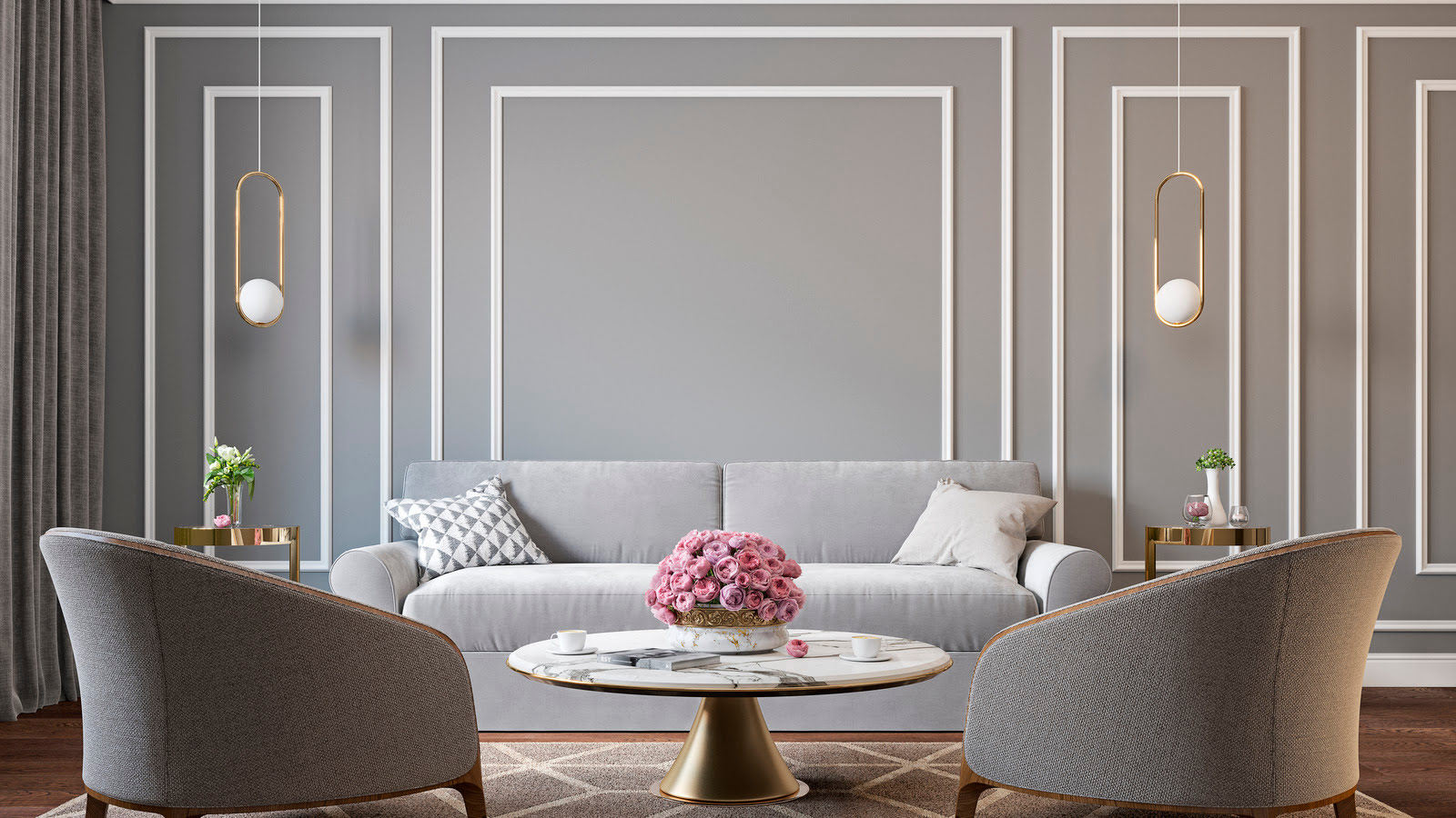
In a monochromatic color scheme, different shades, tints, and tones of a single color are used. This creates a harmonious and sophisticated look. For example, using various shades of blue in different elements of the living room.
Understanding color harmony and the different color schemes will help you make informed decisions when choosing colors for your living room. In the following sections, we will dive deeper into each color scheme, exploring how they can be applied and providing tips for successful color combinations.
Basic Color Theory
Color theory is the study of how colors interact and how they can be combined to create pleasing visual effects. It is based on the color wheel, which is a circular arrangement of colors that displays the relationship between primary, secondary, and tertiary colors.
The primary colors are red, blue, and yellow. These colors cannot be created by mixing other colors together and are used as the foundation for all other colors. When primary colors are combined, they create secondary colors. Red and blue, for example, create purple; blue and yellow create green, and red and yellow create orange.
Tertiary colors are created by mixing a primary color with a neighboring secondary color. This results in colors like red-orange, yellow-green, and blue-violet. Understanding the relationship between primary, secondary, and tertiary colors is essential in creating color harmony.
In addition to primary, secondary, and tertiary colors, there are also warm and cool colors. Warm colors include shades of red, orange, and yellow and are associated with energy, warmth, and excitement. Cool colors, on the other hand, include shades of blue, green, and purple and are associated with calmness, tranquility, and relaxation.
Another important aspect of color theory is value and saturation. Value refers to the lightness or darkness of a color, while saturation refers to the intensity or purity of a color. By adjusting the value and saturation of colors, you can create different visual effects and evoke different emotions.
When it comes to combining colors, there are a few principles to keep in mind. The first is the concept of color temperature. Warm colors tend to harmonize well with other warm colors, while cool colors work best when combined with other cool colors. However, using a mix of warm and cool colors can create dynamic and visually interesting compositions.
Contrast is another important principle in color theory. Contrasting colors, such as complementary colors, create a sense of vibrancy and visual excitement. On the other hand, using colors that are similar in hue, like an analogous color scheme, creates a more harmonious and soothing effect.
Understanding basic color theory will help you make informed choices when selecting colors for your living room. By considering factors like the color wheel, primary and secondary colors, warm and cool colors, value and saturation, and principles of contrast and harmony, you can create a visually appealing and harmonious color scheme that enhances the overall atmosphere of your living room.
Choosing a Dominant Color
When planning the color scheme for your living room, it’s important to start by choosing a dominant color. The dominant color will set the tone and serve as the primary focus of the room. This color will be the most prevalent and will guide the selection of other colors in the space.
There are a few factors to consider when selecting a dominant color. First, think about the mood or atmosphere you want to create in your living room. Different colors evoke different emotions and can have a significant impact on the overall feel of the space.
For example, if you want to create a calming and serene environment, consider choosing a dominant color from the cool color family, such as shades of blue or green. These colors have a soothing effect and can promote relaxation.
If you want to create a vibrant and energetic space, opt for a dominant color from the warm color family, such as shades of red or orange. These colors add warmth and create a more lively atmosphere.
Another factor to consider when choosing a dominant color is the size and layout of your living room. If you have a small space, it’s generally recommended to go with lighter and more neutral colors. Lighter colors open up the room and create an illusion of space.
On the other hand, if you have a larger living room, you have more flexibility to experiment with bold and richer colors. Darker shades can add depth and create a more intimate and cozy atmosphere. However, be mindful of the amount of natural light in the room, as darker colors can make the space appear smaller if there’s not enough light.
Additionally, consider the existing furnishings and decor in your living room. Take into account the colors and patterns of your furniture, curtains, rugs, and artwork. The dominant color should complement these elements and create a cohesive and harmonious look.
Finally, don’t be afraid to use your personal style and taste as a guide when selecting a dominant color. Look for colors that resonate with you and reflect your personality. Whether you prefer bold and vibrant shades or soft and subtle tones, choosing a dominant color that aligns with your style will make your living room feel more inviting and personalized.
Remember, the dominant color sets the foundation for the rest of the color scheme in your living room. Take your time to explore different options and consider the atmosphere you want to create, the size of the room, existing furnishings, and your personal style. With careful consideration, you can select a dominant color that sets the perfect tone for your living room.
Complementary Color Schemes
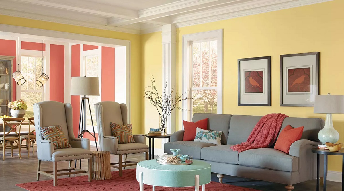
A complementary color scheme involves using colors that are opposite each other on the color wheel. This creates a high contrast and vibrant look that adds visual interest to your living room.
The key to successfully using a complementary color scheme is finding the right balance between the two colors. One color should serve as the dominant color, while the other acts as an accent color to create a focal point or add pops of color to a space.
For example, if you choose blue as your dominant color, its complementary color is orange. You can use various shades and tones of blue for the walls, furniture, and accessories, and then add accents of orange through throw pillows, artwork, or decorative pieces.
Another complementary color combination is purple and yellow. Purple can be used as the dominant color, creating a sense of depth and elegance in your living room. Yellow can then be incorporated as accents through curtains, rugs, or decorative items, adding a touch of vibrancy and energy.
When using a complementary color scheme, it’s best to choose one color as the main focus and use the other color sparingly. This creates a visually appealing balance and prevents the colors from overwhelming the space.
A complementary color scheme works well in a living room because it creates a dynamic and visually exciting environment. The contrasting colors add depth and interest to the space, making it feel more vibrant and lively.
However, it’s important to be mindful of the intensity and saturation of the colors when using a complementary color scheme. If both colors are highly saturated and bright, it can create a visually overwhelming effect. Consider using varying shades and tones of the complementary colors to create a more harmonious and balanced look.
Additionally, consider incorporating neutral colors to balance out the vibrant complementary colors and create a more cohesive color palette. Neutral colors like white, beige, or gray can serve as a backdrop and help tone down the intensity of the complementary colors.
Overall, a complementary color scheme is a bold and dramatic choice that can make a statement in your living room. With careful planning and attention to balance, this color scheme can create a visually striking and harmonious space that reflects your personal style.
Analogous Color Schemes
An analogous color scheme involves using colors that are adjacent to each other on the color wheel. This creates a harmonious and soothing effect, making it a popular choice for creating a cohesive color palette in a living room.
When using an analogous color scheme, you typically choose one dominant color and then incorporate the neighboring colors as accents and supporting tones. This allows for a smooth transition of colors and creates a sense of unity in the space.
For example, if you choose blue as your dominant color, the neighboring colors on the color wheel would be green and purple. You can use varying shades and tones of blue for the walls, furniture, and larger elements in the living room. Then incorporate touches of green and purple through accessories, such as throw pillows, curtains, or artwork.
An analogous color scheme is often used to create a calm and relaxing atmosphere in a living room. The soft transition between colors evokes a sense of harmony and cohesiveness. This color scheme works particularly well in spaces where you want to promote a soothing and tranquil ambiance.
When working with an analogous color scheme, it’s important to consider the saturation and value of the colors you choose. You can create depth and dimension by using different shades and tones of the dominant color. For instance, combining light and dark shades of blue can add visual interest to the space.
Another approach is to use different intensities of the neighboring colors to create contrast and variation. For example, combining a pale green with a deep purple can add richness and depth to the overall color scheme.
It’s also worth considering adding neutral tones to balance out the analogous color scheme. Neutral colors like white, beige, or gray can serve as a backdrop and allow the analogous colors to take center stage. They can also help create a sense of balance and prevent the colors from overpowering the space.
Overall, an analogous color scheme is a great choice for those who want to create a harmonious and soothing living room. By carefully selecting and combining analogous colors, you can achieve a sophisticated and balanced color palette that adds a sense of unity and tranquility to your space.
Split-Complementary Color Schemes
A split-complementary color scheme is a variation of the complementary color scheme. Instead of using the direct opposite color on the color wheel, this scheme involves selecting a color and then using the two colors on either side of its complement.
This color scheme provides a balanced combination of contrasting and harmonious colors, offering a unique and visually appealing look for your living room.
To create a split-complementary color scheme, start by selecting a dominant color. Let’s say you choose purple as your dominant color. The two colors on either side of its complement, which is yellow, are yellow-orange and yellow-green.
Incorporate the dominant color of purple into your space through the walls, furniture, or larger elements. Then use shades and tones of yellow-orange and yellow-green as accents and complementary tones.
This color scheme offers the benefits of both contrast and harmony. The dominant color provides a focal point, while the split-complementary colors add interest and depth to the overall color scheme.
Using a split-complementary color scheme can create a rich and balanced look in your living room. The combination of the three colors provides enough contrast to make the space visually dynamic, while maintaining a sense of harmony.
When working with a split-complementary color scheme, it’s important to consider the balance between the dominant color and the two split-complementary colors. The dominant color should remain the focal point and be used in larger proportions, while the split-complementary colors can be used as accents and in smaller doses.
To create a more cohesive look, consider incorporating neutral tones such as white, beige, or gray. These neutral colors can help balance out the vibrancy of the split-complementary colors and create a visually pleasing composition.
Experiment with different shades, tones, and intensities of the colors to create depth and dimension in your living room. You can use lighter shades of the dominant color for a softer and more subtle look, or opt for bolder and more intense hues for a vibrant and energetic ambiance.
Overall, a split-complementary color scheme offers a creative and balanced approach to color selection in your living room. By carefully choosing and combining the dominant color with its split-complementary colors, you can achieve a visually striking and harmonious color palette that adds interest and depth to your space.
Triadic Color Schemes
A triadic color scheme involves using three colors that are evenly spaced around the color wheel. This creates a vibrant and dynamic look for your living room, as it combines three colors that are visually stimulating and contrasting.
To create a triadic color scheme, start by selecting one dominant color. Let’s take blue as an example. The other two colors in the triadic scheme would be yellow and red, which are equidistant from blue on the color wheel.
Incorporate the dominant color, blue, into your living room through the walls, furniture, or larger elements. Then introduce touches of yellow and red as accents, such as through throw pillows, artwork, or decorative accessories.
A triadic color scheme provides a balanced combination of warm and cool colors, creating a visually pleasing and energetic atmosphere in your living room. The three contrasting colors work together to stimulate the senses and add vibrancy to the space.
When using a triadic color scheme, it’s important to maintain a balance between the colors. One color should serve as the dominant color, while the other two colors act as supporting accents. This helps create a visually harmonious composition.
Consider the saturation and intensity of the colors when working with a triadic color scheme. You can choose different shades and tones of each color to create depth and variation. For example, use a lighter shade of blue paired with a darker shade of yellow and a medium shade of red.
It can be helpful to incorporate neutral tones, such as white, beige, or gray, to balance out the triadic colors and create a cohesive color palette. Neutral colors can act as a backdrop and allow the triadic colors to take center stage.
It’s also important to consider the proportions of each color in the space. The dominant color should be used in slightly larger amounts, with the other two colors used as accents. This helps create a sense of balance and prevents one color from overpowering the others.
A triadic color scheme offers a bold and dynamic look for your living room. By carefully selecting and combining three colors that are evenly spaced on the color wheel, you can create a visually striking and harmonious color palette that adds energy and interest to your space.
When choosing colours for a living room, consider using a combination of complementary colours such as blue and orange, or analogous colours like green and yellow. This will create a harmonious and visually appealing space.
Tetradic Color Schemes
A tetradic color scheme, also known as a rectangle color scheme, involves using four colors that are evenly spaced around the color wheel, forming a rectangle. This color scheme offers a wide range of possibilities for creating a visually interesting and dynamic living room.
To create a tetradic color scheme, start by selecting one dominant color. Then, identify the two colors that are opposite each other on the color wheel from the dominant color. Lastly, choose the color that is between the two opposing colors, completing the rectangular shape on the color wheel.
For example, let’s choose purple as the dominant color. The two opposing colors on the color wheel would be yellow and green, while the color in between would be orange. With this tetradic color scheme, you have a rich combination of purple, yellow, green, and orange to work with in your living room.
To successfully incorporate a tetradic color scheme, begin by deciding how the colors will be distributed in the space. One option is to use the dominant color, purple, for the walls or larger pieces of furniture. Then, use the remaining colors, yellow, green, and orange, as accents in smaller elements such as throw pillows, curtains, or accessories.
When working with a tetradic color scheme, it’s essential to maintain a balance among the colors. Consider using various shades and tones of each color to create depth and harmony. This will prevent one color from overpowering the others and ensure a visually pleasing composition.
It can be helpful to use neutral tones as a backdrop or to incorporate them as a fifth color in the color scheme. Neutral colors such as white, beige, or gray can provide a visual break and help balance the vibrancy of the tetradic colors.
When using a tetradic color scheme, remember that you have a wide range of possibilities to explore. Experiment with different combinations and proportions of the colors to achieve the desired effect in your living room. Pay attention to the saturation and intensity of the colors to create a harmonious and balanced composition.
A tetradic color scheme offers a visually striking and dynamic look for your living room. By carefully selecting and combining four colors that form a rectangle on the color wheel, you can create a visually interesting and harmonious color palette that adds depth, vibrancy, and personality to your space.
Read more: What Color Mums Go Together
Monochromatic Color Schemes
A monochromatic color scheme involves using different shades, tints, and tones of a single color in your living room. This creates a harmonious and elegant look that is both visually pleasing and sophisticated.
When working with a monochromatic color scheme, start by selecting a color that you love and want to be the focus of your space. This color will serve as the dominant hue and will be used in varying intensities throughout the room.
For example, if you choose blue as your dominant color, you can incorporate lighter shades of blue for the walls, medium blue for furniture, and darker shades for accessories or accent pieces. By playing with the different values of blue, you can add depth and visual interest to your living room.
A monochromatic color scheme is versatile and allows for creativity within a specific color palette. You can experiment with different textures, patterns, and materials to create a visually dynamic space.
One benefit of using a monochromatic color scheme is the sense of cohesion it creates. Since all the colors used are variations of the same hue, they naturally complement each other, resulting in a visually unified and seamless design.
When using a monochromatic color scheme, it’s essential to incorporate contrast and variation to prevent the space from appearing flat or one-dimensional. Consider incorporating different textures, patterns, and materials. For instance, pairing a smooth velvet sofa with a textured rug or adding patterned throw pillows can add visual interest and break up the monotony.
Additionally, consider incorporating different shades and tones of neutral colors to balance out the monochromatic color palette. Neutrals like white, beige, or gray can serve as a backdrop and highlight the various shades of the dominant color.
Lighting also plays a crucial role in showcasing a monochromatic color scheme. Proper lighting can enhance the different shades and create depth in the space. Consider incorporating a mix of natural and artificial lighting to bring out the subtleties of the colors.
A monochromatic color scheme offers a timeless and sophisticated look for your living room. By carefully selecting and using different shades, tints, and tones of a single color, you can create a visually stunning and harmonious color palette that adds elegance and depth to your space.
Tips for Successful Color Combinations
Choosing the right color combinations for your living room can be a daunting task. However, with a few tips and guidelines, you can create a successful color palette that transforms your space into a visually appealing and harmonious environment. Here are some tips to keep in mind:
- Start with inspiration: Look for inspiration in magazines, online platforms, or nature. Pay attention to color combinations that catch your eye and evoke the desired mood for your living room.
- Consider the function and mood: Think about the purpose of your living room and the atmosphere you want to create. Choose colors that align with the intended mood – calm and relaxing, energetic and vibrant, or sophisticated and elegant.
- Understand color psychology: Different colors evoke different emotions and moods. Research the psychological effects of colors to ensure your chosen colors align with the desired ambiance of your living room.
- Use the 60-30-10 rule: To create a well-balanced color scheme, stick to the 60-30-10 rule. Use the dominant color for about 60% of the space (e.g., walls), the secondary color for 30% (e.g., furniture), and the accent color for the remaining 10% (e.g., accessories).
- Create contrast: Contrast helps elements stand out and adds visual interest. Incorporate contrasting colors to create depth and focal points in your living room. For example, pair light colors with dark colors or warm colors with cool colors.
- Consider color temperature: Warm colors (reds, oranges, yellows) create a cozy and inviting atmosphere, while cool colors (blues, greens, purples) evoke a sense of calmness and serenity. Use color temperature to set the desired mood in your living room.
- Play with shades and tones: Incorporate different shades, tones, and intensities of a color to add depth and variation to your color scheme. Lighter shades can create a softer and more subtle look, while darker tones can add richness and drama.
- Don’t forget about neutrals: Neutrals such as white, beige, gray, or black can balance out vibrant colors and create a sense of cohesion. Use neutrals as a backdrop or to allow other colors in your scheme to stand out.
- Test colors in different lighting conditions: Lighting can significantly affect how colors appear. Test your color choices in different lighting conditions, including natural daylight and artificial lighting, to ensure they look as intended.
- Trust your instincts: Ultimately, go with colors that resonate with you and reflect your personal style. Trust your instincts and choose colors that you love and enjoy being surrounded by.
By considering these tips and guidelines, you can confidently select and combine colors for your living room that create a visually pleasing, harmonious, and personalized space. Remember to trust your own sense of style and have fun exploring different color combinations to find the perfect palette for your living room.
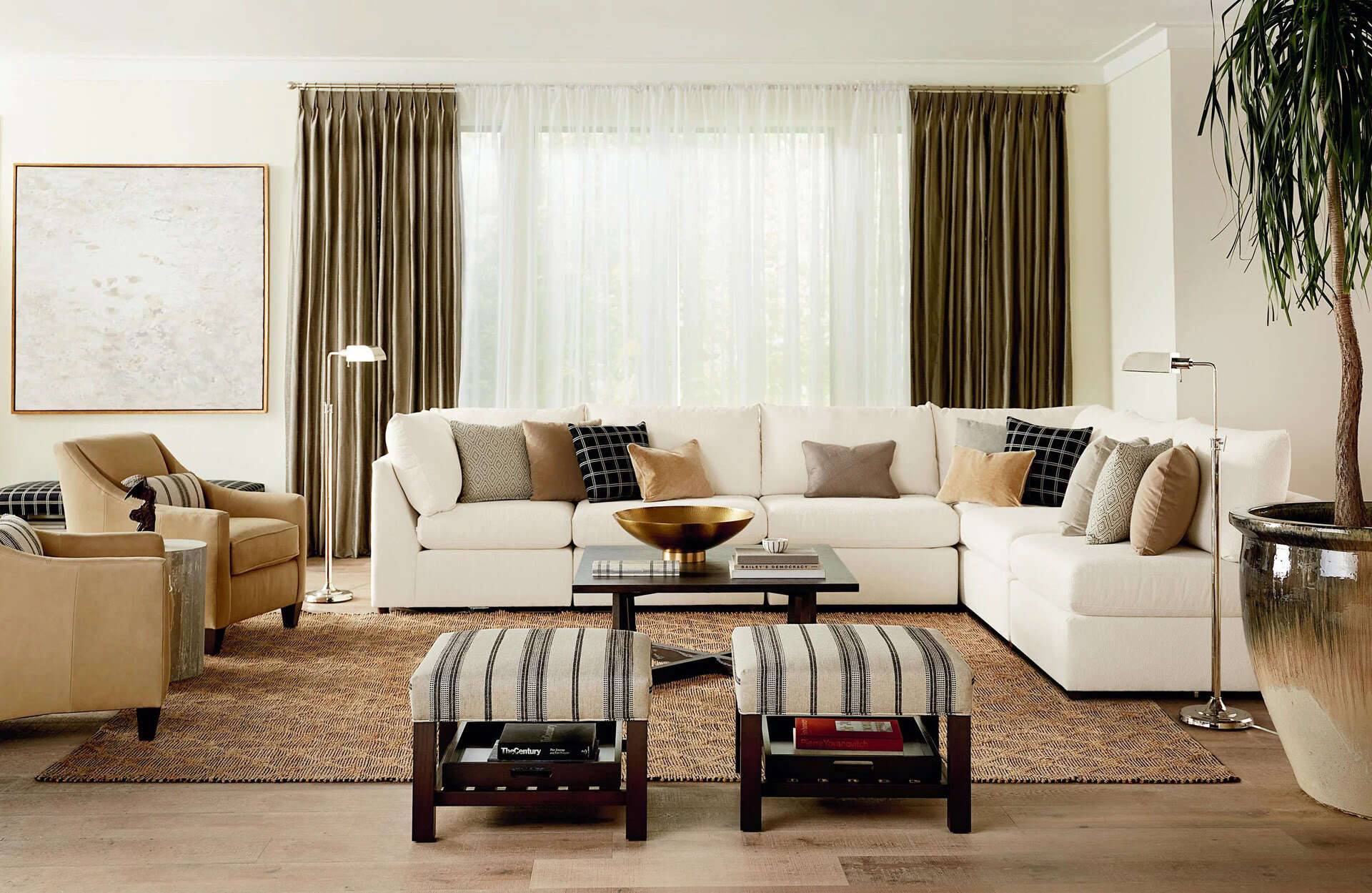
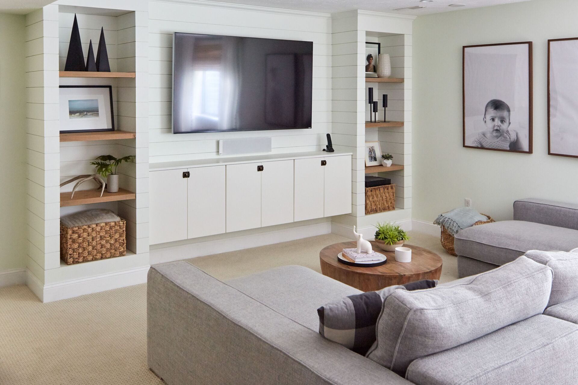
Incorporating Neutrals
When designing your living room’s color scheme, incorporating neutrals is a key element in creating a balanced and versatile space. Neutrals serve as a backdrop and anchor for the other colors in your palette, adding a sense of calmness and cohesion to the overall design.
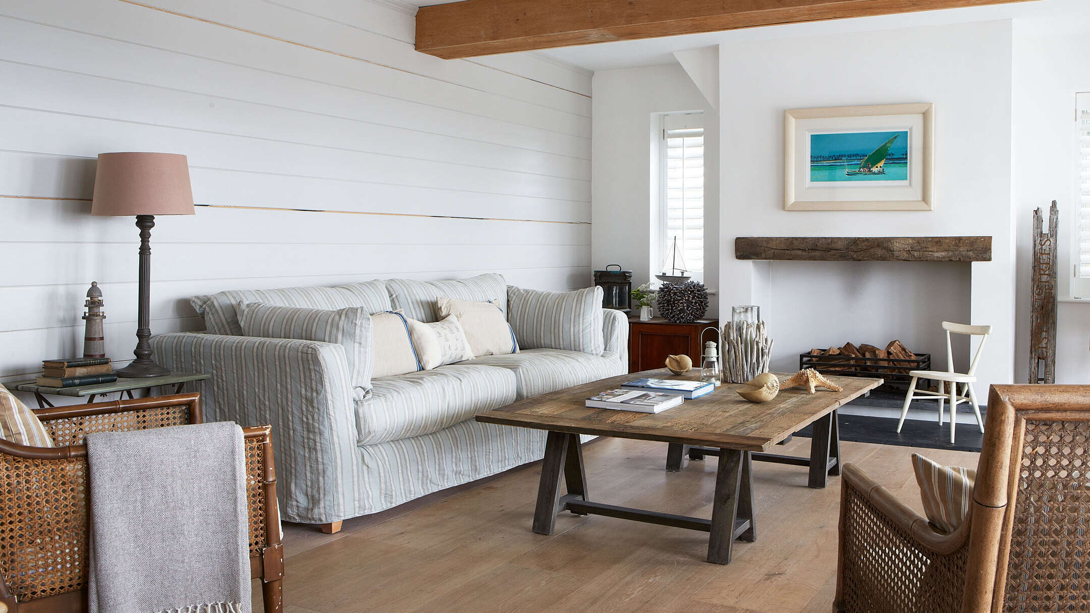
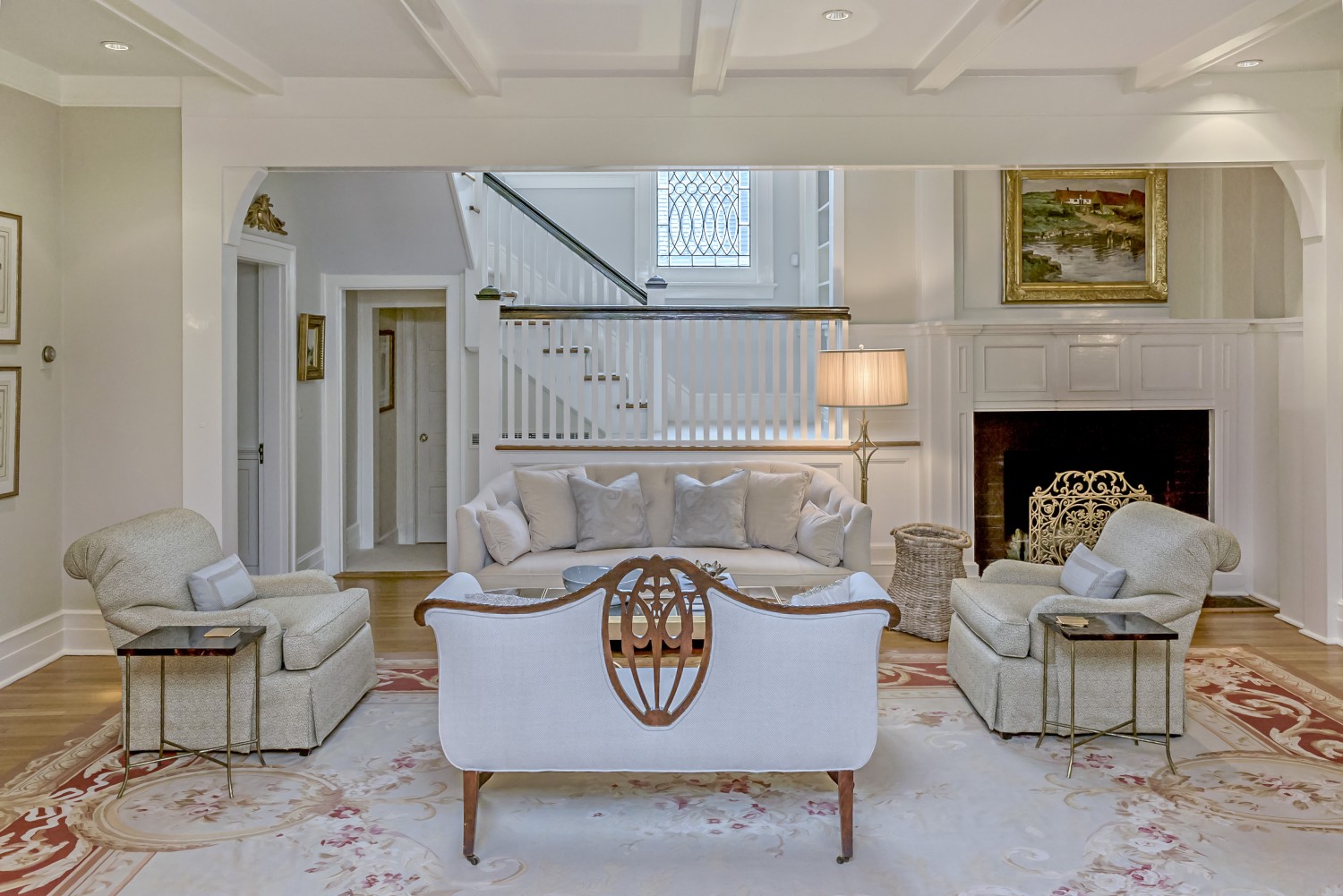
Neutrals encompass a range of colors, including white, beige, gray, and black. These hues are often considered timeless and can complement any style or color scheme, making them an excellent choice for your living room.
One way to incorporate neutrals is by using them as a dominant color throughout the space. Painting the walls in a soft, warm beige or a cool and crisp shade of white creates a neutral canvas that allows other colors to shine. Neutrals on the walls provide versatility, as they are easily complemented by a variety of furniture and accent colors.
In addition to wall color, you can infuse neutrals into your living room through furniture and textiles. Whether it’s a neutral-toned sofa, area rug, or curtains, using neutral-colored furniture and textiles adds depth and texture to the room while maintaining a clean and cohesive look.
Another way to incorporate neutrals is by choosing neutral-colored accessories and decor items. For instance, opting for neutral throw pillows, blankets, and decorative accents allows you to easily switch out and experiment with different colors in the future. This versatility is particularly useful if you enjoy updating the look of your living room from time to time.
When working with neutrals, consider their undertones and how they can complement or contrast with other colors. Cool neutrals like gray and white work well with cooler colors, such as blues and greens, creating a calming and modern feel. Warm neutrals, such as beige or cream, pair beautifully with warmer colors like reds and yellows, producing a cozy and inviting ambiance.
Additionally, don’t be afraid to play with different textures and materials within the neutral color palette. Mixing soft fabrics, like velvet or linen, with rougher textures, like woven baskets or weathered wood, adds visual interest and depth to the room.
Lastly, remember that neutrals can also be used to balance out bolder and more vibrant colors in your living room. If you have chosen a vibrant or saturated color as your dominant or accent color, incorporating neutrals will help prevent the space from feeling overwhelming or visually busy.
Incorporating neutrals into your living room’s color scheme provides a timeless and versatile foundation. By using neutrals as the backdrop, you can create a harmonious and balanced space that allows other colors and design elements to shine. Whether it’s through wall color, furniture, accessories, or textiles, neutrals add a sense of calmness and elegance to your living room.
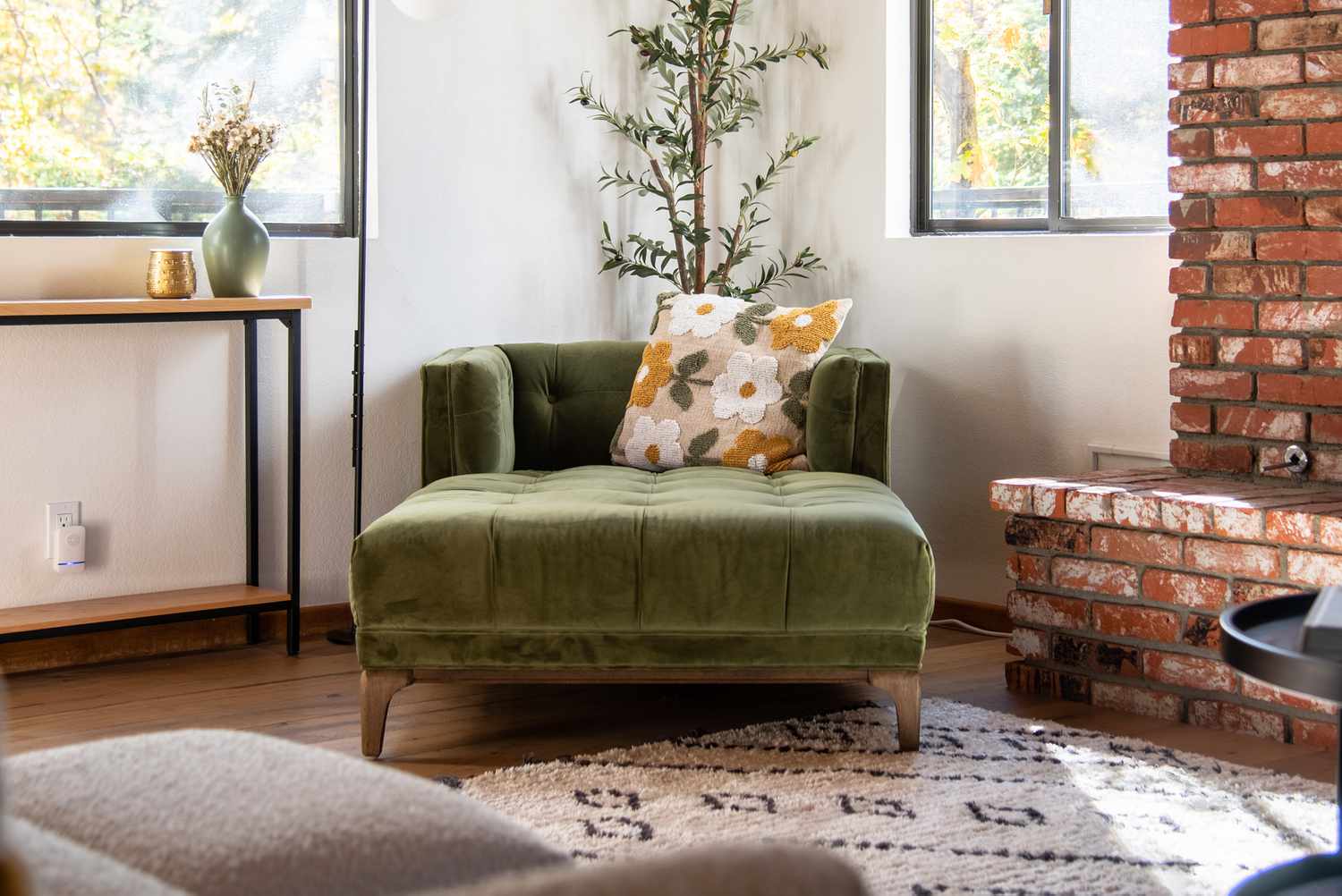
Accent Colors and Patterns
When designing your living room’s color scheme, accent colors and patterns play a crucial role in adding depth, visual interest, and personality to your space. They act as focal points and can create a vibrant and dynamic atmosphere in your living room.
Accent colors are typically bold and vibrant hues that are used sparingly throughout the room to create pops of color and draw attention to specific elements. They can be incorporated through furniture, artwork, accessories, or statement pieces.
One approach to selecting accent colors is to choose shades that complement the dominant color in your color scheme. For instance, if your living room’s dominant color is a cool shade of blue, you can introduce an accent color like orange or yellow to create a striking contrast. This creates visual excitement and adds energy to the space.
Another way to choose accent colors is by using complementary colors. Colors that are opposite each other on the color wheel, such as blue and orange or purple and yellow, create a high contrast and visually interesting effect. By incorporating accent colors that are complementary to your dominant color, you can achieve a harmonious and balanced composition in your living room.
When selecting patterns for your living room, consider the scale and style of the space. Patterns add visual interest and texture to the room, so it’s essential to choose patterns that complement the overall aesthetic.
For instance, if your living room has a more traditional or classic style, consider incorporating timeless patterns like florals, damask, or stripes. These patterns can be used in upholstery, curtains, or even as a wallpaper in a feature wall to add a touch of elegance and a sense of familiarity.
If your living room has a more modern or eclectic style, you can opt for bold and geometric patterns. These patterns can be incorporated through rugs, throw pillows, or statement artwork. They add a contemporary and artistic touch to the space.
Be mindful of the scale of the patterns and how they interact with the other elements in the room. If you have a small living room, consider using smaller-scale patterns to avoid overwhelming the space. In larger rooms, you have the freedom to play with larger or more intricate patterns.
Remember to use patterns strategically and in moderation. A few well-placed patterned elements can create visual interest and make a statement, while too many patterns can create a chaotic and busy look. Balance the use of patterns with solid colors and neutrals to maintain a sense of cohesion and balance in your living room.
Accent colors and patterns are essential in adding personality and visual interest to your living room. They can be used to create focal points, add pops of color, and set the overall mood of the space. By carefully selecting accent colors that complement your dominant color and incorporating patterns that align with your style, you can create a visually captivating and well-designed living room.
Considerations for Lighting
When designing your living room, lighting is a crucial element that can greatly influence the overall ambiance and functionality of the space. Proper lighting not only illuminates the room but also enhances the colors, textures, and mood of your design. Here are some important considerations for lighting your living room:
Natural Light: Take advantage of natural light as much as possible. Maximize the amount of natural light by using sheer curtains or blinds that allow sunlight to filter in. Natural light adds a sense of warmth and openness to the space, making it feel inviting and comfortable.
Artificial Lighting: Supplement natural light with artificial lighting to create a well-lit and versatile space. Incorporate a variety of lighting fixtures such as ceiling lights, wall sconces, floor lamps, and table lamps. This combination of lighting sources provides both ambient and task lighting, allowing you to adjust the lighting levels based on the desired mood or activity.
Ambient Lighting: Ambient lighting refers to the overall illumination of a space. It can be achieved through the use of general lighting fixtures, such as ceiling lights or chandeliers. Consider the size and height of your living room when selecting ambient lighting fixtures. Ensure they provide sufficient light coverage without overwhelming the space.
Task Lighting: Task lighting serves a specific purpose, providing focused light for activities such as reading, working, or playing games. Consider incorporating task lighting through floor lamps or table lamps positioned near seating areas or workspaces. This targeted lighting enhances functionality in specific areas of the living room.
Accent Lighting: Accent lighting highlights specific elements or areas in your living room, creating visual interest and emphasizing architectural features or decorative objects. Use accent lighting to showcase artwork, display shelves, or focal points like a fireplace. Spotlights, track lighting, or adjustable wall sconces can be used to create effective accent lighting.
Dimmers: Install dimmers for your lighting fixtures to have control over the intensity and mood of the light. Dimmers allow you to adjust the lighting levels according to different activities or times of the day, creating a more dynamic and customizable living environment.
Color Temperature: Consider the color temperature of the lighting sources you choose. Cool white light (higher color temperature) can create a more energetic and stimulating atmosphere, while warm white light (lower color temperature) provides a cozy and inviting ambiance. Experiment with different bulbs or LED strips to find the color temperature that best suits your living room’s design and desired mood.
Layered Lighting: Combining different types of lighting sources creates a layered effect, resulting in a well-balanced and visually appealing living room. Layered lighting incorporates ambient, task, and accent lighting to provide depth and flexibility in the lighting design.
Lighting Control: Consider incorporating smart lighting controls or dimming systems that allow you to adjust and program your lighting preferences. Smart lighting systems offer convenience and the ability to create different lighting scenes and moods with just a few taps or voice commands.
Lighting Placement: Strategically place lighting fixtures to ensure even distribution of light and to avoid shadows or dark spots. Consider the layout and function of your living room when positioning lighting fixtures, and ensure they are easily accessible and do not obstruct the flow of the space.
With careful consideration of natural and artificial lighting options, the appropriate selection of lighting fixtures, and the thoughtful placement of fixtures, you can create a well-lit living room that enhances the aesthetic and functionality of your space. Lighting plays a crucial role in setting the mood, emphasizing design elements, and creating a welcoming and comfortable environment for you and your guests to enjoy.
Conclusion
Designing the color scheme for your living room is an exciting and creative process. By understanding color theory, exploring different color harmonies, and considering the mood and functionality of your space, you can create a visually appealing and harmonious living room that reflects your personal style and evokes the desired atmosphere.
Whether you choose a complementary color scheme for a vibrant and energetic look, an analogous color scheme for a soothing and harmonious feel, or a monochromatic color scheme for a timeless and sophisticated ambiance, each color scheme has its own unique benefits and visual impact.
Incorporating accent colors and patterns adds depth and personality to the space, creating a focal point and enhancing visual interest. By carefully selecting accent colors that complement your dominant color and incorporating patterns that align with your style, you can create a visually captivating and well-designed living room.
Considering lighting is essential for creating the desired mood, enhancing colors, and providing functionality in your living room. A combination of natural and artificial lighting sources, including ambient, task, and accent lighting, creates a well-lit and versatile space. By strategically placing lighting fixtures, using dimmers, and considering color temperature, you can create a balanced and inviting atmosphere.
Incorporating neutrals, such as whites, beiges, grays, or blacks, creates a timeless foundation and allows other colors and elements to stand out. Neutrals provide a sense of calmness and cohesion, balancing vibrant colors and adding versatility to your living room’s color scheme.
When designing your living room’s color scheme, trust your instincts, seek inspiration, and have fun experimenting with different combinations. Remember to consider the proportions, the scale of patterns, the lighting conditions, and the overall mood you want to create.
By applying these principles, understanding color theory, and infusing your personal style, you can create a living room that is visually appealing, harmonious, and tailored to your preferences. Whether you prefer a bold and vibrant space or a subtle and calming atmosphere, the right color scheme can transform your living room into a welcoming and inviting sanctuary.
Take the time to explore various color schemes, experiment with different shades and tones, and find the perfect combination that brings your living room to life. The color scheme you choose will not only enhance the aesthetic appeal of your space but also create an environment that caters to your unique taste and needs.
So, unleash your creativity, embrace the power of color, and enjoy the process of designing a truly remarkable living room that will bring you joy and comfort for years to come.
Frequently Asked Questions about What Colours Go Together In A Living Room
Was this page helpful?
At Storables.com, we guarantee accurate and reliable information. Our content, validated by Expert Board Contributors, is crafted following stringent Editorial Policies. We're committed to providing you with well-researched, expert-backed insights for all your informational needs.
0 thoughts on “What Colours Go Together In A Living Room”