Home>Interior Design>How Do I Know What Colors Go Together?
Interior Design
How Do I Know What Colors Go Together?
Modified: January 19, 2024
Discover the perfect color combinations for your interior design projects. Learn how to create harmonious color schemes and make your space visually appealing.
(Many of the links in this article redirect to a specific reviewed product. Your purchase of these products through affiliate links helps to generate commission for Storables.com, at no extra cost. Learn more)
Introduction
Choosing the right color combination is essential in any interior design project. Colors can greatly impact the overall look and feel of a space, evoking different emotions and setting different moods. However, knowing which colors go well together can be a daunting task for many people.
Luckily, there are principles of color theory that can help guide us in selecting harmonious color combinations. Understanding these concepts can not only make the decision-making process easier but also result in a visually appealing and cohesive design.
In this article, we will explore various color schemes and how they can be used effectively in interior design. By the end, you’ll have a better understanding of how to choose the perfect color combinations that reflect your style and create a harmonious and inviting space.
Key Takeaways:
- Understanding color theory and different color schemes is essential for creating visually appealing and harmonious interior designs. By utilizing the principles of color coordination, you can evoke specific emotions and set the desired mood in any space.
- Incorporating contrast in colors, textures, and elements is crucial for adding depth and visual interest to interior designs. Experimenting with different color palettes and personalizing your choices can result in stunning and inviting spaces that reflect your unique style.
Read more: What Color Mums Go Together
Understanding Color Theory
Color theory is the study of how colors interact with each other and how they can be combined to create visually pleasing compositions. It is a fundamental aspect of art and design, including interior design. By understanding color theory, you can effectively use color to evoke specific emotions, create balance, and enhance the overall aesthetic of a space.
One of the key concepts in color theory is the color wheel. The color wheel is a visual representation of the spectrum of colors, arranged in a circular format. It consists of primary colors (red, blue, and yellow), secondary colors (green, orange, and purple), and tertiary colors (blue-green, red-violet, etc.). The color wheel provides a foundation for understanding various color relationships.
There are different types of color schemes that can be derived from the color wheel, each with its own unique characteristics and visual impact. Let’s explore some of the most common color schemes used in interior design.
The Color Wheel
The color wheel is an essential tool in understanding color relationships and creating harmonious color combinations. It is divided into different sections that represent primary, secondary, and tertiary colors. These sections allow us to identify different color schemes and how they can be utilized in interior design.
The primary colors, which are red, blue, and yellow, cannot be created by mixing any other colors together. They are the foundation for all other colors. Mixing two primary colors together creates secondary colors. For example, mixing red and blue creates purple, mixing blue and yellow creates green, and mixing red and yellow creates orange.
Tertiary colors are created by mixing a primary color with a neighboring secondary color on the color wheel. This results in colors like yellow-orange, blue-green, and red-violet.
By understanding the relationships between these colors on the color wheel, we can create visually pleasing color schemes that complement each other.
Now that we have a basic understanding of the color wheel, let’s explore some common color schemes used in interior design.
Complementary Colors
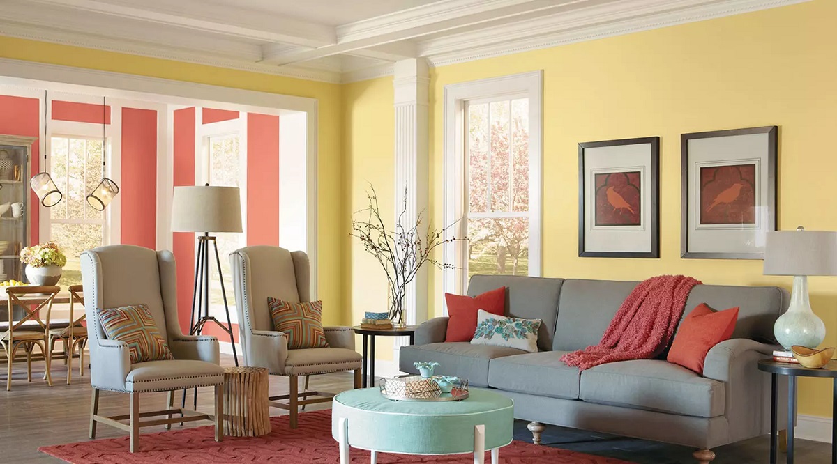
Complementary colors are colors that are opposite each other on the color wheel. They create a high contrast effect and can make each other appear more vibrant when placed together in a design. Complementary color schemes are often used to create dynamic and visually striking interiors.
Examples of complementary color combinations include red and green, blue and orange, and yellow and purple. When using complementary colors, it’s important to consider the intensity and saturation of the colors to ensure they balance each other harmoniously in a space.
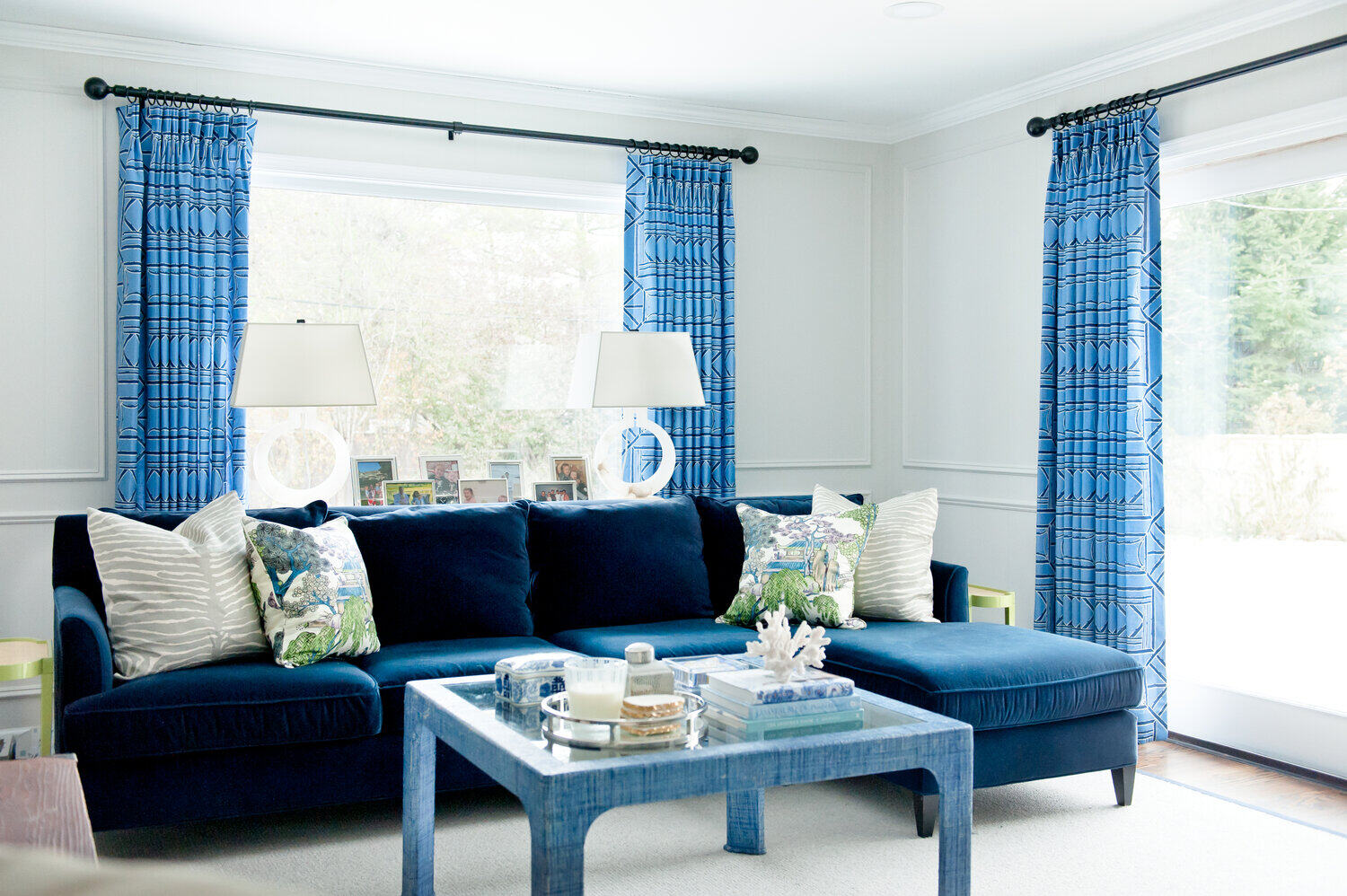
In interior design, complementary colors can be used to create focal points and add visual interest. For instance, using a deep blue couch against a vibrant orange wall can create a bold and eye-catching centerpiece in a living room.
It’s important to note that when working with complementary colors, it’s best to have one color dominate while using the other as an accent. This helps create a balanced and pleasing composition.
Complementary color schemes can be particularly effective in areas where you want to create a sense of energy and excitement, such as a game room or an entertainment space.
Analogous Colors
Analogous colors are colors that are adjacent to each other on the color wheel. These color combinations create a sense of harmony and unity as they share similar undertones. Analogous color schemes are often used to create a cohesive and calming atmosphere in interior design.
For example, a common analogous color scheme is using shades of blue, green, and teal. These colors work well together as they create a calming and natural aesthetic. Other examples include yellow, orange, and red or purple, blue, and violet.
Analogous color schemes are versatile and can be applied to an entire space or used in specific areas to create a focal point. For instance, using different shades of green in a bedroom can create a serene and soothing environment.
When using analogous colors, it’s important to vary the saturation and intensity of the colors to add depth and visual interest. This can be achieved by using lighter and darker shades within the same color family.
Analogous color schemes are widely used in interior design to create a cohesive and balanced look. They work well in areas where you want to create a sense of harmony, such as bedrooms, living rooms, or offices.
Read more: What Colours Go Together In A Living Room
Triadic Colors
Triadic colors are three colors that are evenly spaced around the color wheel, forming an equilateral triangle. This color scheme creates a vibrant and balanced look and is often used to add visual interest and excitement to interior design.
The triadic color scheme offers a mix of warm and cool colors, allowing for a wide range of design possibilities. Some popular triadic color combinations include red, yellow, and blue or orange, green, and purple.
When using a triadic color scheme, it’s important to select one dominant color and use the other two as accents to create a visually appealing composition. Balancing the proportions of each color is key to maintain harmony and avoid overpowering a space.
Triadic color schemes work well in areas where you want to make a bold statement or create a playful atmosphere. They can be used in various ways, such as incorporating the colors in furniture, accessories, or even wall paint.
When implementing a triadic color scheme, it’s essential to consider the overall balance and cohesiveness of the space. As these color combinations can be vibrant and energetic, it’s recommended to use them in moderation and balance them with neutral elements to create a harmonious design.
With careful consideration of the color balance, a triadic color scheme can add a visually striking and dynamic look to any interior space.
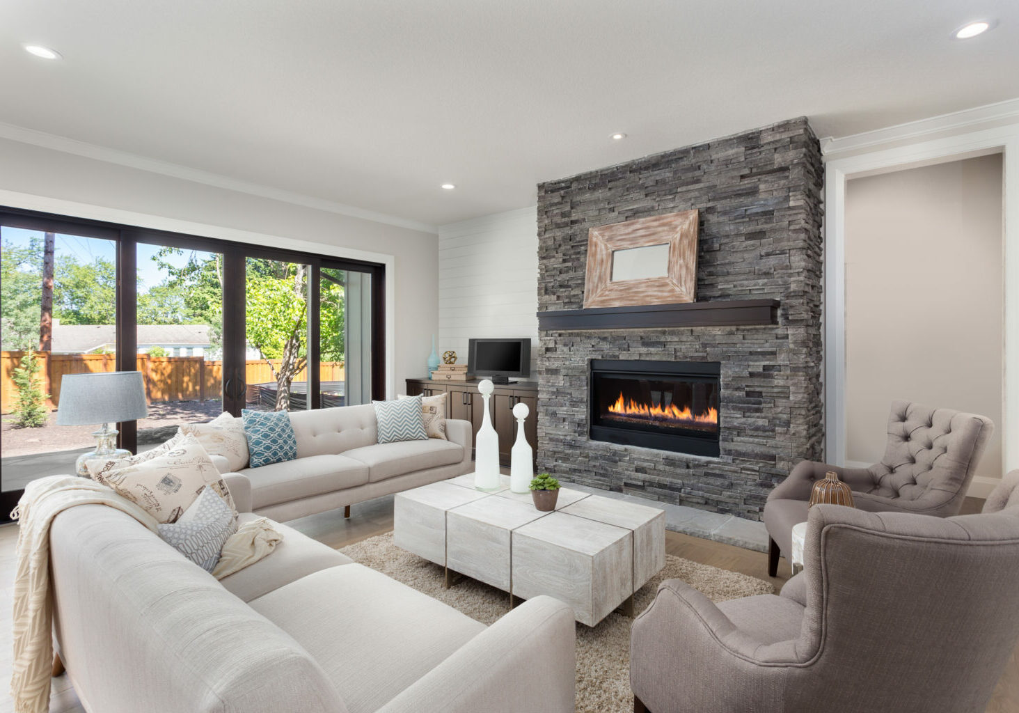
Monochromatic Colors
Monochromatic color schemes are based on a single color that is varied in saturation, brightness, and shade. This color scheme creates a harmonious and sophisticated look, with different tones of the same color used throughout the space.
When using a monochromatic color scheme, the variations in the intensity of the color can add depth and dimension to the design. For example, a monochromatic color scheme in shades of blue can include light blue, navy blue, and teal, creating a serene and calming atmosphere.
Monochromatic color schemes are versatile and can be applied to any interior style. They provide a cohesive and polished look, and the lack of contrasting colors allows other elements in the space to stand out.
To prevent a monochromatic scheme from feeling flat, it’s important to incorporate different textures and patterns. This can be done through the use of different fabrics, materials, and finishes, adding visual interest and tactile appeal.
Monochromatic color schemes are popular in minimalist and modern interior design, as they create a clean and sophisticated aesthetic. They are also well-suited for smaller spaces, as they can make the room appear larger and more cohesive.
When working with a monochromatic color scheme, it’s essential to pay attention to lighting. Different shades of the same color can appear differently under various lighting conditions, so it’s important to test the colors in the actual space and consider natural and artificial lighting sources.
Overall, monochromatic color schemes offer a timeless and elegant look, allowing for a cohesive and visually appealing interior design.
Look at a color wheel to find complementary colors (opposite each other), analogous colors (next to each other), or triadic colors (evenly spaced). This will help you create harmonious color combinations.
Split-Complementary Colors
Split-complementary colors are a variation of the complementary color scheme. Instead of using one complementary color, split-complementary colors utilize two adjacent colors to the complement. This allows for a balanced and visually appealing design with a bit more variety.
When using a split-complementary color scheme, the main color is paired with two colors that are located on each side of its complement on the color wheel. For example, if the main color is blue, the split-complementary scheme could include yellow-orange and red-orange as the secondary colors.
This color scheme maintains the vibrancy and contrast of complementary colors while adding a touch of variety and nuance. The split-complementary scheme creates visual interest and depth without being as intense as a complementary scheme.
In interior design, split-complementary color schemes can be used to create a focal point or add visual interest to a space. For example, in a living room with a neutral color palette, using a split-complementary scheme for accent pieces like throw pillows or artwork can bring life and excitement to the room.
To ensure a harmonious design, it’s important to balance the proportions of the colors. The main color should still dominate, while the secondary colors are used as accents to create a cohesive and pleasing composition.
Split-complementary color schemes offer versatility and can be adapted to various design styles. Whether you prefer a bold and vibrant look or a more subdued and subtle approach, this color scheme provides flexibility and room for creativity.
When working with a split-complementary color scheme, it’s helpful to use color tools or consult a color wheel to ensure that the chosen colors create a balanced and visually appealing combination.
Overall, split-complementary color schemes offer a unique and visually dynamic alternative to traditional complementary schemes, allowing for a harmonious yet exciting design.
Tetradic Colors
Tetradic colors, also known as rectangular colors, are a color scheme that involves using four colors evenly spaced around the color wheel. This color scheme creates a vibrant and visually striking design with a balanced distribution of warm and cool colors.
When using a tetradic color scheme, it’s important to select one dominant color and use the other three as accents. This helps establish a harmonious composition while adding visual interest and variety.
For example, a tetradic color scheme could include a combination of purple, yellow-green, orange, and blue. The dominant color, such as purple, can be used as the main color for furniture or walls, while the other colors are incorporated through accessories, artwork, or textiles.
Tetradic color schemes offer a wide range of color combinations and allow for flexibility in design. They provide an opportunity to explore different color harmonies and create a bold and dynamic space.
When working with a tetradic color scheme, it’s important to consider the balance of warm and cool colors. This balance can be achieved by varying the intensity and tone of each color, creating a visually pleasing composition.
One way to ensure a harmonious design is to establish a color hierarchy. This means assigning roles to each color within the scheme, such as a dominant color, secondary colors, and an accent color. This helps create a focal point and maintain a cohesive visual flow.
Tetradic color schemes are often used in more eclectic or adventurous interior designs, as they offer a wide range of color combinations and allow for creative expression. They can add depth and vibrancy to any space, whether it’s a living room, bedroom, or even a kitchen.
With proper color coordination and thoughtful application, a tetradic color scheme can result in a visually stunning and balanced interior design.
Using Color Schemes in Design
Color schemes play a crucial role in interior design as they set the mood, create visual interest, and establish a cohesive look in a space. Understanding different color schemes and how to use them effectively can help you achieve the desired atmosphere and aesthetic in your design.
When incorporating color schemes in your design, it’s important to consider the purpose of the space and the emotions you want to evoke. Each color scheme has its own unique characteristics and can create different effects.
Complementary colors, for example, can add energy and vibrancy to a room, while analogous colors offer a sense of harmony and tranquility. Monochromatic schemes create a sophisticated and cohesive look, while split-complementary and tetradic schemes provide a more dynamic and adventurous feel.
To effectively use color schemes in design, consider the following tips:
- Create a focal point: Use a bold color from the chosen color scheme to draw attention and create a focal point in the room. This can be achieved through an accent wall, a statement piece of furniture, or vibrant artwork.
- Balance the colors: Pay attention to the proportions and distribution of colors in the space. Consider using the dominant color in larger areas, secondary colors as accents, and neutral shades to provide balance and visual relief.
- Consider the lighting: Take into account the natural and artificial lighting in the room when selecting colors. Lighting can affect how colors appear, so test the colors in different lighting conditions to ensure they achieve the desired effect.
- Coordinate with other design elements: Consider how the color scheme interacts with other design elements such as furniture, flooring, and accessories. Ensure that the colors harmonize with the overall aesthetic and style you want to achieve.
- Experiment and personalize: Don’t be afraid to experiment with different color schemes and make adjustments to suit your personal taste and style. Interior design is a creative process, and finding the right color combination may involve some trial and error.
Remember, color schemes are just one aspect of interior design, and they should complement the overall theme and purpose of the space. Consider the function of the room, the desired atmosphere, and the preferences of those who will be using it.
By carefully selecting and implementing the appropriate color scheme, you can create a visually appealing and harmonious design that reflects your personal style and enhances the overall aesthetic of the space.
Importance of Contrast
When it comes to interior design, contrast is a powerful tool that can elevate the visual impact of a space. Contrast refers to the juxtaposition of different elements, such as colors, textures, patterns, or shapes. It creates visual interest, adds depth, and helps distinguish between various design elements.
One of the most common forms of contrast in design is color contrast. When combining colors, creating contrast involves using hues that are significantly different from each other.
The importance of contrast in interior design cannot be overstated. Here are a few reasons why contrast is essential:
- Enhancing visual appeal: Contrast adds excitement and intrigue to a space. It creates a focal point and draws the eye to specific areas or elements that you want to highlight.
- Providing depth and dimension: Contrast adds depth and makes a space feel more dynamic. By using contrasting colors or textures, you can create a sense of depth and make the room appear more visually interesting.
- Improving readability and clarity: Contrast enhances readability and helps define different elements in a space. For example, using light-colored text on a dark background improves legibility, making it easier to read.
- Creating visual hierarchy: Contrast can be used to establish a visual hierarchy, guiding the viewer’s attention to specific elements in the design. By using contrasting colors or sizes, you can emphasize important elements and create a sense of order and organization.
- Avoiding monotony: Without contrast, a design can appear monotonous and flat. Contrast helps break up the monotony by adding variety and interest.
When using contrast in interior design, it’s important to find the right balance. Too much contrast can be overwhelming, while too little can result in a bland and uninteresting design. Strive for a balance that suits your personal style and the desired atmosphere of the space.
Experiment with different elements such as color, texture, pattern, and shape to create contrast. Consider pairing light and dark colors, smooth and textured surfaces, or bold patterns with solid backgrounds to add visual interest.
Remember that contrast should not only be limited to colors but can also be applied to other design elements such as furniture styles, lighting, and materials. Explore different ways to introduce contrast and create a visually compelling and captivating interior design.
Tips for Color Coordination
Coordinating colors effectively is essential for creating a cohesive and visually appealing interior design. Whether you’re working with a specific color scheme or trying to incorporate different colors harmoniously, here are some tips to help you achieve successful color coordination:
- Start with a focal point: Begin by selecting a focal point in the room, such as a piece of artwork, a statement piece of furniture, or a bold accent wall. Use this focal point as a starting point for choosing complementary or coordinating colors for the rest of the space.
- Consider the mood and atmosphere: Different colors evoke different moods and feelings. Consider the mood and atmosphere you want to create in the room. For example, cool colors like blues and greens can create a calming and serene ambiance, while warm colors like oranges and yellows can create an energetic and inviting atmosphere.
- Understand color psychology: Take into account the psychological effects of colors. Certain colors have specific associations and can influence emotions. For example, red is associated with passion and energy, while green is associated with nature and tranquility. Use this understanding to select colors that align with the intended mood and purpose of the room.
- Use the 60-30-10 rule: This rule helps maintain a balanced distribution of colors in a space. Divide the room’s color palette into percentages: 60% for the dominant color (walls and larger surfaces), 30% for the secondary color (furniture and textiles), and 10% for the accent color (accessories and small details). This rule ensures a harmonious and visually pleasing color composition.
- Consider color temperature: Colors can be categorized as warm or cool based on their undertones. Warm colors, such as reds, oranges, and yellows, create a cozy and inviting feel, while cool colors, such as blues and greens, can have a calming and refreshing effect. Mixing warm and cool colors can add balance and visual interest to a space.
- Utilize color swatches and samples: Before making final color selections, collect color swatches or samples of different materials to see how they interact with each other. Natural and artificial lighting can affect how colors appear, so evaluate color combinations in the actual environment to ensure they work well together.
- Create contrast and balance: Incorporate contrast and balance to prevent the color scheme from feeling overwhelming or monotonous. Pair light colors with dark ones, use complementary colors, or add pops of vibrant accent colors to create visual interest.
- Stay true to your personal style: Ultimately, select colors that resonate with your personal style and preferences. Don’t be afraid to experiment and think outside the box. Trust your instincts and choose colors that make you feel happy and inspired.
Remember, color coordination is a creative process, and there are no fixed rules. Use these tips as guidelines to develop a color scheme that reflects your unique vision and creates a harmonious and inviting space.
Conclusion
Understanding color theory and effectively coordinating colors is crucial in creating a visually stunning and harmonious interior design. Whether you’re aiming for a bold and vibrant look or a calm and serene atmosphere, selecting the right color combinations can greatly impact the overall aesthetic and mood of a space.
By familiarizing yourself with the color wheel and different color schemes like complementary, analogous, monochromatic, split-complementary, tetradic, and using them strategically, you can create a cohesive and visually appealing design. Each color scheme offers unique characteristics and can be tailored to suit different styles and preferences.
When coordinating colors, consider factors such as the mood and atmosphere you want to create, the purpose of the space, and the psychology of colors. Strike a balance between using dominant colors, secondary colors, and accent colors to establish visual hierarchy and maintain harmony.
Don’t be afraid to experiment and personalize your color choices. The beauty of interior design lies in its creativity and expression. Use color swatches and samples, consider lighting conditions, and trust your instincts in selecting colors that resonate with your style and evoke the desired emotions.
Remember, contrast is a key element in creating visual interest and depth in your design. Incorporate contrasts in colors, textures, patterns, and shapes to add depth, make elements stand out, and avoid monotony.
Whether you’re designing a living room, bedroom, kitchen, or any other space, color coordination plays a pivotal role in creating an inviting and visually stunning environment. By applying the principles of color theory and following the tips outlined in this article, you’ll be well-equipped to achieve a successful color coordination that brings your interior design vision to life.
So, have fun exploring the world of colors, experimenting with different palettes, and creating beautiful spaces that reflect your personal style and inspire those who inhabit them.
Frequently Asked Questions about How Do I Know What Colors Go Together?
Was this page helpful?
At Storables.com, we guarantee accurate and reliable information. Our content, validated by Expert Board Contributors, is crafted following stringent Editorial Policies. We're committed to providing you with well-researched, expert-backed insights for all your informational needs.


0 thoughts on “How Do I Know What Colors Go Together?”