Home>Ideas and Tips>Clean Lines And Primary Colors In Modern Homes
Ideas and Tips
Clean Lines And Primary Colors In Modern Homes
Published: October 25, 2024
Discover how clean lines, minimalism, and primary colors can transform your modern home into a sleek, functional, and visually appealing space.
(Many of the links in this article redirect to a specific reviewed product. Your purchase of these products through affiliate links helps to generate commission for Storables.com, at no extra cost. Learn more)
Modern home design is a style that has evolved significantly over the years, influenced by various architectural and artistic movements. From its roots in German Bauhaus design and Scandinavian design, modern interior design has become synonymous with clean lines, sleek textures, and a neutral color palette. However, this doesn't mean that modern homes are devoid of color; rather, they often incorporate primary colors in a way that adds contrast and visual interest to the space. In this article, we will delve into the key elements of modern design and explore how primary colors can be effectively used to enhance the aesthetic of a modern home.
Key Elements of Modern Design
Modern interior design is characterized by several key elements that contribute to its clean and functional look. These elements include:
1. Minimalism
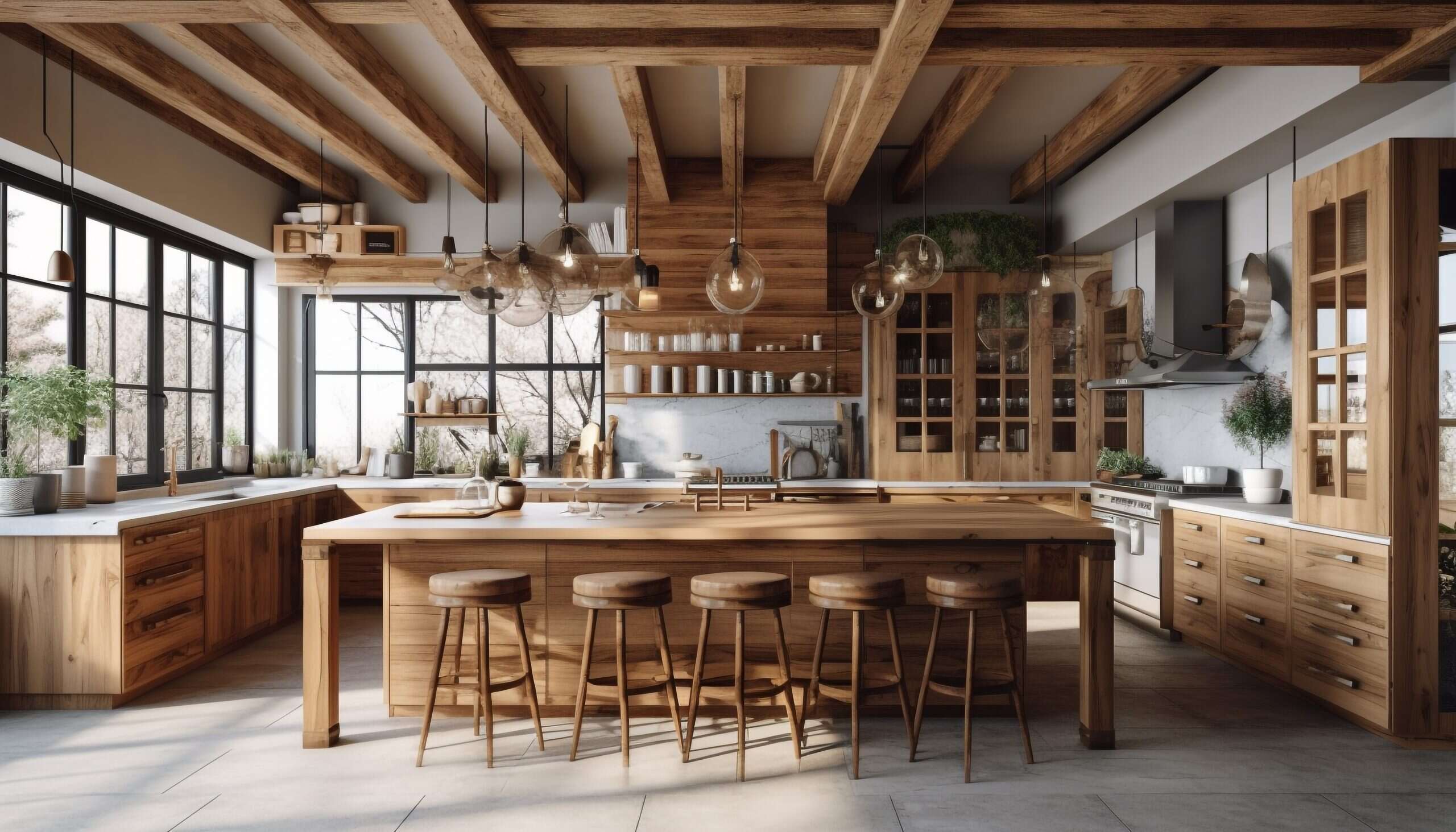
Modern design is all about minimalism. It rejects the opulence and excess of previous design eras, such as Art Deco, in favor of a streamlined minimalism. This approach ensures that the space is highly organized and never cluttered. Only the most meaningful pieces are included, and statement pieces shine in their own right with paired-down accents.
2. Clean Lines
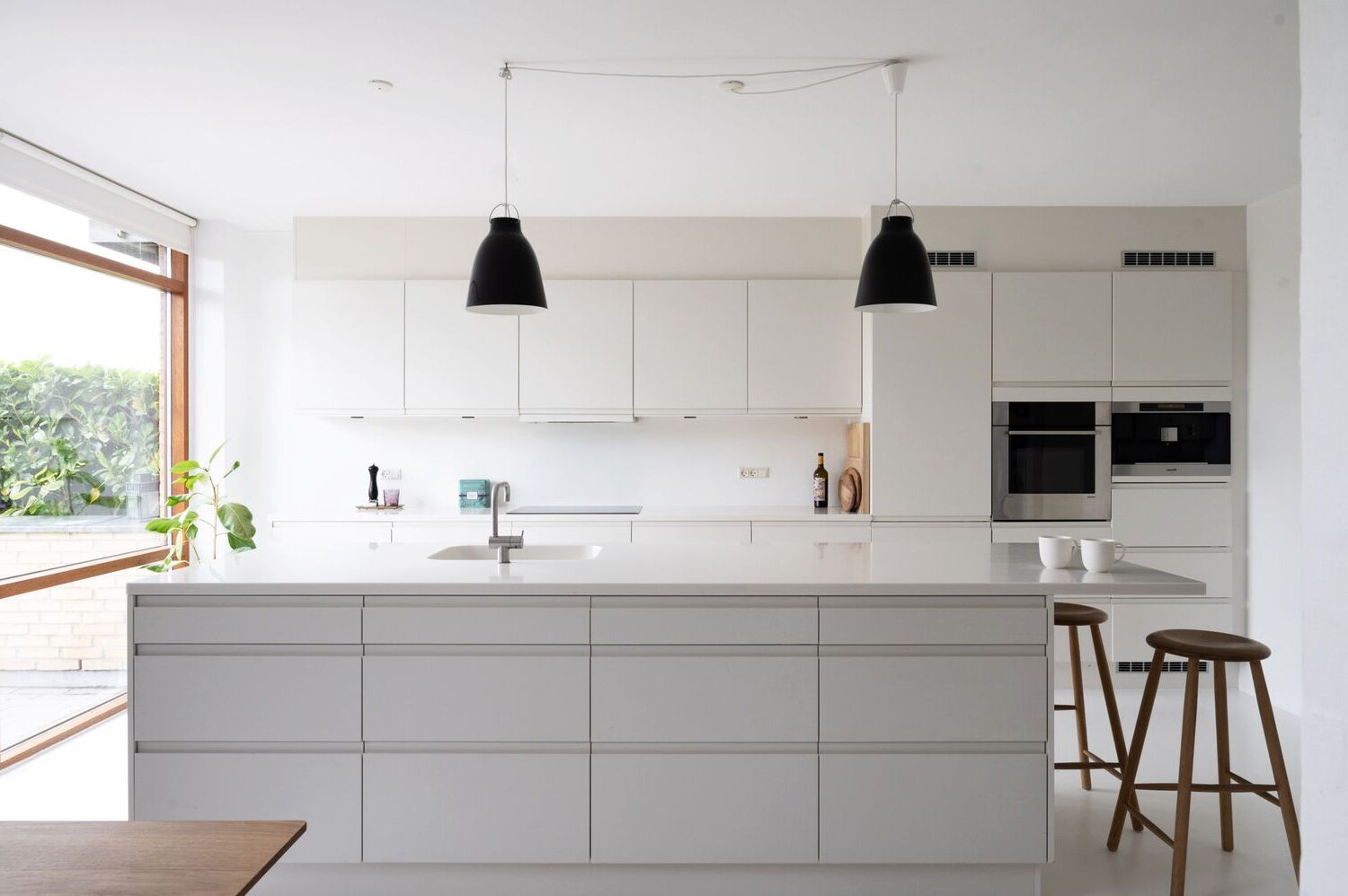
Clean lines are another hallmark of modern design. Elements are tailored and structural rather than organic and undone. Everything, from fabric to material textures, should look smooth, streamlined, and intentional. This focus on clean lines creates a sense of order and simplicity in the space.
3. Airy, Open-Plan Layout
Modern design often employs an airy, open-plan layout that plays with negative space. Furniture is placed in a way that creates an open and spacious feel, rather than being confined to separate rooms. This layout not only enhances the sense of openness but also makes the space feel larger than it actually is.
4. Neutral Color Palette with Bold Accents
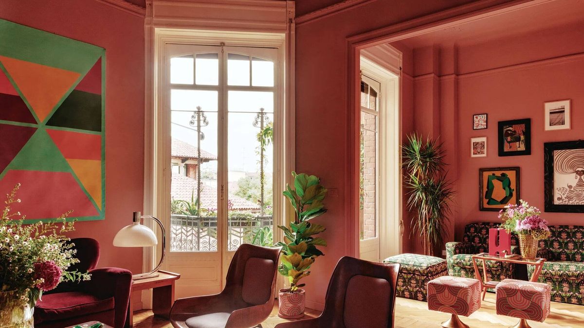
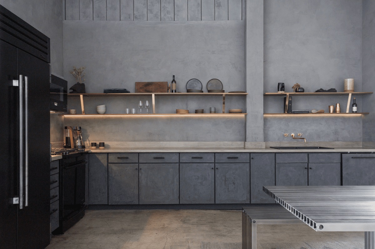
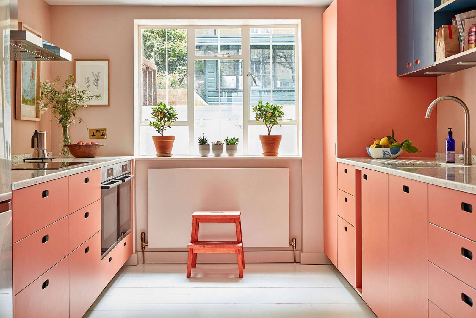
Most modern interiors feature an overarching neutral color palette made up of airy natural tones like cream, light gray, or white. This neutral background is typically paired with bold accent colors to create contrast and add visual interest. Primary colors such as bright shades of blue, red, or yellow are popular choices for these accents, along with dark shades of black, brown, and gray.
Read more: Color Splash: Bold Hues For Modern Interiors
5. Natural Materials and Elements
Modern design finds itself at the crossroads between natural and manmade materials. It celebrates natural textures like leather, metal, and woodgrain but presents them in a way that looks sleek rather than rustic. This blend of natural and manmade elements adds depth and sophistication to the space.
6. Practicality
While style is an important aspect of interior design, modern design places an emphasis on practicality. Pieces should have a purpose without sacrificing style. Everything added to a room should feel intentional and functional, ensuring that the space remains both stylish and practical.
Incorporating Primary Colors
Primary colors—red, blue, and yellow—are fundamental to the color wheel and are often used in modern design to add a splash of color to an otherwise neutral backdrop. Here’s how you can effectively incorporate primary colors into your modern home:
Using Primary Colors as Accents
One of the most common ways to incorporate primary colors into modern design is by using them as accents. This can be done through throw pillows, brightly colored sofas, or abstract art. For example, a brightly colored sofa in a living room can add a pop of color that immediately draws attention and creates visual interest.
Choosing the Right Shade
When choosing a primary color for your modern home, it’s important to select a shade that complements the neutral background. For instance:
- Red: A deep red can add warmth and coziness to a room but may overpower the space if used extensively. Instead, use it sparingly through accessories like vases or rugs.
- Blue: A light blue can create a calming atmosphere but may not provide enough contrast against a neutral background. Use it in bold accents like statement walls or furniture pieces.
- Yellow: A bright yellow can add energy and warmth but may be overwhelming if used too much. Use it in smaller doses through decorative items like lamps or wall art.
Balancing with Neutrals
To ensure that primary colors do not overwhelm the space, it’s crucial to balance them with neutrals. Here’s how you can achieve this balance:
- Neutral Background: Use a neutral background like white, light gray, or cream to provide a clean canvas for your primary colors.
- Contrast: Create contrast by pairing primary colors with their complementary colors. For example, red and green are complementary colors that create a striking contrast when used together.
Texture and Pattern
While primary colors are essential for adding color to your modern home, texture and pattern can also play a significant role in enhancing the aesthetic. Here’s how you can incorporate texture and pattern:
- Natural Textures: Incorporate natural textures like wood, leather, and metal to add depth and sophistication to your space. These textures can be paired with primary colors to create a harmonious balance.
- Patterned Fabrics: Use patterned fabrics like geometric patterns or abstract designs to add visual interest without overwhelming the space. These patterns can be incorporated through throw pillows, blankets, or even wallpaper.
Color Theory in Modern Design
Understanding color theory is crucial when incorporating primary colors into your modern home. Here’s a brief overview of color theory and how it applies to modern design:
The Color Wheel
The color wheel is an essential tool in color theory. It consists of primary colors (red, yellow, and blue), secondary colors (orange, green, and purple), and tertiary colors (mixes of secondary and primary colors). By understanding how these colors interact with each other, you can create harmonious color schemes that enhance the aesthetic of your space.
Color Compositions
There are several common color compositions that can be used in modern design to create balanced and cohesive spaces:
- Complementary Colors: Combining opposites on the color wheel creates a striking contrast. For example, pairing red with green or blue with orange can add visual interest to your space.
- Triadic Colors: Using three colors evenly spaced on the color wheel creates a balanced and harmonious palette. For example, using blue, yellow, and red can add a vibrant touch to your space.
- Analogous Colors: Using happy little neighbors on the color wheel creates a smooth transition between colors. For example, using blue, green, and yellow can create a soothing atmosphere in your space.
- Monochromatic Colors: Using a single hue in varying shades and tints can create a cohesive look while adding depth to your space.
Practical Tips for Incorporating Primary Colors
Incorporating primary colors into your modern home requires careful planning to ensure that the space remains balanced and cohesive. Here are some practical tips to help you achieve this:
Start with Neutrals
Begin by setting up a neutral background using white, light gray, or cream. This provides a clean canvas for your primary colors and ensures that they do not overwhelm the space.
Read more: How To Clean A Refrigerator Water Line
Choose Your Accents Wisely
Select primary colors that resonate with your personal style and the overall aesthetic of your home. For example, if you prefer a calm atmosphere, use light blue or green as accents. If you prefer energy and warmth, use bright yellow or red.
Balance with Texture and Pattern
Incorporate natural textures like wood and leather to add depth and sophistication to your space. Use patterned fabrics like geometric patterns or abstract designs to add visual interest without overwhelming the space.
Consider the Psychology of Colors
Different colors evoke different emotions and moods. Warm colors like red and orange can invoke coziness and passion, while cool colors like blue and green can create a calming atmosphere.
Case Study: Braeswood Place
The Braeswood Place project by Laura U Design Collective is an excellent example of how primary colors can be effectively used in modern design. The project features a bold and vibrant yet calming and organic color palette inspired by Southwestern sunsets and natural elements. The use of earth tones like mustard yellow, sage green, and deep red creates a harmonious balance with the neutral background, making the space both meaningful and visually appealing.
Read more: How To Clean Edgestar Kegerator Lines
Conclusion
Incorporating primary colors into your modern home is not about overwhelming the space with bright hues but about adding a splash of color that enhances the aesthetic. By understanding color theory and balancing primary colors with neutrals, textures, and patterns, you can create a harmonious and visually appealing space that reflects your personal style. Remember, modern design is all about clean lines, sleek textures, and practicality, so ensure that every element you add serves a purpose while maintaining the integrity of the space. With these tips and practical advice, you can transform your modern home into a vibrant and inviting space that truly reflects your personality.
Was this page helpful?
At Storables.com, we guarantee accurate and reliable information. Our content, validated by Expert Board Contributors, is crafted following stringent Editorial Policies. We're committed to providing you with well-researched, expert-backed insights for all your informational needs.

0 thoughts on “Clean Lines And Primary Colors In Modern Homes”