Home>Interior Design>Family Room Paint Ideas: 10 Paint Colors For A Family Room
Interior Design
Family Room Paint Ideas: 10 Paint Colors For A Family Room
Modified: October 20, 2024
Get inspired with these 10 interior design family room paint ideas. Transform your space with these beautiful paint colors. Perfect for creating a cozy and inviting atmosphere.
(Many of the links in this article redirect to a specific reviewed product. Your purchase of these products through affiliate links helps to generate commission for Storables.com, at no extra cost. Learn more)
Introduction
When it comes to designing a family room, paint color plays a crucial role in setting the mood and creating a welcoming atmosphere. The right paint color can transform a plain space into a cozy and inviting area where the whole family can gather, relax, and create lasting memories.
Choosing the perfect paint color for a family room can be a daunting task, with so many options available. Should you go for vibrant and energetic shades or stick to calming neutrals? To help you make the right decision, we have compiled a list of 10 paint colors that are ideal for family rooms, each with its own unique charm and character.
Whether you prefer warm and cozy hues or cool and refreshing tones, there is a paint color on this list that will suit your style and personality. So, let’s dive in and explore these exciting family room paint ideas!
Key Takeaways:
- Create a cozy and inviting family room with versatile paint colors, from warm and earthy tones to light and airy hues, allowing for personalization and a welcoming atmosphere for cherished family moments.
- Infuse personality and visual interest into your family room with accent wall ideas, from textured walls to bold patterns, adding depth and creating a captivating focal point that reflects your unique style and enhances the overall design.
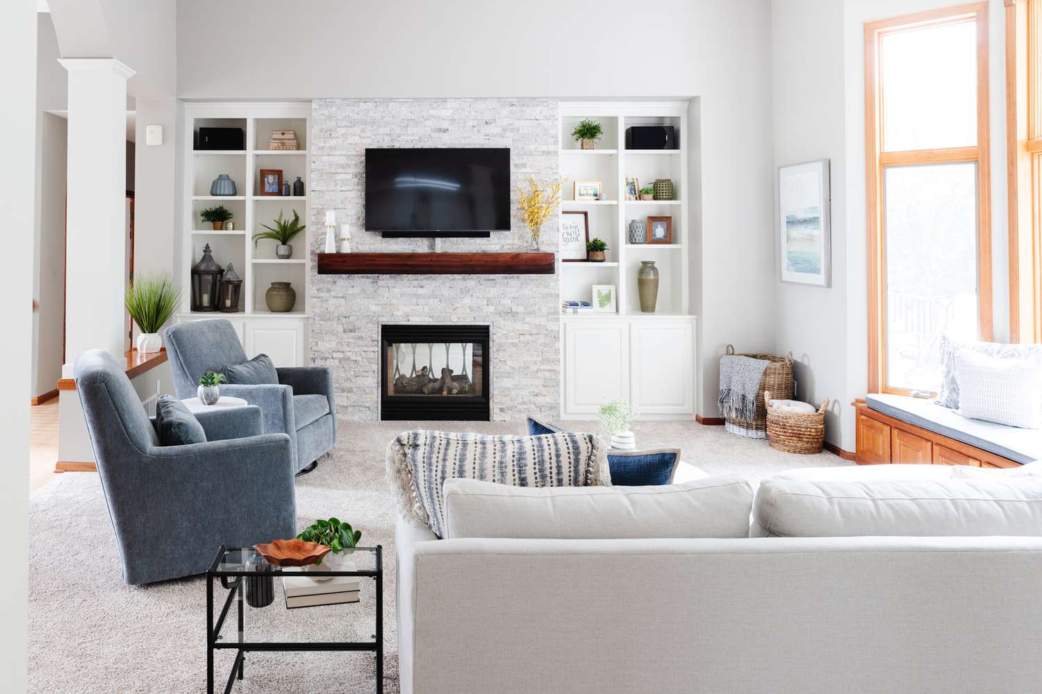
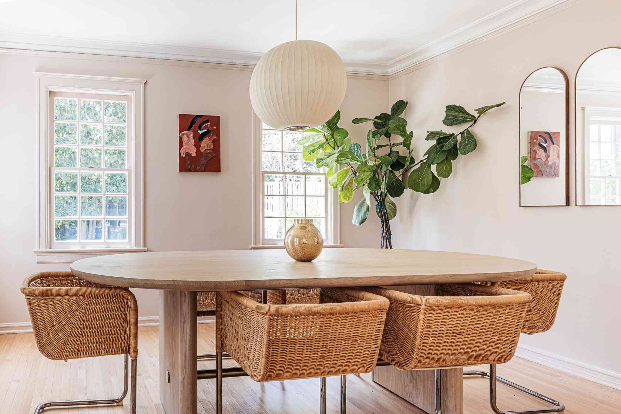
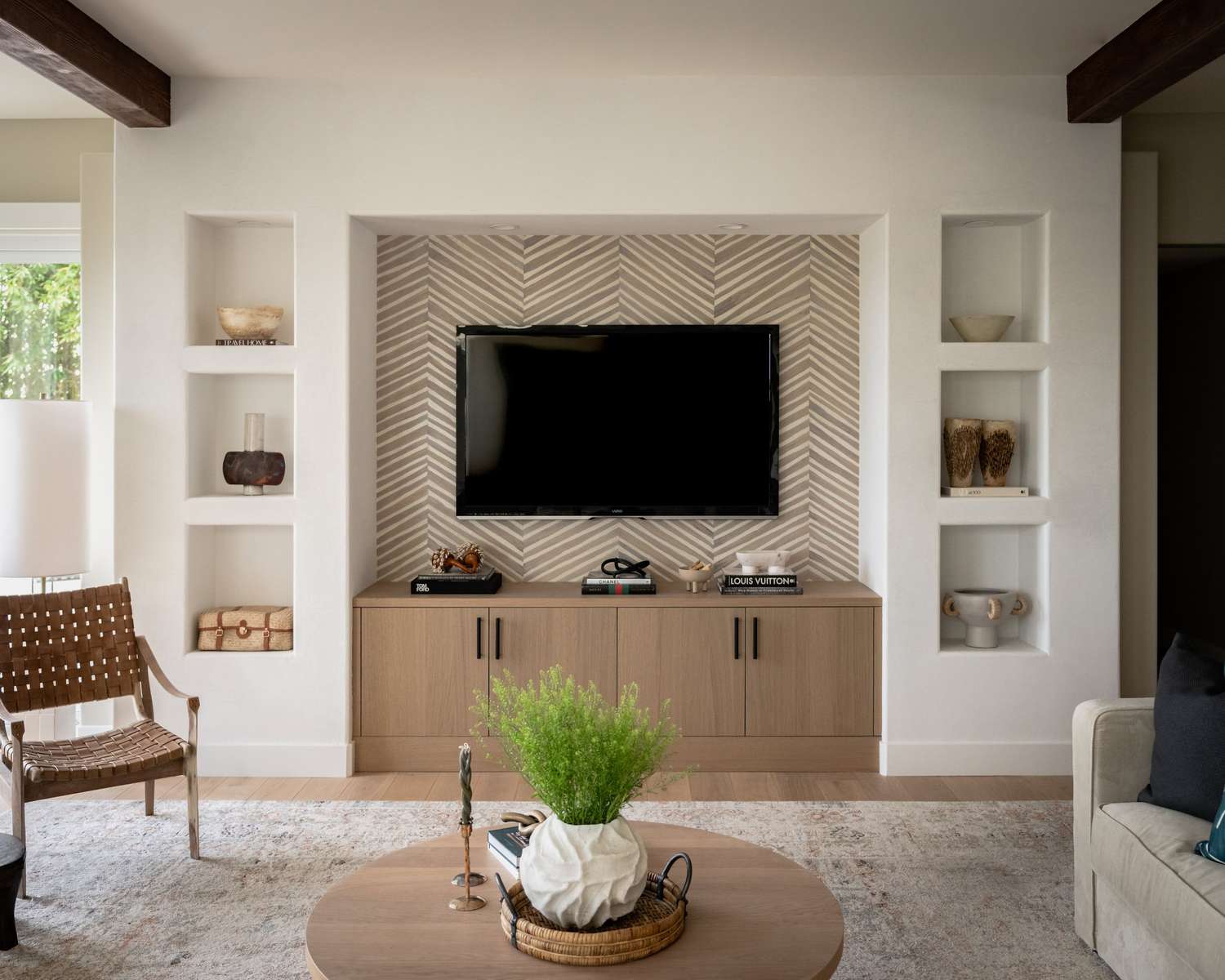
Neutral Colors
Neutral colors are timeless and versatile, making them an excellent choice for a family room. They create a calm and soothing ambiance, allowing other elements in the room to shine. Neutrals such as white, beige, and gray provide a blank canvas that can be easily paired with different furniture styles or accent colors.
White is a classic choice for a family room, as it creates a bright and airy feel. It reflects natural light, making the space appear larger and more open. Beige, on the other hand, adds warmth and a cozy vibe to the room. It pairs well with wooden furniture and earthy tones.
Gray is a popular neutral color that can range from light to dark shades, offering versatility and sophistication. Light grays provide a modern and elegant look, while dark grays bring depth and a touch of drama to the space. Gray can be paired with various accent colors to create a stylish and contemporary family room.
Neutral colors are also great for those who like to change the decor frequently or tend to have different styles and themes throughout the year. They serve as a backdrop that allows you to easily switch up the look by adding different accessories and textiles.
Overall, neutral colors are a safe yet stylish choice for a family room, providing a versatile foundation that can be easily personalized and adapted to your changing tastes and preferences.
Warm Colors
If you want to create a cozy and welcoming atmosphere in your family room, warm colors are the way to go. These colors are associated with comfort, intimacy, and a sense of togetherness, making them perfect for a space designed for family gatherings and relaxation.
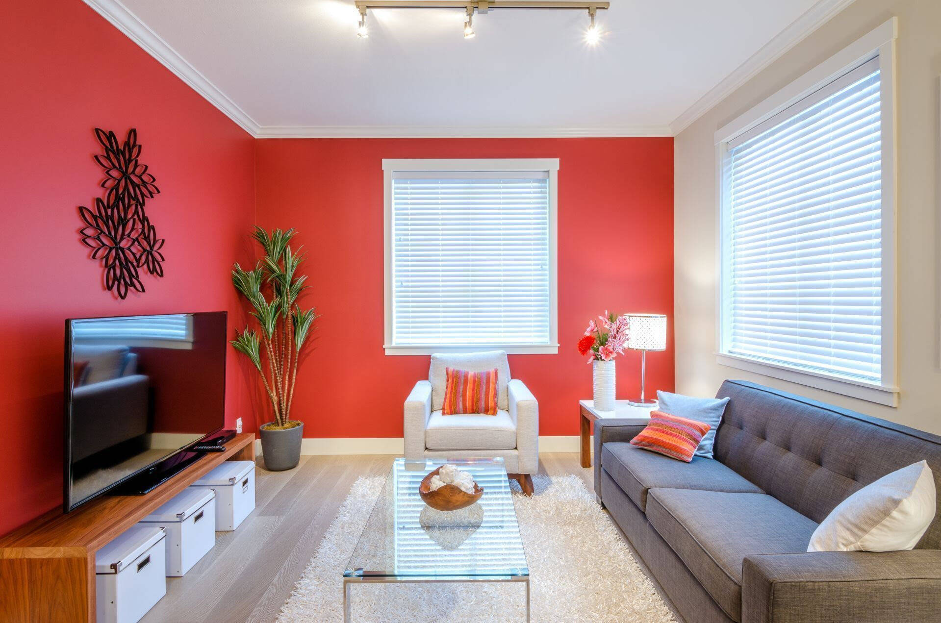
Warm colors include shades of red, orange, and yellow. They evoke feelings of warmth, optimism, and energy. Red is a passionate and dynamic color that can add drama and excitement to the room. It’s ideal for creating a focal point or accentuating certain areas, such as a fireplace or a feature wall.
Orange is a vibrant and friendly color that promotes sociability and creativity. It can create a lively and energetic atmosphere in the family room. Whether used as the main wall color or as an accent, orange adds warmth and liveliness to the space.
Yellow is a cheerful and uplifting color that brings sunshine and happiness into the room. It stimulates positivity and optimism, creating a joyful and inviting ambiance. Soft shades of yellow can be used for an overall calming effect, while brighter yellow can be used as accents to add pops of color.
Warm colors can be used in different intensities depending on your preference and the size of the room. If you have a large family room, you can experiment with bold and rich shades to create a cozy and intimate atmosphere. For smaller spaces, consider using warm colors as accents or in lighter tones to avoid overwhelming the room.
Pair warm colors with neutral tones or earthy shades to create a balanced and harmonious look. Wood furniture and natural textures complement warm colors beautifully, creating a cohesive and inviting space for the whole family to enjoy.
Overall, warm colors inject a sense of coziness and positivity into the family room, making it a perfect place to unwind, connect, and create memories together.
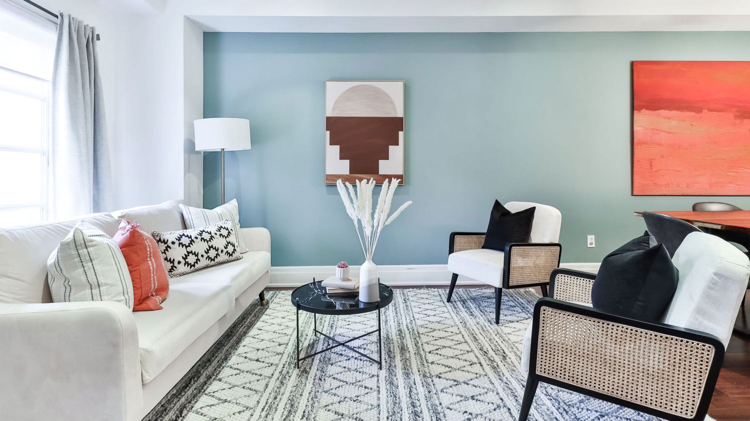
Cool Colors
Cool colors are known for their calming and soothing qualities, making them an excellent choice for a family room where relaxation and serenity are desired. If you want to create a tranquil and peaceful atmosphere, incorporating cool colors into your family room design can help achieve that.
Cool colors include shades of blue, green, and purple. Blue is often associated with serenity and tranquility. Lighter shades of blue create a sense of openness and freshness, while deeper shades offer a more dramatic and sophisticated look. Blue is also known to promote a sense of calmness and relaxation, making it an ideal choice for a space designed for unwinding and rejuvenation.
Green is a versatile and refreshing color that brings a touch of nature indoors. It symbolizes growth, harmony, and balance. Light greens can create a sense of serenity and relaxation, similar to blue, while brighter greens can bring energy and vibrancy to the space. Green is particularly suitable for family rooms as it promotes a sense of togetherness and connection with nature.
Purple is associated with luxury, creativity, and spirituality. It comes in a wide range of shades, from soft lilacs to rich and deep eggplants. Lighter shades of purple can create a calm and romantic atmosphere, while darker shades add a touch of elegance and sophistication. Purple is a unique choice for a family room, adding a sense of opulence and creativity.
Cool colors can be complemented with neutrals or warmer tones to create a well-balanced and harmonious look. Soft grays, whites, or earthy beiges can be used as a backdrop to enhance the calming effect of the cool colors. Introduce natural elements such as plants or wood furniture to create a cohesive and inviting atmosphere.
When using cool colors in a family room, consider the size and lighting of the space. Cool colors can visually recede the walls, making the room appear larger. It’s essential to strike a balance between using cool colors as the main wall color and incorporating warmer accents to create a cozy and inviting environment.
Overall, cool colors provide a sense of tranquility and relaxation in a family room, creating the perfect space to unwind, recharge, and spend quality time with loved ones.
Earthy Tones
If you want to bring a sense of warmth, grounding, and connection to nature into your family room, consider using earthy tones. These colors are inspired by the natural elements found in the earth and can create a cozy and harmonious atmosphere in your space.
Earthy tones are warm and inviting, evoking a sense of calmness and serenity. They include shades such as brown, tan, beige, and terracotta. Brown is a versatile color that ranges from light taupe to rich chocolate tones. It can create a warm and comforting feel in the family room and pairs well with other earthy colors or with pops of vibrant hues.
Tan and beige are neutral earthy tones that provide a sense of balance and simplicity. They create a warm and cozy ambiance without overwhelming the space. Beige pairs wonderfully with wood furniture and natural textures, creating a seamless connection to the natural world.
Terracotta is a reddish-brown color that is reminiscent of clay and pottery. It brings a rustic and earthy feel to the family room and adds depth and character. Terracotta works well as an accent color or as a feature wall, creating a focal point that draws the eye.
When using earthy tones in the family room, consider incorporating natural textures and materials such as wood, stone, rattan, or jute. These elements further enhance the connection to nature and create a cozy and inviting space. Layering different shades of earthy tones can also add depth and dimension to the room.
Earthy tones can be complemented with pops of color from nature, such as deep greens or vibrant blues, to create visual interest and contrast. Additionally, incorporating plants and botanical elements into the design can further enhance the natural and earthy feel of the space.
Overall, earthy tones bring a sense of warmth, grounding, and connection to nature into the family room, creating a cozy and inviting haven for the whole family to relax and unwind.
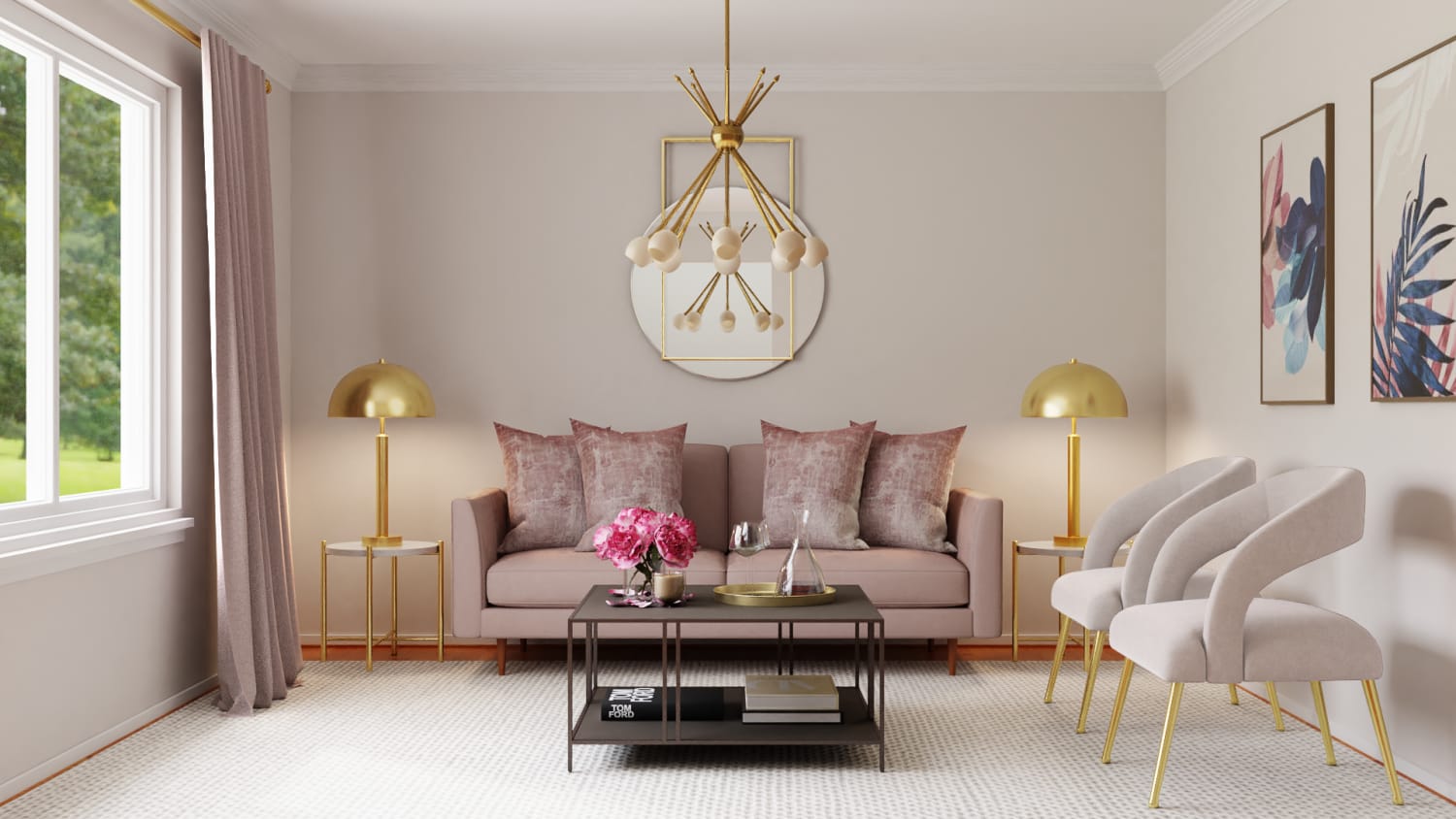
Pastel Shades
If you want to create a light and airy atmosphere in your family room, pastel shades are a fantastic choice. These soft and muted colors provide a gentle and calming effect, perfect for promoting relaxation and serenity in your space.
Pastel shades are light versions of colors that have been mixed with white, resulting in a delicate and subtle color palette. These colors include soft pinks, light blues, pale yellows, and mint greens. Pastels are often associated with femininity, tranquility, and a sense of innocence.
Pastel pink is a popular choice for a family room, particularly if you want to create a warm and inviting space. Soft pink hues can evoke feelings of comfort and relaxation. They pair well with other pastel shades or with contrasting neutrals such as white or gray.
Light blue is another soothing pastel shade that creates a sense of calmness and serenity. It is often associated with a coastal or beachy theme, evoking images of the sky and the sea. Light blue can make the family room feel larger and more open, particularly when used as the main wall color.
Pale yellow is a cheerful and sunny pastel shade. It brings a sense of warmth and positivity to the family room, creating a joyful and inviting atmosphere. Pair it with other pastel shades or with neutral tones such as white or beige to maintain a light and airy feel.
Mint green is a fresh and soft pastel shade that can add a touch of sophistication to the family room. It creates a calming and peaceful ambiance, reminiscent of nature. Mint green pairs well with neutrals or other pastels for a cohesive and harmonious look.
Pastel shades can be used as the main wall color or as accents throughout the room. They work well in combination with light and neutral furniture and can be easily paired with various decor styles, from traditional to contemporary.
Overall, pastel shades bring a sense of calmness and tranquility to the family room, creating a light and airy space where the whole family can relax and enjoy each other’s company.
When choosing a paint color for a family room, consider warm and inviting tones like soft beige, warm gray, or light blue to create a cozy and comfortable atmosphere for gathering and relaxation.
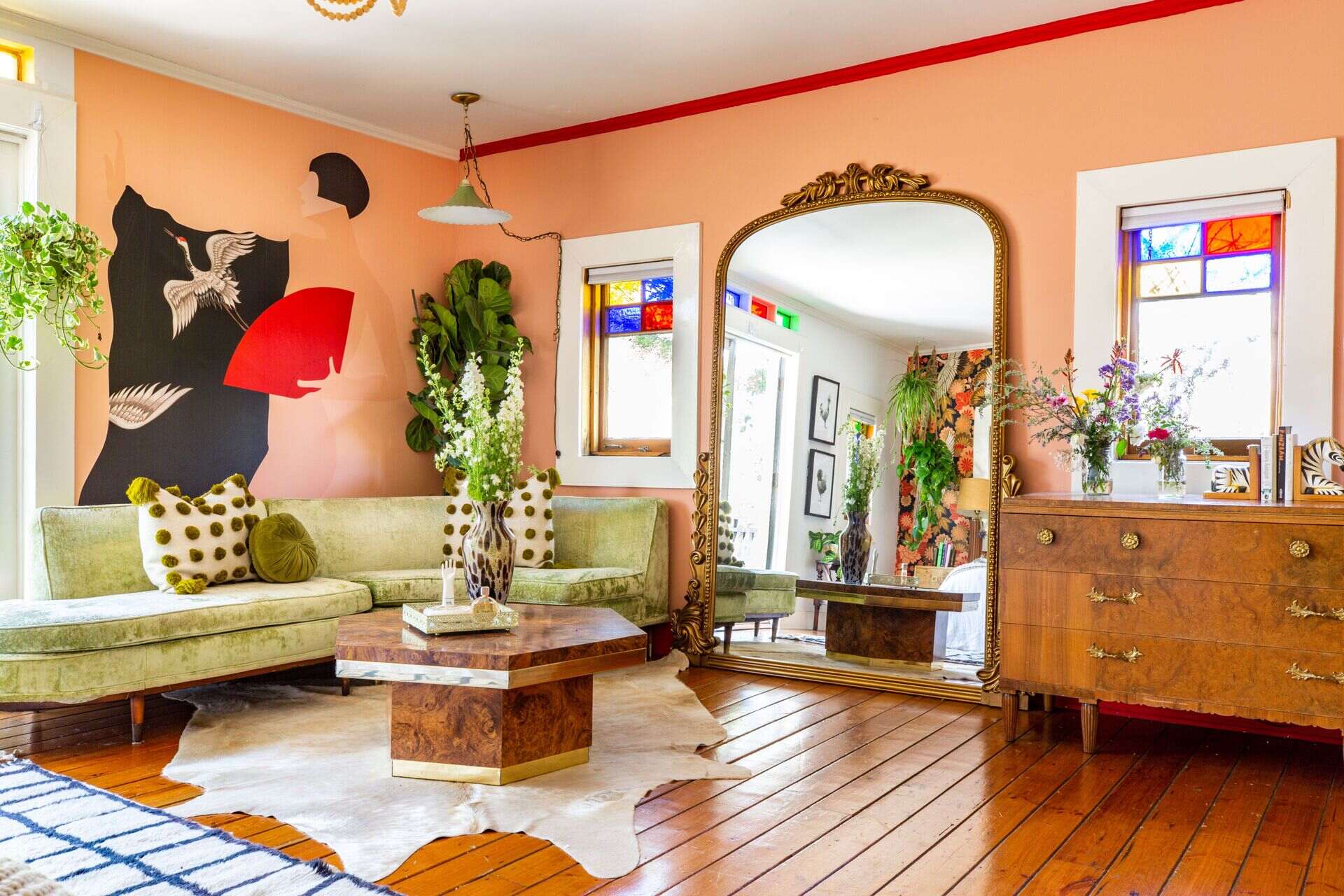
Bold and Vibrant Colors
If you’re looking to make a bold statement in your family room and infuse it with energy and personality, using bold and vibrant colors is the way to go. These colors create a lively and dynamic atmosphere, adding excitement and visual interest to your space.
Bold and vibrant colors include shades such as rich reds, vibrant oranges, electric blues, and lively yellows. These colors are attention-grabbing and can instantly transform a dull room into a vibrant and energetic space.
Red is a fiery color that exudes passion and intensity. It can be used to create a focal point or to add drama to the family room. Consider using it as an accent wall color or incorporating red accessories to capture attention and create a vibrant atmosphere.
Orange is a lively and cheerful color that brings warmth and vibrancy to the room. It can create a playful and energetic ambiance, perfect for a family room that doubles as a fun and entertaining space. Use orange as an accent color or in bold furniture pieces to make a statement.
Electric blues and vibrant yellows are eye-catching and energizing colors. They can create a vibrant and lively atmosphere in the family room, adding a sense of playfulness and charm. These colors work well together and can be used as accents or in bold patterns to create a striking visual impact.
To balance the boldness of these colors, consider incorporating neutral tones as a backdrop. Shades of gray, white, or beige can help tone down the vibrancy and create balance in the room. Additionally, choose furniture and decor in complementary colors to create a cohesive and harmonious look.
When using bold and vibrant colors, it’s important to consider the size and natural lighting of the room. In smaller spaces, it’s best to use these colors in moderation to avoid overwhelming the room. In larger rooms, feel free to be more adventurous and use bold colors as the main wall color or in larger furniture pieces.
Overall, bold and vibrant colors add personality and excitement to the family room, creating a space that reflects your unique style and sets the stage for lively conversations and memorable gatherings.
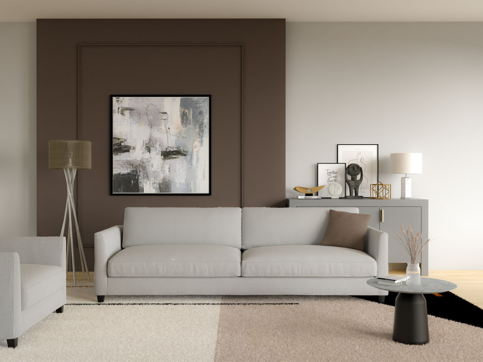
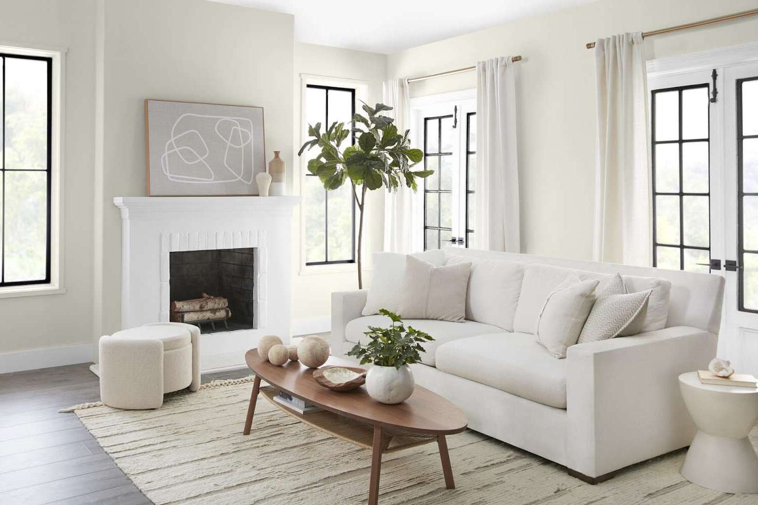
Light and Airy Colors
If you want to create a sense of spaciousness and openness in your family room, using light and airy colors is an excellent choice. These colors make the space feel bright, fresh, and inviting, perfect for creating a relaxed and comfortable atmosphere.
Light and airy colors include soft whites, pale grays, gentle blues, and subtle creams. These colors reflect natural light, making the room appear larger and more open. They create a tranquil and serene ambiance, reminiscent of a breezy coastal retreat.
White is a classic and timeless choice for a light and airy family room. It serves as a blank canvas, allowing other elements in the room to shine. White walls create a sense of purity and simplicity, giving the room a clean and modern look. Pair white walls with light-colored furniture and accessories for a cohesive and harmonious feel.
Pale grays are another popular choice for creating a light and airy atmosphere. These soft and subtle tones add depth and sophistication to the room without overwhelming the space. Light grays work well with various decor styles and can be paired with both warm and cool accent colors.
Gentle blues bring a sense of calmness and tranquility to the family room. Light blues create a serene and peaceful atmosphere, reminiscent of clear skies and gentle ocean waves. It’s a particularly suitable color choice for coastal or beach-themed decor. Pair light blue walls with white or cream furniture for a fresh and coastal-inspired look.
Subtle creams and off-whites add warmth and softness to the family room. These colors create a cozy and inviting ambiance without compromising the light and airy feel. Cream walls provide a neutral backdrop that can be complemented with various accent colors or textures to create visual interest.
When using light and airy colors, consider incorporating natural elements such as plants or natural textures to enhance the connection to the outdoors. Light-colored wood furniture or rattan accents can further enhance the light and airy feel of the space.
Overall, light and airy colors create a fresh and inviting family room, making it the perfect space to relax, unwind, and enjoy the company of loved ones.
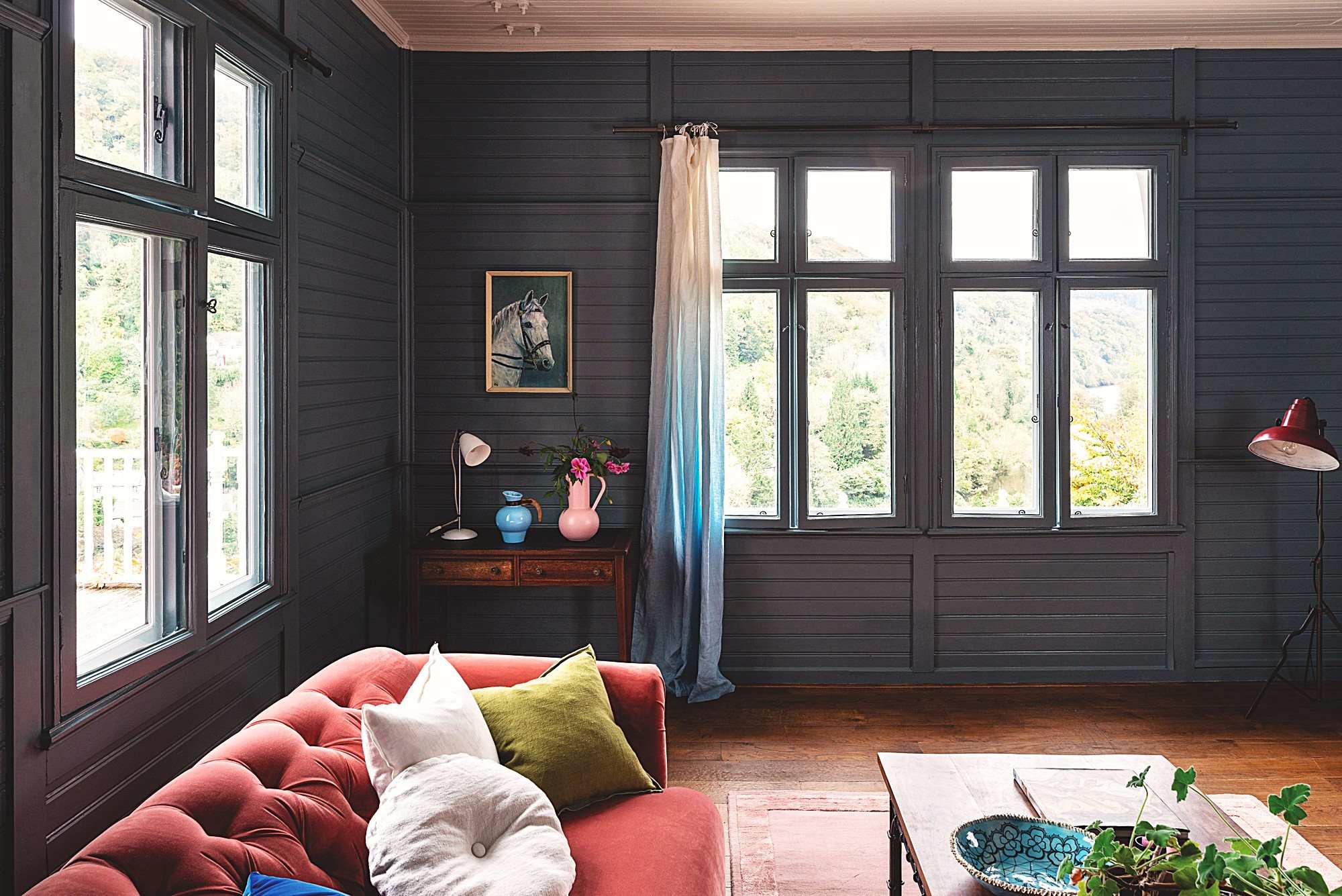
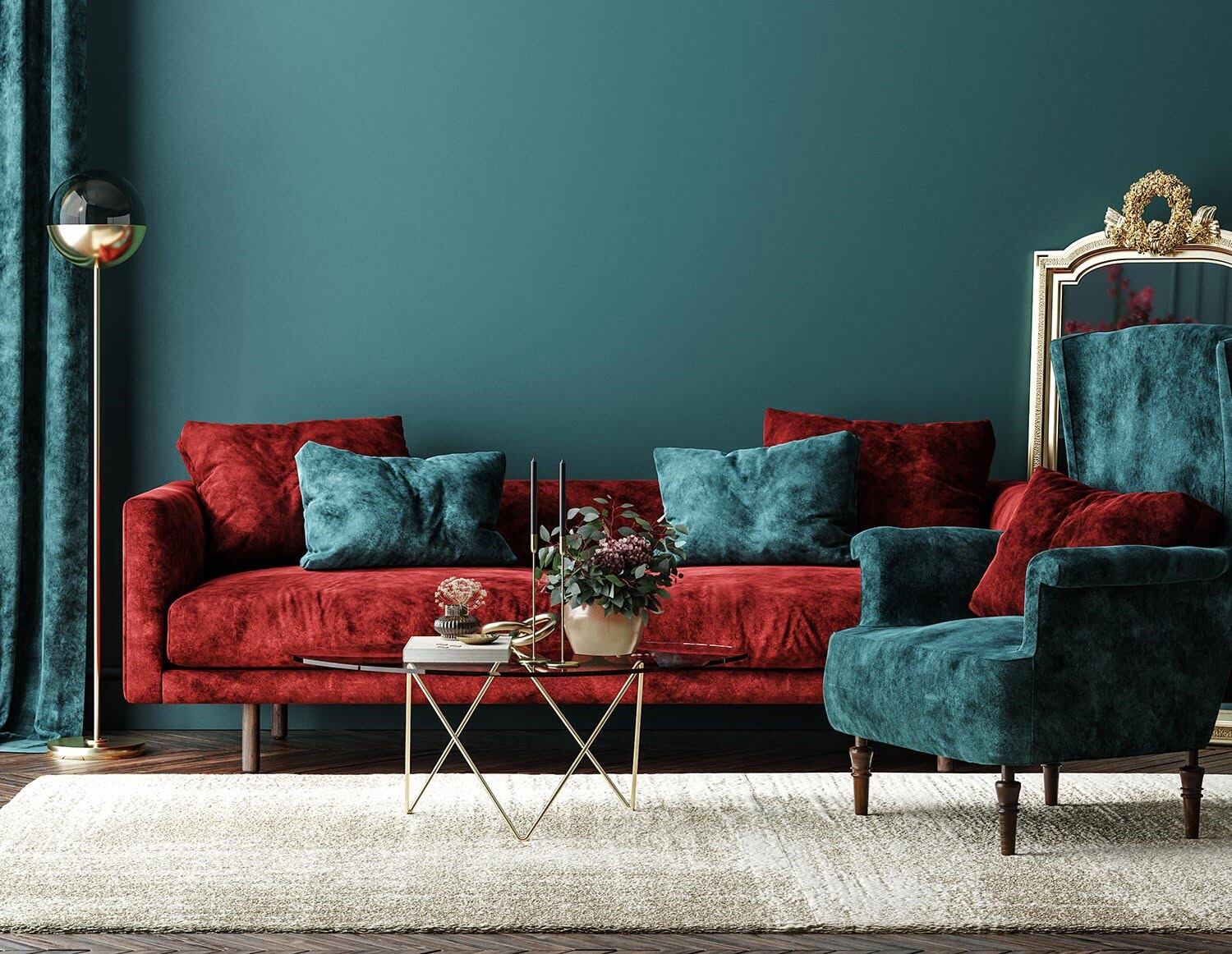
Dark and Moody Shades
For those looking to create a dramatic and sophisticated ambiance in their family room, incorporating dark and moody shades is an excellent choice. These colors bring depth, richness, and a sense of luxury to the space, creating a cozy and intimate atmosphere.
Dark and moody shades include deep blues, elegant grays, sumptuous purples, and rich charcoal tones. These colors create a sense of drama and intrigue, making a bold statement in your family room.
Deep blues, such as navy or indigo, evoke a sense of calmness and elegance. They can create a tranquil and intimate atmosphere, perfect for unwinding after a long day. Use deep blues as accent colors, or consider painting one wall in a deep blue shade to create a focal point that adds visual interest to the room.
Elegant grays, particularly charcoal gray, add a touch of sophistication and modernity to the family room. These dark gray shades create depth and can be paired with lighter hues or metallic accents to create a stylish and luxurious atmosphere. Charcoal gray walls can also serve as a beautiful backdrop for artwork or statement furniture pieces.
Sumptuous purples, such as deep violet or plum, bring a regal and opulent feel to the family room. These colors create a sense of luxury and can add a touch of romance to the space. Use deep purples as accent colors or incorporate them into textiles or upholstery to add a pop of richness and elegance.
When using dark and moody shades, it’s important to consider the natural lighting in the room. If the room lacks natural light, opt for lighter shades of the dark colors to avoid creating a cave-like effect. Additionally, balance the darkness with lighter furniture and accessories to create contrast and prevent the room from feeling too heavy.
Dark and moody shades work well in rooms with larger spaces or those that have an abundance of natural light. They can create an intimate and cozy atmosphere, perfect for family gatherings or as a space for relaxation and reflection.
Overall, incorporating dark and moody shades in your family room brings a sense of depth, drama, and sophistication to the space, creating a captivating and luxurious environment for your family to enjoy.
Monochromatic Scheme
A monochromatic color scheme is a stylish and elegant choice for a family room. This versatile approach involves using different shades, tones, and tints of a single color throughout the space. It creates a cohesive and harmonious look, while still allowing for visual interest and depth.
By using a monochromatic color scheme, you can create a sense of unity and balance in the family room. Choose a color that you love and feel drawn to, such as shades of blue, green, or gray, and work with varying intensities of that color.
For example, if you choose blue as your base color, start with a light sky blue on the walls, then incorporate deeper shades of navy or indigo for furniture or accent pieces. You can also add pops of a lighter or darker blue to create contrast and dimension in the room.
A monochromatic color scheme allows you to play with different textures and materials to add visual interest. Consider incorporating different fabrics, such as velvet, linen, or leather, in varying shades of your chosen color. This adds depth and creates a luxurious and inviting feel in the family room.
Additionally, layering different patterns and textures through rugs, curtains, and throw pillows can add dimension to the monochromatic space. This creates visual interest and prevents the room from feeling flat or one-dimensional.
If you want to break up the monochromatic color scheme, you can introduce neutrals as contrasting elements in the room. For example, add white or cream accents to create a crisp and clean look, or incorporate earthy tones such as beige or brown for a warm and inviting feel.
Remember to consider the lighting in your family room when designing a monochromatic scheme. Natural light can enhance the different shades and tones of your chosen color, while artificial lighting can create different atmospheres depending on the color temperature. Experiment with different lighting options to create the desired effect.
A monochromatic color scheme is a sophisticated and timeless choice for a family room. It allows for creativity and personalization while maintaining a cohesive and balanced look. Whether you prefer a calming blue palette, a serene green scheme, or a sophisticated gray color scheme, a monochromatic approach provides endless opportunities for creating a beautiful and harmonious space.
Accent Wall Ideas
Adding an accent wall is a fantastic way to make a statement and add visual interest to your family room. An accent wall serves as a focal point that draws attention and enhances the overall design of the space. It allows you to incorporate bold colors, patterns, textures, or even unique materials to create a stunning feature wall.
Here are some accent wall ideas to consider for your family room:
- Painted Accent Wall: One of the simplest and most popular accent wall ideas is to paint it in a contrasting color. Choose a color that complements the overall color scheme of the room and creates a striking visual impact. You can opt for vibrant hues, rich jewel tones, or even a darker shade of the main wall color.
- Textured Wall: Create visual interest by adding texture to your accent wall. You can achieve this by using materials such as reclaimed wood panels, stone veneers, or textured wallpapers. These elements add depth and dimension to the space, giving the room a unique and captivating look.
- Patterned Wallpaper: Incorporate patterned wallpaper to create a bold and eye-catching accent wall. Choose a pattern that complements the overall style of the room, whether it’s a geometric design, botanical print, or a stylish damask pattern. Wallpaper adds texture and visual appeal, instantly transforming the family room.
- Gallery Wall: Create an accent wall using a collection of framed artwork, photographs, or decorative mirrors. Choose a variety of sizes, shapes, and frames to create an eclectic and personalized display. This not only adds visual interest but also creates a conversation-starting feature in your family room.
- Brick or Stone Accent Wall: Incorporating a brick or stone accent wall brings a rustic and organic element to the room. Whether you use real bricks or stone veneers, this feature adds texture and character to the family room. It works particularly well in industrial or farmhouse-inspired decor styles.
- Vertical or Horizontal Paneling: Add depth and visual interest to your family room by incorporating vertical or horizontal paneling. This can be achieved using wood, MDF, or other paneling materials. Consider painting the panels in a contrasting color or leaving them natural for a more subtle texture.
- Mirrored Accent Wall: Create a sense of openness and light by incorporating a mirrored accent wall. Mirrors reflect light and make the room feel larger. Consider using mirror tiles or a custom-cut mirror panel to create a sleek and stylish accent wall.
- Chalkboard or Whiteboard Wall: Add functionality and creativity by turning an accent wall into a chalkboard or whiteboard. This idea works particularly well in family rooms that double as a play area or a home office. It allows for artistic expression, note-taking, or simply serving as a fun feature for children.
When choosing an accent wall idea, consider the overall style and color scheme of your family room. You want the accent wall to complement the existing elements in the space while adding personality and visual interest.
Remember, an accent wall should be a statement piece that enhances the design of your family room. It’s an opportunity to inject your personal style and create a focal point that captures attention and adds wow-factor to the space.
Conclusion
Designing a family room is an exciting and creative process, and choosing the right paint colors is essential to creating a space that is both visually appealing and inviting. Whether you prefer neutral tones for timeless elegance, warm colors for a cozy atmosphere, cool shades for a calm ambiance, earthy tones for a grounded feel, or pastel hues for a light and airy vibe, there are endless possibilities to customize your family room to reflect your personal style.
Bold and vibrant colors can make a statement and infuse the space with energy, while light and airy colors create a sense of spaciousness and tranquility. Dark and moody shades add depth and a touch of sophistication, while a monochromatic scheme brings cohesiveness and balance to the room. And don’t forget the power of an accent wall, adding visual interest and serving as a focal point to captivate attention.
When selecting paint colors, consider the size and lighting of the room, as well as the overall mood you want to create. Experiment with different combinations, textures, and materials to find the perfect palette that speaks to your family’s style and enhances your family room’s functionality.
Ultimately, a well-designed family room should be a space where loved ones can gather, relax, and create lasting memories. The paint colors you choose will set the tone and create the backdrop for moments of joy, laughter, and connection. So, let your creativity flow and turn your family room into a haven that reflects who you are and encourages cherished moments with your loved ones.
Frequently Asked Questions about Family Room Paint Ideas: 10 Paint Colors For A Family Room
Was this page helpful?
At Storables.com, we guarantee accurate and reliable information. Our content, validated by Expert Board Contributors, is crafted following stringent Editorial Policies. We're committed to providing you with well-researched, expert-backed insights for all your informational needs.
0 thoughts on “Family Room Paint Ideas: 10 Paint Colors For A Family Room”