Home>Interior Design>5 Colors To Avoid In Your Family Room – According To Experts
Interior Design
5 Colors To Avoid In Your Family Room – According To Experts
Modified: September 2, 2024
Discover the top 5 interior design colors to avoid in your family room, as recommended by experts. Create a harmonious space with our tips!
(Many of the links in this article redirect to a specific reviewed product. Your purchase of these products through affiliate links helps to generate commission for Storables.com, at no extra cost. Learn more)
Introduction
When it comes to designing your family room, color plays a crucial role in creating the right atmosphere and setting the tone for the space. The colors you choose can greatly impact the overall look and feel of the room. While there is no right or wrong color palette to follow, it is important to consider certain factors, such as personal preferences, lighting, and the purpose of the room.
However, there are some colors that interior design experts recommend avoiding in family rooms. These colors, if not used carefully, can have a negative effect on the space, making it feel overwhelming or uninviting. In this article, we will explore five colors that you might want to steer clear of when designing your family room, according to experts in the field.
Key Takeaways:
- Avoid using intense colors like red, bright orange, and neon green as dominant colors in your family room to prevent overwhelming and visually distracting environments. Instead, opt for softer shades or use them as accent colors for a balanced and inviting atmosphere.
- While black and pure white can add sophistication and brightness, respectively, using them excessively in your family room may make the space feel dark or sterile. Incorporate these colors strategically and in moderation to maintain a welcoming and comfortable environment.
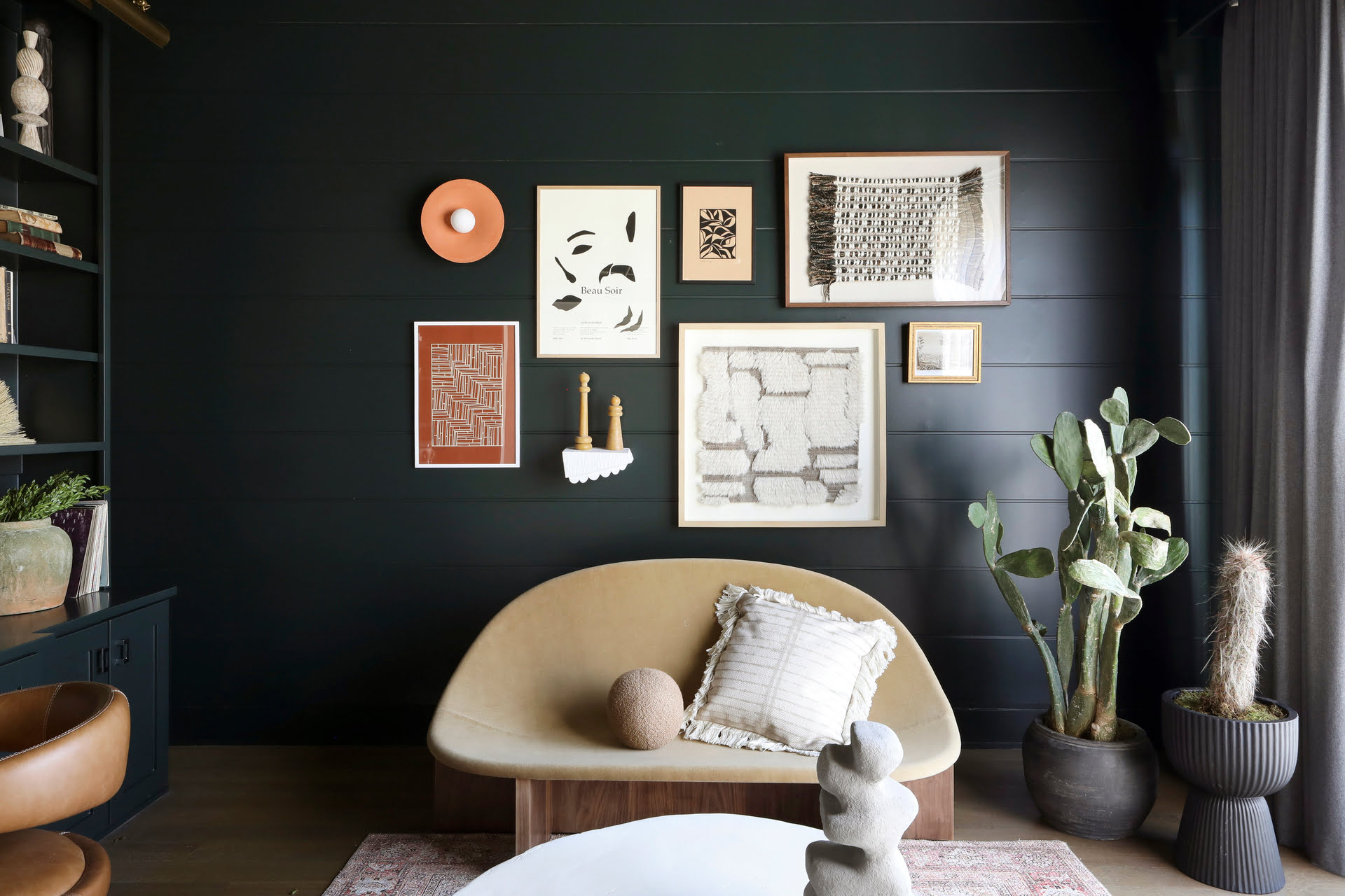
Red
Red is a bold and vibrant color that can evoke strong emotions and energize a space. However, when it comes to the family room, it is important to use red in moderation. Red has been associated with increased heart rate and blood pressure, which is why it’s not ideal for a room where relaxation and comfort are key.
While a touch of red can add warmth and depth to a space, using it as the dominant color in your family room might make it feel too intense and overpowering. Instead, consider using red as an accent color through accessories like throw pillows, artwork, or a statement rug.
If you do choose to incorporate red into your family room, opt for softer shades like burgundy or coral, which can create a more inviting and cozy atmosphere. Pairing red with neutral colors like white, beige, or gray can help to balance out the intensity and create a harmonious space.
Remember to consider the natural lighting in your family room as well. Red can appear darker and more intense in rooms with limited natural light. If your family room lacks ample sunlight, it would be best to avoid using red as the main color in your design scheme.
In summary, while red can add warmth and energy to a space, it is important to use it sparingly in the family room. Consider using red as an accent color and pair it with neutrals to create a balanced and inviting atmosphere.
Black
Black is a powerful and sophisticated color that can add a sense of drama and elegance to a room. However, when it comes to family rooms, incorporating too much black can make the space feel dark, gloomy, and closed-in. It is important to carefully consider how and where to use black in your family room design.
One of the primary concerns with using black as a dominant color is that it can absorb light rather than reflect it. This can make the room feel smaller and more cramped, especially if your family room has limited natural light. If you have a smaller or poorly lit space, it is advisable to avoid using black on large surfaces like walls or furniture.
Instead, consider using black as an accent color to create contrast and depth. Incorporate it through smaller elements such as picture frames, artwork, or accessories. This way, you can still achieve the sophisticated and modern look that black offers while maintaining a brighter and more welcoming atmosphere.
Another way to incorporate black without overwhelming the space is to use it in combination with other lighter colors. For example, you can pair black furniture with lighter walls or add pops of black through patterned pillows or curtains.
Ultimately, the key is to strike a balance and not let black dominate the entire family room. By using it strategically and in moderation, you can add depth and a touch of elegance to your space without sacrificing comfort and brightness.
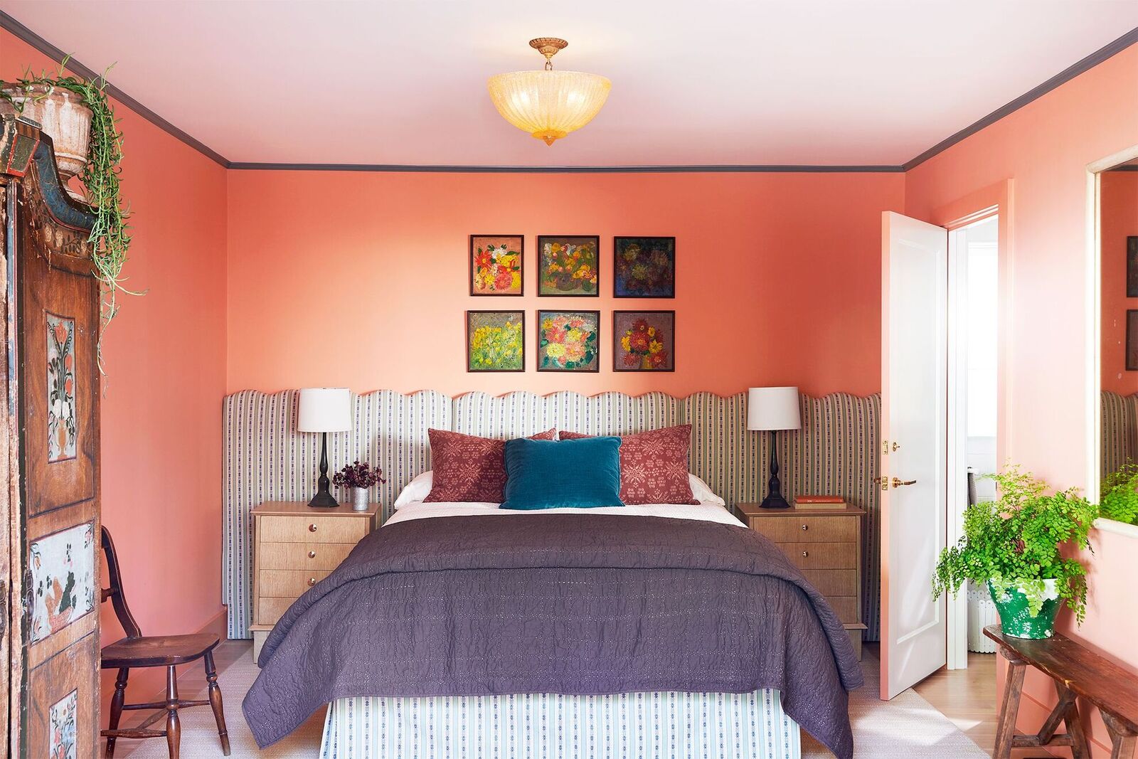
Bright Orange
Bright orange is a vibrant and energetic color that can add a pop of personality to any space. However, when it comes to the family room, it is important to exercise caution when using bright orange as the primary color in your design scheme.
While orange can be invigorating, too much of it can create a visually overwhelming and stimulating environment. Bright orange can be particularly challenging to work with in a family room where relaxation and comfort are key. The intense and bold nature of bright orange can easily overpower the space and make it feel chaotic rather than inviting.
If you still have your heart set on incorporating orange into your family room, consider opting for softer shades or incorporating it as an accent color. Softer shades like peach or coral can bring in the warmth and energy of orange while creating a more soothing and calming atmosphere in the room.
When using orange as an accent color, choose accessories like throw pillows, rugs, or artwork to introduce pops of color without overwhelming the space. Pairing orange with neutral colors such as beige, cream, or even gray can help to balance out the vibrancy and create a more harmonious environment.
Additionally, it is important to consider the overall style and theme of your family room. Bright orange might work well in a contemporary or eclectic setting, but it may clash with more traditional or minimalist design styles. Make sure that the color choices you make align with the overall aesthetic you are trying to achieve.
In summary, while bright orange can add a burst of energy to a space, it is advisable to use it sparingly in the family room. Consider opting for softer shades or incorporating orange as an accent color to create a balanced and inviting atmosphere.
When choosing colors for your family room, avoid bright and intense colors like neon yellow, electric blue, hot pink, and bright orange. These colors can be overwhelming and may not create a relaxing atmosphere.
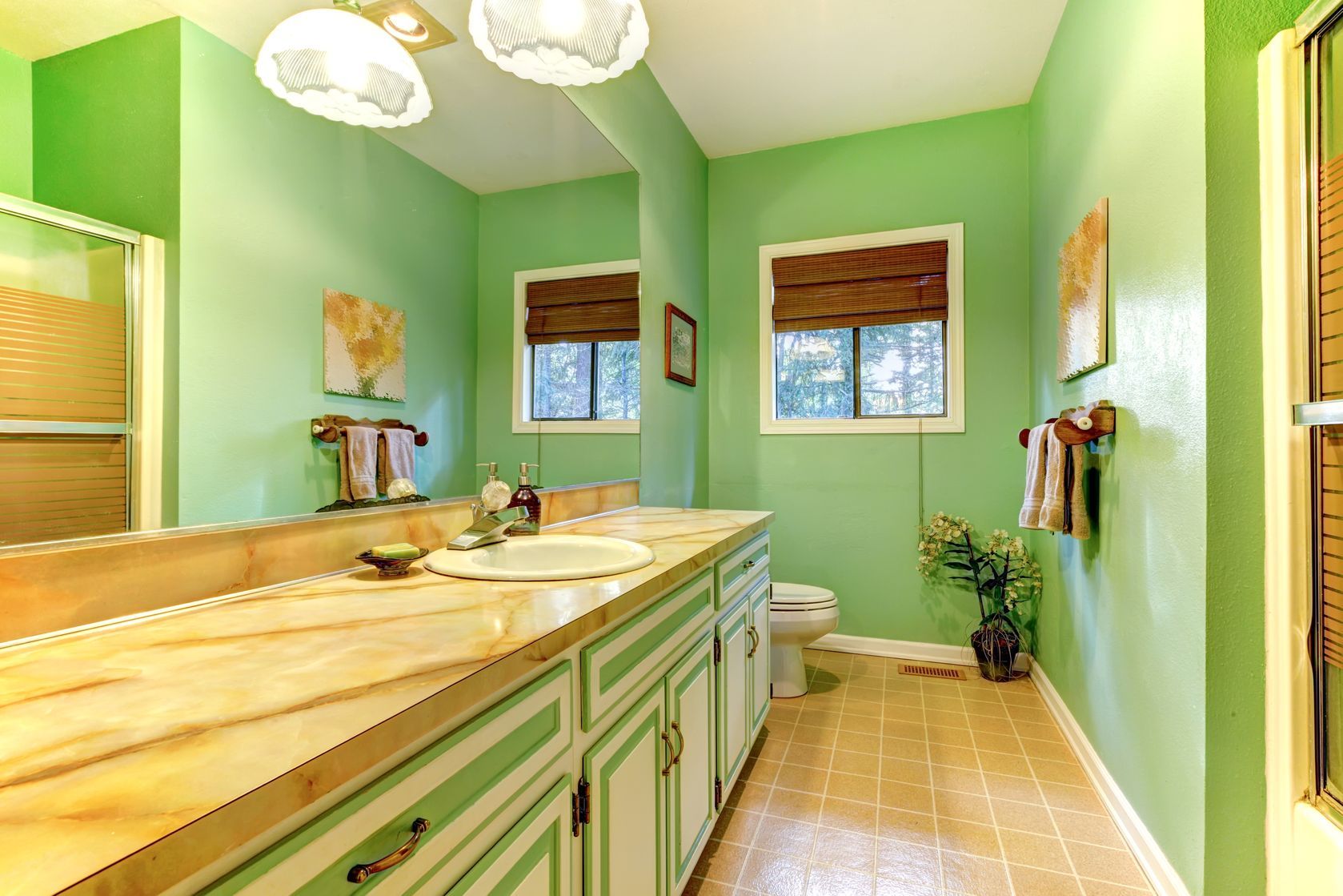
Neon Green
Neon green is a vibrant and eye-catching color that can make a bold statement in any room. However, when it comes to the family room, it is best to avoid using neon green as it can create a visually overwhelming and distracting environment.
Neon green is an extremely bright color that can easily overpower a space. Its intense and fluorescent nature can make it difficult to create a harmonious and relaxing atmosphere in the family room. The high contrast and intensity of neon green can cause strain on the eyes and make it difficult to unwind and feel comfortable in the space.
If you still want to incorporate green into your family room, consider opting for softer shades like sage or mint green. These muted tones can still bring in the freshness and natural feel of green while creating a more soothing and calming environment.
In terms of using green as an accent color, consider incorporating it through accessories such as throw pillows, curtains, or potted plants. This way, you can introduce touches of green without overwhelming the space.
It is important to consider the overall color palette and style of your family room as well. Neon green might work well in a modern or eclectic setting, but it may clash with more traditional or minimalistic design styles. Make sure that the colors you choose complement the overall aesthetic you are trying to achieve.
In summary, neon green is a color to avoid in the family room due to its overwhelming and distracting nature. Opt for softer shades of green if you still want to incorporate this color into your design scheme.
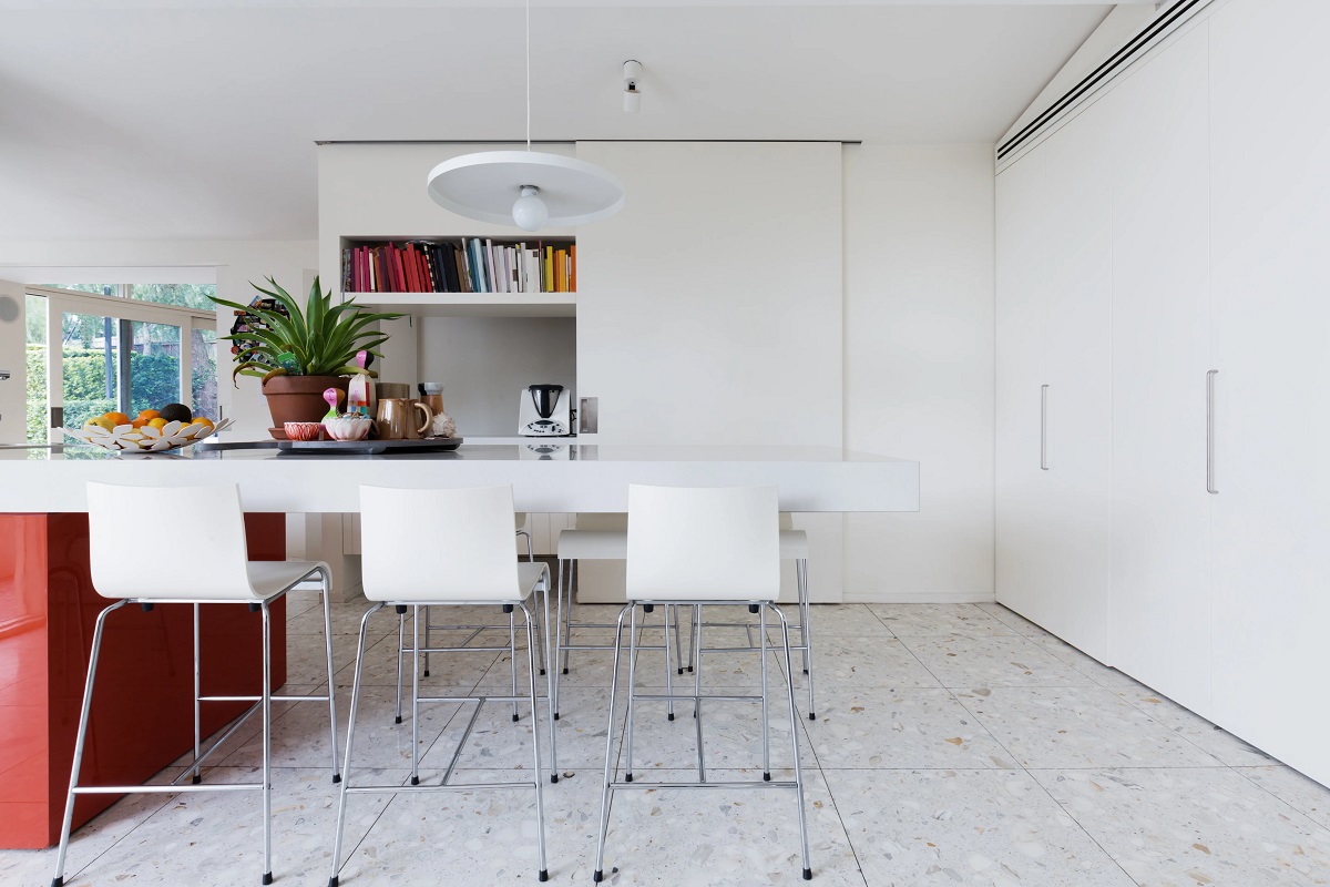
Pure White
While white is often associated with cleanliness and simplicity, using pure white as the dominant color in a family room may not be the best choice. While it can create a sense of brightness and spaciousness, pure white can also make a room feel cold, sterile, and lacking in warmth.
Using pure white on all surfaces, including walls and furniture, can create a stark and clinical atmosphere. It may not provide the cozy and inviting feeling that is desired in a family room. Additionally, pure white can be challenging to maintain, as it can easily show dirt, smudges, and stains.
If you still want to incorporate white into your family room, consider opting for off-white or creamy shades instead. These variations of white can add warmth to the space while still creating a bright and fresh atmosphere. Off-white colors also tend to be more forgiving when it comes to dirt and stains.
Incorporating texture and different shades of white can also add depth and visual interest to the room. For example, mix in textured white fabrics, such as a cozy knit throw or a fluffy rug, to create a more inviting and comfortable space.
Pairing white with other colors can also help to balance the room and prevent it from feeling too sterile. Consider combining white with complementary colors, such as soft blues or warm neutrals, to create a more inviting and visually appealing color scheme.
Ultimately, when using white in a family room, it is important to create a balance between a clean and bright atmosphere and a cozy, welcoming environment. By opting for off-white shades and incorporating texture and complementary colors, you can create a family room that is both visually appealing and comfortable.
Conclusion
When it comes to designing your family room, color selection is a critical factor in creating the right ambiance and atmosphere. While there is no fixed set of rules for color choices, it is important to consider the impact that certain colors can have on the overall feel of the space. In this article, we have explored five colors that interior design experts recommend avoiding in family rooms: red, black, bright orange, neon green, and pure white.
Red, although warm and inviting, should be used sparingly in the family room to prevent it from feeling too intense. Black, while elegant and sophisticated, can make the room feel smaller and darker if used excessively. Bright orange and neon green, with their vibrant and intense nature, can create overwhelming and visually distracting environments. Pure white, though commonly associated with cleanliness, can make a family room feel cold and lacking in warmth when used as the dominant color.
However, it is important to note that all of these colors can still be incorporated into your family room design in different ways. When used in moderation or as accent colors, they can add depth, vibrancy, and personality to the space. The key is to strike a balance and create a harmonious color scheme that aligns with the overall style and purpose of your family room.
Ultimately, the goal of designing your family room is to create a space that is inviting, comfortable, and reflective of your personal style. By carefully considering color choices and being mindful of how they can impact the space, you can create a family room that is not only visually appealing but also conducive to relaxation, bonding, and quality time with your loved ones.
Frequently Asked Questions about 5 Colors To Avoid In Your Family Room – According To Experts
Was this page helpful?
At Storables.com, we guarantee accurate and reliable information. Our content, validated by Expert Board Contributors, is crafted following stringent Editorial Policies. We're committed to providing you with well-researched, expert-backed insights for all your informational needs.


0 thoughts on “5 Colors To Avoid In Your Family Room – According To Experts”