Home>Interior Design>What Colors Go With Cream? 8 Complementary Colors
Interior Design
What Colors Go With Cream? 8 Complementary Colors
Modified: August 28, 2024
Discover the perfect interior design color combinations to enhance your cream-colored space. Explore 8 complementary colors that go harmoniously with cream.
(Many of the links in this article redirect to a specific reviewed product. Your purchase of these products through affiliate links helps to generate commission for Storables.com, at no extra cost. Learn more)
Introduction
When it comes to interior design, choosing the right color palette is essential for creating a harmonious and visually appealing space. One color that serves as a versatile base and pairs well with a variety of other shades is cream. Cream is a warm and neutral color that brings a sense of elegance and sophistication to any room. It provides a soft and inviting backdrop that can be complemented by a range of different colors.
In this article, we will explore eight complementary colors that go well with cream. Each of these colors will add its own unique touch and create a cohesive and stylish look.
Key Takeaways:
- Cream pairs beautifully with a range of colors, from calming blue to vibrant coral, creating stunning and versatile color combinations for interior design.
- Experimenting with different textures and shades of complementary colors can help achieve a harmonious and visually captivating interior design when paired with cream.
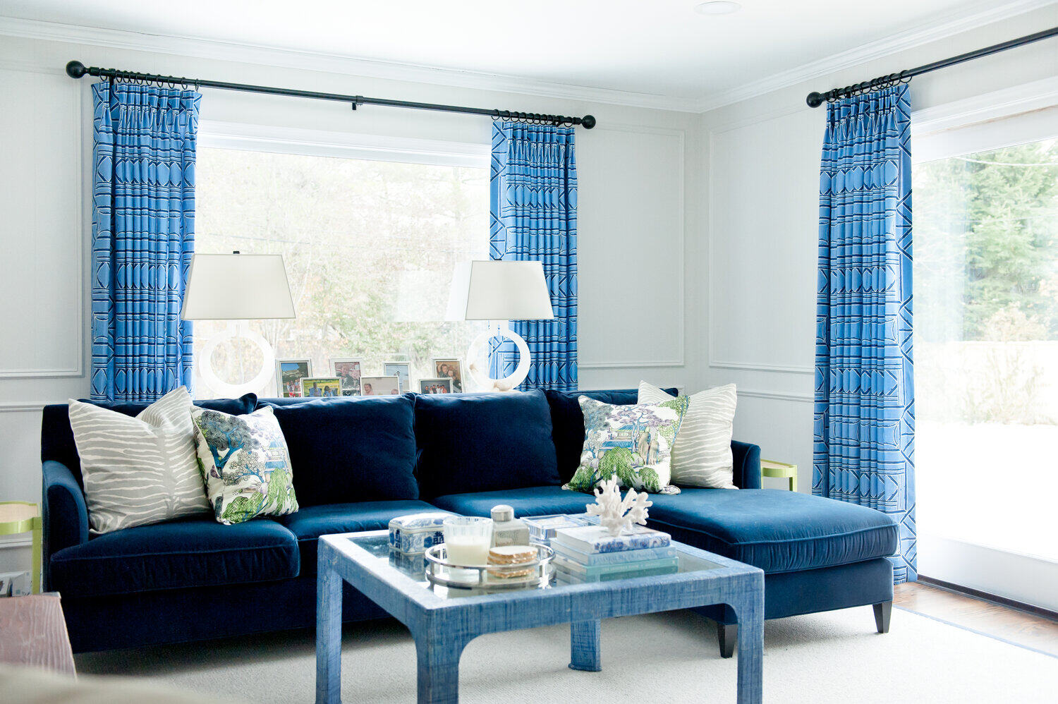
Blue
Blue is a calming and serene color that is often associated with the sky and the sea. It evokes a sense of tranquility and can create a soothing atmosphere in any room. When paired with cream, the combination is timeless and sophisticated.
The softness of cream harmonizes beautifully with varying shades of blue. Light blue shades like baby blue or powder blue create a refreshing and airy ambiance when combined with cream. On the other hand, darker shades like navy blue or royal blue add depth and richness to the space.
There are several ways to incorporate blue and cream in your interior design. For example, you can use cream as the primary color for the walls, furniture, and larger elements in the room. Then, introduce pops of blue through accents like throw pillows, curtains, or artwork. This combination creates a balanced and visually pleasing aesthetic.
Another option is to use blue as the dominant color and cream as the accent. This can be achieved by painting the walls in shades of blue and incorporating cream-colored furniture, rugs, and accessories. The cream accents provide a subtle contrast and help to soften the overall look.
For a more dynamic and bold look, consider combining different shades of blue with cream. For instance, you can layer different shades of blue in your decor, such as using a navy blue sofa paired with cream-colored walls and light blue curtains. This creates a visually interesting and sophisticated space.
Overall, blue and cream make for a classic and elegant color combination. Whether you prefer a subtle and understated look or a more vibrant and eclectic style, the pairing of blue and cream is sure to create a beautiful and inviting space.
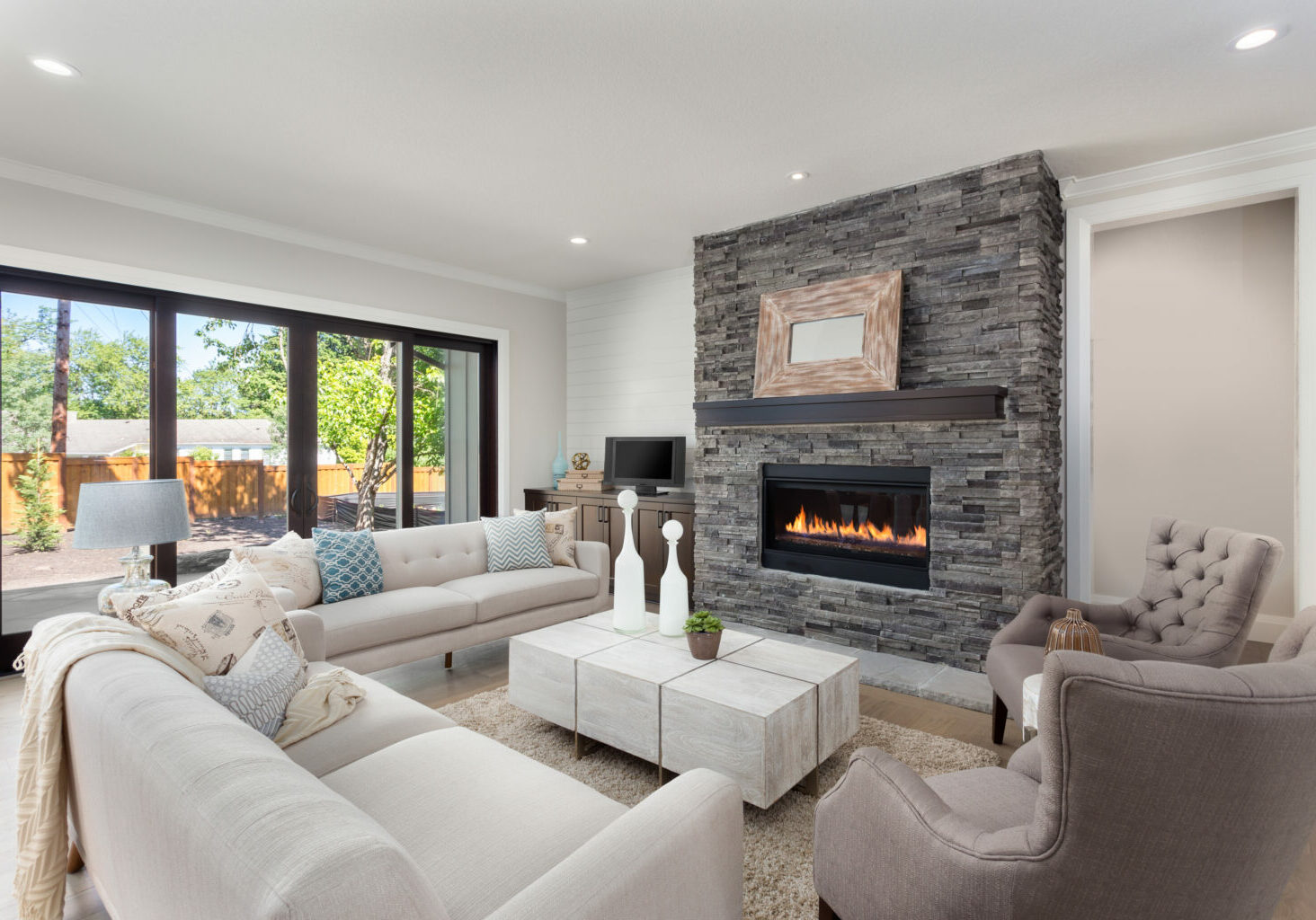
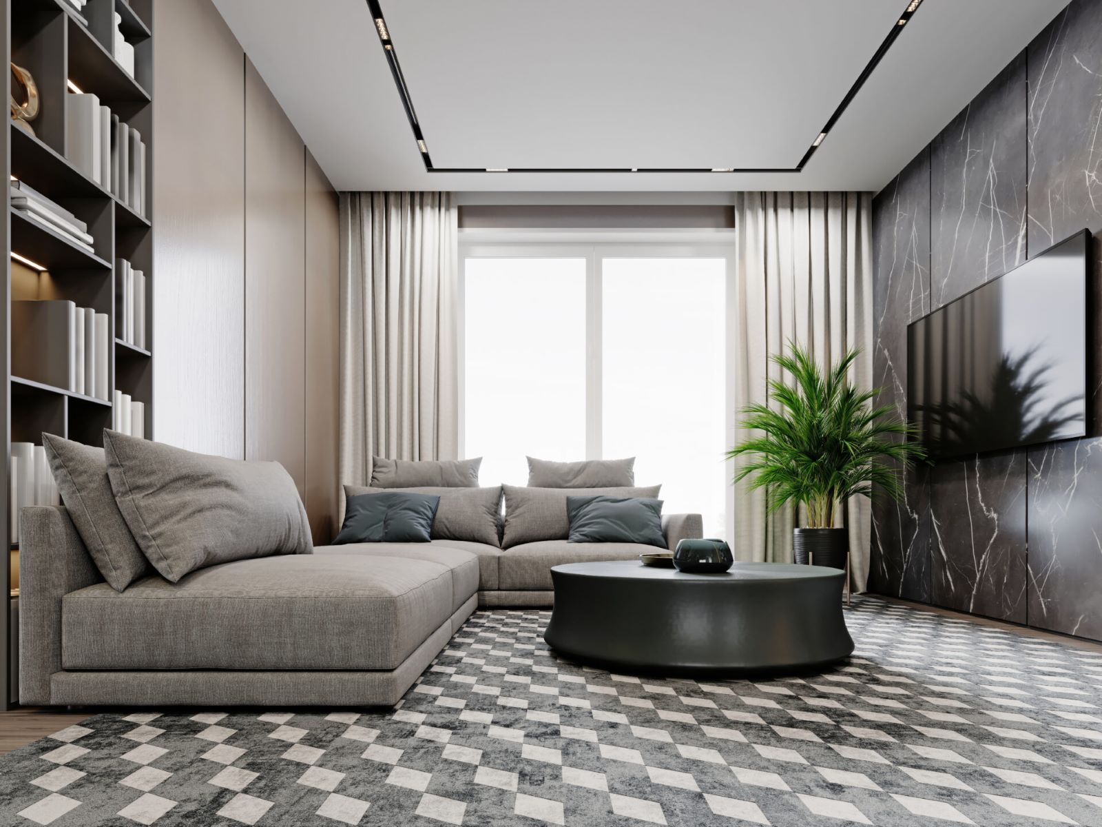
Grey
Grey is a versatile and neutral color that has become increasingly popular in interior design. It is a sophisticated and modern choice that complements cream exceptionally well. Grey adds depth and elegance to a space, while cream brings warmth and softness.
There are various shades of grey, ranging from light hues like dove grey to deep, charcoal tones. When paired with cream, the combination creates a serene and refined ambiance. Light grey walls combined with cream furnishings can give a room an airy and calming feel, perfect for bedrooms or living rooms.
For a more dramatic look, consider using darker grey shades in your design. Charcoal grey or slate grey combined with cream accents create a striking contrast and add a touch of luxury to the space. This combination works well in modern or industrial-style interiors.
When it comes to incorporating grey and cream into your décor, there are endless possibilities. You can opt for a monochromatic look by using different shades of grey and cream throughout the room. This creates a cohesive and sophisticated atmosphere.
Alternatively, you can use grey as the dominant color and add cream accents to soften the overall look. For example, grey walls with cream trimmings or a cream-colored sofa against a grey backdrop can create a chic and inviting space.
To add visual interest, you can also experiment with textures when combining grey and cream. Mix fabrics like wool, velvet, or linen in different shades of grey and cream to create depth and dimension in your design.
Remember, the key to achieving a harmonious color combination is to balance the proportions of grey and cream in the room. Pay attention to the natural lighting in the space as well, as it can influence how the colors appear.
Whether you prefer a minimalist, traditional, or contemporary style, the combination of grey and cream is sure to create an elegant and timeless aesthetic in your interior design.
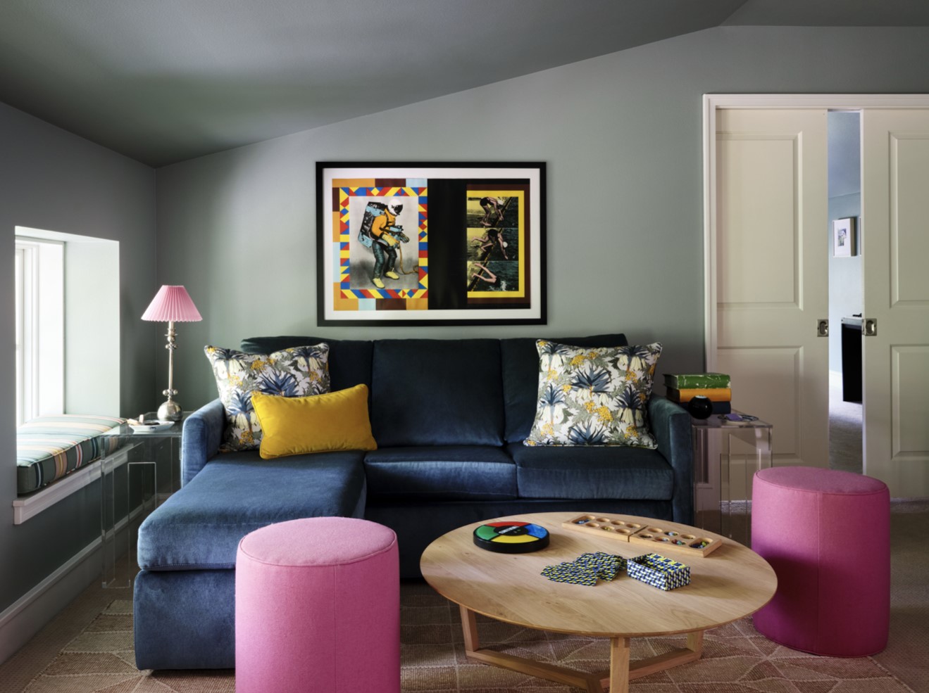
Pink
Pink is a color often associated with femininity, romance, and sweetness. It is a versatile and playful color that can be used to create various moods in interior design. When paired with cream, pink creates a soft and delicate color combination that is both soothing and visually pleasing.
There are numerous shades of pink, from light pastels like blush pink to deeper hues like dusty rose or mauve. The choice of pink shade will determine the overall atmosphere of the room. Lighter shades of pink combined with cream create a serene and airy ambiance, perfect for bedrooms or nurseries.
When incorporating pink and cream, it’s important to strike a balance between the two colors. Too much pink can be overwhelming, but when used strategically with cream, it creates a visually appealing and harmonious look.
One option is to use cream as the dominant color and introduce pops of pink as accents. For example, you can have cream-colored walls and furniture, and then add pink throw pillows, curtains, or artwork to bring a touch of color and playfulness to the space.
On the other hand, you can use pink as the main color and use cream as a supporting accent. This can be achieved by painting the walls in a shade of pink and incorporating cream-colored furniture and accessories. The cream accents provide a soft contrast and help to balance out the vibrancy of the pink.
For a more sophisticated and modern look, consider combining different shades of pink and cream. This creates a layered and textured effect in the room. For example, you can have pale pink walls, cream-colored furniture, and deeper pink accents through accessories or drapes.
When it comes to fabric choices, consider using soft textures like velvet or silk in shades of pink and cream. This adds depth and richness to the space and creates a luxurious atmosphere.
The combination of pink and cream is versatile and can work well in various design styles, from traditional to contemporary. It brings a sense of warmth and elegance to any room and is particularly popular in bedrooms, living rooms, or even home offices.
Experiment with different shades of pink and cream to find the balance that suits your personal style and create a beautiful and inviting space.
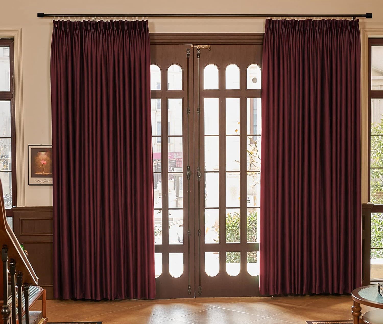
Purple
Purple is a color that symbolizes luxury, creativity, and spirituality. It comes in various shades, including lavender, lilac, violet, and deep plum. When paired with cream, purple creates a rich and regal color combination that adds a touch of elegance to any room.
Purple and cream complement each other beautifully, creating a sense of harmony and balance. The combination of these colors evokes a sense of calmness, making it an excellent choice for bedrooms or lounging areas.
Lighter shades of purple, such as lavender or lilac, when combined with cream, create a soft and serene environment. These gentle hues can be used on the walls or as accent pieces, such as pillows or curtains. Cream-colored furniture against a backdrop of light purple walls creates a subtle and sophisticated look.
On the other hand, darker shades of purple, like deep plum or royal purple, paired with cream, create a more dramatic and opulent ambiance. For a luxurious touch, you can incorporate purple velvet furniture or accessories against cream-colored walls. This combination is particularly suited for formal dining rooms or grand living spaces.
When using purple and cream together, it’s important to find the right balance. Too much purple can overpower the space, so it’s advisable to use cream as the dominant color and introduce touches of purple as accents. This can be done through decorative elements like artwork, rugs, or cushions.
Consider incorporating different textures when combining purple and cream. Velvet, silk, or satin materials in shades of purple and cream add depth and a tactile appeal to the room. A plush purple rug against cream flooring or a cream-colored velvet sofa with purple throw pillows can create an inviting and visually striking look.
Whether your style is modern, traditional, or eclectic, the combination of purple and cream offers versatility and sophistication. Experiment with different shades and find the right balance to create a captivating and luxurious atmosphere in your space.
Cream is a versatile color that pairs well with many others. Complementary colors include navy blue, sage green, dusty rose, charcoal gray, mustard yellow, soft peach, chocolate brown, and deep plum.
Read more: What Color Curtains Go With Cream Walls
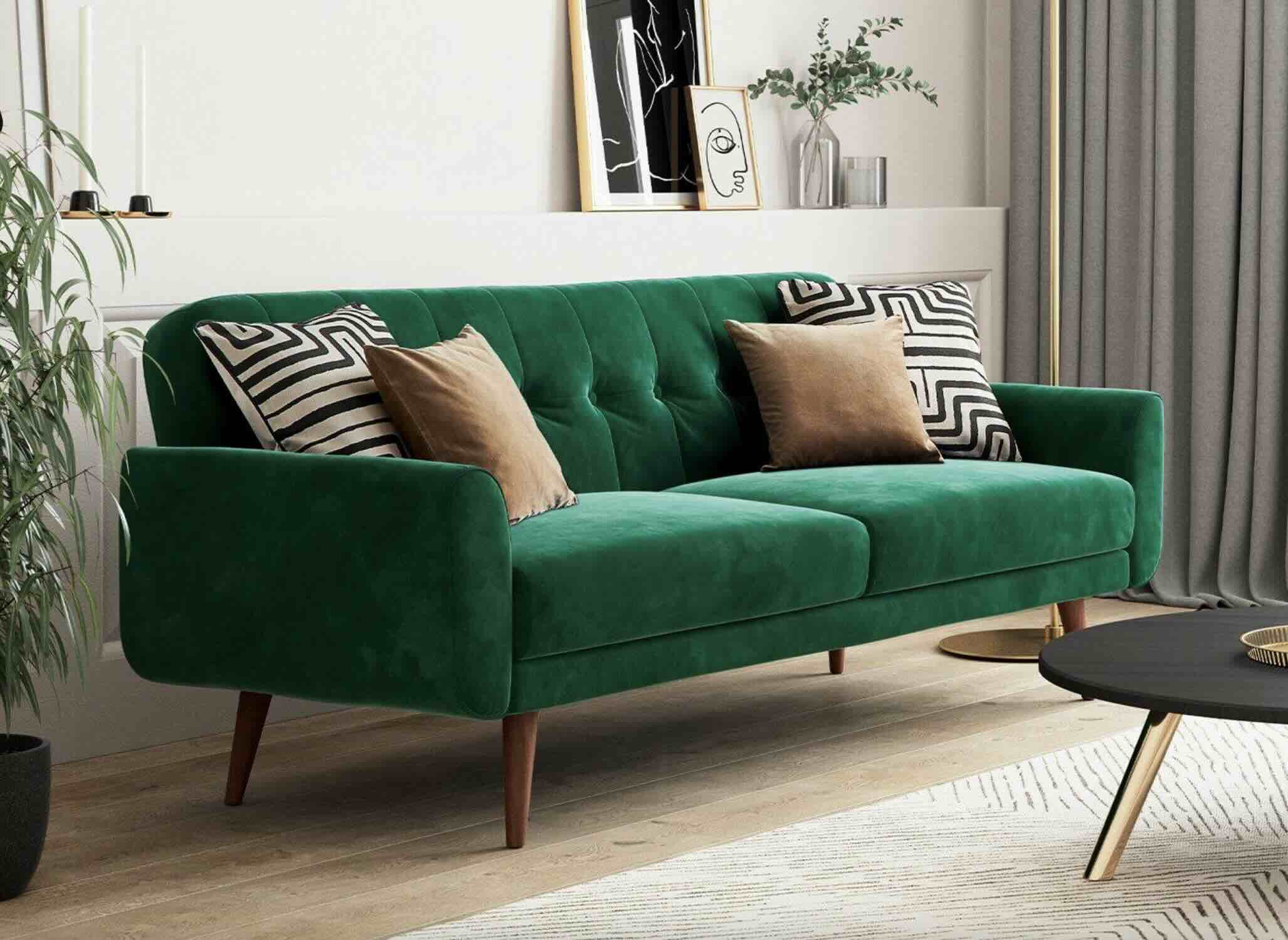
Green
Green is a color that is associated with nature, freshness, and tranquility. It brings a sense of calmness and rejuvenation to any space. When paired with cream, green creates a harmonious and refreshing color combination that can transform your interior design.
Green comes in various shades, from light and pale mint green to deep and rich emerald or forest green. When combined with cream, the result is a soothing and balanced color palette that works well in any room of the house.
Lighter shades of green, such as mint or sage, paired with cream create a soft and airy ambiance. This combination is ideal for creating a tranquil and peaceful atmosphere in bedrooms or living rooms. Cream walls with green accents through bedding, curtains, or plants can bring a touch of nature indoors.
For a more vibrant and energizing look, consider incorporating deeper shades of green with cream. Emerald or forest green furniture against cream-colored walls creates a striking contrast and adds a touch of drama to the space. Additionally, green plants against a cream backdrop can bring life and freshness to the room.
One way to incorporate green and cream in your interior design is to use cream as the base color for walls, floors, and larger furniture pieces. Then, add pops of green through smaller accents such as throw pillows, rugs, or artwork. This combination creates a balanced and visually pleasing look.
Another option is to use green as the dominant color and incorporate cream as a supporting accent. For example, you can paint the walls in a shade of green and add cream-colored trimmings or furniture. This combination provides a refreshing and uplifting atmosphere.
When combining green and cream, it’s essential to consider the natural lighting in the room. Green can be sensitive to different lighting conditions, so it’s important to test the shades and see how they appear in different lighting situations.
Whether you prefer a modern, rustic, or bohemian style, the combination of green and cream offers versatility and a connection to nature. Experiment with different shades and textures to create a serene and inviting environment in your home.
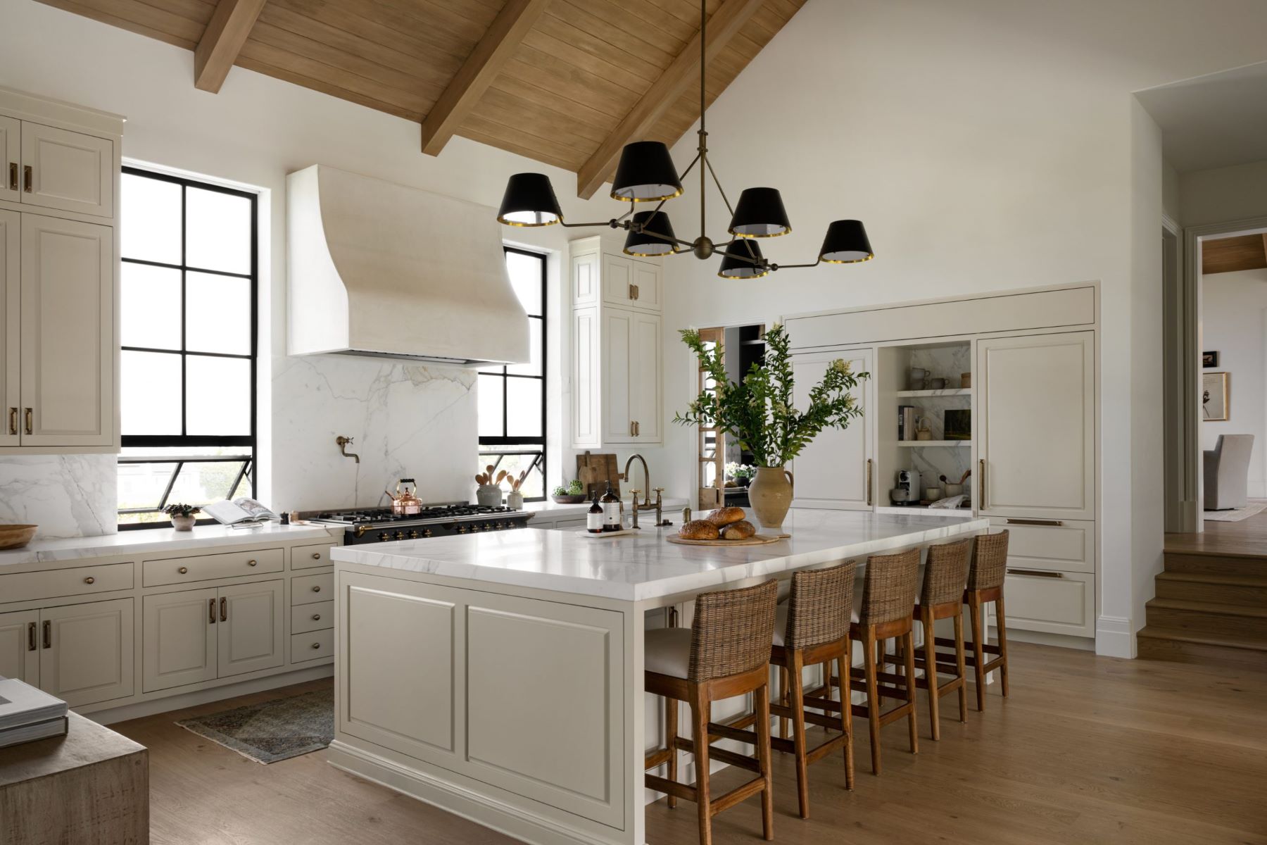
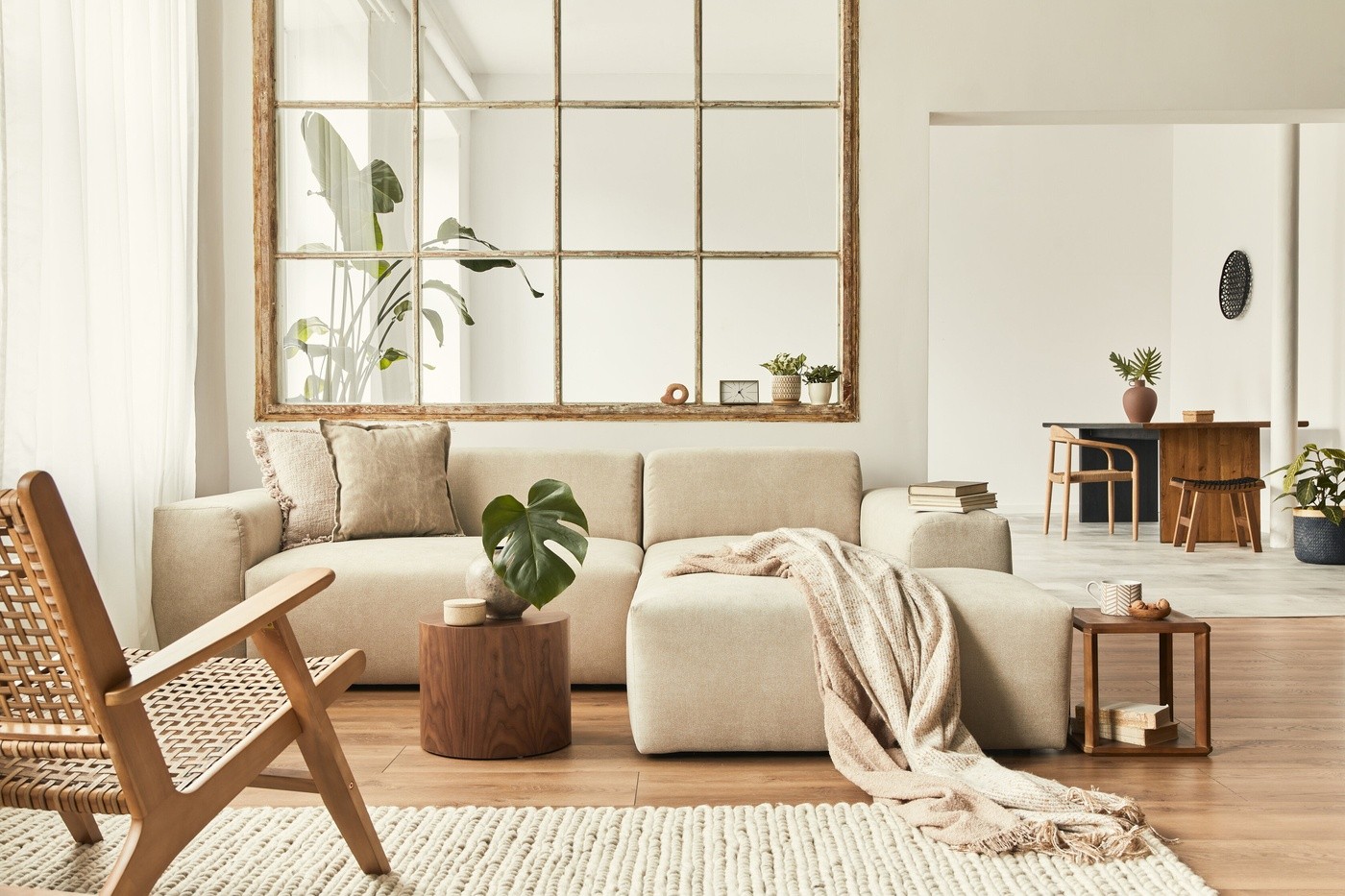
Brown
Brown is a warm and earthy color that conveys a sense of stability, warmth, and comfort. When paired with cream, brown creates a cozy and inviting color combination that can transform your space into a haven of relaxation.
Brown comes in various shades, from light and creamy taupe to deep and rich chocolate brown. When combined with cream, the result is a timeless and versatile color palette that works well in a range of design styles.
Lighter shades of brown, such as beige or taupe, paired with cream create a soft and neutral foundation for your interior design. This combination is perfect for creating a serene and calming atmosphere in bedrooms or living rooms. Cream-colored walls with light brown furnishings provide a soothing and comfortable space to unwind.
For a more dramatic look, consider incorporating deeper shades of brown with cream. Dark chocolate brown furniture against cream walls creates a striking contrast and adds a touch of sophistication to the room. Additionally, brown wood accents, such as flooring or cabinetry, paired with cream-colored countertops or tiles, create a warm and inviting kitchen or bathroom.
When using brown and cream together, it’s important to find the right balance. Too much brown can make a space feel heavy, so it’s advisable to use cream as the dominant color and introduce touches of brown as accents. This can be done through furniture, rugs, throw pillows, or decorative accessories.
Textures are also vital when combining brown and cream. Soft fabrics like suede, leather, or cotton in shades of brown and cream add depth and warmth to the space. A cream-colored sofa with brown leather accents or a plush brown rug against cream flooring can create a cozy and inviting atmosphere.
The combination of brown and cream is versatile and works well in various design styles, from traditional to modern. It evokes a sense of comfort and harmony, making it ideal for creating a welcoming and homely ambiance.
Experiment with different shades of brown and cream to find the perfect balance that suits your personal style and creates a beautiful and inviting space.
Gold
Gold is a color that symbolizes luxury, elegance, and opulence. When paired with cream, gold creates a stunning and sophisticated color combination that adds a touch of glamour to any interior design.
Gold is a warm and radiant color that can range from soft and subtle tones to bold and vibrant shades. When combined with cream, the combination creates a harmonious and visually pleasing look.
Lighter shades of gold, such as champagne or pale gold, paired with cream create a soft and elegant ambiance. This combination is perfect for creating a sense of warmth and luxury in living rooms or dining areas. Cream-colored walls with gold accents through furniture, lighting fixtures, or decorative objects can give the space a refined and glamorous look.
For a more dramatic and opulent look, consider incorporating deeper shades of gold with cream. Rich and shimmering gold tones against cream walls create a striking contrast and add a sense of grandeur to the room. Gold accents like chandeliers, mirrors, or metallic finishes can create a luxurious and captivating space.
When using gold and cream together, it’s important to find the right balance. Too much gold can overpower the space, so it’s advisable to use cream as the dominant color and introduce touches of gold as accents. This can be done through accessories, trimmings, or textiles.
Additionally, gold pairs well with cream in patterns and textures. Consider using cream-colored wallpapers or fabrics with gold patterns or motifs. This adds depth and visual interest to the space.
For a more contemporary look, pairing cream and gold with other neutral colors like grey or beige can create a modern and sophisticated atmosphere. Cream walls with gold and grey accents through furniture and accessories result in a chic and stylish design.
Overall, the combination of gold and cream creates a luxurious and timeless aesthetic. It works well in various design styles, from traditional to modern, and can elevate the elegance of any room.
Experiment with different shades of gold and cream to create a space that exudes glamour and sophistication.
Coral
Coral is a vibrant and energetic color that is often associated with the beauty of the ocean and tropical destinations. When paired with cream, coral creates a lively and cheerful color combination that can bring a sense of warmth and playfulness to your space.
Coral is a shade of orange with a touch of pink, giving it a unique and lively appeal. When combined with cream, the result is a captivating and harmonious color palette.
Lighter shades of coral, such as peach or salmon, paired with cream create a soft and refreshing ambiance. This combination is perfect for creating a bright and invigorating atmosphere in bedrooms or bathrooms. Cream-colored walls with coral accents through bedding, curtains, or wall art can infuse the space with a vibrant and energetic vibe.
For a bolder and more vibrant look, consider incorporating deeper shades of coral with cream. Rich and intense coral tones against cream walls or furniture create a striking contrast and add a touch of drama to the room. Coral accent pieces like chairs, rugs, or artwork can create a focal point and make a bold statement within the space.
When using coral and cream together, it’s important to achieve the right balance. Too much coral can overwhelm the space, so it’s advisable to use cream as the dominant color and introduce touches of coral as accents. This can be done through pillows, accessories, or decorative accents.
Coral also pairs well with cream in patterns and textures. Consider using cream-colored fabrics with coral patterns or incorporating textured coral pieces into the space. This adds depth and visual interest to the overall design.
The combination of coral and cream works well in various design styles, from coastal to bohemian and even modern. It brings a sense of vitality and freshness to any room.
Experiment with different shades of coral and cream to find the right balance that suits your personal style and creates a vibrant and inviting space.
Conclusion
Choosing the right color combinations is crucial in interior design, and when it comes to complementing cream, there are several beautiful options. From the calming and serene blue to the versatile and neutral grey, each color brings its own unique charm when paired with cream. The soft and delicate pink, the regal and luxurious purple, the vibrant and refreshing green, the warm and cozy brown, the opulent and glamorous gold, and the lively and energetic coral all create stunning color combinations that can transform your space.
When incorporating these complementary colors with cream, it’s essential to find the right balance. The use of cream as a dominant or supporting color, experimentation with textures, and thoughtful placement of accents all contribute to creating a cohesive and captivating design. Whether you prefer a subtle and understated look or a bold and vibrant style, these color combinations offer endless possibilities for creating a harmonious and visually appealing space.
Remember, interior design is about personal expression and creating a space that reflects your unique taste and style. Don’t be afraid to experiment, mix and match, and trust your instincts when it comes to choosing colors to complement cream. By combining the right colors, you can achieve a beautiful, inviting, and visually captivating interior that you’ll love to spend time in.
So, embrace the versatility of cream and explore the endless possibilities of color combinations. Let your creativity shine and transform your living spaces into a true reflection of your personality and style.
Frequently Asked Questions about What Colors Go With Cream? 8 Complementary Colors
Was this page helpful?
At Storables.com, we guarantee accurate and reliable information. Our content, validated by Expert Board Contributors, is crafted following stringent Editorial Policies. We're committed to providing you with well-researched, expert-backed insights for all your informational needs.


0 thoughts on “What Colors Go With Cream? 8 Complementary Colors”