Home>Interior Design>What Are The Most Relaxing Colors? Experts Prefer These Hues
Interior Design
What Are The Most Relaxing Colors? Experts Prefer These Hues
Modified: September 2, 2024
Discover the most relaxing colors recommended by interior design experts. Transform your space with soothing hues that create a serene atmosphere.
(Many of the links in this article redirect to a specific reviewed product. Your purchase of these products through affiliate links helps to generate commission for Storables.com, at no extra cost. Learn more)
Introduction
When it comes to designing your home, one of the key elements to consider is the color scheme. Colors have the power to evoke certain emotions and create different atmospheres. This is especially important in spaces where you want to relax and unwind, such as the bedroom or living room. Choosing the right colors for these areas can significantly contribute to creating a serene and calming environment.
In this article, we will explore the most relaxing colors recommended by experts in interior design. Understanding the psychology behind these colors will help you make informed decisions when it comes to decorating your home and creating a peaceful sanctuary.
Key Takeaways:
- Create a serene sanctuary at home by incorporating relaxing colors like blue, green, and gray. These hues have the power to evoke tranquility and promote a sense of calmness and well-being in your living spaces.
- Personal preference plays a significant role in choosing the most relaxing colors for your home. Experiment with different shades and tones of blue, green, purple, pink, gray, and white to find the perfect palette that brings you the utmost relaxation and tranquility.
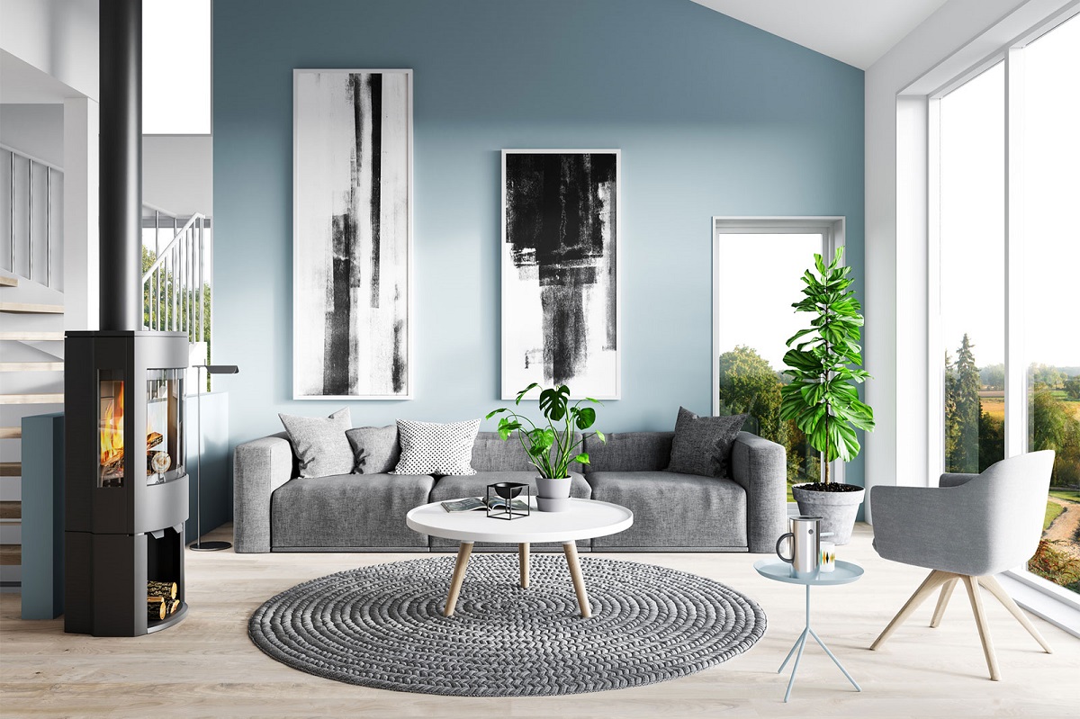
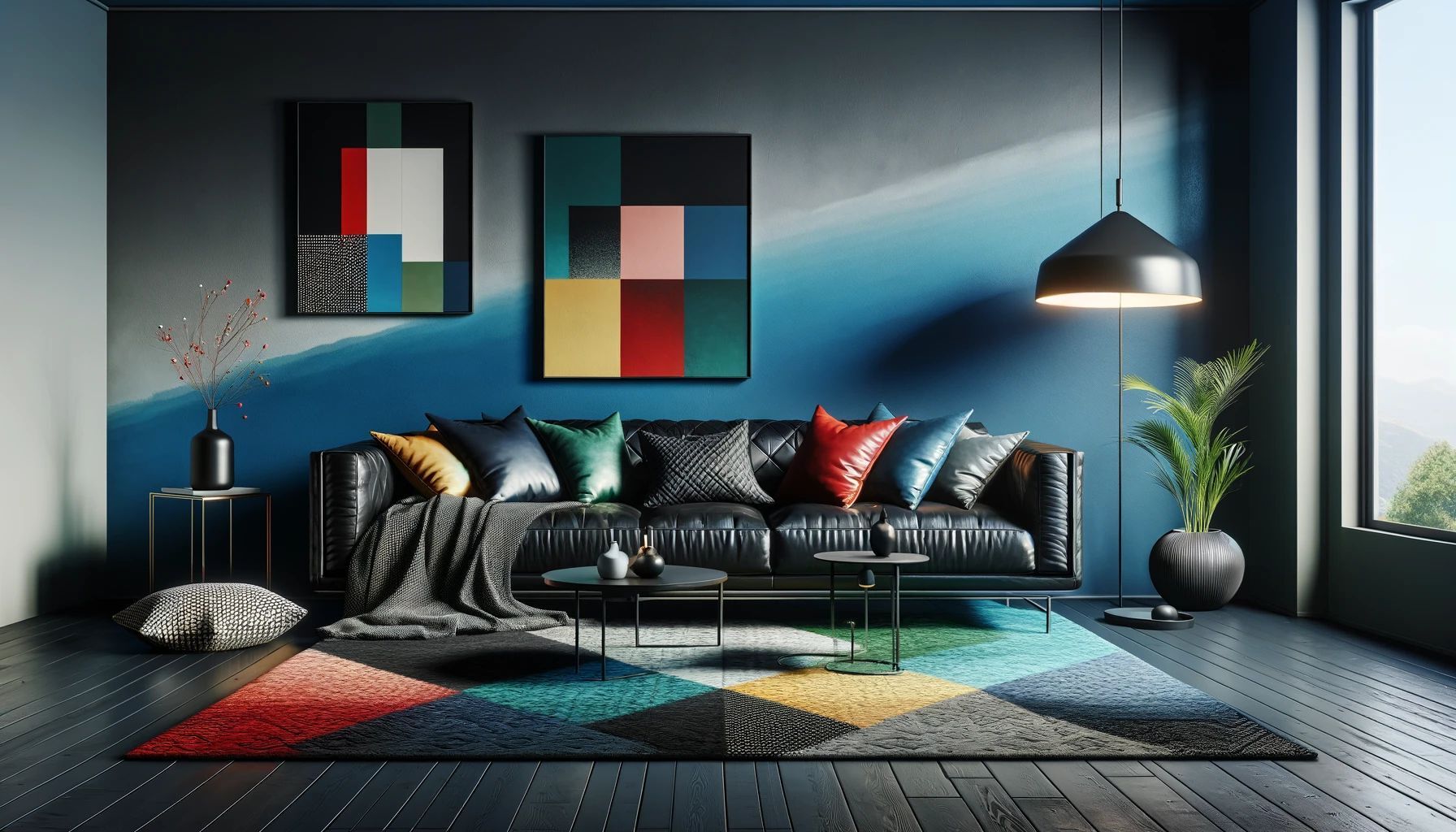
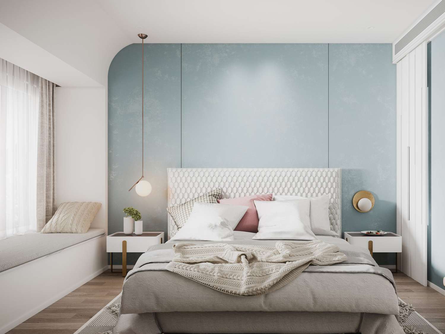
Blue
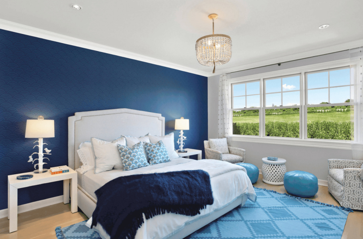
When it comes to relaxation, blue is often considered the go-to color. This serene hue has a calming effect on the mind and body, making it an excellent choice for bedrooms and spaces where you want to promote a sense of tranquility.
Blue is associated with the sky and the ocean, evoking feelings of peace and serenity. Its cool undertones can help lower blood pressure and heart rate, creating a soothing environment. In fact, studies have shown that exposure to blue can even decrease feelings of anxiety and stress.
There are various shades of blue that you can choose from, each with its own unique appeal. Lighter shades like baby blue or sky blue create a sense of openness and purity, while darker shades like navy or indigo add a touch of sophistication and depth to a space.
It’s important to note that different shades of blue can have different effects on individuals. Lighter blues can promote a sense of relaxation and introspection, while darker blues can convey a sense of stability and security. Consider your personal preferences and the overall theme of your space when selecting the shade of blue that best suits your needs.
Incorporating blue into your interior design can be done in various ways. You can opt for blue wall paint or wallpaper, or use blue as an accent color through textiles, furniture, or artwork. Mixing different textures and shades of blue can add visual interest and depth to your space.
Pairing blue with neutral colors like white or gray can create a clean and timeless look. Additionally, combining blue with natural elements such as wood or plants can enhance its calming effect and create a harmonious and peaceful ambiance.
Overall, blue is a versatile and universally loved color that can create a relaxing and tranquil environment in your home. Whether you choose a light or dark shade, incorporating blue into your interior design can have a significant positive impact on your overall well-being.
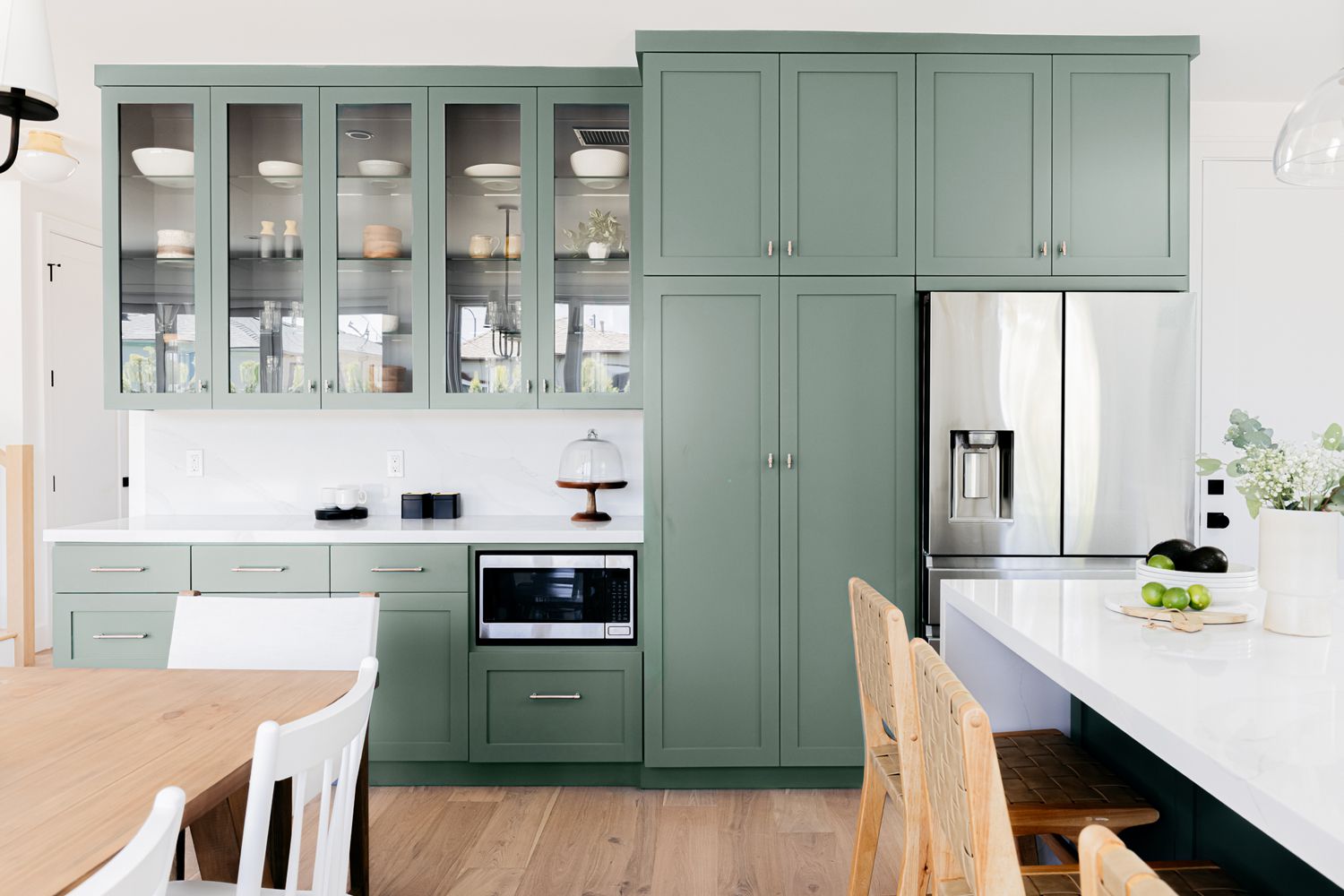
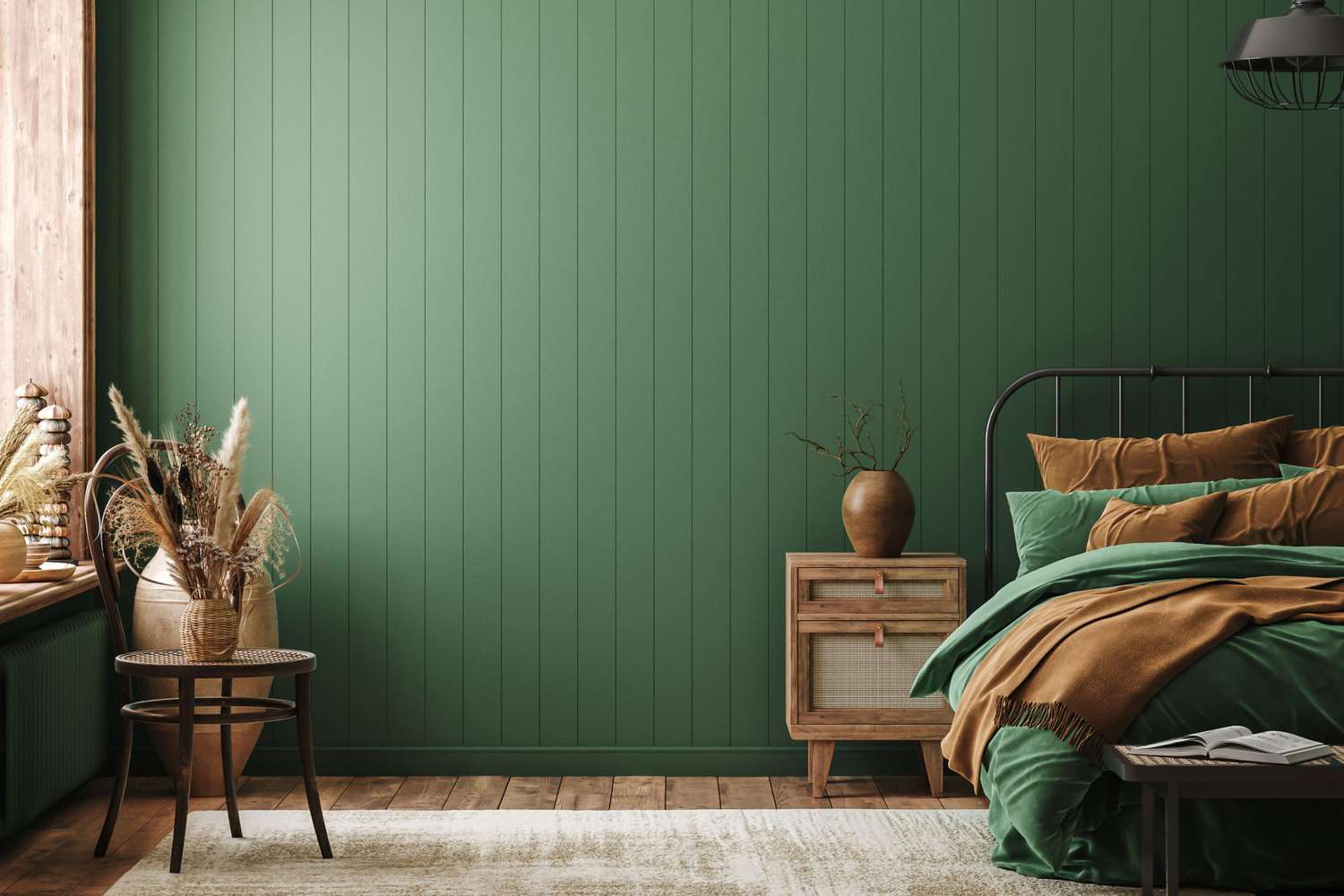
Green
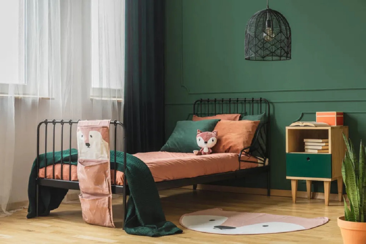
When it comes to creating a soothing and relaxing atmosphere, green is another color that experts highly recommend. As the color of nature, green has a calming and rejuvenating effect on the mind and body.
Green is associated with feelings of harmony, balance, and renewal. It has been proven to reduce stress and anxiety, making it an excellent choice for spaces where you want to unwind and relax.
Similar to blue, there are various shades of green to choose from, each with its own unique qualities. Lighter shades of green, such as mint or sage, can create a refreshing and airy ambiance. These shades are particularly well-suited for bathrooms or spaces where you want to create a spa-like atmosphere.
On the other hand, darker shades of green, like forest or emerald, can add a touch of sophistication and depth to a space. These darker shades work well in living rooms or home offices, creating a sense of groundedness and calm.
One of the benefits of using green in your interior design is that it pairs beautifully with a wide range of other colors. From neutrals like white and beige to earthy tones like brown or terracotta, green can complement and enhance the overall aesthetic of your space.
There are various ways to incorporate green into your home design. You can paint your walls in shades of green or add green accents through furniture, textiles, or decor pieces. Indoor plants are also a fantastic way to bring greenery into your space while improving air quality and adding a natural touch.
When it comes to creating a relaxing and serene environment, consider combining green with other calming colors like blue or neutral tones. This combination can create a harmonious and tranquil atmosphere that promotes a sense of calmness and well-being.
Ultimately, green is a versatile and refreshing color that can instantly create a relaxing and rejuvenating environment in your home. Whether you choose to incorporate light or dark shades, adding green elements to your interior design will help you create a serene sanctuary where you can unwind and recharge.
Purple
When it comes to creating a sense of luxury and relaxation, purple is a color that experts recommend. Often associated with royalty, purple represents elegance, creativity, and spirituality.
Purple is a unique color that combines the calming properties of blue with the stimulating qualities of red. It has a soothing effect on the mind and can promote a sense of relaxation and introspection.
There are different shades of purple to choose from, ranging from soft lavenders to rich deep purples. Lighter shades like lavender and lilac can create a calming and serene atmosphere, especially in bedrooms or meditation spaces. These shades are known to promote a sense of tranquility and balance.
On the other hand, deeper shades of purple, such as eggplant or plum, can add an air of sophistication and opulence to a space. These darker tones work well in areas where you want to create a cozy and luxurious ambiance.
Incorporating purple into your interior design can be done in various ways. Paint your walls in shades of purple, or use purple as an accent color through furniture, textiles, or decorative accessories. Purple can also be incorporated through artwork, rugs, or curtains to add a stylish touch to your space.
When it comes to pairing purple with other colors, it works well with both warm and cool tones. For a soothing and calming effect, pair purple with lighter shades of blue or neutral tones like gray or beige. If you want to create a bold and vibrant look, combine purple with contrasting colors like yellow or orange.
When using purple in your interior design, it’s important to find the right balance. Too much purple can create an overwhelming and heavy atmosphere, so consider using it as an accent color and incorporating other complementary colors to create a well-rounded design.
Ultimately, purple is a versatile and sophisticated color that can add a touch of luxury and relaxation to your home design. Whether you choose light or dark shades, incorporating purple elements will help you create a serene and elegant space where you can unwind and find inspiration.
When looking for relaxing colors, consider soft blues, greens, and lavenders. These colors are known to have a calming effect on the mind and body.
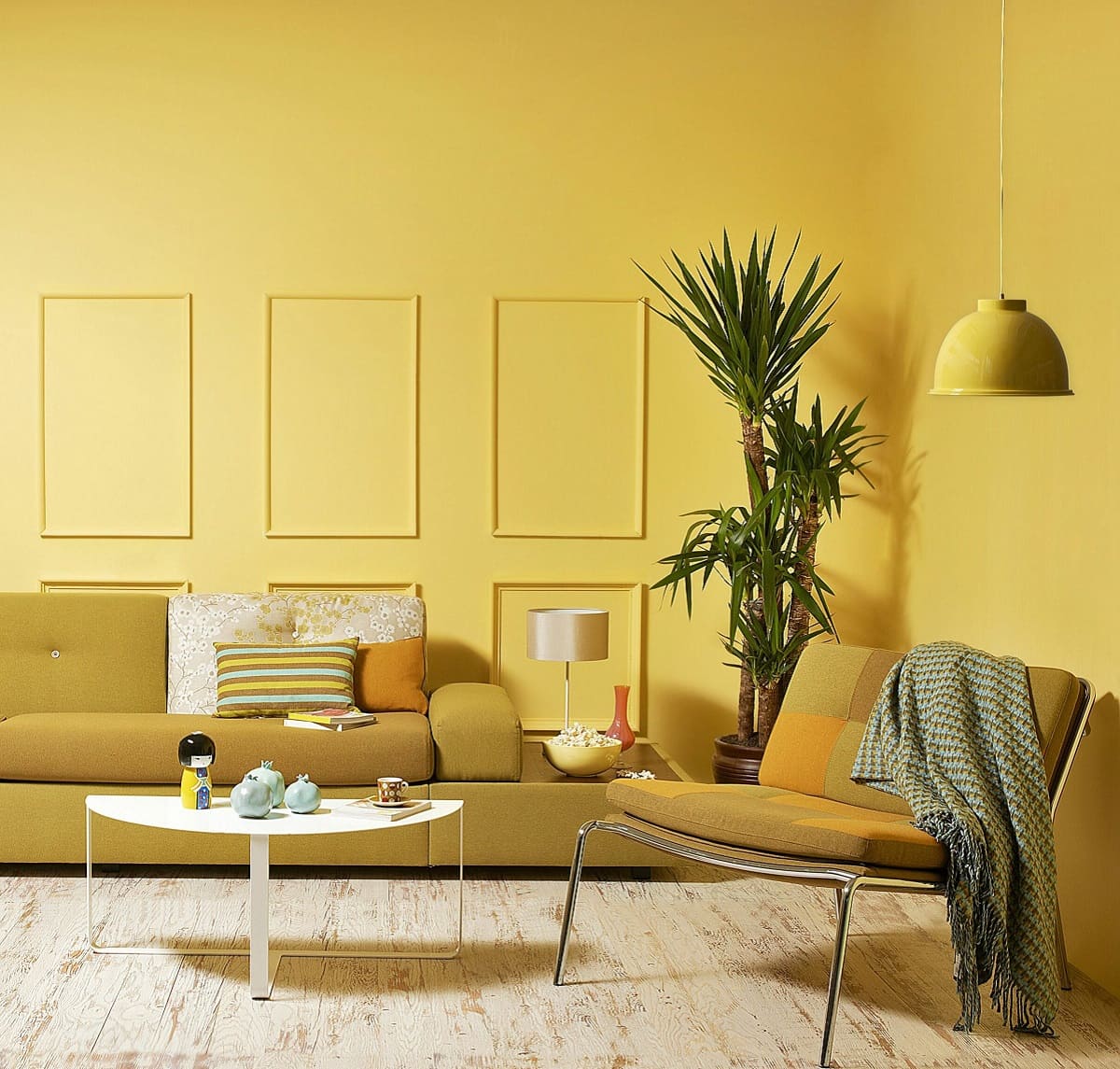
Pink
When it comes to creating a soft and calming atmosphere, pink is a color that experts recommend. Often associated with femininity and gentleness, pink has a soothing effect on both the mind and body.
Pink is known to evoke feelings of tranquility, love, and nurture. It can create a sense of warmth and comfort in a space, making it an excellent choice for areas where relaxation is desired, such as bedrooms or reading nooks.
There are various shades of pink to choose from, ranging from light pastels to vibrant fuchsias. Lighter shades like blush or baby pink create a gentle and serene ambiance, evoking a sense of innocence and calmness. These shades are commonly used in nurseries or spaces designed to promote a sense of tranquility.
On the other hand, deeper shades of pink, such as magenta or coral, can add a touch of vibrancy and energy to a space. These bolder tones work well in areas where you want to create a lively and uplifting atmosphere, such as living rooms or creative spaces.
Incorporating pink into your interior design can be done in various ways. Paint your walls in shades of pink to create a soft and inviting backdrop, or use pink as an accent color through furniture, textiles, or decorative accessories. Pink can also be incorporated through artwork, throw pillows, or area rugs, adding a playful and feminine touch to your space.
Pairing pink with neutral colors like white, beige, or gray can create a sophisticated and elegant look. This combination allows pink to shine while keeping the overall design balanced and harmonious. Alternatively, you can combine pink with complementary colors like green or blue for a fresh and vibrant look.
When using pink in your interior design, it’s important to consider the overall theme and mood you want to achieve. Too much pink can create an overwhelming or overly girly atmosphere, so it’s essential to find the right balance and incorporate other elements to create a well-rounded design.
Ultimately, pink is a versatile and soothing color that can add a sense of calmness and warmth to your home design. Whether you choose light or deep shades, incorporating pink elements will help you create a serene and inviting space where you can relax and rejuvenate.
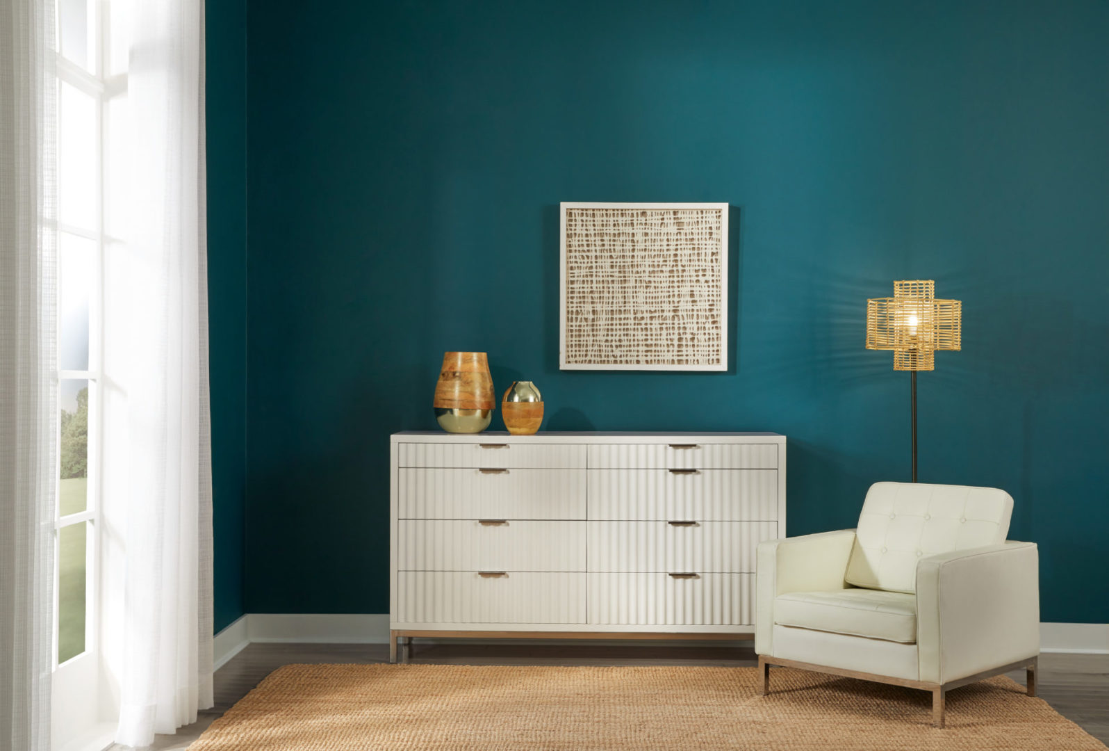
Gray
When it comes to creating a peaceful and timeless atmosphere, gray is a color that experts highly recommend. Gray is often associated with neutrality, sophistication, and balance, making it a versatile choice for creating a relaxing environment.
Gray is a color that doesn’t overpower a space but rather creates a sense of calmness and serenity. It is known for its ability to evoke a feeling of tranquility and can provide a perfect backdrop for other colors and elements in your home design.
There are various shades of gray to choose from, ranging from light and airy to deep and moody. Lighter shades like dove gray or silver can create a sense of openness and purity, allowing other elements in the room to shine. These shades work well in spaces where you want to promote a serene and minimalist aesthetic, such as bedrooms or home offices.
On the other hand, darker shades of gray, such as charcoal or slate, can add a touch of drama and elegance to a space. These deeper tones work well in areas where you want to create a cozy and intimate atmosphere, such as living rooms or dining areas.
Incorporating gray into your interior design can be done in various ways. Paint your walls in shades of gray, or use gray as a base color for furniture and textiles. Gray can also be used as an accent color through decorative accessories or artwork, adding depth and sophistication to your space.
Pairing gray with other colors can create different effects. Combining gray with cool colors like blue or green can create a calming and refreshing ambiance. On the other hand, pairing gray with warm colors like pink or yellow can create a cozy and inviting feel.
Gray also works well with a variety of different design styles. Whether you prefer a modern, minimalist look or a more traditional and classic aesthetic, gray can seamlessly blend into the overall design and provide a sense of harmony.
When using gray in your interior design, consider incorporating different textures and materials to add visual interest and depth to the space. Soft fabrics, wood accents, or metallic finishes can enhance the overall ambiance and make the gray color scheme even more captivating.
Ultimately, gray is a versatile and calming color that can create a peaceful and timeless environment in your home. Whether you choose light or dark shades, incorporating gray elements will help you create a serene and sophisticated space where you can relax and unwind.
White
When it comes to creating a serene and calming atmosphere, white is a color that experts often recommend. White is associated with purity, simplicity, and tranquility, making it a popular choice for spaces where relaxation is key.
White has the ability to create a sense of openness and airiness, instantly brightening up a space. It reflects light, giving the illusion of a larger and more spacious room. This makes white an excellent choice for smaller rooms or areas where you want to create a peaceful and uncluttered environment.
White is a versatile color that can be used as the main color scheme or as a neutral backdrop for other accent colors. It pairs well with virtually any color, allowing you to create a variety of different moods and styles in your space.
Using white as the dominant color in your interior design can create a minimalist and modern aesthetic. The clean and crisp look of white brings a sense of calmness and purity to the space, creating a serene and tranquil atmosphere.
Incorporating white into your home design can be done in various ways. You can paint your walls white or choose white furniture and textiles to create a clean and fresh look. White can also be used as an accent color through accessories, such as pillows, curtains, or decorative items, to add a touch of elegance and sophistication.
One of the benefits of using white is its ability to showcase other elements in the space. By providing a neutral backdrop, white allows other colors, patterns, and textures to stand out and make a statement.
When using white in your interior design, it’s important to consider the different shades and undertones. Pure white may come off as stark or cool, so consider using warmer shades like off-white or ivory to create a softer and more inviting atmosphere.
While white can create a serene and calming environment, it’s important to balance it with other elements to avoid a space that feels too clinical or sterile. Adding touches of color through art, plants, or textiles can bring warmth and a sense of personality to the space.
Ultimately, white is a classic and timeless color that can create a serene and peaceful environment in your home. Whether you choose it as the main color or as a neutral backdrop, incorporating white elements will help you create a tranquil and inviting space where you can relax and rejuvenate.
Conclusion
Choosing the right colors for your home design can have a significant impact on creating a relaxing and peaceful atmosphere. Whether you’re looking to unwind in the bedroom, create a serene living room, or transform your entire home into a sanctuary, incorporating the right colors is key.
Throughout this article, we’ve explored some of the most recommended relaxing colors by interior design experts. From the soothing blues that mimic the tranquility of the ocean to the rejuvenating greens that bring a touch of nature into your space, each color has its own unique qualities and benefits.
Purple adds a sense of luxury and creativity, while pink creates a soft and feminine ambiance. Gray offers a timeless and sophisticated look, and white brings a sense of purity and simplicity into the space.
While these colors have individual properties, it’s important to note that personal preference plays a significant role in creating a relaxing environment. Pay attention to how different colors make you feel and choose the ones that speak to your sense of calmness and tranquility.
When incorporating these colors into your interior design, consider the various shades and tones available. Lighter shades tend to create a more open and airy feel, while darker shades can add depth and warmth to a space. Finding the right balance is crucial to achieving the desired atmosphere.
In addition to choosing the right colors, don’t forget to consider the overall design elements, such as textures, materials, lighting, and furniture placement. Every aspect of your design should work together harmoniously to create a relaxing and inviting space.
So, whether you’re painting your walls, selecting furniture, or choosing decorative accents, keep in mind the impact that color can have on creating a serene and calming atmosphere. Experiment with different color combinations and find the perfect palette that brings you the utmost relaxation and tranquility in your home.
By incorporating these recommended relaxing colors into your interior design, you can transform your living spaces into peaceful retreats where you can escape the stresses of the outside world and find solace within your own sanctuary.
Frequently Asked Questions about What Are The Most Relaxing Colors? Experts Prefer These Hues
Was this page helpful?
At Storables.com, we guarantee accurate and reliable information. Our content, validated by Expert Board Contributors, is crafted following stringent Editorial Policies. We're committed to providing you with well-researched, expert-backed insights for all your informational needs.

0 thoughts on “What Are The Most Relaxing Colors? Experts Prefer These Hues”