Home>Interior Design>What Is The Most Stressful Color? The One Shade To Never Use
Interior Design
What Is The Most Stressful Color? The One Shade To Never Use
Modified: December 12, 2023
Discover the most stressful color in interior design and learn which shade to avoid for a calming environment. Explore expert advice on color choices.
(Many of the links in this article redirect to a specific reviewed product. Your purchase of these products through affiliate links helps to generate commission for Storables.com, at no extra cost. Learn more)
Introduction
Interior design is a captivating blend of art, science, and psychology. The colors we choose for our living spaces can significantly impact our emotions, behaviors, and overall well-being. From calming blues to energizing yellows, each hue has a unique psychological effect on our minds. However, amidst this vibrant spectrum, there exists a color notorious for evoking stress and anxiety. In this article, we will delve into the captivating world of color psychology and explore the most stressful color, unveiling the one shade that should be approached with caution in interior design. So, let's embark on a journey through the captivating realm of color and its profound influence on our lives.
Key Takeaways:
- Red is the most stressful color in interior design, as it can evoke feelings of restlessness and overwhelm. It should be used judiciously and balanced with neutral tones to avoid inducing stress.
- When incorporating red into interior design, consider using it as accent pieces or in strategic placements to harness its invigorating qualities without overwhelming the space. Be mindful of cultural connotations and approach its use with intention.
The Psychology of Color
Color psychology is a fascinating field that delves into the profound impact of different hues on human emotions and behavior. Our physiological and psychological responses to colors are deeply ingrained in our subconscious, influencing our perceptions and moods in profound ways.
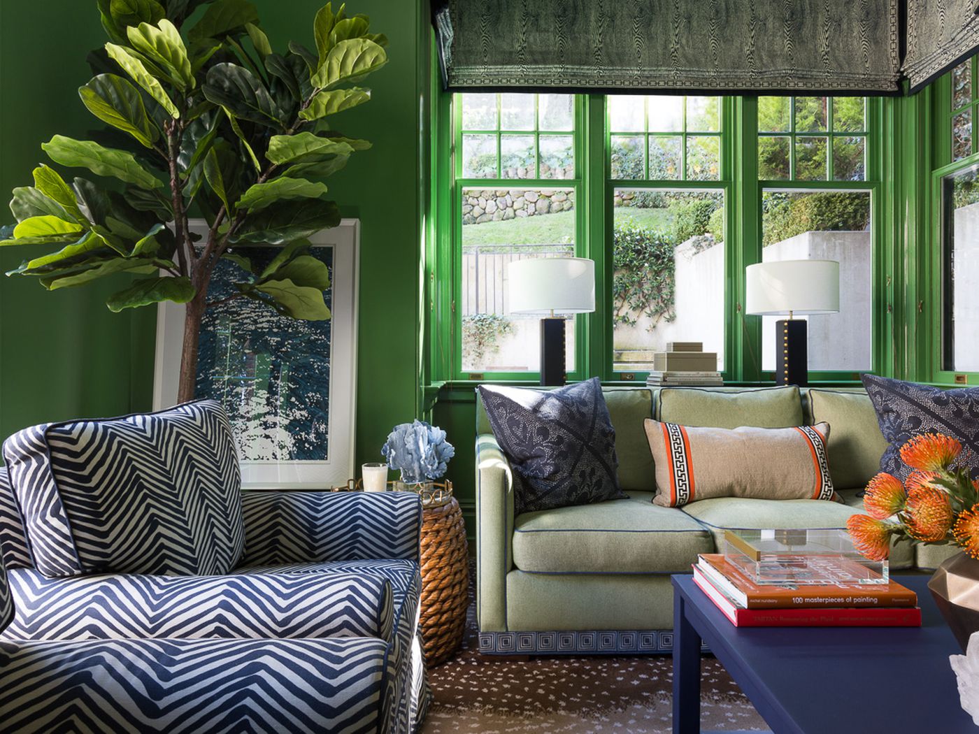
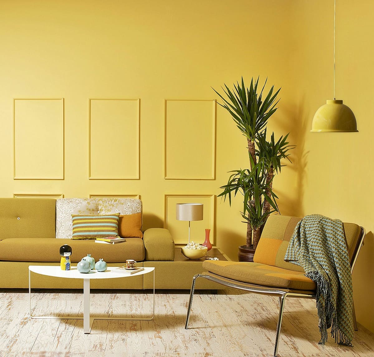
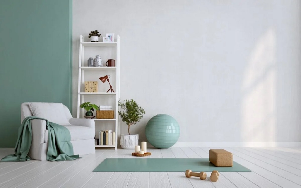
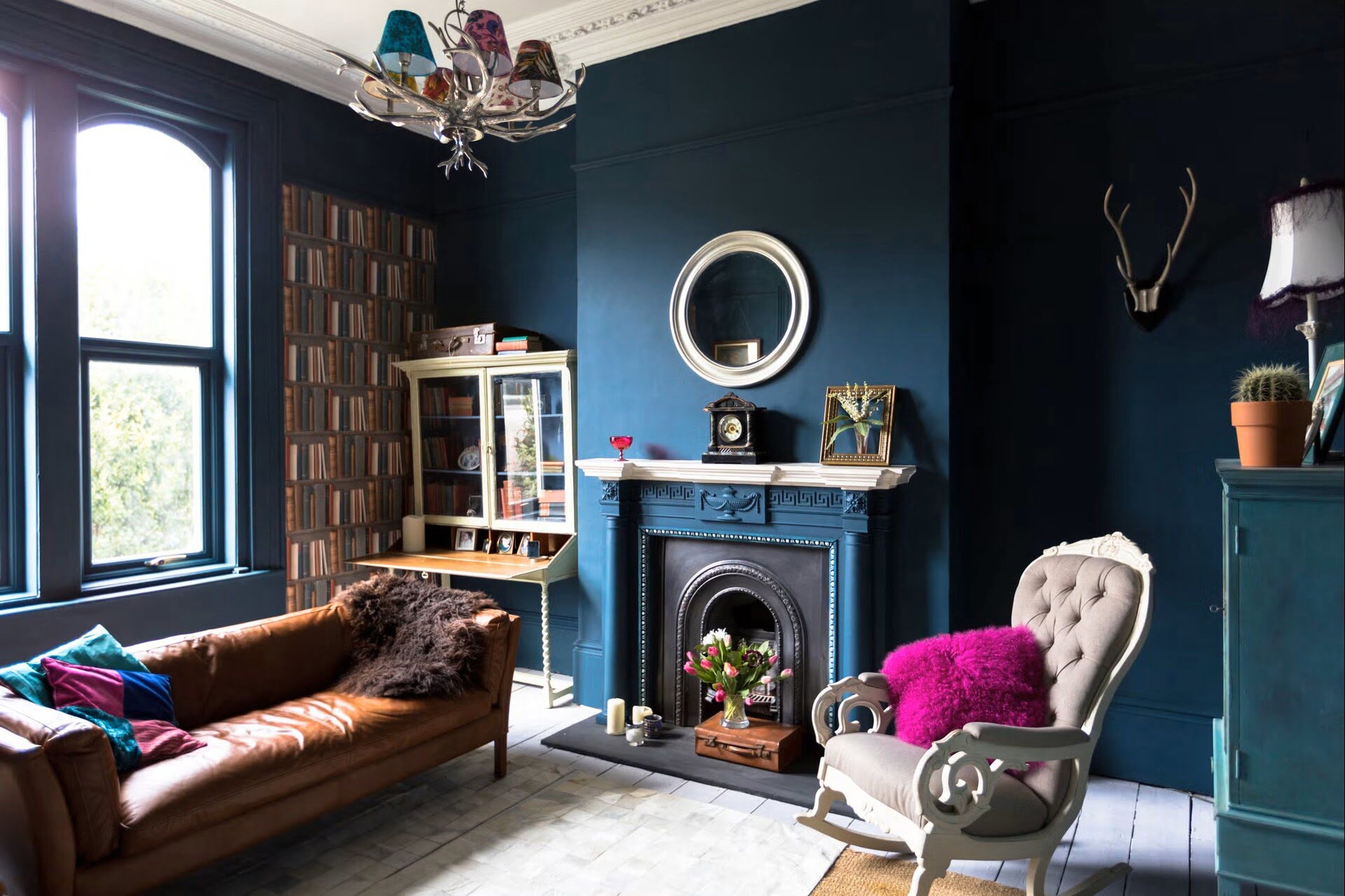
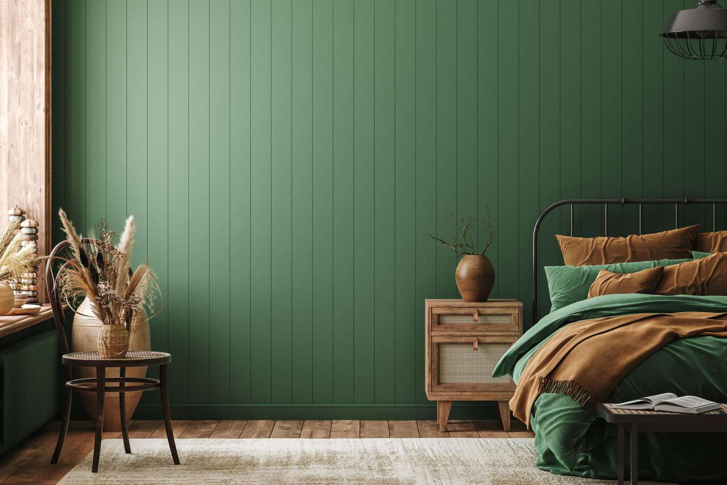
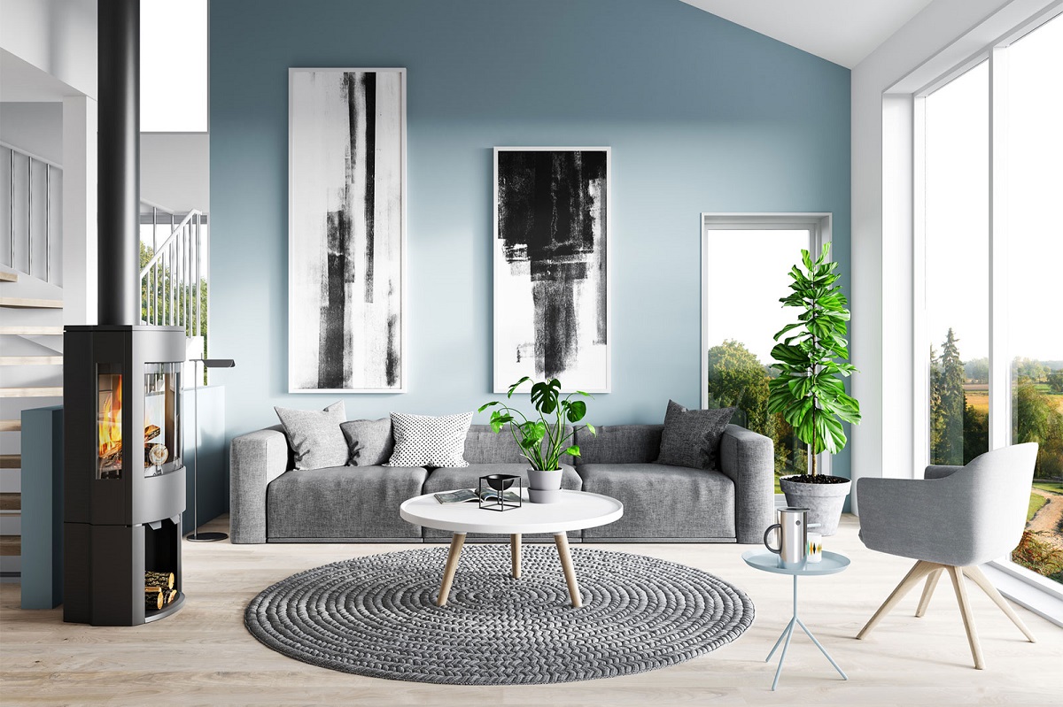
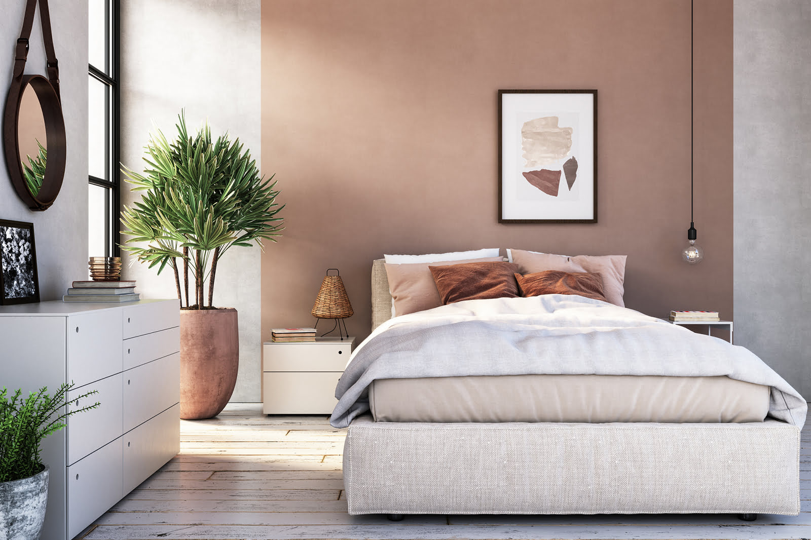
For instance, warm colors like red, orange, and yellow are often associated with energy, warmth, and stimulation. They can evoke feelings of excitement, passion, and even hunger. In contrast, cool colors such as blue, green, and purple tend to have a calming and soothing effect, promoting relaxation and tranquility.
Furthermore, the saturation and intensity of colors play a crucial role in their psychological impact. Bold, vibrant shades can elicit strong emotions and create a sense of dynamism, while softer, muted tones evoke subtler, more delicate feelings.
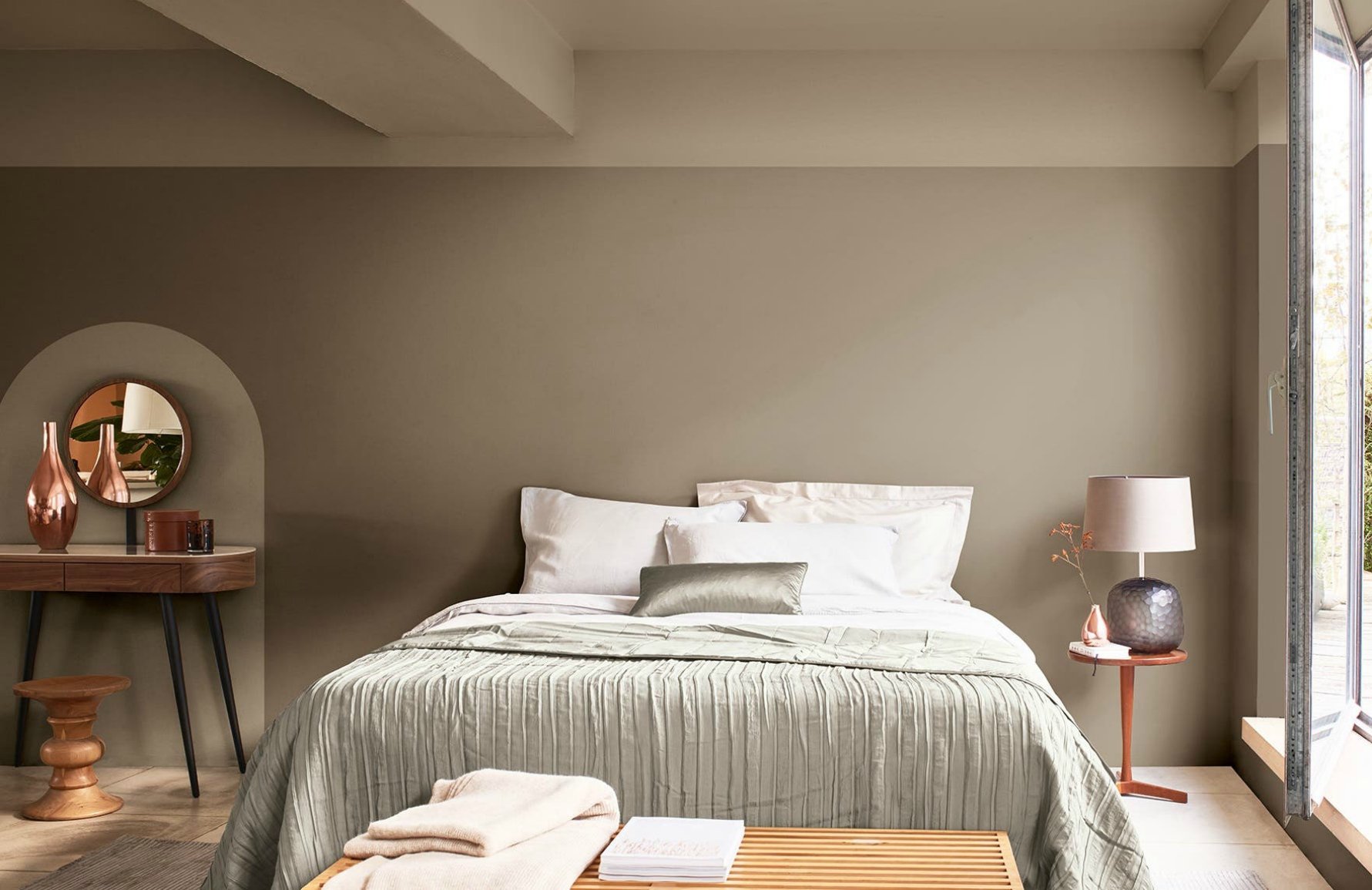
Understanding the psychological nuances of color is essential in interior design, as the hues we choose for our living spaces can profoundly influence our daily experiences. Whether it’s creating a serene bedroom retreat, a vibrant and stimulating workspace, or a cozy and inviting living room, harnessing the power of color is a pivotal aspect of crafting harmonious and emotionally resonant interiors.
The Most Stressful Color
While colors can evoke a wide range of emotions, there is one shade notorious for its ability to induce stress and anxiety: the intense and vibrant hue of red. Red is a color that commands attention and stimulates the senses, but its psychological effects can be complex and, in some cases, overwhelming.
From a physiological standpoint, exposure to the color red has been shown to increase heart rate and blood pressure, eliciting a sense of urgency and heightened alertness. This innate physiological response is deeply rooted in our evolutionary past, where the sight of red signaled danger or the presence of a threat in the environment.
Psychologically, red is often associated with strong emotions such as passion, intensity, and aggression. While these qualities can be invigorating in certain contexts, an overabundance of red in an interior space can create a sense of restlessness and agitation. In environments where relaxation and tranquility are paramount, such as bedrooms and meditation spaces, the pervasive presence of red can disrupt the desired ambiance.
Furthermore, in the context of interior design, the excessive use of red can be visually overwhelming and exhausting. Its bold and dominant presence can overshadow other elements in the space, creating a sense of imbalance and discord. As a result, individuals may experience heightened levels of stress and discomfort in environments where red prevails.
It’s important to note that the impact of red can vary based on cultural and individual differences. While some individuals may find the color energizing and empowering, others may feel overwhelmed or agitated in its presence. As such, the judicious use of red in interior design is crucial, ensuring that its potent effects are harnessed thoughtfully and in harmony with the overall design vision.
Avoid using bright, intense shades of red as it is known to increase stress and anxiety. Opt for calming colors like blue or green instead.
The One Shade to Never Use
When it comes to interior design, the one shade that should be approached with caution is the intense and vibrant hue of red. While red can undoubtedly make a bold and striking statement, its potent psychological effects on stress and anxiety warrant careful consideration in its application within living spaces.
However, this does not imply that red should be entirely avoided. Instead, it should be used judiciously and consciously in interior design. Here are some considerations for incorporating red without overwhelming the space:
- Accent Pieces: Introduce red through accent pieces such as throw pillows, artwork, or decorative objects. This allows for a pop of color without overwhelming the entire space.
- Strategic Placement: Use red in areas where a touch of dynamism and energy is desired, such as an accent wall or a focal point in the room. This strategic placement ensures that the color commands attention without dominating the entire space.
- Balance with Neutrals: Pair red with neutral tones such as white, beige, or gray to create a harmonious and balanced palette. This juxtaposition softens the impact of red while allowing it to shine in a more controlled manner.
- Consider Cultural Connotations: Be mindful of the cultural associations of red. In some cultures, red symbolizes luck, prosperity, and joy, making it a welcome and auspicious addition to the interior environment.
By approaching the use of red with intention and mindfulness, it can be integrated into interior design schemes in a way that harnesses its invigorating qualities without overwhelming the space or inducing stress.
In essence, while red is a color that commands attention and exudes passion, its potential to evoke stress and anxiety necessitates a thoughtful and strategic approach in interior design. By understanding its psychological impact and employing it judiciously, red can be harnessed to create captivating and emotionally resonant living spaces.
Conclusion
Color is a powerful and evocative element in interior design, capable of shaping our emotions, perceptions, and overall experiences within a space. While each hue holds its own unique psychological influence, the intense and vibrant hue of red stands out as a color that demands careful consideration in interior design due to its potential to induce stress and anxiety.
Understanding the psychological nuances of color, including the impact of red, empowers designers and homeowners to create living spaces that resonate harmoniously with their emotional and functional needs. By approaching the use of red with intention and mindfulness, its potent effects can be harnessed thoughtfully, enhancing the ambiance without overwhelming the space.
Ultimately, the art of interior design lies in the thoughtful orchestration of colors, textures, and elements to craft spaces that not only delight the eyes but also nurture the soul. By embracing the profound influence of color psychology and exercising discernment in its application, we can create environments that uplift, inspire, and instill a sense of well-being.
As we continue to explore the captivating realm of interior design, let us approach the palette of colors with a deep appreciation for their psychological impact, recognizing that each hue has the potential to enrich our lives and elevate our living spaces when wielded with care and understanding.
Frequently Asked Questions about What Is The Most Stressful Color? The One Shade To Never Use
Was this page helpful?
At Storables.com, we guarantee accurate and reliable information. Our content, validated by Expert Board Contributors, is crafted following stringent Editorial Policies. We're committed to providing you with well-researched, expert-backed insights for all your informational needs.

0 thoughts on “What Is The Most Stressful Color? The One Shade To Never Use”