Home>Interior Design>What Color Is Replacing White? Interior Designers Prefer This Color
Interior Design
What Color Is Replacing White? Interior Designers Prefer This Color
Modified: October 20, 2024
Discover the top color choice interior designers prefer over white. Enhance your space with this trendy color. Find out now!
(Many of the links in this article redirect to a specific reviewed product. Your purchase of these products through affiliate links helps to generate commission for Storables.com, at no extra cost. Learn more)
Introduction
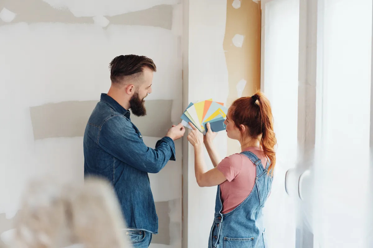
When it comes to interior design, colors play a crucial role in setting the mood and creating a harmonious living space. Over the years, white has been the go-to color choice for many designers, as it brings a sense of cleanliness, simplicity, and versatility. However, there is a new color trend that is rapidly replacing white as the preferred choice among interior designers – the color blue.
Gone are the days when white walls and furniture dominated the interior design landscape. Designers are now embracing the calming and soothing effect that blue brings to a space, making it the color of choice for creating a relaxing and inviting atmosphere. Whether it’s a light blue for a subtle touch or a bold navy blue for a statement piece, this versatile color has become a staple in modern interior design.
The rise of the new color trend is not a coincidence. There are several reasons why interior designers are gravitating towards blue as their color of choice. Let’s delve into the factors that make blue the preferred color among design professionals.
Key Takeaways:
- Blue is the new white in interior design, offering versatility, calming effects, and a timeless appeal. Its association with nature and positive impact on well-being make it a popular choice for creating harmonious living spaces.
- Interior designers prefer blue for its psychological impact, including promoting relaxation, enhancing productivity, and fostering trust and communication. From statement walls to decorative accents, blue offers endless possibilities for creating a serene and sophisticated home.
The Rise of the New Color Trend
The shift from white to blue as the prominent color in interior design is a response to the changing design preferences and the need for more depth and personality in living spaces. White, while synonymous with cleanliness and simplicity, can sometimes feel stark and cold. Blue, on the other hand, brings a sense of tranquility and warmth that is highly sought after in today’s fast-paced world.
One of the main reasons for the rise of the blue color trend is its versatility. Blue comes in a wide array of shades and tones, allowing designers to create various moods and visual effects. Whether it’s a light sky blue that evokes a feeling of serenity or a deep indigo that adds a sense of drama, there is a shade of blue for every design style and preference.
Another contributing factor is the association of blue with nature. Blue hues are reminiscent of the sky and the sea, creating a connection to the outdoors and bringing a sense of calm and tranquility into the interior space. This connection to nature can help create a more peaceful and harmonious environment, promoting a sense of well-being and relaxation.
Additionally, blue has been proven to have a positive effect on our emotions and mental state. Studies have shown that blue can lower blood pressure, reduce stress, and promote feelings of calmness and relaxation. This makes it an ideal color choice for bedrooms, bathrooms, and other areas where relaxation and rejuvenation are vital.
The rise of technology and the increasing amount of time spent indoors has also contributed to the popularity of blue. As we become more connected to screens and devices, incorporating blue into interior design is a way to counterbalance the overstimulation of technology and create a space that promotes tranquility and mindfulness.
Furthermore, blue is a color that can easily be incorporated into existing color schemes. Whether it’s pairing blue with neutral tones for a classic and timeless look, or combining it with bold and vibrant colors for a more eclectic style, blue blends seamlessly and adds depth and interest to any space.
The new color trend is not limited to residential spaces but has also permeated commercial design. From restaurants to offices, blue is being used to create environments that are both visually appealing and conducive to productivity and concentration.
Overall, the rise of the blue color trend in interior design can be attributed to the desire for a more serene and harmonious living environment, the versatility of the color, its connection to nature, and the positive impact it has on our well-being. Designers are embracing this new trend and incorporating blue into their projects as a way to create spaces that are both aesthetically pleasing and emotionally comforting.
Reasons Why Interior Designers Prefer This Color
The choice to incorporate blue into interior design goes beyond simple aesthetics. Interior designers have several reasons for preferring this color and incorporating it into their projects. Let’s explore some of the key reasons why blue has become a favored choice for design professionals.
1. Versatility:
One of the primary reasons interior designers prefer blue is its versatility. Blue comes in a wide range of shades, from soft pastels to bold, vibrant blues. This versatility allows designers to adapt blue to various design styles and preferences, making it suitable for both traditional and modern spaces. It can be incorporated as the main color or used as an accent, adding depth and visual interest to any room.
2. Calming Effect:
Blue is known for its calming and soothing effect on the mind and body. It has been scientifically proven that the color blue can lower blood pressure, decrease heart rate, and reduce feelings of stress and anxiety. This makes it an ideal choice for spaces where relaxation and tranquility are desired, such as bedrooms, living rooms, and spas.
3. Timelessness:
Unlike other trendy colors that may become outdated over time, blue is a timeless color choice. It has a classic appeal that can withstand passing design fads and maintain its elegance year after year. This makes blue a safe and reliable choice for those who prefer a more enduring design aesthetic.
4. Visual Interest and Depth:
Blue brings depth and visual interest to any space. Depending on the shade and intensity, it can create a sense of drama or add a subtle touch of sophistication. With blue, designers can create focal points, accent walls, or incorporate it into furniture and decor accessories to make a bold statement.
5. Connection to Nature:
Blue is often associated with nature, reminding us of the sky and the ocean. By incorporating blue into interior spaces, designers can bring a sense of tranquility and serenity, connecting occupants to the beauty of the natural world. This connection to nature can have a profound impact on overall well-being and create a more harmonious living environment.
6. Complementary Color Pairings:
Blue is a highly versatile color that pairs well with a wide range of other colors. It can be combined with neutrals such as white, beige, or gray for a clean and modern look. Alternatively, designers can create vibrant and eclectic spaces by pairing blue with complementary colors like yellow, orange, or green. This flexibility allows designers to create unique and personalized interiors.
Given its versatility, calming effect, timelessness, visual interest, connection to nature, and complementary color pairings, it’s no surprise that interior designers prefer incorporating blue into their projects. Whether it’s a subtle hint of blue or a bold statement, this color choice has the power to transform any space into a harmonious and inviting sanctuary.
The Psychological Impact of the Color
Color psychology plays a crucial role in interior design, as colors have the power to evoke certain emotions and influence our mood and behavior. When it comes to blue, it has a profound psychological impact on our well-being and can greatly enhance our living spaces. Let’s explore the psychological impact of the color blue in interior design.
1. Calming and Relaxing:
Blue is widely recognized as a color that promotes feelings of calmness and relaxation. It has a soothing effect on both the mind and body, making it the perfect color choice for spaces where we seek solace and tranquility. Whether it’s a light pastel blue or a deeper navy blue, the color works to create a sense of serenity and helps to reduce stress and anxiety.
2. Enhanced Productivity:
In addition to its calming properties, blue has been found to boost productivity and focus. This makes it an excellent choice for home offices or workspaces where concentration is essential. Blue stimulates mental clarity and can enhance cognitive performance, making it easier to stay focused and engaged in tasks.
3. Increased Trust and Communication:
Blue is often associated with trustworthiness and reliability. It has a calming effect on our emotions, making us feel more at ease and open to communication. Using blue in spaces where interpersonal relationships are important, such as meeting rooms or communal areas, can help foster a sense of trust and promote effective communication.
4. Positive Associations:
Blue is linked to positive associations in our daily lives. We often associate blue with clear skies, sparkling water, and other natural elements. These associations create a sense of positivity and freshness, elevating our mood and creating a pleasant and uplifting atmosphere.
5. Symbolic Meaning:
Blue carries symbolic meanings that can influence our perception of a space. It is often associated with qualities such as serenity, stability, and depth. By incorporating blue into interior design, designers can communicate these meanings and create spaces that reflect a sense of calmness, reliability, and sophistication.
6. Harmonious Balance:
Blue is a color that harmonizes well with many other colors. It can create a feeling of balance and harmony when paired with complementary colors or used as a backdrop for contrasting shades. This harmonious balance adds visual interest and creates a sense of equilibrium within the space.
Understanding the psychological impact of the color blue allows interior designers to create spaces that not only look visually appealing but also contribute to occupant well-being. By utilizing blue strategically in various areas of a home or office, designers can evoke a range of emotions and help create an environment that promotes relaxation, focus, trust, positivity, and balance.
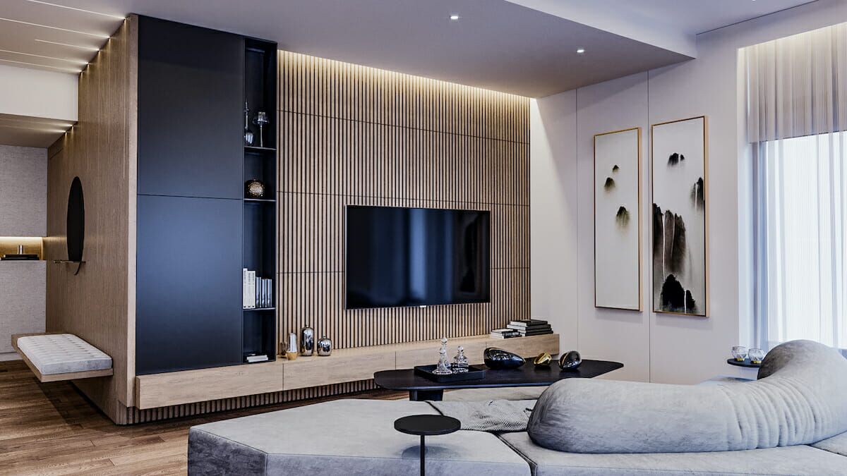
Popular Applications of the Color in Interior Design
Blue is a highly versatile color that can be used in various ways to elevate the overall design aesthetic of a space. Interior designers have incorporated blue into their projects in creative and visually stunning ways. Here are some popular applications of the color in interior design:
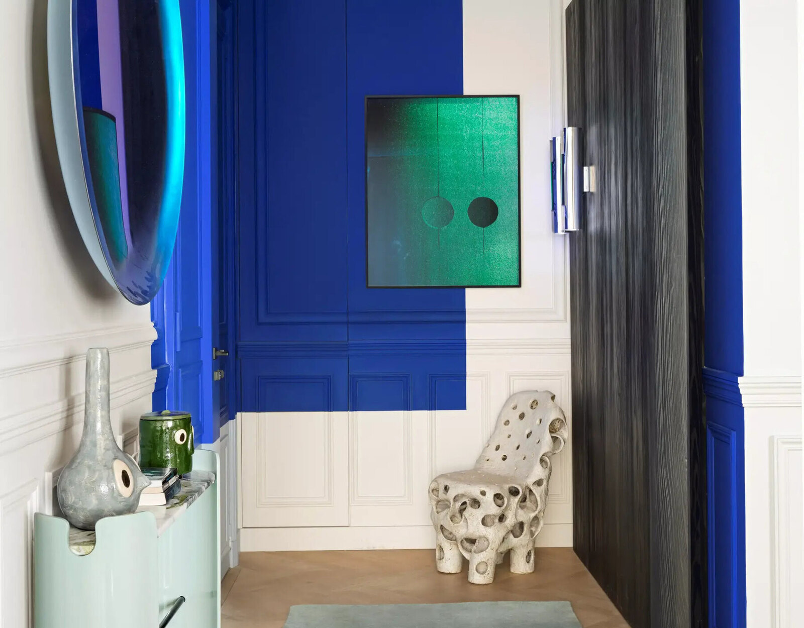
1. Statement Walls:
Creating a statement wall with a bold blue color can instantly transform a room and become the focal point of the space. Whether it’s a deep navy blue or a vibrant teal, a blue statement wall adds depth and character, making a striking visual impact.
2. Furniture:
Introducing blue-colored furniture pieces can add a touch of elegance and sophistication to any room. From sofas and armchairs to ottomans and accent chairs, blue furniture pieces make a stylish statement while also providing a comfortable seating option.
3. Accent Pieces:
Bringing blue into a space through accent pieces such as rugs, throw pillows, curtains, and artwork can add pops of color and create a cohesive design scheme. These smaller touches of blue can complement existing color palettes and tie the room’s elements together.
4. Cabinetry:
Blue cabinetry has become increasingly popular in kitchen design. Whether it’s a sleek navy blue or a softer pastel blue, blue-colored cabinets can bring a sense of freshness and uniqueness to the kitchen space.
Read more: What Is The Best Color For Interior Walls
5. Bathroom Design:
Incorporating blue into bathroom design adds a spa-like atmosphere. Blue tiles, fixtures, and accessories create a soothing environment, enhancing relaxation and rejuvenation.
6. Decorative Accents:
Decorative accents such as vases, lamps, and picture frames in shades of blue can add a touch of elegance and visual interest to any room. Blue accents can be used strategically to create a cohesive color scheme and tie the various elements of a space together.
7. Wallpaper:
Blue-patterned wallpaper can add depth and character to walls, creating a visually stunning backdrop. From intricate floral patterns to modern geometric designs, blue wallpaper can transform a room into a stylish and captivating space.
The beauty of using blue in interior design lies in its versatility and ability to adapt to various design styles. Whether it’s a modern, coastal, or traditional aesthetic, blue can be incorporated seamlessly into any space, adding a touch of sophistication, tranquility, and visual interest.
Tips for Incorporating the Color in Your Home
If you’re intrigued by the blue color trend in interior design and would like to incorporate it into your own home, here are some helpful tips to guide you:
Read more: What Color Blinds For White Walls
1. Start with Small Accents:
If you’re unsure about using blue as a dominant color, start by incorporating small accents. Add blue throw pillows, rugs, or artwork to bring a pop of color to your space. This allows you to experiment with the color and see how it complements your existing decor.
2. Consider Shades and Tones:
When choosing the right shade of blue for your interiors, consider the overall mood you want to create. Light blues, like sky blue or powder blue, evoke a sense of calmness and serenity, while darker blues, like navy or royal blue, add depth and drama. Experiment with different shades to find the one that resonates with your style and desired atmosphere.
3. Create Contrast:
Pairing blue with contrasting colors can create visual interest. For example, blue works well with warm shades like yellow or orange, creating a dynamic and energetic look. Alternatively, combining blue with neutral tones like white, beige, or gray can create a clean and contemporary vibe.
4. Utilize Blue in Key Areas:
Focus on incorporating blue in key areas of your home where it will make the most impact. Consider using blue in bedrooms to create a serene oasis, or in living rooms to evoke a sense of relaxation and harmony. Bathrooms and home offices are also great spaces to embrace blue to enhance focus and well-being.
5. Choose Furniture Wisely:
Invest in a statement furniture piece, such as a blue sofa or accent chair, to anchor your blue color scheme. If you prefer a more subtle approach, opt for blue upholstered dining chairs or a blue side table. These furniture pieces will act as focal points and add personality to your space.
6. Experiment with Patterns and Textures:
Explore blue-patterned wallpapers, curtains, or tiles to introduce texture and visual interest. Geometric patterns, floral designs, or abstract prints can transform a room into a captivating space. Mix and match different patterns and textures to create a unique and personalized look.
7. Consider Lighting:
Keep in mind that lighting can greatly influence the appearance of blue in a room. Natural daylight can enhance the brightness of lighter blue shades, while warm artificial lighting can add depth and richness to darker blues. Pay attention to the lighting in your space and how it interacts with the blue accents you’ve incorporated.
Remember, incorporating blue into your home is a personal design choice. Experiment with different shades, textures, and patterns to find a look that aligns with your style and creates the atmosphere you desire. By following these tips, you can successfully bring the calming and sophisticated effects of blue into your living space.
Conclusion
The shift from white to blue as the preferred color in interior design is revolutionizing the way we approach our living spaces. Blue brings a sense of tranquility, sophistication, and versatility, making it the color of choice for many interior designers. Its calming effect, association with nature, and positive impact on our well-being make it an ideal choice for creating serene and harmonious environments.
From statement walls to furniture and decorative accents, there are countless ways to incorporate blue into your home. The key is to experiment with different shades, textures, and patterns to find the perfect balance that reflects your personal style and creates the desired atmosphere.
Whether you choose to incorporate blue in small accents or make it the dominant color in a room, the psychological impacts of blue will undoubtedly enhance your living experience. With its ability to promote relaxation, boost productivity, and foster trust and communication, blue can truly transform your home into a sanctuary of serenity.
As the color trend continues to rise, it’s important to remember that interior design is a reflection of personal taste and style. While blue may be the preferred choice for many designers, it’s essential to choose colors and design elements that resonate with your own preferences and create a space that feels uniquely yours.
Incorporating blue into your home is not just a passing trend but a timeless design choice. It is a color that withstands the test of time and allows for endless creativity and personalization. So, why not embrace the serenity and elegance that blue brings and transform your living space into a haven of tranquility?
Frequently Asked Questions about What Color Is Replacing White? Interior Designers Prefer This Color
Was this page helpful?
At Storables.com, we guarantee accurate and reliable information. Our content, validated by Expert Board Contributors, is crafted following stringent Editorial Policies. We're committed to providing you with well-researched, expert-backed insights for all your informational needs.

0 thoughts on “What Color Is Replacing White? Interior Designers Prefer This Color”