Home>Interior Design>What Color Is Magenta? Everything You Need To Know
Interior Design
What Color Is Magenta? Everything You Need To Know
Modified: January 23, 2024
Discover the mesmerizing world of interior design with our comprehensive guide. Learn about stunning magenta color options and how they can transform your space.
(Many of the links in this article redirect to a specific reviewed product. Your purchase of these products through affiliate links helps to generate commission for Storables.com, at no extra cost. Learn more)
Introduction
Welcome to the world of colors, where every hue has its own story to tell. In this article, we will explore the captivating color known as magenta. From its origins and properties to its cultural significance and common uses, we will dive deep into the fascinating world of magenta.
Magenta is a color that sits on the border between red and purple, exuding a vibrant and intense energy. Its unique composition has drawn the attention of artists, designers, and interior decorators, making it a popular choice for adding a touch of flair to any space. Whether you’re a fan of bold colors or simply curious about the origins and uses of this captivating hue, join us as we unravel the mysteries of magenta.
Discover what lies beneath the surface of magenta and how it can bring life and personality to even the most mundane environments. From its cultural connotations to its role in color perception, magenta holds a place of significance in art, design, and fashion. So, let’s embark on this colorful journey together and explore everything there is to know about magenta!
Key Takeaways:
- Magenta, a captivating color between red and purple, exudes vibrancy and intensity, making it a versatile choice for interior design, fashion, and branding, evoking passion, creativity, and confidence.
- The unique perception of magenta, created by combining red and blue light, adds to its allure and makes it a powerful tool for designers to evoke emotions and create memorable visual experiences.
Defining Magenta
Magenta is a bold and captivating color that falls in between red and purple on the color spectrum. While it may be tempting to label it as a shade of pink, magenta possesses its own unique identity. It is often described as a deep purplish-red or a reddish-purple, with a rich and vibrant tone that commands attention.
Originally, the term “magenta” referred to a dye that was created in the mid-19th century. It was named after the Battle of Magenta, a significant event during the Second Italian War of Independence. The dye was renowned for its intense and striking color, which led to the adoption of the name “magenta” for this unique hue.
One of the defining characteristics of magenta is its lack of a specific wavelength in the visible light spectrum. Instead, magenta is considered a non-spectral color, meaning it is not directly represented by a single wavelength of light. It is created by combining red and blue light in equal intensity, stimulating the eyes’ red and blue receptors simultaneously. This combination tricks our brain into perceiving the color magenta, even though it doesn’t exist as a single wavelength.
Due to its position between red and purple, magenta is often associated with a sense of balance. It embodies the intensity and warmth of red, while incorporating the soothing and mystical qualities of purple. This unique combination gives magenta a versatile and dynamic nature, making it suitable for a variety of design applications.
Whether used as a dominant color or as an accent, magenta has the power to add energy, drama, and elegance to any space. Its bold and vibrant presence evokes feelings of passion, creativity, and confidence. Magenta is a color that demands attention and creates a memorable visual impact, making it a popular choice among interior designers, fashion designers, and artists alike.
The Origins of Magenta
The origins of magenta can be traced back to the mid-19th century when a chemist named François-Emmanuel Verguin discovered a new dye while working at a textile factory. This dye, a vibrant and intense purplish-red color, was named “magenta” in honor of the Battle of Magenta, which took place in 1859 during the Second Italian War of Independence. The dye gained popularity in the textile industry due to its bright and fast colorfastness properties.
The discovery of magenta dye was a significant breakthrough, as it allowed for the production of fabrics and garments in a color that was not easily achievable before. This vivid and attention-grabbing hue quickly became associated with luxury and extravagance, and it began to make its mark in fashion and design.
Magenta’s popularity and influence continued to grow throughout the late 19th and early 20th centuries, particularly in the Art Nouveau movement. Artists and designers including Henri de Toulouse-Lautrec and Gustav Klimt incorporated magenta into their work, using it to evoke a sense of drama, passion, and femininity.
Over time, the color magenta became more than just a dye; it became a symbol of innovation and artistic expression. As artists experimented with new materials and techniques, magenta continued to evolve and find its way into various forms of visual arts.
In recent decades, magenta has remained a prominent color in the world of fashion and design. Its bold and eye-catching nature lends itself well to making a statement within interior spaces. From bold accent walls to vibrant furniture and accessories, magenta adds a touch of energy and intrigue to any room.
Today, magenta continues to be celebrated for its unique and captivating qualities. It has become synonymous with creativity, individuality, and confidence. Whether used in fashion, graphic design, or interior decoration, magenta remains a color that stands out and leaves a lasting impression. Its origins as a dye have paved the way for its widespread recognition and continued popularity in the world of colors.
Properties of Magenta
Magenta possesses a distinct set of properties that make it a captivating and versatile color. Understanding these properties can help us appreciate its impact and make informed design choices. Let’s explore some of the key properties of magenta:
- Hue and Saturation: Magenta is a vivid and intense color, falling between red and purple on the color spectrum. It is often described as a deep purplish-red or a reddish-purple. The hue of magenta can vary, ranging from more pinkish tones to cooler bluish tones.
- Intensity: Magenta is known for its high intensity. It has a visual impact that stands out in various lighting conditions, making it an excellent choice when you want to create a focal point or add drama. Its bold and vibrant nature commands attention and evokes a sense of energy.
- Complementary Colors: The complementary color of magenta is green. Pairing magenta with shades of green can create a visually striking contrast and balance. This complementary relationship adds depth and visual interest to any design.
- Emotional Impact: Magenta is often associated with emotions such as passion, creativity, and confidence. Its bold and vibrant nature elicits strong emotional responses and can create a sense of excitement and intensity in a space.
- Color Psychology: In color psychology, magenta is believed to stimulate imagination, creativity, and inspire unconventional thinking. It is a color that encourages originality and uniqueness, making it an ideal choice for environments where creativity and innovation are fostered.
- Color Harmony: Magenta can be paired with a wide range of colors to create different harmonies and moods. When combined with neutral tones such as white, gray, or black, magenta can make a bold statement. Alternatively, pairing magenta with complementary or analogous colors can create a harmonious and balanced color palette.
By understanding the properties of magenta, we can harness its visual impact and emotional resonance to create engaging and visually stunning designs. Whether used as a dominant color or as an accent, magenta has the power to transform and elevate any space, making it a favorite among artists, designers, and interior decorators.
Color Perception and Magenta
Color perception is a fascinating aspect of human vision, and the perception of magenta is no exception. Unlike other colors in the visible light spectrum, magenta does not have a corresponding single wavelength. Instead, it is a non-spectral color that is created in our minds through a combination of red and blue light.
Our eyes have color receptors called cones that are sensitive to different wavelengths of light. There are cones that respond to red light, cones that respond to green light, and cones that respond to blue light. When pure red light is present, our red cones are stimulated, creating the sensation of red. Similarly, when pure blue light is present, our blue cones are stimulated, creating the sensation of blue.
However, when red and blue light are combined in equal intensity, something interesting happens. Our red and blue cones are both stimulated, but our green cones are not. As a result, our brain interprets this combination of signals as a unique color, which we perceive as magenta. It’s a bit of an optical illusion, as magenta does not exist as a single wavelength of light, but rather as a combination of signals received by our cones.
This phenomenon is known as color opponent theory or color contrast theory. According to this theory, the human visual system processes color information by comparing the responses of different cones. In the case of magenta, when the red and blue cones are stimulated while the green cones are not, our brain creates the perception of magenta as a distinct color.
This unique nature of magenta in color perception adds to its intrigue and allure. It is a color that is both created and perceived by our minds, demonstrating the fascinating complexities of human vision.
Understanding the perception of magenta can have practical implications in design and branding. By utilizing magenta strategically, designers can evoke certain emotions and create memorable visual experiences. The bold and intense nature of magenta, coupled with its intriguing perception, makes it a powerful tool for generating impact and capturing attention.
Next time you see the color magenta, take a moment to appreciate the remarkable phenomenon of how our brain creates this vibrant and captivating hue.
Magenta is a purplish-red color that is often described as a mix of red and blue. It is named after the magenta dye that was created in 1859, and is commonly used in printing and as a primary color in color theory.
Common Uses of Magenta
Magenta is a color that has found its way into various aspects of our lives, from art and design to fashion and branding. Its vibrant and captivating nature makes it a popular choice for creating visual impact and adding a touch of excitement. Let’s explore some of the common uses of magenta:
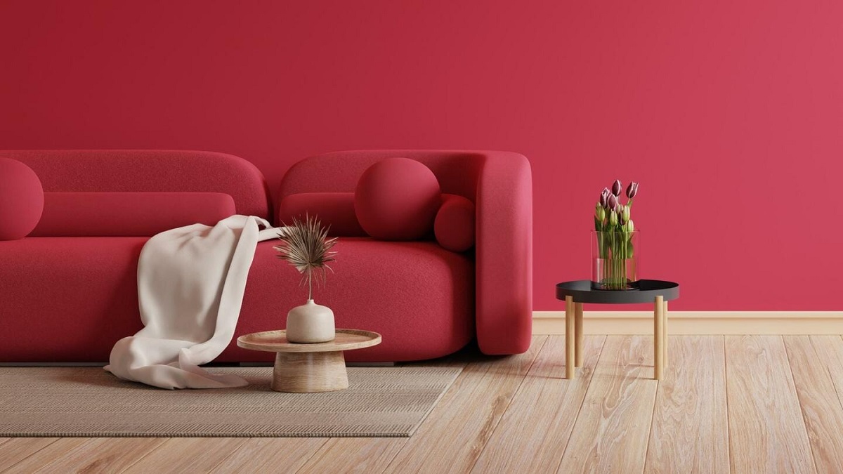
- Interior Design: Magenta can be incorporated into interior design in various ways. Whether it’s painting an accent wall, adding magenta furniture or accessories, or using magenta textiles, this color brings energy and a bold statement to any space. It can be used to create a focal point or to infuse a room with a sense of vibrancy.
- Fashion and Apparel: Magenta has a prominent presence in the fashion world, particularly in clothing and accessories. From elegant evening gowns to vibrant shoes and handbags, magenta adds a pop of color and personality to any outfit. It is often chosen for its ability to make a bold fashion statement and stand out from the crowd.
- Graphic Design and Branding: Many companies and brands utilize magenta in their logos and branding materials. This color is often associated with creativity, innovation, and uniqueness, making it an excellent choice for companies looking to convey those qualities. Magenta can be seen in various industries, from tech companies to fashion brands.
- Floral Arrangements: Magenta flowers are sought after for their vibrant and eye-catching appearance. Flowers such as orchids, roses, and bougainvillea can exhibit shades of magenta, adding a touch of drama and sophistication to floral arrangements and gardens.
- Art and Painting: Artists often incorporate magenta into their artwork to create contrast and evoke emotions. Whether as a dominant color or as a subtle accent, magenta can add depth and intensity to paintings, drawings, and mixed media art.
- Advertising: Magenta is frequently used in advertising to grab attention and create visual impact. Whether in print ads, billboards, or online banners, magenta stands out from the surrounding colors, making it an effective tool for drawing viewers’ attention to the intended message.
- Event Decor: Magenta is a popular choice for event decor, including weddings, parties, and concerts. Its bold and captivating nature adds a touch of excitement and festivity to the atmosphere, creating a memorable experience for attendees.
These are just a few examples of the common uses of magenta in our daily lives. Its versatility and energy make it a popular color choice in various industries and settings. Whether in design, fashion, or branding, incorporating magenta can elevate the visual impact and create a lasting impression.
Mixing and Creating Magenta
Creating the perfect shade of magenta often involves mixing different colors together to achieve the desired hue and tone. While magenta can be found pre-mixed in various art and design materials, such as paints and dyes, understanding how to mix your own magenta can give you more control over its intensity and characteristics. Here’s a guide on how to mix and create magenta:
1. Primary Colors: Magenta is typically created by mixing primary colors, specifically red and blue. Start with equal parts of a vibrant red pigment and a vibrant blue pigment. It’s important to use colors that are pure and have strong intensity to achieve the desired magenta hue.
2. Experiment with Ratios: The ratio of red to blue will affect the tone and intensity of the resulting magenta. Start with equal parts red and blue, and then adjust the ratio as needed. Adding more red will result in a warmer and more intense magenta, while adding more blue will create a cooler and bluish magenta.
3. Test and Observe: As you mix the colors together, use a palette or a test surface to observe and evaluate the resulting shade of magenta. Keep in mind that the colors may appear slightly different when they dry, so it’s important to let your test sample dry before finalizing the mix.
4. Consider Transparent or Opaque Colors: Depending on the texture and finish you desire, you can use either transparent or opaque red and blue pigments. Transparent pigments allow for more layering and mixing of colors, while opaque pigments provide solid coverage and a more opaque finish.
5. Adjusting with White or Black: If you want to lighten or darken the magenta, you can add small amounts of white or black paint to the mix. Adding white will create a lighter and more pastel-like magenta, while adding black will result in a deeper and more toned-down magenta.
6. Take Notes: Keep track of the colors and ratios you use to create your ideal magenta shade. This will allow you to recreate the color in the future or make adjustments if needed.
While mixing colors to create magenta can be a fun and creative process, it’s worth noting that there are also pre-mixed magenta pigments and dyes available in the market. These can provide consistent and reliable results, especially for larger projects or when precise color matching is required.
Experimenting with mixing colors to create magenta allows you to explore the nuances of this vibrant hue and make it uniquely yours. Whether you choose to mix your own magenta or use pre-mixed options, the key is to have fun and embrace the creative process.
Variations of Magenta
Magenta, as a color that sits between red and purple, offers a range of variations that can suit different preferences and design needs. From lighter pastel shades to deep and rich tones, here are some variations of magenta:
- Light Magenta: Light magenta is a softer and more delicate version of the color. It retains the essence of magenta but with a lighter and more pastel-like appearance. This variation is often associated with sweetness, femininity, and a romantic aesthetic.
- Fuchsia: Fuchsia is a bright and vibrant variation of magenta that is closer to the purple side of the spectrum. It has a more intense and saturated hue, creating a lively and energetic impression. Fuchsia is often chosen for its eye-catching and playful qualities.
- Hot Pink: Hot pink is a bold and vivid version of magenta that leans more towards the pink side. It is known for its high visibility and vibrant presence. Hot pink is often associated with energy, youthfulness, and a sense of glamour.
- Raspberry: Raspberry is a deeper and more saturated variation of magenta. It has a reddish undertone, giving it a rich and luxurious appearance. Raspberry is often used to evoke feelings of sophistication, opulence, and elegance.
- Mauve: Mauve is a muted and dusty variation of magenta that incorporates a touch of gray or brown. It has a subtle and understated quality, making it suitable for creating a calm and soothing atmosphere. Mauve is often associated with nostalgia and vintage aesthetics.
- Rose: Rose is a lighter and more delicate variation of magenta. It has a softer and more romantic feel, reminiscent of blooming roses. Rose is often chosen for its gentle and feminine qualities, creating a gentle and charming ambiance.
These are just a few examples of the variations of magenta that exist. The beauty of magenta lies in its ability to be adapted and tailored to different contexts and preferences. Whether you choose a bold and vibrant magenta or a softer and muted variation, each shade carries its own unique charm and personality.
When working with variations of magenta, it’s important to consider the overall color scheme and the intended mood and atmosphere of your design. The right shade of magenta can add depth, vibrancy, or a touch of elegance to any space or project, allowing you to create a visually stunning and harmonious result.
Cultural Significance of Magenta
Magenta holds cultural significance in various contexts around the world, symbolizing different meanings and associations. From its historical origins to its representation in different cultures, let’s explore the cultural significance of magenta:
Artistic Expression: Magenta has been a favorite color among artists throughout history. Its bold and vibrant nature allows it to evoke a range of emotions and create powerful visual impact. In art movements such as Art Nouveau and Pop Art, magenta has been used to express creativity, individuality, and a departure from traditional norms.
Spirituality and Mysticism: In certain spiritual traditions, magenta is associated with intuition, spiritual awakening, and the exploration of higher consciousness. It is believed to inspire imagination, transcendence, and a deep connection to the divine. Magenta is often used in meditation practices and in spaces dedicated to spiritual pursuits.
Gender Symbolism: In Western cultures, magenta has been traditionally associated with femininity. Its vibrant and expressive qualities have been embraced as symbols of female empowerment and self-expression. However, it’s important to note that colors and their associations can vary across cultures and are not limited to gender stereotypes.
Cultural Celebrations: In some cultures, magenta holds significance in traditional ceremonies and celebrations. For example, in Hindu weddings in India, the bride often wears magenta garments, symbolizing a joyous and auspicious beginning to her married life.
Branding and Advertising: Magenta has become associated with certain brands, creating a cultural significance in the world of marketing and advertising. For example, the vibrant magenta color used by telecommunications company T-Mobile has become an instantly recognizable symbol of its brand identity.
Social Movements: Magenta has also been used as a symbol by various social movements. For instance, the pink triangle with a magenta triangle added on the bottom corner became a symbol of LGBTQ+ activism, representing solidarity and resistance against discrimination.
Political Symbolism: In some political contexts, magenta has been used as a symbol to represent political parties or ideologies. Political campaigns and movements often incorporate magenta into their branding, using its bold and attention-grabbing nature to convey their messages.
The cultural significance of magenta goes beyond its visual appeal. It carries a range of meanings and associations that have been shaped by historical, social, and cultural contexts. Whether as a symbol of artistic expression, spirituality, or social movements, magenta continues to hold a place of significance in our cultural landscape.
Read more: Everything You Need To Know About Ladders
Conclusion
Magenta, with its captivating and vibrant nature, has left an indelible mark in the world of colors. From its historical origins as a dye named after the Battle of Magenta to its representation in various cultural contexts, magenta has become a symbol of creativity, individuality, and visual impact.
We have explored the defining characteristics and properties of magenta, including its position between red and purple, its intensity, and its unique perception in the human eye. We have learned about the versatility of magenta, witnessing its common uses in interior design, fashion, branding, and the arts.
Mixing and creating magenta opens up a world of possibilities, offering the opportunity to tailor its shade and intensity to suit specific preferences and design needs. The variations of magenta, from lighter pastel shades to richer and deeper tones, allow for endless creativity and the ability to evoke different moods and atmospheres.
Magenta’s cultural significance transcends borders and encompasses various aspects of human expression. From its association with artistic movements and spirituality to its role in gender symbolism and social activism, magenta continues to inspire and provoke thought.
As we conclude our exploration of magenta, it is clear that this captivating color holds a place of significance in our visual and cultural landscape. Its ability to capture attention, evoke emotions, and spark creativity makes it a valuable tool for designers, artists, and individuals who seek to make an impact.
Next time you encounter magenta, take a moment to appreciate its richness and the stories it has to tell. Allow magenta to inspire you, whether in your design choices, your artistic endeavors, or your personal expression. Embrace the vibrant energy of magenta and let it ignite your imagination and sense of possibility.
Frequently Asked Questions about What Color Is Magenta? Everything You Need To Know
Was this page helpful?
At Storables.com, we guarantee accurate and reliable information. Our content, validated by Expert Board Contributors, is crafted following stringent Editorial Policies. We're committed to providing you with well-researched, expert-backed insights for all your informational needs.


0 thoughts on “What Color Is Magenta? Everything You Need To Know”