Home>Interior Design>What Color Is Chartreuse? Everything You Need To Know
Interior Design
What Color Is Chartreuse? Everything You Need To Know
Modified: March 5, 2024
Discover the vibrant and unique color of chartreuse for your interior design projects. Learn everything you need to know about this captivating shade and how to incorporate it into your home.
(Many of the links in this article redirect to a specific reviewed product. Your purchase of these products through affiliate links helps to generate commission for Storables.com, at no extra cost. Learn more)
Introduction
Welcome to the colorful world of interior design! One of the key elements that can transform a space and evoke specific emotions is color. From soothing blues to vibrant reds, each color has its own unique charm and impact. In this article, we will delve into the fascinating world of the color chartreuse.
Chartreuse is a captivating color that has a rich history and diverse range of applications. Whether you’re a design enthusiast, an artist, or someone looking to update their home decor, understanding the nuances of chartreuse can help you make informed choices and create visually stunning spaces.
In this article, we will explore the origins and definition of the color chartreuse, examine its presence in nature and art, discuss its significance in fashion and interior design, and look at the various shades and tones of chartreuse. We will also delve into mixing chartreuse with other colors, as well as its representation in popular culture.
So, join us on this colorful journey as we unravel the mysteries and beauty of chartreuse. By the end of this article, you’ll have a deeper understanding of this enchanting color and how to incorporate it into your own design projects.
Key Takeaways:
- Chartreuse, a vibrant and captivating color, has a rich history dating back to the 18th century when it was created by Carthusian monks. Its presence in nature, art, fashion, and interior design reflects its versatility and ability to evoke emotions.
- Chartreuse’s symbolic and cultural significance varies across different contexts and cultures, representing growth, renewal, and positivity. Its various shades and tones offer endless design possibilities, and its presence in popular culture reflects its ability to captivate and inspire.
The History of Chartreuse
The history of chartreuse dates back to the 18th century when it was first created by the Carthusian monks in the Chartreuse Mountains of France. These monks were known for their expertise in herbal medicine and distillation, and they sought to create a tonic that would both revitalize and heal.
The exact recipe for chartreuse is a closely guarded secret held within the Order of the Carthusians. It is said to contain a blend of over 130 different herbs and plants, infused with alcohol. The vibrant green color of chartreuse comes from the addition of chlorophyll-rich plants, giving it a distinct and recognizable hue.
Originally, chartreuse was created as a medicinal elixir and was used for its healing properties. However, its popularity quickly spread beyond the confines of the monastery, and it became a sought-after liqueur in France and eventually around the world.
Over the years, the Carthusian monks refined their recipe and created two variations of chartreuse: Green Chartreuse and Yellow Chartreuse. Green Chartreuse is the original version, with a higher alcohol content and a more intense flavor. Yellow Chartreuse is a milder, sweeter variant that was introduced later.
In the world of interior design and fashion, the vibrant color of chartreuse quickly caught on. Its unique blend of yellow and green tones made it a versatile choice for a variety of design styles. Chartreuse began to appear in wall coverings, upholstery, and accessories, adding a pop of color and a sense of vibrancy to any space.
Throughout the centuries, chartreuse has remained an iconic and timeless color that continues to captivate designers and enthusiasts alike. Its history and association with the Carthusian monks give it an air of mystique and intrigue that adds to its allure.
As we move forward in this article, we will explore the various applications of chartreuse in the natural world, art and design, fashion and interior design, as well as its symbolism and cultural significance. Let’s delve deeper into the fascinating world of chartreuse and uncover its many wonders.
Definition and Origin of the Color Chartreuse
Chartreuse is a striking color that falls into the category of yellow-green tones. It is often described as a vibrant blend of lime green and yellow, creating a color that is both eye-catching and energetic. The name “chartreuse” is derived from the Chartreuse liqueur created by the Carthusian monks.
Chartreuse is a unique color that stands out in a crowd. Its hue is reminiscent of fresh spring leaves or zesty citrus fruits. It carries a sense of freshness and vitality, making it a popular choice in interior design and fashion for those who want to make a bold statement.
The origin of the color chartreuse can be traced back to the 19th century when it was first recognized and named after the iconic liqueur. The vibrant green color of the liqueur became synonymous with the color itself, and it quickly gained popularity in various artistic and design circles.
Chartreuse is often associated with growth, renewal, and abundance. Its bright and energetic nature is believed to stimulate creativity and inspire feelings of optimism and joy. This is why it is commonly used to add a vibrant touch to spaces that require an injection of life and vitality.
Interestingly, chartreuse has a duality to its character. It can be both warm and cool, depending on the specific shade and tone. Lighter chartreuse hues tend to lean towards the yellow side and exude a sunny and cheerful vibe. On the other hand, darker chartreuse shades have more green undertones and create a cooler and slightly more mysterious atmosphere.
Chartreuse is a versatile color that pairs well with a variety of other colors. It can be used as a focal point in a design or as an accent color to add pops of interest. Its boldness allows it to stand on its own, but it also plays well with complementary colors like purple or magenta, creating a vibrant and harmonious color palette.
Whether used in fashion, interior design, or art, chartreuse is a color that demands attention and makes a lasting impression. Its unique blend of green and yellow creates a color that is both invigorating and visually captivating. By incorporating chartreuse into your design choices, you can create spaces that are lively, dynamic, and truly one-of-a-kind.
Now that we have explored the definition and origin of chartreuse, let’s delve into its presence in the natural world and how it has inspired art and design.
Chartreuse in the Natural World
Chartreuse, a vibrant and captivating color, finds its inspiration from the natural world. From lush foliage to exotic flora, chartreuse is a hue that can be found in various elements of nature, evoking a sense of freshness and vitality.
One of the most evident sources of chartreuse in nature is the abundance of green vegetation. Think of the vibrant leaves of trees swaying in the summer breeze or the lush foliage of a tropical rainforest. The bright green hue captures the essence of chartreuse, representing growth and rejuvenation.
Many plants and fruits also showcase shades of chartreuse. Picture the tangy zest of a freshly picked lime or the delicate petals of a blooming green flower. These natural elements serve as a reminder of the vibrancy and energy that chartreuse brings to a space.
Another area where chartreuse can be observed in the natural world is through the presence of vibrant insects and reptiles. From the striking green of a dart frog to the shimmering wings of a dragonfly, these creatures add pops of chartreuse to their surroundings, making them eye-catching and memorable.
Furthermore, chartreuse can be seen in the mesmerizing underwater world. Coral reefs boast an array of hues, with chartreuse being prominently displayed in the vibrant ecosystem. The soft coral and sea anemones provide splashes of this captivating color, creating a visually stunning aquatic environment.
Chartreuse is not limited to the realm of flora and fauna; it can also be found in minerals and gemstones. Some crystals, such as peridot and chrysoprase, exhibit chartreuse tones, adding a touch of luxury and allure to jewelry and decor inspired by the natural world.
When incorporating chartreuse into your design, whether in fashion or interior spaces, drawing inspiration from the natural world can yield impressive results. Consider embracing the vibrant hues found in lush foliage, the intricate patterns of insects, or the delicate beauty of flowers to infuse your designs with the energy and liveliness of chartreuse.
Now that we have explored chartreuse in the natural world, let’s turn our attention to how chartreuse has influenced and inspired art and design throughout history.
Chartreuse in Art and Design
Chartreuse, with its vibrant and eye-catching hue, has long been a source of inspiration for artists and designers. From paintings to furniture, chartreuse has found its place in various art forms, adding a sense of energy and uniqueness to compositions.
In the world of painting, chartreuse has been used by artists to create striking and dynamic works of art. The boldness of this color allows it to stand out among other hues, capturing the viewer’s attention and creating a focal point within the composition. Artists have utilized chartreuse to evoke emotions, convey movement, and enhance the overall visual impact of their artwork.
Chartreuse also frequently appears in textile design and fashion. Fabrics with chartreuse patterns or accents can bring a sense of playfulness and liveliness to fashion pieces, making them visually striking and memorable. Designers often incorporate chartreuse into their collections during seasons that embrace vivid and vibrant colors.
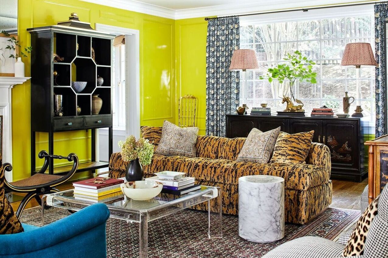
When it comes to interior design, chartreuse can be used to create spaces that are energetic and filled with personality. It can be introduced through furniture, accessories, or even painted walls. A chartreuse accent chair or a bold chartreuse rug can inject a fresh and invigorating vibe into a room, instantly transforming its atmosphere.
The use of chartreuse in graphic design and digital art has also gained popularity in recent years. Website designers and digital artists harness the power of this vibrant color to create captivating visuals and user interfaces that leave a lasting impression.
When incorporating chartreuse into your own art and design projects, remember that balance is key. Chartreuse’s boldness should be used strategically to create focal points or add pops of interest. Pair it with complementary colors or neutral tones to create a harmonious and visually pleasing palette.
Chartreuse’s versatility allows it to work well in a range of design styles, whether modern, eclectic, or even classic. It can be incorporated in small doses or used as a primary color, depending on the desired aesthetic and effect.
Whether it’s a painting, fashion piece, interior design, or digital artwork, chartreuse continues to inspire and captivate artists and designers across various disciplines. Its vibrant and energetic nature adds a dose of liveliness to any creative endeavor, making it a remarkable color to explore and incorporate into your own artistic pursuits.
Next, let’s dive into the use of chartreuse in the realm of fashion and interior design.
Chartreuse in Fashion and Interior Design
Chartreuse, with its vibrant and invigorating hue, has made a significant impact in the worlds of fashion and interior design. This captivating color has the ability to transform spaces and wardrobes, infusing them with energy, personality, and a touch of boldness.
In the realm of fashion, chartreuse has become a popular choice for those seeking to make a statement or add a pop of color to their wardrobe. This dynamic hue can be seen in a variety of fashion pieces, from dresses and tops to accessories like handbags and shoes.
When worn as clothing, chartreuse garments effortlessly command attention and radiate a sense of confidence. A chartreuse dress can become the focal point of an outfit, turning heads and leaving a lasting impression. For those looking to incorporate chartreuse into their wardrobe in a subtler way, accessories like a chartreuse clutch or statement earrings can add a vibrant touch to any ensemble.
In the world of interior design, chartreuse is an excellent choice for those seeking to create bold and vibrant spaces. Whether it’s a living room, bedroom, or even an office, the addition of chartreuse elements can transform a space from ordinary to extraordinary.
Chartreuse accent furniture, such as a statement chair or ottoman, can become the centerpiece of a room, instantly adding a sense of liveliness and personality. Chartreuse throw pillows or blankets can infuse a touch of vibrancy into a neutral-toned room, creating an interesting visual contrast.
One of the advantages of chartreuse in interior design is its ability to work well with a variety of color schemes. It pairs beautifully with neutrals like white, gray, and beige, creating a fresh and modern look. Chartreuse can also be combined with other vibrant hues, such as magenta or royal blue, to create a lively and eclectic atmosphere.
When incorporating chartreuse into your fashion choices or interior design projects, it’s essential to consider the overall aesthetic and the mood you want to create. Chartreuse can be used as the main color to make a bold statement, or as an accent to add pops of energy and interest.
Ultimately, chartreuse is a color that inspires creativity and pushes boundaries. It encourages individuals to embrace their unique style and inject a sense of vibrancy into their personal spaces. Whether in fashion or interior design, chartreuse continues to make a significant impact and capture the attention of those with a passion for bold and captivating aesthetics.
Now that we’ve explored chartreuse in the realms of fashion and interior design, let’s explore the symbolism and cultural significance that this captivating color holds.
Chartreuse is a yellowish-green color named after the French liqueur. It is a mix of yellow and green, with a vibrant and eye-catching appearance.
Symbolism and Cultural Significance of Chartreuse
Chartreuse, with its vibrant and energetic personality, holds symbolic and cultural significance that varies across different contexts and cultures. The color’s association with growth, renewal, and vibrancy has made it a symbol of positivity, creativity, and abundance.
In Western culture, chartreuse is often associated with nature and the renewal of springtime. The vibrant green tones evoke images of fresh leaves and blooming flowers, symbolizing a sense of growth and rejuvenation. It represents the energy and vitality of life itself, making it a color that exudes positivity and optimism.
Chartreuse’s bright and uplifting nature has also made it a symbol of creativity and inspiration. This color is believed to stimulate the mind and spark creative thinking. Many artists and designers incorporate chartreuse into their works to infuse them with a sense of playfulness, excitement, and innovation.
In the realm of spirituality, chartreuse is often associated with the heart chakra, which symbolizes love, compassion, and healing. It is seen as a color that promotes emotional balance, nurturing connections with others, and fostering a sense of harmony and well-being.
Culturally, chartreuse has made appearances in various traditions and celebrations. In some Western countries, green chartreuse liqueur is often enjoyed during festive occasions and celebrations, symbolizing joy and abundance. Chartreuse can also be found as a prominent color in traditional costumes and ceremonies of certain cultures, representing cultural heritage and vitality.
Chartreuse’s presence in cultural symbolism extends beyond the Western world as well. In some Eastern cultures, green is associated with luck, fertility, and prosperity. Chartreuse tones can be seen in traditional attire and artwork, reflecting these auspicious beliefs and cultural values.
Chartreuse’s symbolic and cultural significance is not limited to specific contexts. It is a color that can be interpreted and appreciated by individuals from various backgrounds. Its vibrant and invigorating nature transcends borders and creates a universal language of positivity and vitality.
When incorporating chartreuse into your own designs or personal choices, understanding its symbolic and cultural connotations can add depth and meaning to your creations. It allows you to infuse your designs with a sense of intention and purpose, connecting with the energy and symbolism that chartreuse represents.
Through its symbolism and cultural significance, chartreuse continues to captivate and inspire individuals across different walks of life. Its vibrant hues and positive associations make it a color that resonates with our innate desire for growth, renewal, and joy.
Now that we’ve explored the symbolism and cultural significance of chartreuse, let’s delve into the various shades and tones of this captivating color.
Various Shades and Tones of Chartreuse
Chartreuse, with its vibrant and lively character, encompasses a range of shades and tones that allow for diverse design possibilities. From the lightest hues to the deepest tones, chartreuse offers a spectrum of options to suit different tastes and aesthetics.
Starting with the lighter end of the chartreuse spectrum, we have pastel chartreuse. This delicate shade leans more towards the yellow side, reminiscent of fresh spring leaves kissed by the sunlight. Pastel chartreuse brings a soft and soothing vibe, perfect for creating serene and peaceful spaces.
Moving towards the medium range, we encounter the classic true chartreuse. This shade strikes a balance between green and yellow, capturing the essence of the color. True chartreuse is vibrant, energetic, and truly eye-catching. It adds a touch of playfulness and vivacity to any design, be it in fashion or interior spaces.
Deepening the chartreuse palette, we reach the earthy and mossy chartreuse tones. These shades lean more towards the green side, resembling the lush foliage of the forest floor. Earthy chartreuse creates a grounding and calming effect, bringing a sense of connection to nature into any design scheme.
At the darkest end of the chartreuse spectrum, we find olive chartreuse. This tone boasts a rich green hue with subtle chartreuse undertones. It adds a touch of sophistication and elegance to any design, making it a popular choice for those seeking a muted yet captivating color.
Chartreuse also interacts beautifully with other colors, creating unique and harmonious combinations. Pairing chartreuse with cool shades like turquoise or teal can create a refreshing and beachy atmosphere. On the other hand, combining chartreuse with warm hues like coral or pink can infuse a space with a vibrant and tropical feel.
When working with chartreuse in your designs, consider the mood and ambiance you want to evoke. Lighter chartreuse shades tend to create a more airy and cheerful atmosphere, while deeper tones bring a sense of depth and intrigue.
Remember that the choice of shades and tones of chartreuse ultimately depends on your personal preferences and the overall design concept. Experimenting with various chartreuse variations allows you to create unique and captivating compositions that truly speak to your style and vision.
Now that we’ve explored the different shades and tones of chartreuse, it’s time to move on to the art of mixing chartreuse with other colors.
Mixing Chartreuse with Other Colors
Chartreuse, with its vibrant and energetic nature, interacts beautifully with a variety of other colors, offering endless possibilities for creative combinations. Whether you’re looking to create a harmonious palette or make a bold statement, the art of mixing chartreuse with other colors can elevate your designs to new heights.
One classic and timeless pairing is chartreuse with shades of purple. The combination of chartreuse and deep amethyst or rich plum creates a luxurious and regal atmosphere. This combination brings together the vibrancy of chartreuse with the sophistication and depth of purple, achieving a balanced and captivating harmony.
If you’re seeking a fresh and contemporary feel, consider pairing chartreuse with cool shades like turquoise or teal. The combination of chartreuse with these refreshing blues creates a vibrant and beachy ambiance, reminiscent of tropical waters and sunny skies. This pairing is perfect for adding a sense of calm and tranquility to your designs.
For those looking to make a bold statement, chartreuse can be paired with fiery and energetic colors like magenta or fuchsia. The contrast between the vibrant chartreuse and the deep pinks creates a striking and captivating effect. This combination exudes confidence and adds an electrifying pop to any design.
Chartreuse also pairs beautifully with neutral tones like white, gray, and beige. This versatile combination creates a clean and modern look, allowing the chartreuse accents to take center stage. The neutrality of the background colors allows the vibrant chartreuse to shine, creating a visually pleasing and balanced composition.
When incorporating chartreuse into your designs, consider the emotions and atmosphere you want to create. The color combinations you choose can evoke different moods and aesthetics. Experiment with various pairings, mix chartreuse with other colors, and let your creativity guide you towards unique and captivating designs.
Additionally, don’t limit yourself to only one secondary color. Chartreuse can work well in multi-color palettes, especially in eclectic and bohemian design styles. Pair it with a range of complementary colors, such as coral, navy blue, and mustard yellow, to create a visually stunning and dynamic composition.
Remember, it’s all about balance and harmony when mixing chartreuse with other colors. Consider the proportions and intensity of each color and the overall impact you want to achieve. The beauty of chartreuse lies in its ability to effortlessly combine with a variety of hues, allowing you to bring your design vision to life.
Now that we’ve explored the art of mixing chartreuse with other colors, let’s dive into the presence of chartreuse in popular culture.
Read more: Everything You Need To Know About Ladders
Chartreuse in Popular Culture
Chartreuse, with its vibrant and captivating hue, has made a memorable impact in popular culture throughout the years. From film and television to music and literature, chartreuse has become an iconic color, representing a sense of energy, uniqueness, and artistic expression.
One notable appearance of chartreuse in popular culture can be seen in fashion. Countless designers have embraced this bold and lively color in their collections, making chartreuse a staple on runways and red carpets. Celebrities have been spotted wearing chartreuse gowns and suits, showcasing the color’s ability to capture attention and leave a lasting impression.
Chartreuse also holds a significant presence in film and television. It has been used to symbolize vibrancy and individuality in characters’ wardrobes, set designs, and cinematography. From the mysterious green glow of a sci-fi film to the vibrant dresses of a musical, chartreuse adds a touch of visual intrigue and excitement to the on-screen world.
In the world of literature, chartreuse has been employed as a descriptive tool to evoke a vivid and memorable image. Writers often use chartreuse to paint a picture of vibrant landscapes, eccentric characters, or eccentrically decorated spaces. This color choice adds depth and personality to the storytelling, allowing readers to immerse themselves in the author’s imaginative world.
Chartreuse’s influence extends beyond the realms of fashion, film, and literature. It has made appearances in music and album covers, often showcasing a vibrant and energetic persona. Musicians use chartreuse to express their creativity and stand out, creating a visual representation of the liveliness and uniqueness they bring to their art.
The presence of chartreuse in popular culture reflects the color’s ability to captivate and leave a lasting impression. It embodies a sense of individuality, creativity, and a willingness to push boundaries. It represents the daring spirit of those who embrace chartreuse, making it a color of choice for artists and trendsetters alike.
So whether it’s a chartreuse gown on the red carpet, the vibrant set design of a favorite film, or the lyrics of a song that paint a picture of this captivating color, chartreuse continues to make its mark in popular culture, captivating our senses and captivating our attention.
Now that we’ve explored chartreuse’s presence in popular culture, it’s time to wrap up our journey through the world of chartreuse.
Conclusion
Chartreuse, with its vibrant and captivating hue, has taken us on a colorful journey through the world of interior design. We have explored the history of chartreuse, delved into its definition and origin, and discovered its presence in the natural world. We have seen how chartreuse has influenced and inspired art, fashion, and interior design. We have also explored the symbolism and cultural significance chartreuse holds, as well as its various shades and tones.
Chartreuse has proven to be a color that embodies energy, uniqueness, and a sense of artistic expression. Its ability to evoke emotions and create visually stunning compositions is unmatched. Whether used as a focal point or as an accent, chartreuse has the power to transform spaces and captivate attention.
Throughout our exploration, we have witnessed how chartreuse interacts with other colors, creating harmonious and striking combinations. The art of mixing chartreuse with complementary hues allows for endless possibilities and gives artists and designers the opportunity to create captivating and unique designs.
From popular culture to the natural world, chartreuse has made a lasting impact. It has become a symbol of growth, renewal, and vitality, capturing the essence of life itself. Its presence in art, fashion, film, literature, and music reflects its ability to captivate and inspire, making it a color of choice for those who seek to make a statement and embrace their individuality.
As we conclude our colorful journey through the world of chartreuse, remember that color is a powerful tool that can transform spaces, evoke emotions, and enhance design choices. Embrace the vibrancy and energy that chartreuse brings and let it ignite your creativity in your own design endeavors.
Whether you choose to incorporate chartreuse in your wardrobe, add bold chartreuse accents to your home, or experiment with its vibrant tones in your artwork, may chartreuse continue to inspire and invigorate your design journey.
So go forth, embrace the color, and let the captivating hue of chartreuse bring vitality and uniqueness to your world of design.
Frequently Asked Questions about What Color Is Chartreuse? Everything You Need To Know
Was this page helpful?
At Storables.com, we guarantee accurate and reliable information. Our content, validated by Expert Board Contributors, is crafted following stringent Editorial Policies. We're committed to providing you with well-researched, expert-backed insights for all your informational needs.


0 thoughts on “What Color Is Chartreuse? Everything You Need To Know”