Home>Interior Design>6 Tricks With Color Designer Summer Thornton Uses In Her Interiors
Interior Design
6 Tricks With Color Designer Summer Thornton Uses In Her Interiors
Modified: May 28, 2024
Discover the top 6 color tricks interior designer Summer Thornton uses in her stunning interiors. Elevate your space with her expert techniques.
(Many of the links in this article redirect to a specific reviewed product. Your purchase of these products through affiliate links helps to generate commission for Storables.com, at no extra cost. Learn more)
Introduction
Color plays a crucial role in interior design, transforming spaces from ordinary to extraordinary. It has the power to evoke emotions, set moods, and create a sense of harmony within a room. When it comes to using color effectively in interior design, there is no one-size-fits-all approach. Each designer has their own unique tricks and techniques for incorporating color into their projects.
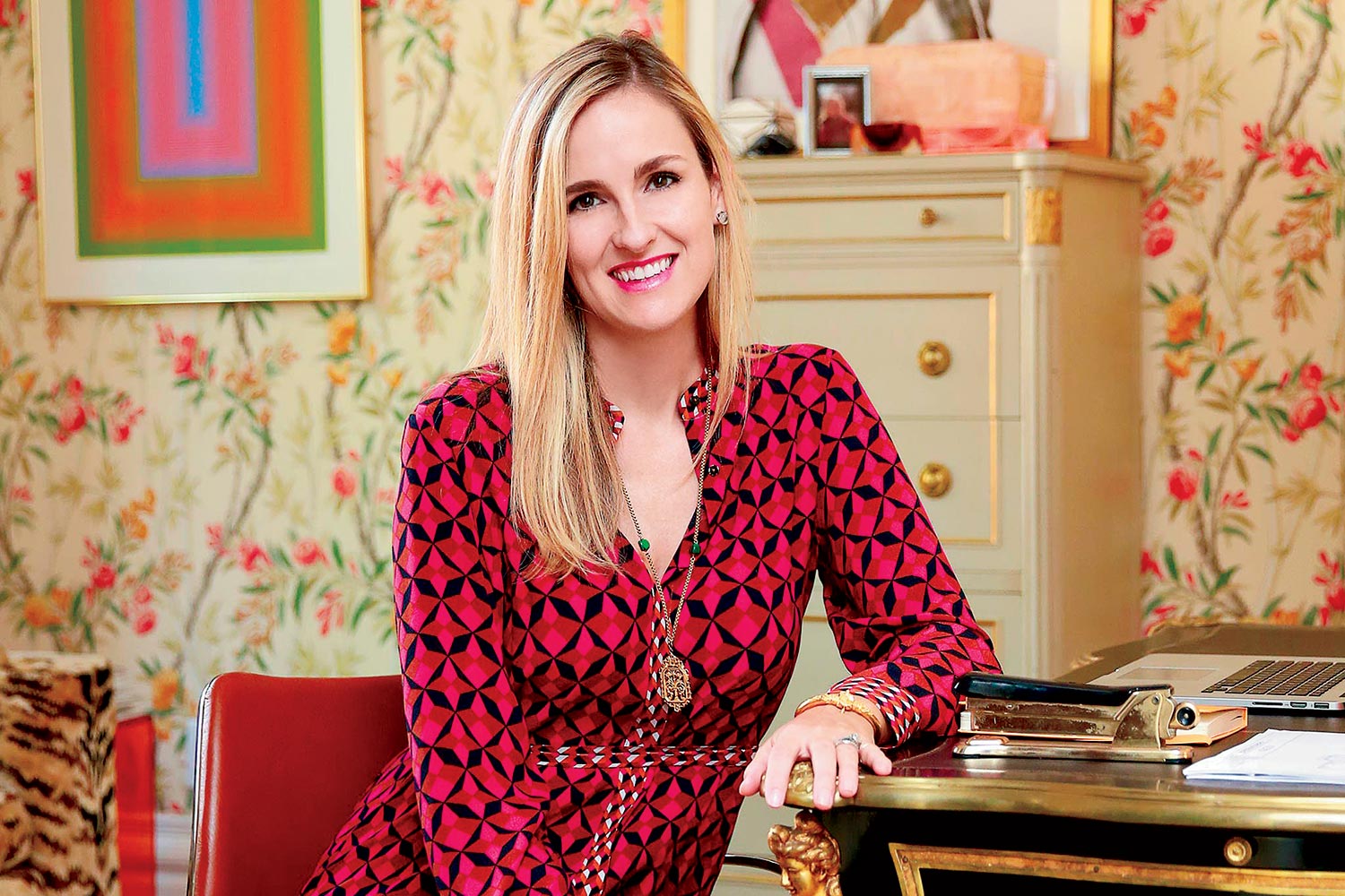
One such talented designer is Summer Thornton, known for her bold and vibrant use of color in her interiors. With a keen eye for detail and an understanding of color theory, Summer has mastered the art of using color to create stunning and captivating spaces.
In this article, we will explore six tricks that Summer Thornton utilizes in her interior designs to achieve remarkable results. From vibrant color accents to monochromatic palettes, you will discover how color can be used effectively to transform any space into a work of art.
Key Takeaways:
- Summer Thornton’s tricks with color, from bold accents to monochromatic palettes, showcase the power of color in transforming ordinary spaces into visually captivating masterpieces.
- By skillfully mixing warm and cool colors and incorporating natural and neutral tones, Summer Thornton creates balanced, inviting, and timeless interiors that reflect individual personalities.
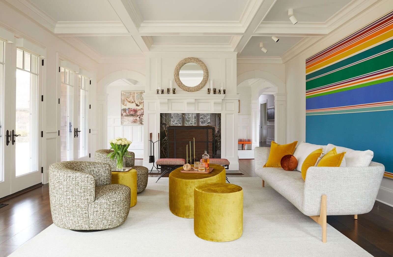
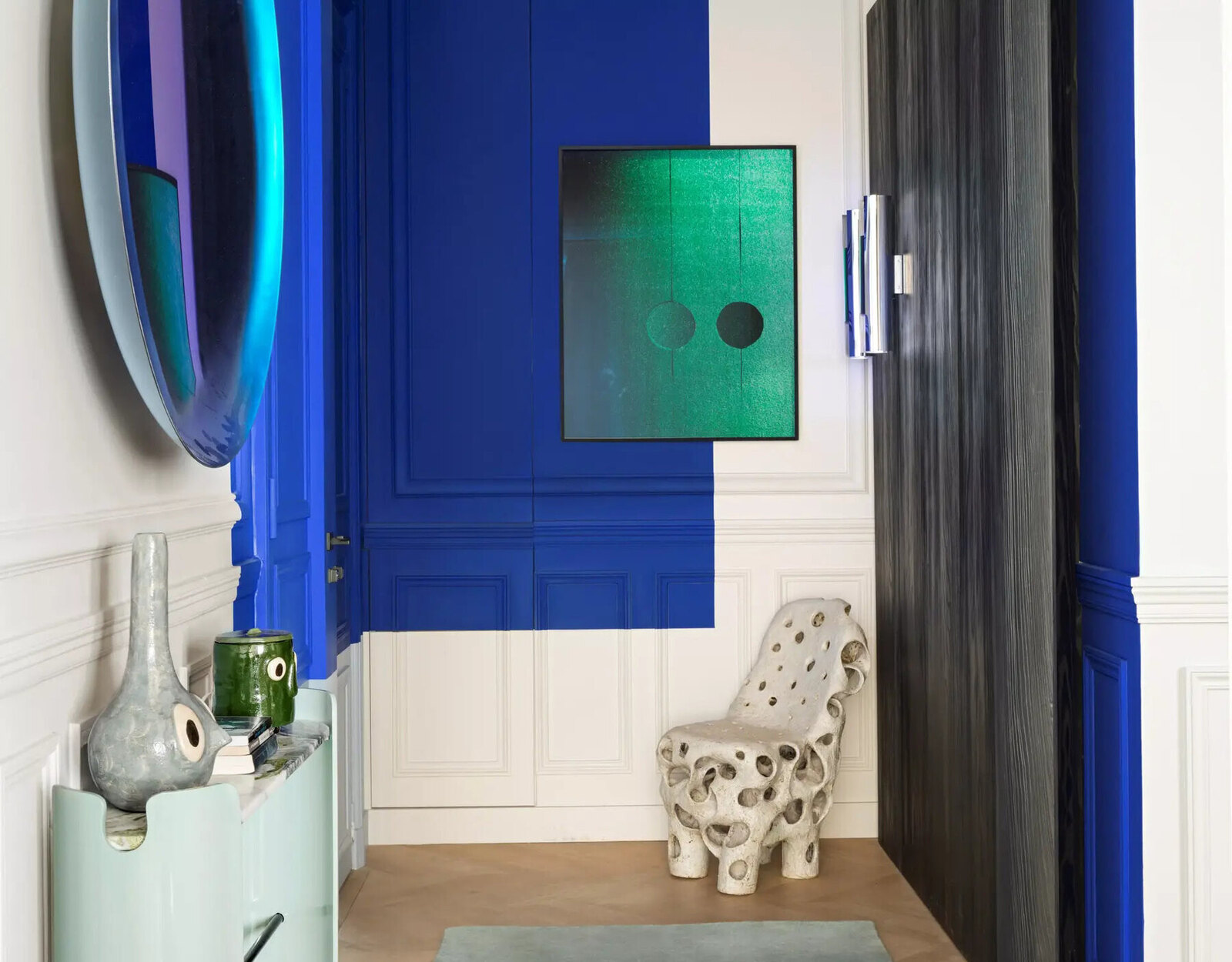
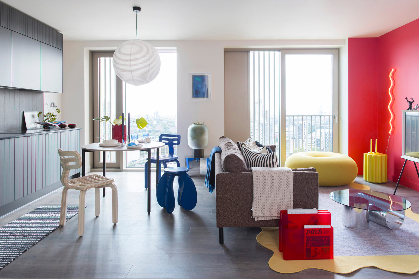
Trick 1: Bold and Vibrant Color Accents
One of Summer Thornton’s go-to tricks when it comes to using color in her interiors is incorporating bold and vibrant color accents. These accents serve as focal points within a space and instantly draw the eye, creating a sense of energy and excitement.
Whether it’s a pop of vibrant red in an otherwise neutral living room or a bold shade of blue on an accent wall, these bursts of color inject personality and add visual interest to the room. Summer believes that color accents should be used strategically to create balance and harmony in the overall design.
When incorporating bold and vibrant color accents, it’s important to consider the surrounding elements and ensure that they complement each other. For example, if you choose a bold red accent, make sure the furniture and accessories in the room complement or contrast with the color appropriately.
To avoid overwhelming a space with bold color accents, Summer suggests using them sparingly and strategically. You can start with smaller accents such as throw pillows, artwork, or accessories, and gradually introduce larger elements like furniture or rugs in vibrant hues. This creates a cohesive and visually appealing look throughout the room.
Remember, the goal is to create a balanced space that allows the color accents to shine without overwhelming the overall design. With this trick, Summer Thornton proves that a little splash of bold and vibrant color can go a long way in transforming a room from ordinary to extraordinary.
Trick 2: Layering Different Shades of the Same Color
An effective technique often employed by Summer Thornton is the layering of different shades of the same color. By using various tones and hues within a single color palette, she creates depth and dimension in her interiors.
When layering different shades of the same color, it’s essential to consider the undertones and intensities of each shade. This ensures a harmonious and cohesive look. For instance, if you’re working with blue tones, you can combine a light sky blue with a deeper navy or a cool pastel turquoise.
By layering these different shades, you create visual interest and give the room a sense of sophistication. The variation in tones adds depth and complexity to the space without overwhelming it, resulting in a more visually pleasing and balanced design.
It’s essential to distribute the different shades of color throughout the room strategically. For example, you might use a lighter shade on the walls, a slightly darker shade on the furniture, and accents of the darkest shade in accessories or artwork. This distribution of color helps to tie the space together and ensures a cohesive design.
Layering different shades of the same color can be a versatile technique, suitable for both vibrant and more subdued color palettes. Whether you’re working with soft pastels or bold jewel tones, this trick allows you to create a visually stunning and harmonious space that reflects your design vision.
Summer Thornton’s expertise in layering different shades of color shows that even a monochromatic palette can be visually captivating and sophisticated when executed with care and precision.
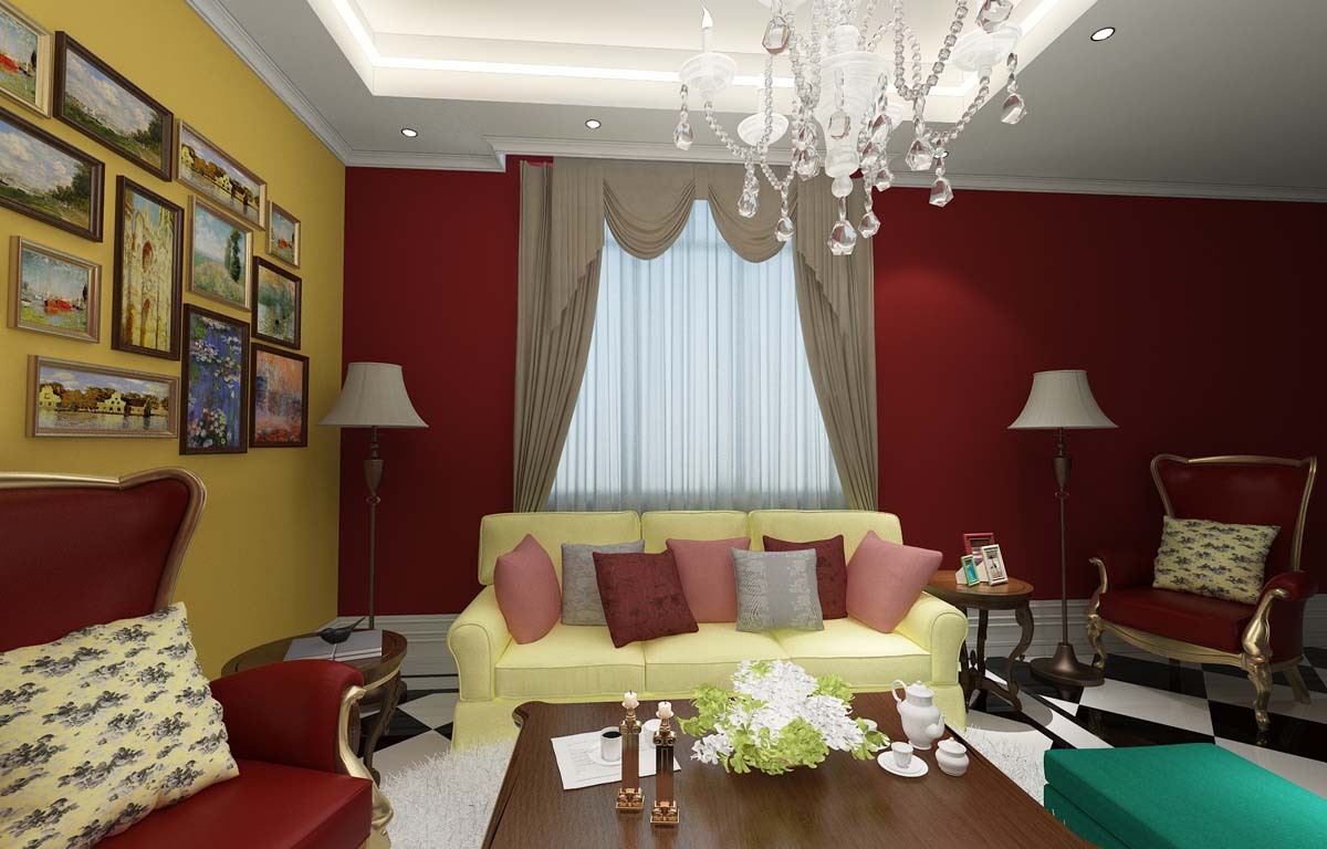
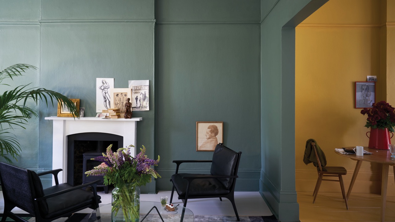
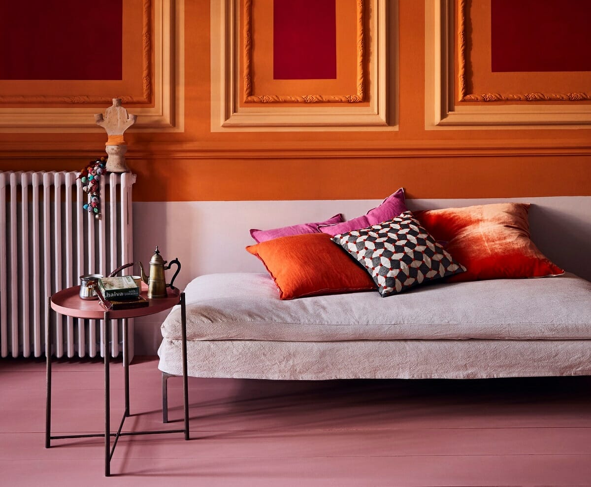
Trick 3: Mixing Warm and Cool Colors
One of Summer Thornton’s signature design tricks is the art of mixing warm and cool colors within a space. This deliberate combination brings balance and harmony to a room, creating an inviting and visually appealing atmosphere.
Warm colors, such as reds, oranges, and yellows, are known for their energizing and cozy qualities. They create a sense of warmth and intimacy in a space. On the other hand, cool colors, such as blues, greens, and purples, evoke a calming and soothing ambiance.
By cleverly mixing warm and cool colors, Summer Thornton creates a dynamic and well-balanced environment. The contrast between the two creates visual interest and prevents the space from feeling too one-dimensional.
When mixing warm and cool colors, consider using a dominant color as your base and incorporating accents of the contrasting color. For example, you might have a predominantly cool-toned room with blue walls and green accents, then introduce a warm-toned sofa or rug to create a striking contrast.
This trick works particularly well in open floorplans where different areas flow seamlessly into one another. By using warm colors in one section and cool colors in another, you can visually define and differentiate the spaces while maintaining a cohesive look.
Remember to consider the overall mood and atmosphere you want to create in the room. The proportion of warm and cool colors will play a role in determining the overall feeling. More warm colors will create a lively and energetic space, while more cool colors will result in a calm and serene environment.
By skillfully mixing warm and cool colors, Summer Thornton demonstrates that contrasting elements can coexist harmoniously, resulting in a space that is both visually stunning and emotionally inviting.
When using color in interiors, consider the psychological effects of different hues. For example, blue can create a calming atmosphere, while yellow can bring energy and warmth to a space.
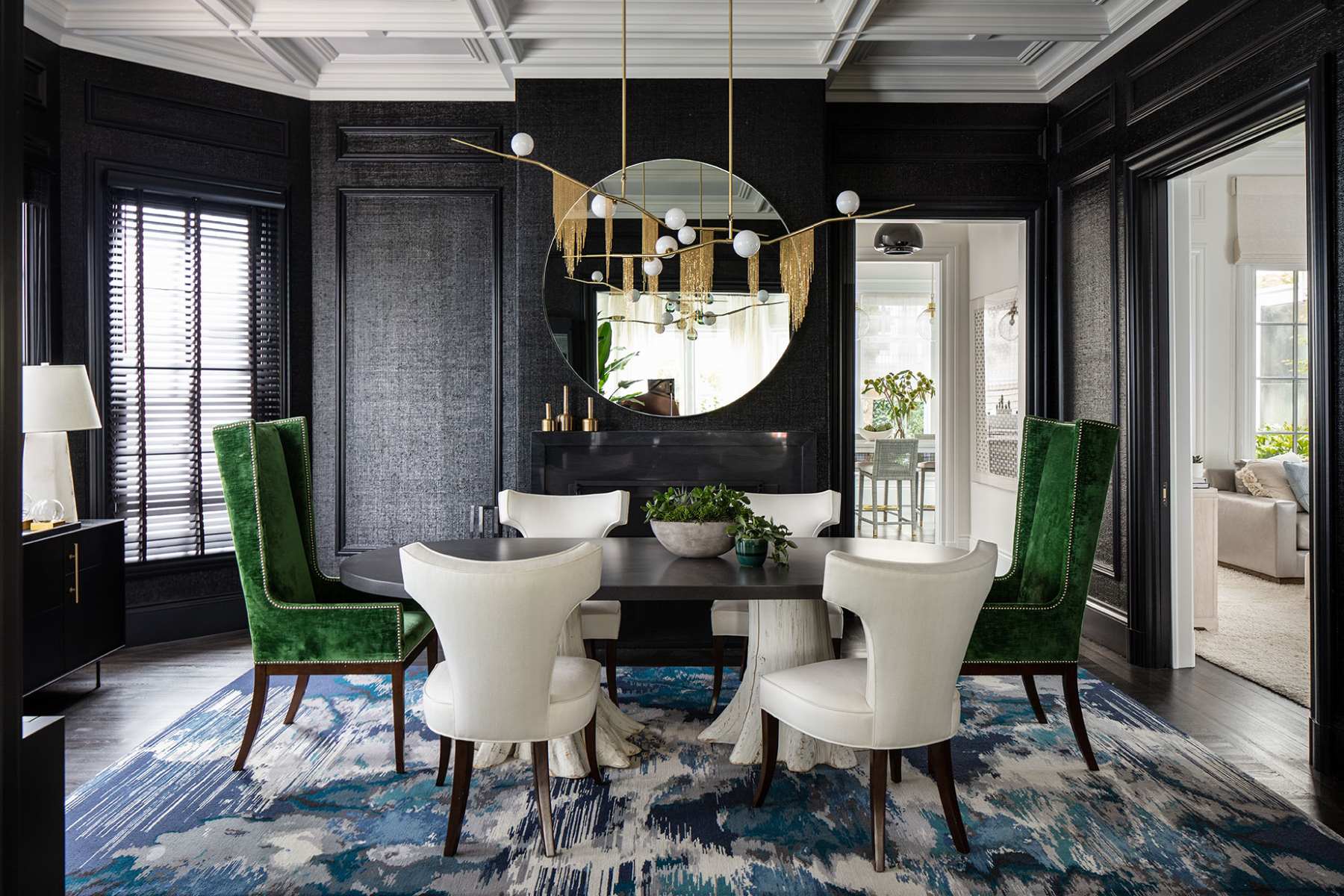
Trick 4: Creating a Monochromatic Palette
In her interior designs, Summer Thornton often embraces the power of a monochromatic color scheme. This design trick involves working with various shades, tints, and tones of a single color to create a cohesive and visually engaging space.
Using a monochromatic palette doesn’t mean the room will be boring or lack variety. On the contrary, it offers a myriad of opportunities to play with different textures, patterns, and materials within the chosen color family.
When creating a monochromatic color scheme, start by selecting a base color that you want to work with. For example, you might choose different shades of gray to create a sophisticated and modern look. Then, incorporate lighter and darker shades of gray throughout the room, along with various textures and patterns to add depth and visual interest.
To ensure a successful monochromatic design, consider using a mix of matte, glossy, and textured finishes to create contrast and dimension within the space. Velvet upholstery, sleek metal accents, and textured wallpapers can all contribute to a captivating monochromatic design.
While the focus is on a single color, you can still introduce pops of complementary or contrasting colors as accents to create visual interest. For example, if you have a primarily blue monochromatic palette, you can incorporate pops of yellow or orange in accessories or artwork to add a vibrant touch.
A monochromatic palette lends itself well to any design style, whether it’s modern, traditional, or eclectic. It allows you to experiment with different shades within a single color family, creating a harmonious and sophisticated aesthetic.
Summer Thornton’s mastery of creating inviting and captivating monochromatic interiors showcases the versatility and impact of this design trick. It demonstrates that working within a single color palette can result in a space that is visually stunning, cohesive, and full of character.
Trick 5: Using Colorful Statement Pieces
One of Summer Thornton’s favorite techniques for incorporating color into her interiors is through the use of colorful statement pieces. These pieces act as focal points within a room and instantly capture attention, adding vibrancy and personality to the space.
Colorful statement pieces can be anything from bold furniture pieces to eye-catching artwork or unique accessories. They bring a sense of playfulness and excitement to the design, making a bold statement and infusing the space with energy.
When choosing colorful statement pieces, it’s essential to consider the overall color scheme and style of the room. Opt for pieces that complement the existing palette and enhance the desired atmosphere. For instance, a vibrant yellow armchair can bring warmth to a neutral-toned living room, while a bold abstract painting can inject drama into a contemporary space.
These pieces should not only stand out visually but also reflect the homeowner’s personality and style. Whether it’s a vibrant rug, a colorful chandelier, or a patterned wallpaper, the key is to select statement pieces that make a statement but still harmonize with the overall design scheme.
Colorful statement pieces can also serve as conversation starters, adding a touch of intrigue and personality to any space. They allow the designer to inject their creativity and create a space that is truly unique and unforgettable.
Remember, the goal is to strike a balance between boldness and cohesion. While these statement pieces should grab attention, they should also work harmoniously with the rest of the design elements in the room.
Summer Thornton’s skillful use of colorful statement pieces showcases how a single bold element can transform a space from mundane to extraordinary, making it a reflection of the homeowner’s individuality and creativity.
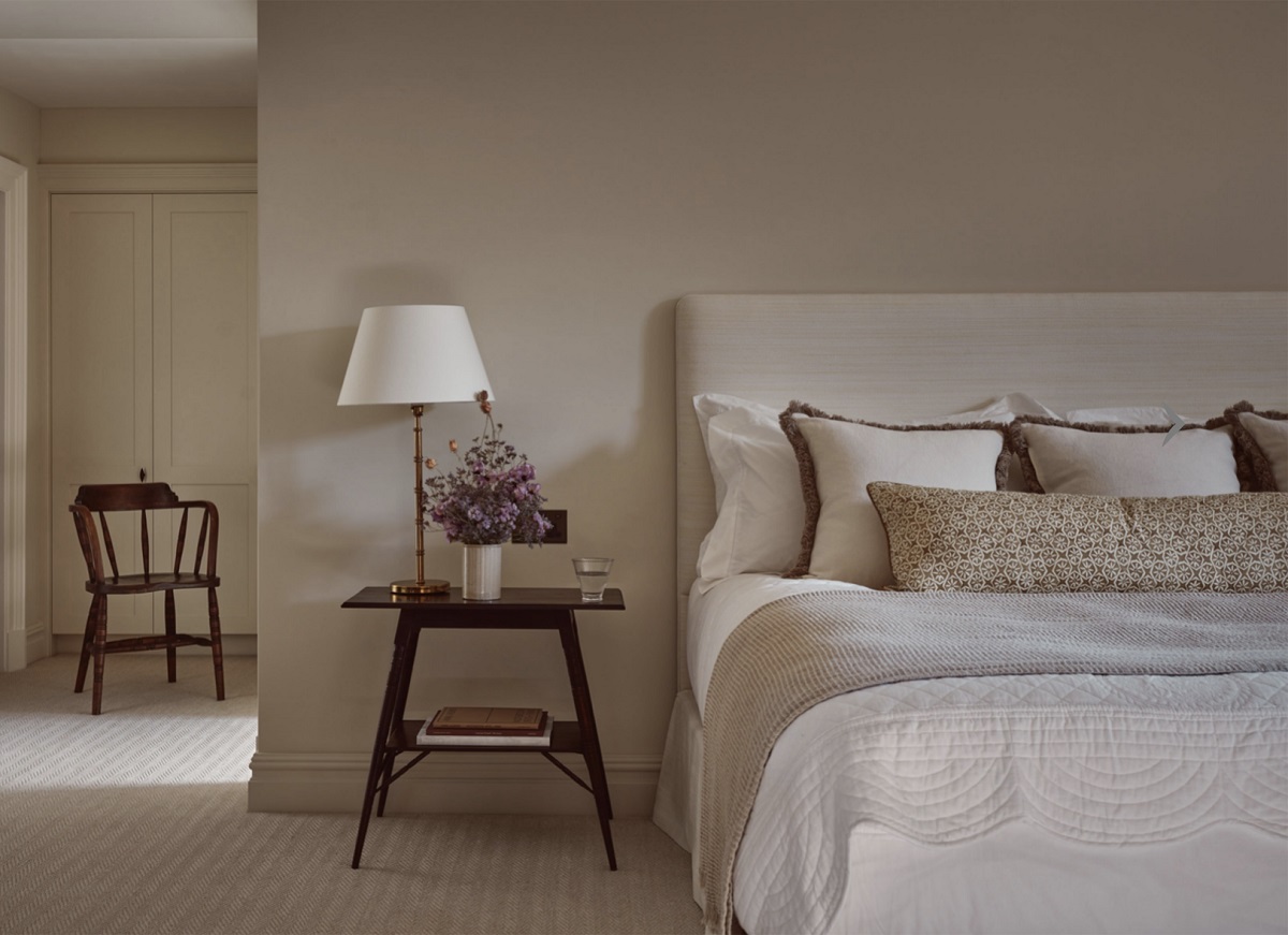
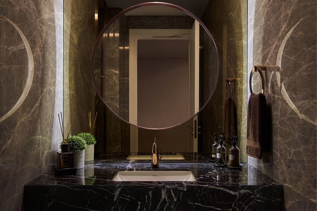
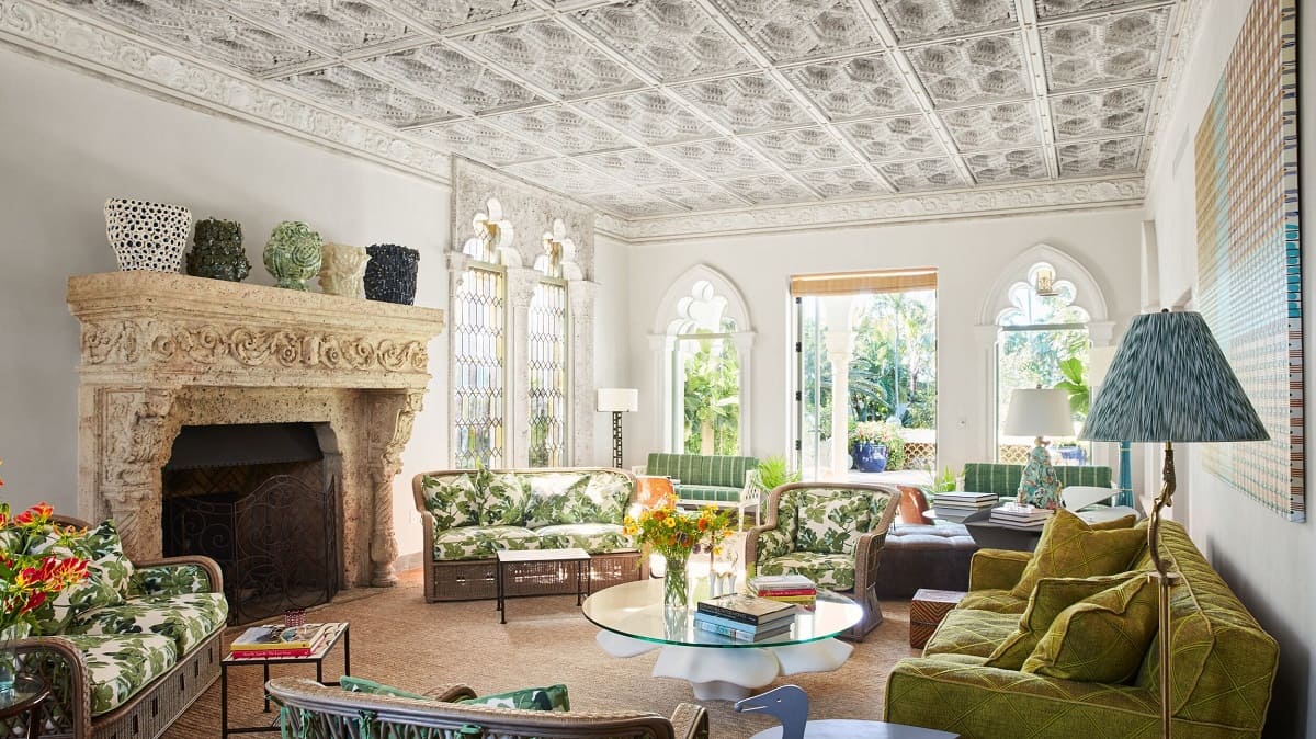
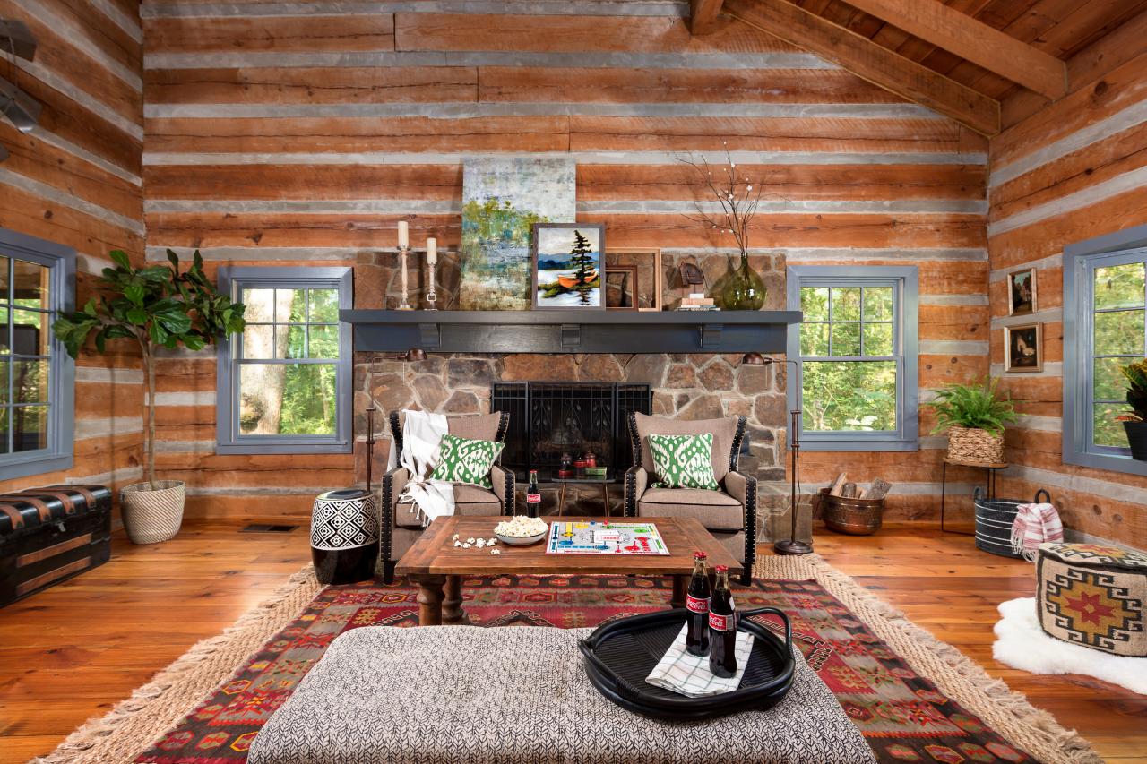
Trick 6: Incorporating Natural and Neutral Colors
In addition to her love for bold and vibrant colors, Summer Thornton also understands the importance of incorporating natural and neutral colors into her interior designs. These colors provide a sense of calmness, balance, and timeless elegance to a space.
Natural and neutral colors, such as earthy tones, beige, cream, and soft grays, serve as the foundation for many of Summer’s designs. They create a soothing backdrop that allows other elements in the room to shine and stand out.
When incorporating natural and neutral colors, Summer often looks to nature for inspiration. She draws from the colors of sand, stone, and greenery, creating a serene and organic atmosphere. These colors can be incorporated through paint, furniture, textiles, and accessories.
By embracing natural and neutral tones, the focus shifts to texture, patterns, and materials, further enhancing the richness and depth of the design. Elements such as exposed brick, reclaimed wood, woven fabrics, and natural fibers add visual interest and a tactile quality to the space.
Using natural and neutral colors as a foundation also provides flexibility in styling and accessorizing the room. These colors serve as a blank canvas that can easily be paired with pops of color or patterned accents to add interest and personality.
Moreover, natural and neutral colors have a timeless appeal, making the space feel warm and inviting year after year. They create a versatile backdrop that can easily adapt to changing trends or personal preferences.
Summer Thornton’s incorporation of natural and neutral colors showcases her understanding of the importance of creating a balanced and serene environment. By embracing these colors, she creates spaces that are not only visually appealing but also comfortable and soothing.
Conclusion
Incorporating color in interior design is a powerful tool that can transform a space into a personalized and visually captivating masterpiece. Summer Thornton, with her expertise and creative flair, demonstrates how to use color effectively to create remarkable interiors.
From bold and vibrant color accents to layering different shades of the same color, Summer’s tricks showcase the versatility and impact of color in design. Mixing warm and cool colors and creating monochromatic palettes bring balance and sophistication to a room. Additionally, using colorful statement pieces and incorporating natural and neutral colors add personality, depth, and timeless elegance to any space.
When applying these tricks, it’s essential to consider the overall style, atmosphere, and individual preferences. Each space is unique, and color should be used to enhance its character and reflect the homeowner’s personality.
Remember, the goal is not only to create visually stunning interiors but also to evoke emotions and create a sense of harmony and comfort within the space. Colors can impact our mood, energy levels, and overall well-being, making their thoughtful integration crucial in design.
With Summer Thornton’s tricks, you can take your interior design to the next level, creating spaces that leave a lasting impression. So go ahead, embrace the power of color, and let your creativity and imagination soar as you transform your space into a personal sanctuary.
Frequently Asked Questions about 6 Tricks With Color Designer Summer Thornton Uses In Her Interiors
Was this page helpful?
At Storables.com, we guarantee accurate and reliable information. Our content, validated by Expert Board Contributors, is crafted following stringent Editorial Policies. We're committed to providing you with well-researched, expert-backed insights for all your informational needs.
0 thoughts on “6 Tricks With Color Designer Summer Thornton Uses In Her Interiors”