Home>Ideas and Tips>How To Choose The Right Paint Colors For A 1970s Retro Kitchen

Ideas and Tips
How To Choose The Right Paint Colors For A 1970s Retro Kitchen
Published: August 29, 2024
Discover how to choose the perfect paint colors for a 1970s retro kitchen, blending bold hues and earthy tones for a nostalgic yet stylish look.
(Many of the links in this article redirect to a specific reviewed product. Your purchase of these products through affiliate links helps to generate commission for Storables.com, at no extra cost. Learn more)
Choosing the right paint colors for a 1970s retro kitchen can be a daunting task, especially if you're aiming to maintain the era's nostalgic charm. The 1970s were known for their bold and vibrant color schemes, which often included bright hues, earthy tones, and retro-inspired patterns. In this article, we will guide you through the process of selecting the perfect paint colors that will bring your 1970s retro kitchen back to life.
Understanding the Era's Color Palette
Before diving into the specifics of choosing paint colors, it's essential to understand the color palette of the 1970s. This era was characterized by a mix of bold and playful colors, often inspired by the emerging disco and psychedelic cultures. Here are some key color trends from the 1970s that you might want to consider:
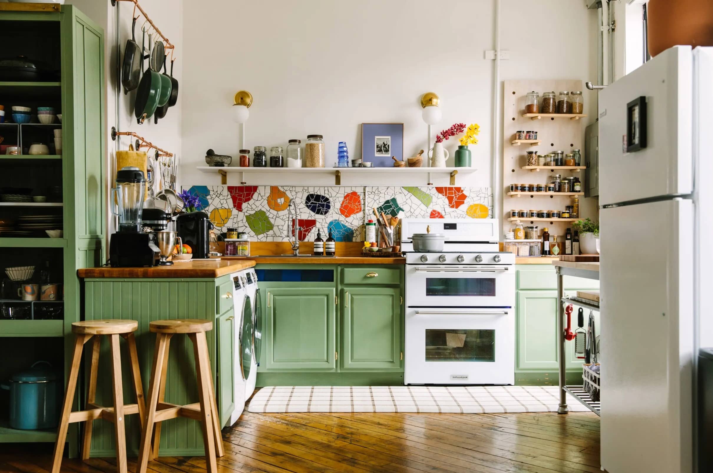
- Bold Hues: Colors like avocado green, harvest gold, and burnt orange were staples of 1970s decor. These bold hues can add a lot of character to your kitchen but should be used judiciously to avoid overwhelming the space.
- Earth Tones: Earthy tones such as terracotta red, sienna brown, and olive green were also popular during this era. These colors can bring warmth and coziness to your kitchen.
- Retro Patterns: In addition to solid colors, the 1970s were known for their retro patterns like paisley, florals, and geometric shapes. These patterns can be incorporated through wallpaper or even paint with special effects.
Considering the Room's Purpose
When choosing paint colors for your 1970s retro kitchen, it's crucial to consider the room's purpose and how you plan to use it. Here are some tips based on common kitchen activities:
- Cooking Area: For areas where you'll be cooking, it's best to choose lighter colors that reflect light and make the space feel more spacious. Colors like creamy whites or soft yellows can create a clean and inviting atmosphere.
- Dining Area: If you plan to use your kitchen as a dining area as well, you might want to choose colors that promote relaxation and conversation. Earthy tones like terracotta red or sienna brown can create a cozy ambiance.
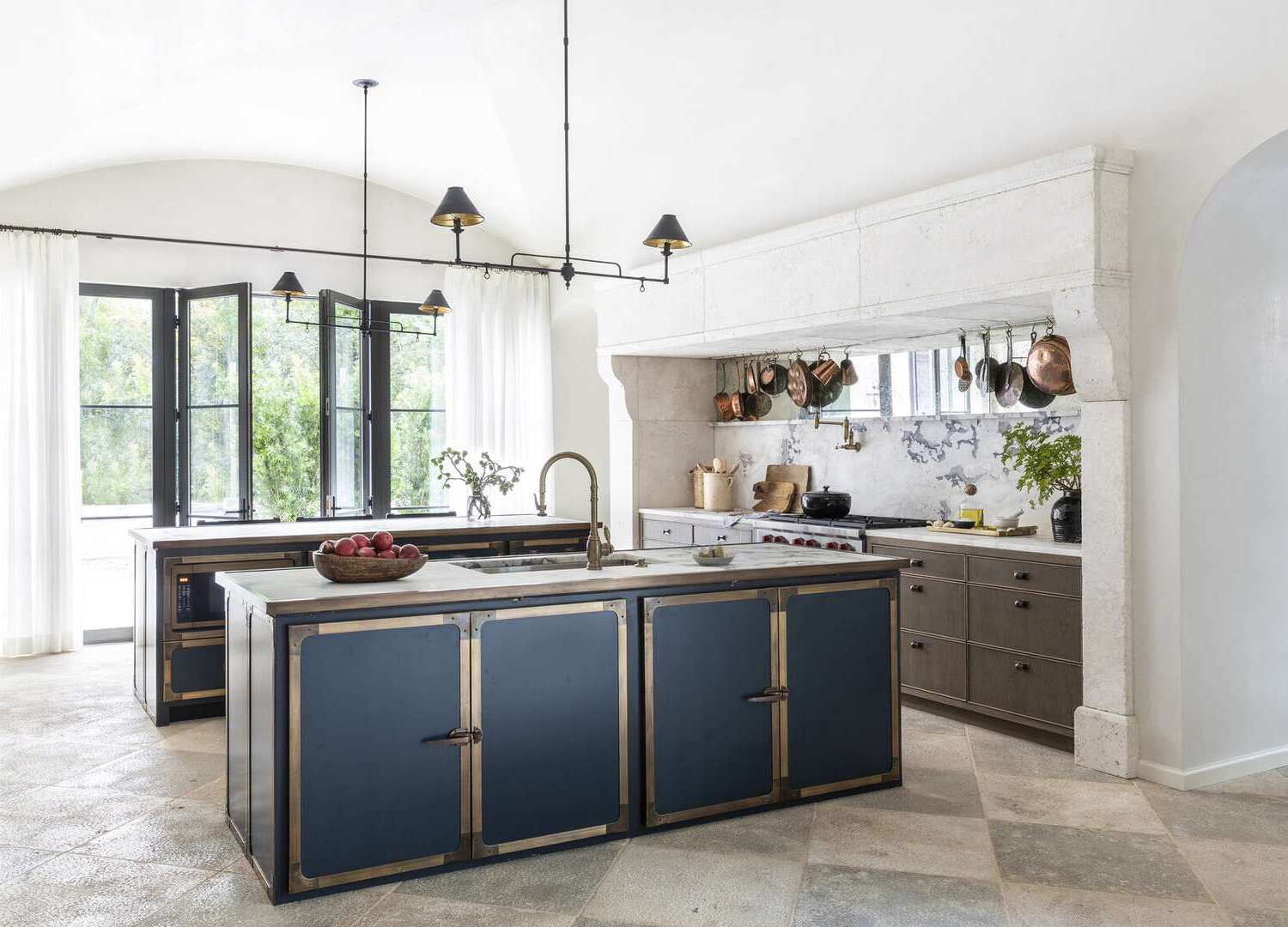
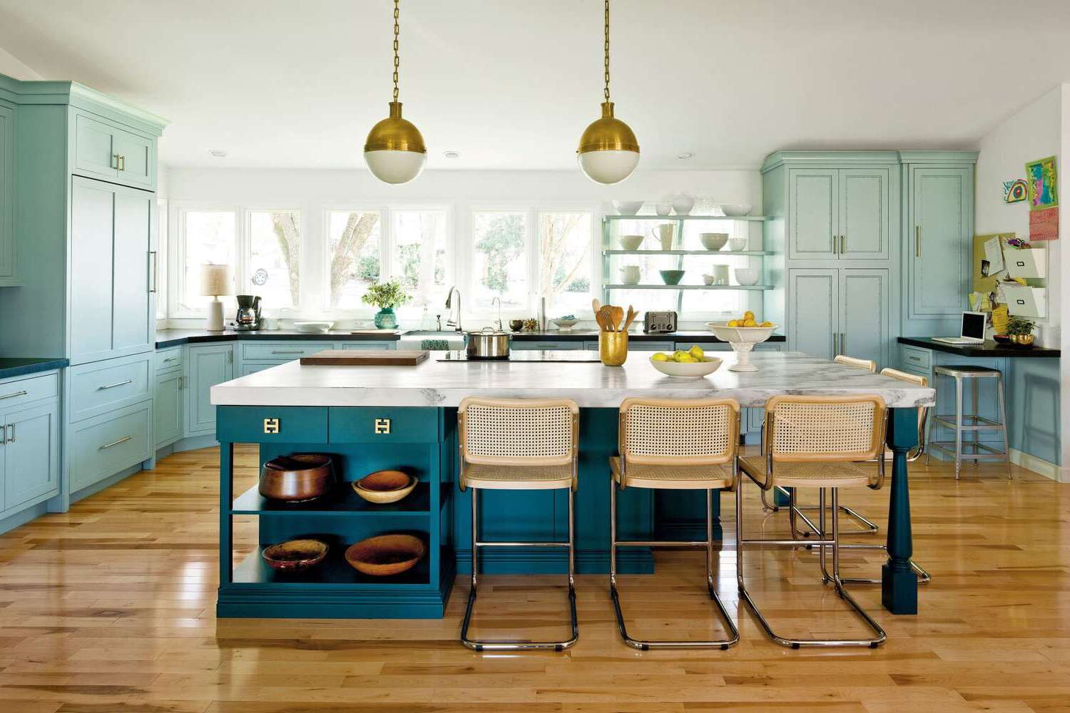
- Decorative Elements: If you have decorative elements like a retro-style kitchen island or unique lighting fixtures, you can use these as inspiration for your paint colors. For example, if you have a vintage-style kitchen island with avocado green accents, you might want to incorporate similar shades into your wall color.
Lighting Matters
Lighting plays a significant role in how paint colors appear in your kitchen. Here are some tips on how lighting affects color choice:
- Natural Light: If your kitchen receives plenty of natural light, you can opt for bolder colors without worrying about them looking overwhelming. Natural light tends to diffuse bold colors, making them appear more balanced.
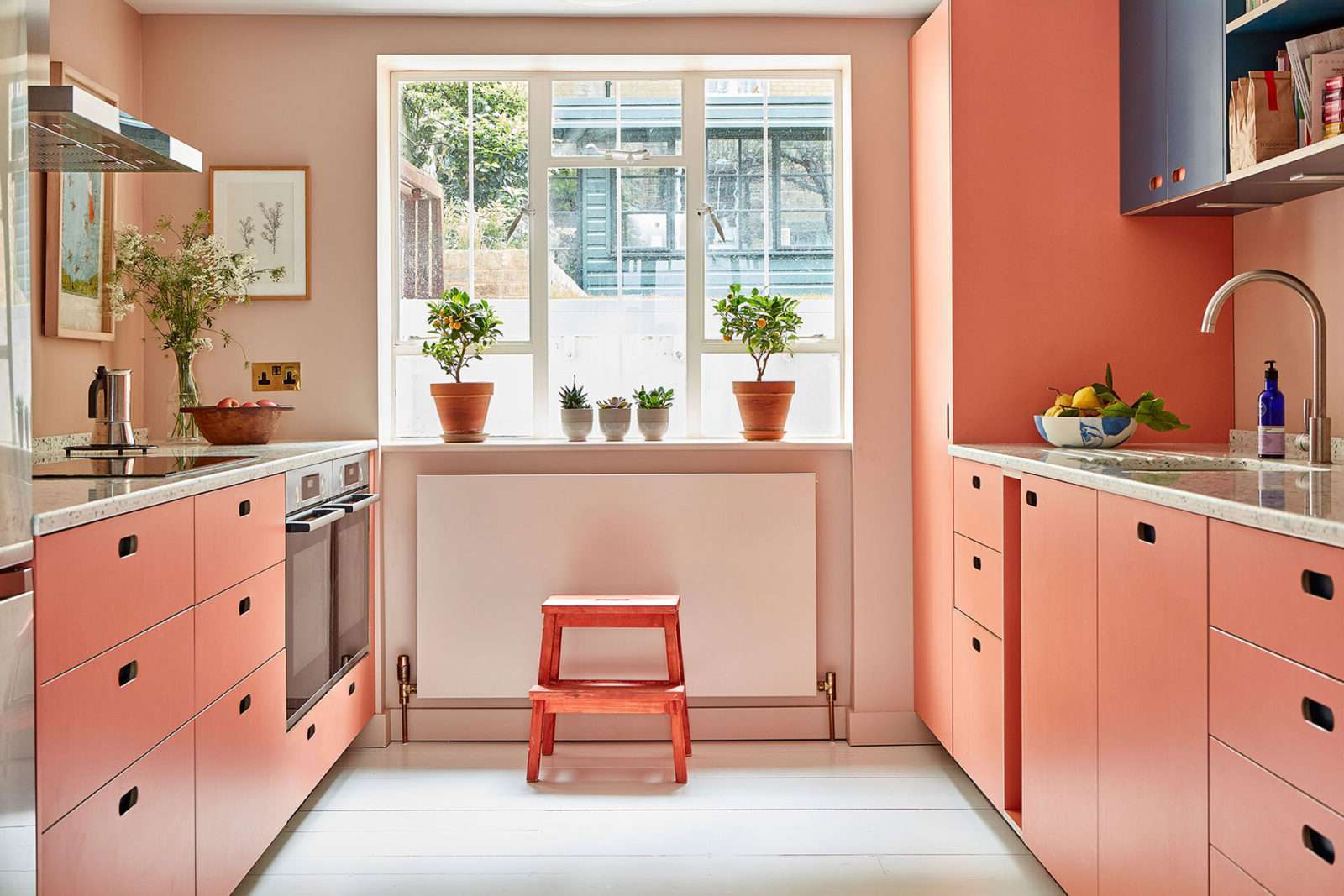
- Artificial Light: On the other hand, if your kitchen is dimly lit, it's best to choose softer shades that won't appear too dark or heavy under artificial lighting. Soft pink or beige can be good options for such spaces.
Choosing a Color Scheme
Selecting a color scheme for your 1970s retro kitchen involves more than just picking any color; it's about creating a cohesive look that ties everything together. Here are some popular color schemes inspired by the era:
-
Monochromatic:
- Using variations of a single color can create a harmonious and cohesive look. For example, different shades of avocado green can be used for walls, trim, and accents to maintain a consistent theme.
-
Complementary:
- Combining colors that are opposite each other on the color wheel can add depth and interest to your kitchen. For instance, pairing avocado green with burnt orange can create a dynamic and energetic atmosphere.
-
Analogous:
- Using colors next to each other on the color wheel can produce a smooth transition between different elements in your kitchen. For example, using shades of green like olive green and lime green can create a natural and earthy feel.
Balancing Colors
To avoid overwhelming your kitchen with too many colors, it's essential to balance them properly. Here’s how you can achieve this balance:
-
Dominant Color:
- Choose one dominant color that sets the main tone for each room depending on how you plan to use it. For example, if you choose avocado green as your dominant color, use it for about 60% of the room.
-
Supporting Colors:
- Select two supporting colors that complement your dominant color. These supporting colors should be used for about 30% of the room. For instance, if you choose avocado green as your dominant color, you can pair it with burnt orange or harvest gold as supporting colors.
-
Accent Colors:
- Use accent colors sparingly but effectively to add pops of color throughout your kitchen. These accent colors should be used for about 10% of the room and can include retro patterns or bold hues.
Tips for Applying Paint
Applying paint in a 1970s retro kitchen requires some planning and patience to achieve the desired look:
-
Prepare Your Surface:
- Ensure that your walls are clean and free from any old paint or debris before applying new paint.
-
Test Colors:
- Always test paint samples on your walls before committing to a specific color. This will help you see how the color looks in different lighting conditions.
-
Use Retro Patterns:
- If you want to incorporate retro patterns into your paint job, consider using special effects like metallic or glitter finishes for added flair.
-
Consider Trim and Accents:
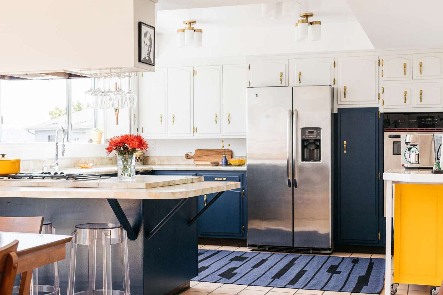
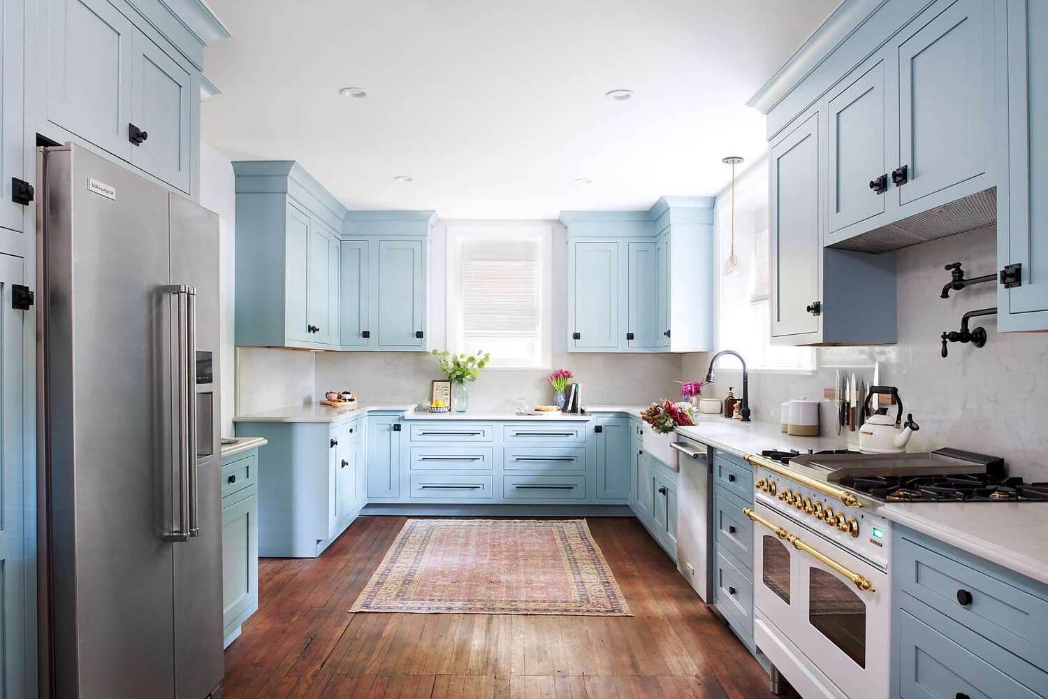
- Trim and accents like cabinet handles or appliances can also influence your paint color choices. For example, if you have avocado green cabinets, you might want to choose a lighter shade for walls to avoid overwhelming the space.
-
Don’t Forget About Texture:
- Texture can add depth to your kitchen design by incorporating different finishes like matte or glossy textures in various areas of the room.
Common Mistakes to Avoid
While choosing paint colors for a 1970s retro kitchen can be exciting, there are several common mistakes that you should avoid:
-
Not Testing Colors:
- Failing to test paint samples on your walls before applying them can lead to disappointing results when you see how they look in different lighting conditions.
-
Overwhelming the Space:
- Using too many bold colors without balancing them properly can overwhelm the space and make it look cluttered rather than retro chic.
-
Ignoring Lighting Conditions:
- Not considering how lighting affects color appearance can result in colors looking different than expected once they're applied.
-
Not Incorporating Unifying Elements:
- Failing to incorporate unifying elements like recurring colors or themes across different rooms can make your kitchen look disjointed rather than cohesive with other parts of your home.
Conclusion
Choosing the right paint colors for a 1970s retro kitchen involves understanding the era's color palette, considering the room's purpose, lighting conditions, and balancing colors effectively. By following these tips and avoiding common mistakes, you can create a kitchen that not only looks retro chic but also reflects your personal style and love for vintage decor. Remember to test colors thoroughly and incorporate unifying elements to ensure that your kitchen stands out as a true gem of 1970s design.
Was this page helpful?
At Storables.com, we guarantee accurate and reliable information. Our content, validated by Expert Board Contributors, is crafted following stringent Editorial Policies. We're committed to providing you with well-researched, expert-backed insights for all your informational needs.

0 thoughts on “How To Choose The Right Paint Colors For A 1970s Retro Kitchen”