Home>Interior Design>7 Small Entryway Mistakes That Designers Want Us To Stop Making
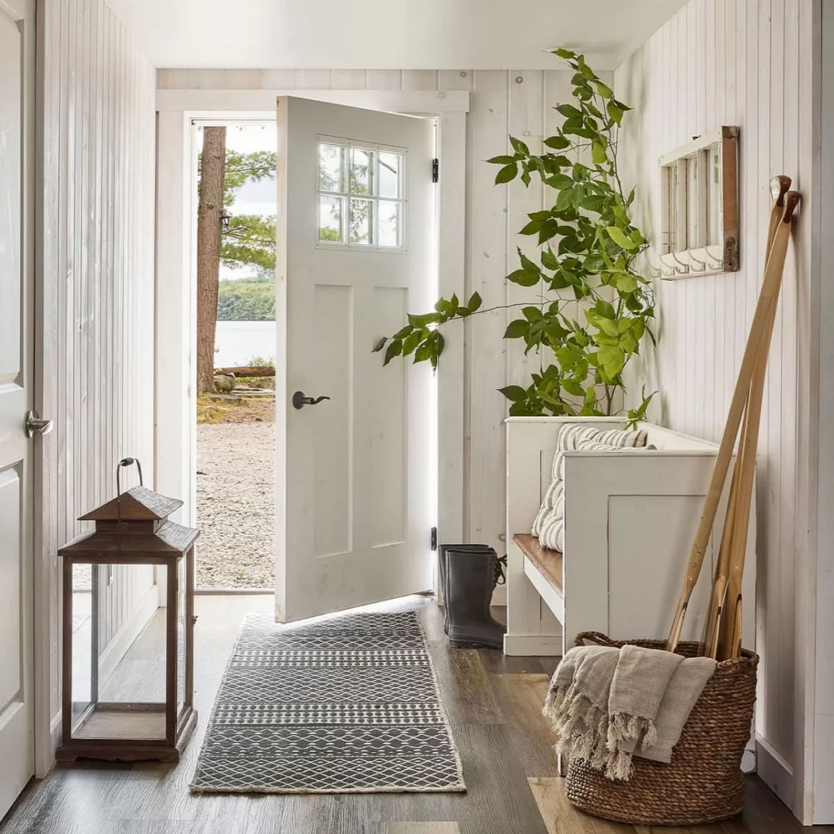

Interior Design
7 Small Entryway Mistakes That Designers Want Us To Stop Making
Modified: January 21, 2024
Avoid common mistakes in your small entryway with these interior design tips from experts. Enhance the functionality and style of your space with our helpful advice.
(Many of the links in this article redirect to a specific reviewed product. Your purchase of these products through affiliate links helps to generate commission for Storables.com, at no extra cost. Learn more)
Introduction
Welcome to the exciting world of interior design! Whether you are a homeowner, renter, or just someone with a passion for creating beautiful spaces, you know that every detail matters when it comes to crafting the perfect environment. And one area that often gets overlooked but is essential for making a good first impression is the entryway. The entryway sets the tone for the rest of your home, so it’s important to avoid some common mistakes that designers want us to stop making. In this article, we will explore seven small entryway mistakes and how to avoid them.
By addressing these mistakes, you can transform your entryway into a functional and aesthetically pleasing space that welcomes you and your guests with style and warmth. So let’s dive in and discover how to make the most of your entryway.
Key Takeaways:
- Transform your entryway into a functional and aesthetically pleasing space by addressing common mistakes like neglecting proper lighting, overlooking storage solutions, and ignoring the importance of a mirror.
- Avoid overwhelming your entryway with excessive accessories and clutter, and harness the power of paint to create a welcoming and visually appealing space that reflects your personal style.
Mistake 1: Neglecting proper lighting
One of the biggest mistakes you can make in your entryway is neglecting proper lighting. Your entryway should be bright and inviting, providing ample visibility for you and your guests. Poor lighting not only affects the functionality of the space, but it also creates a gloomy and unwelcoming atmosphere. So, how can you avoid this mistake?
Firstly, consider the natural light sources in your entryway. If you have windows, make sure to utilize them by keeping them clean and unobstructed. Natural light brings a sense of warmth and openness to the space.
Secondly, incorporate artificial lighting that complements the natural light. A combination of ambient, task, and accent lighting can work wonders in your entryway. Start with an overhead fixture or chandelier to provide general illumination. Then, add wall sconces or table lamps for task lighting, such as illuminating an entry table or providing light for key activities like shoe-tying. Lastly, consider adding accent lighting to highlight specific architectural features or artwork.
Remember to choose light fixtures that match the style of your entryway. Whether you prefer modern, industrial, or traditional design, there are plenty of lighting options available to suit your taste. And don’t forget about the importance of dimmers! They allow you to adjust the lighting according to the time of day or the desired mood.
Proper lighting not only enhances the functionality of your entryway but also adds a touch of elegance and sophistication. So, take the time to carefully plan your lighting scheme and bring your entryway to life.
Mistake 2: Overlooking storage solutions
When it comes to entryways, one common mistake that many people make is overlooking the importance of storage solutions. An organized entryway not only creates a welcoming atmosphere but also helps to keep your space clutter-free. So, let’s explore how you can avoid this mistake and maximize the storage potential of your entryway.
Firstly, consider the layout and size of your entryway. Take advantage of vertical space by installing wall-mounted shelves or hooks. This provides a convenient spot to hang coats, bags, and hats, keeping them easily accessible yet out of the way.
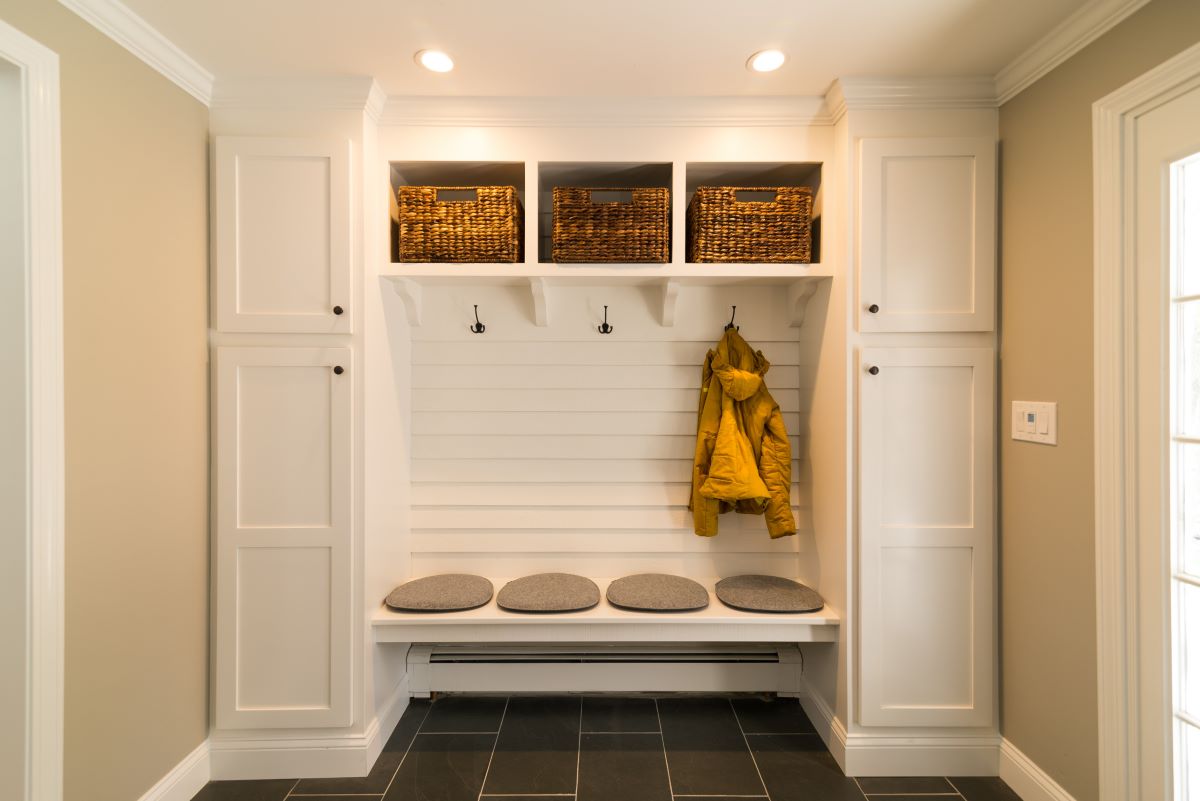
Additionally, invest in a stylish storage bench or console table with drawers or baskets. This allows you to store shoes, umbrellas, or other items that you frequently use but don’t want cluttering the space. A bench also provides a functional seating option, allowing you or your guests to comfortably take off or put on shoes.
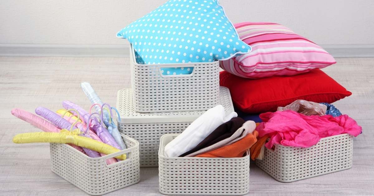
Another great storage solution is a wall-mounted key holder. This prevents you from misplacing your keys and adds a touch of organization to your entryway. You can even get creative and incorporate decorative baskets or bins for storing small items like gloves, scarves, or sunglasses.
Remember to choose storage solutions that align with the overall style and aesthetic of your entryway. Opt for furniture and accessories that not only serve a functional purpose but also contribute to the visual appeal of the space.
By incorporating smart storage solutions into your entryway, you can keep the space tidy and clutter-free while ensuring that everything has its designated place. This not only creates a more efficient and organized entryway but also sets the tone for the rest of your home.
Mistake 3: Ignoring the importance of a mirror
Have you ever walked into an entryway and felt like something was missing? Well, that missing element could be a mirror. Ignoring the importance of a mirror in your entryway is a common mistake that many people make. A well-placed mirror not only adds functionality but also enhances the overall design and aesthetics of the space. Let’s delve into why you should not overlook the importance of a mirror in your entryway.
First and foremost, a mirror in the entryway serves a practical purpose. It allows you and your guests to quickly check your appearance before stepping out of the house. Whether it’s a quick glance to adjust your hair or a final check of your outfit, having a mirror in the entryway is a convenient feature that can save you time and hassle.
In addition to its functionality, a mirror also has the power to make your entryway appear larger and brighter. By reflecting light, a mirror can create an illusion of spaciousness, especially in smaller entryways. Choose a mirror with a stylish frame that complements the overall design of your entryway for an extra visual impact.
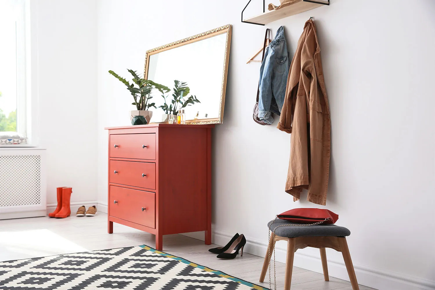
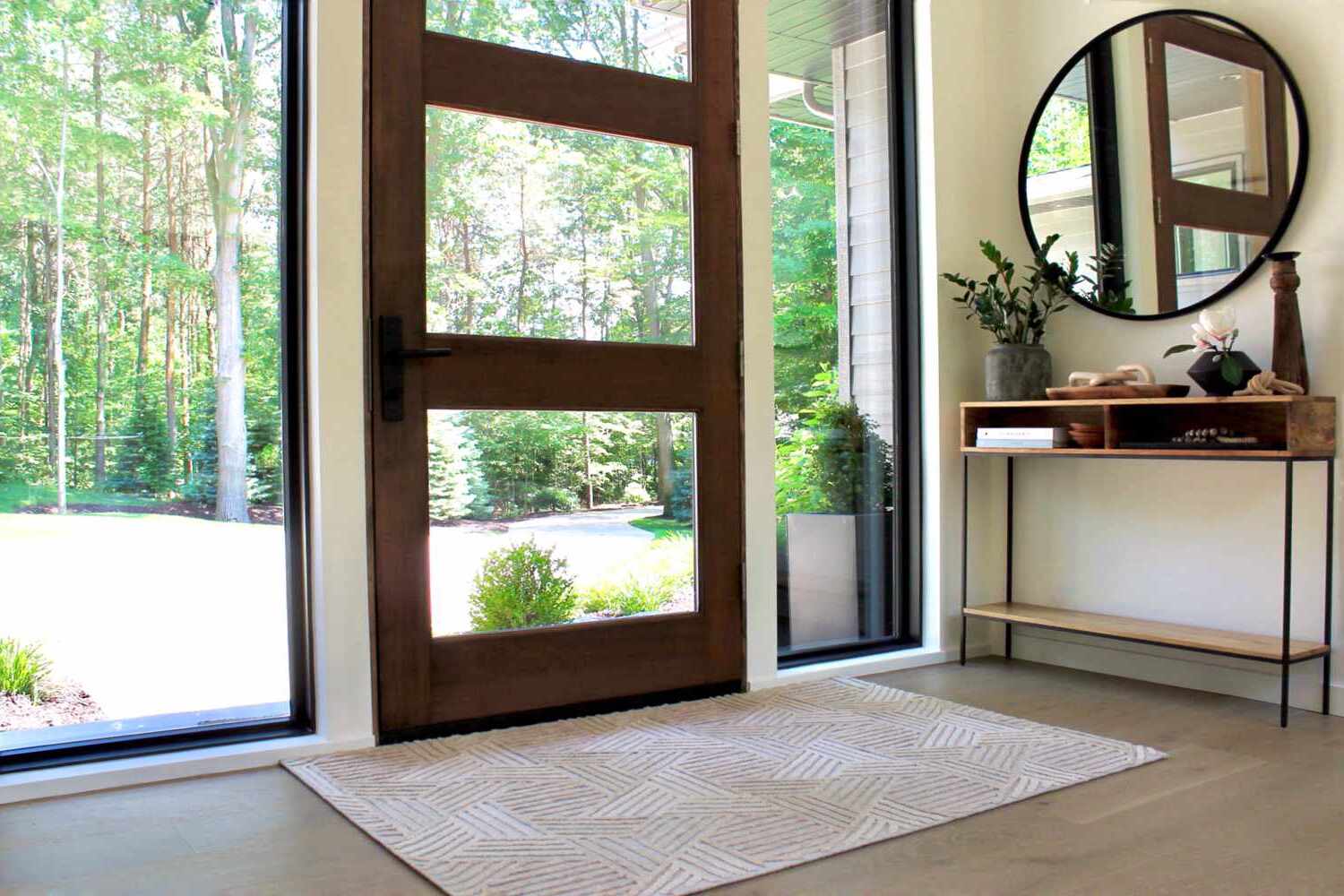
Furthermore, a well-placed mirror can act as a focal point, adding depth and visual interest to the space. Consider placing a mirror above a console table or bench to create a stylish vignette. You can also incorporate multiple mirrors in various shapes and sizes to create a unique and eclectic look.
Remember to think about the placement of the mirror in relation to the natural and artificial light sources in your entryway. Positioning the mirror opposite a window or light fixture will maximize its reflective properties and enhance the overall brightness of the space.
So, don’t make the mistake of ignoring the importance of a mirror in your entryway. Whether it’s for convenience, visual appeal, or creating a sense of spaciousness, a well-chosen mirror can make a significant difference in transforming your entryway into a stunning and welcoming space.
Mistake 4: Lack of seating options
One overlooked aspect of the entryway design is the lack of seating options. Many entryways simply consist of a blank space with no seating, but incorporating seating into your entryway can greatly enhance its functionality and comfort. Let’s explore why you should avoid the mistake of neglecting seating options in your entryway.
First and foremost, having seating in your entryway provides a convenient and comfortable spot to sit down and put on or take off your shoes. It’s a practical solution that saves you from having to balance on one foot or find a nearby surface to sit on. Whether it’s a bench, a stool, or even a small chair, having seating allows you and your guests to comfortably transition from outdoors to indoors.
In addition to its functionality, seating can also serve as a decorative element in your entryway. Choose seating options that complement the overall style and aesthetic of your entryway. Whether you prefer a sleek and modern design, a rustic and farmhouse-inspired look, or something more eclectic, there are seating options available to suit your taste.
Consider the size of your entryway when choosing the seating. If you have a larger entryway, you can opt for a larger bench or even a small sofa. For a smaller entryway, a compact bench or a couple of stools can do the trick. You can also get creative by incorporating storage benches that offer both seating and additional storage space for shoes or other items.
Lastly, don’t forget to accessorize your seating area with pillows or cushions to add comfort and a pop of color or pattern. This allows you to personalize and customize your entryway to reflect your style and taste.
By incorporating seating options into your entryway, you create a welcoming and functional space that not only serves a practical purpose but also adds a touch of design aesthetic. So, don’t fall into the trap of overlooking seating in your entryway and make sure to provide a comfortable and inviting spot for you and your guests to enjoy.
When designing an entryway, avoid cluttering the space with too many accessories or furniture. Keep it simple and functional to create a welcoming first impression.
Mistake 5: Choosing the wrong size rug
When it comes to designing an entryway, one common mistake that people often make is choosing the wrong size rug. The rug in your entryway plays a crucial role in tying the space together and adding warmth and texture. Therefore, it’s important to avoid this mistake and select the right size rug for your entryway.
Firstly, consider the size and layout of your entryway. Measure the space to determine the appropriate size for your rug. Ideally, your rug should cover a significant portion of the floor, providing a visually defined area for people to step onto as they enter your home.
A common mistake is choosing a rug that is too small, resulting in an imbalance and a disconnected look in the space. A small rug can also make the entryway feel cramped and insignificant. So, opt for a rug that is large enough to span the width of the entryway, allowing for ample walking space around it.
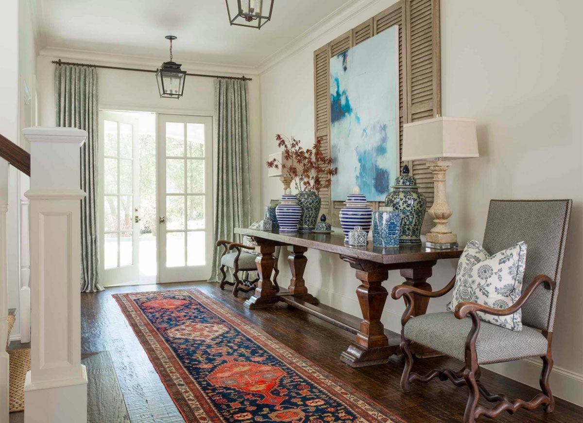
If you have a narrow entryway, you can use a runner rug that extends down the length of the space. This helps to elongate the area and creates a visual flow. Similarly, for a larger entryway, you can consider layering rugs of different sizes to add dimension and interest.
Furthermore, choose a rug that complements the style and color scheme of your entryway. Whether you prefer a bold and patterned rug or a more subtle and neutral option, make sure it harmonizes with the overall design aesthetic. The rug should enhance the visual appeal of the space and reflect your personal style.
Remember, a rug in the entryway not only adds a decorative touch but also serves a functional purpose. It helps to trap dirt and debris, keeping your floors cleaner. Therefore, choose a rug that is durable and easy to clean, particularly in high traffic areas.
By avoiding the mistake of choosing the wrong size rug, you can elevate the look of your entryway and create a welcoming and cohesive space. The right rug will tie everything together, adding warmth, style, and practicality to your entryway.
Mistake 6: Too many accessories and clutter
One of the most common mistakes made in entryway design is the tendency to overcrowd the space with too many accessories and clutter. While it’s natural to want to showcase your personal style and add personality to your entryway, it’s important to strike a balance and avoid overwhelming the space. Let’s explore why you should avoid this mistake and how to create a clutter-free entryway that still reflects your unique taste.
Firstly, take a step back and evaluate the current state of your entryway. Are there too many accessories cluttering the space? Are there unnecessary items that could be removed? Start by decluttering and organizing your entryway. Remove any items that are not necessary or do not contribute to the overall aesthetic of the space.
Consider utilizing storage solutions, such as hooks, baskets, or shelves, to keep smaller items neatly tucked away. This helps to reduce visual clutter and keeps your entryway looking clean and organized. Choose a few key accessories or statement pieces that reflect your style and personality, and strategically place them throughout the space.
Next, think about the scale and proportion of the accessories in your entryway. Avoid overwhelming the space with oversized or excessive decor items. Instead, opt for a few well-chosen pieces that make a statement without overpowering the area. This allows your chosen items to stand out and creates a visually appealing and harmonious display.
Remember to also consider the flow and functionality of your entryway. Leave enough space for movement and ensure that the layout is practical. Avoid blocking pathways or doorways with excessive furniture or accessories.
Lastly, periodically re-evaluate your entryway and make adjustments as needed. Over time, it’s natural for clutter to accumulate, so make it a habit to regularly declutter and refresh your entryway. This will help maintain a clean and inviting space.
By avoiding the mistake of too many accessories and clutter, you can create an entryway that is visually pleasing, organized, and showcases your personal style without overwhelming the senses. Keep it simple, purposeful, and stylish for an entryway that truly welcomes you and your guests.
Mistake 7: Neglecting the power of paint
One of the most overlooked aspects of entryway design is the power of paint. Neglecting the effect that paint can have on this small space is a common mistake. The right paint color can completely transform your entryway, setting the tone for the rest of your home. Let’s explore why you shouldn’t neglect the power of paint and how to use it effectively to create a welcoming entryway.
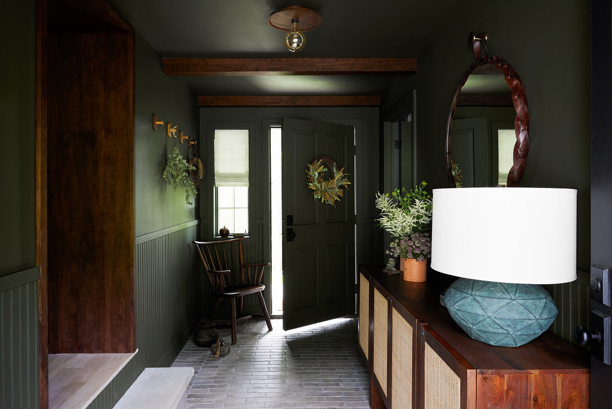
Firstly, consider the atmosphere you want to create in your entryway. Are you looking for a space that feels bright and airy? Or do you prefer a more cozy and intimate ambiance? The choice of paint color can greatly influence how the space feels. Light and neutral colors, such as whites, creams, or soft grays, can make the entryway feel more spacious and open. On the other hand, darker or bolder hues, like navy blue, deep green, or charcoal gray, can add a sense of drama and sophistication.
Consider the overall style and aesthetic of your home when choosing a paint color for your entryway. You can either choose a color that complements the existing color scheme or use it as an opportunity to introduce a new color that will tie the space together. The key is to create a cohesive look that flows seamlessly from the entryway to the rest of your home.
Another important factor to consider is lighting. How much natural light does your entryway receive? If your entryway is lacking in natural light, avoid using dark colors that may make the space feel smaller and dim. Instead, opt for lighter shades that will help brighten the area. Conversely, if your entryway is flooded with natural light, you can experiment with darker or richer colors to create a more dramatic effect.
Don’t forget about the power of paint on the architectural elements of your entryway. Consider painting the trim, doors, or even a feature wall in a contrasting color or a bold statement shade. This can instantly add visual interest and draw attention to those architectural details.
Lastly, don’t be afraid to experiment and have fun with paint. It’s a relatively low-cost and easy way to transform your entryway. If you find that you’re not happy with the chosen color, it’s easy to repaint and try something new.
By recognizing the power of paint and carefully selecting the right color for your entryway, you can create a space that sets the right mood, reflects your personal style, and leaves a lasting impression on anyone who enters your home.
Conclusion
Designing the perfect entryway is about more than just creating a functional space to welcome guests; it’s an opportunity to make a statement and set the tone for your entire home. By avoiding common entryway design mistakes, you can transform this often-overlooked area into a stylish and inviting space that reflects your personal style. From neglecting proper lighting to overlooking the power of paint, every detail matters when it comes to creating a cohesive and visually pleasing entryway.
Taking the time to address these mistakes can make a world of difference in the functionality and aesthetics of your entryway. Proper lighting enhances visibility and creates a warm ambiance, while storage solutions help keep the space organized and clutter-free. Incorporating a mirror adds both practicality and a sense of depth, while seating options offer comfort and a welcoming touch. Choosing the right size rug and avoiding excessive accessories and clutter ensures a visually balanced and appealing space. Finally, utilizing the power of paint allows you to create a unique atmosphere and make a lasting impression.
Remember that every design decision should be mindful of your personal style and overall home aesthetic. It’s important to strike a balance between functionality and visual appeal, ensuring that your entryway reflects your personality and makes a positive impression on both you and your guests.
So, whether you have a small entryway or a grand foyer, take the time to carefully plan and design this important area of your home. By avoiding these seven common mistakes and incorporating the tips provided, you can create an entryway that not only serves as a functional space but also showcases your unique sense of style and makes a lasting impression.
Frequently Asked Questions about 7 Small Entryway Mistakes That Designers Want Us To Stop Making
Was this page helpful?
At Storables.com, we guarantee accurate and reliable information. Our content, validated by Expert Board Contributors, is crafted following stringent Editorial Policies. We're committed to providing you with well-researched, expert-backed insights for all your informational needs.


0 thoughts on “7 Small Entryway Mistakes That Designers Want Us To Stop Making”