Home>Interior Design>How To Use A Color Wheel For Interior Design
Interior Design
How To Use A Color Wheel For Interior Design
Modified: October 19, 2024
Learn how to effectively use a color wheel for interior design to create stunning and harmonious color schemes. Enhance your space with the perfect blend of colors.
(Many of the links in this article redirect to a specific reviewed product. Your purchase of these products through affiliate links helps to generate commission for Storables.com, at no extra cost. Learn more)
Introduction
When it comes to interior design, color is a vital component that can transform any space. The right color choices can evoke emotions, create specific atmospheres, and enhance the overall aesthetic appeal of a room. However, navigating the world of colors can be overwhelming without a proper guide. This is where the color wheel comes into play.
The color wheel is a powerful tool that can help interior designers and homeowners make informed decisions when selecting colors for their spaces. By understanding the color wheel and its various relationships, designers can create harmonious color schemes that elevate the look and feel of any room. In this article, we will delve into the intricacies of the color wheel and explore how it can be used effectively in interior design.
Using the color wheel is not limited to professionals alone. Whether you are planning a complete home makeover or simply want to freshen up a room, the color wheel can provide inspiration and guidance. So, let’s dive in and uncover the secrets of the color wheel.
The color wheel is a circular representation of colors, showcasing their relationships based on their placement. It consists of three primary colors, three secondary colors, and six tertiary colors. Understanding these colors and their relationships is crucial for creating visually appealing and harmonious color schemes.
Key Takeaways:
- Embrace the power of the color wheel to create visually appealing and harmonious color schemes that reflect your personal style and desired atmosphere in any interior design project.
- Utilize the color wheel to strategically incorporate accent colors, achieve balance and harmony, and evoke specific moods in different spaces throughout your home.
Understanding the Color Wheel
Before we delve into the practical applications of the color wheel, let’s first understand its structure and the different types of colors it encompasses.
Primary Colors: The color wheel starts with the three primary colors: red, blue, and yellow. These colors cannot be created by mixing other colors together and are considered the building blocks of all other colors.
Secondary Colors: The secondary colors are created by mixing equal parts of two primary colors. They include green (a combination of blue and yellow), orange (a combination of red and yellow), and purple (a combination of red and blue).
Tertiary Colors: Tertiary colors are formed by mixing a primary color with a neighboring secondary color on the color wheel. They are denoted by hyphenated names such as red-orange, blue-green, and yellow-green. Tertiary colors provide more variation and subtlety in color choices.
Now that we have a basic understanding of the color wheel’s structure, let’s explore the temperature of colors, which plays a significant role in interior design.
Warm Colors: Warm colors are found on one side of the color wheel and include reds, oranges, and yellows. These colors evoke feelings of warmth, energy, and excitement. They are often used to create a vibrant and inviting atmosphere in a room.
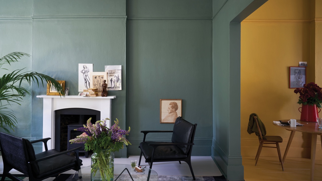
Cool Colors: Cool colors can be found on the opposite side of the color wheel and include blues, greens, and purples. These colors are associated with relaxation, calmness, and tranquility. They are frequently used in spaces where a soothing and peaceful ambiance is desired.
Now that we understand the basics of the color wheel and the temperature of colors, let’s explore the different relationships between colors and how they can be used to create visually appealing interior designs.
Primary Colors
Primary colors are the foundation of the color wheel and cannot be created by mixing any other colors together. The three primary colors are red, blue, and yellow. These colors are considered pure and vibrant, and they form the basis for all other colors in the color spectrum.
Each primary color has its own unique characteristics and attributes:
1. Red: Red is a bold and intense color that symbolizes energy, passion, and power. It can elicit strong emotions and has the ability to make a statement in any space. Red is often used as an accent color to add a pop of vibrancy to a room.
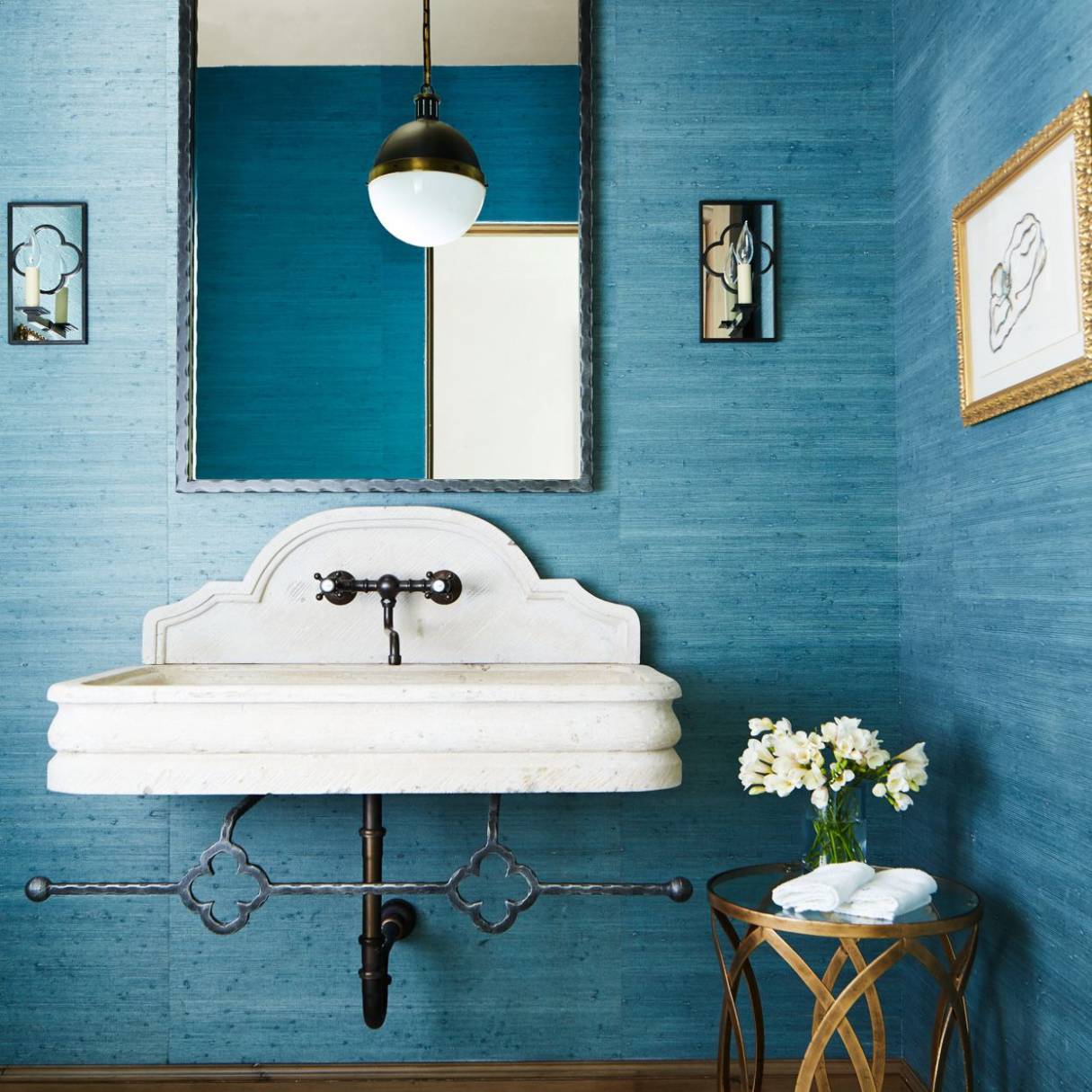
2. Blue: Blue is a calming and serene color that evokes a sense of tranquility and stability. It is often associated with the sky and the ocean, creating a sense of spaciousness and depth. Blue can be used in various shades to create different moods in a room.
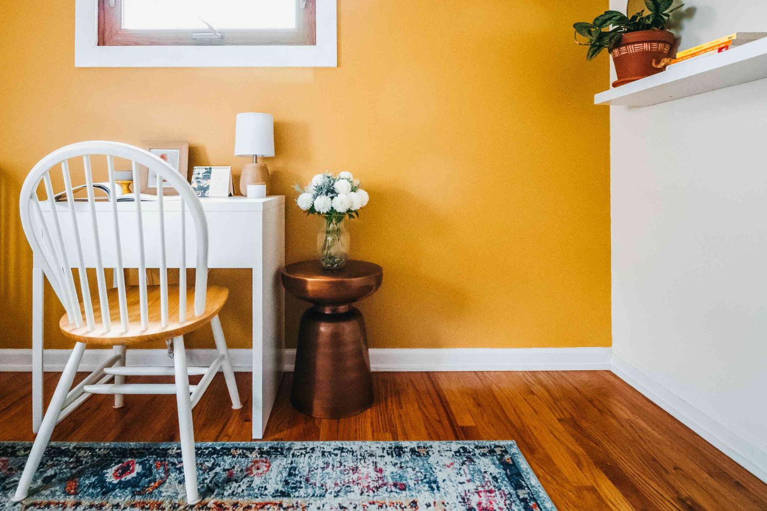
3. Yellow: Yellow is a cheerful and sunny color that represents warmth, happiness, and positivity. It can brighten up any space and create a welcoming and joyful atmosphere. Yellow is often used in kitchens, dining areas, and other spaces where a sense of energy and optimism is desired.
Primary colors are versatile and can be used on their own or mixed together to create a wide range of colors. They are often combined with secondary and tertiary colors to form intricate and visually pleasing color schemes.
Understanding the primary colors is essential when creating a color palette for your interior design. Whether you choose to use them as the dominant colors in a room or as accent colors, incorporating primary colors into your design can add depth, contrast, and visual interest.
Keep in mind that primary colors can have different shades and tones. Experimenting with different shades can help you achieve the desired atmosphere and effect in your space. Additionally, considering the surrounding elements such as lighting, furniture, and textiles can further enhance the impact of primary colors in your interior design.
In summary, primary colors are the fundamental colors of the color wheel. Red, blue, and yellow are bold and vibrant, each carrying its own unique meaning and symbolism. Incorporating primary colors into your interior design can create a visually striking and engaging space. So, why not embrace the power of primary colors and let them become the building blocks of your design vision?
Secondary Colors
In the color wheel, secondary colors are created by mixing equal parts of two primary colors. The three secondary colors are green, orange, and purple. These colors are vibrant and offer a wide range of possibilities when it comes to interior design.
Let’s take a closer look at each secondary color:
1. Green: Green is created by mixing equal parts of blue and yellow. It is a versatile and refreshing color that represents nature, growth, and harmony. Green can create a sense of balance and tranquility in a space and is often associated with relaxation and renewal. Different shades of green, from lime to sage, can evoke different feelings and moods, allowing you to tailor the ambiance of a room to your liking.
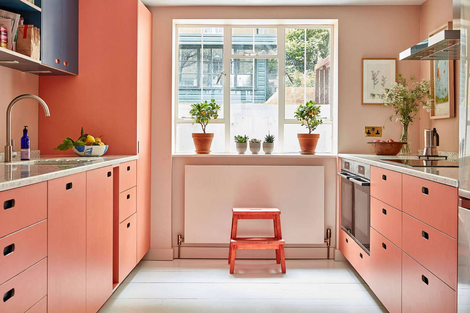
2. Orange: Orange is formed by combining red and yellow. It is a vibrant and energetic color that exudes warmth, enthusiasm, and creativity. Orange can create a cozy and inviting atmosphere and is often used to add a pop of color in a room. From bright and bold oranges to softer and more muted shades like peach or coral, this versatile secondary color can cater to a variety of design styles.
3. Purple: Purple is produced by mixing red and blue. It is a rich and luxurious color that signifies royalty, mystery, and spirituality. Purple can bring a sense of sophistication and elegance to a space, making it a popular choice for bedrooms and living areas. Depending on the shade, purple can range from deep and dark to light and lavender, allowing for a range of design possibilities.
The secondary colors provide a bridge between the primary colors and offer more depth and variation in color choices. When used strategically, these colors can add vibrancy, balance, and visual interest to your interior design.
Consider incorporating secondary colors through accent pieces, such as pillows, artwork, or statement furniture. Using these colors as accents can inject personality and excitement into a room while complementing the primary colors and creating a cohesive color scheme.
Pairing complementary colors, which are colors that lie opposite each other on the color wheel, is another effective way to utilize secondary colors. For example, green pairs well with red, orange complements blue, and purple works harmoniously with yellow. This combination of complementary colors can create a visually striking and dynamic effect in your design.
Remember, secondary colors can be bold and impactful, so it’s important to consider the overall mood and desired atmosphere of the room you are designing. By carefully incorporating secondary colors into your interior design, you can elevate your space and make a statement with color.
Tertiary Colors
Tertiary colors are created by mixing a primary color with a neighboring secondary color on the color wheel. They offer a wide range of subtle and nuanced shades that can bring depth and sophistication to your interior design.
There are six tertiary colors in total, each with its own distinct characteristics:
1. Red-Orange: Red-orange is a warm and vibrant color that combines the intensity of red with the energy of orange. It can add a fiery and passionate touch to any space and is often used to create a bold and striking focal point.
2. Yellow-Orange: Yellow-orange is a bright and cheerful color that exudes warmth and positivity. It brings a sunny and inviting ambiance to a room and is often used to create a lively and energetic atmosphere.
3. Yellow-Green: Yellow-green is a fresh and invigorating color that combines the vibrancy of yellow with the calming influence of green. It can evoke feelings of nature and growth, making it a popular choice for spaces that require a rejuvenating touch.
4. Blue-Green: Blue-green is a tranquil and serene color that blends the soothing qualities of blue with the rejuvenating properties of green. It creates a sense of harmony and balance, making it ideal for spaces where relaxation and calmness are desired.
5. Blue-Violet: Blue-violet is a cool and sophisticated color that combines the tranquility of blue with the richness of violet. It can add a touch of elegance and refinement to a room, creating a soothing and luxurious atmosphere.
6. Red-Violet: Red-violet is a bold and dramatic color that merges the intensity of red with the richness of violet. It brings a sense of passion and depth to a space and can create a striking visual impact when used as an accent color.
Tertiary colors offer a wide range of hues and can be used in various ways within your interior design. Incorporating these colors into your color palette can add depth and complexity to your space’s overall aesthetic.
When using tertiary colors, consider the desired mood and atmosphere of the room. Lighter shades of tertiary colors can create a softer and more delicate feel, while darker shades will lend a sense of richness and depth. Selecting the right shade will help you achieve the desired ambiance in your space.
Tertiary colors can be used as accent colors, either through furniture pieces, accessories, or artwork. They can also be utilized in combination with primary and secondary colors to create harmonious color schemes. Additionally, tertiary colors can be employed to highlight specific architectural features or areas of interest in a room.
With their diverse range of hues and versatility, tertiary colors provide endless design possibilities. Incorporating them into your interior design will add nuance and sophistication, elevating the overall aesthetic appeal of your space.
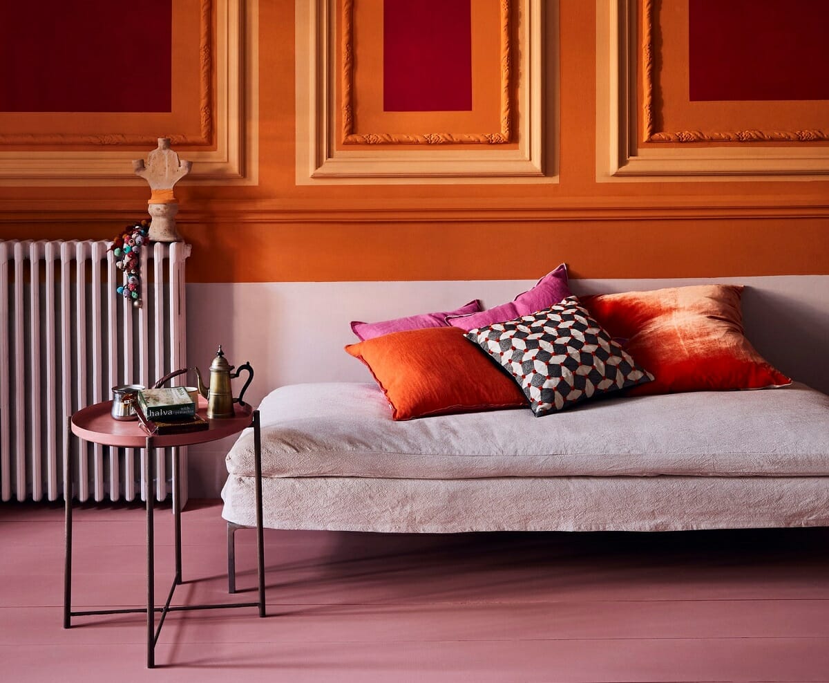
Warm Colors
Warm colors are a group of colors that evoke feelings of warmth, energy, and positivity. These colors are typically found on one side of the color wheel and include reds, oranges, and yellows. When used in interior design, warm colors can create a cozy and inviting atmosphere, making a space feel welcoming and vibrant.
Let’s explore the different warm colors and their characteristics:
1. Reds: Reds are passionate and energetic colors that can evoke strong emotions. Shades of red can range from vibrant and bold to deep and rich. Red is often associated with love, power, and warmth. It can create a focal point in a room and add a sense of drama and intensity.
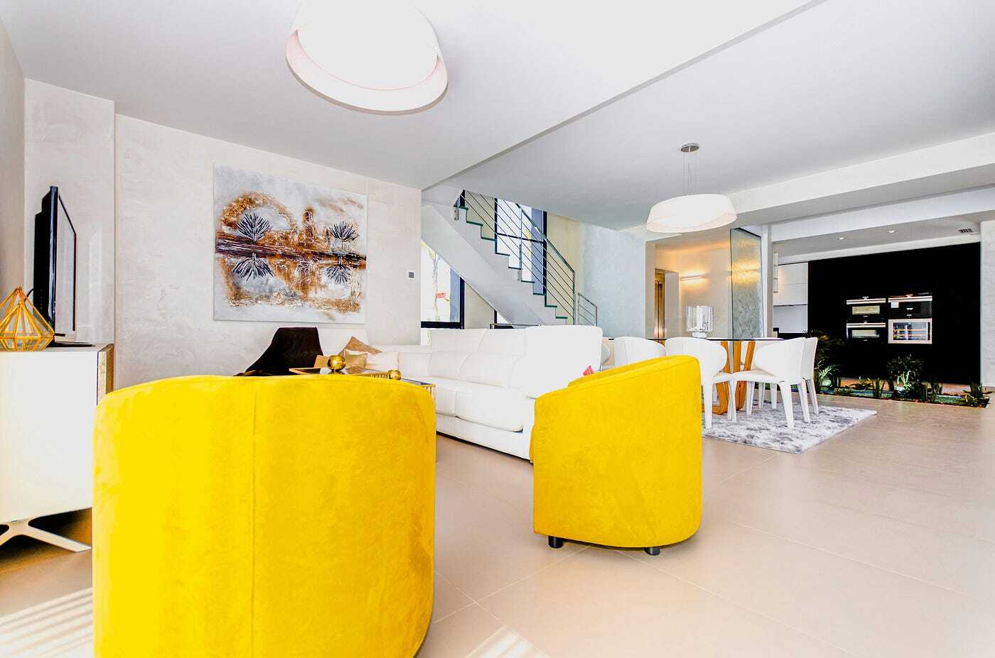
2. Oranges: Oranges are warm, cheerful, and vibrant colors that bring energy and excitement to a space. From bright and bold oranges to softer and more muted shades like peach or coral, this versatile color can create a lively and uplifting ambiance. Orange is often used as an accent color to add a pop of vibrancy and create a sense of playfulness.
3. Yellows: Yellows are sunny and optimistic colors that symbolize happiness and positivity. This vibrant and bold color can brighten up any room, creating a cheerful and lively atmosphere. From soft and pale yellows to bold and golden tones, there is a wide range of shades to choose from when incorporating yellow into your interior design.
Warm colors are popular choices for spaces where a sense of energy, vibrancy, and coziness is desired. They are often used in living rooms, dining areas, and kitchens to create an inviting and intimate atmosphere.
To incorporate warm colors into your interior design, consider these ideas:
1. Accent Walls: Paint one wall in a warm color to create a focal point in the room. This can add depth and visual interest to the space while making a bold statement.
2. Furniture and Upholstery: Choose sofas, chairs, or curtains in warm hues to create a cozy and inviting seating area. Mixing different textures and patterns can add visual richness and warmth to the space.
3. Accessories and Décor: Use warm-colored accessories such as pillows, rugs, artwork, or decorative pieces to infuse the space with warmth and energy. These small touches can bring a cohesive look to the room and create a sense of harmony.
Remember to balance warm colors with neutral tones or cooler colors to avoid overwhelming the space. Consider the size and natural lighting of the room when choosing warm colors, as they can make a room feel more cozy and intimate. Additionally, warm colors work well with natural materials such as wood and earthy textures, creating a harmonious and inviting ambiance.
By incorporating warm colors into your interior design, you can create a space that feels inviting, energetic, and full of positivity.
Cool Colors
Cool colors are a group of colors that evoke feelings of calmness, tranquility, and relaxation. These colors are typically found on the opposite side of the color wheel from warm colors and include blues, greens, and purples. When used in interior design, cool colors can create a soothing and peaceful atmosphere, making a space feel refreshing and serene.
Let’s explore the different cool colors and their characteristics:
1. Blues: Blues are calming and serene colors that symbolize tranquility and stability. Lighter shades of blue can create a sense of openness and spaciousness, while darker shades can bring depth and richness to a room. Blue is often associated with the sky and the ocean, and it can create a cool and refreshing ambiance.
2. Greens: Greens are refreshing and rejuvenating colors that evoke a sense of nature and growth. From soft and pastel greens to deep and vibrant shades, this versatile color can create a harmonious and peaceful atmosphere. Green is often used in spaces where a calming and balanced ambiance is desired, such as bedrooms, bathrooms, or home offices.
3. Purples: Purples are rich and luxurious colors that represent creativity and spirituality. Lighter shades of purple, such as lavender or lilac, can create a soft and dreamy feel, while darker shades like plum or eggplant can add drama and sophistication. Purple is often used in bedrooms or relaxation areas to create a serene and tranquil environment.
Cool colors are popular choices for spaces where a sense of calmness and relaxation is desired. They work well in bedrooms, bathrooms, or any area where you want to create a soothing and peaceful atmosphere.
To incorporate cool colors into your interior design, consider these ideas:
1. Painted Walls: Paint the walls in cool shades of blue or green to create a serene backdrop in the room. Lighter shades can make a small space feel more open, while darker shades can add depth and coziness.
2. Furniture and Accessories: Choose furniture pieces or accent pieces in cool colors to create a calming energy in the room. This can be done through upholstery, rugs, curtains, or decorative accessories.
3. Natural Elements: Incorporate natural elements such as plants or natural textures inspired by nature to enhance the cool color scheme. Green plants not only add a pop of color but also contribute to the overall calming atmosphere.
Remember to balance cool colors with warm or neutral tones to create a harmonious and well-rounded design. Use lighting strategically to enhance the cool color palette and create the desired ambiance in the room.
Cool colors have a calming and soothing effect on the overall environment. By incorporating them into your interior design, you can create a space that feels tranquil, refreshing, and full of serenity.
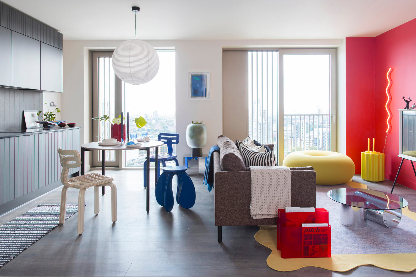
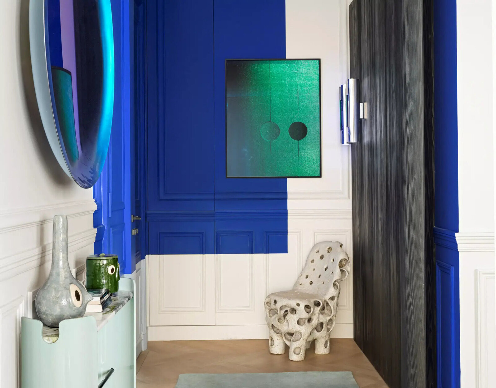
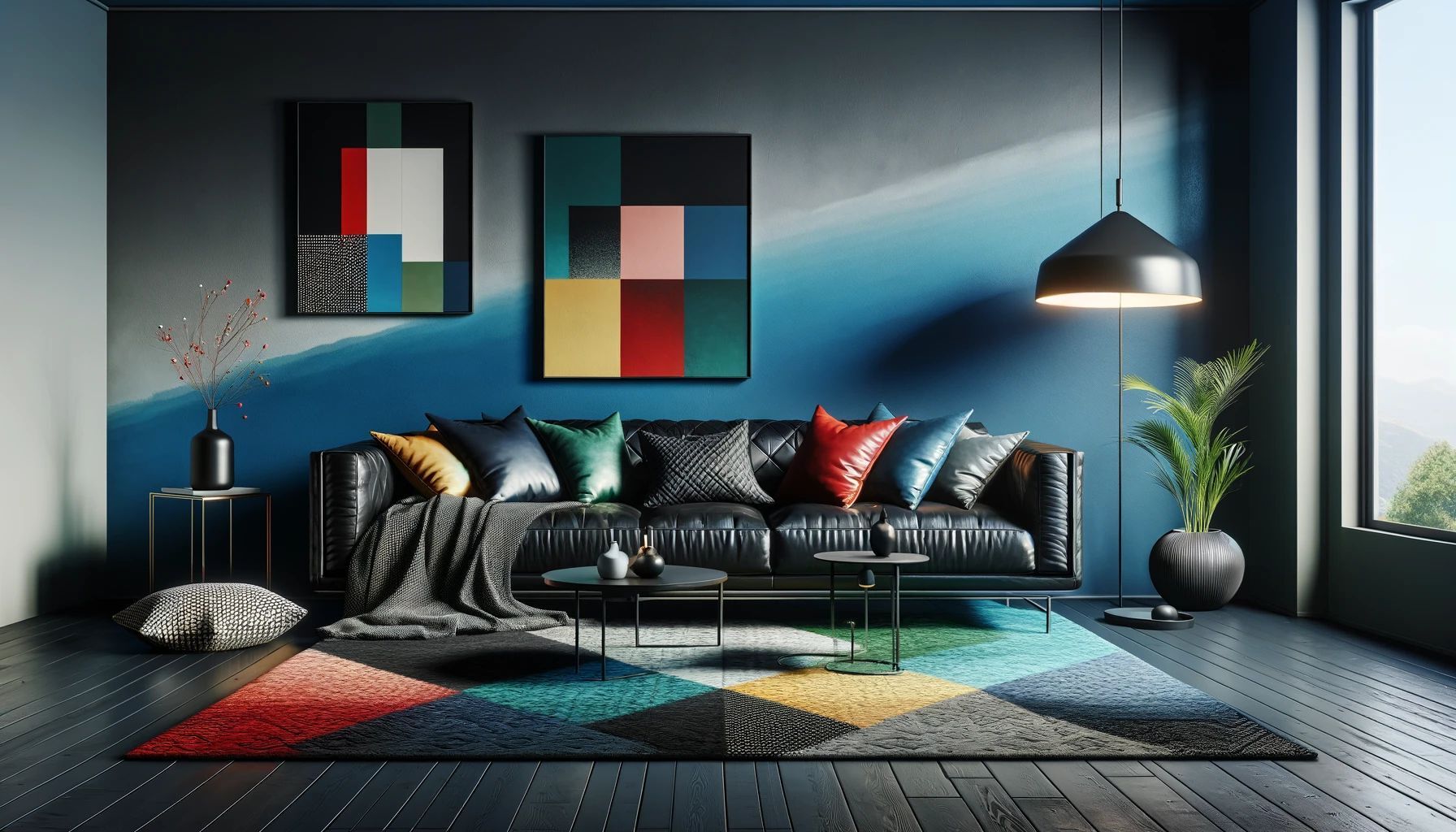
Complementary Colors
Complementary colors are pairs of colors that lie directly opposite each other on the color wheel. These colors create a dynamic and visually striking contrast when used together. By pairing complementary colors in your interior design, you can create a vibrant and energetic atmosphere in your space.
Let’s explore some examples of complementary color pairs:
1. Blue and Orange: Blue and orange are a popular complementary color pair. The coolness of blue contrasts with the warmth of orange, creating a visually captivating combination. This pairing is often used to create a lively and energetic ambiance in a space.
2. Red and Green: Red and green are another classic complementary color pair. The boldness of red complements the freshness of green, creating a vibrant and festive atmosphere. This combination is often associated with the holiday season, but it can be used effectively in interior design year-round.
3. Purple and Yellow: Purple and yellow form a complementary color pair that offers a striking contrast. The richness of purple harmonizes with the brightness of yellow, creating a dynamic and visually stimulating combination. This pairing can add a touch of drama and sophistication to your space.
When using complementary colors in your interior design, it’s important to find the right balance. Here are some tips to incorporate complementary colors effectively:
1. Dominant and Accent: Choose one color as the dominant color and the other as an accent color. This allows one color to take center stage while the other adds pops of contrast throughout the room.
2. Tone it Down: If you prefer a more subtle approach, opt for desaturated or muted tones of your complementary colors. This can create a softer and more harmonious contrast while still maintaining the dynamic effect.
3. Splashes of Color: Use complementary colors as accents through accessories, such as throw pillows, artwork, or rugs. This can add a vibrant and playful touch to your space without overwhelming the overall design.
Using complementary colors in interior design requires careful considerations of the color intensity, lighting, and the overall mood you want to achieve. While complementary colors create a visually striking contrast, it’s important to maintain a sense of harmony and balance in your design.
By skillfully incorporating complementary color pairs into your interior design, you can create a space that is energizing, visually engaging, and full of life.
Analogous Colors
Analogous colors are groups of colors that are adjacent to each other on the color wheel. These colors share similar tones and have a harmonious relationship. When used together in interior design, analogous colors create a cohesive and soothing atmosphere in your space.
Let’s explore some examples of analogous color combinations:
1. Blue-Green and Green: Blue-green and green are adjacent colors on the color wheel. These colors create a calming and serene ambiance, evoking the tranquility of nature. This combination is often used in spaces where relaxation and a sense of balance are desired, such as bedrooms or meditation areas.
2. Red and Purple: Red and purple create a warm and luxurious color scheme. This analogous pairing brings a sense of drama and richness to a space. It is often used in areas where you want to create a bold statement or add a touch of glamour, such as living rooms or dining areas.
3. Yellow and Orange: Yellow and orange are vibrant and energetic colors. This analogous color combination creates a lively and cheerful atmosphere. It is often used in spaces where you want to bring energy and positivity, such as kitchens or children’s playrooms.
To effectively incorporate analogous colors into your interior design, consider these tips:
1. Dominant Color: Choose one color from the analogous color scheme to be the dominant color. This color will anchor the design and set the overall tone for the space.
2. Gradual Transitions: Arrange the analogous colors in a gradual transition from one color to the next. This allows for a smooth and visually pleasing flow of colors throughout the space.
3. Use Neutrals: To prevent the color scheme from becoming overwhelming, balance the vibrant analogous colors with neutrals such as white, gray, or beige. This will provide a visual rest for the eyes and create a harmonious balance in the design.
By using analogous colors in your interior design, you can create a space that feels cohesive, balanced, and visually pleasing. The subtle variations within the color scheme add depth and interest to the overall design.
Remember, the key to successful design using analogous colors is to carefully consider the hues, intensities, and proportions of the colors. With the right balance and combination, your space will exude harmony and a sense of unity.
When using a color wheel for interior design, remember that complementary colors (opposite each other on the wheel) create a dynamic contrast, while analogous colors (next to each other) create a harmonious look.
Triadic Colors
Triadic colors are groups of three colors that are evenly spaced around the color wheel, forming an equilateral triangle. These colors create a vibrant and energetic color scheme that offers a balanced and dynamic look in your interior design.
Let’s explore some examples of triadic color combinations:
1. Red, Yellow, and Blue: Red, yellow, and blue form a classic triadic color combination. This combination creates a primary color scheme, offering a striking and bold look. The contrast between warm and cool tones in this color scheme creates a dynamic and eye-catching design.
2. Orange, Green, and Purple: Orange, green, and purple form another triadic color combination. This combination offers a balance between warm and cool tones. It creates a lively and vibrant color scheme that can add a sense of playfulness and energy to your space.
3. Yellow-Green, Red-Violet, and Blue-Orange: This triadic color combination features tertiary colors. The blend of warm and cool tertiary colors creates a harmonious and visually engaging design. It offers a balance between subtlety and vibrancy in your interior space.
When working with triadic colors, it’s important to consider the proportions and intensities of each color in the scheme. Here are some tips to effectively incorporate triadic colors in your interior design:
1. Dominant, Subdominant, and Accent Colors: Assign one color as the dominant color, another as the subdominant color, and use the third color as an accent. This will provide a hierarchy and balance to the color scheme.
2. Balance and Contrast: Ensure that the three colors are used in a balanced and cohesive manner throughout the space. The contrast between the colors will create visual interest and make the design more dynamic.
3. Neutrals as a Base: Use neutral colors such as white, gray, or beige as a base to anchor the triadic color scheme. This will help create a harmonious balance and prevent the colors from overwhelming the space.
By incorporating triadic colors into your interior design, you can create a vibrant, lively, and visually captivating space. The playfulness of the color combinations can add energy and personality to your design.
Remember to use triadic colors strategically, considering the overall mood and atmosphere you want to create in your space. With careful balance and thoughtful arrangement, your interior design will be a showcase of dynamic color harmony.
Split Complementary Colors
Split complementary colors are a variation of complementary colors that provide a more nuanced and balanced approach to color schemes. Instead of using two colors directly opposite each other on the color wheel, split complementary colors involve selecting a base color and then pairing it with the two colors adjacent to its complementary color. This creates a harmonious and visually appealing color scheme in interior design.
Let’s explore some examples of split complementary color combinations:
1. Blue as the Base: If we take blue as the base color, the split complementary colors would be orange and yellow-orange. This combination incorporates a cool color with warm tones, resulting in a vibrant and dynamic color scheme.
2. Red as the Base: If we choose red as the base color, the split complementary colors would be cyan and teal. This combination creates a bold and captivating effect, fusing warm and cool tones in a balanced way.
3. Green as the Base: Taking green as the base color, the split complementary colors would be red-violet and red-orange. This combination blends cool and warm tones to create a lively and contrasting color scheme.
Using split complementary colors in your interior design offers a visually interesting alternative to traditional complementary color schemes. Here are some tips to effectively incorporate split complementary colors:
1. Dominant and Accent Colors: Select one color from the split complementary palette as the dominant color and use the other two colors as accents. This will provide a balanced distribution of colors and create a cohesive look in the space.
2. Proportions: Consider the proportions of each color in the scheme to maintain visual balance. You can achieve this by using the dominant color as the primary hue, with the two complementary colors as complementary accents.
3. Neutrals and Whites: To create a harmonious backdrop for the split complementary colors, consider incorporating neutral tones or white elements. This will allow the colors to shine while providing visual rest for the eyes.
Split complementary colors can be applied to various aspects of interior design, such as wall paint, furniture upholstery, accessories, or artwork selection. By incorporating these color combinations, you can create a visually captivating and harmonious space that is sure to make a statement.
Remember, striking the right balance is key when working with split complementary colors. Experiment with different shades, intensities, and proportions to find the combination that best suits your style and the ambiance you desire for your interior design project.
Using the Color Wheel for Interior Design
The color wheel is a powerful tool that can guide and inspire your interior design decisions. By understanding the relationships between colors and their placement on the color wheel, you can create harmonious and visually appealing color schemes that enhance the overall look and feel of your space. Here are some key ways to use the color wheel effectively in your interior design:
Choosing a Color Scheme: The color wheel provides a comprehensive guide for selecting a color scheme for your space. Whether you prefer a monochromatic, complementary, analogous, triadic, or split complementary scheme, the color wheel can help you identify the colors that work well together. Consider the mood, ambiance, and function of the space to determine which color scheme suits your preferences and the purpose of the room.
Creating Balance and Harmony: The color wheel offers a visual representation of color relationships, making it easier to achieve balance and harmony in your design. You can create a sense of balance by using complementary colors to create contrast, or opt for analogous colors for a more harmonious and serene atmosphere. Consider the proportions and distribution of colors within the space to ensure a visually pleasing and well-balanced design.
Adding Accent Colors: A well-placed accent color can add visual interest and personality to your space. The color wheel can help you identify the most suitable accent color by pairing complementary or contrasting shades with the dominant colors in your color scheme. Whether you use accent colors through accessories, artwork, or furniture pieces, they can add depth and vibrancy to your design.
Using the Color Wheel for Different Spaces: Different spaces in your home may require different color schemes to evoke specific moods or serve varying functions. For example, in the bedroom, you might want to create a calming and serene atmosphere with cool and soothing colors. In the living room, you may want to design a more inviting and energetic space using warm, vibrant hues. By understanding how different color schemes work, you can tailor each space to its intended purpose and create a cohesive flow throughout your home.
Remember, the color wheel is a guide, not a set of rules. While it provides a foundation for color selection, personal preference and the specific characteristics of your space should also be considered. Experiment with different shades, tones, and intensities of colors to find what works best for your unique vision and style.
Incorporating the color wheel into your interior design process allows you to make informed decisions regarding color selection, balance, and overall harmony in your space. Whether you aim for a vibrant and playful aesthetic or a calm and serene ambiance, the color wheel is an invaluable tool that can bring your design ideas to life.
Choosing a Color Scheme
Choosing a color scheme is a crucial step in the interior design process as it sets the tone and ambiance of your space. The color scheme you select will influence the overall look and feel of your home, creating a cohesive and visually appealing environment. The color wheel is an excellent tool to guide you in choosing a color scheme that suits your style and achieves the desired atmosphere. Here are some tips to help you in the process:
1. Consider the Mood: Determine the mood or atmosphere you want to create in the space. Do you want it to feel calm and relaxing? Energetic and vibrant? Sophisticated and elegant? Different color schemes have a profound impact on the mood of a room. Cool colors like blues and greens create a sense of tranquility, while warm colors like reds and oranges evoke energy and excitement. Think about the emotions you want to evoke and choose colors that align with that vision.
2. Start with a Base Color: Begin by selecting a base color, which will serve as the foundation for your color scheme. This can be a color you love or one that complements existing elements in the space, such as furniture or artwork. The base color will help create a cohesive look throughout the room.
3. Explore Color Harmonies: Refer to the color wheel to explore different color harmonies that align with your vision. Here are a few popular harmonies:
- Monochromatic: This scheme focuses on different shades and tints of a single color, creating a harmonious and understated look.
- Complementary: This scheme pairs colors that are directly opposite each other on the color wheel. The contrast between these colors creates a vibrant and dynamic effect.
- Analogous: This scheme uses colors that are adjacent to each other on the color wheel. Analogous colors create a harmonious and soothing atmosphere.
- Triadic: This scheme involves selecting three colors that are evenly spaced on the color wheel, creating a balanced and visually engaging combination.
4. Balance Warm and Cool Tones: Achieve balance in your color scheme by considering the balance of warm and cool tones. Warm colors tend to be stimulating and lively, while cool colors are calming and serene. Mixing warm and cool tones can create a visually balanced and harmonious space.
5. Test Samples: Before committing to a color scheme, it’s always a good idea to test paint samples or gather fabric swatches to see how the colors look in the actual space. Lighting and other elements in the room can significantly affect how colors appear, so it’s important to observe them in your specific environment.
6. Consider Personal Preference: Ultimately, your personal preference should guide your color scheme decision. Choose colors that resonate with you and make you feel comfortable in your space. After all, you are the one living in and experiencing the room every day.
Remember that there is no right or wrong color scheme — it all depends on your style, the mood you want to create, and what makes you feel happy and inspired. The color wheel serves as a valuable tool in helping you explore different possibilities and find the perfect color scheme that reflects your personal taste and enhances your living environment.
Creating Balance and Harmony
Balance and harmony are essential elements of interior design that can greatly impact the overall aesthetic and feel of a space. Achieving balance and harmony involves careful consideration of various design elements, including color, texture, pattern, and scale. By creating a sense of equilibrium and cohesion, you can create a visually pleasing and harmonious environment. Here are some tips to help you create balance and harmony in your interior design:
1. Symmetry and Asymmetry: Balance can be achieved through symmetrical or asymmetrical arrangements. Symmetry involves mirroring identical elements on either side of a central point or axis, creating a sense of formal balance. Asymmetry, on the other hand, involves arranging different visual elements to achieve a sense of equilibrium and informality. Both approaches can be effective, depending on the style and atmosphere you wish to create.
2. Color Balance: Color plays a critical role in establishing balance and harmony within a space. Utilize the color wheel to ensure a harmonious color scheme, whether monochromatic, complementary, analogous, or other combinations. Distribute colors evenly throughout the room, balancing dominant colors with accents and neutrals. Consider the visual weight and intensity of different hues, carefully arranging them to achieve a pleasing visual balance.
3. Texture and Pattern: Incorporating various textures and patterns can add depth and interest to your design while promoting visual balance. Mix smooth and rough textures, such as pairing a plush rug with smooth leather furniture, to create contrast and balance. When it comes to patterns, use them sparingly and ensure they complement rather than compete with each other. Distribute patterns throughout the space to create a sense of balance and repetition.
4. Scale and Proportion: Balance can also be achieved through careful consideration of scale and proportion. Ensure that furniture and other elements within the room relate to one another harmoniously. Pair larger furniture pieces with smaller decorative accents to create balance and avoid overwhelming the space. Consider the room’s architecture and dimensions when selecting and arranging furniture to create a visually pleasing and proportionate balance.
5. Negative Space: Utilize negative space, also known as empty or white space, as a powerful tool in achieving balance and harmony. Negative space provides breathing room and helps to visually balance the elements within a room. A well-balanced composition allows the eye to rest and appreciate the focal points and design elements without feeling cluttered or overwhelmed.
6. Edit and Simplify: Lastly, it’s important to edit and simplify your design choices to maintain balance and harmony. Avoid overcrowding a space with too many objects or excessive decoration. Instead, select key pieces that complement each other and contribute to a cohesive narrative. This will help create a sense of calm and balance in the overall design.
Remember, achieving balance and harmony in interior design is about finding the right equilibrium that suits your personal style and the desired atmosphere of your space. By carefully considering the various elements and utilizing the principles mentioned above, you can create a visually appealing, balanced, and harmonious environment that reflects your unique design sensibilities.
Adding Accent Colors
Accent colors are a powerful tool in interior design that can add personality, visual interest, and depth to a space. These colors are used sparingly to create focal points, highlight specific elements, and enhance the overall aesthetic. When used effectively, accent colors can elevate your design and create a vibrant and dynamic environment. Here are some tips to help you add accent colors in your interior design:
1. Create Contrast: Accent colors should create contrast with the dominant colors in your color scheme. Utilize the color wheel to identify complementary or contrasting colors that will make an impact. For example, if your space has predominantly cool colors, a bold and warm accent color can create a striking contrast and draw attention.
2. Strategic Placement: Place accent colors strategically within the space to create focal points or highlight specific architectural features or decorative elements. Consider using accent colors on key areas like accent walls, furniture, artwork, or accessories to make them stand out and become visual focal points in the room.
3. Balance and Proportion: Keep in mind the balance and proportion when incorporating accent colors. Use them judiciously to avoid overwhelming the space. A few carefully placed accents can have a more significant impact than an excessive amount of contrasting colors. Finding the right balance is important to create a harmonious and visually pleasing design.
4. Enhance with Accessories: Accessories provide an excellent opportunity to incorporate accent colors. Consider using throw pillows, area rugs, curtains, artwork, or decorative objects in your chosen accent color. These small additions can inject pops of color and personality into the space, instantly transforming the overall look and creating visual interest.
5. Consider the Mood: Accent colors can also contribute to the mood and ambiance you want to create in a room. Cooler tones like blues and greens can evoke a calm and serene atmosphere, while warmer tones like reds and oranges can create a more energetic and lively ambiance. Consider the desired emotional impact and select accent colors that align with the mood you want to establish.
6. Use Nature as Inspiration: Look to nature for inspiration when choosing accent colors. Take cues from natural elements like flowers, plants, or landscapes to select colors that harmonize with the surroundings. Nature provides a wide range of beautifully balanced and complementary color combinations that can be applied to your design.
7. Experiment and Personalize: Don’t be afraid to experiment with different accent colors and combinations. Trust your own sense of style and intuition when selecting accent colors that resonate with you. Adding personal touches through accent colors will give your space a unique and personalized touch.
Remember, accent colors are meant to enhance and elevate your design. They should bring excitement and draw attention without overpowering the overall look and feel of the space. By thoughtfully incorporating accent colors, you can create a visually captivating and dynamic environment that reflects your personal style and leaves a lasting impression.
Using the Color Wheel for Different Spaces
The color wheel can be a valuable tool when designing different spaces in your home. Different areas have different purposes and desired atmospheres, and the color wheel can help you choose color schemes that align with those goals. Here’s how you can use the color wheel effectively for different spaces:
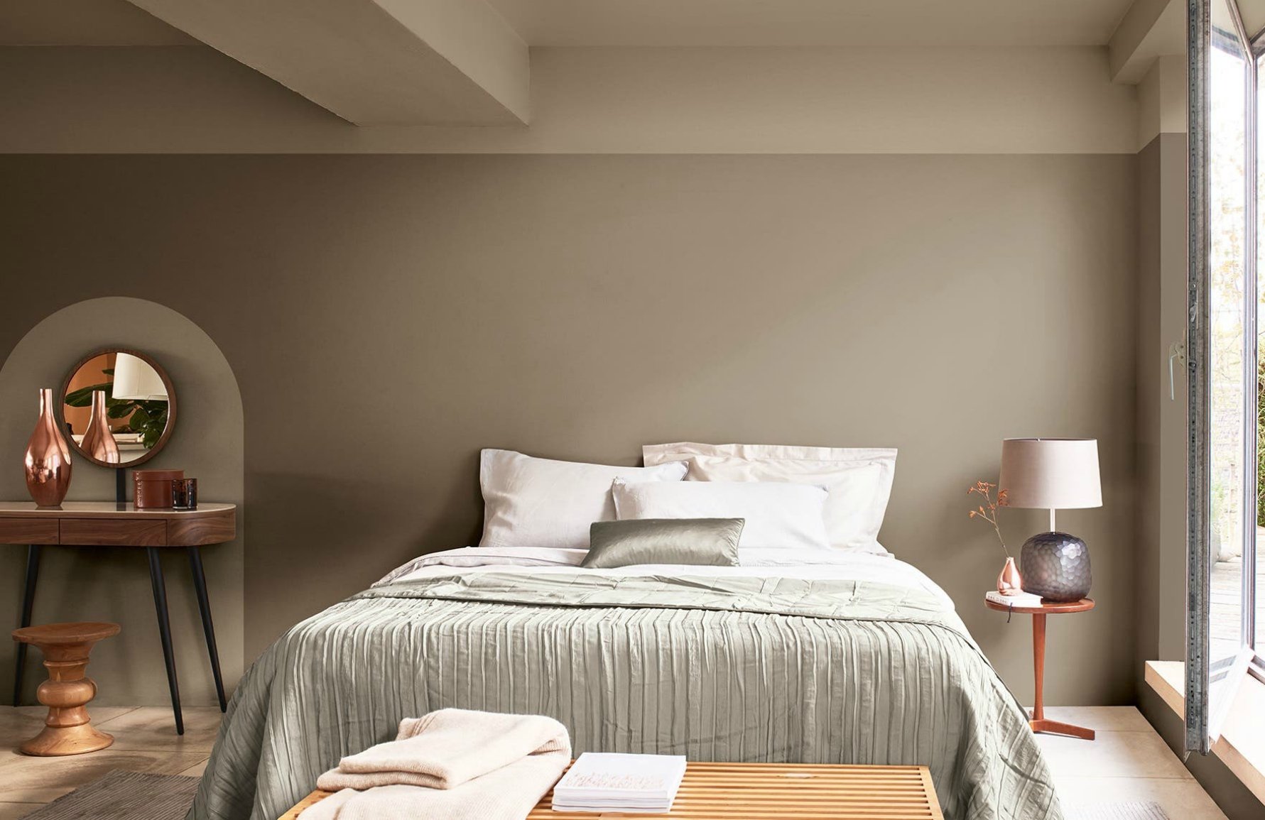
1. Bedrooms: Bedrooms are spaces of relaxation and tranquility, so calming color schemes are often preferred. Cool colors like blues, greens, and lavenders can create a soothing and peaceful atmosphere. Consider monochromatic or analogous color schemes for a serene and harmonious feel. Soft pastel shades can also add a delicate touch to the space.
2. Living Rooms: Living rooms are versatile spaces used for relaxation, socializing, and entertainment. Warm and inviting color schemes work well in this area. Consider using warm neutrals, such as beige or taupe, as a base and infuse it with complementary or analogous accent colors for added interest. You can also incorporate bold and vibrant colors as accent pieces to create a lively and energetic atmosphere.
3. Kitchens: Kitchens are often considered the heart of the home, where functionality and aesthetics should come together. While white and neutrals are popular for kitchens, you can also introduce color through cabinets, backsplashes, or accent walls. Warm colors like oranges, yellows, and reds can stimulate appetite and create a welcoming ambiance. Consider using complementary colors to create visual interest and balance in the space.
4. Bathrooms: Bathrooms can benefit from both bright and soothing color schemes. Using cool tones like blues and greens can create a spa-like ambiance, promoting relaxation and tranquility. Lighter shades of these colors can make a small bathroom feel more open and airy. Pairing cool colors with crisp whites can create a fresh and clean look.
5. Home Offices: Home offices should inspire productivity and focus. Consider using neutral colors like grays, beiges, or soft blues to establish a calm and harmonious workspace. Accent colors can be added through accessories or artwork to inject energy and creativity into the space.
6. Children’s Rooms: Children’s rooms offer an opportunity to play with colors and create a lively and imaginative space. Bright and vibrant colors, such as primary colors, can stimulate creativity and energy. Consider using complementary or triadic color schemes to create a playful and exciting environment.
Remember, the color wheel is a guide, and personal preference should ultimately drive your color choices. Consider the purpose of each space and the mood you want to create. Play around with different color combinations, keeping in mind the principles of balance and harmony. By using the color wheel effectively, you can create spaces that reflect your style, cater to their intended purpose, and evoke the desired atmosphere.
Conclusion
The color wheel is a powerful tool that can significantly enhance your interior design projects. By understanding its structure and the relationships between colors, you can create visually appealing and harmonious color schemes that reflect your personal style and desired atmosphere. Whether you are designing a bedroom, living room, kitchen, or any other space, the color wheel provides a foundation for selecting colors with intention and purpose.
Through primary colors, secondary colors, tertiary colors, warm colors, cool colors, complementary, analogous, triadic, and split complementary colors, you have a wide range of options to choose from. Each color combination brings its own unique energy, mood, and visual impact to a space. By experimenting with different color schemes and considering the specific needs of each room, you can create a harmonious environment that is both aesthetically pleasing and functional.
Remember to seek balance and harmony in your design by carefully considering factors such as color intensity, proportions, textures, patterns, and the use of negative space. Building a cohesive and visually appealing space involves thoughtful consideration of these elements while allowing your personal style and preferences to shine through.
As you work with the color wheel, don’t be afraid to step outside your comfort zone and explore new possibilities. Let your creativity guide you and trust your instincts. Interior design is a fluid and evolving process, and the color wheel can serve as your trusty companion to navigate the vast array of color options at your disposal.
Ultimately, the goal is to create a space that not only looks visually stunning but also feels comfortable, inviting, and reflective of your unique personality. By harnessing the power of the color wheel, you can infuse your interior design projects with color harmony, balance, and a touch of artistic brilliance.
So go ahead, embrace the color wheel, and let its vibrant spectrum guide you towards designing spaces that are both visually captivating and personally fulfilling.
Frequently Asked Questions about How To Use A Color Wheel For Interior Design
Was this page helpful?
At Storables.com, we guarantee accurate and reliable information. Our content, validated by Expert Board Contributors, is crafted following stringent Editorial Policies. We're committed to providing you with well-researched, expert-backed insights for all your informational needs.


0 thoughts on “How To Use A Color Wheel For Interior Design”