Home>Interior Design>Living Room Color Mistakes: 7 Common Errors To Avoid
Interior Design
Living Room Color Mistakes: 7 Common Errors To Avoid
Modified: October 19, 2024
Avoid these 7 common interior design mistakes when choosing colors for your living room. Create a stylish and cohesive space with our expert tips and tricks.
(Many of the links in this article redirect to a specific reviewed product. Your purchase of these products through affiliate links helps to generate commission for Storables.com, at no extra cost. Learn more)
Introduction
Creating a beautiful and functional living room is a goal for many homeowners. It’s a space where you can relax, entertain guests, and showcase your personal style. When it comes to designing your living room, the colors you choose play a crucial role in setting the tone and overall ambiance of the space. However, there are common mistakes that people often make when it comes to selecting and using colors in their living rooms. In this article, we will explore the seven most common color mistakes to avoid, providing you with actionable tips to create a vibrant and harmonious living room.
Key Takeaways:
- Choose paint shades wisely: Consider room size, natural light, and undertones to create a balanced and inviting living room atmosphere.
- Balance bold colors: Use them as accents and consider the room’s purpose and desired mood to create a visually appealing and functional living space.
Mistake #1: Choosing the wrong shade of paint
One of the most common mistakes people make when selecting a color for their living room walls is choosing the wrong shade of paint. It can dramatically affect the look and feel of the space. Here are a few sub-mistakes to be aware of:
Going too dark
While dark colors can make a bold statement and create a cozy atmosphere, using them in small or poorly lit living rooms can make the space feel cramped and gloomy. Instead, opt for lighter shades to maximize natural light and create an open, airy vibe.
Going too light
On the other hand, going too light can result in a washed-out and uninviting living room. It’s essential to strike a balance between light and dark tones to create depth and visual interest in the space.
Ignoring the undertones
When selecting paint colors, it’s crucial to consider the undertones. Undertones are subtle hues that can affect the overall look of the color. Ignoring undertones can lead to colors clashing with the furniture, flooring, and other elements in the room. Take the time to test paint samples and observe how they interact with the existing features to ensure harmony.
Read more: The Pillow Colors To Avoid In A Living Room
Mistake #2: Overlooking natural lighting
The natural light in your living room can have a significant impact on how colors appear. It is important not to overlook this crucial factor when choosing paint colors or selecting furnishings. Here are a couple of common mistakes relating to lighting:
Not considering the room’s orientation
The direction your living room faces can affect the amount and quality of natural light it receives. North-facing rooms tend to have cooler light, while south-facing rooms have warmer light. It’s essential to consider the orientation to select colors that complement the lighting conditions and create the desired atmosphere.
Neglecting window treatments
Window treatments such as curtains or blinds can help regulate the amount of natural light that enters the room. Choosing the wrong window treatments can either block too much light or allow too much glare. Consider light-filtering options that allow natural light to brighten the space without compromising privacy or comfort.
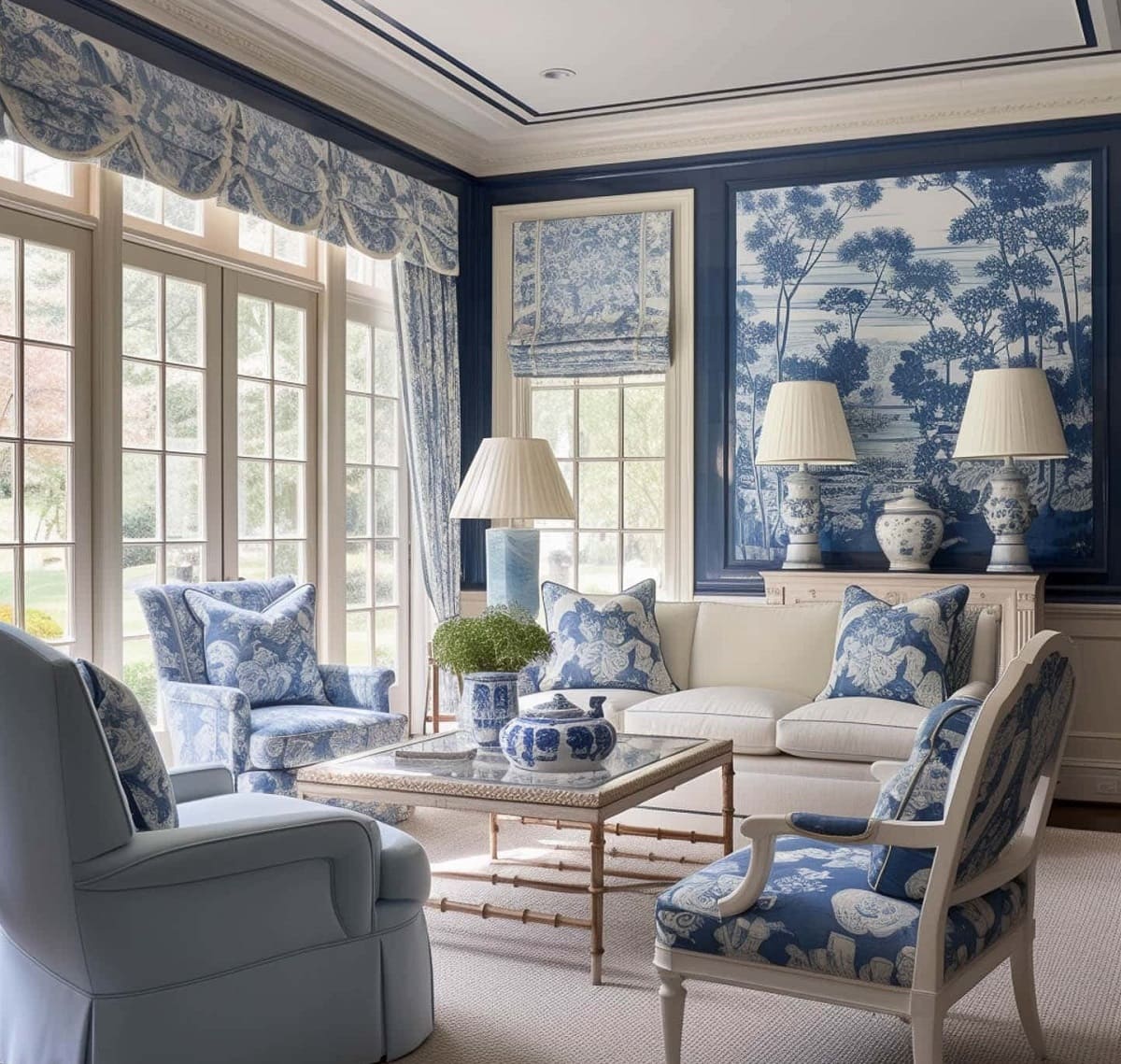
Mistake #3: Using too many bold colors
While bold colors can add vibrancy and personality to your living room, using too many can overwhelm the space and create visual chaos. Here are a couple of sub-mistakes to avoid with bold colors:
Failing to create balance
When incorporating bold colors, it’s essential to strike a balance between the vibrant hues and more neutral tones. Use bold colors sparingly as accents through accessories such as pillows, rugs, or artwork, while keeping the main furniture pieces and walls in more neutral shades.
Using vibrant colors in small spaces
In small living rooms, using bright and bold colors on all walls can make the room feel cramped and overpowering. Instead, opt for a feature wall in a vibrant color while keeping the remaining walls in lighter, more subdued tones to create an illusion of space.
Remember to validate the output HTML
Key Takeaways:
- Choose paint shades wisely: Consider room size, natural light, and undertones to create a balanced and inviting living room atmosphere.
- Balance bold colors: Use them as accents and consider the room’s purpose and desired mood to create a visually appealing and functional living space.
Mistake #1: Choosing the wrong shade of paint
When it comes to selecting the perfect shade of paint for your living room, there are a few common mistakes to avoid. Let’s explore them in more detail:
Going too dark
While deep, rich colors can create a luxurious and dramatic effect in your living room, using them inappropriately or in small spaces can make the room feel cramped and gloomy. Dark hues tend to absorb light, which can make the space feel smaller and less inviting. If your living room is already limited in size or lacks natural light, opt for lighter shades to maximize the brightness and create a more open and airy atmosphere. Lighter colors reflect more light, making the room appear more spacious and inviting.
Going too light
On the other end of the spectrum, going too light with your paint color can result in a lackluster and uninspiring living room. While a neutral color palette can create a soothing and versatile backdrop, using overly pale shades can make the room feel cold and uninviting. Light colors are also prone to showing dirt and marks more easily, requiring more frequent maintenance. To add warmth and depth to your living room, consider choosing a slightly deeper shade within the same color family. This will add dimension and create a more visually pleasing space.
Ignoring the undertones
When selecting a paint color, it’s important to pay attention to the undertones. Undertones are subtle hues that give a color its unique character and can significantly impact how it appears in your living room. For example, a seemingly gray paint can have subtle blue or green undertones, which can become more pronounced once applied to the walls. Ignoring the undertones can lead to colors clashing with other elements in the room, such as the furniture, flooring, or existing decor. To avoid this, always test paint samples and observe how they interact with the other components of your living room. Consider the overall color scheme and ensure that the undertones harmonize with the existing elements for a cohesive and aesthetically pleasing result.
By being aware of these common mistakes when choosing the shade of paint for your living room, you can ensure that the color enhances the overall ambiance of the space. Remember to consider factors such as room size, natural light, and undertones to create a harmonious and inviting environment that reflects your personal style.
Read more: The Pillow Colors To Avoid In A Living Room
Mistake #2: Overlooking natural lighting
The natural lighting in your living room is a crucial element that can greatly impact the overall atmosphere and appearance of the space. Here are two common mistakes to avoid when it comes to natural lighting:
Not considering the room’s orientation
The orientation of your living room, specifically the direction it faces, plays a significant role in the quality and amount of natural light it receives. North-facing rooms tend to have cooler lighting, while south-facing rooms receive warmer, more direct sunlight. East-facing rooms enjoy morning sunlight, while west-facing rooms are bathed in afternoon and evening light.
When selecting colors for your living room, it’s important to take the room’s orientation into consideration. Cooler-toned colors can harmonize with the cool light in north-facing rooms, while warmer hues can complement the warm sunlight in south-facing rooms. By considering the orientation, you can choose colors that work in harmony with the natural lighting, creating a space that feels balanced and inviting.
Neglecting window treatments
Window treatments, such as curtains, blinds, or shades, not only provide privacy and control over natural light but also play a significant role in the overall aesthetic of your living room. Neglecting window treatments can hinder your ability to maximize or control the amount of natural light entering the room.
Too much direct sunlight can cause glare and discomfort, while too little natural light can create a dark and somber atmosphere. It’s important to choose window treatments that offer flexibility, allowing you to adjust the amount of light as needed.
Consider light-filtering options that allow plenty of natural light to enter while minimizing harsh glare during the day. Additionally, using curtains or blinds that can be fully opened can maximize natural light exposure, ensuring your living room feels bright and welcoming.
By considering the orientation of your living room and selecting appropriate window treatments, you can make the most of the natural light available. This will help create a warm and inviting atmosphere that enhances the colors and overall aesthetic of your living room.
Mistake #3: Using too many bold colors
While bold colors can add excitement and personality to your living room, using them in excess can overwhelm the space and create visual chaos. Here are two common mistakes to avoid when it comes to using bold colors:
Failing to create balance
When incorporating bold colors into your living room, it’s crucial to strike a balance between the vibrant hues and more neutral tones. Using too many bold colors can result in a cluttered and overwhelming space. Instead, opt for a focal point where you can showcase a bold color, such as an accent wall or a statement piece of furniture. This will help create a visually appealing and harmonious environment.
For example, if you choose a bold and vibrant sofa, balance it out with softer, more neutral colors for the walls and other furnishings. This will create a harmonious composition that allows the bold color to stand out without overpowering the room.
Using vibrant colors in small spaces
In small living rooms, using vibrant and bold colors on all walls can make the space feel even smaller and more cramped. While it’s important to inject personality and liveliness into the room, be mindful of the scale and size of the space. Instead of using bold colors throughout, consider incorporating them as accents through accessories, such as throw pillows, rugs, or artwork.
By using bold colors as accents, you can create visual interest and pops of color without overwhelming the space. This approach allows you to maintain a sense of openness and airiness in the small living room while still infusing it with energy and vibrancy.
To avoid the mistake of using too many bold colors, focus on creating a balanced composition and considering the size and scale of your living room. By doing so, you can successfully incorporate bold colors into your space and create a visually appealing and harmonious living room.
Mistake #4: Ignoring the room’s purpose
When designing your living room, it’s essential to consider its intended purpose and how you plan to use the space. Here are two common mistakes to avoid when it comes to ignoring the room’s purpose:
Lack of functionality
One mistake to avoid is designing a living room that lacks functionality. While aesthetics are important, it’s equally essential to ensure that the space caters to your practical needs. Consider how you will use the living room: will it primarily be a space for relaxation and entertainment, or will it serve multiple functions such as a home office or playroom?
Ensure that the furniture arrangement, storage solutions, and layout of the living room align with the room’s purpose. For example, if you frequently entertain guests, make sure there is ample seating and a layout that promotes conversation. If you use the living room as a workspace, incorporate a designated area with a desk and proper lighting. By considering functionality, you can create a living room that is not only visually appealing but also highly functional.
Not reflecting the desired mood
The living room is a space where you can set the mood and create a specific ambiance. Choosing colors that don’t reflect the desired mood can diminish the overall atmosphere of the room. For instance, if you want a calming and serene living room, using vibrant and bold colors may not align with that intention. Conversely, if you’re aiming for an energetic and lively atmosphere, opting for muted and neutral tones may not achieve the desired effect.
Consider the mood you want to create in your living room and select colors that align with that vision. Soft blues and greens can promote a sense of tranquility, while warm oranges and yellows can create a cozy and welcoming ambiance. By reflecting the desired mood through color choices, you can enhance the overall atmosphere and make your living room a truly inviting space.
Avoid the mistake of ignoring the room’s purpose by prioritizing functionality and aligning the colors with the desired mood. This will result in a living room that is not only visually appealing but also tailored to your specific needs and preferences.
Mistake #5: Neglecting the ceiling
When designing a living room, it’s crucial not to overlook the importance of the ceiling. Here are two common mistakes to avoid when it comes to neglecting the ceiling:
Leaving it plain white
One mistake many people make is leaving the ceiling plain white and devoid of any color or design. While white ceilings can create a bright and airy feel, they can also appear dull and uninspiring. Neglecting the ceiling can make the overall design of the room feel incomplete.
Consider adding some visual interest by painting the ceiling a different color or using decorative techniques such as stencil work or wallpaper. A colored ceiling can add depth and dimension to the room, creating a more visually appealing and cohesive design.
Choosing an inappropriate color
On the flip side, another mistake is choosing an inappropriate color for the ceiling that clashes with the rest of the room. It’s important to consider the overall color scheme and style of your living room when selecting a ceiling color.
If your living room has a bold and vibrant color scheme, opting for a neutral ceiling color can help balance the room. Conversely, if you have a lighter and more neutral color palette, a subtle, complementary shade on the ceiling can add a touch of visual interest.
Avoid using a ceiling color that is too dark or overwhelming, as it can make the room feel oppressive and decrease the perceived height of the space. Similarly, avoid using a ceiling color that is too bright or contrasting, as it can create a jarring effect.
By giving proper attention to the ceiling, you can enhance the overall design and cohesiveness of your living room. Whether it’s adding a pop of color or choosing a complementary shade, a well-designed ceiling can elevate the look and feel of the space.
Mistake #6: Disregarding the furniture and accessories
When designing your living room, it’s important to pay attention to the furniture and accessories in the space. Here are two common mistakes to avoid when it comes to disregarding the furniture and accessories:
Clashing with the color scheme
One mistake to avoid is choosing furniture and accessories that clash with the overall color scheme of your living room. While it’s important to have pieces that stand out and make a statement, they should still complement the color palette you have selected.
If your living room features a specific color scheme, such as cool blues and grays, choosing furniture or accessories in warm reds or oranges can create a visual clash. Instead, opt for pieces that harmonize with the existing colors. Consider complementary colors or shades within the same color family to create a cohesive and balanced look.
Not considering the existing decor
Another mistake is not considering the existing decor in your living room when selecting furniture and accessories. It’s important to take into account the style and theme of your living room and ensure that new additions align with the overall aesthetic.
For example, if your living room has a modern and minimalist theme, choosing ornate and traditional furniture may not fit the overall design. Similarly, if you have a coastal-inspired living room, incorporating rustic and farmhouse-style accessories may feel out of place.
Consider the existing decor and choose furniture and accessories that complement it. By doing so, you can create a cohesive and visually pleasing living room that reflects your personal style.
Avoid the mistake of disregarding the furniture and accessories by selecting pieces that align with the color scheme and overall design of your living room. By considering the existing decor, you can create a harmonious and well-curated space that showcases your individuality and taste.
Mistake #7: Following trends blindly
When it comes to designing your living room, it can be tempting to follow the latest trends in home decor. However, blindly following trends without considering your personal preferences and long-term appeal can lead to design mistakes. Here are two common mistakes to avoid when it comes to following trends:
Not considering personal preferences
One mistake is not considering your own personal preferences when designing your living room. It’s important to create a space that reflects your unique style and taste, rather than solely following what is currently popular.
While trends can provide inspiration, they should not dictate your entire design scheme. Consider your favorite colors, patterns, and styles that resonate with you. Incorporate elements that bring you joy and create a living room that feels authentic and true to your personality.
Remember, trends come and go, but your personal style and preferences are timeless. Don’t be afraid to deviate from the current trends and create a living room that is a true reflection of yourself.
Not accounting for long-term appeal
Another mistake is not considering the long-term appeal of the choices you make when following trends. Trends tend to change quickly, and what may be popular today may be outdated tomorrow. It’s important to think beyond the present moment and consider how your design choices will age over time.
While it’s great to incorporate trendy elements, be mindful of investing in major pieces of furniture or permanent fixtures that may lose their appeal as trends change. Opt for a timeless foundation and use trendy accents and accessories that can be easily replaced or updated as styles evolve.
Consider the longevity and versatility of your design choices. Ask yourself if you can envision yourself loving the elements you choose in your living room for years to come. Make informed decisions that will stand the test of time and ultimately create a living room that you will continue to enjoy for years down the line.
Avoid the mistake of blindly following trends by considering your personal preferences and accounting for long-term appeal. By doing so, you can create a living room that is both stylish and authentically reflects your unique style and taste.
Conclusion
Designing your living room is an exciting endeavor, but it’s crucial to avoid common color mistakes that can hinder the overall aesthetic and functionality of the space. By being mindful of these mistakes and taking proactive steps to avoid them, you can create a living room that is visually appealing, harmonious, and tailored to your personal preferences.
Choosing the wrong shade of paint can dramatically affect the atmosphere of the room. Be mindful of going too dark or too light, and always consider the undertones to ensure color harmony. Additionally, don’t overlook the impact of natural lighting in your living room. Consider the room’s orientation and invest in suitable window treatments to enhance the space’s ambiance.
When using bold colors, strive for balance and incorporate them as accents rather than overwhelming the room. Furthermore, be sure to align the color scheme with the room’s purpose and desired mood. Neglecting the ceiling can be a missed opportunity for adding visual interest and cohesion to the space. Consider adding color or decorative elements to create a more complete design.
Disregarding the furniture and accessories can also undermine the overall design concept. Make sure they harmonize with the color scheme and complement the existing decor. Finally, avoid blindly following trends and consider your personal preferences and long-term appeal. Create a living room that reflects your individuality and will stand the test of time.
By avoiding these common color mistakes, you can transform your living room into a stylish and inviting space that truly represents your unique style and enhances the functionality of the room. Take the time to plan, consider the important factors, and make informed decisions to create a living room that you will love for years to come. Enjoy the process and let your creativity shine as you design your dream living room!
Frequently Asked Questions about Living Room Color Mistakes: 7 Common Errors To Avoid
Was this page helpful?
At Storables.com, we guarantee accurate and reliable information. Our content, validated by Expert Board Contributors, is crafted following stringent Editorial Policies. We're committed to providing you with well-researched, expert-backed insights for all your informational needs.


0 thoughts on “Living Room Color Mistakes: 7 Common Errors To Avoid”