Home>Interior Design>Curtain Color Mistakes: What To Avoid And Why

Interior Design
Curtain Color Mistakes: What To Avoid And Why
Modified: October 19, 2024
Avoid these common curtain color mistakes in interior design to ensure a cohesive and visually appealing space. Learn why these choices can make or break your decor.
(Many of the links in this article redirect to a specific reviewed product. Your purchase of these products through affiliate links helps to generate commission for Storables.com, at no extra cost. Learn more)
Introduction
When it comes to interior design, every detail matters. From furniture arrangement to wall color, each choice contributes to the overall aesthetic and ambiance of a space. One element that often gets overlooked but can make a significant impact is curtain color. Curtains not only serve a functional purpose by providing privacy and controlling light, but they also contribute to the style and mood of a room.
Choosing the right curtain color can elevate the entire space, creating a cohesive and visually pleasing environment. On the other hand, making curtain color mistakes can disrupt the harmony and throw off the balance of the room. To prevent this from happening, it is vital to be mindful of the potential pitfalls in curtain color selection.
In this article, we will explore some common curtain color mistakes to avoid and why they can be detrimental to the overall design of your space. By learning from these mistakes, you can make informed decisions and create a stunning and harmonious interior.
Key Takeaways:
- Avoid clashing with the room’s color palette by choosing curtains that are a shade lighter or darker than the wall color, complementing the overall design and creating visual interest.
- Consider the room’s lighting conditions when selecting curtain colors to ensure they enhance the space, control light, and create a visually appealing and well-balanced environment.
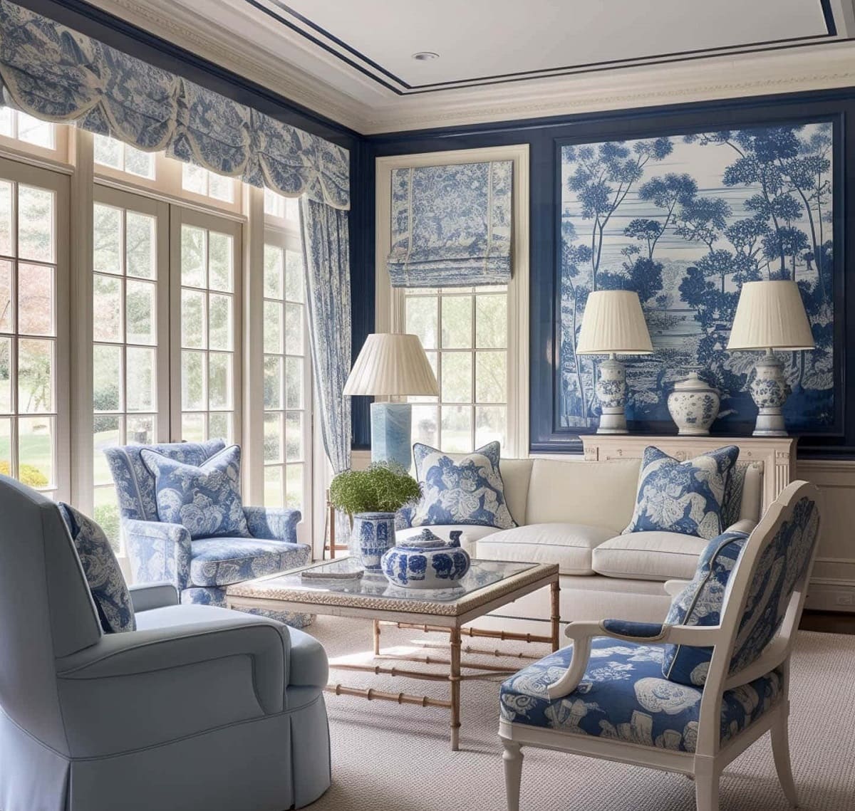
Subtitle 1: Choosing the Wrong Color Palette
One of the most significant curtain color mistakes is selecting the wrong color palette for your space. Colors have the power to affect our mood, perception, and overall ambiance. Therefore, it is crucial to choose a color palette that complements the existing elements in the room.
One mistake to avoid is selecting curtains that are an exact match to the wall color. While this may seem like a safe choice, it can result in a lack of visual interest and make the curtains blend into the background. Instead, opt for curtains that are a shade or two lighter or darker than the wall color to create contrast and depth.
Another common mistake is choosing curtains that clash with the dominant colors in the room. If the space has a bold and vibrant color scheme, selecting curtains in a different bold color might create visual chaos. Instead, consider choosing curtains in a neutral color or a complementary shade that enhances the existing color palette.
Furthermore, take into consideration the overall mood you want to achieve in the room. Cool colors like blue and green create a calming and relaxing atmosphere, making them great choices for bedrooms or living rooms. On the other hand, warm colors like red and orange add energy and vibrancy, making them suitable for spaces like dining areas or home offices.
Lastly, consider the size of the room when selecting curtain colors. Lighter colors tend to create an illusion of spaciousness, while darker colors can make a room feel cozy and intimate. If you have a small room, opting for lighter colored curtains can help create a sense of openness and airiness.
By carefully considering the color palette and how it interacts with the other elements in the room, you can avoid the mistake of choosing curtains that clash or fail to complement the overall design.
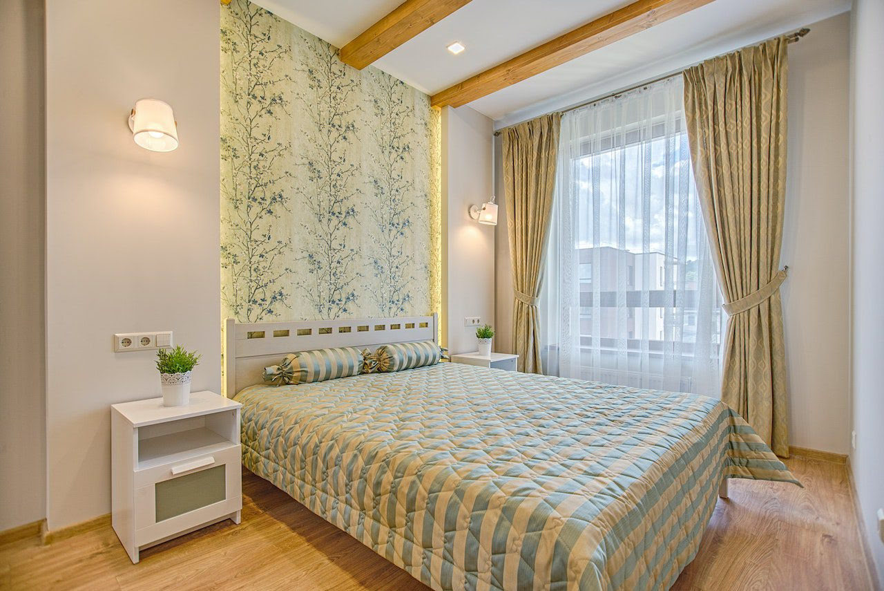
Subtitle 2: Ignoring the Room’s Lighting
When selecting curtain colors, it’s crucial to consider the lighting conditions of the room. Natural light and artificial lighting can significantly impact how colors appear, so ignoring the room’s lighting can lead to disappointing results.
One common mistake is choosing curtains that are too dark for a room with limited natural light. Dark-colored curtains can absorb light, making the space feel even dimmer. Instead, opt for lighter-colored curtains that allow more light to filter through and brighten up the room. If privacy is a concern, consider sheer or semi-sheer curtains that offer a balance between privacy and light diffusion.
Conversely, in rooms that receive ample natural light, it’s essential to avoid overly light-colored curtains that can create excess glare and wash out the space. Opting for curtains in mid-tones or deeper shades can help control the intensity of light and add depth to the room.
In addition to natural light, consider the type and placement of artificial lighting in the room. Curtains can cast shadows and change the perceived color of your lighting fixtures. It’s important to take this into account and choose curtain colors that work harmoniously with the artificial lighting. Consider testing out different curtain samples under your artificial lighting to see how they interact before making a final decision.
By paying attention to the lighting conditions in the room and selecting curtain colors that complement and enhance the lighting, you can create a more visually appealing and well-balanced space.
Subtitle 3: Overlooking the Overall Theme or Style
When choosing curtain colors, it’s important to consider the overall theme or style of the room. Curtains play a significant role in setting the tone and reinforcing the design aesthetic of a space. Overlooking the room’s theme can result in a lack of cohesiveness and visual harmony.
One mistake to avoid is selecting curtain colors that clash with the overall theme or style of the room. For example, if you have a room with a modern and minimalist design, opting for curtains in bold and vibrant colors might disrupt the clean lines and simplicity of the space. In contrast, choosing curtains in neutral tones or muted shades can complement the modern aesthetic and create a more cohesive look.
On the other hand, if you have a room with a bohemian or eclectic style, playing with colors and patterns can be more fitting. Feel free to experiment with vibrant hues or even mix and match different curtain designs to enhance the eclectic vibe. However, be mindful of balancing the various elements to prevent the space from feeling overwhelming or chaotic.
Additionally, consider the materials and textures of the curtains in relation to the overall theme. For example, heavy velvet curtains might suit a luxurious and opulent style, while lightweight linen curtains can be perfect for a more relaxed and beach-inspired decor.
By carefully considering the overall theme or style of the room and selecting curtain colors that align with it, you can create a space that feels visually cohesive and inviting.
Subtitle 4: Neglecting the Impact of Curtain Length
When it comes to curtains, the length is as important as the color. The length of your curtains can have a significant impact on the overall look and feel of a room. Neglecting to consider the appropriate curtain length can result in a design that feels incomplete or awkward.
One mistake to avoid is choosing curtains that are too short for the space. When curtains fall above the floor or window sill, it can create a sense of imbalance and make the room appear unfinished. Instead, opt for curtains that reach the floor or even pool slightly on the floor for a more elegant and polished look. This lengthening effect can visually elongate the height of the room, enhancing the overall proportions and adding a touch of sophistication.
On the other hand, using floor-length curtains in rooms where they are not practical can also be a mistake. For example, in a kitchen or bathroom, long curtains can easily get dirty or obstruct functional areas. In such cases, choosing curtains that hover just above the window sill or using blinds or shades may be a more practical choice.
Another consideration is the desired aesthetic and ambiance of the room. Floor-length curtains can create a sense of grandeur and formality, making them ideal for formal living rooms or dining areas. Alternatively, if you’re going for a more casual and relaxed vibe, opting for curtains that hit just below the window sill can create a breezy and effortless look.
By carefully selecting the appropriate curtain length for each room and considering the desired style, functionality, and proportions, you can enhance the overall design and create a cohesive and visually pleasing space.
When choosing curtain colors, avoid matching them exactly to your wall color. This can make the room feel flat and uninteresting. Instead, opt for complementary or contrasting colors to add depth and visual interest to the space.
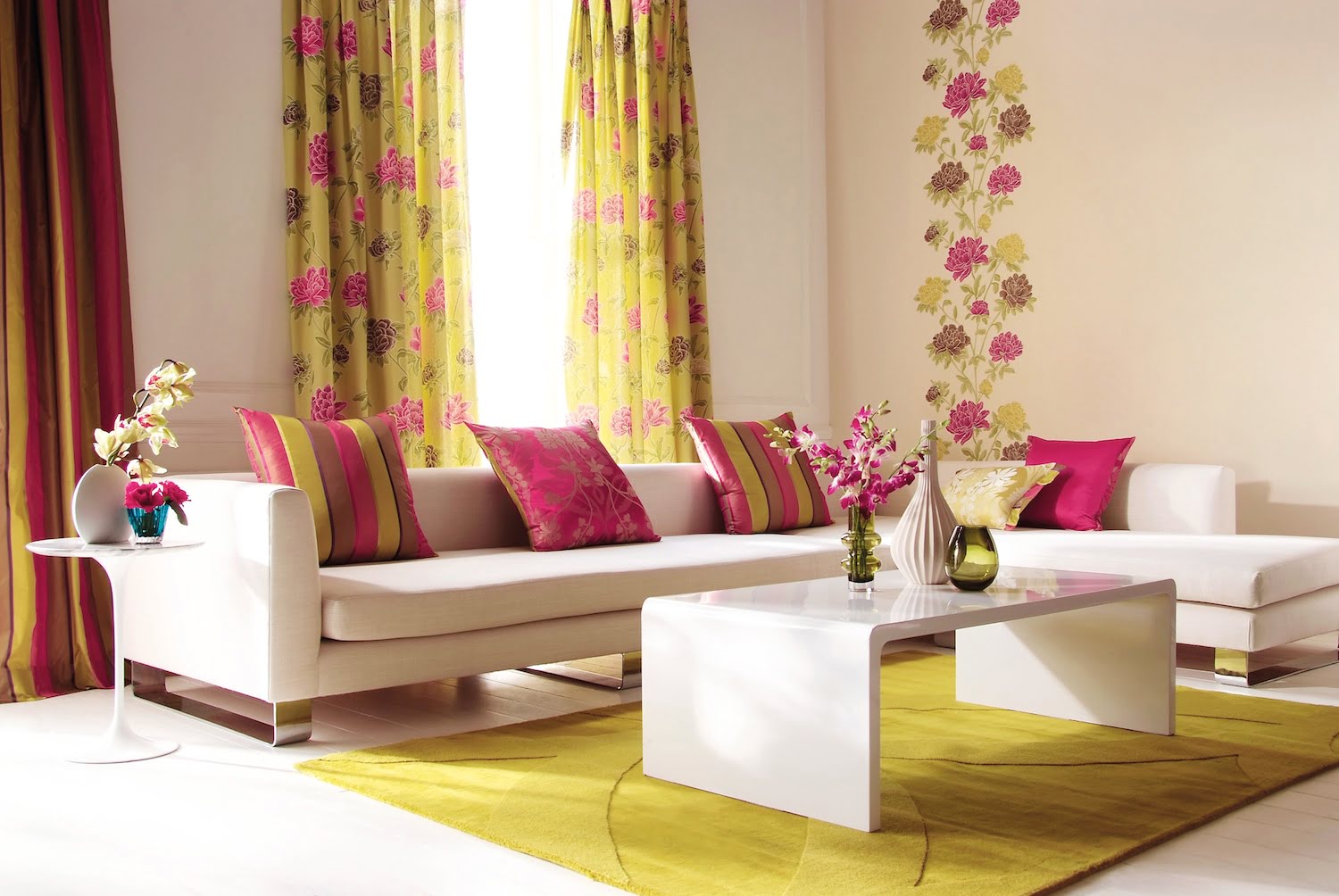
Subtitle 5: Using Contrasting Colors that Clash
Using contrasting colors can be a powerful design choice when done correctly, but it can easily go wrong if the colors clash. When selecting curtain colors, it’s essential to consider how different hues interact and whether they create a complementary or jarring effect.
One common mistake is choosing curtains in contrasting colors that clash with the existing color scheme of the room. While contrasting colors can create a vibrant and dynamic look, opting for colors that are too contrasting or not in harmony with the rest of the space can create visual chaos and disrupt the overall design aesthetic. It’s important to choose colors that enhance and complement the existing color palette rather than compete with it.
Instead of focusing solely on contrasting colors, consider using complementary colors that work together harmoniously. Complementary colors are opposite each other on the color wheel, such as blue and orange or yellow and purple. These combinations can create a balanced and visually pleasing look while still providing a level of contrast.
If you’re unsure about which contrasting or complementary colors to choose, you can also look for inspiration in the room’s existing elements. Take cues from the furniture, artworks, or even the dominant colors in the wallpaper or paint. By selecting curtain colors that echo or harmonize with these elements, you can create a cohesive and well-coordinated space.
Remember, contrast can be achieved not only through different colors but also through variations in shades and tones. Consider using different shades of the same color or incorporating patterned curtains that combine multiple colors in a cohesive way.
By carefully considering the contrasting colors in your curtain selection and ensuring they work harmoniously with the existing color scheme, you can create a visually pleasing and well-balanced design.
Subtitle 6: Forgetting to Consider Privacy and Light Control
While the aesthetic aspect of curtain color is important, it’s crucial not to overlook the practical considerations of privacy and light control. Curtains serve as a barrier between the interior of your space and the outside world, and neglecting these factors can lead to a lack of functionality.
One common mistake is choosing curtains that are too sheer or transparent, resulting in a lack of privacy. While sheer curtains can create an airy and light-filled atmosphere, they may not provide sufficient privacy, especially in areas like bedrooms or bathrooms. Consider pairing sheer curtains with heavier draperies or blinds to strike a balance between natural light and privacy.
Alternatively, choosing curtains that are too heavy and opaque can block out too much natural light, leaving the room feeling dark and gloomy during the day. It’s important to strike a balance between privacy and light control. Opt for curtains that allow enough natural light to filter through while still offering the desired level of privacy. This balance can be achieved by choosing semi-sheer or light-filtering curtains that provide privacy without sacrificing natural light.
Take into consideration the orientation of the windows and the amount of sunlight that enters the room throughout the day. If the room receives intense sunlight, opt for curtains with light-blocking or thermal properties to help regulate the temperature and protect furniture and flooring from sun damage.
In rooms where maximum privacy and light control are desired, such as bedrooms or nurseries, consider adding blackout curtains or blinds. These specialized curtains, with a light-blocking lining, can completely darken the room when closed, ensuring a restful sleep or creating the perfect environment for movie nights.
By carefully considering the level of privacy and light control needed in each room and selecting curtains that meet those requirements, you can create a functional and comfortable space that caters to your specific needs.
Subtitle 7: Disregarding the Importance of Maintenance and Cleaning
When selecting curtain colors, it’s easy to get caught up in the visual appeal and forget about the practical aspect of maintenance and cleaning. Curtains are exposed to dust, dirt, and everyday wear and tear, so it’s crucial to choose colors and fabrics that are easy to maintain and clean.
One mistake to avoid is choosing light-colored curtains in high-traffic areas or rooms prone to staining. Lighter colors may show dirt and stains more easily, resulting in the need for frequent cleaning or replacement. If you have young children or pets, it’s advisable to opt for darker or patterned curtains that can better hide daily wear and tear.
Consider the fabric composition of the curtains, as different materials require different cleaning methods. Delicate fabrics such as silk or velvet may require professional dry cleaning, while synthetic materials like polyester or nylon can often be machine-washed or spot-cleaned. Choose fabrics that align with your cleaning preferences and lifestyle.
Additionally, consider the texture and weave of the fabric. Fabrics with intricate weaves or textured surfaces can trap dust and require more frequent cleaning. Smooth and tightly-woven fabrics, on the other hand, are often easier to clean and maintain.
Another critical factor to consider is the presence of allergens and dust in your environment. If you or your family members are prone to allergies or have respiratory sensitivities, it’s important to choose curtains that are hypoallergenic and easy to clean. Opt for materials that repel dust, such as microfiber or tightly-woven cotton.
Regular maintenance, such as dusting or vacuuming your curtains, can help prolong their lifespan and keep them looking fresh. Additionally, follow the manufacturer’s guidelines for cleaning and care to ensure that your curtains remain in good condition for years to come.
By taking into account the maintenance and cleaning requirements of your curtains and selecting colors and fabrics that are easy to maintain and clean, you can enjoy a beautiful and hassle-free window treatment for your space.
Conclusion
When it comes to interior design, curtain color choices are just as important as any other element in creating a cohesive and visually appealing space. By avoiding common curtain color mistakes, you can elevate the overall aesthetic and achieve a harmonious design that reflects your style and personality.
Choosing the right curtain color palette, considering the room’s lighting conditions, and aligning with the overall theme or style are essential factors to keep in mind. Additionally, understanding the impact of curtain length, avoiding contrasting colors that clash, and considering privacy and light control are crucial for both functionality and visual appeal.
Don’t forget the practical aspects of maintenance and cleaning when selecting curtain colors and fabrics. By choosing curtains that are easy to maintain and clean, you ensure their longevity and keep your space looking fresh and inviting.
Remember, the key to selecting the perfect curtain colors lies in striking a balance between personal taste, design principles, and practicality. Consider experimenting, seeking inspiration, and don’t be afraid to take risks while staying mindful of the potential pitfalls.
So, whether you aim for a calming and relaxing atmosphere or a vibrant and lively space, make thoughtful and informed choices when it comes to curtain color. By avoiding these common mistakes and optimizing your curtain selection, you can transform your space into a beautiful and inviting haven that reflects your unique style and enhances your overall interior design.
Frequently Asked Questions about Curtain Color Mistakes: What To Avoid And Why
Was this page helpful?
At Storables.com, we guarantee accurate and reliable information. Our content, validated by Expert Board Contributors, is crafted following stringent Editorial Policies. We're committed to providing you with well-researched, expert-backed insights for all your informational needs.


0 thoughts on “Curtain Color Mistakes: What To Avoid And Why”