Home>Interior Design>What Are The Worst Colors To Paint A Room? 5 Mistakes To Avoid

Interior Design
What Are The Worst Colors To Paint A Room? 5 Mistakes To Avoid
Modified: August 21, 2024
Avoid making these 5 interior design mistakes when choosing room colors. Discover the worst colors to paint a room and make smarter design choices.
(Many of the links in this article redirect to a specific reviewed product. Your purchase of these products through affiliate links helps to generate commission for Storables.com, at no extra cost. Learn more)
Introduction
When it comes to designing or renovating a room, one of the most crucial decisions to make is choosing the right color scheme. The colors you select can greatly impact the overall ambiance and mood of the space. While there are no strict rules when it comes to color choices, there are some mistakes that are commonly made by homeowners and designers alike. In this article, we will explore the worst colors to paint a room and the mistakes to avoid.
Color psychology plays a significant role in interior design. Colors can evoke emotions, create illusions, and influence our perception of space. Therefore, it is important to carefully consider the effect that each color will have on the room and its occupants. By avoiding these common mistakes, you can ensure that your room reflects your personal style and enhances its functionality.
Key Takeaways:
- Avoid using dark colors in small rooms to prevent a cramped and gloomy feel. Opt for light and neutral colors to create an open and spacious atmosphere while adding pops of darker colors as accents.
- Consider the room’s purpose and natural lighting when choosing colors. Select calming hues for relaxation areas and brighter tones for workspaces, while also taking into account the room’s natural lighting to enhance the overall ambiance.
Mistake 1: Using Dark Colors in Small Rooms
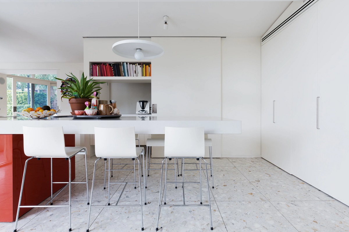
One common mistake that people make when painting small rooms is opting for dark colors. While dark colors can add depth and drama to a space, they tend to make small rooms appear even smaller and more cramped. Dark colors absorb light, which can make the room feel gloomy and claustrophobic.
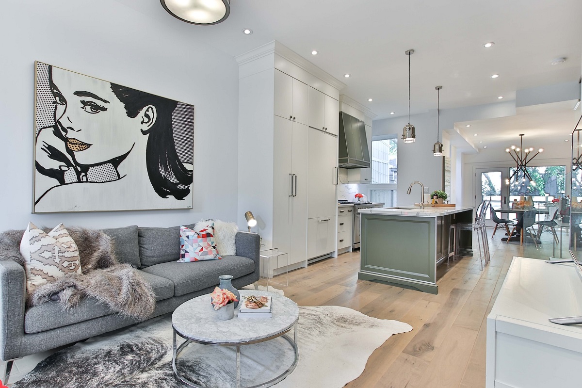
Instead, opt for light and neutral colors for small rooms. Light colors, such as whites, creams, and pastels, reflect light and create an airy and open atmosphere. They can visually expand the room and make it feel more spacious. Additionally, light colors allow natural light to bounce off the walls and illuminate the space, further enhancing the overall brightness.
If you still desire a touch of drama or depth in a small room, consider using darker colors as accents rather than as the main wall color. Add pops of color through furniture, artwork, or accessories to create visual interest without overwhelming the space.
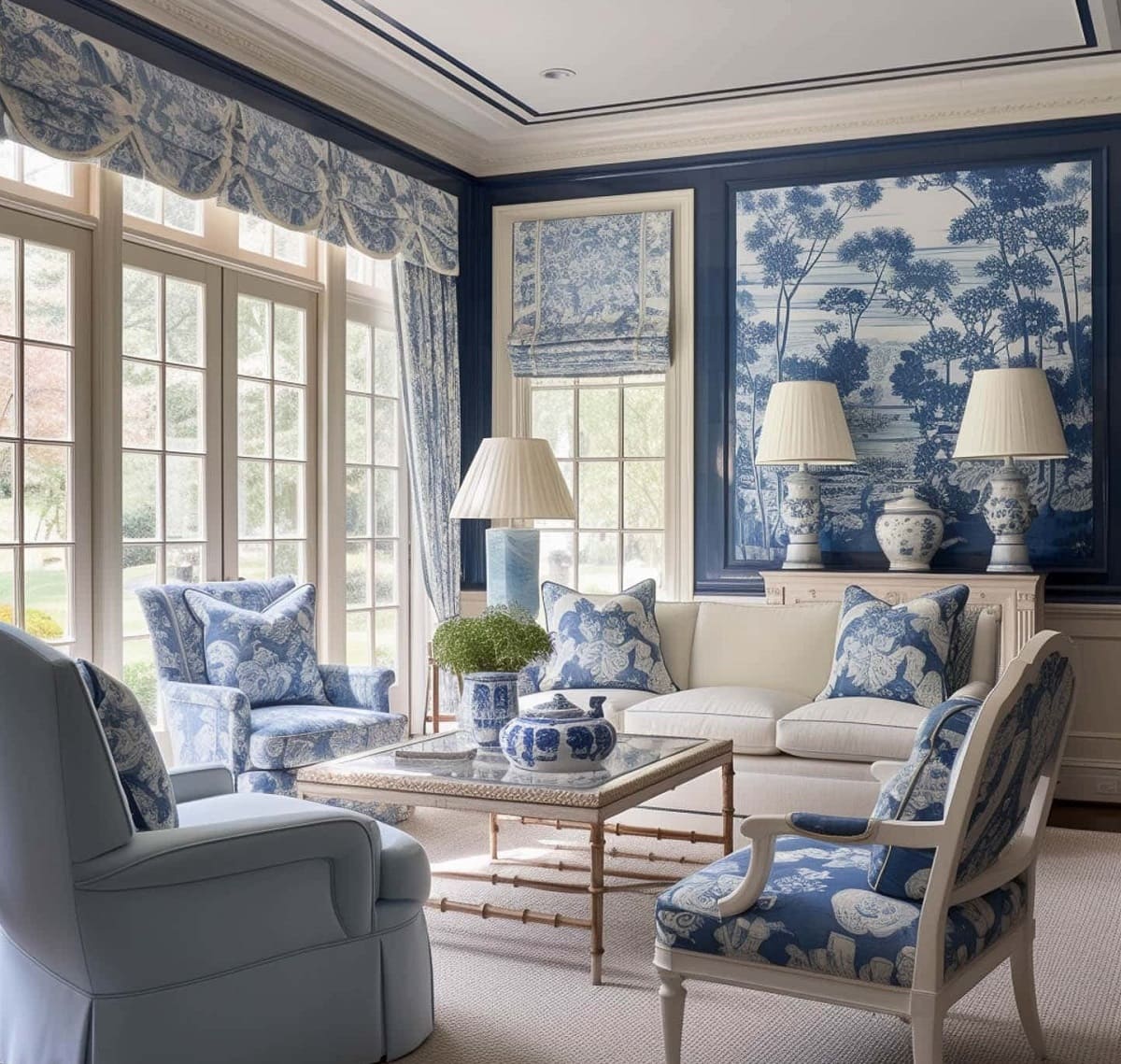
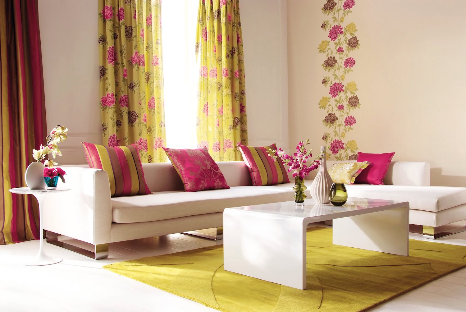
Mistake 2: Choosing Overly Vibrant or Bright Colors
While vibrant and bright colors can inject energy and personality into a room, using them in excess can result in a visually overwhelming space. It’s important to strike a balance between adding pops of color and maintaining a harmonious and relaxing atmosphere.
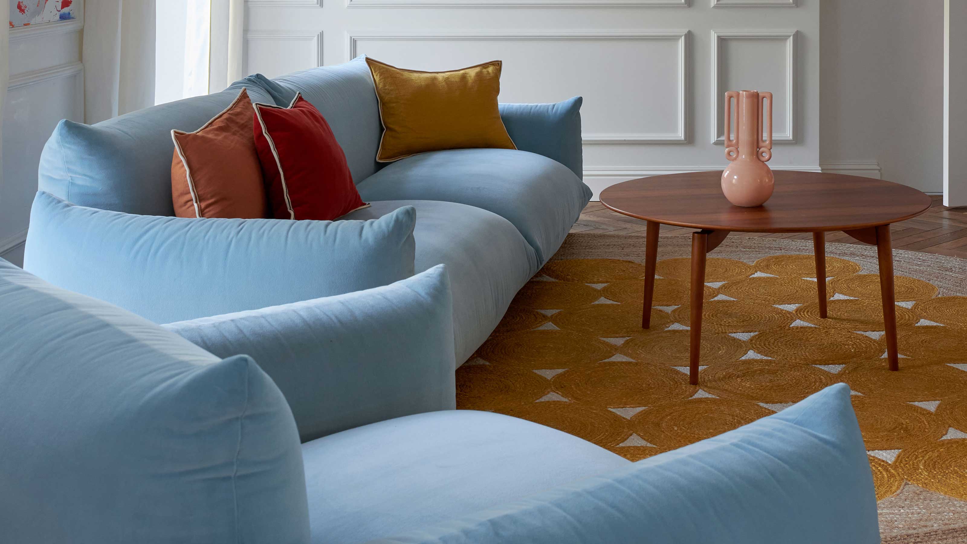
When selecting colors for your room, consider the purpose of the space and how you want it to make you feel. For bedrooms or relaxation areas, it’s generally best to choose calming and soothing colors. Soft blues, greens, and neutrals create a tranquil ambiance that promotes rest and relaxation.
On the other hand, if you’re designing a room meant for more activity and energy, such as a playroom or home office, you can incorporate brighter and more vibrant colors. However, be mindful of using them sparingly or in conjunction with more neutral tones to prevent the space from feeling overwhelming.
If you’re unsure about which colors to choose, consider using a color palette generator or consulting with an interior designer. They can provide expert advice on color coordination and help you find the perfect balance between vibrant and subtle hues.
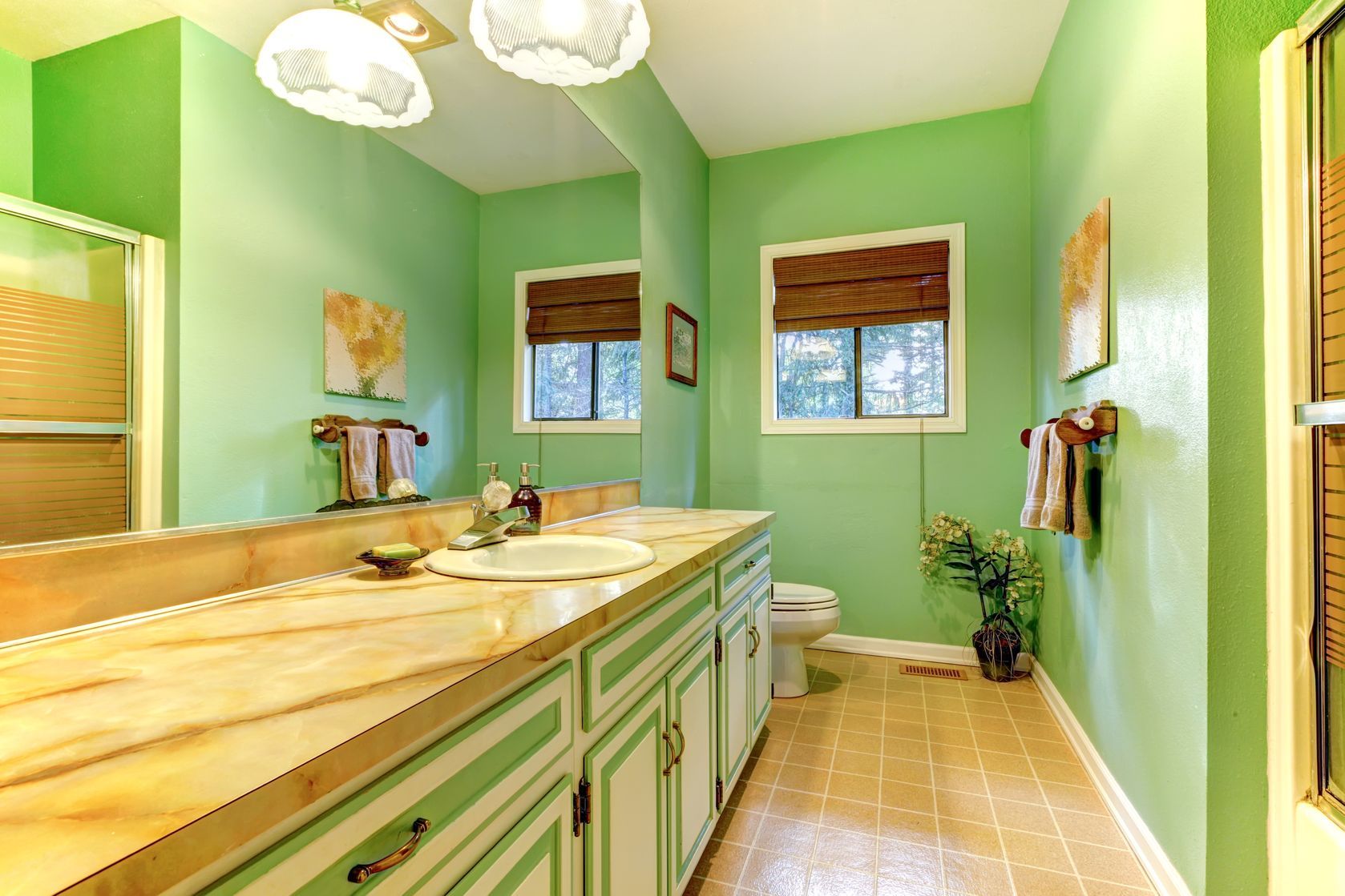
Mistake 3: Ignoring the Room’s Natural Lighting
One crucial factor that is often overlooked when choosing colors for a room is the natural lighting it receives. The amount and direction of natural light can greatly affect how colors appear in a space.
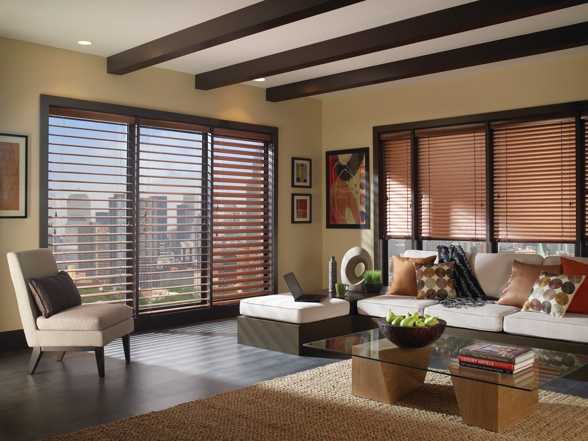
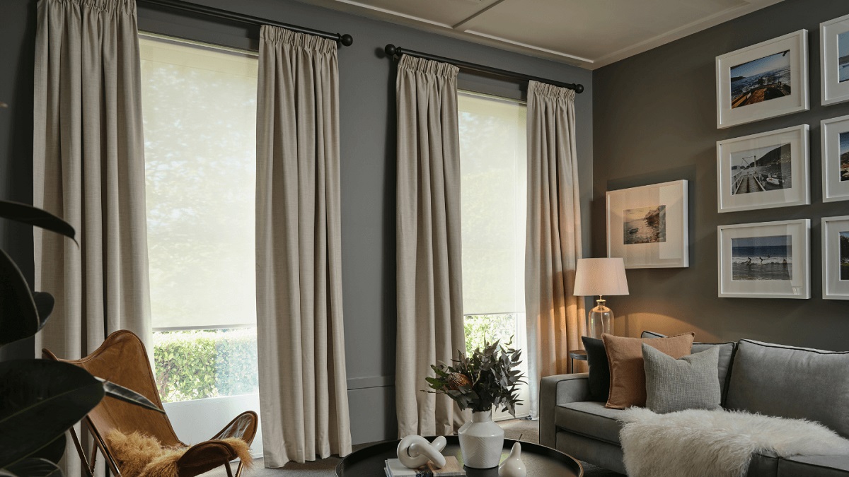
If a room receives ample natural light, you have the flexibility to experiment with a wide range of colors. Light-filled spaces can handle bolder, darker, or warmer colors without feeling overwhelming. However, be cautious about using colors with undertones that clash with the natural light, as it can create an unbalanced and jarring effect.
Conversely, rooms with minimal natural light or those that are north-facing tend to have cooler and dimmer lighting conditions. In these cases, it’s best to avoid colors with cool undertones, as they can make the room feel even colder and gloomier. Instead, opt for warmer tones, such as creamy neutrals, soft yellows, or light oranges, to add warmth and brightness to the space.
It’s important to observe how the natural light interacts with the room throughout the day and take note of any shifts in color appearance. Consider using color swatches and testing them in different areas of the room to see how they look under various lighting conditions before making a final decision.
Avoid painting a room in overly bright or intense colors, as they can be overwhelming. Also, steer clear of colors that clash with the room’s furnishings or that are too trendy and may quickly go out of style.
Mistake 4: Neglecting to Consider the Room’s Purpose
One of the biggest mistakes when choosing colors for a room is neglecting to consider its intended purpose. Each room in your home serves a different function, and the color scheme should align with that purpose to create the desired atmosphere.
For example, in a home office or study area where focus and productivity are essential, it’s best to choose calming and neutral colors. Soft blues and greens can promote concentration and create a serene environment. On the other hand, if you want to stimulate creativity and energy in a workspace, consider incorporating stimulating colors like yellows or oranges.
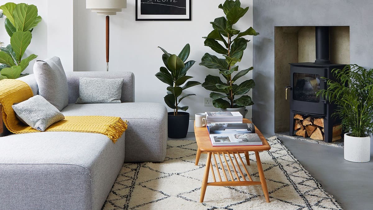
In rooms intended for relaxation, such as bedrooms or living rooms, it’s important to create a soothing and inviting atmosphere. Colors like soft lavender, muted grays, or warm neutrals can help to create a peaceful ambiance that encourages rest and relaxation.
Additionally, don’t forget about the psychological impact of colors. Reds, for instance, are associated with energy and passion, so they may not be suitable for a bedroom where you want to promote calmness and tranquility.
Remember to consider the function of the room and the mood you want to evoke when selecting colors. Take into account the activities that will take place in the room and choose a color scheme that enhances the overall experience.
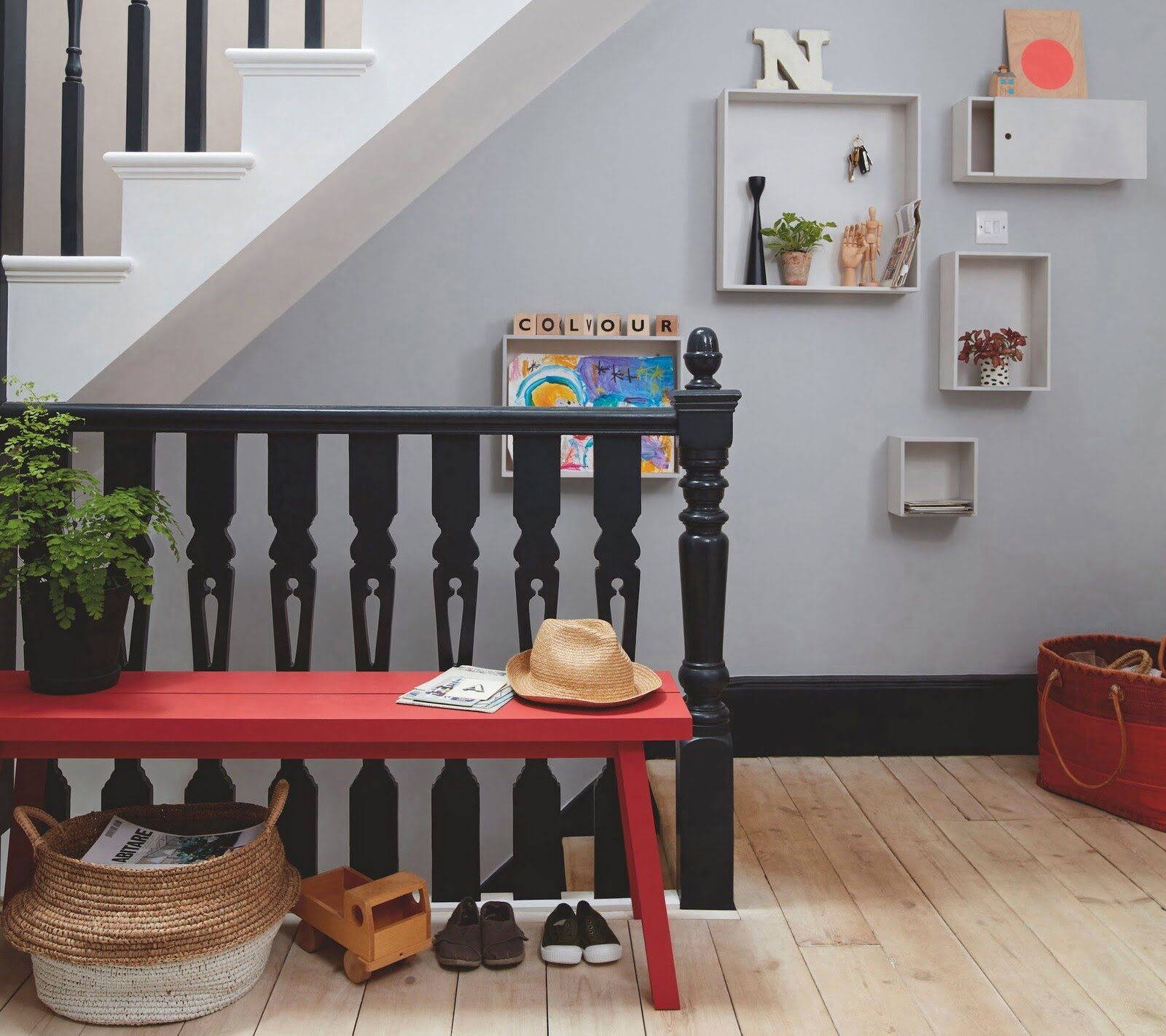
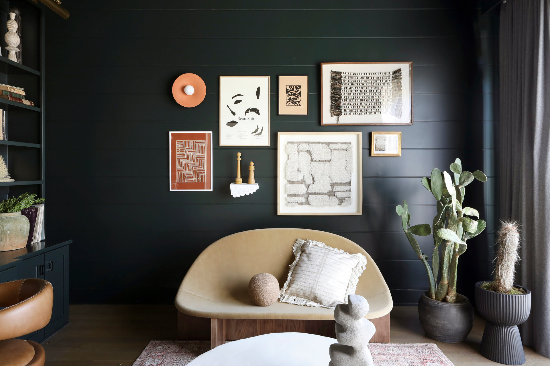
Mistake 5: Failing to Harmonize with Existing Decor
Another common mistake when choosing colors for a room is failing to consider the existing decor and furnishings. It’s important to select colors that complement and harmonize with the room’s existing elements to create a cohesive and visually pleasing space.
Take a look at the furniture, flooring, and accessories in the room and consider their colors and patterns. If you have a statement piece, such as a bold-patterned sofa or a vibrant artwork, use its colors as a starting point for your color scheme. Select colors that coordinate or complement those existing elements to create a unified look.
On the other hand, if you have neutral or minimalistic decor, you have more flexibility to introduce bolder or contrasting colors. Consider adding pops of color through accent pieces or textiles, such as pillows, rugs, or curtains, to bring vibrancy and visual interest to the space.
It’s important to strike a balance between creating a cohesive color palette and adding variation and contrast. Aim for a harmonious blend of colors that tie the room together while allowing each element to shine.
Lastly, consider the style and aesthetic of the room. Different design styles have their own color palettes and themes. For example, coastal or beach-themed designs often incorporate light blues, whites, and sandy neutrals, while a rustic or farmhouse-style room may feature warm earthy tones.
By considering the existing decor and furnishings, you can select colors that enhance the overall look and feel of the room and create a space that is visually cohesive and aesthetically pleasing.
Conclusion
Choosing the right colors for a room can greatly impact its overall ambiance and functionality. By avoiding these common mistakes, you can ensure that your space reflects your personal style and enhances its purpose.
Avoid using dark colors in small rooms, as they can make the space feel even smaller and gloomy. Opt for light and neutral colors to create an open and spacious atmosphere.
Be cautious when using overly vibrant or bright colors, as they can overwhelm the space. Strike a balance between adding pops of color and maintaining a harmonious and relaxing ambiance.
Consider the natural lighting in the room and choose colors that work well with the available light. Light-filled spaces can handle a wider range of colors, while dimly lit rooms benefit from warmer tones to add brightness.
Take into account the room’s purpose and select colors that align with the desired atmosphere. Calming colors for relaxation areas and stimulating colors for workspaces can enhance the functionality and mood of the space.
Lastly, harmonize the color scheme with the existing decor and furnishings. Choose colors that complement and coordinate with the room’s elements to create a visually cohesive and pleasing space.
By avoiding these mistakes and carefully selecting your color scheme, you can create a room that is not only aesthetically pleasing but also functional and inviting. Remember, color is a powerful tool in interior design – embrace it and let it enhance the beauty of your space.
Frequently Asked Questions about What Are The Worst Colors To Paint A Room? 5 Mistakes To Avoid
Was this page helpful?
At Storables.com, we guarantee accurate and reliable information. Our content, validated by Expert Board Contributors, is crafted following stringent Editorial Policies. We're committed to providing you with well-researched, expert-backed insights for all your informational needs.


0 thoughts on “What Are The Worst Colors To Paint A Room? 5 Mistakes To Avoid”