Home>Interior Design>What Color Should You Not Paint Your Living Room?
Interior Design
What Color Should You Not Paint Your Living Room?
Modified: January 5, 2024
Find out the worst color to paint your living room and avoid interior design disasters with expert advice.
(Many of the links in this article redirect to a specific reviewed product. Your purchase of these products through affiliate links helps to generate commission for Storables.com, at no extra cost. Learn more)
Introduction
Welcome to the world of interior design, where every decision you make can have a significant impact on the overall look and feel of your living room. One of the most crucial choices you’ll need to make is selecting the right color for your walls. The color you choose will set the tone for the entire space and can greatly influence the mood and atmosphere.
Choosing the perfect paint color for your living room is not a decision to be taken lightly. It requires careful thought and consideration, as it can make or break the overall aesthetic of your space. In this article, we’ll explore the importance of selecting the right color for your living room and highlight the colors you should avoid.
When it comes to interior design, the color of your walls has a profound impact on the ambiance of the room. Different colors evoke different emotions and can affect our mood and perception of the space. Whether you want to create a cozy and warm atmosphere or go for a bold and vibrant look, the color you choose will play a vital role in achieving your desired outcome.
Before diving into the world of color psychology and the effects of different colors, it’s important to understand the factors you should consider when selecting a paint color for your living room. Factors such as the size and layout of the room, natural light, and existing furniture and decor can influence your color choice. So, let’s explore these factors in more detail before delving into the colors to avoid.
Key Takeaways:
- Choose your living room wall color wisely, considering factors like room size, natural light, and existing decor. Avoid intense red, black, dark brown, neon, and pure white for a more inviting space.
- Understand the psychological effects of colors to create the desired ambiance. Use red, black, dark brown, neon, and pure white sparingly or as accents to maintain balance and harmony in your living room.
Importance of choosing the right color for your living room
When it comes to designing your living room, choosing the right color for the walls is of utmost importance. The color you choose will not only affect the overall aesthetic of the space but also impact the mood and ambiance of the room. Here are a few reasons why selecting the right color is crucial:
- Setting the tone: The color of your living room sets the tone for the entire space. It creates the first impression when someone enters the room and establishes the atmosphere. Whether you want to create a relaxing and serene environment or an energetic and vibrant one, the color you choose plays a crucial role.
- Reflecting your personality: Your living room is a reflection of your personality and style. The color you select should align with your personal taste and preferences. It should make you feel comfortable and resonate with your sense of aesthetics.
- Enhancing the space: Choosing the right color can enhance the visual appeal of your living room. It can make a small room appear larger and brighter, or add depth and dimension to a larger space. The right color choice can transform your living room into a welcoming and visually appealing area.
- Creating a harmonious environment: Colors have the power to create harmony and balance in a space. By carefully selecting a color scheme that complements your furniture, decor, and flooring, you can create a cohesive and well-coordinated living room. A harmonious environment can promote relaxation and make the space more enjoyable to spend time in.
- Influencing mood and emotions: Colors have psychological effects on our mood and emotions. Warm colors like red and orange can create a cozy and intimate atmosphere, while cool colors like blue and green can evoke a sense of calmness and tranquility. By choosing colors that align with the mood you want to create, you can enhance the overall experience in your living room.
As you can see, the color you choose for your living room goes beyond mere aesthetics. It has the power to influence your emotions, enhance the visual appeal of the space, and create a harmonious environment. So, take the time to explore different color options and consider how they align with your vision for your living room.
Now that you understand the importance of selecting the right color, let’s explore the factors you should consider when choosing a paint color for your living room.
Factors to consider when selecting a paint color
Choosing a paint color for your living room can be an exciting yet daunting task. To ensure you make the right decision, there are several factors you should consider. These factors will help you narrow down your options and find a color that best suits your space. Here are the key factors to keep in mind:
- Room size and layout: The size and layout of your living room play a significant role in color selection. If you have a small room, using light and neutral colors can create an illusion of space and make the room appear larger. On the other hand, in a large room, you have more flexibility to experiment with darker or bolder colors.
- Natural light: Take into account the amount of natural light your living room receives throughout the day. If the room is well-lit with ample natural light, you can opt for both light and dark colors. However, in rooms with limited natural light, lighter colors can help brighten up the space and make it feel more airy and open.
- Existing furniture and decor: Consider the colors of your existing furniture, decor, and flooring. The paint color should complement and enhance the overall look of the room. Take cues from the dominant colors in your furnishings to create a cohesive and harmonious space.
- Function of the room: Think about how you use your living room. Is it a place for relaxation and unwinding, or is it a space for lively gatherings and entertaining guests? The color you choose should align with the intended function of the room. Soft and calming colors like blues and greens are ideal for relaxation, while bold and vibrant colors like reds and yellows can energize the space for entertaining.
- Personal preference: Ultimately, your personal taste and preferences should be the driving force behind your color choice. Consider colors that you are naturally drawn to and that make you feel comfortable and happy when you enter the room.
By considering these factors, you can narrow down your options and find a paint color that not only suits your living room but also aligns with your personal style and preferences. Remember to test paint samples on your walls before making a final decision, as lighting and other factors can affect how a color appears in your specific space.
Now that you have a better understanding of the factors to consider when selecting a paint color, let’s delve into the psychological effects of colors in a living room setting.
The psychological effects of colors in a living room setting
Colors have a profound impact on our emotions, mood, and overall well-being. When it comes to designing your living room, understanding the psychological effects of different colors can guide you in creating the desired atmosphere. Here are some common colors and their psychological effects in a living room setting:
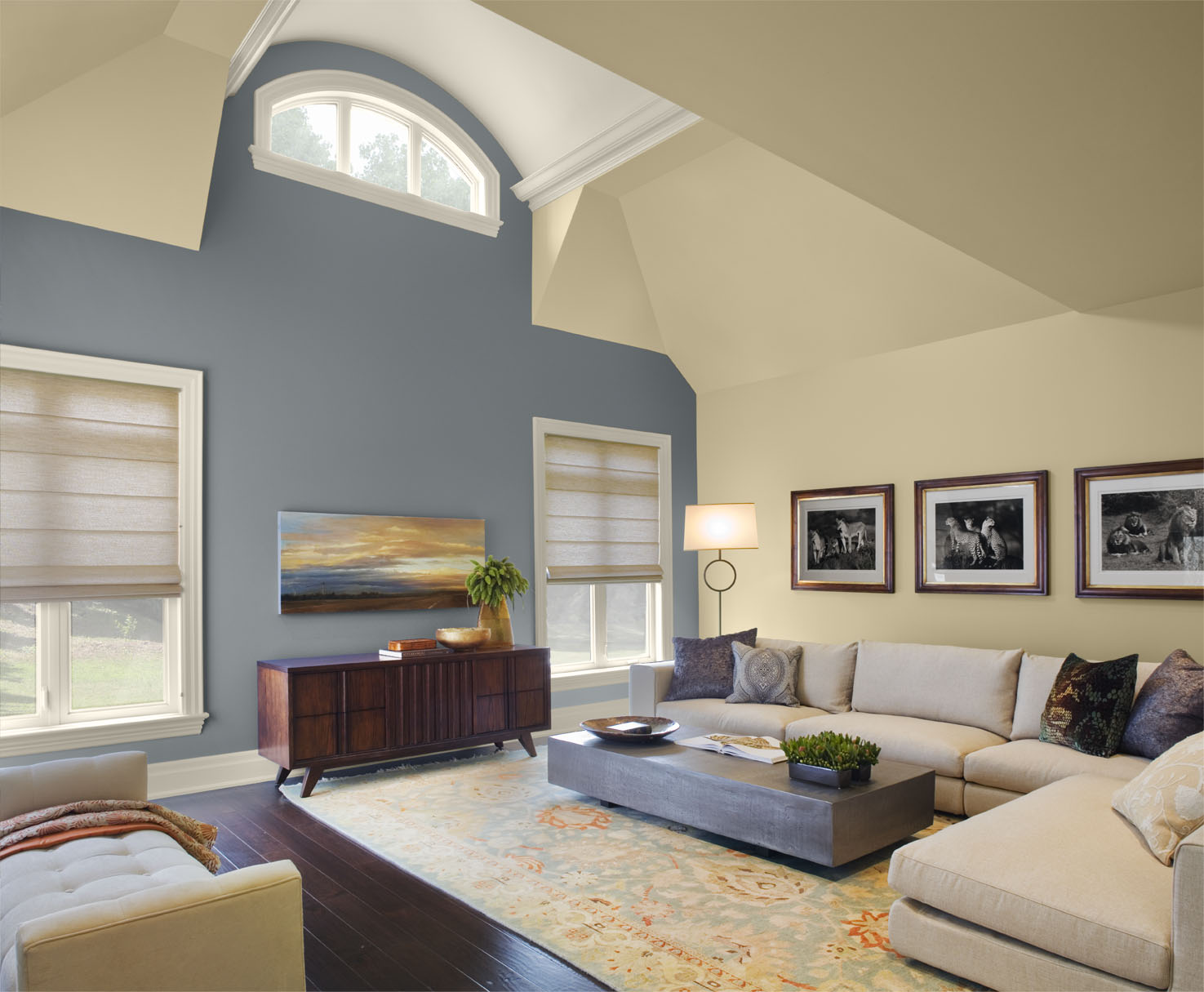
- Blue: Often associated with calmness and tranquility, blue can create a serene and relaxing environment in your living room. It can promote feelings of peace, stability, and trust. Lighter shades of blue can make a space feel airy and spacious, while darker shades can add depth and sophistication.
- Green: Green is commonly associated with nature and represents growth, harmony, and balance. It has a calming effect and can create a sense of freshness and tranquility in your living room. Green is an excellent choice for nature lovers or those seeking a refreshing and rejuvenating atmosphere.
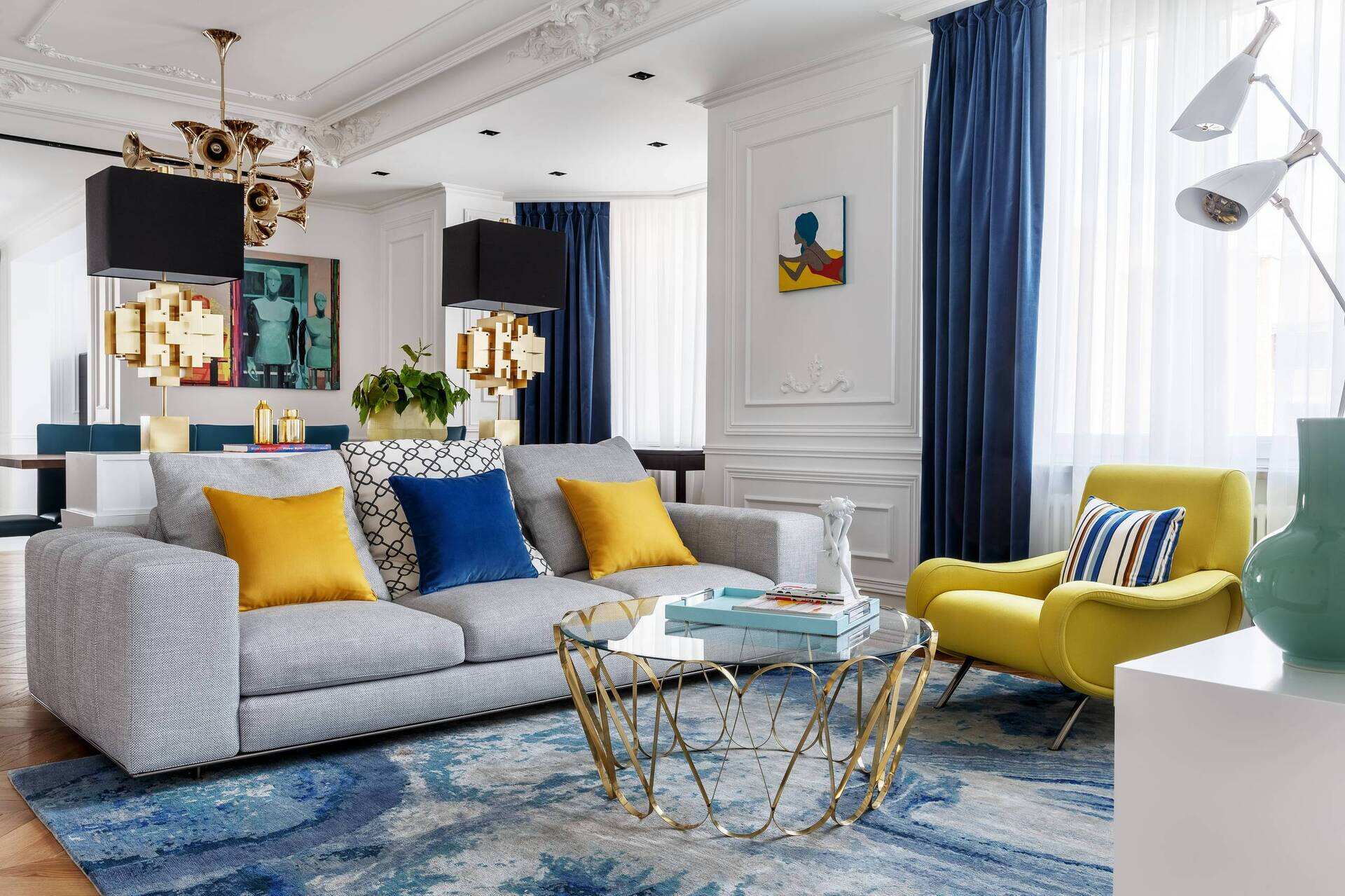
- Yellow: Yellow is a vibrant and energetic color that can add a cheerful and uplifting vibe to your living room. It is often associated with happiness, optimism, and creativity. However, it’s important to use yellow in moderation as too much yellow can be overwhelming or cause feelings of agitation.
- Red: Red is a bold and intense color that evokes strong emotions. It is associated with passion, energy, and excitement. Incorporating red into your living room can create a warm and inviting space, perfect for socializing and entertaining. However, too much red can be overwhelming and may increase heart rate and blood pressure, so it’s best to use it as an accent color.
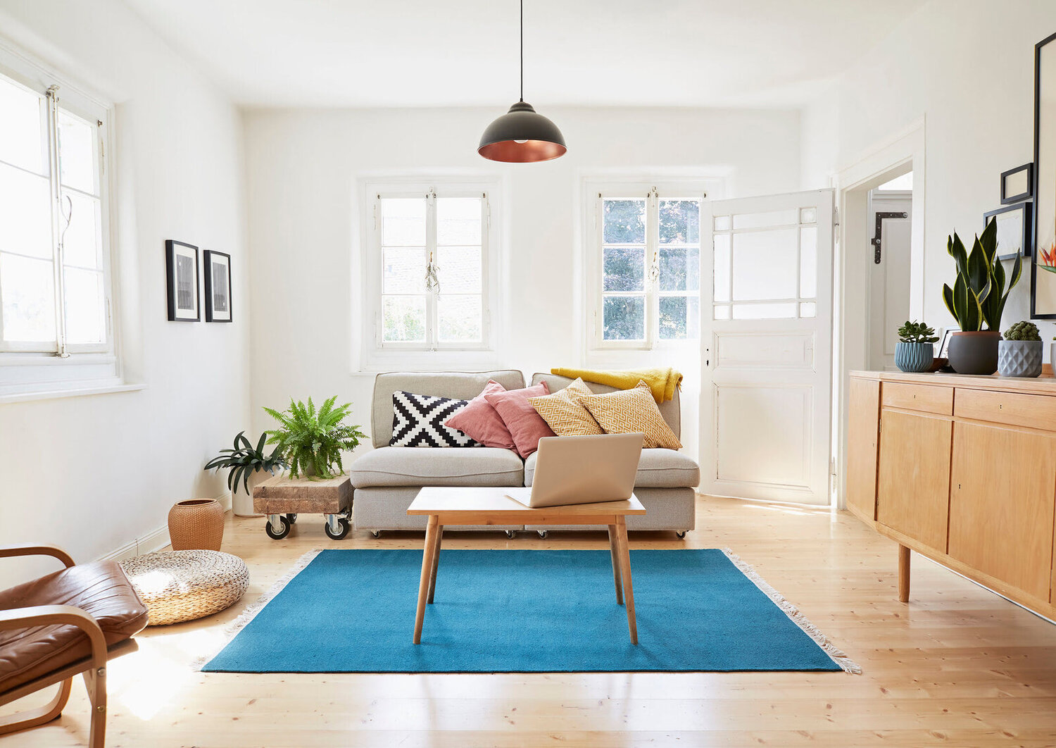
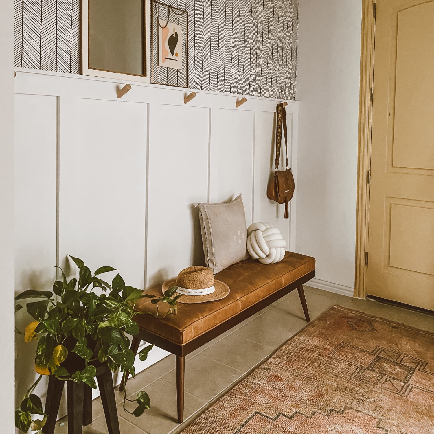
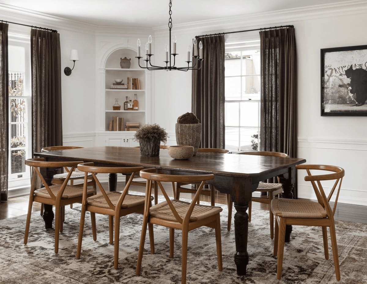
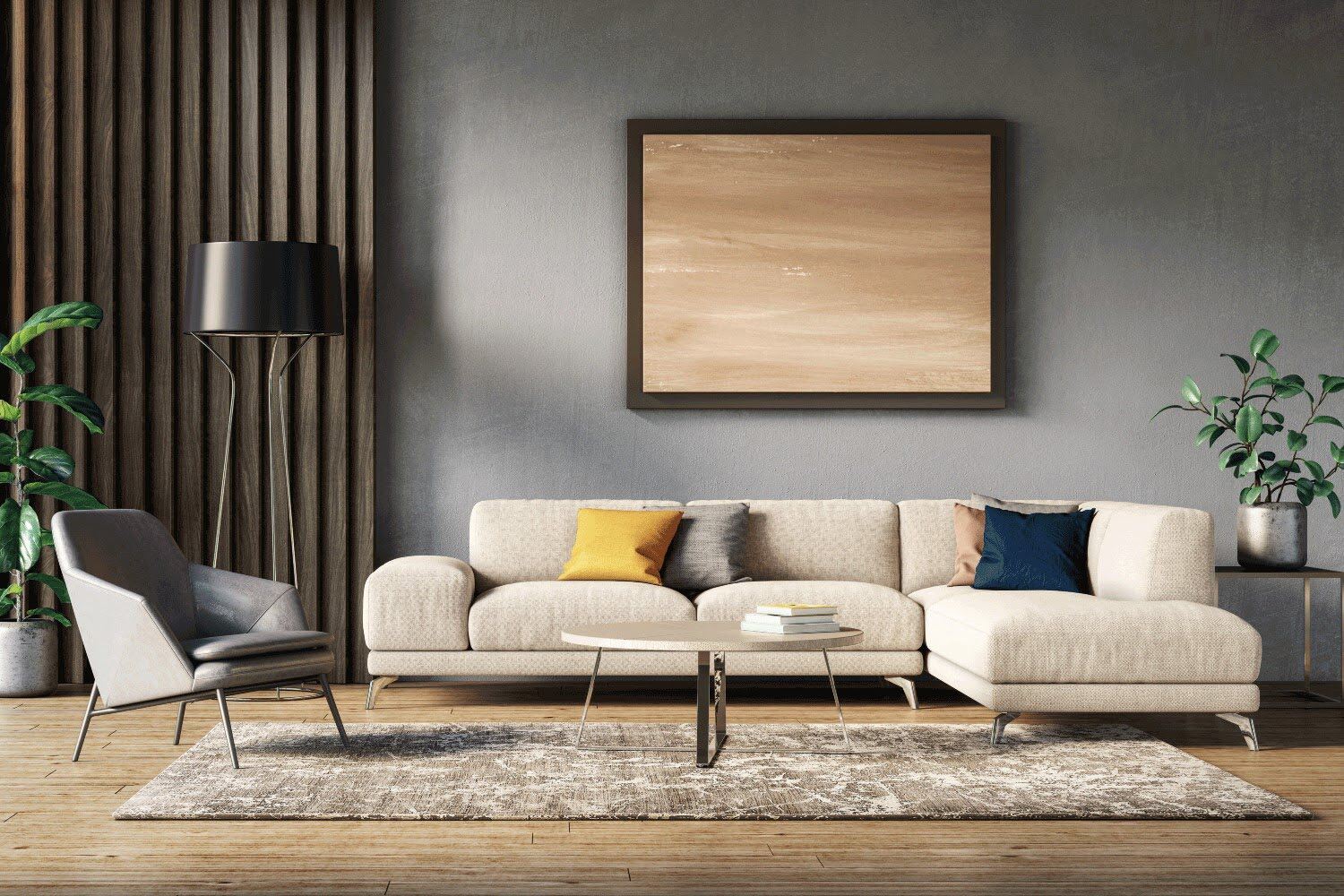
- Neutral colors: Colors like white, beige, and gray are considered neutral and provide a versatile backdrop for any living room. Neutral colors are timeless and can create a sense of sophistication and elegance. They also allow you to easily incorporate other colors into your decor and furnishings.
It’s important to note that personal associations and cultural influences can also affect how we perceive colors. The psychological effects of colors can vary from person to person, so it’s essential to consider your own preferences and the mood you want to create in your living room.
When selecting colors for your living room, you can also consider combining different hues to create a harmonious and balanced space. For example, pairing cool blues with warm neutrals can create a soothing and inviting atmosphere.
Now that we’ve explored the psychological effects of colors, let’s move on to discussing the colors to avoid when painting your living room.
Colors to avoid when painting your living room
While color choice is subjective and ultimately depends on personal preference, there are some colors that may not be ideal for a living room setting. These colors can have negative effects on the overall ambiance and may not create the desired atmosphere you’re looking for. Here are some colors to avoid when painting your living room:
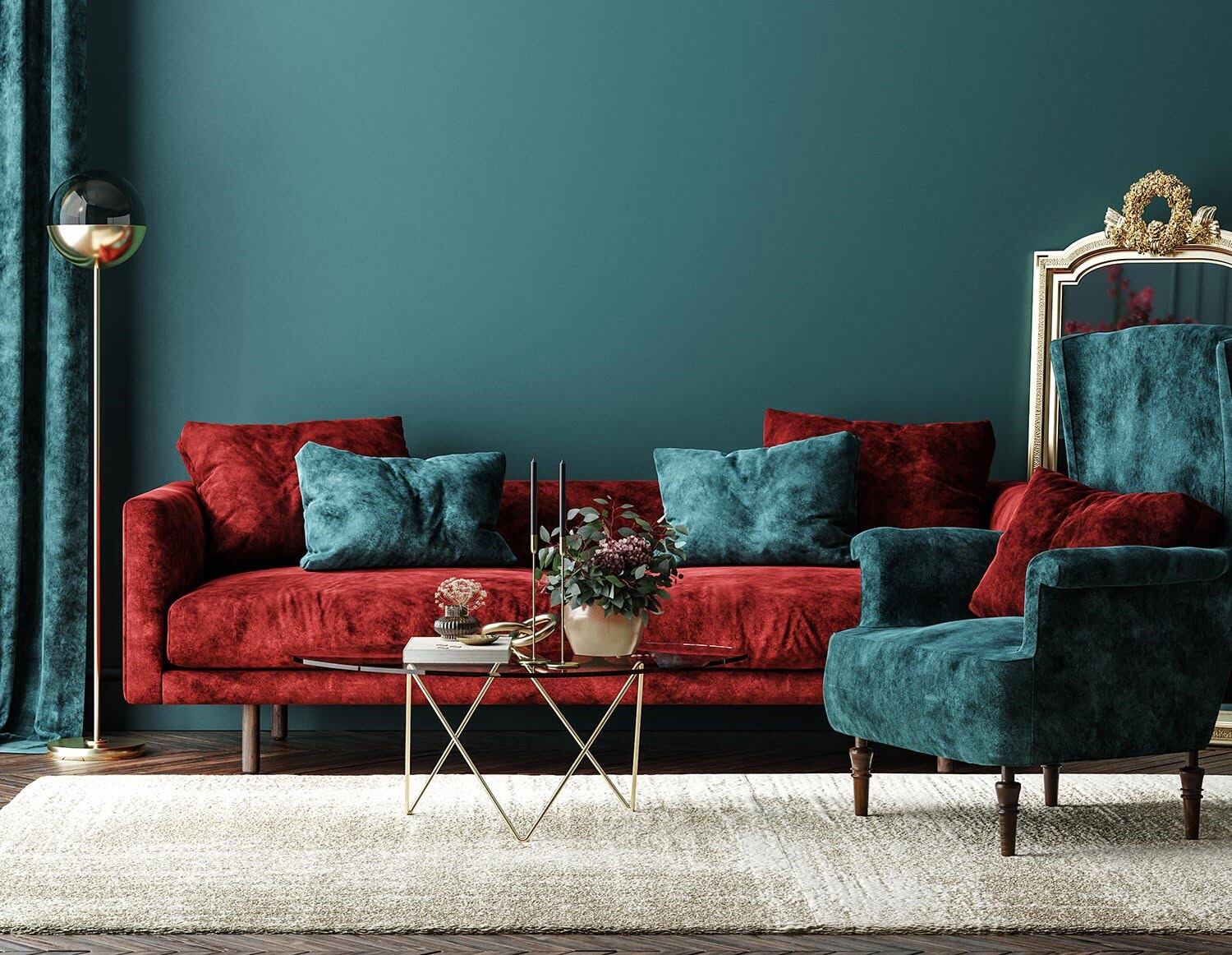
- Red: While red can bring warmth and energy to a space, intense shades of red can be overpowering in a living room. Too much red can create a sense of agitation and may even increase heart rate and blood pressure. If you still want to incorporate red, it’s best to use it as an accent color or choose softer and more muted shades.
- Black: Black is a bold and dramatic color that can make a statement in certain settings, but it is generally not recommended for painting entire living room walls. Black can make a room feel dark, small, and gloomy. If you’re drawn to the elegance of black, consider using it sparingly as an accent color or in furniture and accessories.
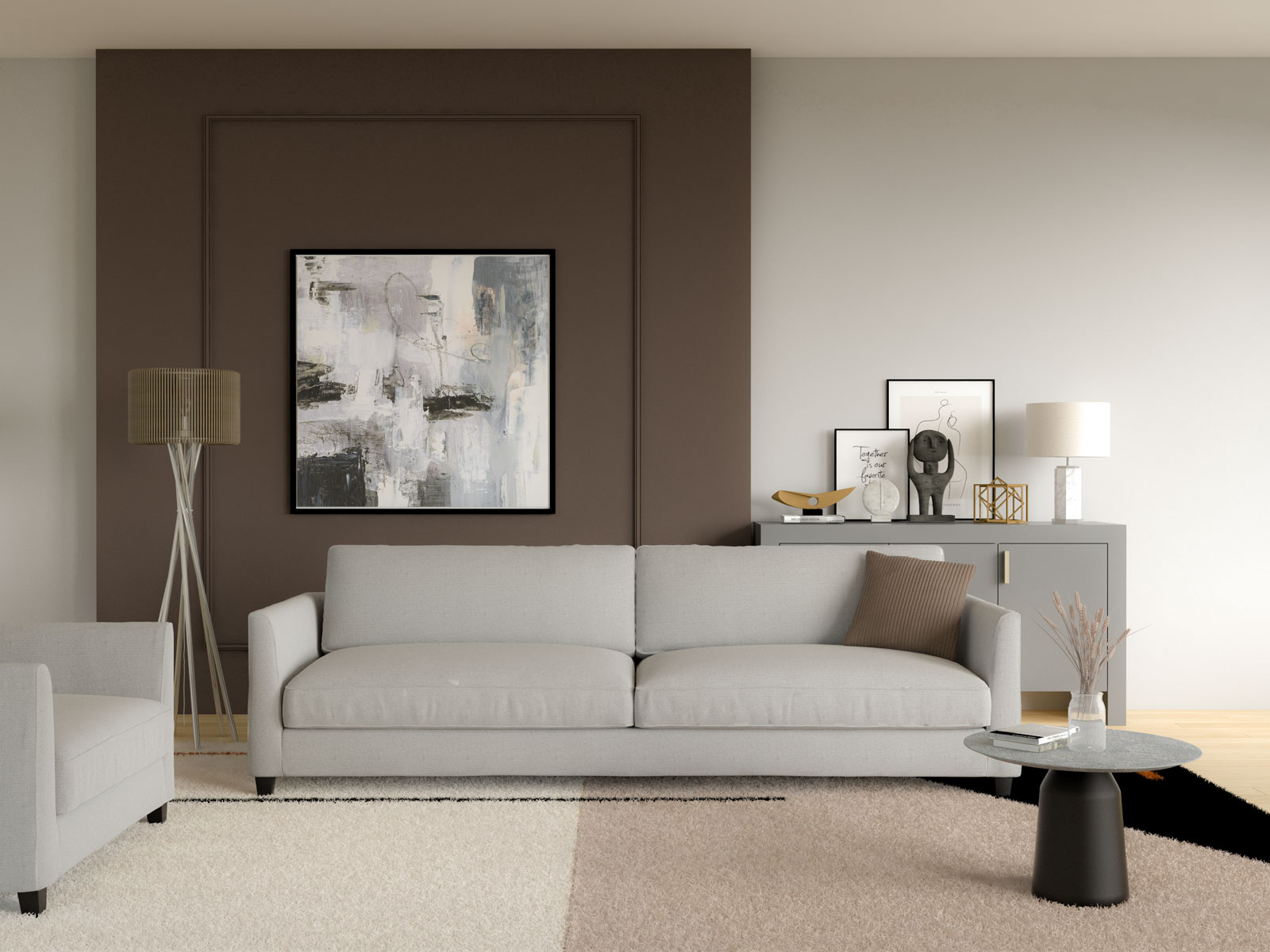
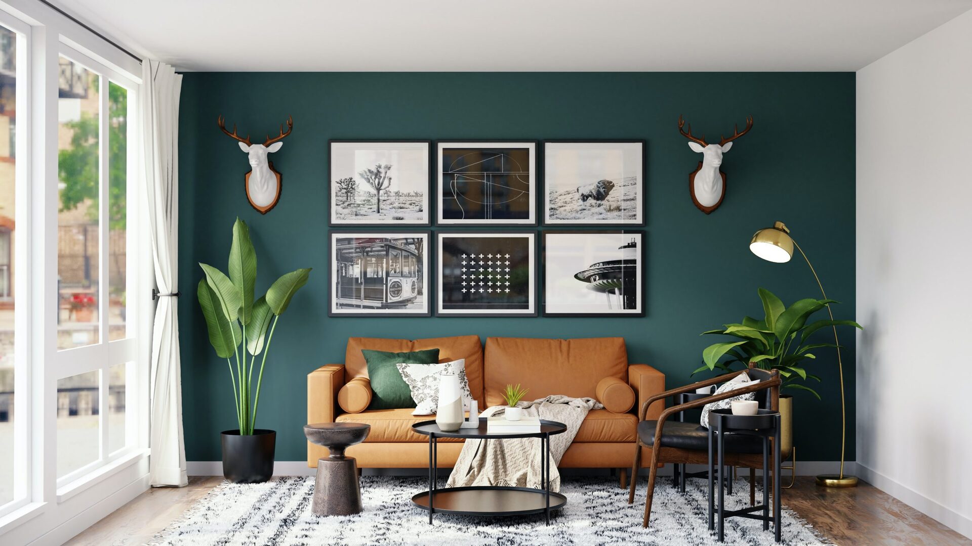
- Dark brown: Dark brown, similar to black, can make a living room feel heavy and closed-off. It has a tendency to absorb light and create a dull and somber atmosphere. If you still want to incorporate brown, opt for lighter shades or use it in furniture and decor pieces rather than on the walls.
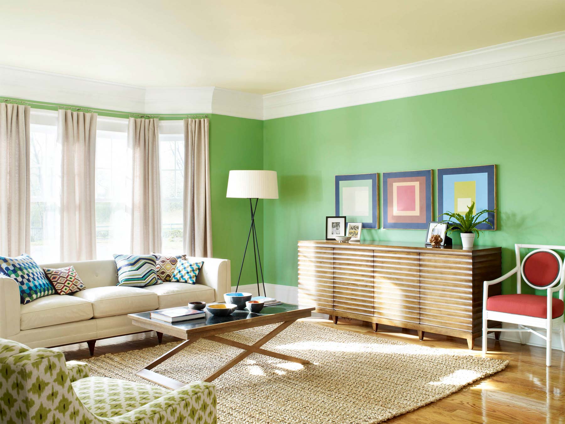
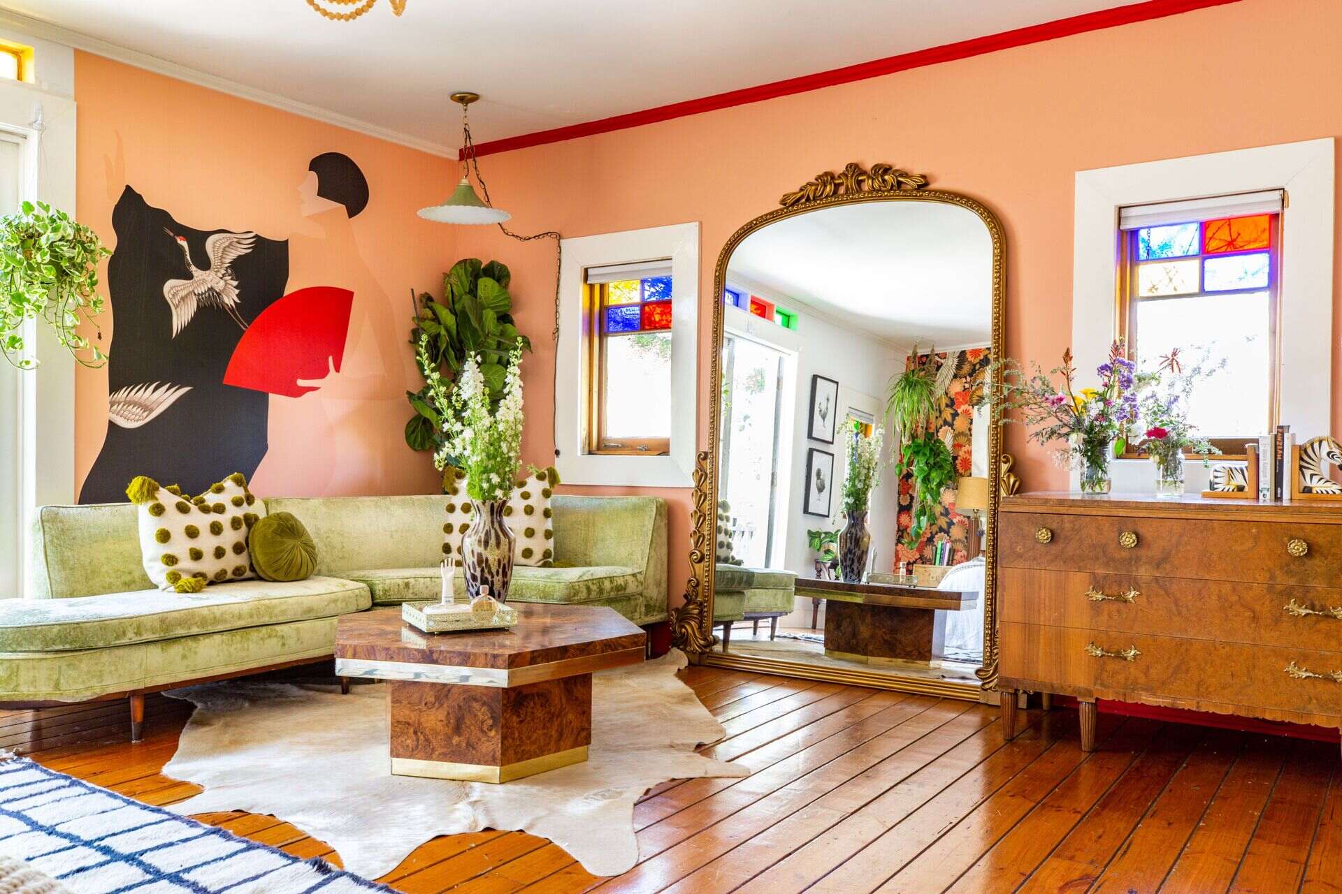
- Neon or bright colors: While bright colors can add a fun and playful touch to a room, using neon or overly vibrant colors for your living room walls can quickly become overwhelming and distracting. These colors may create a harsh and unnatural look, making it difficult to relax and unwind in the space.
- Pure white: While white can evoke a clean and minimalist aesthetic, painting your entire living room in pure white can make the space feel sterile and devoid of personality. Additionally, white walls tend to highlight imperfections and can easily show signs of wear and tear.
Remember, these color suggestions are not absolute rules, but rather considerations based on how these colors may impact the ambiance and mood of your living room. It’s always a good idea to test paint samples on your walls and observe them under different lighting conditions to see how they look in your specific space.
Ultimately, the goal is to create a living room that reflects your personal style, promotes relaxation, and provides a comfortable environment for you and your guests. By avoiding certain colors that may detract from these objectives, you can create a more enjoyable and visually appealing living room.
Now, let’s conclude our exploration of color choices for your living room.
Red
Red is a bold and vibrant color that can bring warmth and energy to a space. However, when it comes to painting your living room, red is a color to approach with caution. While it can create a stimulating and passionate atmosphere, intense shades of red can be overpowering and may not be suitable for a relaxing living room environment.
One of the main concerns with using red as the primary color for your living room walls is its ability to evoke strong emotions. Red is associated with energy, excitement, and passion, but it can also increase heart rate and blood pressure. Too much red in a space can create a sense of agitation and restlessness, making it challenging to unwind and relax.
If you’re drawn to the warmth and vibrancy of red and still want to incorporate it into your living room, it’s best to use it as an accent color or in more subtle and muted shades. Consider painting one accent wall in a deep burgundy or using red in your furniture, artwork, or accessories to add pops of color without overwhelming the space.
Another factor to consider when using red is the size of your living room. In smaller spaces, intense shades of red can make the room feel even smaller and more confined. If you have a small living room, you may want to opt for lighter and softer shades of red or consider using red in smaller doses to avoid overpowering the space.
Additionally, the lighting in your living room can greatly impact how red appears on the walls. Natural light and artificial light sources can alter the intensity and tone of the color. It’s essential to consider how the lighting in your living room will interact with red before committing to it as the primary wall color.
In summary, while red can add a bold and energetic element to your living room, it’s important to use it thoughtfully and in moderation. Consider using red as an accent color or in softer shades to create a warm and inviting ambiance without overwhelming the space. Be mindful of the size of your living room and the lighting conditions to ensure you achieve the desired effect.
Now, let’s move on to the next color to avoid when painting your living room.
Avoid painting your living room with dark and intense colors like black or deep red, as they can make the space feel smaller and more closed in. Instead, opt for lighter and more neutral tones to create a spacious and inviting atmosphere.
Black
Black is a color associated with sophistication, elegance, and mystery. While it can be a striking choice for accessories or furniture pieces in a living room, using black as the primary color for your walls is generally not recommended. Painting your living room entirely in black can create a dark and gloomy atmosphere that may not be conducive to a welcoming and comfortable space.
One of the main challenges with using black on the walls is that it absorbs light rather than reflecting it. This can make your living room feel smaller and more cramped, especially in rooms with limited natural light. Black can also make a space appear heavy and can be visually overwhelming if used extensively.
If you are drawn to the elegance and drama of black, consider using it sparingly as an accent color or incorporating it in furniture, artwork, or decor pieces. This way, you can still achieve the desired sophisticated look without compromising the overall ambiance of your living room.
Another consideration when using black is the style and theme of your living room. While black can work well in certain design styles, such as modern or industrial, it may clash with other styles that favor lighter and brighter color palettes. It’s important to ensure that black fits seamlessly with the overall aesthetic of your living room and doesn’t create a stark contrast that feels out of place.
When using black, it’s crucial to pay attention to the balance of the space. Pairing black with lighter colors or incorporating elements of texture and pattern can help create a sense of harmony and prevent the room from feeling overly dark and dreary.
In summary, while black can add allure and sophistication to a living room, using it as the predominant color for your walls may not create the inviting and comfortable atmosphere you desire. Consider incorporating black as an accent color or in smaller doses to maintain balance and harmony in your space.
Now, let’s move on to the next color to avoid when painting your living room.
Dark Brown
Dark brown is a rich and earthy color that can create a warm and cozy ambiance in a living room. However, when using dark brown as the primary color for your walls, it’s important to exercise caution. While dark brown can add depth and warmth to a space, using it excessively can make your living room feel heavy and closed-off.
One of the main challenges with dark brown is its ability to absorb light. This can make your living room appear smaller and darker, especially in rooms with limited natural light. Dark brown walls can create a somber atmosphere that may not be conducive to a vibrant and welcoming living space.
If you are drawn to the richness of dark brown and still want to incorporate it into your living room, consider using it in moderation or as an accent color. Painting a single accent wall in dark brown can add a touch of warmth and create visual interest without overwhelming the space.
Another option is to balance the dark brown with lighter shades or incorporate elements of contrast through furniture, accessories, or artwork. Lighter colors can help counterbalance the darkness and create a sense of balance and harmony in your living room.
It’s also essential to consider the size of your living room when using dark brown. In smaller spaces, dark colors can make the room feel even more confined and cramped. If you have a small living room, it’s recommended to opt for lighter and more neutral colors that can create the illusion of a larger space.
In summary, while dark brown can add a sense of warmth and coziness to a living room, it’s crucial to use it in moderation and consider the overall balance of the space. Dark brown can create a somber and heavy atmosphere, so consider lighter shades or using it as an accent color to maintain a welcoming and comfortable environment in your living room.
Now, let’s move on to the next color to avoid when painting your living room.
Neon or Bright Colors
Neon and excessively bright colors can be visually striking and attention-grabbing, but they are generally not recommended for painting the walls of a living room. While these colors can add a fun and playful vibe to a space, using them extensively can quickly become overwhelming and visually exhausting in a living room setting.
One of the key concerns with neon or bright colors is their intensity and ability to overpower a room. These colors have a high saturation level, which can be visually fatiguing and may make it difficult to relax and unwind in the living room. They can create a sense of chaos and restlessness rather than a calming and inviting atmosphere.
Another factor to consider when using neon or bright colors is their tendency to become dated quickly. Trends and personal preferences change over time, and what may be fashionable today may lose its appeal in the future. Painting your living room in neon or bright colors can limit your flexibility in terms of design and may require frequent repainting to stay up to date with changing trends.
If you still want to incorporate neon or bright colors into your living room, it’s best to do so in smaller doses. Consider using these colors as accents through accessories, artwork, or soft furnishings. This way, you can add pops of color without overwhelming the space.
When incorporating neon or bright colors, it’s important to consider the overall balance and cohesion of the room. Pairing these colors with more neutral and subdued colors can help create a harmonious and visually pleasing environment.
In summary, while neon and bright colors can add excitement and energy to a space, using them excessively on your living room walls can create a visually overwhelming and unbalanced environment. It’s best to incorporate these colors as accents rather than as the primary wall color to maintain a welcoming and visually comfortable living room.
Now, let’s move on to the next color to avoid when painting your living room.
Read more: What Colors To Paint A Small Living Room
Pure White
While white is often associated with purity, cleanliness, and simplicity, painting your entire living room in pure white may not be the best choice. While white walls can create a minimalistic and airy aesthetic, it’s important to consider the potential drawbacks of using pure white as the primary color in your living room.
One of the main concerns with pure white walls is their tendency to appear sterile and lacking in personality. Without any other complementary colors or textures, a living room with pure white walls can feel cold and impersonal. It may lack the warmth and coziness that many people desire in their living spaces.
Another challenge with pure white walls is their susceptibility to showing dirt, scuffs, and imperfections more easily compared to other colors. This can require more frequent cleaning and maintenance to keep your living room looking pristine. If you have young children or pets, pure white walls may become impractical due to the constant risk of smudges and marks.
Additioally, pure white walls can create a lack of visual interest or focal points in your living room. Without any contrasting colors or design elements, the space may feel bland and uninspiring. It’s important to incorporate other colors or textures through furniture, artwork, or decor to create depth and visual appeal.
If you still want to embrace a predominantly white color scheme in your living room, consider using softer shades of white or off-white. These warmer white tones can add a touch of warmth and coziness to the space while still maintaining a clean and fresh aesthetic.
Additionally, you can create visual interest by incorporating different textures and materials in shades of white, such as textured wall panels, woven rugs, or upholstered furniture. This will add depth and variation to the room, preventing it from feeling one-dimensional.
In summary, while pure white walls can create a minimalistic and clean aesthetic, they may lack personality and coziness. Consider using softer shades of white or incorporating other colors and textures to add warmth and visual interest to your living room.
Now that we’ve covered the colors to avoid when painting your living room, let’s conclude our discussion.
Conclusion
The color you choose for your living room walls is a crucial decision that can greatly impact the overall look and feel of the space. It sets the tone, reflects your personality, and influences the mood and ambiance. While personal preference plays a significant role, considering certain factors and understanding the psychological effects of colors can guide you in making the right choice.
When selecting a paint color for your living room, factors such as room size and layout, natural light, existing furniture and decor, and the intended function of the room should be taken into consideration. By carefully evaluating these factors, you can choose a color that enhances the space and aligns with your personal style and preferences.
Understanding the psychological effects of colors is also crucial. Colors have the power to influence our emotions and moods. Whether you want to create a calm and relaxed atmosphere, a vibrant and energetic space, or something in between, choosing the right colors can help you achieve your desired ambiance.
While there are no strict rules when it comes to color choices, there are certain colors that are generally not recommended for painting your living room walls. Red, black, dark brown, neon or bright colors, and pure white are colors to approach with caution as they can have negative effects on the overall ambiance and may not create the desired atmosphere.
Ultimately, the goal is to create a living room that reflects your personal style, promotes relaxation, and provides a comfortable environment for you and your guests. By considering the factors mentioned and understanding the psychological effects of colors, you can make an informed decision when choosing the color for your living room walls.
Remember, it’s your living room, and your color choice should align with your preferences and create a space that you enjoy spending time in. Experiment with different colors, test paint samples, and trust your instincts to find the perfect color that will transform your living room into a stunning and inviting space.
Frequently Asked Questions about What Color Should You Not Paint Your Living Room?
Was this page helpful?
At Storables.com, we guarantee accurate and reliable information. Our content, validated by Expert Board Contributors, is crafted following stringent Editorial Policies. We're committed to providing you with well-researched, expert-backed insights for all your informational needs.

0 thoughts on “What Color Should You Not Paint Your Living Room?”