Home>Interior Design>5 Colors You Should Never Paint A Small Room – Designers Warned
Interior Design
5 Colors You Should Never Paint A Small Room – Designers Warned
Modified: December 7, 2023
Discover the 5 colors that interior designers warn against painting small rooms. Get expert advice on maximizing your space.
(Many of the links in this article redirect to a specific reviewed product. Your purchase of these products through affiliate links helps to generate commission for Storables.com, at no extra cost. Learn more)
Introduction
When it comes to interior design, color plays a crucial role in creating the desired atmosphere and aesthetic appeal of a room. However, when dealing with small rooms, the choice of color becomes even more important. The right color palette can make a small space appear larger and more inviting, while the wrong colors can have a negative impact, making the room feel cramped and claustrophobic.
In this article, we will delve into the world of interior design and explore five colors that designers advise against using in small rooms. By avoiding these colors, you can ensure that your small space feels open, airy, and visually appealing.
Key Takeaways:
- Choose lighter shades for small rooms to create a sense of openness and brightness. Balance warm and cool tones for a visually spacious and inviting atmosphere.
- Use bold colors and patterns as accents, not as the main color scheme, to add depth and excitement without overwhelming the space. Balance is key!
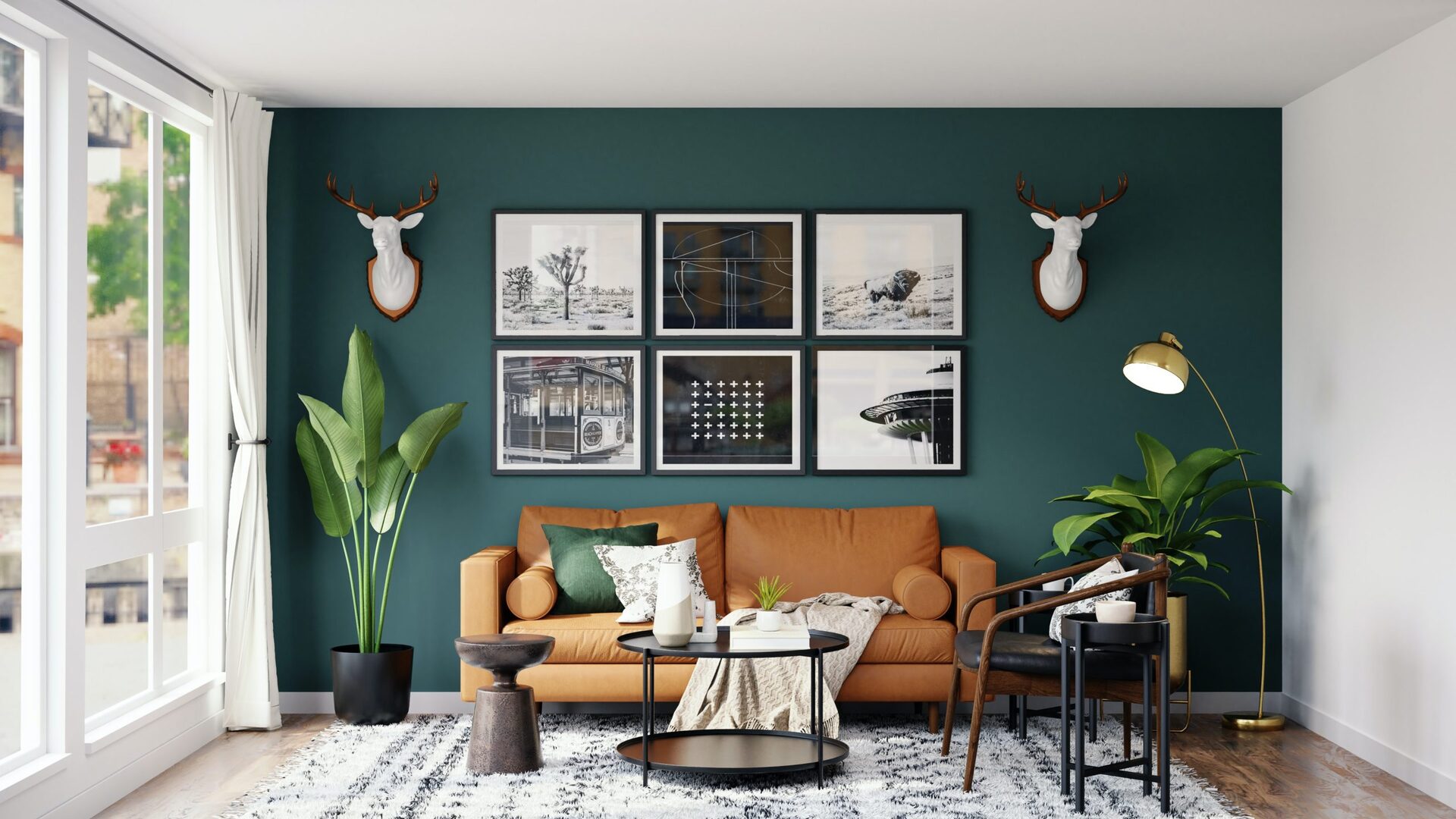
Dark Colors
While dark colors can add drama and sophistication to a room, they generally aren’t recommended for small spaces. Dark colors tend to absorb light, making the room feel smaller and more confined. Additionally, dark colors can make a room appear gloomy and less inviting.
When choosing colors for a small room, opt for lighter shades instead. Lighter colors reflect more light and create an illusion of a larger space. Pastel shades, soft neutrals, and pale hues are excellent choices that can make a small room feel brighter and more open.
If you still want to incorporate darker colors into your small space, consider using them as accent colors rather than as the main color scheme. You can use dark colors for furniture, accessories, or accent walls to add depth and contrast without overwhelming the room.
Remember, the goal is to create a sense of openness and lightness, and using dark colors excessively can hinder that objective.
Too Bright Colors
While bright and vibrant colors can add energy and excitement to a room, they can also make a small space feel overwhelming and claustrophobic. Bold shades such as neon yellow, electric blue, or fiery red can be visually stimulating, but when used excessively in a small room, they can create a sense of discomfort and chaos.
Instead of opting for overly bright colors, consider using softer and more muted tones. Pastels, muted shades, and earthy tones can still inject personality into your small space without overpowering it. These colors can create a more calming and harmonious atmosphere, making the room feel more spacious and balanced.
If you still want to incorporate some pops of bright color, do so sparingly as accents. Use vibrant colors for accessories, throw pillows, or artwork. This way, you can add a touch of excitement without overwhelming the room.
Remember, the key is to strike a balance between vibrant and soothing colors in order to create a visually pleasing and comfortable environment in your small room.
Bold Patterns
While patterns can add interest and personality to a room, using bold and busy patterns in a small space can be overwhelming. Large-scale patterns, intricate designs, and busy prints can visually clutter a small room and make it feel crowded.
Instead, opt for smaller-scale patterns or more subtle designs that can create visual interest without overwhelming the space. Delicate patterns, understated stripes, or subtle textures can add depth and style to your small room without making it feel cramped.
If you have a penchant for bold patterns, consider using them sparingly as accents rather than covering entire walls or furniture pieces. Use patterned throw pillows, curtains, or rugs to add a pop of excitement without overwhelming the space.
Remember, the goal is to create a visually balanced and harmonious environment. Too many bold patterns can create visual chaos and hinder the sense of openness in a small room.
Avoid painting a small room with dark colors like black, navy, or deep red, as they can make the space feel even smaller. Also, steer clear of bright, intense colors that can be overwhelming in a small space. Stick to light, neutral tones to create the illusion of a larger room.
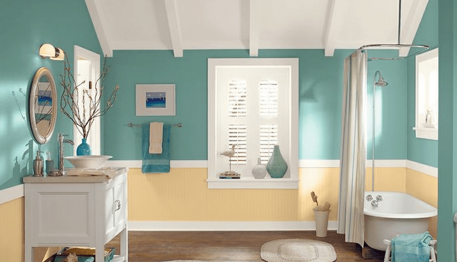
Cool Tone Colors
Cool tones, such as blues and greens, can create a calming and soothing atmosphere in a room. However, when used in abundance in a small space, they can make the room feel chilly and uninviting.
Cool tone colors have a tendency to recede and create an illusion of space. While this can be beneficial in larger rooms, it can make a small room feel even smaller. If you still want to incorporate cool tones into your small space, consider using them as accents rather than as the dominant color scheme.
Opt for warmer neutral colors as the main backdrop of your small room. Shades of beige, cream, or warm grays can create a cozy and welcoming atmosphere while visually expanding the space. You can then use cool tones in small doses through accessories, artwork, or textiles to add a touch of tranquility and visual interest.
By balancing warm and cool tones, you can create a more inviting and visually spacious environment in your small room.
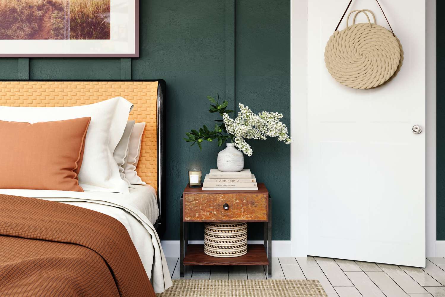
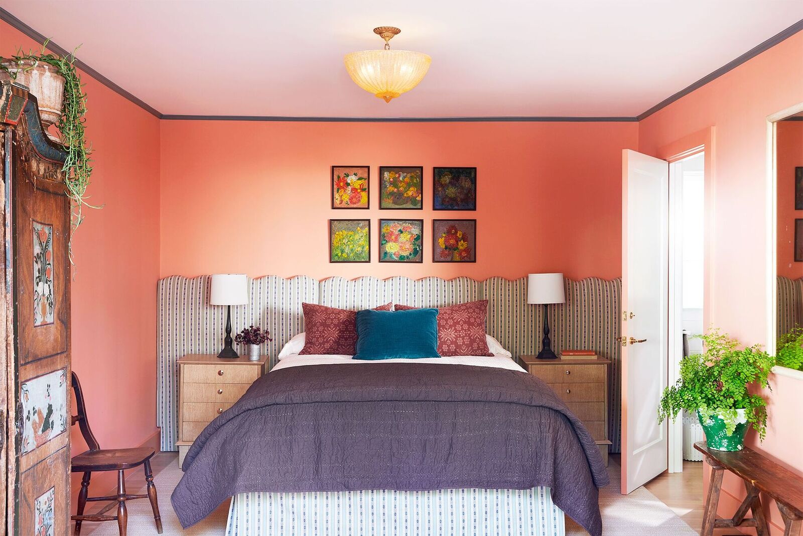
Overly Warm Tone Colors
While warm tone colors can evoke a sense of coziness and intimacy, using overly warm tones in a small room can make it feel cramped and smaller than it actually is. Colors such as deep reds, oranges, or rich yellows can create a visually heavy and claustrophobic effect.
Instead of using excessive warm tones, opt for softer and lighter warm colors. Lighter shades of peach, coral, or pale yellow can still create a warm and inviting atmosphere without overwhelming the space.
Remember, the goal is to create a sense of openness and airiness in a small room. Balancing warm and cool tones can achieve this. Use warm tones as accents or in moderation to add depth and visual interest without overpowering the space.
Additionally, consider using neutral or cool tone colors as the main backdrop of your small room. These colors can help create a sense of balance and prevent the room from feeling too cramped.
Remember, when working with warm tone colors in a small room, less is often more. Use them strategically and in moderation to create a cozy and visually spacious environment.
Conclusion
When it comes to painting a small room, the choice of colors can greatly impact its overall look and feel. By avoiding certain colors, you can ensure that your small space feels open, airy, and visually appealing.
Dark colors tend to make a room feel smaller and gloomier. Opt for lighter shades that reflect light and create a sense of spaciousness. Too bright colors can overwhelm a small room, so choose softer and more muted tones instead. Bold patterns can clutter the visual space, so opt for smaller-scale patterns or subtle designs. Cool tone colors can make a small room feel chilly, so balance them with warmer neutrals. Lastly, overly warm tone colors can create a visually heavy and cramped effect, so use them sparingly and balance them with other tones.
Remember, the key is to create a sense of balance and harmony in your small room. Use colors strategically as accents and choose a main color palette that allows the space to feel open and inviting. By considering these color choices and following the advice of designers, you can transform your small room into a stunning and visually appealing space.
So, before you start painting your small room, take the time to carefully consider your color choices. Remember that the right colors can make all the difference in creating a room that feels comfortable, spacious, and aesthetically pleasing.+
Frequently Asked Questions about 5 Colors You Should Never Paint A Small Room – Designers Warned
Was this page helpful?
At Storables.com, we guarantee accurate and reliable information. Our content, validated by Expert Board Contributors, is crafted following stringent Editorial Policies. We're committed to providing you with well-researched, expert-backed insights for all your informational needs.


0 thoughts on “5 Colors You Should Never Paint A Small Room – Designers Warned”