Home>Interior Design>5 Colors You Should Never Paint Your Living Room
Interior Design
5 Colors You Should Never Paint Your Living Room
Modified: August 26, 2024
Looking for interior design tips? Find out which 5 colors you should never paint your living room for a stylish and inviting space.
(Many of the links in this article redirect to a specific reviewed product. Your purchase of these products through affiliate links helps to generate commission for Storables.com, at no extra cost. Learn more)
Introduction
When it comes to interior design, one of the most important decisions you’ll make is the choice of colors for your living room. The color scheme sets the tone for the entire space and can greatly impact the overall mood and atmosphere. While there is a wide range of colors to choose from, there are a few colors that are best avoided in your living room. These colors can have a negative effect on the energy, aesthetics, and functionality of the space. In this article, we will explore five colors that you should never paint your living room.
Choosing the right colors for your living room is essential to create a harmonious and inviting environment. While personal preference plays a significant role, it’s important to consider the impact of colors on your mood and the overall design scheme. By avoiding certain colors, you can ensure that your living room remains a stylish and comfortable space that reflects your unique tastes and personality.
So, let’s dive into the colors that should be avoided when painting your living room.
Key Takeaways:
- Avoid white, black, neon/fluorescent colors, red, and brown as primary living room paint colors. Use them sparingly as accents to create a balanced, inviting, and visually appealing space.
- Incorporate warmer shades and off-white tones for a cozy and inviting living room. Use colors strategically and in moderation to enhance the overall design without dominating it.
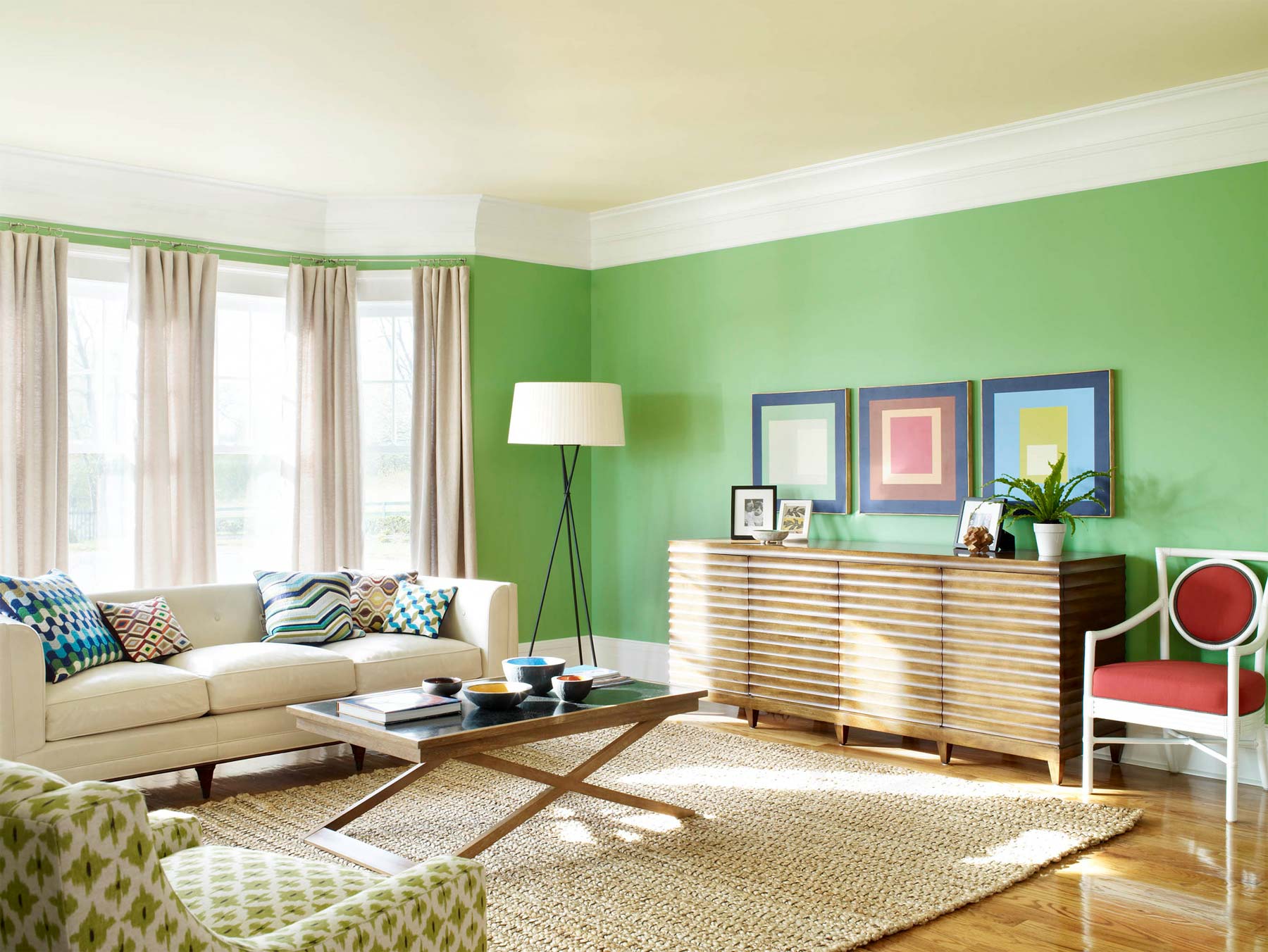
White
While white may seem like a safe and neutral color choice, it can actually be problematic when used excessively in a living room. The use of pure white walls or furniture can create a cold and sterile atmosphere that lacks warmth and personality. Additionally, white surfaces are prone to showing dirt, stains, and smudges more easily, requiring frequent cleaning and maintenance.
Another drawback of white is that it can make a space feel too bright and glaring, especially if there is an abundance of natural light. This can be particularly uncomfortable during sunny days when the intense brightness can create an unpleasant glare that strains the eyes. When choosing colors for your living room, consider using warmer shades or off-white tones to maintain a cozy and inviting ambiance.
However, this doesn’t mean that you should completely avoid white in your living room. White can be used effectively as an accent color or as part of a balanced color palette. For example, you can incorporate white through stylish furniture pieces, textiles, or accessories to add a touch of elegance and sophistication to your living room. The key is to use white strategically and in moderation, ensuring that it enhances the overall design rather than dominating it.
Black
While black can be a stylish and sophisticated color choice, it should be used sparingly and with caution in your living room. The excessive use of black can make a space feel gloomy, cramped, and even oppressive. It absorbs light rather than reflecting it, resulting in a dark and somber atmosphere.
Furthermore, black can make a living room appear smaller and more closed off, especially if the space is already limited in size. This can create a claustrophobic feeling and make the room feel unwelcoming. If you still want to incorporate black into your living room design, consider using it as an accent color rather than the dominant one.
To prevent the living room from feeling too dark and heavy, balance the black with lighter and brighter colors. This will create a sense of contrast and allow the black accents to stand out without overwhelming the space. Incorporate elements like white or light-colored furniture, accessories, and artwork to create a well-balanced and visually appealing living room.
Additionally, consider the lighting in your living room when using black. Adequate lighting is crucial to offset the darkness and create a more inviting and comfortable atmosphere. Incorporate a variety of light sources such as ceiling lights, floor lamps, table lamps, and wall sconces to ensure that the black elements are properly illuminated.
Avoid painting your living room with bright neon colors as they can be overwhelming. Also, steer clear of dark, gloomy colors like black or deep brown, as they can make the space feel smaller and less inviting.
Neon or Fluorescent Colors
Neon and fluorescent colors may be eye-catching and trendy, but they are generally not the best choice for painting your living room. These vibrant and intense colors can easily overpower the space and create a chaotic and overwhelming environment. They can be visually exhausting, especially when used in large quantities or on large surfaces.
One of the main concerns with neon and fluorescent colors is their impact on the mood and atmosphere of the room. These bright, bold colors are known to evoke feelings of energy and excitement, which may not be suitable for a space dedicated to relaxation and comfort. Living rooms are often used for unwinding, entertaining guests, or spending quality time with family, so it’s important to create an ambiance that promotes a sense of calm and serenity.
Instead, opt for more subdued and soothing colors that evoke a sense of tranquility, such as pastels or earthy tones. These colors can create a more welcoming and peaceful atmosphere in your living room, allowing you to fully enjoy your time spent in the space.
If you still want to incorporate neon or fluorescent colors into your living room, consider using them as accent colors rather than the main color scheme. Use them sparingly on decorative items, such as throw pillows, artwork, or small accessories, to add pops of color and create visual interest. This way, you can enjoy the vibrancy of these colors without overwhelming the space.
Remember, moderation is key when using neon or fluorescent colors. By using them strategically and in small doses, you can create a dynamic and visually appealing living room without sacrificing comfort and tranquility.
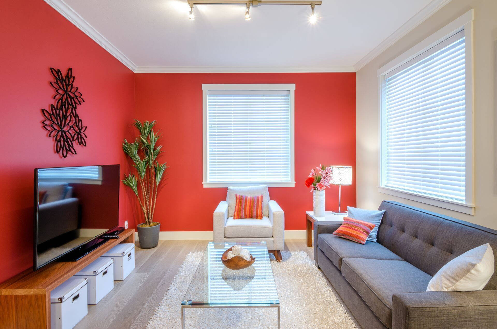
Red
Red is a powerful and stimulating color that can add energy and excitement to a space. However, it is generally not recommended to paint your entire living room in red. This bold and intense color can be overwhelming and may create a sense of agitation or restlessness.
One of the reasons red is not ideal for a living room is because it can be visually overpowering. The eye is naturally drawn to red, and having large expanses of this color can make the room feel smaller and more confined. It can also dominate the space, making it difficult to incorporate other colors and decorative elements.
Furthermore, red is known to increase heart rate and blood pressure, making it less suitable for a room that is meant for relaxation and socializing. While a touch of red can add warmth and vibrancy to your living room, it’s important to use it in moderation and balance it with calming, neutral colors.
If you’re still drawn to the idea of incorporating red into your living room, consider using it as an accent color or in smaller doses. Use red in decorative elements like throw pillows, curtains, or artwork to create pops of color and visual interest. This allows you to enjoy the passionate and energetic qualities of red without overwhelming the room.
Alternatively, you can use different shades of red, such as muted or earthy tones, to create a more subdued and sophisticated look. These softer shades can create a warm and inviting atmosphere without being overly stimulating.
Remember, the goal is to strike a balance between creating a visually appealing living room and maintaining a comfortable and inviting space. By using red strategically and in moderation, you can achieve a harmonious and stylish living room design.
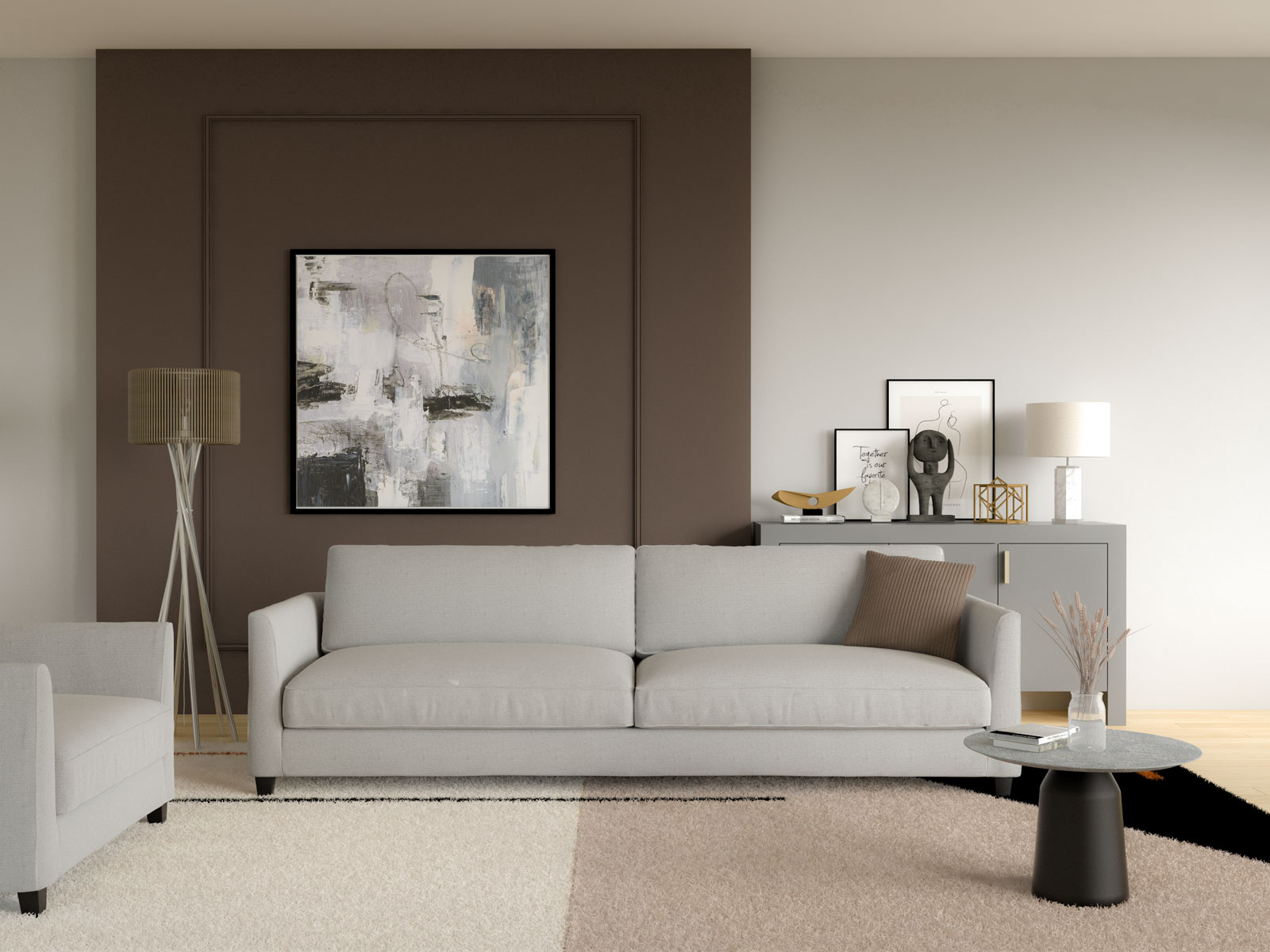
Brown
Brown is a versatile and timeless color that can create a cozy and warm atmosphere in a living room. However, it’s important to use brown in moderation and with careful consideration. When overused or used in the wrong way, brown can make a living room feel dull, heavy, and uninspiring.
The main concern with brown is that it can make a space appear dark and gloomy, especially when used on walls or large furniture pieces. This can be particularly problematic if your living room has limited natural light or if the room is already on the smaller side. To avoid this, consider using lighter shades of brown or incorporating brown as an accent color rather than the main color scheme.
Add pops of brown through elements like wooden furniture, flooring, or decorative accessories to create warmth and texture in your living room. Pairing brown with lighter colors, such as cream or beige, can help balance the darkness and create a more inviting and visually appealing space.
Additionally, consider the overall style and theme of your living room when using brown. Different shades of brown can evoke different moods and complement various design schemes. For a modern and sleek look, opt for darker shades of brown with clean lines and minimalistic furniture. For a more rustic or traditional feel, use warmer shades of brown with distressed or vintage-inspired furniture.
It’s also worth noting that brown can be a bit predictable and safe when used excessively. While it can create a cozy and comforting ambiance, it’s important to add touches of other colors to prevent the living room from feeling monotonous. Incorporate pops of color through accessories, artwork, or accent furniture to create visual interest and a sense of personality.
Remember, the key is to strike a balance between creating a warm and inviting living room and preventing it from feeling heavy or boring. By using brown strategically and complementing it with other colors and textures, you can create a stylish and welcoming space for you and your guests to enjoy.
Frequently Asked Questions about 5 Colors You Should Never Paint Your Living Room
Was this page helpful?
At Storables.com, we guarantee accurate and reliable information. Our content, validated by Expert Board Contributors, is crafted following stringent Editorial Policies. We're committed to providing you with well-researched, expert-backed insights for all your informational needs.


0 thoughts on “5 Colors You Should Never Paint Your Living Room”