Home>Interior Design>5 Colors You Should Never Paint Your Entryway
Interior Design
5 Colors You Should Never Paint Your Entryway
Modified: August 26, 2024
Discover the top 5 colors to avoid when painting your entryway and create a stunning interior design.
(Many of the links in this article redirect to a specific reviewed product. Your purchase of these products through affiliate links helps to generate commission for Storables.com, at no extra cost. Learn more)
Introduction
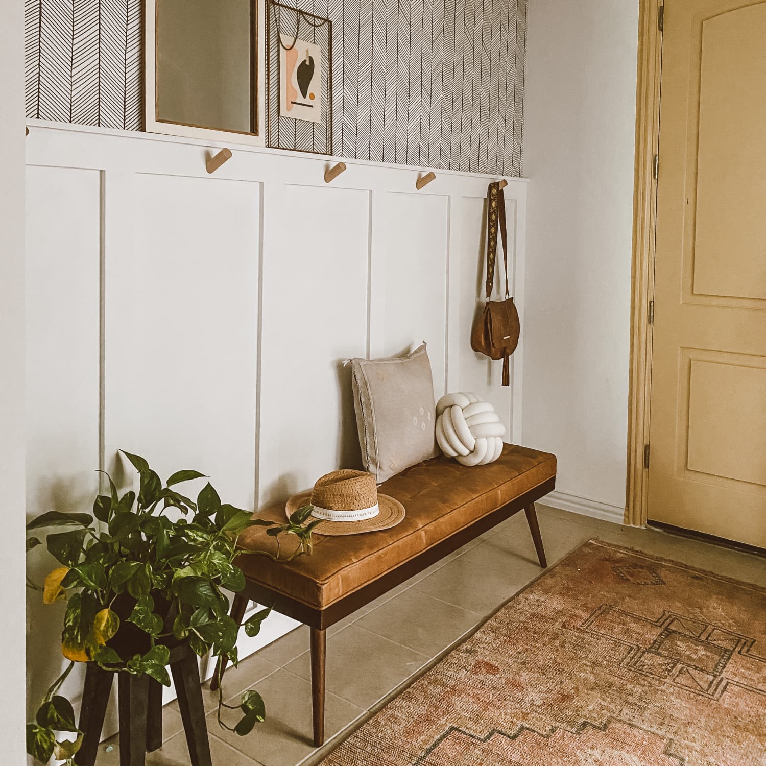
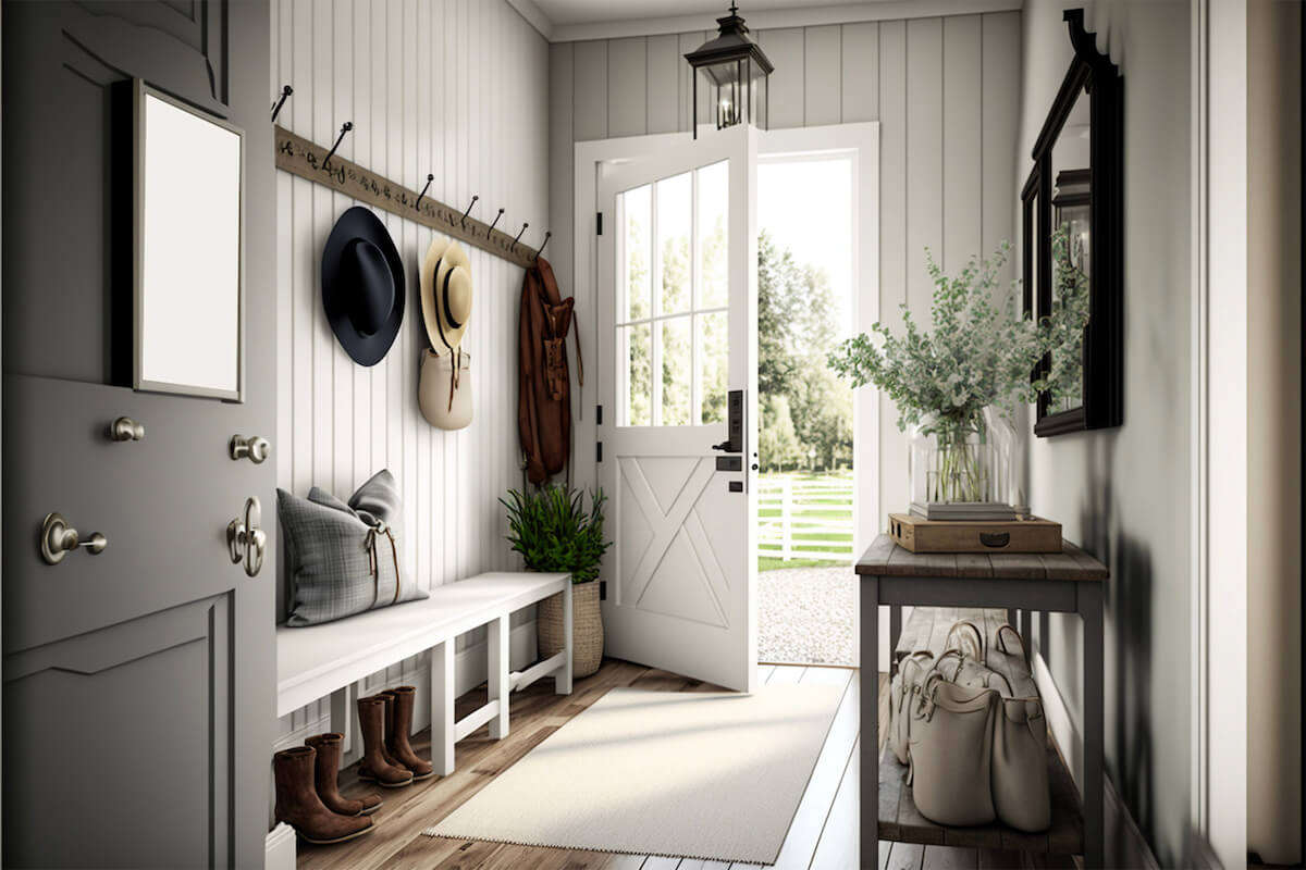
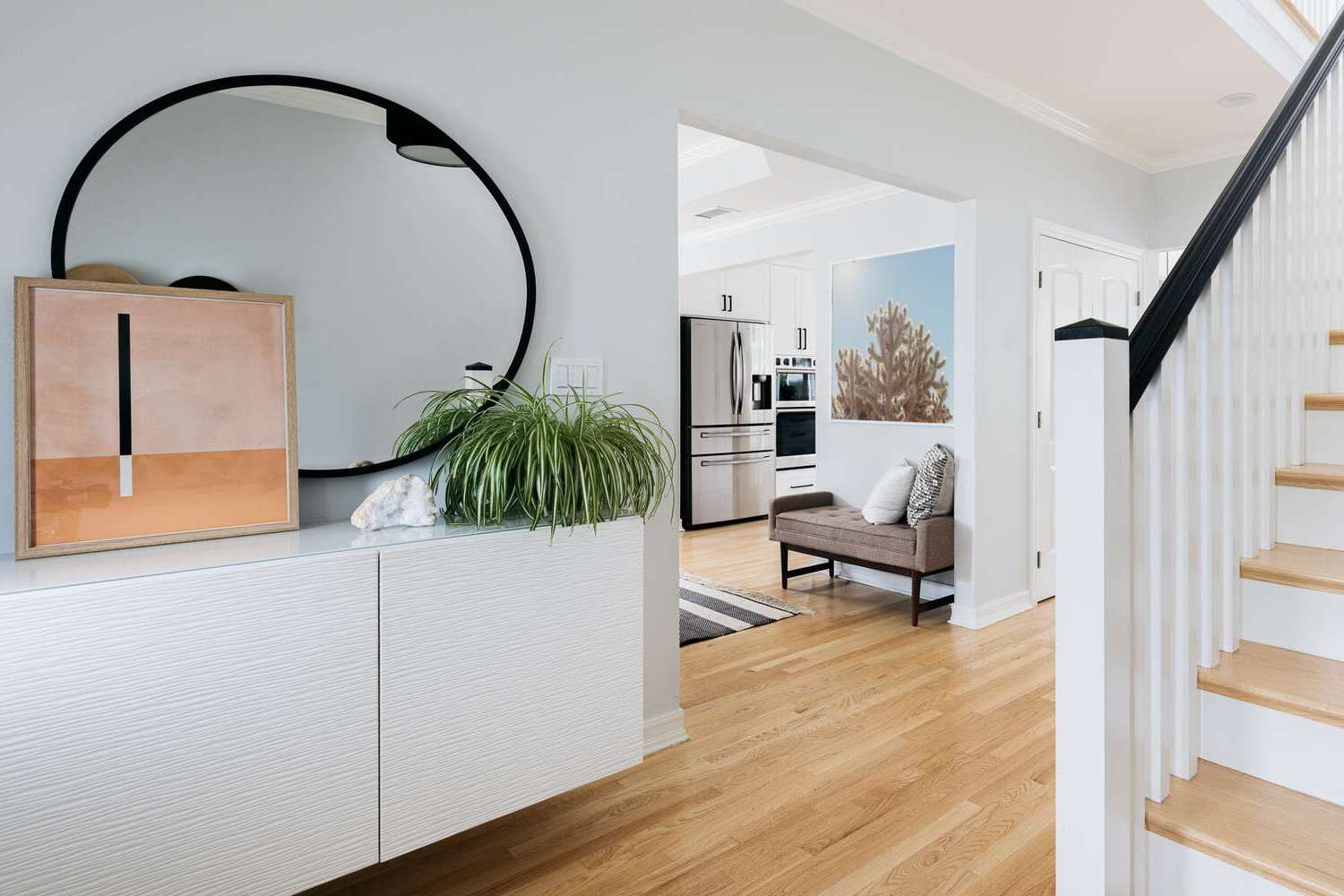
When it comes to interior design, choosing the right colors can significantly impact the overall look and feel of a space. Each color has its own unique psychological and emotional effects, making it crucial to consider the purpose and ambiance you want to create in each room. The entryway, in particular, sets the tone for the entire home, as it is the first impression your guests will have when they step inside.
In this article, we will explore five colors that you should avoid painting your entryway. While these colors may be eye-catching or trendy, they can have negative effects on the overall atmosphere and energy of your home.
Key Takeaways:
- Choose calming and soothing colors for your entryway to create a welcoming and tranquil environment. Soft neutral tones, cool blues, gentle greens, or warm earthy shades can set the right tone for your entire home.
- Avoid overwhelming and visually chaotic colors like red, black, neon green, bright orange, and metallic gold in your entryway. Use them as accents or in a toned-down form to achieve the desired effect.
Red
Red is often associated with energy, passion, and excitement. While it can be a bold and vibrant color, using red in your entryway may not be the best choice. Red has a tendency to create feelings of intensity and aggression, which may not be the desired atmosphere as soon as you walk through the front door.
Additionally, red can be overwhelming and may make the space feel smaller and more confined. In an area that is meant to be welcoming and open, it’s essential to create a sense of spaciousness and relaxation. Opting for softer, cooler tones instead can contribute to a more inviting and calming environment.
The exception to this rule is if you have carefully balanced the use of red with other neutral or complementary colors. For example, incorporating accents of red in artwork, furniture, or accessories can add a touch of vibrancy without overwhelming the space.
Black
Black is a color often associated with elegance, sophistication, and mystery. While it can be a stunning color choice in certain areas of your home, painting your entryway entirely black may not be the best idea. Black has a tendency to absorb light and can make a space feel smaller and more enclosed.
Entryways are typically smaller areas that benefit from a sense of openness and brightness. Painting the walls black can create a gloomy and unwelcoming atmosphere. Guests may feel a sense of heaviness and darkness as soon as they step through the front door.
However, this doesn’t mean that you should completely avoid using black in your entryway. Instead, consider incorporating black in smaller doses, such as through furniture, accents, or accessories. This can add a touch of sophistication without overwhelming the space.
Alternatively, if you still want to create a dramatic look in your entryway, consider using a dark charcoal gray instead. This color can provide depth and richness without the harshness of pure black, allowing you to achieve a stylish and welcoming entryway.
Neon Green
Neon green is a color that is often associated with energy, youthfulness, and a bold statement. While it may be a trendy color choice for accents or accessories, using neon green as the main color for your entryway can be overwhelming and jarring.
Neon green has a high level of brightness and can be visually distracting. When used in large amounts, it can create a chaotic and disorganized look, which is not ideal for an entryway. The purpose of an entryway is to provide a sense of calm and order as you enter your home.
In addition, neon green can be a challenging color to coordinate with other elements in your home decor. Finding complementary colors and accessories that work well with neon green may be tricky, making it more difficult to create a cohesive and harmonious look in your entryway.
Instead, consider using a more muted or toned-down shade of green for your entryway. Colors like sage green or olive green can still add a touch of freshness and tranquility, without overwhelming the space. These shades of green can create a soothing and natural ambiance, making your entryway feel welcoming and serene.
Avoid painting your entryway in bright neon colors, as they can be overwhelming and off-putting. Similarly, avoid dark, gloomy colors that can make the space feel unwelcoming. Stick to neutral, inviting tones like soft blues, greens, or warm neutrals.
Bright Orange
Bright orange is a color that exudes energy, warmth, and enthusiasm. While it can be an attention-grabbing hue, using bright orange in your entryway may not be the best choice. This vibrant color has the potential to create a visually overwhelming and chaotic atmosphere.
The purpose of an entryway is to create a sense of calm and welcome as you enter your home. Bright orange can have the opposite effect, creating a sense of restlessness and hyperactivity. This may not be the ideal ambiance to start and end your day.
Additionally, bright orange can be a difficult color to coordinate with other elements of your entryway decor. Finding complementary colors and accessories that work well with bright orange may prove challenging, making it difficult to create a cohesive and harmonious look.
Instead of using bright orange, consider opting for softer and more muted shades like terracotta or burnt orange. These warm tones can still add a touch of coziness and warmth to your entryway without overwhelming the space.
If you still want to incorporate hints of orange in your entryway, consider using it as an accent color rather than the main hue. This way, you can achieve a subtle pop of energy and vibrancy without sacrificing the overall calm and welcoming atmosphere.
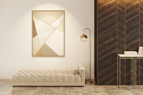
Metallic Gold
Metallic gold is a color often associated with luxury, opulence, and grandeur. While it can be a stunning choice for accents or accessories, using metallic gold as the main color for your entryway may not be the best idea.
Metallic gold has a high level of brightness and reflectivity, which can create a visually overwhelming and distracting space. It can also give off a gaudy or tacky appearance if not used in moderation. The purpose of an entryway is to create a welcoming and inviting atmosphere, and an excessive use of metallic gold can create a sense of ostentation rather than elegance.
Furthermore, metallic gold can be challenging to coordinate with other elements in your entryway. Finding complementary colors and accessories that work well with metallic gold may be difficult, making it challenging to achieve a cohesive and harmonious look.
If you still want to incorporate a touch of gold in your entryway, consider using it as an accent color instead. Pairing metallic gold with neutral tones like white, gray, or beige can create a sophisticated and elegant look. This way, you can achieve a subtle and tasteful touch of luxury without overwhelming the space.
Alternatively, you can consider using warm metallic tones like bronze or copper. These colors still offer a sense of elegance and richness without the overwhelming brightness of metallic gold.
Ultimately, the goal when choosing colors for your entryway is to create a welcoming and calming atmosphere. By opting for softer, more soothing hues, you can ensure that your entryway sets the right tone for your entire home.
Conclusion
Choosing the right color for your entryway is essential in creating the desired ambiance and setting the tone for your entire home. While there are countless color options to consider, it’s important to avoid certain colors that may have a negative impact on the overall atmosphere.
Colors like red, black, neon green, bright orange, and metallic gold can all present challenges when used in the entryway. They can create an overwhelming, unwelcoming, or visually chaotic environment. However, this doesn’t mean that you should completely avoid these colors. With careful planning and consideration, you can incorporate them as accents or in a toned-down form to achieve the desired effect.
When deciding on a color for your entryway, think about the feeling you want to evoke when entering your home. Consider using calming and soothing colors that create a sense of relaxation and warmth. Soft neutral tones, cool blues, gentle greens, or warm earthy shades can all provide a welcoming and tranquil environment.
Remember, the entryway is the first impression guests have of your home, so it’s crucial to make it inviting and appealing. By choosing the right colors, you can create an entryway that sets the stage for the style and atmosphere of the rest of your house.
Take the time to experiment with different color schemes, and don’t be afraid to consult with interior design professionals who can provide expert guidance. With thoughtful consideration and careful color selection, you can create an entryway that leaves a lasting positive impression on everyone who walks through the door.
Frequently Asked Questions about 5 Colors You Should Never Paint Your Entryway
Was this page helpful?
At Storables.com, we guarantee accurate and reliable information. Our content, validated by Expert Board Contributors, is crafted following stringent Editorial Policies. We're committed to providing you with well-researched, expert-backed insights for all your informational needs.


0 thoughts on “5 Colors You Should Never Paint Your Entryway”