Home>Interior Design>What Color Makes You Angry? The One Shade To Avoid Indoors
Interior Design
What Color Makes You Angry? The One Shade To Avoid Indoors
Modified: December 7, 2023
Discover the one shade of color you should avoid using in your interior design as it can make you feel angry. Find out more about color psychology and create a harmonious indoor space.
(Many of the links in this article redirect to a specific reviewed product. Your purchase of these products through affiliate links helps to generate commission for Storables.com, at no extra cost. Learn more)
Introduction
The world of interior design is about more than just aesthetics. It’s about creating spaces that evoke emotions, reflect personal style, and promote well-being. One element that plays a significant role in achieving these goals is color. The right combination of colors can enhance mood, stimulate creativity, and create a sense of harmony in any room.
Colors have a profound impact on our emotions and psychology. Scientific research and studies have shown that different colors can elicit different emotional responses. Understanding the psychology behind colors can help us make informed decisions when designing our living spaces.
Among the plethora of emotions that colors can evoke, anger is one that we generally want to avoid in our homes. No one wants to feel irritable, agitated, or tense while spending time in their own sanctuary.
In this article, we will delve into the psychology of anger, explore colors that can evoke this emotion, and identify the one shade to avoid indoors. We will also discuss how colors overall affect our mood indoors and provide tips on choosing calming colors for our interior spaces.
Key Takeaways:
- Avoid bright and intense shades of red in interior spaces to promote relaxation and tranquility, as they are associated with anger and aggression. Opt for calming colors like blues, greens, and neutrals for a serene ambiance.
- When incorporating soothing colors into your home, prioritize cool tones, lighter shades, and natural elements to create a harmonious and tranquil environment. Balance calming colors with personal style and consider the flow between rooms for a cohesive atmosphere.
The Impact of Colors on Emotions
Colors have a powerful influence on our emotions and can create a range of responses, from tranquility and happiness to excitement and anger. This phenomenon is rooted in our evolutionary past and has been studied extensively in the field of color psychology.
Each color carries its own symbolism and can evoke specific emotions and associations. For example, warm colors like red, orange, and yellow are often associated with energy, passion, and excitement, while cool colors like blue and green are associated with calmness, tranquility, and relaxation.
When it comes to evoking emotions like anger, certain colors have a greater impact. These colors stimulate our senses and can make us feel more agitated, irritable, or aggressive. Understanding which colors to avoid in interior spaces can help create a more peaceful and harmonious environment.
It is important to note that individual experiences and cultural backgrounds can also influence how we perceive colors. What may evoke anger in one person might have a different effect on another. However, certain colors have a more universal impact on our emotions.
Let’s explore the psychology behind anger and the colors that can trigger this strong emotion.
The Psychology of Anger
Anger is a natural human emotion that arises in response to perceived threats, injustices, or frustrations. It is a powerful and intense emotion that can vary in intensity from mild irritation to full-blown rage.
From a psychological perspective, anger serves as a defense mechanism, preparing us to confront or react to a threatening situation. It is a way for our bodies to mobilize energy and protect ourselves when we feel attacked or wronged.
However, while anger can be a normal response to certain situations, excessive or uncontrolled anger can have negative effects on our mental and physical well-being. It can strain relationships, impair judgment, and even lead to aggression or violence.
Various factors can influence how we experience and express anger. Personality traits, past experiences, and our overall emotional well-being all play a role. Additionally, environmental factors, such as the colors surrounding us, can influence the intensity and duration of our anger.
Colors have a direct impact on our emotions and can either amplify or dampen certain feelings. Understanding the colors that can trigger or exacerbate anger can help us create a more peaceful and balanced environment.
Let’s delve into the colors that evoke anger and should be avoided in our interior spaces.
Colors That Evoke Anger
While colors can elicit a wide range of emotions, there are certain shades that are more likely to evoke feelings of anger, aggression, or irritability. These colors have a stimulating effect on our minds and bodies, increasing our heart rate and blood pressure.
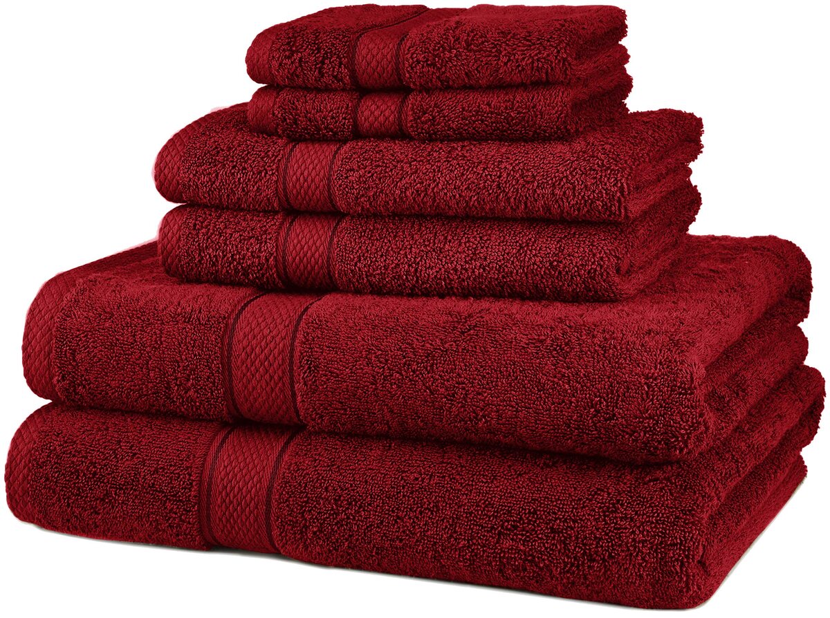
The color that most commonly comes to mind when we think of anger is red. Red is associated with strong emotions, power, and intensity. It can evoke feelings of anger, passion, and even aggression. Red has been shown to increase heart rate and stimulate adrenaline production, making it a color to be used sparingly in interior spaces.
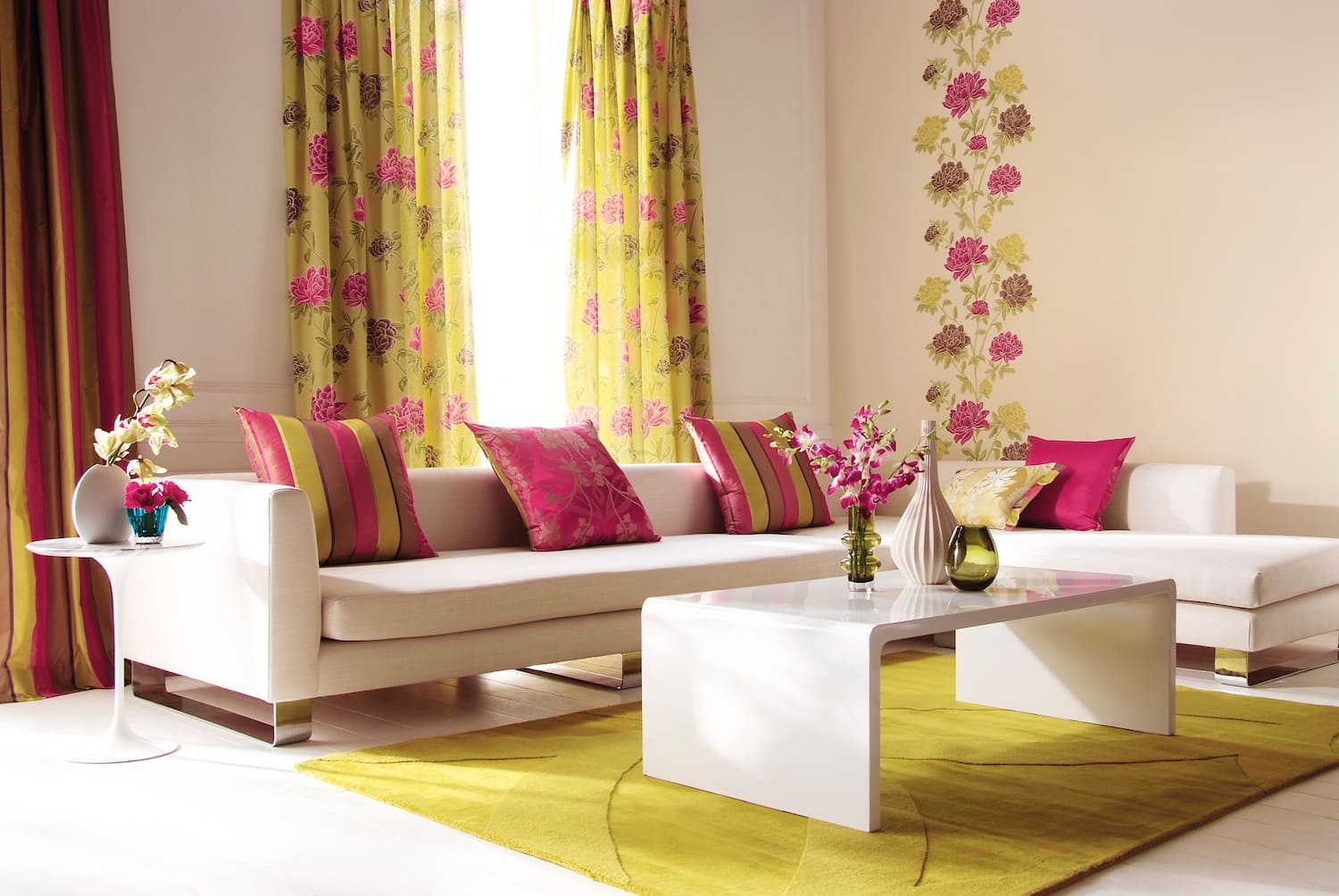
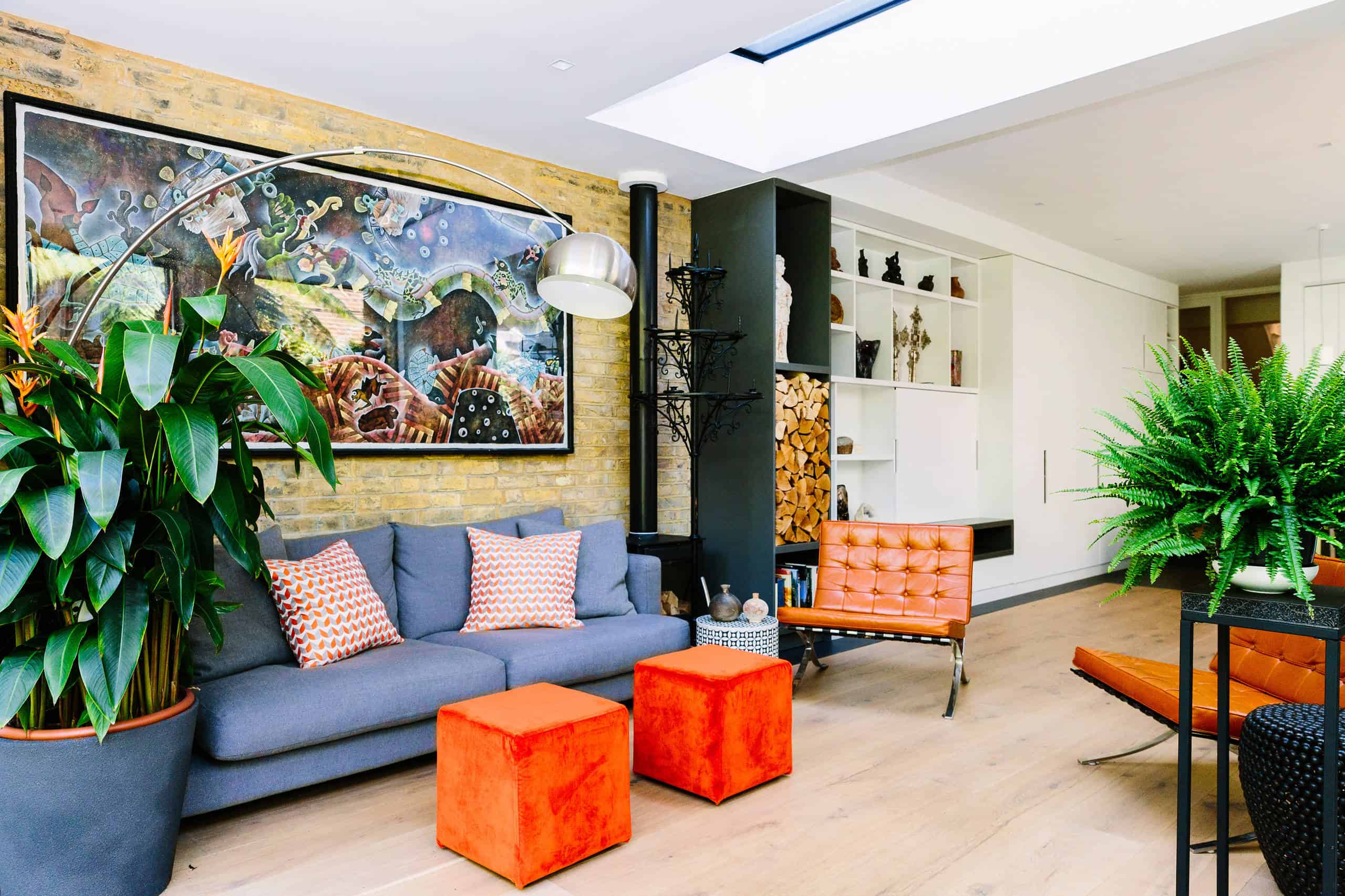
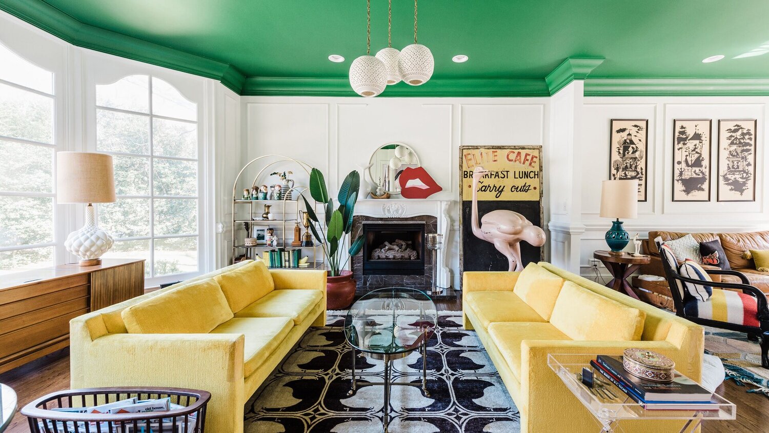
Another color that can trigger anger is orange. Like red, orange is a warm and vibrant color that stimulates energy and excitement. While it can be used to create a lively and playful atmosphere, excessive use of orange can lead to feelings of restlessness or irritability.
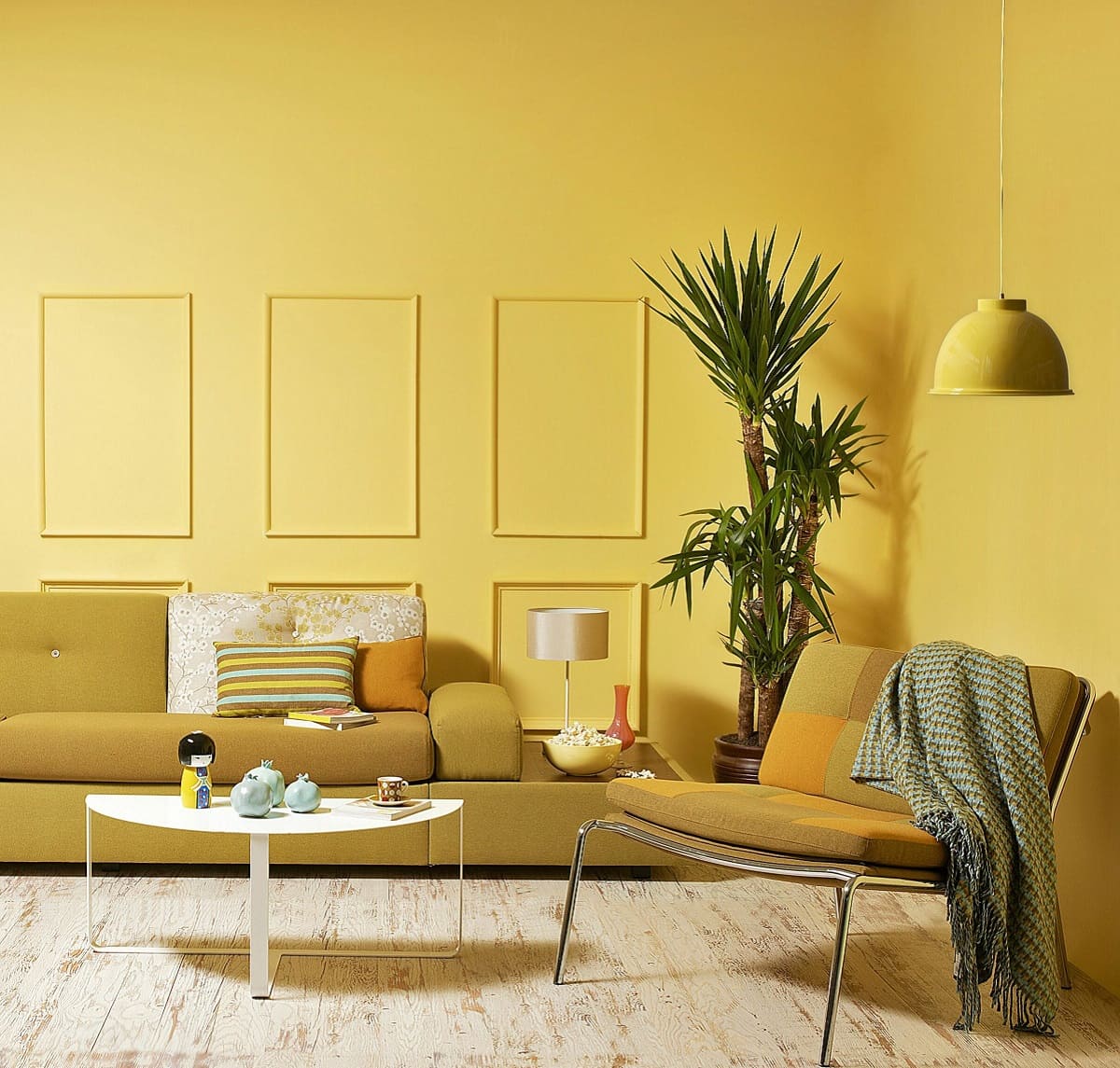
Yellow, often associated with happiness and optimism, can also evoke anger when used in abundance. Bright, vibrant shades of yellow can overstimulate our senses and make us feel overwhelmed or agitated.
It is important to note that the intensity and saturation of these colors can impact their emotional effect. Bolder and brighter shades have a stronger impact, while muted or desaturated tones can have a more subtle effect on our emotions.
While red, orange, and yellow are the primary colors associated with anger, it’s essential to consider individual preferences and cultural associations when selecting colors for interior spaces. Additionally, personal experiences and associations with specific colors can also influence their emotional impact.
While these colors may evoke anger, it doesn’t mean they should be completely avoided. When used strategically and in moderation, they can add depth and vibrancy to a space. However, it’s important to balance them with calming colors to create a harmonious environment.
The One Shade to Avoid Indoors
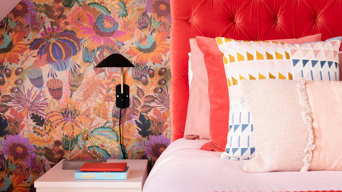
When it comes to creating a peaceful and relaxing atmosphere in your home, there is one shade that should be avoided due to its association with anger and aggression: bright and intense shades of red.
While red can be a powerful and bold color when used in the right context, using it excessively or in rooms where you want to promote a sense of calmness can have the opposite effect. Bright red walls or furniture pieces can create a feeling of tension and stimulation, making it difficult to unwind and relax.
Red is known to raise blood pressure, increase heart rate, and stimulate activity. It is a color that encourages action and excitement, which is not ideal for spaces like bedrooms, living rooms, or any area where you want to create a serene ambiance.
If you still want to incorporate touches of red into your interior design, consider using it as an accent color rather than a dominant hue. You can use red in accessories, such as pillows, artwork, or rugs, to add a pop of color without overwhelming the space.
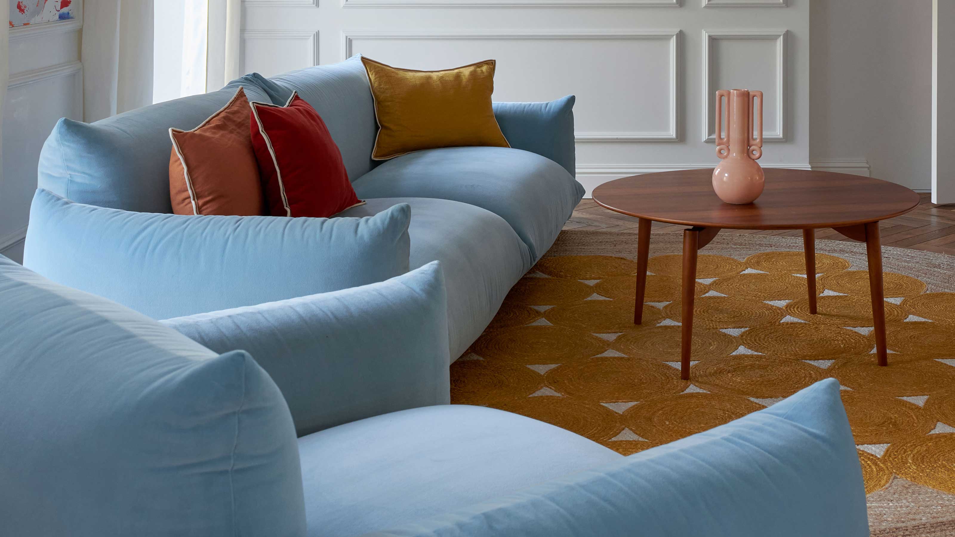
Instead, opt for soothing and calming colors that can help create a sense of tranquility. Colors like soft blues, light greens, and soothing neutrals such as beige and light gray are ideal for creating a relaxing environment.
By avoiding intense shades of red and choosing more calming colors for your home, you can create an atmosphere that promotes relaxation and better emotional well-being.
Remember that every individual’s perception of colors may differ, so it’s essential to consider personal preferences and cultural associations when selecting colors for your interior spaces.
Avoid using bright, intense shades of red, as this color is often associated with anger and can evoke strong emotions. Opt for calming, cool tones like blues or greens instead.
How Colors Affect Mood Indoors
Colors have a profound impact on our mood and emotions, and this effect can be harnessed to create specific atmospheres and evoke desired feelings within our interior spaces.
Warm colors like reds, oranges, and yellows can create a sense of energy, vibrancy, and warmth. These colors are known to stimulate the mind and body, making them suitable for areas where you want to encourage conversation and activity, such as dining rooms or creative workspaces.
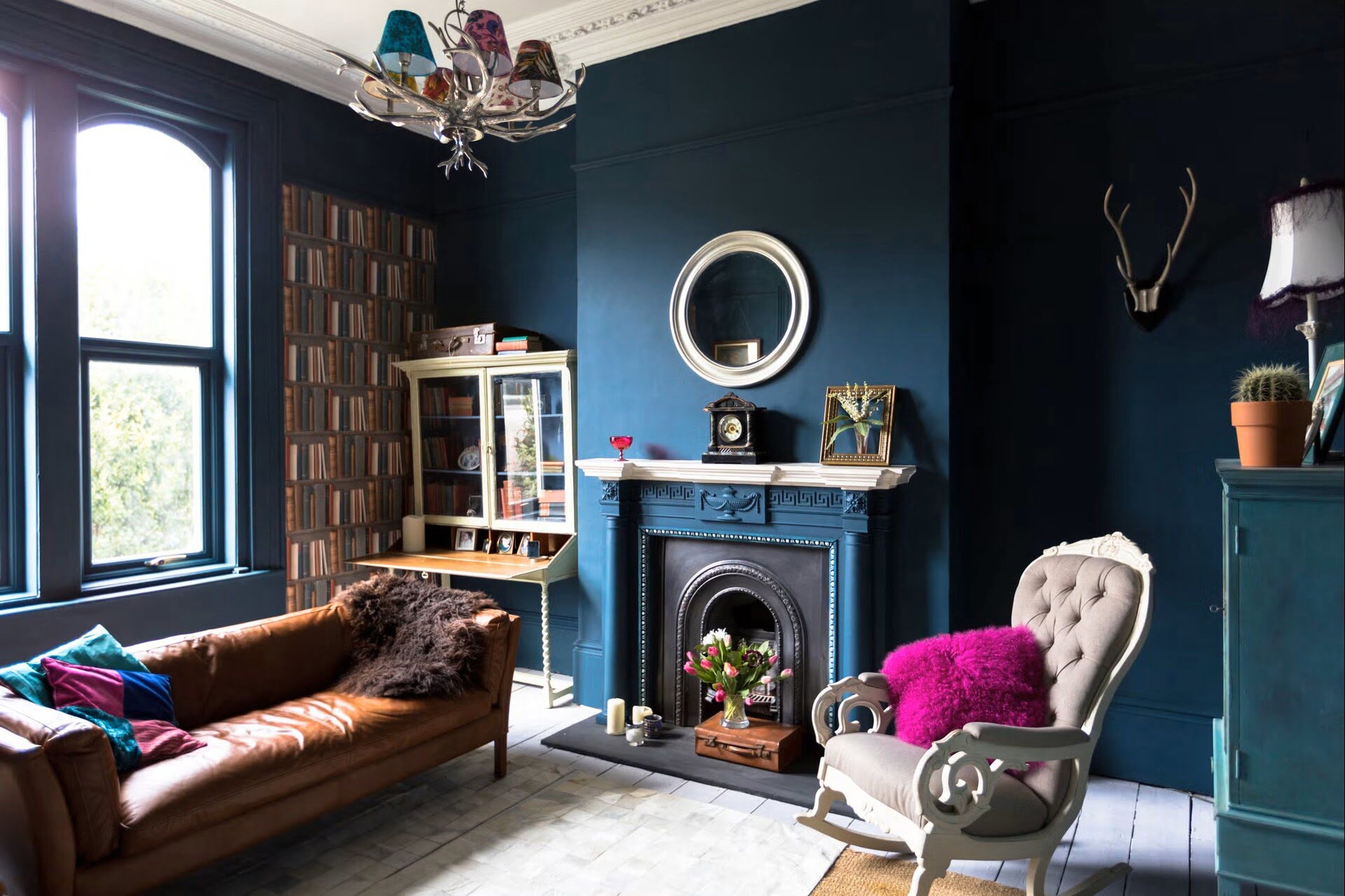
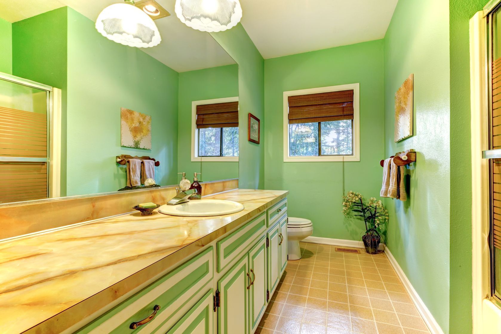
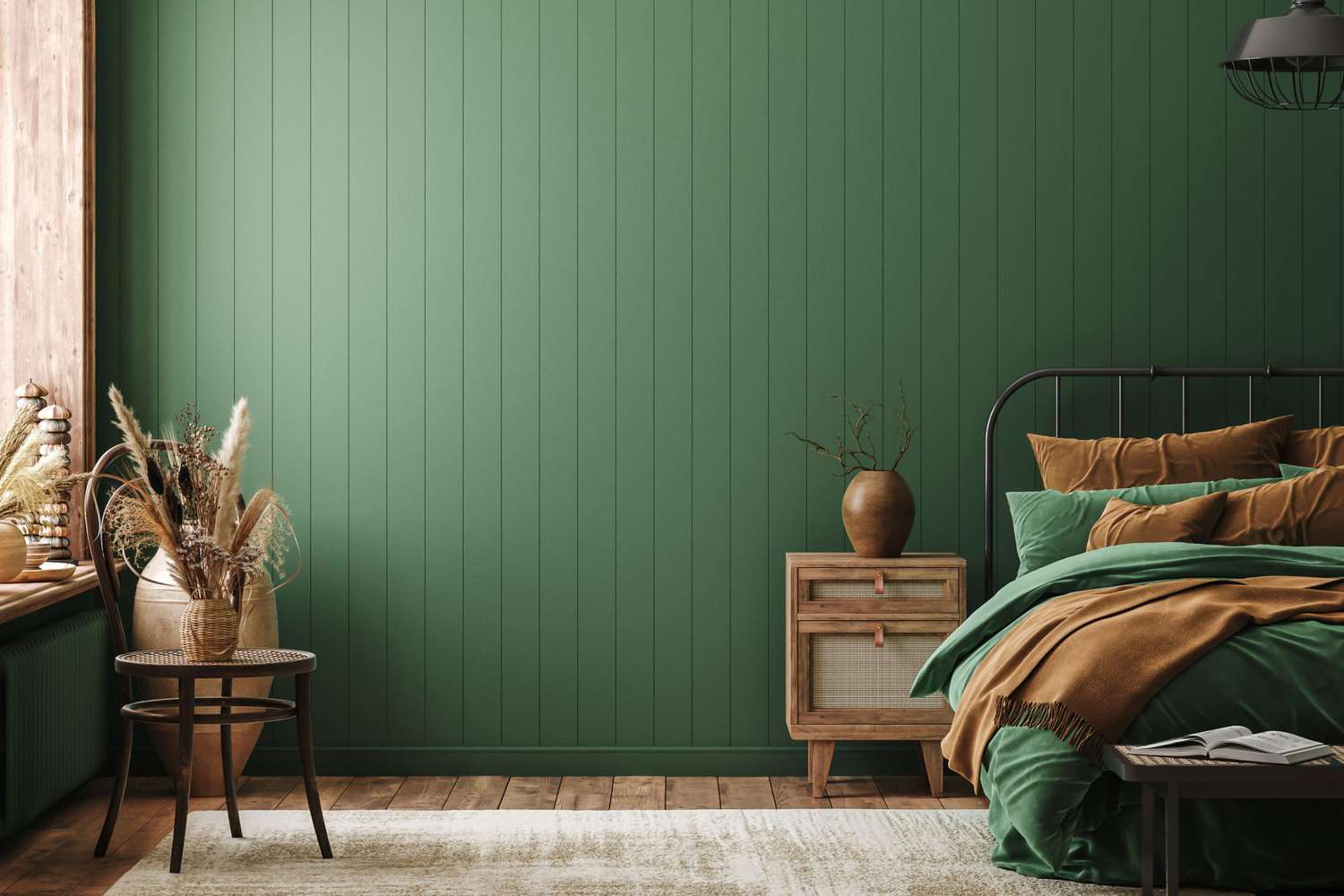
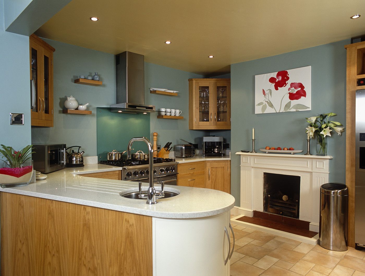
Cool colors, on the other hand, like blues and greens, have a calming and soothing effect. These colors are often associated with nature, tranquility, and relaxation. They can create a serene atmosphere in spaces like bedrooms, living rooms, and bathrooms.
Neutral colors, such as whites, grays, and beige, are versatile and can create a sense of balance and harmony. These colors can serve as a backdrop for other elements in the room and allow you to introduce pops of color through accessories or furniture.
It’s important to note that not only the color itself, but also the shade and saturation, can impact the mood it creates. Lighter and softer shades tend to feel more calming, while bold and vibrant shades have a more stimulating effect.
Colors can also interact with each other to create different moods. Complementary colors, which are opposite each other on the color wheel (e.g., blue and orange), can create a vibrant and energetic atmosphere. Analogous colors, which are adjacent to each other on the color wheel (e.g., blue and green), create a more harmonious and soothing ambiance.
Personal preferences and cultural associations can also influence how colors affect our mood. It’s essential to consider these factors when choosing colors for your interior spaces.
By understanding how colors influence mood, you can intentionally select and combine colors in your home to create the desired ambiance and support your emotional well-being.
Choosing Calming Colors for Interior Spaces
When it comes to creating a calming and peaceful environment in your home, the choice of colors is crucial. By selecting calming colors, you can transform your interior spaces into soothing retreats that promote relaxation and well-being.
Here are some tips for choosing calming colors for your interior spaces:
- Opt for cool tones: Cool colors like blues, greens, and purples have a calming effect on our minds and bodies. These colors are associated with nature, tranquility, and serenity. Consider using shades like soft sky blue, gentle sea green, or soothing lavender for walls, curtains, or furniture pieces.
- Prioritize lighter shades: Lighter shades of colors tend to feel more calming than darker shades. Light pastels or muted tones of your chosen calming color will create a softer and more serene ambiance. Think about using soft mint green, pale turquoise, or gentle lilac to create a sense of tranquility.
- Incorporate neutral hues: Neutral colors like whites, grays, and beiges can help create a sense of balance and calmness. These colors work well as the base color for your interior spaces and can be combined with pops of calming colors as accents. Consider using warm, creamy whites or soft, warm grays to create a soothing backdrop.
- Avoid high contrast: High contrast between colors can be visually stimulating and create a sense of vibrancy. To maintain a calming environment, opt for a more harmonious color palette with subtle variations in shades and tones. This will create a soothing and cohesive atmosphere.
- Consider natural elements: Bringing elements from nature into your interior spaces can enhance the calming effect. Natural materials and textures, such as wooden furniture, stone accents, or plants, complement calming colors and create a connection with the outdoors.
Remember that the goal is to create a harmonious and tranquil space, so it’s important to strike a balance between calming colors and your personal style. Be mindful of your own preferences and the specific needs of each room when selecting colors.
By intentionally choosing calming colors, you can transform your home into a peaceful sanctuary that promotes relaxation and well-being.
Tips for Incorporating Soothing Colors into Your Home
Creating a soothing and tranquil environment in your home involves more than just selecting calming colors. It’s about incorporating these colors in the right way to enhance the overall ambiance of your space. Here are some tips to help you incorporate soothing colors into your home:
- Start with a neutral base: Begin by selecting a neutral color as the base for your space. Neutrals like whites, beiges, and grays provide a versatile backdrop that allows soothing colors to shine. This neutral base creates a sense of calmness and provides flexibility for introducing pops of soothing colors as accents.
- Focus on one or two main colors: Choose one or two main soothing colors that you want to incorporate throughout your home. These colors should be calming to you and create the desired ambiance. For example, you might choose shades of blue and green as your main colors for a serene and peaceful atmosphere.
- Use calming colors in large furniture pieces: Incorporate your main soothing colors in larger furniture pieces like sofas, armchairs, or bedding. This will create a cohesive look and ensure that the calming colors are prominent in the space. Consider using soft blue or green upholstery or bedding to add a sense of relaxation.
- Add accents with accessories: Introduce pops of soothing colors through accessories like throw pillows, curtains, rugs, and artwork. These accents will add visual interest and help create a sense of harmony. Opt for softer shades of your chosen calming colors to maintain a tranquil atmosphere.
- Consider natural elements: Incorporate natural elements into your home decor, such as wooden furniture, plants, or natural fibers. These elements harmonize well with soothing colors and create a connection with the outdoors. The combination of calming colors and natural elements can promote a sense of serenity.
- Experiment with textures: Play with different textures to add depth and visual interest to your space. Consider incorporating textured cushions, woven baskets, or textured wall coverings in your chosen calming colors. The interplay of textures can further enhance the calming atmosphere in your home.
- Pay attention to lighting: Lighting plays a crucial role in the overall mood of a space. Choose soft, warm lighting options to create a cozy and relaxing ambiance. Avoid harsh or cool-toned lighting that can disrupt the serenity of your space and make it feel less inviting.
- Personalize with accents of your favorite colors: While the focus is on incorporating soothing colors, don’t be afraid to add accents of your favorite colors as well. As long as they complement the overall calming palette, these splashes of personal color can bring joy and individuality to your space.
- Create a cohesive flow: To ensure a harmonious flow throughout your home, consider how each room connects to one another both visually and color-wise. Use a consistent color scheme or coordinating shades to create a sense of unity and coherence.
By following these tips, you can effectively incorporate soothing colors into your home and create an environment that promotes relaxation, tranquility, and well-being.
Conclusion
Color has a tremendous impact on our emotions and can significantly influence the mood and atmosphere of our interior spaces. Understanding the psychology behind colors and their effect on our emotions can help us create harmonious, calming, and inviting environments within our homes.
While certain colors like red, orange, and yellow can evoke feelings of anger and agitation, there are plenty of soothing colors that can promote relaxation, tranquility, and well-being. Cool colors such as blues, greens, and purples have a calming effect, while neutral colors provide a versatile and balanced backdrop.
Incorporating these soothing colors into your home can be achieved through strategic color selection for walls, furniture pieces, accessories, and lighting. By focusing on one or two main calming colors and using them in a variety of ways, you can create a cohesive and serene atmosphere throughout your space.
Remember to also consider the use of natural elements, textures, and personal preferences in your color choices. Creating a harmonious flow between rooms and paying attention to lighting can further enhance the calming ambiance.
By intentionally incorporating soothing colors into your home, you can transform it into a sanctuary that promotes relaxation and well-being. The right combination of colors can make a remarkable difference in how you feel in your living space.
So, take a step back, assess your home’s color scheme, and make thoughtful choices to create a calm and inviting space that you truly love and enjoy. Embrace the power of colors and let them work their magic in creating a harmonious and peaceful sanctuary for you and your loved ones.
Frequently Asked Questions about What Color Makes You Angry? The One Shade To Avoid Indoors
Was this page helpful?
At Storables.com, we guarantee accurate and reliable information. Our content, validated by Expert Board Contributors, is crafted following stringent Editorial Policies. We're committed to providing you with well-researched, expert-backed insights for all your informational needs.
0 thoughts on “What Color Makes You Angry? The One Shade To Avoid Indoors”