
Articles
What Color Picture Frames Should I Use
Modified: December 7, 2023
Discover the best colors of picture frames for your articles. Find out how different color choices can enhance your content and create a visually appealing presentation.
(Many of the links in this article redirect to a specific reviewed product. Your purchase of these products through affiliate links helps to generate commission for Storables.com, at no extra cost. Learn more)
Introduction
Welcome to the world of picture frames! When it comes to displaying your artwork or photographs, choosing the right frame color can make a significant difference in enhancing the overall aesthetic appeal of your space. The color of the frame can help create a cohesive look and complement the artwork, adding a touch of style and personality to your room.
In this article, we will explore the various factors to consider when selecting the color of picture frames. From considering the room’s color palette to matching the frame to the style of the artwork, we will guide you through the decision-making process, helping you make the best choice for your space.
So, if you’ve ever found yourself wondering what color picture frames you should use, keep reading for some helpful tips and insights.
Key Takeaways:
- Consider the room’s color palette and the dominant colors in the artwork when choosing frame colors to create a visually pleasing and cohesive display that complements the overall design scheme.
- Experiment with bold and vibrant frame colors to make a statement and infuse personality into your space, but ensure the frame complements the artwork without overshadowing it.
Read more: What Types Of Picture Frames Are There
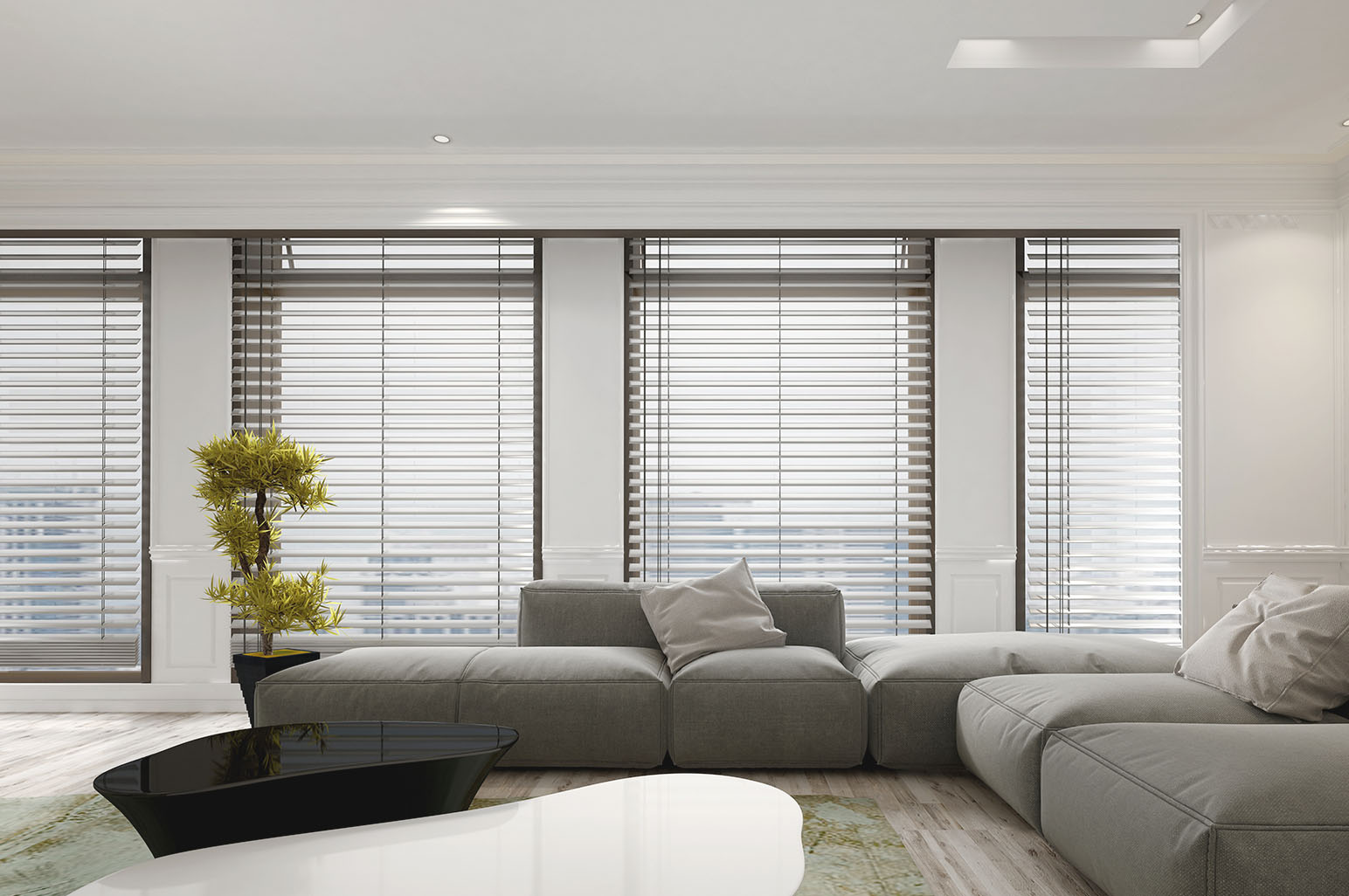
Consider the Room’s Color Palette
When deciding on the color of your picture frames, it’s essential to take into account the existing color palette of the room where the artwork will be displayed. The frame color should complement the overall color scheme and blend harmoniously with the surrounding decor.
If your room’s color palette consists of cool tones like blues or greens, consider using frames in similar cool tones or even neutrals like white or gray. This will create a sense of cohesiveness and visual balance in the space.
On the other hand, if your room features warm tones like reds or yellows, opting for frames in warmer hues or even rich wood tones can help create a unified and inviting atmosphere.
Remember that the frame color should not only match the room’s color palette but also consider the dominant colors in the artwork itself. By choosing a frame color that complements both the room and the artwork, you can create a visually pleasing and cohesive look.
For instance, if your room has a neutral color scheme with pops of vibrant colors in the artwork, you could select a frame color that matches one of the accent colors in the artwork. This will help tie the room and the artwork together, creating a harmonious and balanced display.
By considering the room’s color palette, you can ensure that the picture frame seamlessly integrates with the overall design scheme, enhancing the visual appeal of both the artwork and the room.
Complementing the Artwork
One of the primary considerations when choosing the color of your picture frames is how well they complement the artwork itself. The frame color should enhance the colors, tones, and overall mood of the piece, rather than overpowering or distracting from it.
If your artwork predominantly features cool colors like blues and greens, consider using frames in complementing cool tones like silver or shades of blue. This will create a sense of harmony and allow the colors in the artwork to shine.
Similarly, if your artwork consists of warm tones like reds, oranges, or yellows, opt for frames in warm hues like gold or bronze. These warm tones will enhance the richness and depth of the colors in the artwork, creating a visually pleasing display.
It is also important to take into account the intensity and saturation of the colors in the artwork. If the artwork has bright and vibrant colors, choosing a more neutral frame color can help balance the overall composition. On the other hand, if the artwork has softer, muted colors, a frame color that matches or complements those tones can create a cohesive and soothing effect.
Another consideration is the style and theme of the artwork. For instance, if you have a contemporary or abstract piece, you might consider using a sleek and minimalist frame in black or white to accentuate its modern aesthetic. On the other hand, a traditional or vintage artwork could be complemented with ornate frames in gold or dark wood tones for a classic and timeless look.
By carefully selecting a frame color that complements the artwork, you can create a visually stunning display that enhances the overall impact and message of the piece.
Matching the Frame to the Style of the Artwork
Choosing a frame color that matches the style and genre of the artwork can further enhance its visual impact. Different art styles call for different frame choices, and selecting the right frame color can help emphasize the artistic intent and highlight the unique characteristics of the artwork.
If you have a contemporary or modern artwork with clean lines and bold colors, consider using minimalist frames in black, white, or metallic tones. These frames will complement the simplicity and sleekness of the artwork, allowing it to take center stage without overpowering it.
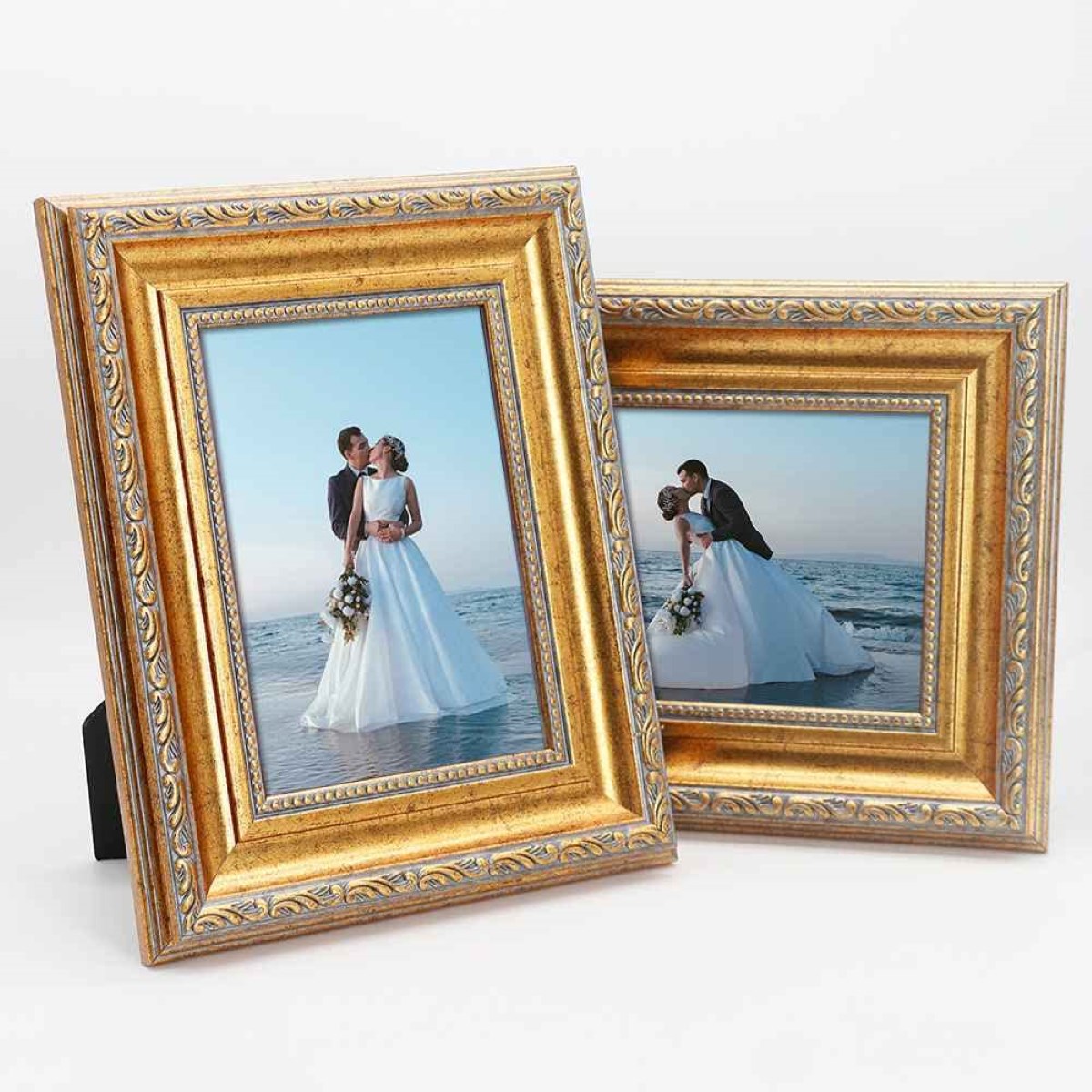
For traditional or classical artworks, ornate frames in gold, silver, or dark wood tones can add a touch of elegance and sophistication. These frames often feature intricate details and elaborate moldings, enhancing the traditional aesthetics of the artwork.
Photographs and landscapes are versatile and can be displayed in various frame colors. For natural landscapes, frames in earthy tones like brown or green can create a seamless connection with the subject matter. Black or white frames can provide a timeless and gallery-like presentation for photographs, allowing the focus to remain on the image itself.
Abstract or eclectic artworks offer the opportunity to experiment with different frame colors and styles. You can opt for frames that contrast or complement the colors in the artwork, depending on the mood and effect you wish to achieve. Bold and vibrant artwork may benefit from frames in contrasting colors to create a standout effect, while more subtle or monochromatic pieces could be enhanced with frames in complementary tones.
By matching the frame to the style of the artwork, you can create a cohesive and visually pleasing presentation that showcases the unique characteristics and intentions of the piece.
Choosing Frame Colors Based on the Mood
The color of a picture frame can significantly influence the mood and atmosphere of a room. By considering the desired emotional impact, you can choose frame colors that evoke certain feelings and enhance the overall ambiance of the space.
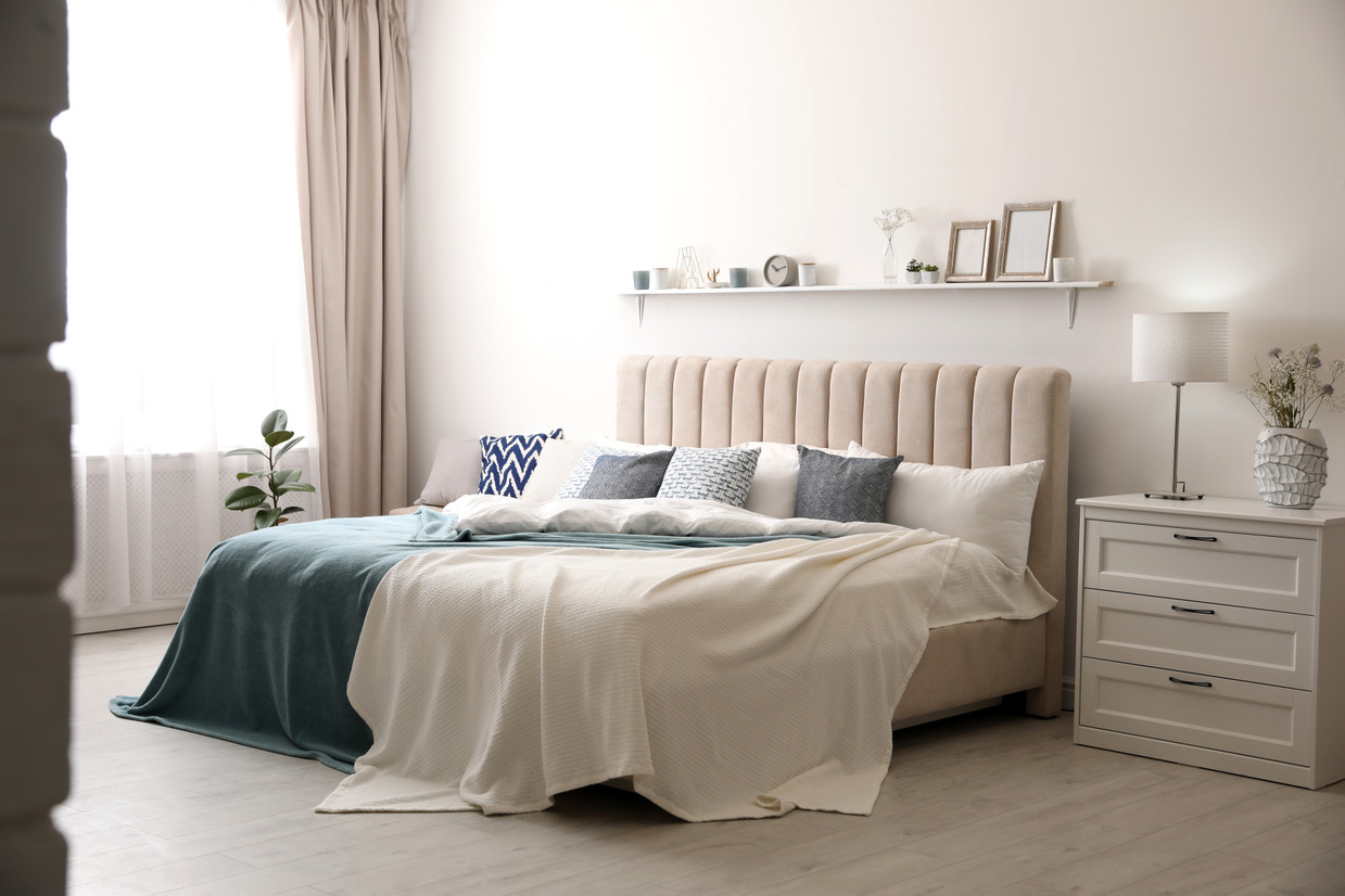
If you want to create a calming and serene atmosphere, consider using frame colors in cool tones like blues, greens, or pastels. These colors have a soothing effect and are often associated with tranquility and relaxation. They can be particularly suitable for displaying artwork in bedrooms, meditation spaces, or areas where you want to promote a sense of peace and tranquility.
If you’re aiming for a vibrant and energetic feel, opt for frame colors in bold and bright shades. Reds, oranges, and yellows are associated with energy, enthusiasm, and creativity. Using frames in these colors can inject a lively and dynamic atmosphere into the room, making it ideal for areas like offices, studios, or spaces where you want to inspire productivity and positive energy.
For a sophisticated and elegant ambiance, frames in neutral colors like black, white, or gray can work wonders. These classic and timeless colors provide a clean and sophisticated look, allowing the focus to be on the artwork itself. They can be suitable for various styles of art and complement different room decors without overpowering the overall aesthetic.
Consider the emotions and atmosphere you want to create in the room and choose frame colors accordingly. Remember that different colors evoke different feelings, so it’s important to select a color that aligns with the desired mood and complements the overall design scheme.
By choosing frame colors based on the mood, you can create a space that not only showcases your artwork but also resonates with the emotions and atmosphere you want to cultivate.
When choosing picture frames, consider the color scheme of the room. Use frames that complement the dominant colors in the artwork and the decor for a cohesive look.
Read more: How High Should Picture Frames Be Hung
Using Neutrals for Versatility
When in doubt, you can never go wrong with using neutral-colored frames. Neutrals, such as black, white, gray, or beige, offer versatility and can easily adapt to various styles of artwork and room decors.
Black frames, for example, are known for their timeless and sophisticated appeal. They can add a touch of elegance to any artwork and complement a wide range of color palettes. Black frames work well with both monochromatic and vibrant artworks, providing a sleek and polished look. They are particularly popular for displaying photographs and modern or contemporary art pieces.
On the other hand, white frames offer a clean and crisp aesthetic. They are often associated with a gallery-like presentation and can create a minimalist and modern look. White frames are especially suitable for showcasing black and white photographs, minimalist artwork, or artworks with softer color palettes. They can also help brighten up a room and create an airy and spacious feel.
Gray frames offer a more subtle alternative to black or white. They provide a neutral backdrop that allows the artwork to take center stage without overpowering it. Gray frames can work well with a variety of color schemes and art styles, adding a touch of sophistication and providing a cohesive look in any room.
Beige frames, with their warm and earthy tones, offer a versatile option that complements a wide range of artwork and interior designs. They can add a sense of warmth and create a cozy ambiance in a room. Beige frames work well with landscapes, nature-inspired artwork, or pieces that incorporate earthy tones.
Using neutral-colored frames provides flexibility and allows your artwork to stand out without interference. They can seamlessly blend with various room decors and art styles, making them a reliable and versatile choice that will never go out of style.
So, if you’re unsure which frame color to choose, you can always rely on neutrals for their adaptability and ability to complement any artwork and room design.
Bold and Vibrant Frames for a Statement
If you’re looking to make a bold and eye-catching statement with your artwork, consider using frames in vibrant and bold colors. These frames can add personality, drama, and a pop of color to your space, drawing attention to the artwork and creating a focal point.
Red frames, for example, can create a sense of excitement, energy, and passion. They are particularly striking when paired with black and white photographs or artworks with dominant red accents. Red frames can be used to create a captivating contrast and evoke strong emotions in the viewer.
Yellow frames can bring warmth, cheerfulness, and optimism to a room. They work well with artwork that features bright and sunny colors or artworks that aim to evoke a sense of joy and positivity. Yellow frames can add a playful and energetic element to the space, making them ideal for children’s rooms or areas where you want to create a lively and vibrant atmosphere.
Blue frames can create a sense of calmness, serenity, and tranquility. They work well with artwork that depicts water, landscapes, or artwork with cool color palettes. Blue frames can evoke a sense of relaxation and provide a soothing effect, making them well-suited for bedrooms, living rooms, or spaces where you want to create a peaceful ambiance.
Green frames are associated with nature, renewal, and balance. They work well with artwork that features landscapes, botanical themes, or art inspired by nature. Green frames can add a touch of freshness and bring the outdoors inside, creating a serene and harmonious atmosphere in your space.
Using bold and vibrant frames is a creative way to make a statement and infuse your personality into your artwork display. However, keep in mind that these frames can be quite impactful, so it’s essential to ensure that they do not overshadow the artwork itself. The key is to strike a balance and create a harmonious composition where the frame and artwork complement each other.
So, if you’re feeling adventurous and want to add a splash of color and personality to your space, bold and vibrant frames can be the perfect choice to make a statement with your artwork.
Considering the Size and Scale of the Artwork
When choosing the color of picture frames, it is crucial to consider the size and scale of the artwork. The frame color should complement the dimensions of the piece and help create a harmonious visual balance.
For large-scale artwork or oversized pieces, it’s generally best to opt for frames in neutral colors. Black, white, or gray frames can provide a clean and contemporary look that allows the artwork to take center stage without overwhelming the space. Additionally, neutral frames can help create a sense of cohesion and balance in rooms with diverse decor styles.
On the other hand, for smaller and more delicate artwork, you can experiment with frames in bolder colors to add visual interest and make the piece stand out. Bright frames in blues, reds, or greens can create a focal point and draw attention to the artwork, adding a dynamic element to the space.
Another important aspect to consider is the thickness of the frame. Thicker frames tend to have a bolder and more substantial presence. They can work well with larger or more impactful artwork, helping to create a sense of depth and framing the piece in a captivating way. Thinner frames, on the other hand, can provide a more minimalistic and understated look, allowing the artwork to speak for itself.
It’s also worth noting that a thin and simple frame can be a great choice for a gallery wall or when displaying multiple artworks together. This approach helps create a cohesive and unified look, allowing the focus to be on the collective presentation rather than individual frames.
By considering the size and scale of the artwork, you can choose frame colors that enhance the overall composition and create a visually pleasing display. Whether it’s using neutral colors for larger pieces or bold colors for smaller ones, the frame color can contribute to the overall aesthetic and impact of the artwork.
Framing Multiple Artworks Together
Creating a cohesive and visually appealing display with multiple artworks requires careful consideration of frame colors. When framing multiple artworks together, you have several options depending on the look and atmosphere you want to achieve.
One approach is to use frames in the same color or color family. This creates a sense of unity and consistency, allowing the artworks to blend seamlessly together. Using frames in the same color can create a cohesive look, especially when the artwork varies in style, subject matter, or size. This approach works well when you want the focus to be on the collection as a whole rather than on individual pieces.
Alternatively, you can opt for frames in complementary colors. Consider selecting frames that harmonize with the dominant colors in the artworks. Choose colors that are adjacent on the color wheel or colors that create a pleasing contrast. This approach can add visual interest and create a dynamic display. For example, if you have a collection of nature-themed artwork with predominantly green tones, you can use frames in shades of green or frames in contrasting colors like deep browns or earthy oranges.
Another option is to use frames in a neutral color to create a clean and cohesive look. Black, white, or gray frames can provide a timeless and contemporary aesthetic, allowing the focus to be on the artwork itself. This approach works well when you have a more eclectic mix of artworks and want to create a cohesive presentation.
When framing multiple artworks together, it’s important to consider the spacing between the frames. Leaving consistent spacing between each frame can help create a balanced and visually pleasing composition.
It’s also worth considering the use of matting when framing multiple artworks. Matting can provide a visual separation between the artwork and the frame, enhancing the overall presentation. Using the same color or type of matting for all the artworks can create a cohesive look, while varying the matting colors can add a touch of individuality to each piece.
Ultimately, the choice of frame colors when framing multiple artworks together depends on your personal preference, the style and subject matter of the artworks, and the overall aesthetic you want to achieve. Experimenting with different options can help you find the perfect combination that creates a cohesive and visually stunning display.
Conclusion
Choosing the right color of picture frames is an essential aspect of displaying artwork or photographs. The frame color can greatly impact the overall aesthetic and mood of a room, as well as enhance the visual appeal of the artwork itself.
When considering the color of picture frames, it’s important to take into account various factors, such as the room’s color palette, the style and theme of the artwork, the desired mood, and the size and scale of the artwork. By carefully considering these elements, you can select frame colors that complement the artwork, create a cohesive look in the room, and evoke the desired emotions.
Whether you choose to use neutrals for versatility, bold and vibrant frames for a statement, or frames that match the mood or style of the artwork, each approach can contribute to the overall impact and visual harmony of the display.
Remember to strike a balance between making the artwork the focal point and allowing the frame to enhance its presentation. Experimentation and personal preference play a crucial role in finding the perfect frame color that aligns with your artistic vision and design aesthetics.
Ultimately, the color of picture frames is a powerful tool that can transform the way artwork is perceived and can create a cohesive and harmonious environment within a room. So, next time you’re faced with the decision of what color picture frames to use, consider these factors and let your creativity guide you in selecting the perfect frame color for your artwork.
Frequently Asked Questions about What Color Picture Frames Should I Use
Was this page helpful?
At Storables.com, we guarantee accurate and reliable information. Our content, validated by Expert Board Contributors, is crafted following stringent Editorial Policies. We're committed to providing you with well-researched, expert-backed insights for all your informational needs.


0 thoughts on “What Color Picture Frames Should I Use”