Home>Furniture & Design>Interior Design Trends>How To Design Home Decor Color Scheme
Interior Design Trends
How To Design Home Decor Color Scheme
Modified: May 6, 2024
Discover the latest interior design trends and learn how to create a stunning home decor color scheme. Elevate your space with expert tips and inspiration. Explore now!
(Many of the links in this article redirect to a specific reviewed product. Your purchase of these products through affiliate links helps to generate commission for Storables.com, at no extra cost. Learn more)
Introduction
Designing a home decor color scheme is an exciting and pivotal aspect of interior design. The colors we choose for our living spaces can significantly impact the overall atmosphere and aesthetics of our homes. Whether you're aiming for a cozy and inviting ambiance or a sleek and modern look, the colors you incorporate play a crucial role in achieving your desired style. Understanding the principles of color theory and how to effectively apply them will empower you to create a harmonious and visually appealing color scheme that reflects your personal taste and complements your home's architecture.
When it comes to selecting colors for your home decor, the options can seem overwhelming. From calming blues to vibrant reds, each color carries its own psychological and emotional associations. By delving into the realm of color theory and exploring the interplay of different hues, you can gain valuable insights into how to use color to evoke specific moods and enhance the overall aesthetic of your living space.
In this comprehensive guide, we will delve into the intricacies of designing a home decor color scheme, from understanding the fundamentals of color theory to selecting the perfect combination of base, accent, and neutral colors. We will explore the art of balancing warm and cool tones and creating a cohesive color palette that ties the entire room together. By the end of this journey, you will be equipped with the knowledge and inspiration to confidently implement a stunning color scheme that transforms your home into a captivating and harmonious sanctuary.
Key Takeaways:
- Designing a home decor color scheme involves choosing base, accent, and neutral colors to create a harmonious and visually appealing living space that reflects your personal style and enhances the ambiance of your home.
- Understanding color theory and the interplay of warm and cool tones empowers you to create a captivating and emotionally resonant color scheme that evokes specific moods and enhances the overall aesthetic of your living space.
Understanding Color Theory
Color theory is the foundation upon which all successful color schemes are built. It encompasses the principles and guidelines that govern the use of color in art and design. By familiarizing yourself with these fundamental concepts, you can make informed decisions and create visually compelling color palettes for your home decor.
One of the key elements of color theory is the color wheel, which serves as a visual representation of the relationships between colors. The traditional color wheel consists of 12 hues, with primary colors (red, blue, and yellow) forming its basis. Secondary colors (orange, green, and purple) are created by mixing primary colors, while tertiary colors result from mixing a primary color with a secondary color adjacent to it on the wheel.
Understanding the relationships between colors on the wheel is essential for crafting harmonious color schemes. Complementary colors, which are positioned opposite each other on the wheel (e.g., blue and orange), create a dynamic contrast when used together. Analogous colors, found next to each other on the wheel (e.g., blue and green), produce a cohesive and serene effect. Additionally, triadic color schemes, formed by three colors equidistant from each other on the wheel, offer a balanced yet vibrant composition.
Beyond the color wheel, color theory delves into the psychological and emotional impact of different hues. Warm colors like red, orange, and yellow exude energy and warmth, making them ideal for creating a lively and inviting atmosphere. In contrast, cool colors such as blue, green, and purple evoke tranquility and sophistication, perfect for fostering a serene and calming environment.
By grasping the principles of color theory, you can leverage the emotional and visual dynamics of different colors to curate a home decor color scheme that resonates with your personal style and enhances the ambiance of your living space. With this knowledge as your foundation, you are ready to embark on the creative journey of selecting the perfect colors for your home.
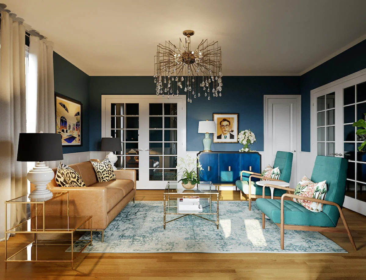
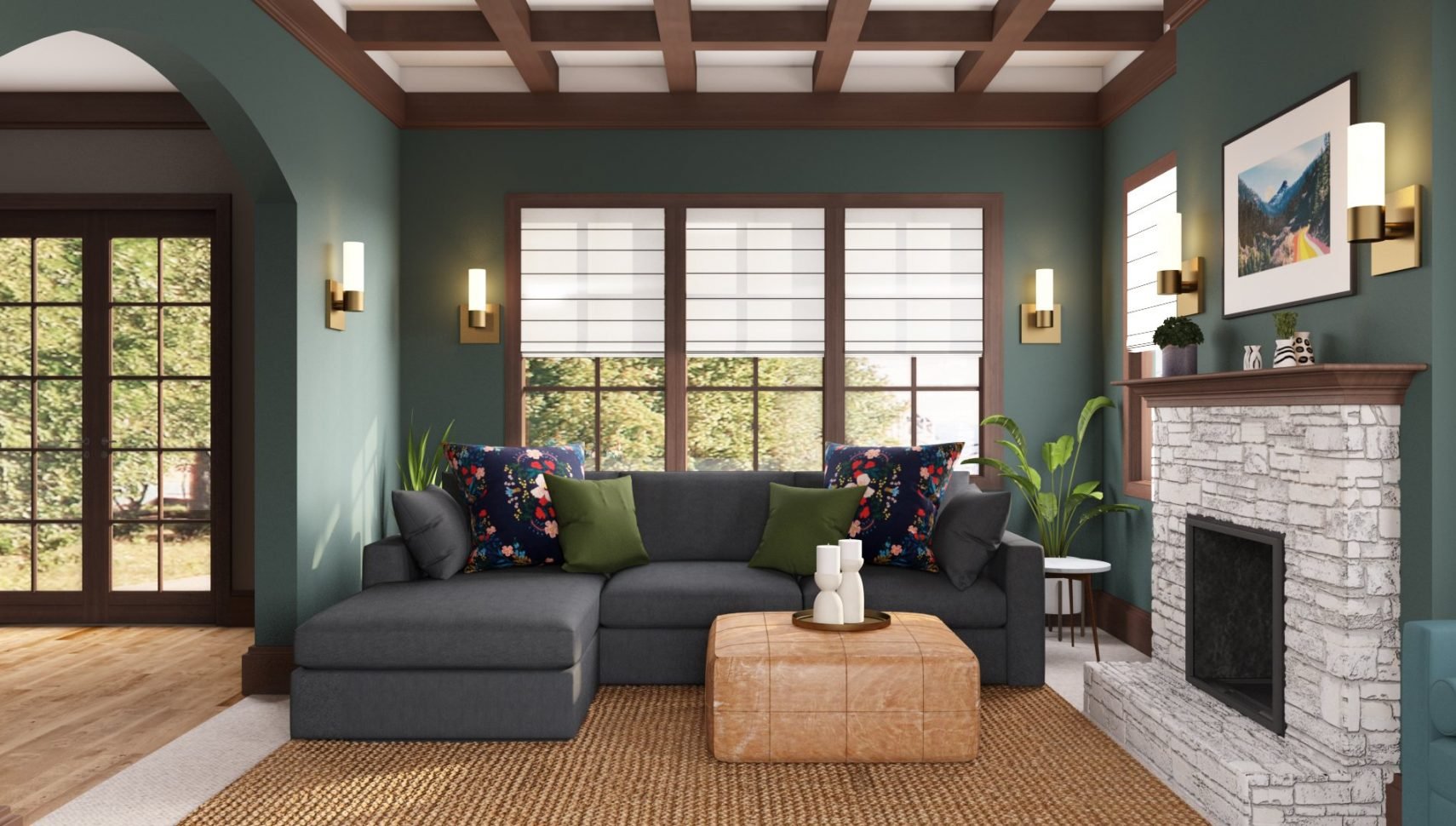
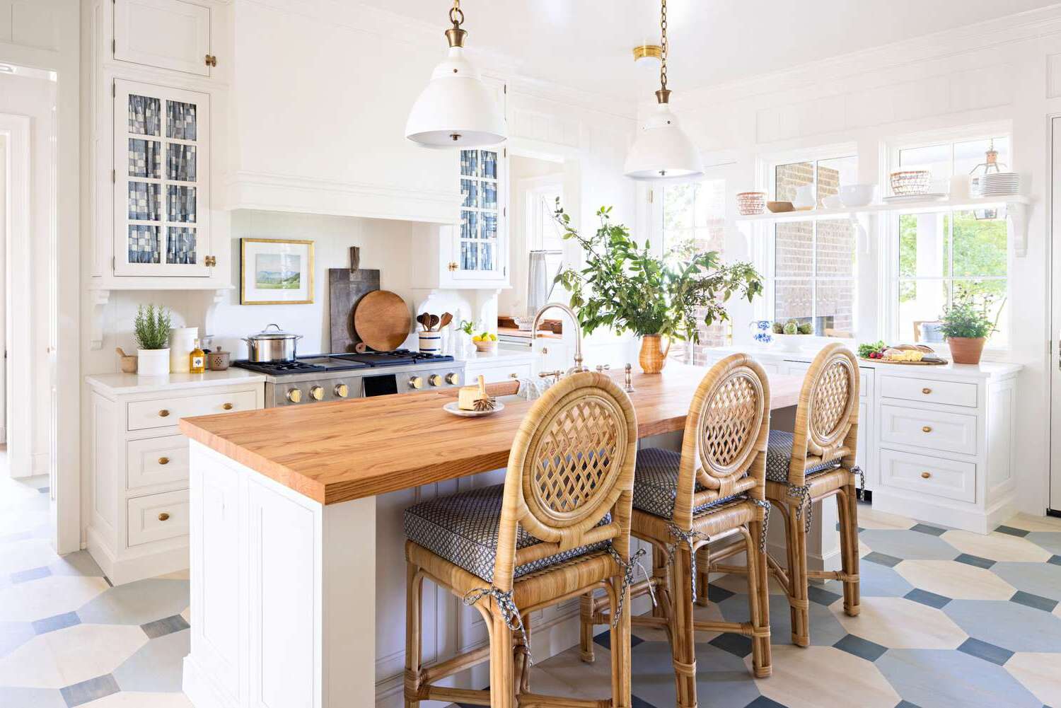
Choosing a Base Color
When designing a home decor color scheme, selecting a base color is akin to laying the foundation for your entire design concept. The base color serves as the primary hue that sets the tone for the room and anchors the overall aesthetic. It forms the backdrop against which other colors and elements will interact, making it essential to choose a base color that aligns with your vision for the space.
Before delving into specific hues, consider the mood and atmosphere you wish to create in the room. Are you aiming for a cozy and intimate setting, or do you envision a bright and airy space? Understanding the desired ambiance will guide your choice of a base color. For a warm and inviting feel, earthy tones such as terracotta, warm beige, or creamy off-white can infuse the room with a sense of comfort and relaxation. On the other hand, if you seek a modern and vibrant atmosphere, consider opting for crisp whites, light grays, or soft pastels to imbue the space with an open and refreshing aura.
Another crucial factor to consider when choosing a base color is the room’s natural lighting. Natural light can significantly influence how colors appear in a space, with north-facing rooms often benefiting from cooler tones to counterbalance the subdued light, while south-facing rooms may accommodate warmer hues that complement the abundant sunlight. It’s essential to test your chosen base color under different lighting conditions to ensure it maintains its intended character throughout the day.
Additionally, take into account the existing elements in the room, such as furniture, flooring, and architectural features. Your base color should harmonize with these elements to create a cohesive and unified aesthetic. For instance, if your furniture and decor feature bold patterns or vibrant colors, a neutral base color can provide a balanced backdrop, allowing the furnishings to take center stage without overwhelming the space.
Ultimately, the base color sets the stage for the entire color scheme, influencing the selection of accent colors and neutrals. By carefully considering the desired mood, natural lighting, and existing elements in the room, you can confidently choose a base color that forms the cornerstone of your home decor color palette, laying the groundwork for a visually captivating and harmonious living space.
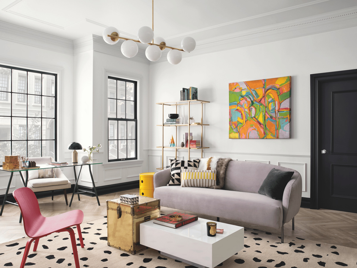
Selecting Accent Colors
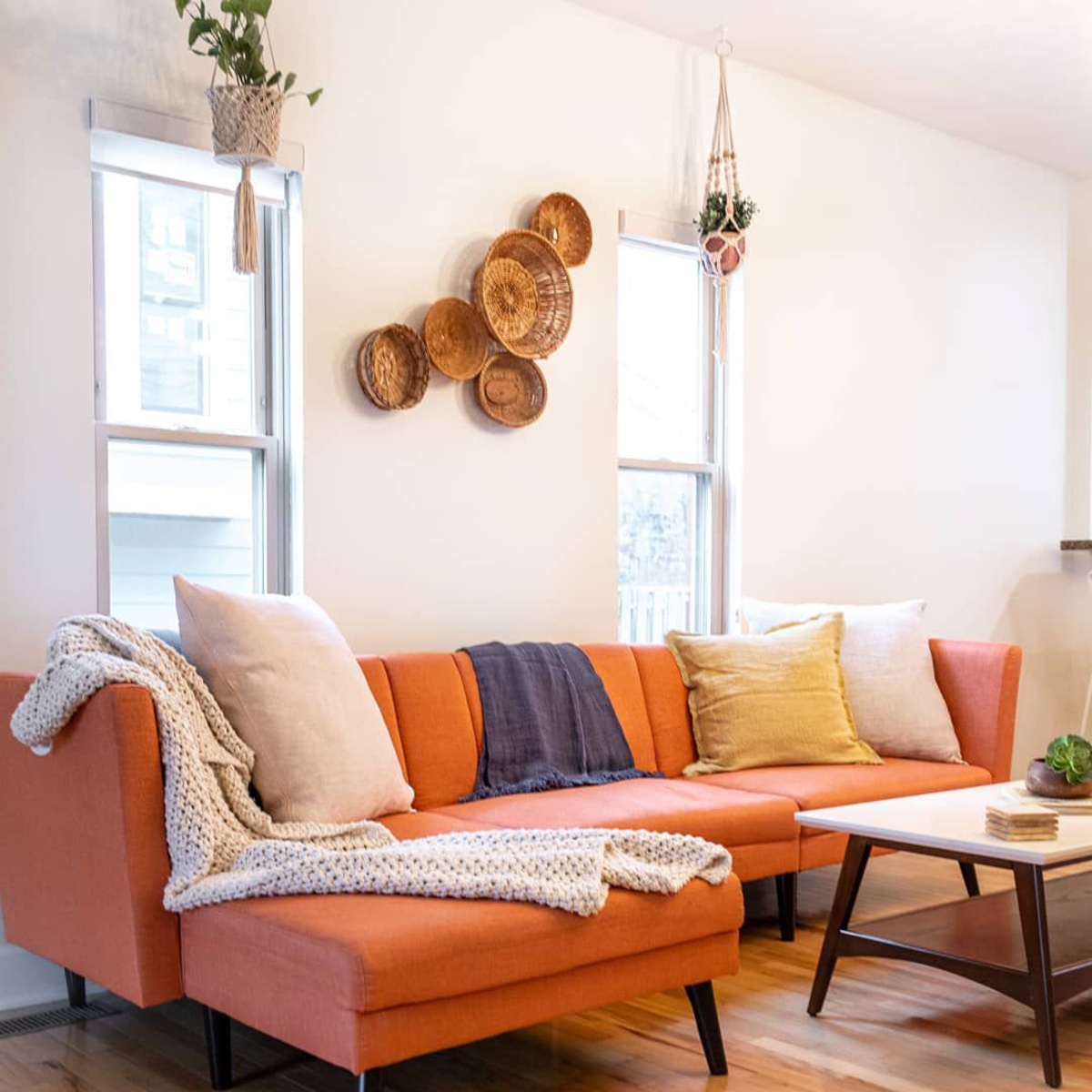
Once you have established a base color for your home decor scheme, the next step is to select accent colors that complement and enhance the overall aesthetic of the space. Accent colors play a pivotal role in adding depth, visual interest, and personality to the room, infusing it with character and style. By strategically incorporating accent hues, you can create focal points, evoke specific emotions, and tie the color scheme together seamlessly.
When choosing accent colors, consider the mood and atmosphere you wish to cultivate in the room. Vibrant and bold accent colors, such as deep jewel tones or energetic reds and oranges, can inject a sense of drama and vitality into the space, making them ideal for creating a lively and dynamic ambiance. In contrast, softer accent colors, like muted pastels or tranquil blues and greens, can imbue the room with a serene and calming feel, perfect for fostering a relaxing and peaceful environment.
One effective approach to selecting accent colors is to draw inspiration from the base color. By referencing the undertones or complementary hues of the base color, you can identify accent colors that harmonize with the overall palette. For example, if your base color is a warm beige with subtle yellow undertones, accent colors like deep ochre, rich terracotta, or muted sage can complement the warmth of the base color while adding visual intrigue.
Another strategy for choosing accent colors is to consider the room’s focal points and architectural features. By highlighting specific elements, such as a fireplace, an accent wall, or decorative moldings, with a contrasting or coordinating accent color, you can draw attention to these features and create a sense of balance and proportion within the space.
Furthermore, don’t underestimate the power of texture and pattern when incorporating accent colors. Textiles, artwork, and decorative accessories can introduce accent colors in subtle yet impactful ways, enriching the visual depth of the room. Whether through vibrant throw pillows, statement artwork, or intricate rugs, these accents can infuse the space with personality and visual intrigue, elevating the overall design scheme.
By thoughtfully selecting accent colors that harmonize with the base color, reflect your desired ambiance, and enhance the room’s architectural features, you can cultivate a captivating and cohesive color scheme that invigorates your living space with style and sophistication.
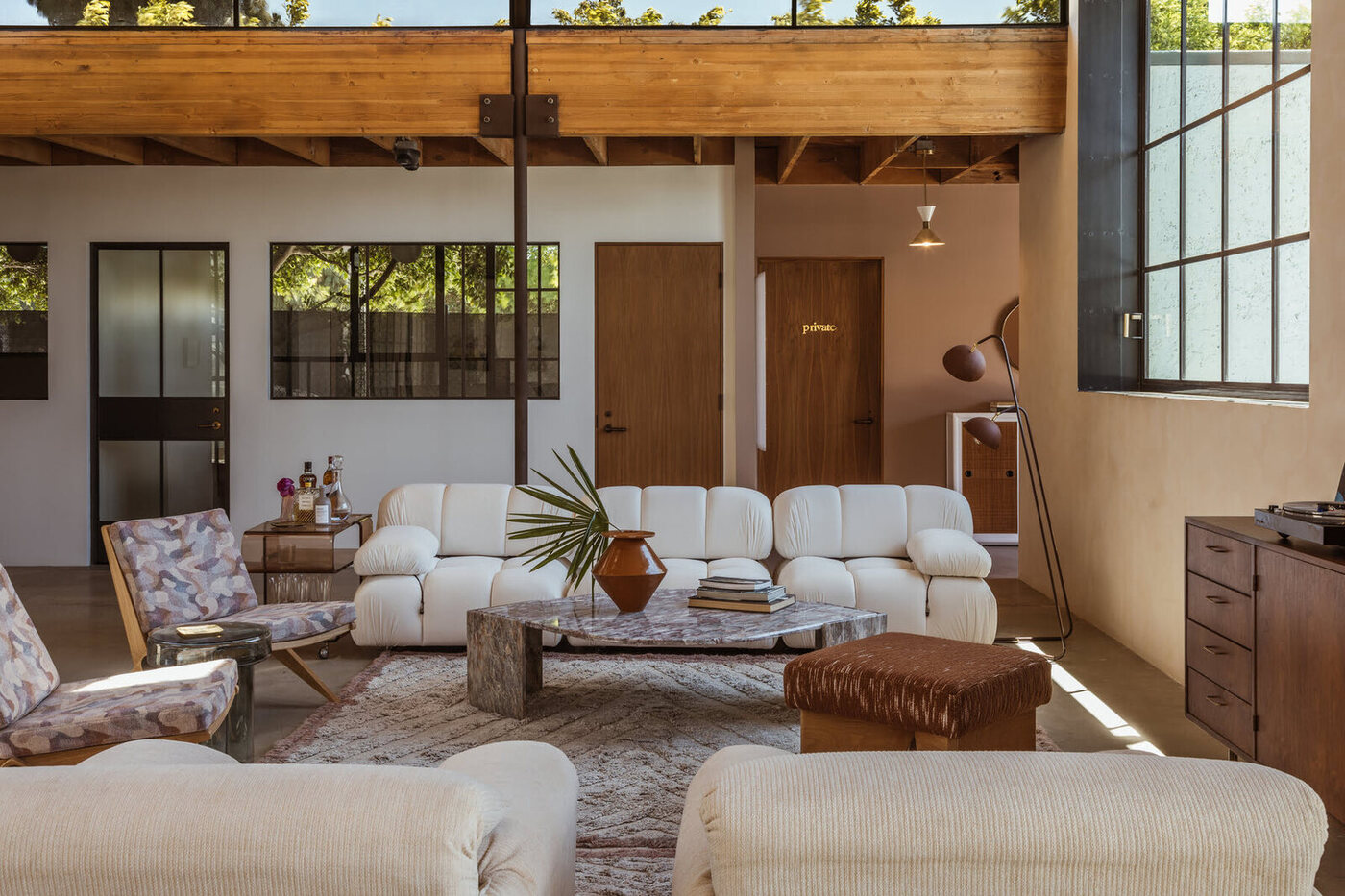
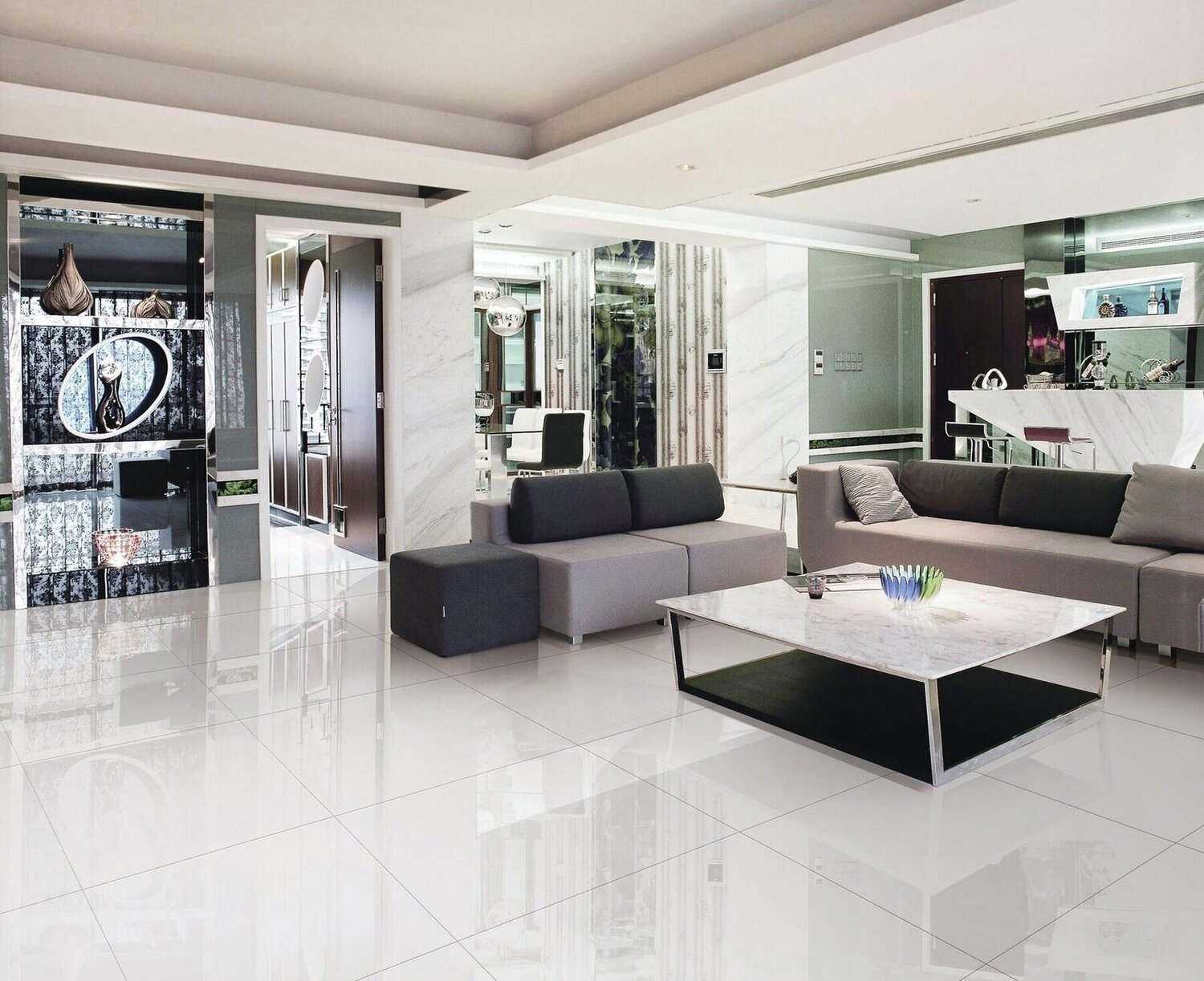
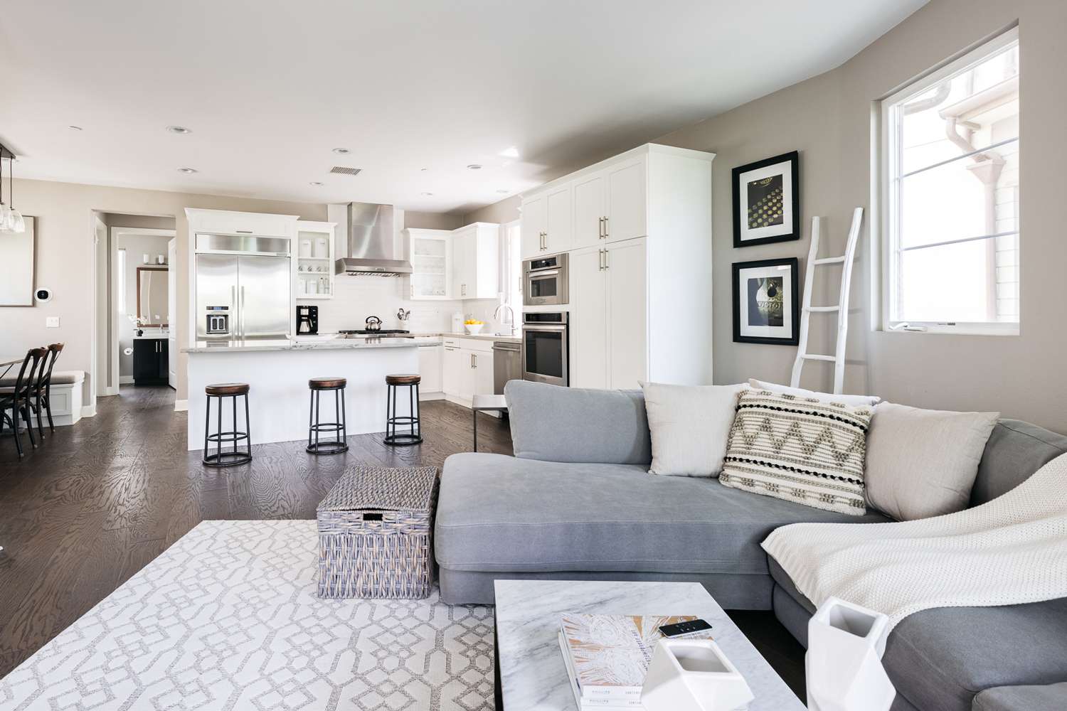
Incorporating Neutrals
Neutrals play a foundational role in home decor color schemes, offering versatility, balance, and a timeless elegance to any space. While base and accent colors infuse a room with personality and vibrancy, neutrals provide a calming backdrop and ensure visual cohesion within the color palette. By incorporating neutrals strategically, you can create a sense of harmony, sophistication, and flexibility in your home decor.
When integrating neutrals into your color scheme, consider the diverse range of neutral tones available, from crisp whites and soft ivories to warm beiges and cool grays. Each neutral hue carries its own distinct character and undertones, allowing you to tailor the color palette to suit the specific ambiance you wish to achieve. For instance, cool grays and icy whites can impart a modern and minimalist aesthetic, while warm beiges and creamy off-whites evoke a sense of comfort and tranquility.
One of the primary benefits of neutrals is their ability to provide a sense of balance and cohesion, particularly in rooms with diverse furnishings and decor. If your space features an array of colors, patterns, and textures, neutrals can act as a unifying force, allowing the various elements to coexist harmoniously without overwhelming the visual landscape. Additionally, neutrals can serve as a backdrop for showcasing statement furniture pieces, artwork, or architectural details, allowing these focal points to shine amidst a subdued yet sophisticated backdrop.
Furthermore, neutrals can play a crucial role in connecting different areas of your home. By maintaining a consistent neutral base throughout various rooms, you can establish a sense of flow and continuity, creating a cohesive visual narrative that ties the entire home together. This approach is particularly effective in open-concept spaces, where a harmonious color scheme can enhance the sense of interconnectedness and fluidity.
Another advantage of neutrals is their timelessness and adaptability. While bold colors and trends may come and go, neutrals possess enduring appeal and can serve as a canvas for evolving decor styles. Whether you opt for a monochromatic neutral palette or introduce subtle variations in tone and texture, neutrals provide a versatile foundation that can accommodate changes in furnishings, decor, and design preferences over time.
By thoughtfully integrating neutrals into your home decor color scheme, you can establish a sense of balance, cohesion, and enduring elegance within your living space. Whether used as a calming backdrop, a unifying force, or a timeless canvas for creativity, neutrals offer boundless opportunities for creating a visually captivating and harmonious environment.
When designing a home decor color scheme, start by choosing a main color and then select 2-3 complementary colors to create a cohesive look throughout your space.
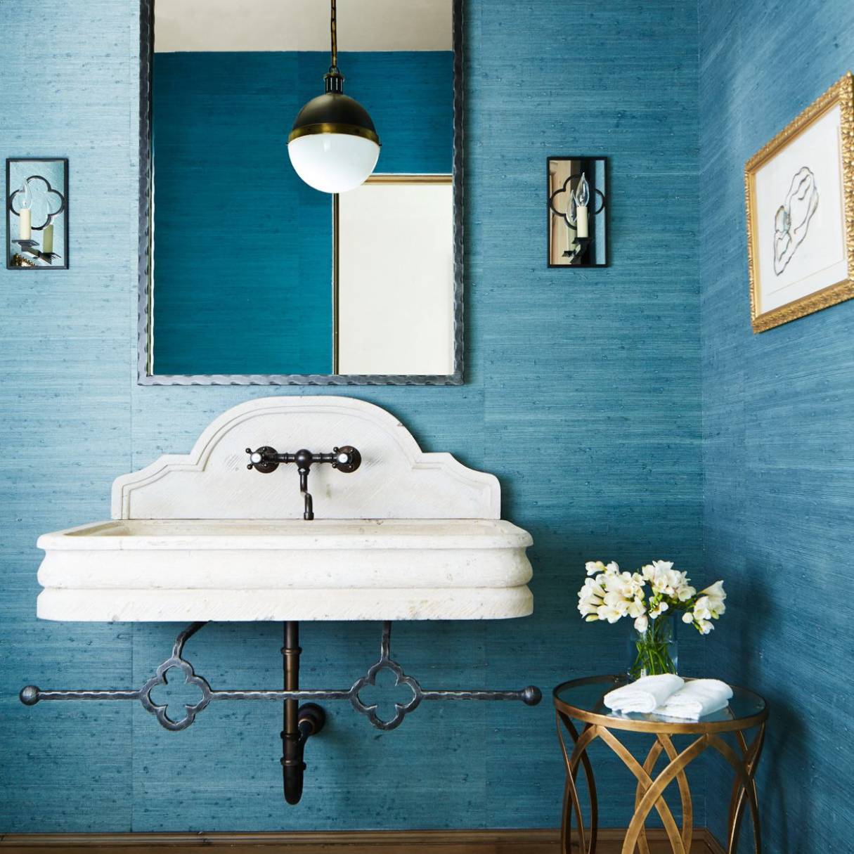
Balancing Warm and Cool Tones
One of the key considerations in designing a captivating home decor color scheme is the balance between warm and cool tones. Warm colors, such as reds, oranges, and yellows, exude energy and vibrancy, while cool colors, including blues, greens, and purples, evoke tranquility and sophistication. By artfully harmonizing these contrasting elements, you can create a dynamic and visually compelling color palette that infuses your living space with depth and character.
When striking a balance between warm and cool tones, it’s essential to consider the overall mood and ambiance you wish to cultivate in the room. Warm tones can foster a sense of intimacy and conviviality, making them well-suited for gathering spaces such as living rooms and dining areas. In contrast, cool tones can instill a serene and calming atmosphere, making them ideal for bedrooms, home offices, and areas intended for relaxation and contemplation.
An effective approach to achieving harmony between warm and cool tones is to leverage the principles of color temperature. Warm colors have undertones of red, orange, and yellow, while cool colors are characterized by undertones of blue, green, and purple. By selecting a dominant color temperature for the room, whether warm or cool, you can establish a cohesive foundation for the color scheme. Subsequently, incorporating accents or neutrals with complementary undertones can introduce a sense of balance and visual interest.
Another strategy for balancing warm and cool tones is to explore the concept of color intensity. Warm colors often possess higher intensity and vibrancy, while cool colors tend to be more subdued and calming. By juxtaposing vibrant warm hues with softer cool tones, you can create a dynamic interplay that adds depth and dimension to the room. This contrast can be achieved through furnishings, decor accents, and artwork, allowing each element to contribute to the overall equilibrium of the color scheme.
Furthermore, consider the impact of natural light on warm and cool tones. Sunlight can influence how colors appear in a room, with warm sunlight enhancing the richness of warm hues and cool daylight complementing the subtlety of cool tones. Understanding the interplay between natural light and color temperature can inform your selection of colors, ensuring that they maintain their intended character and harmony throughout the day.
By skillfully balancing warm and cool tones, you can create a captivating and harmonious color scheme that resonates with the unique character of your living space. Whether infusing the room with warmth and vitality or imbuing it with tranquility and sophistication, the interplay of warm and cool tones offers boundless opportunities for crafting a visually compelling and emotionally resonant environment.
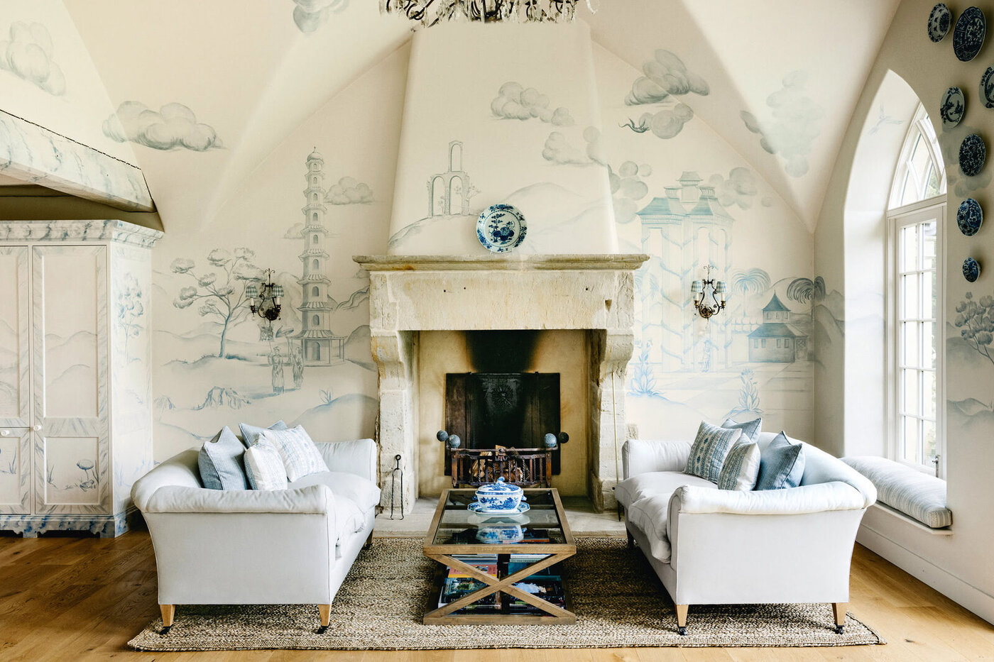
Creating a Cohesive Color Palette
Designing a cohesive color palette for your home decor involves the artful integration of base, accent, and neutral colors to establish a harmonious and visually captivating environment. A well-crafted color palette not only reflects your personal style and preferences but also fosters a sense of unity and balance within the space. By following a few key principles, you can create a color scheme that elevates the aesthetic appeal of your home and resonates with your desired ambiance.
One fundamental aspect of creating a cohesive color palette is maintaining a sense of continuity and flow throughout the space. This can be achieved by establishing a unifying element, such as a shared undertone or intensity, that threads through the various colors in the room. Whether it’s warm earthy tones, cool pastel hues, or monochromatic neutrals, this common thread provides a cohesive visual narrative that ties the color scheme together.
Additionally, consider the distribution of colors within the room to ensure a balanced and harmonious composition. A well-balanced color palette takes into account the proportions of each color, preventing any single hue from overpowering the space. Whether through the 60-30-10 rule, where the dominant color comprises 60% of the room, the secondary color occupies 30%, and accent colors make up the remaining 10%, or through a more fluid distribution based on the specific needs of the space, thoughtful consideration of color proportions contributes to a visually pleasing and well-rounded design.
Furthermore, embracing the concept of contrast and variation can enrich the color palette, adding depth and visual interest to the room. Contrasting colors, whether complementary or analogous, create dynamic focal points and evoke a sense of dynamism within the space. Additionally, incorporating variations in tone, saturation, and texture within the color scheme can introduce a layer of complexity and sophistication, elevating the overall aesthetic appeal.
Another key consideration in creating a cohesive color palette is the concept of rhythm and repetition. By strategically repeating certain colors or color combinations throughout the room, you can establish a sense of rhythm that guides the eye and creates a cohesive visual experience. This repetition can manifest through textiles, artwork, and decor elements, fostering a sense of unity and coherence within the space.
Ultimately, a cohesive color palette is a reflection of your unique style and vision for your home. By embracing the principles of continuity, balance, contrast, and rhythm, you can craft a color scheme that not only enhances the aesthetic appeal of your living space but also fosters a sense of harmony and unity, creating an environment that resonates with your personal taste and elevates your everyday living experience.
Implementing the Color Scheme
Implementing a carefully curated color scheme is the final step in bringing your home decor vision to life. This phase involves integrating the chosen base, accent, and neutral colors into the various elements of your living space to create a cohesive and visually captivating environment. Whether through wall treatments, furnishings, decor accents, or textiles, the strategic application of your color scheme can transform your home into a harmonious and inviting sanctuary that reflects your personal style and aesthetic sensibilities.
One of the primary methods of implementing the color scheme is through wall treatments, such as paint, wallpaper, or decorative finishes. The base color, which serves as the foundational hue, can be applied to the walls to establish the room’s primary ambiance and visual character. Whether you opt for a bold accent wall to introduce a pop of color or prefer a consistent application of the base color throughout the space, the walls serve as a canvas for anchoring the color scheme and setting the tone for the room.
Furnishings and upholstery play a pivotal role in bringing the color scheme to life. Whether through sofas, chairs, tables, or cabinets, these elements offer opportunities to introduce accent colors and neutrals, infusing the space with depth and personality. Consider upholstering key furniture pieces in accent colors or integrating decorative cushions and throws that reflect the chosen color palette, adding vibrancy and visual interest to the room.
Decor accents, such as artwork, decorative objects, and lighting fixtures, provide avenues for incorporating accent colors and neutrals in subtle yet impactful ways. Whether through statement artwork that showcases accent hues, decorative vases that echo the base color, or pendant lights that introduce warm or cool tones, these accents contribute to the overall cohesiveness and visual intrigue of the color scheme.
Textiles, including rugs, curtains, and throw pillows, offer an opportunity to infuse the room with texture, pattern, and color. By selecting textiles that align with the chosen color palette, you can introduce layers of warmth, comfort, and visual depth, enriching the ambiance of the space while reinforcing the harmony of the color scheme.
Ultimately, implementing the color scheme involves a thoughtful and holistic approach to integrating colors into the various elements of your living space. By leveraging wall treatments, furnishings, decor accents, and textiles, you can bring your color scheme to life, creating a visually captivating and harmonious environment that reflects your unique style and design sensibilities.
Conclusion
Designing a home decor color scheme is a transformative and deeply personal journey that empowers you to infuse your living space with style, personality, and ambiance. By delving into the intricacies of color theory, selecting a base color that sets the tone for the room, incorporating accent colors that add depth and character, and integrating neutrals that provide balance and versatility, you can create a captivating and harmonious environment that reflects your unique vision and aesthetic sensibilities.
Understanding the interplay between warm and cool tones, creating a cohesive color palette, and implementing the chosen color scheme into the various elements of your home allows you to craft a visually compelling and emotionally resonant living space. Whether you seek to evoke a sense of warmth and vitality, foster a tranquil and serene atmosphere, or manifest a modern and sophisticated aesthetic, the artful application of color empowers you to shape the ambiance and character of your home.
As you embark on this creative journey, remember that the process of designing a home decor color scheme is an expression of your individuality and a reflection of your lifestyle and preferences. Embrace the principles of color theory, draw inspiration from your surroundings and personal experiences, and allow your intuition to guide your choices. By infusing your living space with a harmonious and captivating color scheme, you can create a sanctuary that not only delights the senses but also nurtures a sense of comfort, joy, and well-being.
In the end, the art of designing a home decor color scheme transcends mere aesthetics; it is a celebration of creativity, self-expression, and the profound impact of color on our emotions and experiences. As you breathe life into your living space through the thoughtful selection and application of colors, may your home become a testament to your unique style, a haven of beauty and inspiration, and a reflection of the vibrant tapestry of your life.
Now that you’ve mastered creating a vibrant color scheme, why stop there? Dive into our next feature on enduring decor trends. Here, you'll find fresh insights on styles poised to shape interiors in 2024. Whether you’re refreshing a single room or revamping your entire home, these trends offer exciting opportunities to infuse new life into your spaces. Don't miss out on this essential read for any decor enthusiast looking to stay ahead of the curve.
Frequently Asked Questions about How To Design Home Decor Color Scheme
Was this page helpful?
At Storables.com, we guarantee accurate and reliable information. Our content, validated by Expert Board Contributors, is crafted following stringent Editorial Policies. We're committed to providing you with well-researched, expert-backed insights for all your informational needs.
0 thoughts on “How To Design Home Decor Color Scheme”