Home>Interior Design>Warm Color Schemes: What They Are And How To Use Them
Interior Design
Warm Color Schemes: What They Are And How To Use Them
Modified: August 28, 2024
Discover the power of warm color schemes in interior design. Learn what they are, how to use them, and create a cozy and inviting space.
(Many of the links in this article redirect to a specific reviewed product. Your purchase of these products through affiliate links helps to generate commission for Storables.com, at no extra cost. Learn more)
Introduction
Welcome to the world of warm color schemes! In the realm of interior design, colors play a crucial role in creating an inviting and harmonious space. Whether you’re decorating a cozy living room, a vibrant kitchen, or a serene bedroom, understanding warm color schemes can make all the difference.
Warm colors, such as reds, yellows, and oranges, evoke feelings of energy, warmth, and comfort. They can instantly transform a space, giving it a lively and inviting atmosphere. From the bold and passionate shades of red to the soothing hues of yellow, warm colors have the power to set the mood and create a sense of coziness.
In this article, we will delve into the world of warm color schemes and explore the psychology behind them. We will also provide practical tips on how to incorporate warm color schemes in your interior design projects. Additionally, we will discover how warm colors are used in graphic design, fashion, and website design, and discuss the benefits and limitations of using warm color schemes. So, let’s jump right in and unlock the secrets of warm color schemes!
Key Takeaways:
- Warm color schemes can transform spaces, evoke emotions, and create visually captivating designs in interior design, graphic design, fashion, and website design. Understanding their psychology and strategic use is key to creating welcoming and engaging atmospheres.
- By incorporating warm color schemes strategically, designers can create visually appealing and emotionally engaging designs that leave a positive and lasting impression. Understanding the benefits and limitations of warm colors is essential for impactful and successful designs.
What are Warm Color Schemes?
Warm color schemes are combinations of colors that predominantly consist of warm colors on the color wheel. Warm colors are those that are visually associated with heat, fire, and sunlight. They include shades of red, yellow, and orange, as well as their various tints and tones.
One popular warm color scheme is the monochromatic scheme, which involves using different shades, tints, and tones of a single warm color. This creates a harmonious and cohesive look, with variations in intensity and depth.
Another commonly used warm color scheme is the analogous scheme, which involves using adjacent colors on the color wheel. For example, you can combine shades of yellow, orange, and red to create a visually pleasing and cohesive palette.
Complementary warm color schemes involve pairing warm colors with their complementary cool colors on the opposite side of the color wheel. This creates a vibrant and energetic contrast that can be visually striking.
Triadic warm color schemes involve selecting three colors that are evenly spaced on the color wheel. For example, you can combine shades of red, yellow, and orange to create a bold and balanced color palette.
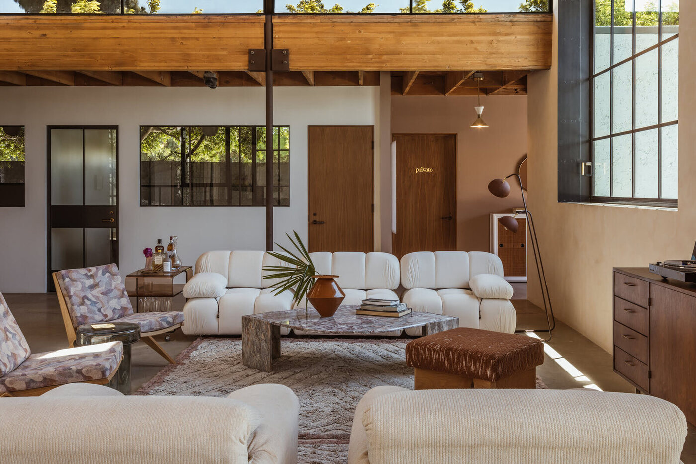
Warm color schemes can also be combined with neutral colors to create a balanced and sophisticated look. Neutral colors, such as white, beige, and gray, provide a calm and grounding backdrop that allows the warm colors to shine.
When designing with warm color schemes, it is important to consider the balance and proportion of colors. Experiment with different combinations and intensities to achieve the desired effect. Warm colors can be used as accents or as the dominant color in a space, depending on the mood and ambiance you want to create.
In the next section, we will explore the psychology of warm colors and how they can impact our emotions and perception of a space.
Psychology of Warm Colors
Warm colors have a profound impact on our emotions and can influence how we perceive and experience a space. Understanding the psychology behind warm colors can help you create the desired atmosphere and mood in your interior design projects.
Red, the boldest and most intense warm color, is associated with energy, passion, and stimulation. It can increase heart rate and blood pressure, making it an ideal choice for spaces that encourage social interaction, such as dining rooms or entertainment areas. However, excessive use of red can be overwhelming, so it’s important to use it strategically as an accent or in moderation.
Yellow is often associated with happiness, warmth, and optimism. It can create a sense of positivity and cheerfulness, making it an ideal color for kitchens, living rooms, and study areas. Yellow also stimulates mental activity and can enhance focus and creativity. However, too much yellow can lead to feelings of agitation or anxiety, so it’s important to use it in balance with other colors.
Orange combines the energy of red and the vibrancy of yellow. It evokes feelings of excitement and enthusiasm and is often associated with warmth and creativity. Orange can create a welcoming and inviting atmosphere, making it a great choice for entryways, dining areas, and playrooms. However, like red and yellow, too much orange can be overwhelming, so consider using it as an accent color or in muted shades.
Warm colors in general have the ability to make a space feel cozy, intimate, and inviting. They can stimulate our appetite, making them a popular choice for dining areas and restaurants. Warm color schemes are often used in spaces where people gather, as they can create a sense of warmth and comfort.
It’s important to note that cultural and personal associations with colors can also influence their psychological impact. For example, red may be associated with luck or prosperity in some cultures, while orange may evoke feelings of autumn or harvest. Consider the cultural context and the emotions you want to evoke when selecting warm color schemes for your interior design projects.
Now that we understand the psychology behind warm colors, let’s explore how you can effectively utilize warm color schemes in your interior design endeavors.
How to Use Warm Color Schemes in Interior Design
Using warm color schemes in interior design can create a welcoming and visually stimulating space. Here are some tips on how to effectively incorporate warm colors into your design projects:
1. Determine the mood:
Before selecting warm colors, consider the mood and atmosphere you want to create. Do you want the space to feel cozy and intimate, or vibrant and energetic? Understanding the desired mood will help guide your color choices.
2. Start with a neutral base:
Begin by establishing a neutral base, such as white, beige, or gray. This will provide a balanced backdrop for the warm colors to stand out. Consider using neutral-toned furniture, flooring, and walls as a foundation for your warm color scheme.
3. Choose a dominant warm color:
Select a dominant warm color to anchor your design. This could be a bold shade of red, a sunny yellow, or a rich shade of orange. Use this color on larger surfaces, such as walls or furniture, to create a focal point and set the tone for the space.
4. Add accents:
Introduce accents of complementary warm colors or cooler tones to create visual interest. For example, if your dominant color is red, consider adding accents of yellow or purple. These accents can be incorporated through accessories, fabrics, artwork, or smaller furniture pieces.
5. Play with shades and tones:
Experiment with different shades and tones of warm colors to add depth and dimension to your design. Consider using lighter or darker variations of your chosen warm colors to create contrast and visual balance.
6. Use warm colors strategically:
Use warm colors strategically to highlight or draw attention to specific areas of the room. For example, you can use warm colors on an accent wall, a statement piece of furniture, or through decorative elements such as pillows or rugs.
7. Balance with neutrals and cool colors:
Balance the warm colors with neutral tones and cool colors to create a visually pleasing and harmonious space. Neutrals can provide a calming effect and prevent the warm colors from overwhelming the room.
8. Consider natural light:
Take into account the natural lighting in the space when selecting warm colors. Warm colors tend to appear more intense in areas with ample natural light, so you may need to adjust the hues accordingly.
By following these tips, you can effectively utilize warm color schemes and transform your space into a warm and inviting oasis.
Incorporating Warm Color Schemes in Graphic Design
Warm color schemes can also be effectively used in graphic design to evoke specific emotions and create visually appealing compositions. Whether you’re designing a logo, a website, or a poster, here are some ways to incorporate warm color schemes:
1. Establish a branding color palette:
When developing a brand identity, warm color schemes can help convey the desired personality and values. Choose warm colors that align with the brand’s message and target audience. Consider using warm tones as the primary or secondary colors in the brand’s color palette.
2. Create visual hierarchy:
Warm colors can be used to create visual hierarchy in your designs. Employ the warm colors as the dominant color for important elements that you want to highlight, such as headlines or call-to-action buttons. This will draw attention and guide the viewer’s eye to the most crucial parts of your design.
3. Enhance emotions and messaging:
Warm colors have the power to evoke specific emotions. Use warm color schemes to reinforce the intended emotional response in your graphic designs. For example, a vibrant red can convey excitement and energy, while a soft orange can evoke warmth and friendliness.
4. Consider color psychology:
Similar to interior design, warm colors in graphic design can have psychological effects on the viewer. Consider the psychological associations of warm colors and how they align with the message or concept you want to communicate. Red can signify passion or urgency, while yellow can represent joy or optimism.
Read more: How To Design Home Decor Color Scheme
5. Create contrast:
Pair warm color schemes with cool colors to create contrast and visual interest. Cool colors like blues or greens can balance out the warmth of the design and create a dynamic composition. Experiment with different combinations to achieve the desired visual impact.
6. Use monochromatic schemes:
A monochromatic warm color scheme in graphic design involves using different shades, tints, and tones of a single warm color. This can create a cohesive and harmonious visual experience. Adjusting the saturation and brightness levels can help create contrast and hierarchy within the design.
7. Consider accessibility:
When designing with warm color schemes, it is crucial to ensure accessibility and legibility. Ensure that there is enough contrast between text and background colors to make the content easily readable. Consider using lighter warm colors against a darker background or vice versa to enhance visibility.
8. Test and iterate:
As with any design process, it’s essential to test and iterate your designs. Get feedback from others and experiment with different warm color combinations to find the most effective and visually appealing solution. Trust your instincts, but also rely on data and user feedback to make informed design decisions.
By incorporating warm color schemes in graphic design thoughtfully, you can create visually captivating and emotionally engaging designs that leave a lasting impression on your audience.
Warm Color Schemes in Fashion
Warm color schemes play a significant role in the world of fashion, allowing designers to showcase their creativity and evoke emotions through their collections. In fashion, warm colors can create bold statements, convey different moods, and flatter different skin tones. Here’s how warm color schemes are used in the fashion industry:
1. Seasonal palettes:
Warm color schemes are often associated with specific seasons. For example, deep reds and oranges are commonly seen in fall collections, while vibrant yellows and pinks are popular during the spring and summer seasons. Fashion designers leverage warm color schemes to reflect the mood and spirit of different seasons.
2. Color in accessories:
Accessories are a great way to incorporate warm colors into an outfit. Handbags, shoes, scarves, and jewelry can be used to add pops of warmth and vibrancy to a look. A warm-colored accessory can also be a statement piece that elevates an otherwise neutral or cool-toned outfit.
3. Complementary color combinations:
Warm color schemes can also be utilized through the combination of contrasting or complementary colors. For instance, pairing a warm shade of red with a cool shade of green creates a visually striking and balanced look. Fashion designers experiment with complementary color combinations to create cohesive and captivating ensembles.
Read more: What Are Roof Jacks And How To Use Them
4. Skin tone flattery:
Warm color schemes are often chosen to enhance different skin tones. Warm colors with yellow or gold undertones can complement those with warm undertones in their skin, while cooler tones may create a contrasting effect. Fashion designers consider various skin tones when selecting warm color palettes for their collections, ensuring that their designs flatter a diverse range of individuals.
5. Retro and vintage inspirations:
Warm color schemes are often used in retro-inspired or vintage fashion designs. These color palettes reflect the fashion trends of the past, evoking nostalgic feelings and a sense of classic elegance. Warm colors can be used to recreate the aesthetic of specific eras, such as the earthy tones of the 1970s or the vibrant hues of the 1950s.
6. Bold statements:
Warm colors make a bold and attention-grabbing statement in fashion. Wearing a garment in a warm red, orange, or yellow can draw immediate focus. Fashion designers use warm color schemes to create eye-catching runway looks and designs that exude confidence and passion.
7. Subtle accents:
Alternatively, warm color schemes can be incorporated as subtle accents in an outfit. For example, a warm-toned scarf or a pair of shoes can add a touch of warmth to an otherwise cool-toned ensemble. These subtle accents add depth and interest to the overall aesthetic without overpowering the look.
Warm color schemes in fashion offer endless creative possibilities, allowing designers to express their artistic vision and individuals to embrace their personal style with confidence and flair.
Read more: Types Of RAM And How To Use Them
Warm Color Schemes in Website Design
Warm color schemes are widely used in website design to create visually appealing and engaging online experiences. Warm colors have the power to evoke emotions, grab attention, and create a sense of warmth and connection. Here’s how warm color schemes are incorporated in website design:
1. Establishing a brand identity:
Warm color schemes are often chosen to reflect a brand’s personality and values. The selection of warm colors in a website’s design can help create a cohesive brand identity and convey specific emotions or traits. For example, an online store selling handmade crafts might opt for warm and earthy color schemes to create a sense of authenticity and warmth.
2. Creating visual hierarchy:
Warm colors can be used to create contrast and establish visual hierarchy on a website. By using warm colors strategically for important elements such as headings, buttons, or call-to-action sections, designers can guide the user’s attention and make the most critical information stand out.
3. Eliciting emotional responses:
Warm color schemes can have a significant impact on the emotional response of website visitors. Colors like red can evoke excitement and urgency, while yellow can create feelings of joy and optimism. Designers leverage warm color schemes to elicit specific emotions that align with the purpose of the website, whether it’s to inspire, motivate, or create a sense of comfort.
Read more: What Color Is Taupe? How To Use This Color
4. Enhancing readability and accessibility:
It’s important to strike a balance between warm colors and readability. Designers must ensure that text and other important information are easily readable against warm-colored backgrounds. By adjusting contrast levels and choosing appropriate text colors, designers can create a visually appealing design that is accessible to all users.
5. Inspiring action and engagement:
Warm colors have the ability to provoke action and encourage user engagement. By strategically using warm color schemes for buttons, links, or interactive elements, designers can create a sense of urgency and motivation for users to click, subscribe, or participate in the website’s desired actions.
6. Combining warm colors with neutrals:
Warm colors can be effectively combined with neutral shades to create a balanced and harmonious website design. Neutrals like white, gray, or beige can provide a calm and neutral background that allows the warm colors to stand out. The combination of warm and neutral colors creates a pleasing contrast and enhances the overall aesthetics of the website.
7. Conveying warmth and trust:
Warm color schemes can create a sense of warmth, comfort, and trust in a website. When used appropriately, warm colors can evoke a feeling of familiarity and approachability, making visitors feel more connected to the website and the brand it represents.
When used thoughtfully, warm color schemes can create visually captivating and emotionally engaging website designs that leave a positive and lasting impression on users.
Benefits and Limitations of Warm Color Schemes
Warm color schemes offer a range of benefits and possibilities in various design disciplines. However, it’s important to understand their limitations as well. Let’s explore the advantages and considerations of utilizing warm color schemes:
Benefits:
1. Emotional impact:
Warm colors have the ability to evoke strong emotions and create a sense of energy, passion, and warmth. They can captivate attention and leave a lasting impression on viewers, making them valuable in creating engaging designs.
2. Enhanced coziness:
Warm color schemes can instantly add a cozy and inviting feel to any space or design. They create a sense of comfort and warmth, making them particularly valuable in creating welcoming atmospheres in interior design or establishing a friendly brand image.
3. Vibrancy and vitality:
Warm color schemes are associated with energy, vibrancy, and vitality. They can inject life and excitement into designs, making them suitable for capturing attention and creating a dynamic visual impact.
4. Attention-grabbing:
Warm colors, especially bold shades like red or orange, tend to grab attention quickly. They can be effectively used to draw focus to specific elements or calls-to-action in design, making them valuable in website design or advertising materials.
5. Versatility:
Warm colors can be used in various design contexts, from interior design to graphic design, fashion, and more. They can be adapted to different styles and aesthetics, allowing for versatility and experimentation.
Limitations:
1. Overwhelm and intensity:
Using warm color schemes extensively or in high intensity can result in overwhelming or visually fatiguing designs. It’s crucial to balance warm colors with neutrals or cool colors to ensure visual harmony and prevent saturation.
2. Cultural associations:
Warm colors can have varying cultural associations, which may impact how they are perceived in different contexts. It’s important to consider cultural nuances and preferences when applying warm color schemes to designs intended for a global or diverse audience.
3. Limited calming effect:
Although warm colors can create a sense of coziness, they may not be as effective in creating a calm or serene ambiance compared to cool colors. Designs where relaxation and tranquility are required may benefit more from cool color schemes.
4. Skin tone consideration:
In fashion and certain design contexts, warm color schemes may not be universally flattering for all skin tones. Designers should consider the diverse range of skin tones and how warm colors may interact with different complexions when creating designs that involve human subjects.
5. Accessibility considerations:
When using warm colors in digital or print design, designers must ensure optimal contrast levels for readability and accessibility. Warm colors can sometimes pose challenges in legibility, especially when paired with similar warm-toned text. This should be taken into account when designing for different users.
By understanding these benefits and limitations, designers can make informed decisions when applying warm color schemes to their creative endeavors, resulting in impactful and successful designs.
Tips for Creating a Welcoming Atmosphere with Warm Colors
Warm colors have the inherent ability to create a welcoming and inviting atmosphere in any space. Here are some tips to help you effectively use warm colors and enhance the overall ambiance:
1. Start with neutral tones:
Establish a neutral base by using colors like white, beige, or gray as a backdrop. This provides a calm and balanced foundation that allows the warm colors to shine and create a welcoming atmosphere without overwhelming the space.
2. Choose the right shades:
When selecting warm colors, consider the specific mood you want to create. Soft, muted shades like blush pink or warm terracotta can evoke a subtle and cozy ambiance, while brighter and bolder shades like rich reds or sunny yellows can create a vibrant and energetic atmosphere.
3. Introduce warm accents:
Add warm accents throughout the space to create visual interest and warmth. This can be achieved through the use of warm-colored accessories, such as throw pillows, rugs, curtains, or artwork. These accents will not only create a welcoming feel but also provide opportunities for easy updates and changes in the future.
4. Layer textures and materials:
Incorporate different textures and materials with warm undertones to add depth and warmth to the space. Consider using materials like wood, natural fibers, or warm-toned metals to create visual and tactile interest. These elements can enhance the overall sense of coziness and comfort.
5. Balance warm and cool colors:
Create a harmonious and balanced look by incorporating cool colors alongside warm colors. Cool colors, such as blues or greens, can complement warm colors and create a visually pleasing contrast. This balance will prevent the space from feeling too overwhelming or one-dimensional.
6. Consider lighting:
Pay attention to the lighting in the space, as it can greatly influence the way warm colors are perceived. Natural light enhances warm hues, so maximize natural light sources by keeping windows unobstructed. In areas with limited natural light, use warm-toned artificial lighting to maintain the cozy ambiance.
7. Use warm colors strategically:
Strategically place warm colors in areas where you want to draw attention or create a focal point. This can be achieved by using warm colors on an accent wall, a piece of furniture, or through carefully chosen decorative elements. By using warm colors selectively, you can guide the eye and create a sense of coziness without overwhelming the entire space.
8. Personalize with warm accessories:
Add personal touches to the space through warm-colored accessories that reflect your personality and style. This can include items like artwork, photographs, or sentimental objects that have warm color elements. These personalized touches will make the space feel even more welcoming and comfortable.
By following these tips, you can effectively create a welcoming atmosphere with warm colors and transform your space into a haven of comfort and hospitality.
Conclusion
Warm color schemes are a powerful tool in interior design, graphic design, fashion, and website design. They have the ability to create a welcoming atmosphere, provoke emotions, and make a powerful visual impact. By understanding the psychology behind warm colors and incorporating them strategically, you can create designs that are visually appealing, engaging, and meaningful.
In interior design, warm color schemes can transform a space, making it feel cozy, inviting, and full of life. From selecting the right shades to balancing warm colors with neutrals, creating a harmonious and welcoming atmosphere is within reach. Incorporating warm color schemes in graphic design can evoke specific emotions and create visual hierarchy. Warm colors can also be used effectively in fashion to flatter different skin tones, make bold statements, and reflect different seasons or vintage aesthetics.
Warm color schemes in website design can create visually captivating experiences, encourage user engagement, and establish a strong brand identity. They can evoke emotions, guide user attention, and enhance the overall user experience. While warm colors have numerous benefits, it is important to consider their limitations, such as potential overwhelming effects or cultural associations.
To create a welcoming atmosphere with warm colors, start with a neutral base, choose the right shades, and incorporate warm accents and textures. Balancing warm colors with cool tones, considering lighting, using warm colors strategically, and personalizing the space with warm accessories are also essential. By following these tips, you can create a warm and inviting environment that leaves a positive and lasting impression on others.
Whether you’re redesigning a room, creating a logo, designing a website, or selecting fashionable outfits, warm color schemes offer endless possibilities and opportunities for creativity. By understanding the psychology and techniques behind warm color schemes, you can bring warmth, energy, and a sense of hospitality to your designs.
So, go ahead and embrace the power of warm colors. Let them infuse your designs with vibrancy, coziness, and a warm welcome that will delight and captivate all who experience them.
Frequently Asked Questions about Warm Color Schemes: What They Are And How To Use Them
Was this page helpful?
At Storables.com, we guarantee accurate and reliable information. Our content, validated by Expert Board Contributors, is crafted following stringent Editorial Policies. We're committed to providing you with well-researched, expert-backed insights for all your informational needs.
0 thoughts on “Warm Color Schemes: What They Are And How To Use Them”