Home>Interior Design>How To Whole-house Color Scheme For A Cohesive Look
Interior Design
How To Whole-house Color Scheme For A Cohesive Look
Modified: October 29, 2024
Learn how to create a cohesive whole-house color scheme for your interiors with these expert interior design tips and ideas. Achieve a harmonious look in your home with the right combination of colors.
(Many of the links in this article redirect to a specific reviewed product. Your purchase of these products through affiliate links helps to generate commission for Storables.com, at no extra cost. Learn more)
Introduction
Welcome to the world of interior design, where colors play a pivotal role in creating an atmosphere that is not only visually appealing but also cohesive. A well-thought-out color scheme can transform a house into a home, tying together different spaces and evoking a desired mood. Whether you’re embarking on a full-scale renovation or simply looking to refresh the look of your home, understanding how to create a whole-house color scheme is essential.
Colors have the power to evoke emotions, set the tone, and create a sense of harmony. They can influence the way we perceive and interact with our surroundings, affecting our mood, energy levels, and overall well-being. When each room of your house has its own color scheme, it can create a sense of disconnect and lack of flow. In contrast, a cohesive color scheme ensures that every space feels connected and unified, creating a seamless transition from one room to another.
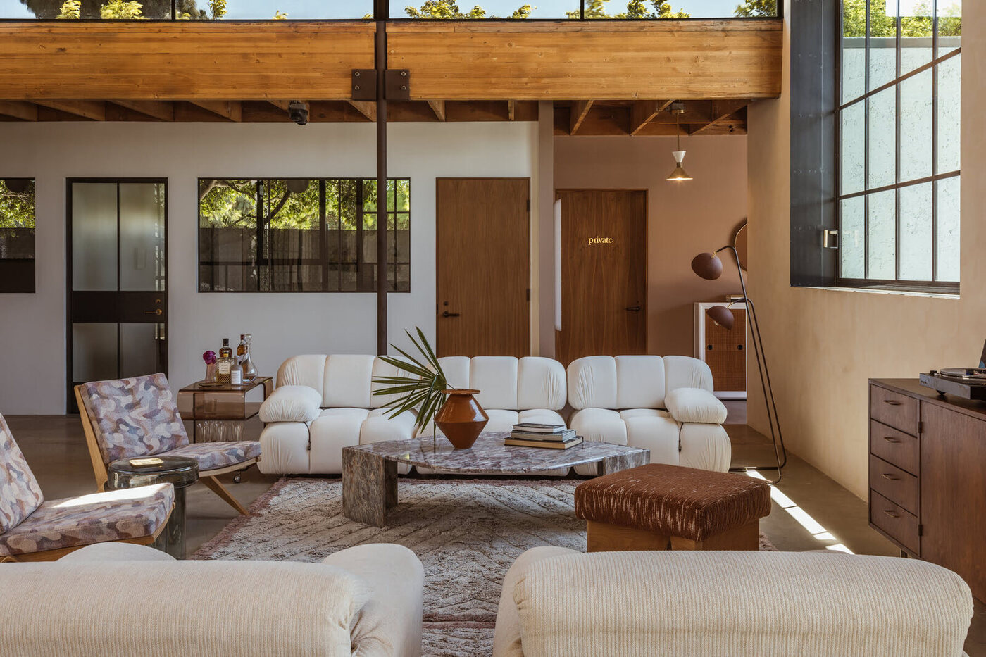
When approaching a whole-house color scheme, it’s important to consider the architectural style of your home and any existing elements that need to be incorporated. The style of your home can guide you in selecting a color palette that complements its architectural features, whether it’s a modern minimalist home, a cozy cottage, or a classic colonial. By working with the existing elements, such as flooring, trim, and furniture, you can achieve a cohesive look that enhances the overall aesthetic of your home.
The primary color palette serves as the foundation of your whole-house color scheme. It consists of the base color that will be present throughout different areas of your home. This color should be chosen carefully, as it will set the tone for the entire space. You can explore different color schemes, such as warm, cool, or neutral, depending on the desired atmosphere. You can also consider using color psychology to evoke specific emotions and create the desired ambiance in each room.
Creating a secondary color scheme is equally important to achieve a cohesive look. These colors will complement the primary color and add depth and visual interest to your space. By selecting complementary colors and exploring accent colors, you can create a harmonious balance throughout your home. Balancing the distribution of colors is essential to ensure that no one color overwhelms the space. Distribute colors proportionally and consider the flow between rooms to maintain continuity.
Coordinating paint colors for different rooms is another crucial aspect of a whole-house color scheme. While you want each room to have a unique identity, it’s important to create a connected color story throughout your home. Selecting colors for common areas like the living room and hallway can set the tone for the rest of the house. Coordinating bedrooms and bathrooms with the overall color scheme adds to the sense of continuity and harmony.
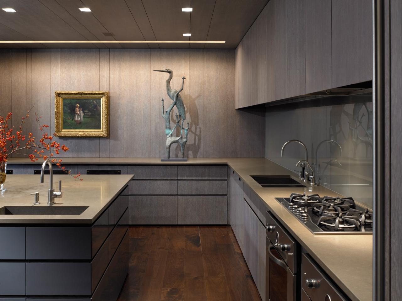
Texture and pattern are essential elements in interior design, and they can be incorporated to enhance a cohesive color scheme. By adding different textures to your space, you can create visual interest and depth. Similarly, using patterns can tie different spaces together and create a sense of continuity. Whether it’s through throw pillows, rugs, or wallpaper, texture and pattern can elevate your whole-house color scheme.
When choosing appropriate colors for functional areas, keep in mind the purpose of each room. Different colors can elicit specific emotions and impact our behavior. Bedrooms may benefit from calming and soothing colors to promote relaxation and sleep, while workspaces may benefit from energizing and stimulating colors to increase productivity. Tailoring the color scheme to the functionality of each room can enhance its purpose.
Creating a cohesive color scheme requires careful consideration and attention to detail. You’ll want to avoid clashing colors that disrupt the harmony of your space. Use color swatches and samples to visualize how different colors will interact with each other and seek professional advice if needed. With a well-planned color scheme, you can achieve a cohesive look throughout your home, creating a welcoming, harmonious, and visually stunning environment.
Key Takeaways:
- Creating a cohesive color scheme is essential for a harmonious home. Consider architectural style, primary and secondary color palettes, and balance color distribution for a visually stunning and unified design.
- Incorporating texture, pattern, and appropriate colors enhances functionality and visual interest. Avoid clashing colors, consider scale and proportion, and seek professional advice for a successful outcome.
Understanding the Importance of a Cohesive Color Scheme
Colors have a profound impact on the overall aesthetic of a space. They have the ability to convey emotions, create visual interest, and establish a specific atmosphere. When it comes to creating a cohesive color scheme for your home, understanding the importance of color is crucial.
One of the primary benefits of a cohesive color scheme is that it creates a unified and harmonious atmosphere throughout your home. When colors are carefully chosen and coordinated, they establish a sense of cohesion that ties all the different spaces together. This continuity helps create a smooth flow from one room to another, ensuring that your home feels like a cohesive whole rather than a collection of separate areas.
Another key aspect of a cohesive color scheme is its impact on the overall aesthetic of your home. When colors are chosen with intention, they can enhance the architectural features and design elements of your space. For instance, selecting a color palette that complements the style of your home can accentuate its unique characteristics and create a visually appealing environment.
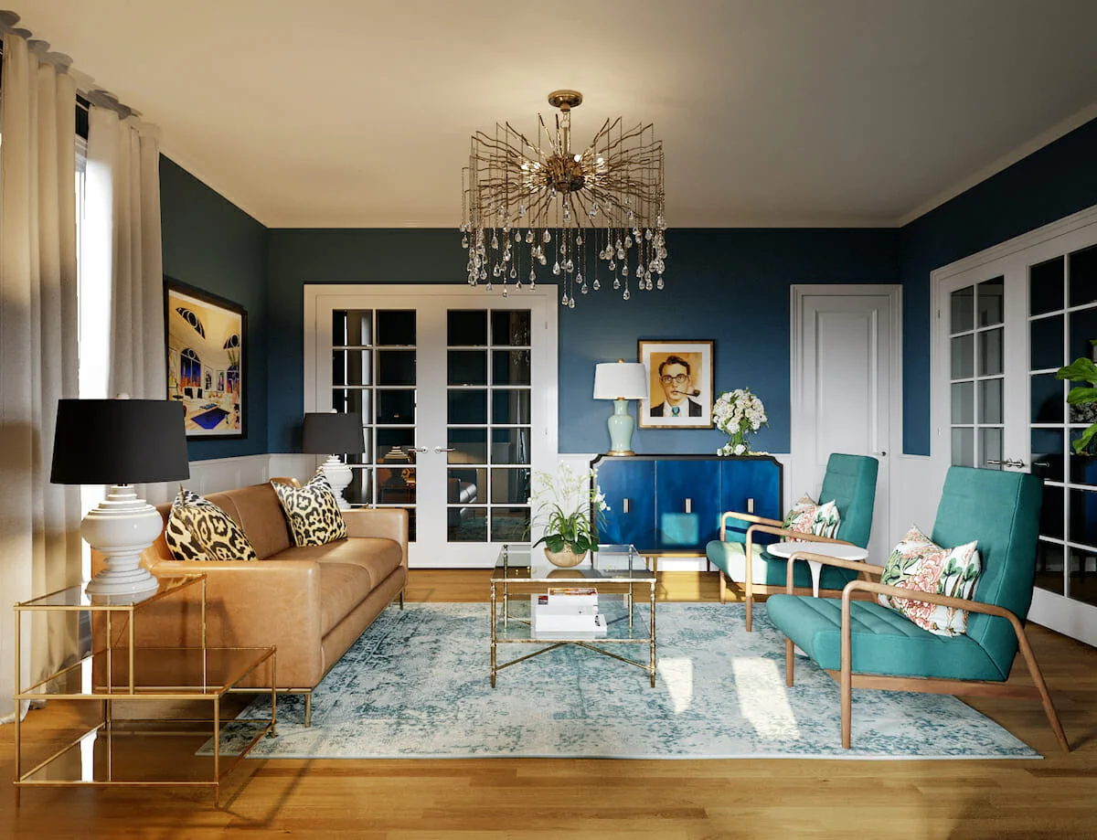
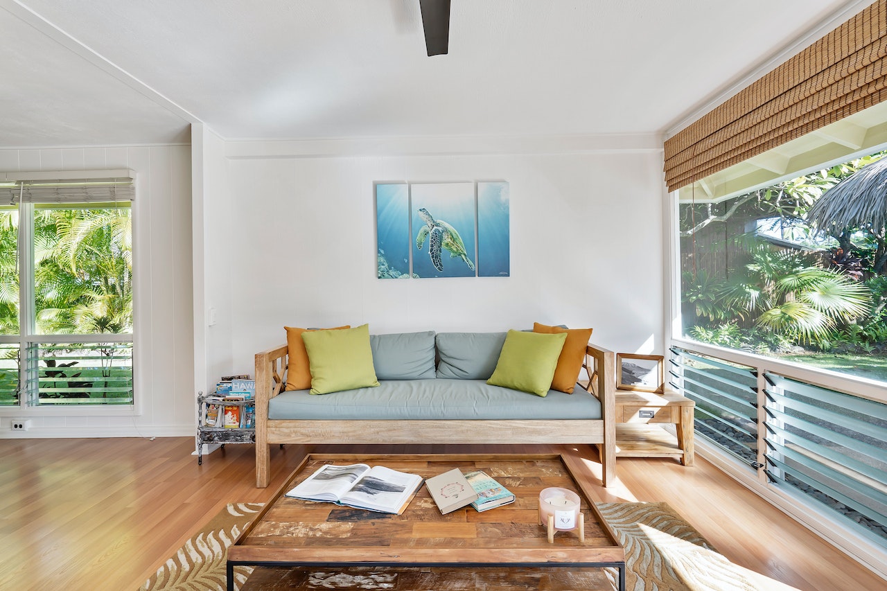
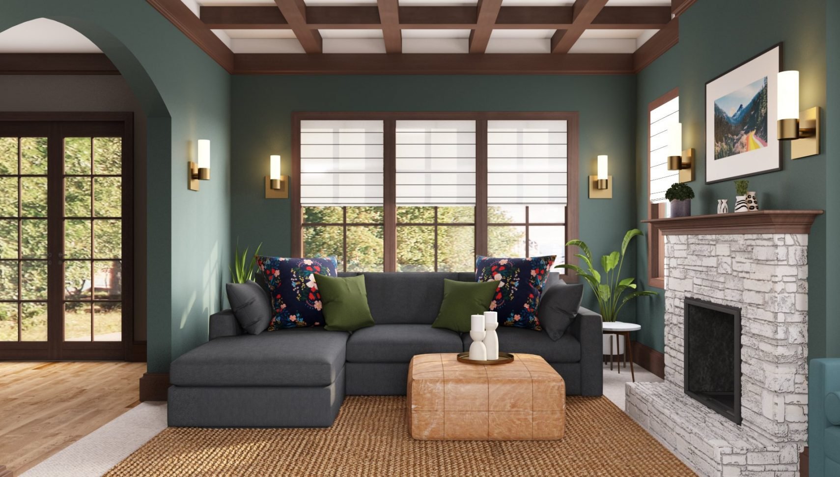
Colors also have the power to influence our emotions and moods. Different hues can evoke a wide range of feelings, from tranquility and relaxation to energy and excitement. By understanding the psychology of colors, you can select shades that reflect the desired atmosphere for each room. For example, cool colors like blues and greens are often associated with calmness and serenity, making them ideal for bedrooms and bathrooms. On the other hand, warm colors like reds and oranges can create a sense of warmth and comfort, making them suitable for living rooms and dining areas.
A cohesive color scheme allows you to create a visual story throughout your home. By adopting a consistent color palette, you can establish a sense of rhythm and balance as you move from one room to another. This visual story creates a sense of unity and cohesion and helps create an inviting and aesthetically pleasing environment for both you and your guests.
Furthermore, a cohesive color scheme can also simplify your design choices. Having a predetermined color scheme ensures that you always have a starting point when selecting furniture, decor, and accessories. It saves you from the overwhelming task of trying to find pieces that match or coordinate with disparate color schemes in different rooms. Instead, you can focus on finding items that complement and enhance the overall color palette, making the design process more enjoyable and efficient.
Overall, a cohesive color scheme is essential for creating a unified and harmonious atmosphere in your home. It establishes a visual continuity that connects different spaces, enhances the overall aesthetic, and evokes the desired emotions and moods. By understanding the impact of colors and selecting a well-curated color palette, you can create a space that is not only pleasing to the eye but also reflects your personal style and creates a welcoming and cohesive environment.
Considering the Architectural Style and Existing Elements
When creating a cohesive color scheme for your home, it’s important to take into account the architectural style of your house and any existing elements that need to be incorporated. These factors play a significant role in determining the overall aesthetic and can guide your color choices.
The first step is to identify the style of your home. Is it a contemporary, modern, traditional, or perhaps a farmhouse-style house? Each architectural style has its own unique characteristics and color palettes that complement it. By understanding the style of your home, you can select colors that enhance its inherent charm and create a harmonious look.
Working with the architectural features of your home is key to creating a cohesive color scheme. Elements such as trim, molding, doors, and windows should be considered when selecting colors. These features can be highlighted or blended seamlessly depending on your desired outcome. If you have ornate trim or crown molding, you may choose to paint it in a contrasting color to make it stand out. On the other hand, if you have minimalistic or modern architectural features, a monochromatic color scheme can create a sleek and cohesive look.
Incorporating existing furniture and decor into your color scheme is also essential. Instead of trying to completely overhaul your space, consider how your current furnishings and accessories can be integrated with the new color scheme. If you have a beloved piece of furniture or artwork that you want to keep, consider its colors when choosing your paint colors. This will ensure that everything is visually cohesive and no elements clash in the space.
When considering the architectural style and existing elements, don’t be afraid to think outside the box. While it’s important to respect the overall aesthetic of your home, you can still introduce unexpected color accents or modern touches to add personality and interest. By striking a balance between honoring the architectural style and infusing your own personal style, you can create a unique and visually stunning space.
To summarize, considering the architectural style and existing elements is crucial when creating a cohesive color scheme. By identifying the style of your home, working with architectural features, and incorporating existing furniture and decor, you can ensure that your color choices enhance the overall aesthetic and create a harmonious look. Strike a balance between respecting the architectural style and infusing your personal style to create a space that is both visually stunning and reflects your unique personality.
Selecting a Primary Color Palette
When creating a cohesive color scheme for your home, selecting a primary color palette is a fundamental step. This primary color palette will serve as the base for your entire house, providing a consistent backdrop that ties all the rooms together. Here are some key considerations when selecting your primary color palette:
Choosing a base color for the entire house is an important decision. This color will be the dominant hue that carries throughout your home, creating a sense of unity and cohesion. You can opt for a neutral color like white, beige, or gray, which provides a versatile and timeless foundation. Alternatively, you may choose a bold and vibrant color that reflects your personal style and sets a specific mood for your space.
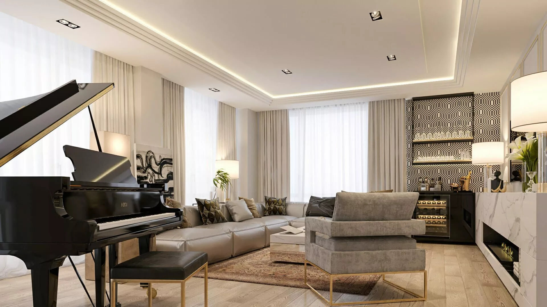
Exploring different color schemes is essential to finding the right primary color palette for your home. Warm color schemes, such as shades of red, orange, and yellow, can create a cozy and inviting atmosphere. Cool color schemes, consisting of blues, greens, and purples, can evoke a sense of calmness and serenity. Neutral color schemes, like grays, whites, and beiges, offer versatility and can serve as a timeless base for various design styles.
Understanding color psychology can also help you evoke desired emotions in each room. Different colors have the power to influence our mood and emotions. For example, warm colors can create a sense of energy and excitement, making them suitable for spaces like the kitchen or dining area. Cool colors, on the other hand, can promote relaxation and tranquility, making them ideal for the bedroom or bathroom. By employing color psychology, you can create an atmosphere that aligns with the function and ambiance you want to achieve in each room.
Additionally, consider the size and natural lighting of each room when selecting your primary color palette. Darker colors can make a room feel smaller and cozy, while lighter colors can create a sense of openness and airiness. If a room receives ample natural light, you can embrace deeper or brighter colors without worrying about them overwhelming the space. In rooms with limited natural light, lighter and softer hues can help maximize the available light.
Remember that choosing a primary color palette is a personal decision. Consider your preferences, the overall style of your home, and the mood you want to create. Experiment with different color swatches and samples to visualize how they will look in your space. Take into account how the color will interact with the other elements in the room, such as furniture, flooring, and decor. Through careful consideration and experimentation, you can choose a primary color palette that sets the tone for a cohesive and aesthetically pleasing home.
To summarize, selecting a primary color palette is a crucial step in creating a cohesive color scheme for your home. Choose a base color that resonates with your personal style and complements the overall aesthetic of your space. Explore different color schemes, considering warm, cool, or neutral options, and utilize color psychology to evoke desired emotions. By taking into account the size and lighting of each room, and considering the harmony with other elements, you can select a primary color palette that creates a unified and harmonious ambiance throughout your home.
Creating a Secondary Color Scheme
In addition to selecting a primary color palette, creating a secondary color scheme is crucial in achieving a cohesive and visually appealing home design. The secondary colors will complement the primary color and create depth and interest within your space. Here are some key considerations when creating your secondary color scheme:
Start by selecting complementary colors that work harmoniously with your primary color palette. Complementary colors reside opposite each other on the color wheel and can create a striking contrast when paired together. For example, if your primary color is a cool blue, consider incorporating warm orange or yellow as complementary accents. These complementary colors can infuse energy and vibrancy into your space, enhancing the overall aesthetic.
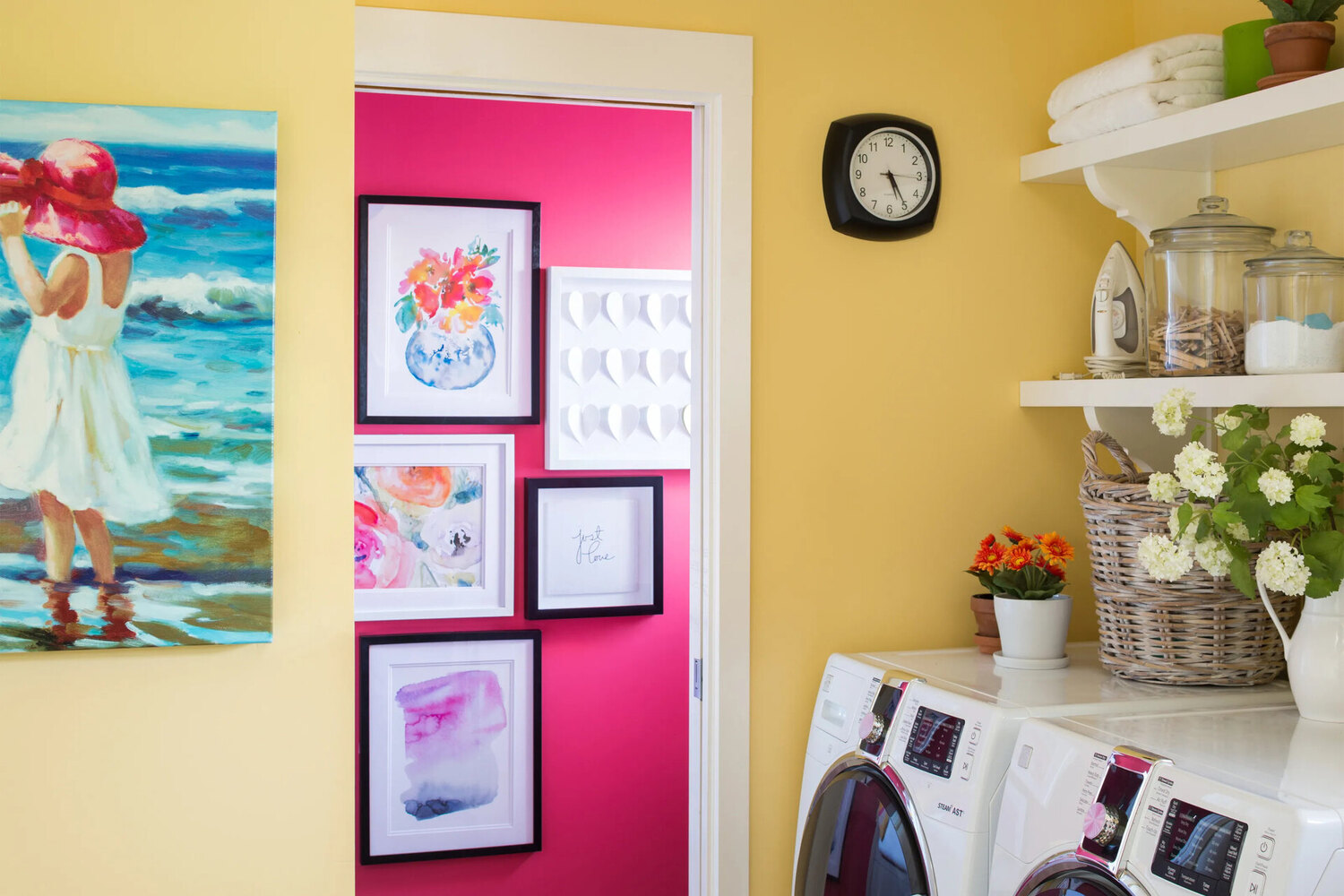
Exploring accent colors is another way to create visual interest within your secondary color scheme. Accent colors are bolder hues that can be incorporated in smaller doses to add pops of color throughout your home. They can be used to highlight architectural features or specific areas, such as an accent wall or a statement piece of furniture. Accent colors can also be utilized through accessories and decor items, such as throw pillows, artwork, or rugs. By strategically integrating accent colors, you can create focal points and balance within your design.
Harmonizing with the primary color palette is essential in creating a cohesive secondary color scheme. The secondary colors should complement and enhance the primary color, not overpower or compete with it. Consider using shades or tones of your primary color as part of your secondary color palette. This creates a sense of cohesion and ensures that the secondary colors seamlessly blend with the primary color throughout your space. By maintaining a harmonious balance between the primary and secondary colors, you can achieve a visually appealing and well-coordinated color scheme.
Another approach to creating a secondary color scheme is to use analogous colors. Analogous colors are located next to each other on the color wheel and naturally complement each other. This technique creates a more subtle and cohesive look. For example, if your primary color is a soothing green, you can choose secondary colors like shades of blue or yellow-green. Analogous colors work well together and provide a harmonious and cohesive color scheme.
Remember, creating a secondary color scheme is an opportunity to add depth, character, and visual interest to your space. Experiment with different combinations of complementary and accent colors, ensuring they harmonize with the primary color palette. Consider the mood and ambiance you want to create in each room and how the secondary colors contribute to this. Through thoughtful selection and integration, your secondary color scheme will enhance the overall design and bring your home to life.
In summary, creating a cohesive secondary color scheme adds depth and interest to your space. Select complementary colors that work harmoniously with your primary color palette, explore accent colors to create focal points, and ensure all colors harmonize with one another. Whether using contrasting complementary colors or analogous colors for a more subtle look, the secondary color scheme should enhance and balance the overall design of your home.
Read more: How To Install A Whole House Dehumidifier
Balancing Color Distribution Throughout the House
When creating a cohesive color scheme for your home, it’s important to balance the distribution of colors to ensure harmony and visual continuity. By distributing colors proportionally, connecting adjacent spaces with consistent colors, and considering the flow and transitions between rooms, you can achieve a well-balanced and visually pleasing color scheme throughout your entire house.
One key aspect of balancing color distribution is to distribute colors proportionally throughout your home. This means considering the size and importance of each room and assigning a suitable amount of color to it. For example, common areas such as the living room, dining room, or kitchen might benefit from a slightly larger portion of the color palette, as these spaces tend to be more central and frequently used. Smaller rooms or less prominent areas, such as guest bedrooms or utility spaces, can have a more subdued color presence to maintain balance.
Connecting adjacent spaces with consistent colors is another important factor in maintaining a cohesive color scheme. When one room flows into another, using consistent color elements can create a seamless and visually pleasing transition. This doesn’t mean that every room must have the exact same color scheme, but incorporating shared colors or similar shades can help establish a connection and prevent abrupt color changes that may disrupt the overall flow of your home.
Consider the flow and transitions between rooms when deciding on the color distribution. How one space transitions to another can influence the choice of colors. For example, if there are open concept areas in your home, it is important to ensure that the colors used in one area complement and harmonize with those in adjoining spaces. This creates a sense of continuity and coherence as you move from one area to another, enhancing the overall flow of your home.
Another aspect to consider is how light and natural lighting affect the perception of colors. Natural light can have a significant impact on how colors appear in a space. Consider the direction of light and how it changes throughout the day. This will help you choose colors that complement and enhance the natural lighting in each room, creating a harmonious and balanced atmosphere.
Remember, balancing color distribution is not about having the exact same colors in every room, but rather ensuring a sense of cohesion and flow throughout your home. It’s about considering the size, importance, and function of each room and assigning colors proportionally, connecting adjacent spaces with consistent colors, and considering the flow and transitions between rooms. By achieving balance in color distribution, you can create a visually pleasing and harmonious color scheme that enhances the overall design of your home.
In summary, balancing color distribution throughout your home is crucial in achieving a cohesive and visually appealing color scheme. Distribute colors proportionally, considering the size and importance of each room. Connect adjacent spaces with consistent colors to create a seamless transition from one room to another. Consider the flow and transitions between rooms, and take into account natural lighting to enhance the perception of colors. By paying attention to these factors, you can achieve a well-balanced and visually stunning color scheme throughout your entire house.
When choosing a whole-house color scheme, start with a main color for the largest, most centrally located room. Then, select complementary colors for adjacent spaces to create a cohesive flow throughout your home.
Coordinating Paint Colors for Different Rooms
Coordinating paint colors for different rooms is a crucial aspect of creating a cohesive and harmonious color scheme throughout your home. By selecting colors that complement each other and create a connected color story, you can achieve a unified and visually stunning design. Here are some tips for coordinating paint colors for different rooms:
Start by selecting colors for common areas such as the living room, hallway, and entryway. These spaces often serve as the central areas of your home, and their colors should set the tone for the rest of the house. Consider a neutral color palette for these areas to create a versatile and timeless backdrop. Shades of gray, beige, or soft whites work well in these spaces and can serve as a starting point for your color scheme.
When coordinating bedrooms and bathrooms, consider creating a sense of continuity and harmony while also allowing each room to have its own unique identity. Choose colors that complement the overall color palette of your home while considering the specific ambiance you want to create in each room. Soft and calming hues like blues or greens work well in bedrooms, creating a peaceful and relaxing atmosphere. For bathrooms, consider using crisp whites or light pastels that promote a sense of cleanliness and tranquility.
Creating a connected color story is important to ensure a cohesive and visually appealing design. Select a few anchor colors from your primary and secondary color palettes and incorporate them in various rooms throughout your home. This can be achieved through accent walls, furniture pieces, or decor accessories. By repeating these anchor colors in different spaces, you’ll create a sense of unity and visual flow from one room to another.
In addition to coordinating paint colors, consider the placement and layout of the rooms when deciding on the color scheme. Consider how certain rooms connect or flow into each other and select colors that transition smoothly between them. This ensures a seamless and visually pleasing transition as you move through your home.
Remember to take into account the natural lighting in each room when coordinating paint colors. Natural light can affect how colors appear, so it’s important to test paint swatches under different lighting conditions. Be mindful of the direction and intensity of natural light in each room and adjust your color choices accordingly.
To summarize, coordinating paint colors for different rooms involves selecting colors for common areas, coordinating bedrooms and bathrooms, and creating a connected color story throughout your home. Start with a neutral palette for common areas, and then consider the specific ambiance desired in each bedroom and bathroom. Create a connected color story by repeating anchor colors in various rooms, ensuring a cohesive design. Consider room layout and natural lighting when making your paint color selections. By following these tips, you’ll achieve a coordinated and visually stunning color scheme that ties your whole home together.
Incorporating Texture and Pattern
When designing a cohesive and visually appealing space, it’s important to go beyond just color and consider the incorporation of texture and pattern. These elements add depth, visual interest, and personality to your home. By strategically incorporating different textures and using patterns to tie spaces together, you can create a dynamic and cohesive interior design.
Adding visual interest with different textures is a great way to enhance your color scheme and create a multi-dimensional space. Consider incorporating various textures such as smooth surfaces, rough finishes, plush fabrics, or natural elements like wood and stone. By combining different textures, you create a contrast that adds depth and richness to your rooms. For example, pairing a velvet sofa with a sleek metal coffee table or layering a plush rug on top of a hardwood floor can create a visually captivating and inviting space.
Using patterns is another effective way to tie different spaces together and create a cohesive look. Patterns can bring a sense of rhythm, repetition, and continuity to your design. Consider selecting patterns that complement your color scheme or draw inspiration from your existing decor. Whether it’s in the form of geometric shapes, floral motifs, or abstract designs, patterns can be integrated through wallpapers, textiles, or accessories like throw pillows or curtains.
When incorporating patterns, it’s important to strike a balance. Too many different patterns can become overwhelming and create visual chaos. Instead, opt for a combination of bold and subtle patterns that work harmoniously with each other. You can also utilize different scales of patterns to add interest and depth. For instance, pairing a large-scale patterned wallpaper with smaller-scale patterned pillows can create a visually pleasing contrast.
Remember to consider the scale of your space when incorporating texture and pattern. In smaller rooms, it’s best to choose textures and patterns that are more delicate and proportionate to the space. In larger rooms, you have more freedom to experiment with larger textures and bolder patterns. Additionally, be mindful of how patterns and textures interact with your existing color scheme. Ensure that they complement each other and contribute to the overall balance and harmony of the room.
By incorporating texture and pattern, you add layers of visual interest and personality to your space. The key is to find a balance between different textures, selecting patterns that work well together, and considering the scale of your space. By doing so, you can create a cohesive and visually captivating interior design that truly reflects your personal style.
In summary, incorporating texture and pattern is essential for creating a cohesive and visually dynamic space. By adding various textures, you can create depth and richness in your rooms. Additionally, using patterns can tie different spaces together and bring a sense of rhythm and repetition to your design. Striking a balance between different textures and patterns while considering the scale of your space will help you achieve a cohesive and visually captivating interior design.
Choosing Appropriate Colors for Functional Areas
When designing a cohesive color scheme for your home, it’s important to consider the purpose of each room and choose appropriate colors that enhance functionality and create the desired atmosphere. By understanding the impact of color on our emotions and behavior, you can select colors that promote the intended purpose of each space. Here are some tips for choosing appropriate colors for functional areas:
Consider the purpose of each room when selecting colors. Different rooms serve different functions, and the color choices should align with these functions. For example, bedrooms should promote relaxation and restful sleep, while workspaces should foster productivity and focus. Understanding the purpose of each room will guide your color selection process.
For bedrooms, consider using calming colors that promote relaxation and tranquility. Soft blues, greens, and neutrals are often associated with calmness and peace, creating a serene environment for restful sleep. Avoid using overly stimulating or vibrant colors in bedrooms, as they can interfere with relaxation and disrupt sleep patterns.
On the other hand, for workspaces or home offices, consider using energizing colors that promote focus and productivity. Vibrant shades of blue, green, or yellow can create an invigorating atmosphere that stimulates the mind and boosts energy levels. However, be cautious not to use overly intense or visually overwhelming colors, as they can cause distraction and hinder concentration.
When selecting colors for social spaces such as the living room or dining area, consider warm and inviting hues. Warm neutrals, earthy tones, and shades of red or orange can create a welcoming and cozy ambiance that encourages conversation and relaxation. These colors promote a sense of connection and warmth, making them ideal for gathering and socializing with family and friends.
In areas such as the kitchen or dining room, consider colors that stimulate the appetite and create a pleasant dining experience. Rich greens, vibrant yellows, or warm terracotta can enhance the enjoyment of food and create a visually appealing space. These colors can also help create a sense of energy and liveliness in these areas.
Lastly, consider using color to enhance the functionality of other areas in your home. For example, in a home gym or exercise room, bright and energizing colors like oranges or reds can provide an extra boost of motivation. In bathrooms, light and clean colors like whites or light blues can create a sense of cleanliness and freshness.
Remember that these suggestions are general guidelines, and personal preferences should also be taken into consideration. Ultimately, it’s important to select colors that resonate with you and create a space that aligns with your personal style and needs.
In summary, choosing appropriate colors for functional areas involves considering the purpose of each room and utilizing color to enhance its functionality. Use calming colors for bedrooms to promote relaxation, energizing colors for workspaces to boost productivity, warm and inviting hues for social spaces, and appetite-stimulating colors for the kitchen and dining areas. Consider using colors to enhance the functionality of other areas such as the home gym or bathroom. By selecting colors that align with the purpose of each space, you can create a cohesive and functional color scheme throughout your home.
Read more: How To Unclog Whole House Plumbing
Cohesive Color Scheme Tips and Tricks
Creating a cohesive color scheme for your home can be an exciting and rewarding process. To help you achieve a visually stunning and harmonious design, here are some tips and tricks to keep in mind:
Avoid clashing colors that disrupt the harmony of your space. While it’s tempting to experiment with bold and contrasting color combinations, it’s essential to ensure that they work harmoniously together. Consider the overall mood and atmosphere you want to create, and select colors that are complementary or harmonize with each other. If in doubt, opt for a more monochromatic or analogous color scheme for a more seamless and cohesive look.
Use color swatches and samples to visualize how different colors will interact with each other. Colors can appear different in various lighting conditions and against different surfaces. By using physical color swatches or paint samples, you can see how the colors look in your space and how they work together. Take the time to observe the swatches at different times of the day, as natural lighting can greatly impact color perception.
Consider the undertones of your chosen colors. Even within the same color family, there can be variations in undertones such as warm (yellow or red) or cool (blue or green). Pay attention to these undertones when selecting your colors to ensure they complement each other. For example, if you have a warm-toned beige as your primary color, choose complementary colors with warm undertones to maintain consistency.
Think about the scale and proportion of color in each room. Some colors may be too overpowering if used extensively, while others may appear too subtle if used sparingly. Distribute colors proportionally, and consider the impact each color will have in a given space. Experiment with different ratios and see how the colors work together to achieve the desired effect.
Don’t hesitate to seek professional advice if needed. Interior designers or color consultants have the expertise to guide you in selecting a cohesive color scheme for your home. They can provide valuable insights and help you make informed choices based on your style preferences, architectural elements, and desired ambiance. A professional’s guidance can save you time, ensure a more successful outcome, and help create a visually stunning and cohesive color scheme.
Remember that creating a cohesive color scheme requires time and patience. It’s important to experiment, evaluate, and make adjustments as needed. Trust your instincts, but be open to exploring different options to find the best combination of colors that reflect your style and create a harmonious and visually pleasing environment.
In summary, creating a cohesive color scheme involves avoiding clashing colors, using color swatches and samples to visualize the final look, considering undertones, and seeking professional advice if necessary. Remember to consider scale, proportion, and overall harmony when selecting and distributing colors throughout your home. By following these tips and tricks, you can create a cohesive and visually stunning color scheme that brings harmony and style to your living space.
Conclusion
Designing a cohesive color scheme for your home is a transformative process that can elevate the overall aesthetic and create a harmonious and visually appealing environment. By understanding the importance of a cohesive color scheme and considering the architectural style and existing elements, you can lay the foundation for a successful design. Selecting a primary color palette and creating a secondary color scheme that complements it ensure a cohesive and balanced look throughout your home.
Balancing color distribution and connecting adjacent spaces with consistent colors help maintain flow and continuity. Additionally, incorporating texture and pattern adds depth and visual interest to your space, while carefully choosing appropriate colors for functional areas enhances the intended atmosphere and functionality of each room.
Throughout the design process, it’s important to consider tips and tricks for maintaining a cohesive color scheme, such as avoiding clashing colors, using color swatches and samples to visualize the final look, and seeking professional advice if needed. By doing so, you can avoid common pitfalls and ensure a successful outcome.
In conclusion, a cohesive color scheme brings unity, harmony, and style to your home. It reflects your personal taste and enhances the overall aesthetic of your space. Through careful consideration of colors, architectural elements, and functionality, you can create a visually stunning and harmonious interior design. So, take inspiration, tap into your creativity, and embark on the journey of creating a cohesive color scheme that truly transforms your home into a beautiful and inviting haven.
Frequently Asked Questions about How To Whole-house Color Scheme For A Cohesive Look
Was this page helpful?
At Storables.com, we guarantee accurate and reliable information. Our content, validated by Expert Board Contributors, is crafted following stringent Editorial Policies. We're committed to providing you with well-researched, expert-backed insights for all your informational needs.


0 thoughts on “How To Whole-house Color Scheme For A Cohesive Look”