Home>Interior Design>Summer Thornton On Decorating With Color: A Masterclass
Interior Design
Summer Thornton On Decorating With Color: A Masterclass
Modified: January 19, 2024
Discover the art of decorating with color in this masterclass by interior designer Summer Thornton. Transform your space with vibrant hues and expert tips.
(Many of the links in this article redirect to a specific reviewed product. Your purchase of these products through affiliate links helps to generate commission for Storables.com, at no extra cost. Learn more)
Introduction
Welcome to a masterclass in decorating with color, featuring the expert insights of Summer Thornton, a renowned interior designer. In the world of interior design, color plays a crucial role in creating a cohesive and visually stunning space. It has the power to evoke emotions, set the mood, and define the personality of a room. Whether you’re looking to infuse your home with bold and vibrant shades or subtle and soothing hues, understanding the art of using color is essential.
Summer Thornton is a trailblazer in the design industry, known for her fearless approach to incorporating color into her projects. Her work effortlessly marries classic elegance with modern sophistication, resulting in breathtaking spaces that reflect the unique style and personality of her clients.
In this masterclass, we will delve into Summer Thornton’s approach to using color and explore how she creates harmonious and captivating interiors. We will learn about her process of selecting the perfect color palette, playing with bold and vibrant tones, incorporating pastel and soft hues, and using neutrals and accents to achieve balance and visual interest.
Furthermore, we will discover the importance of choosing the right color for each room, as well as how to effectively utilize color in different design elements such as walls, furniture, accessories, and artwork. We will also explore the fascinating world of color psychology and its impact on our mood and overall well-being.
Lastly, we will uncover some valuable tips and tricks for successful color combinations that will take your interior design game to new heights. So, get ready to embark on an inspiring journey through the world of color with Summer Thornton as your guide!
Key Takeaways:
- Master the art of using color in interior design with expert insights from Summer Thornton. Understand the impact of color on mood, the power of color psychology, and tips for successful color combinations.
- Unleash your creativity and transform your space with bold and vibrant colors, soothing pastels, and strategic use of neutrals and accents. Learn how to create harmonious and visually stunning interiors with expert tips from Summer Thornton.
Importance of Color in Decorating
Color is a powerful tool that can transform any space from bland to beautiful. It has the ability to create a specific atmosphere, evoke emotions, and reflect personal style. In the realm of interior design, color plays a vital role in setting the tone and creating a harmonious environment.
One of the main reasons why color is so important in decorating is its impact on mood. Different colors have the ability to stir up various emotions and feelings. For example, warm colors like red and orange can create a sense of energy and passion, while cool colors like blue and green can promote relaxation and tranquility.
Color also has the power to visually enhance or alter the perception of a space. Lighter colors tend to make a room feel more open and spacious, while darker colors can add depth and create a cozy ambiance. By strategically using color, interior designers can manipulate the dimensions of a room and make it more visually appealing.
Furthermore, color can be used as a form of self-expression and personalization. Each person has their own unique style and preferences when it comes to choosing colors. Whether it’s bold and vibrant shades or soft and soothing tones, the colors used in a space can reflect the personality and taste of the homeowner.
Color also plays a significant role in creating a cohesive and visually appealing interior design. By carefully selecting a color palette, designers can ensure that every element in the room, from the walls to the furniture to the accessories, harmoniously complements each other. This cohesion brings a sense of unity and balance to the space.
Lastly, color can be used to highlight and accentuate specific architectural features or design elements. By strategically incorporating pops of color, designers can draw attention to focal points or create visual interest in an otherwise monotonous space.
In summary, color is a vital aspect of interior design that has the power to transform spaces, evoke emotions, reflect personal style, create harmony, and enhance the overall aesthetic appeal of a room. It is a tool that allows designers and homeowners to bring their vision to life and create spaces that are not only functional but also visually stunning.
Summer Thornton’s Approach to Using Color
Summer Thornton, the acclaimed interior designer, has gained recognition for her fearless approach to incorporating color into her designs. Her work showcases a masterful understanding of how color can transform and elevate spaces. Let’s explore Summer Thornton’s approach to using color and discover the secrets behind her stunning designs.
One of the key aspects of Summer Thornton’s approach is the thoughtful selection of a color palette. She believes that a well-curated palette sets the foundation for a cohesive and visually appealing space. Thornton often draws inspiration from her clients’ personalities, the surrounding environment, and the intended mood of the room.
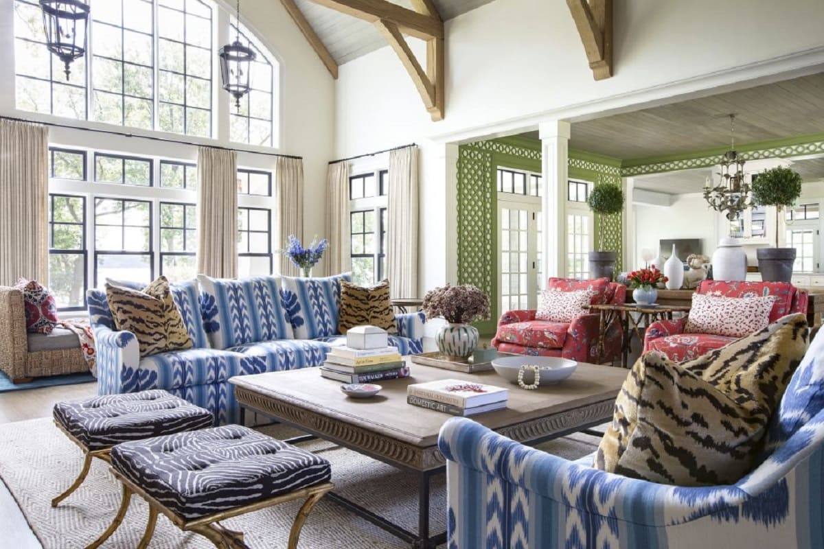
Thornton believes in the power of bold and vibrant colors to make a statement and create visual impact. She often incorporates these colors in the form of accent walls, statement furniture pieces, or eye-catching accessories. By strategically placing these pops of color, she adds excitement and personality to the overall design.
However, Thornton also recognizes the importance of incorporating softer hues and pastel tones to create balance and serenity in a space. These gentle colors can be used in areas where a more soothing and relaxing atmosphere is desired, such as bedrooms or living room retreats. By combining bold and vibrant colors with soft and subtle tones, Thornton achieves a harmonious and well-rounded design.
In addition to using bold and soft colors, Thornton also values the role of neutrals in her designs. Neutrals serve as a versatile foundation upon which colors can be layered. They provide a sense of grounding and timelessness to a room, allowing the vibrant and softer shades to shine. Thornton often uses neutral hues for larger surfaces like walls and floors to create a balanced backdrop that complements the overall color scheme.
Another aspect that sets Thornton’s approach apart is her attention to color placement. She understands that the position of color within a space can greatly impact the overall design. Thornton often uses color strategically to draw attention to focal points or architectural features. By doing so, she creates visual interest and enhances the architectural beauty of a room.
Ultimately, Summer Thornton’s approach to using color is a blend of boldness, harmony, and strategic placement. She embraces the power of color to create stunning and personalized spaces that truly reflect her clients’ unique personalities and style.
Selecting a Color Palette
When it comes to interior design, selecting the right color palette is fundamental in creating a cohesive and visually pleasing space. The perfect combination of colors can set the mood, define the style, and enhance the overall aesthetic appeal of a room. Here, we explore some key considerations and expert tips for selecting a color palette that will transform your space into a work of art.
1. Determine the Mood: Consider the desired mood or atmosphere you want to create in the room. Do you want it to feel calm and serene, energetic and vibrant, or sophisticated and elegant? Different colors evoke different emotions, so understanding the mood you want to achieve is crucial in selecting the right color palette.
2. Draw Inspiration: Look for inspiration in various sources such as nature, artwork, fashion, or even a favorite piece of furniture. Pay attention to colors that catch your eye and resonate with the desired mood and style. Take note of the color combinations that appeal to you and could potentially work in your space.
3. Research Color Harmonies: Familiarize yourself with different color harmonies, such as complementary, analogous, or monochromatic. Complementary colors are opposite each other on the color wheel and create a vibrant and dynamic contrast. Analogous colors are adjacent to each other and create a harmonious and soothing effect. Monochromatic colors are variations of the same hue and create a sophisticated and elegant look.
4. Consider the Room’s Purpose: Think about the intended purpose of the room and how color can support that function. For example, bold and energizing colors like red or yellow may be suitable for a home office or workout space, while soft and soothing colors like blue or green may be ideal for a bedroom or relaxation area.
5. Test Paint Samples: It’s essential to test paint samples before committing to a color palette. Paint a small section of the wall and observe how the color appears in different lighting conditions throughout the day. This will help you determine if the chosen colors are achieving the desired effect.
6. Create a Color Flow: Maintain a sense of cohesion throughout your home by considering the color flow from one room to another. Choose a dominant color that will appear in multiple spaces and use variations of that color or complementary hues to tie the different rooms together.
7. Seek Professional Advice: If you’re unsure about selecting the right color palette or want an expert opinion, consider consulting with a professional interior designer. They can provide valuable insights and guide you in choosing the colors that best suit your space and personal style.
Remember, selecting a color palette is a personal and creative process. Trust your instincts, experiment with different color combinations, and most importantly, have fun as you bring your vision to life through the power of color.
Playing with Bold and Vibrant Colors
Injecting bold and vibrant colors into your interior design can instantly breathe life and personality into a space. The use of these dynamic hues can create a sense of excitement, energy, and visual impact. Here are some expert tips on how to play with bold and vibrant colors to achieve a stunning and captivating design.
1. Decide on your focal point: Identify a focal point or area in the room where you want to make a bold statement. It could be a feature wall, a piece of furniture, or a striking artwork. By concentrating the vibrant colors in one area, you create a compelling visual focal point that draws attention and sets the tone for the entire space.
2. Mix and match complementary colors: Explore complementary color combinations to create a harmonious yet striking design. Complementary colors are opposite each other on the color wheel, such as blue and orange or purple and yellow. Pairing these bold hues together creates a vibrant and visually captivating contrast.
3. Experiment with accent pieces: Introduce bold and vibrant colors through accessories, such as pillows, rugs, curtains, or decorative accents. These accent pieces bring pops of color to the space without overpowering the overall design. They serve as focal points and add a sense of fun and personality to the room.
4. Combine bold colors with neutrals: To prevent the space from becoming overwhelming, balance bold and vibrant colors with neutral tones. Use neutral shades for larger surfaces like walls, floors, and furniture. This allows the vibrant colors to stand out and creates a balanced and visually appealing composition.
5. Consider different shades and saturation levels: Within the realm of bold and vibrant colors, there is a wide spectrum of shades and saturation levels. Play with different hues and intensities to find the perfect balance for your space. Deep, rich tones can create a sense of drama, while bright, vivid hues can add a playful and energetic vibe.
6. Incorporate patterns and textures: Combine bold colors with patterns and textures to add depth and visual interest. Geometric patterns, floral prints, or textured fabrics can enhance the impact of bold colors and create a dynamic and visually stimulating design.
7. Use lighting to your advantage: Properly lighting the space is crucial when working with bold and vibrant colors. Ensure that the room receives ample natural light to showcase the true hues of the colors. Additionally, experiment with lighting fixtures that can enhance the vibrancy and drama of the space.
Remember, playing with bold and vibrant colors allows you to infuse your personal style and creativity into your interior design. Be bold, take risks, and have fun as you create a space that is visually striking and full of character.
Incorporating Pastel and Soft Tones
Pastel and soft tones can lend a sense of elegance, tranquility, and sophistication to any interior design. These gentle hues create a soothing and calming ambiance, making them perfect for creating serene spaces. Here are some expert tips on how to incorporate pastel and soft tones into your design for a beautiful and serene aesthetic.
1. Establish a Soft Color Scheme: Start by selecting a soft color palette that reflects the desired mood of the room. Soft pastel hues typically include shades of pale pink, mint green, baby blue, lavender, and creamy yellow. These colors work harmoniously together and create a cohesive and tranquil atmosphere.
2. Balance with Neutrals: To prevent the space from feeling washed out, balance the soft tones with a mix of neutral hues. Use white, cream, beige, or light gray as a foundation for the walls, flooring, or larger furniture pieces. Neutrals provide a grounding effect and allow the pastels to shine without overpowering the design.
3. Layer Different Tones: Incorporate various shades of pastels within the space to create depth and visual interest. Layering different tones of the same color family adds dimension and a sophisticated touch to the design. For example, mix pale pink with blush pink and a hint of dusty rose to create a soft and dreamy effect.
4. Consider Texture: Introduce different textures to add depth and tactile interest to the space. Opt for fabrics with a soft and luxurious feel, such as velvet or silk. Incorporate textured wallpaper, woven rugs, or knit throws to create a comforting and inviting atmosphere.
5. Pair with Natural Elements: Combine pastel and soft tones with natural materials and elements to create a harmonious and serene environment. Integrate wooden furniture, organic fibers, natural stone, or indoor plants to bring a touch of nature into the space. The combination of soft colors and natural elements evokes a sense of tranquility and balance.
6. Focus on Lighting: Pay attention to the lighting in the room to enhance the soft tones. Natural light is ideal for showcasing the delicate hues, so try to maximize the amount of sunlight that enters the space. Consider using sheer curtains or blinds to allow for soft, diffused light. Additionally, incorporate warm lighting fixtures to create a cozy and intimate atmosphere in the evenings.
7. Add Accents for Contrast: To create visual interest and prevent the design from appearing too monotonous, incorporate small accents in contrasting colors. For instance, pair pastel blue with a touch of navy or soft pink with a hint of burgundy. These subtle pops of color provide contrast and add a touch of excitement to the overall design.
Incorporating pastel and soft tones into your design can create a tranquil and elegant space that promotes relaxation and serenity. With careful selection and attention to detail, these gentle hues will transform your home into a calming oasis.
When decorating with color, consider the mood you want to create in each room. Warm colors like red and orange can create a cozy, energetic atmosphere, while cool colors like blue and green can promote relaxation and calm.
Using Neutrals and Accents
Neutrals serve as a versatile canvas for interior design, providing a sense of calm and timeless elegance. When incorporated thoughtfully, neutrals can create a sophisticated and cohesive look. Adding accents to these neutral tones can bring a touch of personality and visual interest to any space. Here are some expert tips on how to effectively use neutrals and accents in your interior design.
1. Choose a Neutral Base: Start by selecting a neutral color palette that complements your design style and the desired mood of the room. Popular neutral shades include white, beige, gray, taupe, and cream. These colors serve as a cohesive backdrop that allows accent colors to stand out.
2. Layer Neutrals: Create depth and texture by layering different shades of neutrals within the space. Incorporate lighter tones for walls and larger surfaces, and add darker or contrasting neutrals through furniture, textiles, and accessories. Layering neutrals adds visual interest and prevents the design from feeling flat or monotonous.
3. Introduce Texture: Utilize texture to make neutrals more visually appealing. Choose varying textures for furniture, rugs, curtains, and decor elements. Elements like shaggy rugs, textured fabrics, woven baskets, or carved wooden furniture contribute to a rich and tactile experience, even within a neutral color palette.
4. Accent Colors: Select a few bold accent colors to infuse personality and create focal points within the space. These accents can be introduced through throw pillows, artwork, rugs, or small decor pieces. Consider using vibrant hues or deep, rich tones to create contrast against the neutral backdrop.
5. Play with Patterns: Explore the world of patterns to add visual interest and depth to your neutral design. Incorporate patterned accent pieces, such as pillows, curtains, or wallpapers, to inject energy and personality into the space. Patterns can range from subtle geometric prints to bold floral motifs, depending on the desired aesthetic.
6. Utilize Metallics: Introduce metallic accents, such as gold, silver, or copper, to add a touch of glamour and sophistication. Metallic finishes can be incorporated through hardware, light fixtures, mirrors, or decorative accessories. These accents reflect light and bring a luxurious and modern element to the neutral color scheme.
7. Pay Attention to Scale: Consider the scale and proportion of the accents in relation to the neutral base. Larger statement pieces can create impact, while smaller accents add nuance and detail. Find the right balance between the neutrals and accents to ensure a cohesive and visually pleasing composition.
Remember, neuters serve as the foundation for your design, allowing versatility and flexibility. Accents bring life and personality to the space, creating focal points and visual interest. By skillfully incorporating neutrals and accent colors, you can achieve a harmonious and visually stunning interior design.
Choosing the Right Color for Each Room
Color has the power to transform a room and set the desired mood. When selecting colors for different rooms in your home, it’s important to consider the function of the space, the atmosphere you want to create, and your personal style. Here are some expert tips to help you choose the right color for each room.
1. Living Room: The living room is often the central gathering space in the home, so it’s essential to strike a balance between comfort and style. Neutral tones like beige, cream, or light gray are versatile and provide a calming backdrop. Consider adding pops of color through accent pieces, such as colorful throw pillows, artwork, or a vibrant rug.
2. Bedroom: The bedroom is a place of relaxation and rejuvenation, so it’s ideal to select soothing and tranquil colors. Soft blues, muted greens, or lavender hues promote a serene atmosphere. These colors are known to promote restful sleep and create a peaceful environment. Pair them with soft neutrals for a harmonizing effect.
3. Kitchen: The kitchen is often the heart of the home, and the color palette should reflect warmth and energy. Warm tones like earthy browns, warm grays, or creamy yellows can create a cozy and inviting ambiance. You can introduce pops of color through backsplash tiles, colorful dishware, or a vibrant kitchen island.
4. Bathroom: Bathrooms can benefit from clean, fresh, and spa-like colors. Light, airy tones like soft blues, seafoam greens, or pale grays create a serene and calming atmosphere. These colors can make the space feel open and bright. Consider adding textures through natural stone or decorative tiles.
5. Home Office: The home office should inspire productivity and focus. Neutral colors like whites, light grays, or beiges create a clean and organized environment. Adding pops of color through artwork, desk accessories, or a colorful chair can spark creativity and add personality to the space.
6. Kids’ Playroom: For children’s playrooms, vibrant and playful colors are often a great choice. Consider incorporating bold primary colors like red, blue, and yellow. These colors stimulate creativity and energy. Create a playful atmosphere by adding colorful murals, wall decals, or patterned furniture.
7. Dining Room: The dining room is an excellent space to experiment with rich, dramatic colors to create an elegant and sophisticated ambiance. Deep navy blues, rich emerald greens, or regal purples can bring a sense of opulence. Pair these statement colors with metallic accents or luxurious textures for a glamorous touch.
Always keep in mind that personal preference plays a significant role in choosing colors for each room. Consider your own style and what colors resonate with you. Don’t be afraid to experiment and express your creativity while creating a cohesive and inviting atmosphere in each space.
Utilizing Color in Different Design Elements
Color is a versatile and powerful tool in interior design, and it can be applied to various design elements to create a cohesive and visually stunning space. By strategically incorporating color into different aspects of your design, you can achieve a harmonious and impactful aesthetic. Here are some key design elements where color can be effectively utilized.
1. Walls: Walls are a blank canvas waiting to be transformed with color. Choosing the right paint color can set the tone and create a backdrop for the entire room. Bold and vibrant colors can make a statement and add drama, while soft and soothing hues create a calm and serene atmosphere. Consider the purpose of the room and the desired mood when selecting wall colors.
2. Furniture: Furniture can play a significant role in adding color to a space. Upholstered pieces, such as sofas, chairs, and ottomans, can be the focal points of a room. Opt for furniture pieces in bold or vibrant colors to create visual impact. If you prefer a more subtle approach, choose neutral furniture and introduce color through accent pillows or throws.
3. Accessories: Accessories offer a great opportunity to infuse color into your design in a more flexible and interchangeable way. Playful and vibrant accessories, such as pillows, rugs, curtains, and artwork, can add pops of color and create focal points. These pieces can be easily swapped out or changed to refresh the look of the space and adapt to your evolving style.
4. Lighting: Lighting fixtures can serve as an unexpected yet impactful way to introduce color. Consider choosing pendant lights, chandeliers, or lampshades in colorful hues to make a statement. Colored lighting can create a unique atmosphere and add a touch of personality. Additionally, colored bulbs or filters can be used to alter the color of the light itself, transforming the ambiance of the entire room.
5. Floors: Flooring options, such as carpets, rugs, or tiles, can incorporate color into the design scheme. A vibrant patterned rug can anchor the room and tie all the elements together. Alternatively, you can choose flooring materials in natural tones and introduce color through smaller floor coverings like runners or accent tiles.
6. Cabinetry and Built-Ins: In kitchens, bathrooms, or living spaces with built-in storage, consider adding color to the cabinetry or shelving. Bold or contrasting colors can make these elements stand out and become focal points. This can be achieved through painted or stain finishes, or by using colorful hardware to accentuate the design.
7. Artwork and Decorative Accents: Artwork and decorative accents offer a myriad of possibilities to incorporate color into your design. Vibrant paintings, sculptures, or wall hangings can be the centerpiece of a room. Additionally, colorful vases, plants, or decorative objects can bring life and personality to your space.
Remember that the key to effectively utilizing color in design elements is to maintain a sense of balance and cohesion. Choose colors that complement each other and reflect the overall mood and style you wish to achieve. By thoughtfully incorporating color into these elements, you can create a visually captivating and harmonious interior design.
Color Psychology and Its Impact on Mood
Color has a profound effect on our emotions and can significantly influence our mood and well-being. Color psychology explores how different colors evoke distinct emotions and can be strategically used to create desired atmospheres within a space. Understanding the psychological impact of color can help you design rooms that elicit specific moods and create the desired ambiance. Here’s a look at the psychological associations of some common colors:
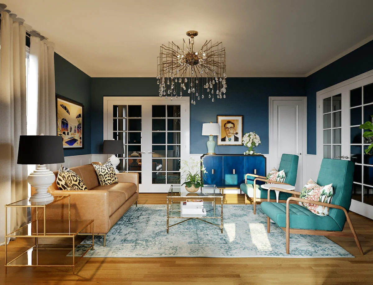
1. Blue: Blue is often associated with calmness and serenity. It has a soothing effect on the mind and body, making it an ideal color for bedrooms, bathrooms, or spaces dedicated to relaxation. Blue can promote feelings of tranquility, reduce stress, and create a sense of peace.
2. Red: Red is a powerful and energetic color that can evoke strong emotions. It can symbolize passion, energy, and excitement. Red stimulates the senses and is often used to create a sense of urgency or to grab attention. It can be used as an accent color to bring vitality to a space, but too much red can be overwhelming.
3. Yellow: Yellow is often associated with happiness, optimism, and warmth. It has a cheerful and uplifting effect on mood, making it an excellent choice for spaces where you want to create a sense of positivity and energy. Yellow works well in kitchens, dining areas, or spaces where social interaction takes place.
4. Green: Green represents nature and has a calming and refreshing effect on the mind. It symbolizes growth, harmony, and balance. Green is often used in spaces where relaxation and rejuvenation are desired, such as bedrooms or living rooms. It can also be used in workspaces to promote focus and productivity.
5. Purple: Purple is often associated with luxury, creativity, and spirituality. It has a regal and mysterious quality that can create a sense of opulence or creativity in a space. Lighter shades of purple, such as lavender, can have a calming effect, while darker shades like eggplant can add drama and sophistication.
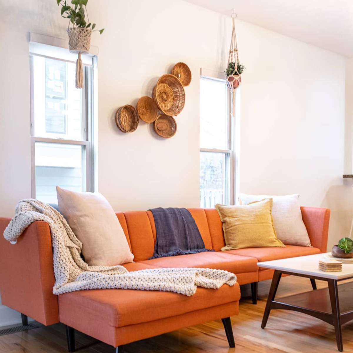
6. Orange: Orange is a vibrant and energetic color that stimulates enthusiasm and creativity. It combines the energy of red and the positivity of yellow. Orange can create a warm and inviting atmosphere and can be used in spaces where social interaction or creativity is encouraged, such as living rooms or creative studios.
7. Neutral Tones: Neutral colors such as beige, gray, and white are often associated with simplicity, elegance, and versatility. They provide a calm and balanced backdrop for other colors to shine. Neutral tones can create a sense of openness and serenity, making them suitable for various spaces.
It’s important to note that cultural and personal experiences can also influence our psychological response to colors. It’s essential to consider individuals’ preferences and cultural backgrounds when using color in design. Additionally, different shades and intensities of a color can elicit different emotional responses, so experimentation and personalization are key.
By understanding the psychological impact of color, you can use it strategically to shape the mood and atmosphere of a space. Whether you want to create a serene sanctuary, a vibrant and energetic environment, or a calming and cozy retreat, color can be a powerful tool in achieving your desired emotional effect.
Tips and Tricks for Successful Color Combinations
Choosing colors for your interior design can be a daunting task, but with the right strategies, you can create stunning and harmonious color combinations. Here are some expert tips and tricks to help you successfully combine colors in your space:
1. Follow the Rule of Three: Stick to a maximum of three main colors in your color scheme. This will help create a cohesive and balanced look without overwhelming the space. Choose one dominant color, one secondary color for visual interest, and one accent color to add pops of excitement.
2. Use a Color Wheel: Familiarize yourself with the color wheel to understand color harmonies and relationships. Complementary colors (opposite on the wheel) create vibrant contrast, while analogous colors (adjacent on the wheel) provide a harmonious and soothing effect. Experiment with different combinations to see what works best for your space.
3. Consider Color Temperature: Colors can be classified as warm (reds, oranges, yellows) or cool (blues, greens, purples). Consider the overall mood and desired atmosphere of the room. Warm colors create energy and coziness, while cool colors evoke calmness and serenity. Mixing warm and cool tones can create a balanced and dynamic look.
4. Utilize the 60-30-10 Rule: Apply the 60-30-10 rule to distribute color proportions. Choose a dominant color for 60% of the room (walls, large furniture), a secondary color for 30% (upholstery, curtains), and an accent color for 10% (accessories, artwork). This rule helps maintain balance and visual harmony in the space.
5. Start with a Neutral Base: Begin with a neutral base, such as white, cream, or beige, for larger surfaces like walls and floors. Neutrals provide versatility and allow for flexibility when adding other colors. Use pops of color through furniture, textiles, and accessories to bring life and personality to the space.
6. Consider Color Psychology: Think about the emotions that different colors evoke and how you want the room to feel. Warm colors like red and orange can stimulate energy and passion, while cool colors like blue and green promote relaxation and calmness. Use this knowledge to align color choices with the intended purpose of the space.
7. Create Visual Flow: When designing multiple rooms, maintain a sense of visual flow by choosing a consistent color scheme throughout the different spaces. This doesn’t mean the colors have to be the exact same, but they should be complementary and harmonious to create a cohesive aesthetic as you move from room to room.
8. Test Samples: Always test paint or fabric samples before committing to a color combination. What looks great in a photo or on a swatch may appear different in the actual space and lighting conditions. Evaluate how the colors interact with each other and how they make you feel in the room.
9. Use the 80/20 Rule for Bold Colors: If you want to incorporate bold or vibrant colors into the design, it’s generally best to use them as accents rather than dominant hues. Stick to the 80/20 rule, where 80% of the space features neutrals or softer colors, and 20% is reserved for bolder accents.
10. Trust Your Instincts: Ultimately, trust your instincts and go with colors that resonate with you and create a space you love. Interior design is a personal expression, and as long as you feel a connection to the colors you choose, your space is bound to be unique and captivating.
Remember, the key to successful color combinations is finding a balance between contrast and harmony. By following these tips and exploring different combinations, you can create a visually appealing and emotionally satisfying interior design that reflects your personal style and enhances your living space.
Conclusion
Color is a vital element in interior design, and understanding how to use it effectively can transform any space into a visually stunning and emotionally engaging environment. Whether you choose bold and vibrant colors, soft and soothing pastels, or a combination of both, the power of color lies in its ability to evoke emotions, set the mood, and reflect personal style.
Throughout this masterclass, we have explored the expert insights of Summer Thornton, a renowned interior designer, delving into her approach to using color and uncovering the secrets behind her breathtaking designs. We learned about the importance of selecting the right color palette, playing with bold and vibrant colors, incorporating pastels and soft tones, and using neutrals and accents to create balance and visual interest.
We also discovered the significance of choosing the appropriate color for each room, understanding how color can enhance functionality and evoke specific emotions in different spaces. Additionally, we explored how color can be utilized in various design elements, such as walls, furniture, accessories, lighting, floors, and cabinetry, to create a harmonious and captivating interior design.
Furthermore, we explored the fascinating world of color psychology and its impact on mood. By understanding the psychological associations of different colors, we gained insight into how color can influence our emotions and create specific atmospheres within a space. This knowledge empowers us to make informed decisions in utilizing color to create the desired ambiance in our homes.
We concluded with a collection of valuable tips and tricks for successful color combinations, providing practical guidance on harmonizing colors, distributing proportions, and creating visual flow. These tips serve as a helpful roadmap for designing captivating color schemes that transform our spaces into personalized havens of beauty and comfort.
In the realm of interior design, color has the power to unleash creativity, evoke emotions, and shape our experiences within a space. By harnessing the principles and insights shared in this masterclass, you have the tools to embark on your own color-filled design journey, unleashing your unique style and creating spaces that inspire, delight, and reflect your personality.
Frequently Asked Questions about Summer Thornton On Decorating With Color: A Masterclass
Was this page helpful?
At Storables.com, we guarantee accurate and reliable information. Our content, validated by Expert Board Contributors, is crafted following stringent Editorial Policies. We're committed to providing you with well-researched, expert-backed insights for all your informational needs.
0 thoughts on “Summer Thornton On Decorating With Color: A Masterclass”