Home>Interior Design>Kit Kemp’s Space-Enhancing Color Rule Will Change How You Use Bold Tones For Good
Interior Design
Kit Kemp’s Space-Enhancing Color Rule Will Change How You Use Bold Tones For Good
Modified: January 5, 2024
Discover Kit Kemp's game-changing color rule in interior design that will revolutionize your use of bold tones and enhance your space.
(Many of the links in this article redirect to a specific reviewed product. Your purchase of these products through affiliate links helps to generate commission for Storables.com, at no extra cost. Learn more)
Introduction
In the world of interior design, color plays a vital role in creating ambiance, defining spaces, and evoking emotions. When it comes to using bold tones, many homeowners are often hesitant, fearing that they may overpower a room or make it feel small and cramped.
However, celebrated interior designer Kit Kemp has a unique approach that challenges this conventional thinking. With her innovative space-enhancing color rule, Kemp demonstrates how bold tones can be effectively used to transform spaces, adding depth and character without compromising on visual appeal. In this article, we will explore Kemp’s color rule and how you can apply it to your own home.
Key Takeaways:
- Embrace Kit Kemp’s space-enhancing color rule to confidently use bold tones, creating visually spacious and harmonious interiors that reflect your personal style.
- Transform small spaces with bold tones by strategically adding depth and visual interest, making them feel more expansive and inviting.
Kit Kemp’s Space-Enhancing Color Rule
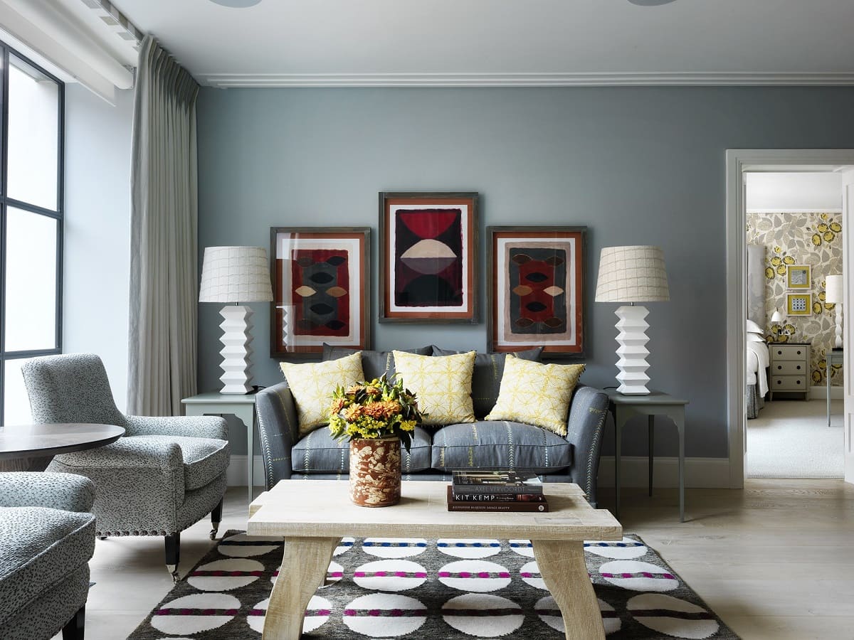
Kit Kemp, the renowned interior designer, is known for her eclectic and vibrant style. One of her signature techniques is her space-enhancing color rule, which aims to create visually spacious and harmonious interiors using bold tones. Kemp believes that by strategically incorporating bold colors, you can transform a room and make it feel larger and more inviting.
At the core of Kemp’s color rule is the concept of balance. It involves creating a harmonious blend of bold and neutral tones to achieve a cohesive and visually appealing space. Instead of overpowering a room with bold colors, Kemp suggests using them as accents and focal points, allowing them to complement the overall design scheme.
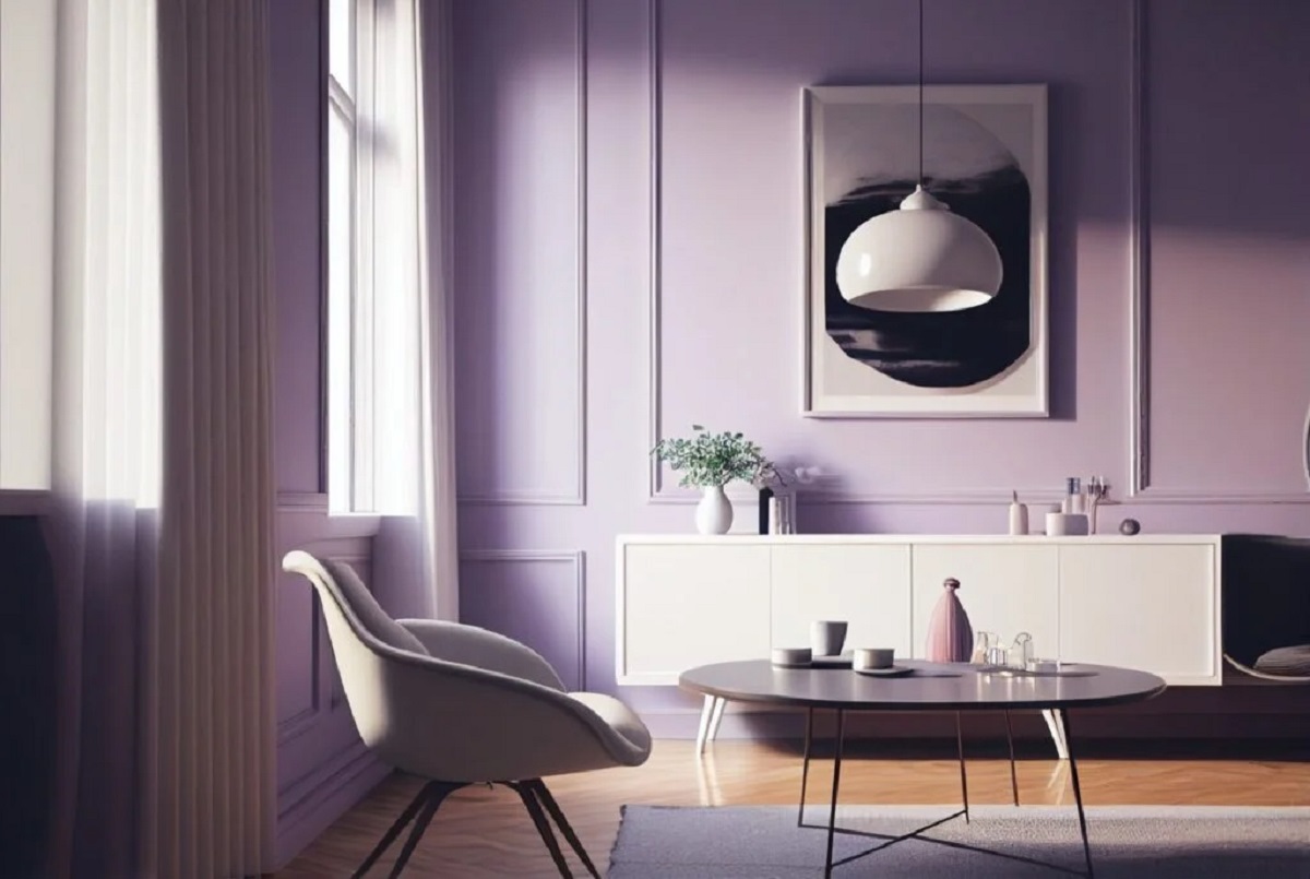
A key aspect of Kemp’s color rule is the use of color blocking. This technique involves selecting a primary bold color and using it to create blocks or zones of color within a space. For example, in a living room, you could paint one wall in a striking shade of blue and balance it out with neutral furnishings and accessories. This not only adds visual interest but also creates a sense of depth and dimension.
Another important element of Kemp’s color rule is the incorporation of texture. By combining different textures and materials in the room, you can further enhance the impact of bold colors. For instance, pairing a vibrant red sofa with a plush velvet texture or adding a statement artwork with texture and pops of bold color can create a dynamic and inviting space.
Kemp’s color rule also emphasizes the importance of natural light in enhancing the effect of bold tones. Maximizing natural light can help open up a room and make it feel more expansive. She suggests using lighter, neutral shades on walls that receive direct sunlight while reserving bolder colors for areas with less natural light. This approach maintains a balanced visual flow throughout the space.
Ultimately, Kit Kemp’s space-enhancing color rule encourages homeowners to embrace bold tones with confidence. By understanding the principles of balance, color blocking, texture, and natural light, you can transform your space and create a stunning interior that feels visually spacious and harmonious.
Understanding Bold Tones
Before diving into the application of bold tones, it is essential to understand what they are and the impact they can have on a space. Bold tones refer to vibrant, intense colors that make a strong visual statement. Whether it’s a deep red, a bright yellow, or a rich navy, these colors demand attention and add personality to a room.
One common misconception about using bold tones is that they can only be utilized in large, open spaces. However, with the right design approach, bold colors can be incorporated into any size of room, creating a stunning and impactful result.
When working with bold tones, it is important to consider the psychological effects they have on individuals. Bold colors are known for evoking emotions and creating a specific atmosphere. For example, warm tones like reds and oranges can elicit feelings of energy and excitement, while cool tones like blues and greens can bring a sense of calmness and relaxation.
Additionally, the choice of bold colors can influence the perception of space. Darker, saturated colors tend to make a room feel cozier and more intimate, while lighter and brighter bold colors can open up a space and make it feel more spacious.
Understanding the impact of bold tones is crucial for successfully incorporating them into your design scheme. By considering the mood and atmosphere you wish to create in a room, as well as the size and natural light available, you can select the perfect bold tones that will enhance the space and align with your design vision.
Applying Kit Kemp’s Color Rule
Now that we have explored Kit Kemp’s space-enhancing color rule and have an understanding of bold tones, let’s delve into how you can apply this rule to your own home.
The first step in applying Kemp’s color rule is selecting a primary bold color. This color will serve as the foundation and focal point of your design scheme. Consider your personal preferences and the mood you want to create in the room.
Next, it’s important to balance the bold color with neutral tones. This creates a harmonious blend and prevents the room from feeling overwhelming. Neutral colors, such as white, beige, or gray, can be used for walls, ceiling, and larger furniture pieces. This allows the bold color to take center stage while maintaining a sense of balance and cohesiveness.
Color blocking is a key technique in Kemp’s rule. Identify areas within the room where you can create blocks or zones of color using the bold tone. This can be achieved through accent walls, furniture pieces, or accessories. By strategically placing these blocks of color, you add depth and visual interest to the space.
Texture plays a crucial role in enhancing the impact of bold tones. By incorporating different textures within the room, such as textured fabrics, rugs, or wallpapers, you can create contrast and visual intrigue. This adds depth and dimension to the design, making the bold colors even more striking.
Lighting is another important consideration. Natural light can enhance the effect of bold tones, while artificial lighting can create a specific ambiance. Optimize natural light by using lighter, neutral shades on walls that receive direct sunlight. For areas with limited natural light, consider using brighter or darker bold colors to add warmth and depth.
When it comes to furniture and accessories, balance is key. Neutral or lighter-toned furniture can provide a grounding effect and prevent the bold colors from overwhelming the space. Use bold colors selectively in accent furniture or accessories, such as throw pillows, artwork, or decorative objects, to create focal points and add pops of color throughout the room.
Lastly, it’s important to approach the application of Kemp’s color rule with confidence and embrace your own personal style. While the color rule provides guidelines, don’t be afraid to experiment and inject your own creativity into the design. After all, the goal is to create a space that reflects your personality and brings you joy.
By following Kit Kemp’s color rule and incorporating bold tones strategically, you can transform your home into a visually stunning and harmonious space that truly reflects your style and personality.
Transforming Small Spaces with Bold Tones
Many homeowners with small spaces often shy away from using bold tones, fearing that it will make the room appear even smaller and more cramped. However, when used strategically, bold colors can actually transform small spaces and make them feel more expansive and inviting.
The key to transforming small spaces with bold tones is to create a sense of depth and visual interest. Here are some tips to help you achieve this:
- Focus on accent walls: In a small room, painting all the walls in a bold color might overwhelm the space. Instead, choose one wall as an accent wall and paint it in a bold tone. This draws the eye and creates a focal point, making the room feel larger.
- Use vertical stripes: Incorporating vertical stripes, either through wallpaper or painted patterns, can create the illusion of height and make the room appear taller and more spacious.
- Consider color gradients: Gradually transitioning from a lighter shade to a bolder hue can add depth and dimension to a small space. Start with a light color near the ceiling and gradually deepen the shade towards the floor.
- Introduce mirrors: Mirrors are a powerful tool in visually expanding small spaces. Place mirrors on walls opposite windows to reflect natural light and give the illusion of a larger area.
- Utilize bold furniture pieces: Instead of painting the walls in a bold color, consider incorporating bold tones through furniture pieces. Choose a vibrant sofa or a statement accent chair to add a pop of color and personality to the room.
- Play with lighting: Proper lighting is essential in small spaces. Use a combination of natural and artificial lighting to create an airy and spacious feel. Install recessed lights or track lighting to highlight specific areas of the room.
- Combine bold colors with neutrals: While bold tones are the highlight of the design, balancing them with neutrals is crucial in small spaces. Choose neutral tones for larger surfaces, such as walls and floors, and use bold colors as accents through smaller accessories and decor.
- Don’t forget about storage: Clutter can make a small space feel even more cramped. Invest in functional and stylish storage solutions to keep the space organized and visually open.
By implementing these strategies, you can successfully transform a small space with bold tones. Embrace your creativity and experiment with different color combinations and design elements to create a visually stunning and inviting environment.
When using bold colors in a space, follow Kit Kemp’s rule of using a lighter, softer shade on the ceiling to create the illusion of height and space. This will help balance out the bold tones and prevent the room from feeling too overwhelming.
Enhancing Natural Light with Bold Colors
Natural light has a transformative effect on any space, making it feel open, airy, and inviting. Combining natural light with bold colors can create a stunning visual impact and elevate the overall atmosphere of a room. Here are some tips for enhancing natural light with bold colors:
- Strategic color placement: Identify areas in the room where natural light is most abundant, such as windows or skylights. Use bold colors in these areas to draw attention and maximize the impact of the sunlight. Consider painting the window frames or accentuating architectural details with bold tones.
- Reflective surfaces: Incorporate reflective surfaces, such as mirrors, metallic accents, or glossy finishes, in areas that receive natural light. These surfaces will help bounce light around the room, creating a brighter and more spacious feel.
- Light-colored walls: Opt for lighter, neutral shades on walls that receive direct sunlight. This will help reflect and amplify the natural light, making the room feel brighter and more expansive. Consider shades of white, cream, or pale pastels to create a fresh and airy ambiance.
- Accent with bold accessories: Instead of painting the entire room in a bold color, use bold accessories strategically to enhance the natural light. Add vibrant throw pillows, rugs, or curtains in bold tones to create pops of color and visual interest.
- Blend with natural elements: Use bold colors that complement the natural elements in the room, such as views of lush greenery or exposed wooden beams. By harmonizing bold colors with nature-inspired elements, you create a cohesive and visually pleasing environment.
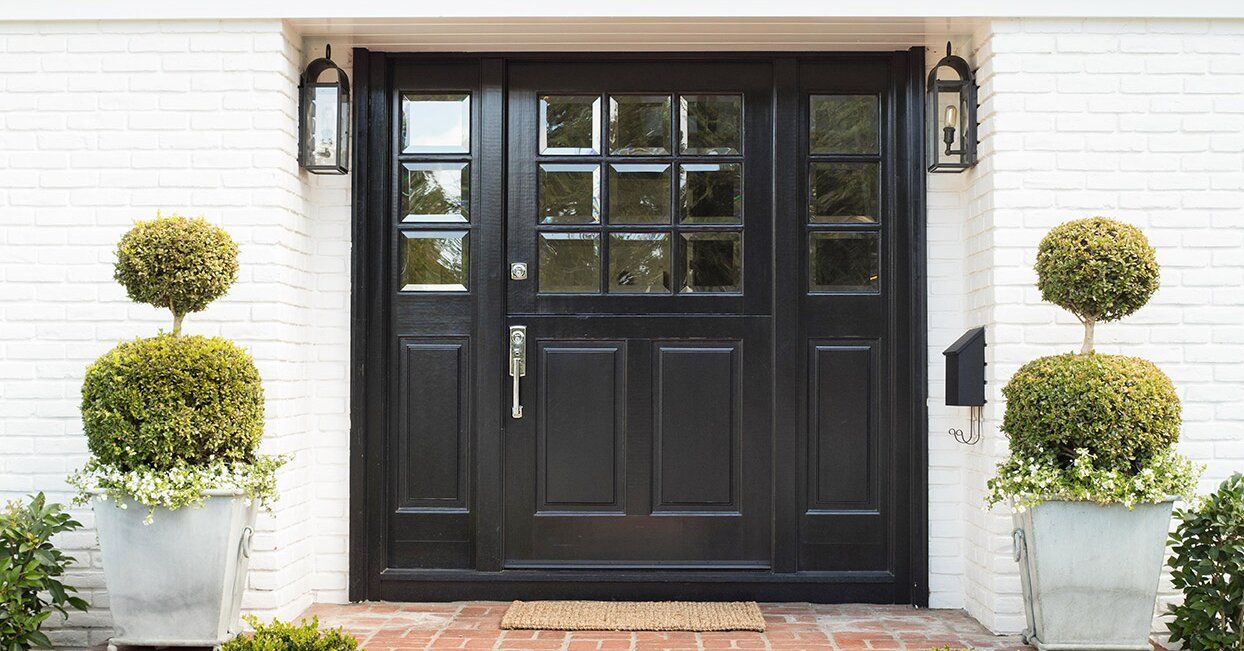
- Doors and windows: Consider painting doors and window frames in bold colors to create focal points and frame the natural light. This will draw attention to the light source and add a touch of creativity to the space.
- Layer textures: Introduce textures with fabrics, rugs, and curtains in bold tones to add depth and dimension to the room. Textures will play with the natural light, resulting in interesting visual effects and creating a warm and inviting atmosphere.
By strategically incorporating bold colors and paying attention to natural light sources, you can enhance the existing light in a room and create a vibrant and inviting space. Embrace the power of natural light and experiment with bold colors to transform your home into a visually captivating environment.
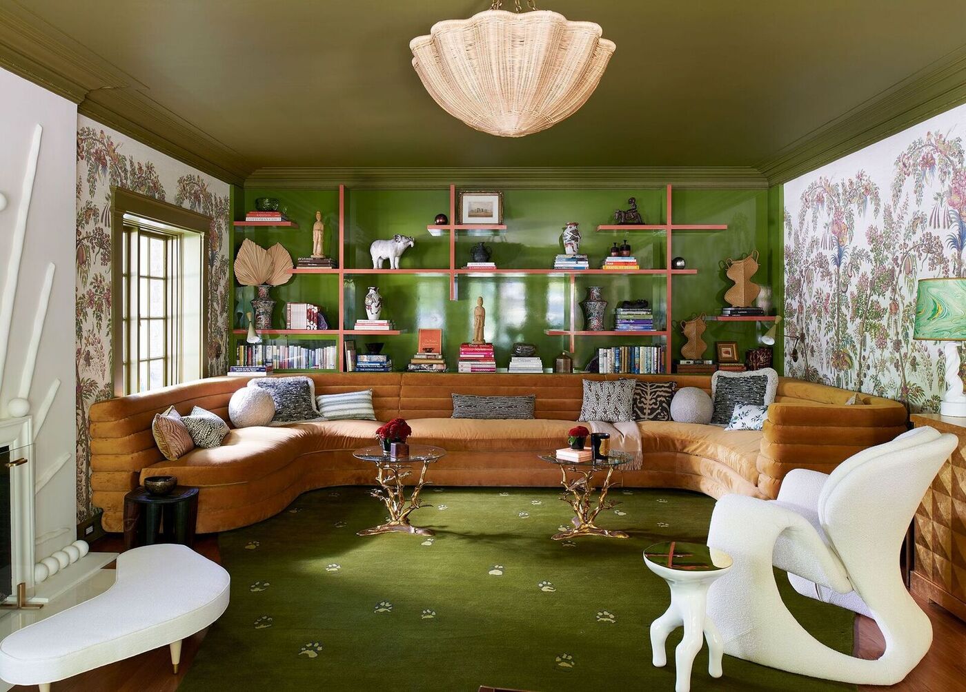
Creating Focal Points with Bold Accents
One of the most effective ways to use bold colors in interior design is by creating focal points within a room. By strategically incorporating bold accents, you can draw attention to specific areas or elements, adding visual interest and personality. Here are some tips for creating focal points with bold accents:
- Feature walls: Designate one wall as a feature wall and paint it in a bold color. This instantly creates a focal point and adds depth to the room. Consider using a bold wallpaper or adding texture to the wall for an even more impactful statement.
- Statement furniture: Choose a bold-colored furniture piece, such as a vibrant sofa, an eye-catching armchair, or a bold-patterned ottoman, to serve as the focal point of the room. Complement the furniture with neutral or complementary-colored accessories to balance the space.
- Artwork and wall decor: Hang a bold and striking artwork or gallery wall on a focal wall to create a visual centerpiece. This not only adds color but also infuses personality into the room. Select pieces with colors that complement the overall design scheme for a cohesive look.
- Statement lighting: Install a bold and unique chandelier, pendant light, or floor lamp to serve as a focal point in the room. The large size or unique design of the lighting fixture will draw attention and add visual interest to the space.
- Bold-colored rugs or carpets: Use a boldly colored or patterned rug or carpet to anchor a seating area or define a specific zone within a room. The vibrant colors and patterns will instantly grab attention and create a focal point.
- Accent pillows and throws: Incorporate bold-colored accent pillows and throws on sofas, chairs, or beds to add pops of color and create focal points. Choose complementary colors that stand out against the neutral tones of the furniture or bedding.
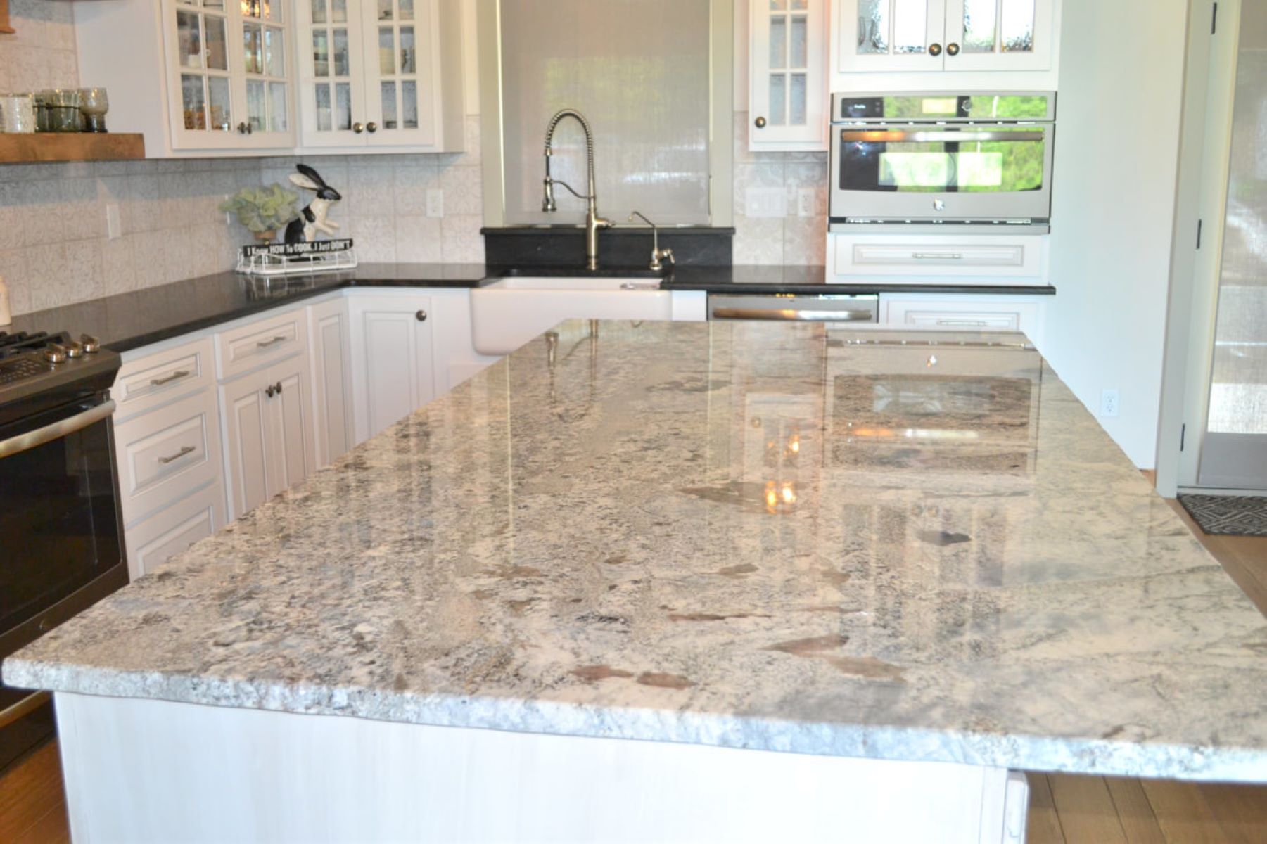
- Bold-colored cabinetry or shelving: In kitchens or living areas, consider incorporating bold-colored cabinetry or shelving to create a focal point. This adds visual interest and can become a statement piece in the room.
- Unique architectural details: Highlight unique architectural details, such as a fireplace, archways, or exposed beams, with bold colors. This draws attention to these features, making them stand out as focal points in the room.
By incorporating these tips, you can create focal points with bold accents that add depth and personality to your space. Don’t be afraid to experiment with different colors and design elements to find the perfect focal point that reflects your style and captures attention in a captivating way.
Adding Depth with Contrasting Colors
Contrasting colors can add visual interest and depth to any space, creating a dynamic and vibrant environment. By incorporating contrasting colors, you can highlight architectural details, create focal points, and give a sense of depth to your interior design. Here are some strategies for adding depth with contrasting colors:
- Color wheel pairing: Referencing the color wheel is a great starting point for selecting contrasting colors. Look for hues that are directly across from each other, such as blue and orange, or purple and yellow. Contrasting colors from different parts of the color wheel create a striking visual impact.
- Light and dark contrasts: Pairing light and dark colors can create a strong contrast that adds depth to a space. For example, a combination of a dark navy blue with a light cream creates a striking contrast that draws the eye and creates visual interest.
- Warm and cool tones: Combining warm and cool tones can add depth and dimension to a room. For instance, pairing a warm red with a cool blue creates a dynamic contrast that adds visual intrigue and creates a sense of balance.
- Accent wall with contrasting color: Consider painting an accent wall in a room with a contrasting color to create a focal point. This draws attention and adds depth by visually separating that wall from the rest of the space.
- Color-blocking: Use contrasting colors to create color blocks within a space. For example, paint one section of a wall in a bold color and the adjacent section in a contrasting shade. This technique adds depth and dimension to the room.
- Mixing complementary colors: Complementary colors, which are opposite to each other on the color wheel, create a striking contrast. For instance, pairing purple with yellow or green with red adds depth and creates a visually appealing composition.
- Contrasting furniture and accessories: Incorporate furniture and accessories in contrasting colors to create depth. For example, pairing a bold red chair with a teal-colored rug or a yellow side table with a purple accent pillow can instantly create a visually dynamic and layered space.
- Consider texture: Alongside contrasting colors, pay attention to texture. Combining materials with contrasting textures, such as rough and smooth or matte and glossy, can amplify the visual impact and add another layer of depth to the room.
By incorporating contrasting colors into your interior design, you can create a visually captivating and dynamic space. Experiment with different combinations and techniques to find the perfect balance of contrasting colors that reflect your style and add depth to your home.
Conclusion
Incorporating bold tones into your interior design can be a game-changer, adding depth, personality, and visual interest to your space. Kit Kemp’s space-enhancing color rule provides valuable guidance on how to use bold colors effectively without overwhelming the room.
By understanding and implementing Kemp’s color rule, you can create visually spacious and harmonious interiors. Whether it’s through color blocking, balance of neutral and bold tones, strategic use of texture, or optimizing natural light, each aspect contributes to transforming your space into something truly remarkable.
Don’t shy away from using bold tones in small spaces. With the right techniques, bold colors can make a small room feel more open and inviting. From accent walls to vertical stripes and clever lighting choices, you can enhance the perception of space and create a stunning visual impact.
Remember that natural light plays a crucial role in the effect of bold tones. Enhancing natural light with bold colors can bring new life to a room, making it feel brighter and more vibrant. Reflective surfaces, light-colored walls, and clever use of bold accessories can all contribute to maximizing the impact of natural light.
Creating focal points with bold accents is another powerful design strategy. By strategically incorporating bold colors through feature walls, statement furniture, artwork, or unique lighting fixtures, you can draw attention and add visual interest to specific areas of your room.
Additionally, adding depth to your space is achievable by incorporating contrasting colors. Mixing warm and cool tones, using complementary colors, or playing with light and dark contrasts can create a dynamic and visually captivating environment.
In conclusion, embracing bold tones in your interior design can transform your space into something truly extraordinary. By applying Kit Kemp’s space-enhancing color rule, understanding the impact of bold tones, and utilizing techniques to enhance natural light, create focal points, and add depth, you can create visually stunning and harmonious interiors that reflect your personal style and captivate anyone who enters your home.
Frequently Asked Questions about Kit Kemp's Space-Enhancing Color Rule Will Change How You Use Bold Tones For Good
Was this page helpful?
At Storables.com, we guarantee accurate and reliable information. Our content, validated by Expert Board Contributors, is crafted following stringent Editorial Policies. We're committed to providing you with well-researched, expert-backed insights for all your informational needs.


0 thoughts on “Kit Kemp’s Space-Enhancing Color Rule Will Change How You Use Bold Tones For Good”