Home>Interior Design>Outdated Color Trends: 5 Overdone Colors Designers No Longer Love
Interior Design
Outdated Color Trends: 5 Overdone Colors Designers No Longer Love
Modified: October 19, 2024
Not sure which colors to avoid in your interior design? Check out this list of 5 outdated color trends that designers no longer love.
(Many of the links in this article redirect to a specific reviewed product. Your purchase of these products through affiliate links helps to generate commission for Storables.com, at no extra cost. Learn more)
Introduction
Interior design trends are constantly evolving, and what was once considered stylish and trendy can quickly become outdated. It’s important for designers to stay current with the latest color palettes and styles to create spaces that feel fresh and modern. In recent years, there have been several color trends that gained immense popularity but are now starting to fade into the background. In this article, we will explore five overdone colors that interior designers no longer love. It’s time to bid farewell to these outdated hues and embrace new and exciting color palettes.
Let’s dive in and discover which colors have lost their charm among designers and why they are no longer captivating the interior design world.
Key Takeaways:
- Say goodbye to Millennial Pink and Ultra Violet! Designers are now opting for more vibrant and versatile shades within the pink and purple spectrum to infuse spaces with energy and sophistication.
- Embrace cooler metallic finishes and bolder shades of green! Designers are moving away from Rose Gold, Copper, and Mint Green, seeking fresher alternatives that offer a more modern and sleek look.
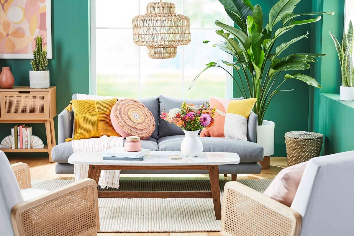
Millennial Pink
Millennial Pink, a soft blush tone that gained immense popularity around 2016, was the go-to color for everything from fashion to home decor. This gender-neutral shade was embraced by millennials and became synonymous with modernity and youthfulness. Its popularity was largely driven by social media and its association with brands targeting younger consumers.
However, as the years passed, Millennial Pink started to lose its appeal. Designers began to perceive it as overused and predictable, lacking the freshness and versatility required to create dynamic interior spaces. Its association with a specific generation also became a drawback, as it limited its universal appeal.
Today, designers are moving away from Millennial Pink and seeking alternatives that offer more depth and complexity. They are exploring bolder shades of pink, such as dusty rose or coral, to infuse spaces with energy and sophistication. These hues provide a more mature and timeless look that appeals to a wider audience.
As the trend has shifted, Millennial Pink is now seen as a color of the past, replaced by more vibrant and versatile shades within the pink spectrum.
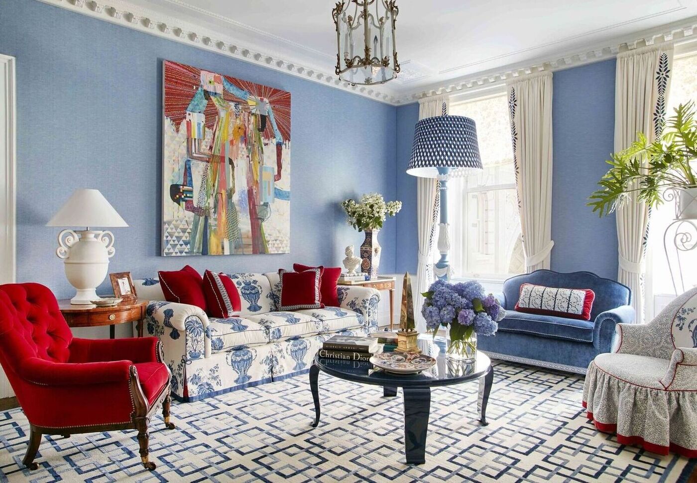
Ultra Violet
Ultra Violet, a rich and vibrant shade of purple, gained significant attention when it was named the Pantone Color of the Year in 2018. This bold and dramatic color was intended to inspire creativity and expressiveness in design. It was embraced by many designers and incorporated into various interior spaces.
However, as time passed, Ultra Violet started to lose its appeal among designers. The saturated and intense nature of this color proved to be challenging to incorporate into cohesive design schemes. Its dominance in a space often overwhelmed other elements and made it difficult to create a balanced and harmonious environment.
In addition, the trend towards more natural and calming color palettes emerged, shifting the focus away from the bold and vibrant tones like Ultra Violet. Designers started to gravitate towards soothing earth tones, gentle neutrals, and soft pastels to create serene and inviting spaces.
While Ultra Violet can still make a statement in small doses or as an accent color, it has become less popular as the primary color for entire rooms or large-scale applications. Designers are now opting for more subtle and versatile shades of purple that can be easily incorporated into a variety of design styles and seamlessly blend with other colors in the space.
Ultimately, Ultra Violet had its moment in the spotlight but has now faded into the background as designers seek more tranquil and adaptable hues.
Rose Gold
Rose Gold, a warm and glamorous metallic shade, experienced a surge in popularity in recent years. Its blend of pink and gold tones instantly added a touch of elegance and sophistication to any space. From jewelry to home decor, Rose Gold was everywhere.
However, as with any trend, its popularity eventually waned. Designers started to perceive Rose Gold as overdone and clichéd. Its ubiquity in fashion and home decor led to a sense of saturation and predictability. As a result, designers began to look for fresher alternatives that could still provide a touch of luxury and opulence.
Today, designers are gravitating towards cooler metallic tones such as silver, platinum, and brushed nickel, which offer a more modern and sleek look. These cooler shades provide a contemporary aesthetic that complements a range of design styles, from minimalist to industrial.
While Rose Gold still has its place, particularly in small accents or accessories, it is no longer the star of the show in interior design. Designers are now exploring other metallic finishes that add a touch of sophistication without overwhelming the overall design scheme.
As with any trend, it’s important for designers to constantly evolve and experiment with new color palettes to keep their designs fresh and captivating.
Tip: Avoid using overdone colors like millennial pink, ultra violet, and rose gold in your designs. Instead, opt for timeless and versatile color palettes that will stand the test of time.
Copper
Copper, with its warm and rich earthy tones, had a moment of glory in interior design. This metallic finish was widely used to add a touch of rustic charm and industrial elegance to spaces. Its reddish-brown hue provided a unique and eye-catching element in various design styles, from farmhouse to contemporary.
However, as design trends shifted towards cooler color palettes, Copper started to lose its popularity. Its warm tones clashed with the rising popularity of cooler metallic finishes such as silver and chrome. Additionally, the overuse of Copper in interior design led to a sense of saturation and predictability, making it less appealing to designers seeking a more unique and innovative look.
Today, designers are exploring alternative metallic finishes like brass or bronze, which offer a more timeless and versatile aesthetic. These finishes blend well with a variety of color schemes and bring a touch of elegance without overpowering the space.
While Copper may still have its place in certain design styles, it has gradually become a less popular choice among designers. It’s important for designers to stay open to new trends and materials to create fresh, contemporary spaces that stand the test of time.
Mint Green
Mint Green, a soft and refreshing shade of green, was once a popular choice in interior design. It added a sense of tranquility and freshness, reminiscent of springtime and nature. Mint Green was often used in spaces seeking a calm and serene atmosphere.
However, as design trends evolved, Mint Green began to lose its appeal. Designers started to perceive it as overused and lacking versatility. Its pastel nature made it difficult to incorporate into a variety of design styles, limiting its overall appeal.
As designers sought new and exciting color palettes, cooler shades of green such as sage or emerald started to gain popularity. These colors offer a stronger and more sophisticated presence, allowing designers to create bold and impactful spaces.
Moreover, the trend towards using more natural and earthy colors in interior design contributed to the decline of Mint Green. Designers began to embrace muted earth tones and nature-inspired hues, creating spaces that feel grounded and organic.
While Mint Green can still be used as an accent color or in small doses, its dominance as the primary color in a space has diminished. Designers are now opting for shades of green that offer more depth and adaptability, allowing for more dynamic and visually appealing designs.
As with any trend, it’s important for designers to stay open to new color palettes and constantly explore new options to create unique and captivating spaces.
Conclusion
Interior design is a constantly evolving field, with trends coming and going. The colors that were once hailed as the epitome of style and modernity can quickly become outdated and overdone. In this article, we explored five colors that interior designers no longer love: Millennial Pink, Ultra Violet, Rose Gold, Copper, and Mint Green.
These colors, which once enjoyed immense popularity, have lost their luster in the eyes of designers. They are seen as overused, predictable, and lacking the versatility required to create dynamic and captivating spaces. In response, designers are seeking fresher alternatives that offer more depth, sophistication, and adaptability.
Designers are gravitating towards bolder and more vibrant shades within color families, exploring shades of pink beyond Millennial Pink, cooler metallic finishes instead of Rose Gold and Copper, and embracing cooler shades of green over Mint Green. They are also incorporating more soothing and natural colors into their designs, creating spaces that exude tranquility and harmony.
While these colors may have fallen out of favor among designers, it’s important to remember that design is subjective. Personal taste and individual preferences play a significant role in the choice of colors. Some may still find beauty and appeal in these colors, and that is perfectly valid.
As trends continue to evolve, it’s essential for designers to stay attuned to the current preferences and explore new color palettes and combinations. By embracing new ideas and continuously pushing the boundaries of design, we can create spaces that remain timeless and captivating for years to come.
So bid farewell to the overdone colors of the past and embrace the possibilities of new and exciting color trends in interior design.
Frequently Asked Questions about Outdated Color Trends: 5 Overdone Colors Designers No Longer Love
Was this page helpful?
At Storables.com, we guarantee accurate and reliable information. Our content, validated by Expert Board Contributors, is crafted following stringent Editorial Policies. We're committed to providing you with well-researched, expert-backed insights for all your informational needs.


0 thoughts on “Outdated Color Trends: 5 Overdone Colors Designers No Longer Love”