Home>Interior Design>Fall Color Schemes: 21 Warm, Cozy Color Combinations To Love
Interior Design
Fall Color Schemes: 21 Warm, Cozy Color Combinations To Love
Modified: August 27, 2024
Discover 21 warm and cozy fall color schemes for your interior design. Create a welcoming atmosphere with these beautiful color combinations.
(Many of the links in this article redirect to a specific reviewed product. Your purchase of these products through affiliate links helps to generate commission for Storables.com, at no extra cost. Learn more)
Introduction
As the leaves start to change colors and the air becomes crisp, it’s time to embrace the warmth and coziness of the fall season. One of the easiest ways to evoke the essence of autumn in your home is through the use of color. By choosing the right color schemes, you can create a space that feels inviting, comforting, and perfectly in tune with the season.
Fall color schemes are all about capturing the natural beauty that surrounds us during this time of year. Earthy tones, rich reds, warm oranges, and rustic browns are just a few of the hues that can bring the cozy vibes of autumn into your interior design.
In this article, we will explore 21 warm and cozy color combinations for your fall-inspired space. From vibrant shades reminiscent of fall foliage to muted tones that evoke the feeling of a crackling fire, these color schemes will transform your home into a haven of autumnal charm.
Key Takeaways:
- Embrace the warmth and vibrancy of autumn with 21 stunning fall color combinations, from earthy tones to fiery reds and yellows, to create a cozy and inviting atmosphere in your home.
- Incorporate natural elements, textures, and lighting to enhance the beauty of fall-inspired color schemes, creating a visually pleasing and harmonious composition that reflects the charm and vibrancy of the season.
Earthy Tones
When it comes to fall color schemes, earthy tones play a significant role in creating a warm and grounded atmosphere. Think of the colors you would find in a forest during autumn: deep greens, warm browns, and muted yellows. These hues can bring a sense of nature and tranquility into your space.
A popular combination for earthy tones is a mix of olive green, sandy beige, and a touch of burnt orange. This palette creates a cozy and organic feel, making it perfect for living rooms and bedrooms. You can incorporate these colors through your furniture, upholstery, and accessories such as throw pillows or rugs.
Another beautiful earthy color scheme is inspired by the changing leaves. Picture shades of golden yellow, rich ochre, and deep terracotta. These warm hues create a visually appealing and harmonious look when used throughout your space. Consider painting an accent wall in a terracotta shade or incorporating throw blankets and curtains in golden yellow tones to complete the look.
Earthy tones can also be paired with neutral shades to create a sophisticated and timeless aesthetic. For example, combine a warm caramel brown with creamy whites and soft grays for a serene and inviting atmosphere. This color combination works well in kitchens and dining areas, as it creates a relaxed and welcoming ambiance.
Whether you choose to go with a bold earthy color scheme or a more subdued and neutral palette, incorporating earthy tones into your fall-inspired design will instantly create a cozy and grounded feel in your home.
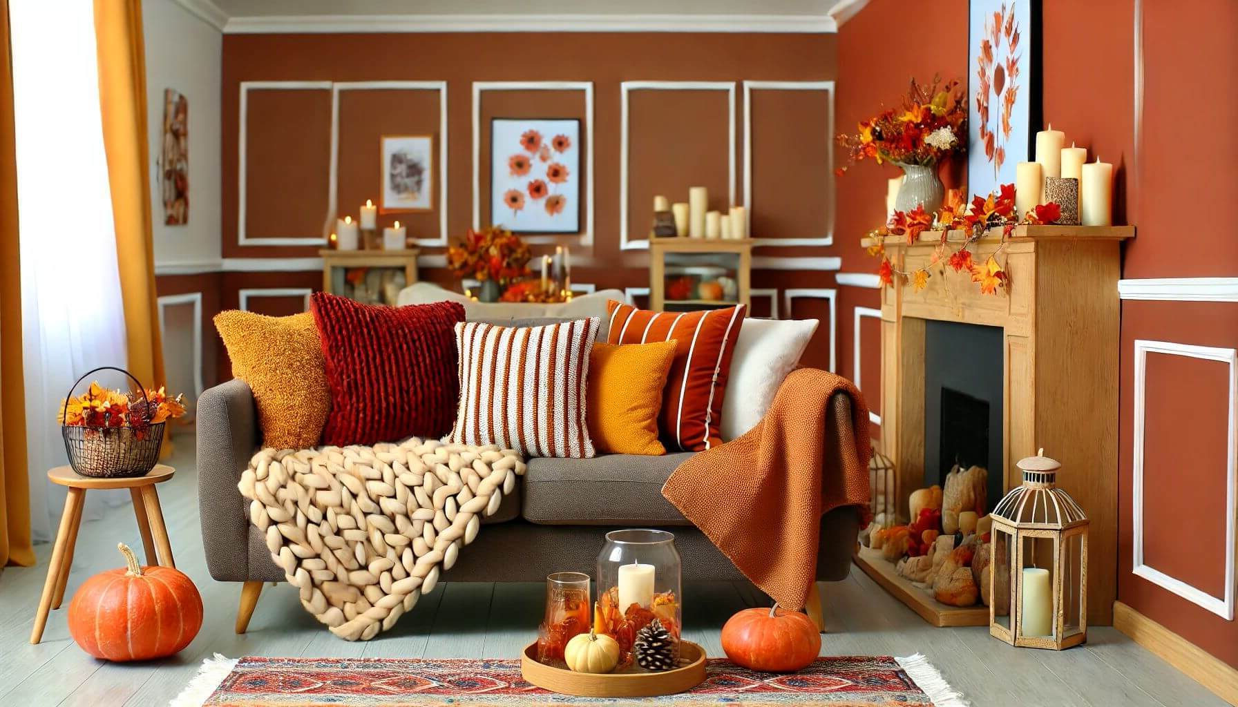
Autumnal Reds
Red is a color that is synonymous with fall, representing both the changing leaves and the warmth of a crackling fire. Incorporating autumnal reds into your color scheme can instantly add drama and a sense of coziness to any room.
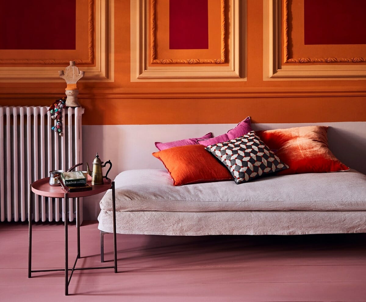
A classic combination for autumnal reds is pairing deep burgundy with warm shades of orange and brown. This creates a rich and inviting color palette that works well in spaces like living rooms and dining areas. You can bring in the red hues through accent walls, furniture upholstery, or decorative accessories such as curtains and artwork.
If you prefer a more vibrant and energetic look, consider combining shades of red with complementary colors like golden yellow or burnt orange. This creates a striking contrast that evokes the fiery hues of autumn leaves. Use these colors in smaller doses, such as in throw pillows, rugs, or statement pieces of furniture, to avoid overwhelming the space.
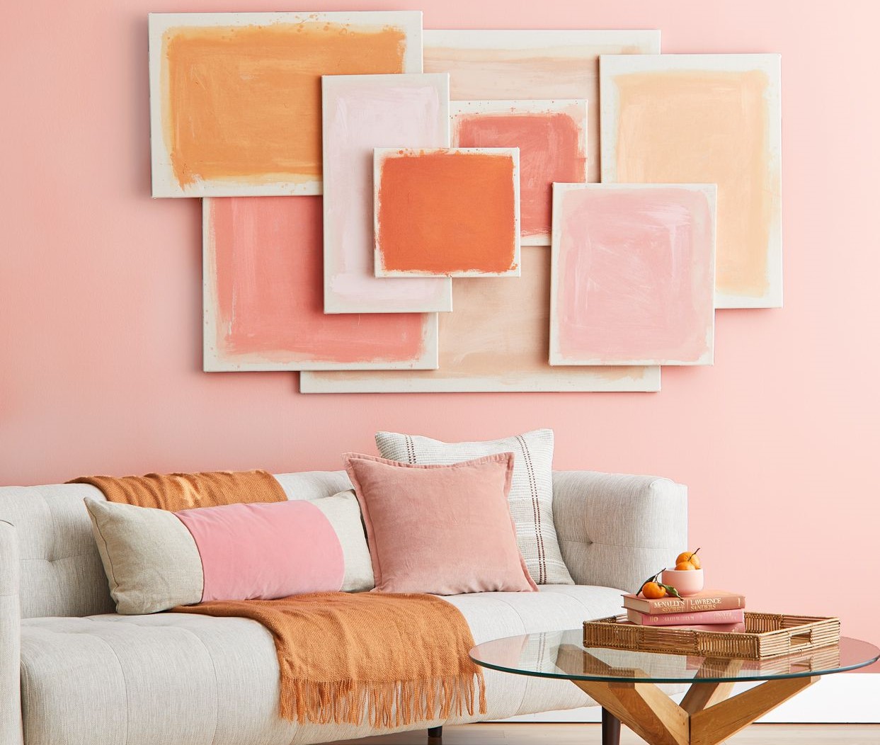
For a softer and more romantic feel, consider pairing deep cranberry red with dusty pinks and blush tones. This creates a feminine and elegant color scheme that works well in bedrooms and cozy reading nooks. Incorporate the red hues through bedding, draperies, and accessories like candles and floral arrangements.
Autumnal reds can also be used as accent colors to create a focal point in your space. For example, a single red accent wall in a living room can draw attention and infuse the space with warmth and character. Pair it with neutral or earthy tones to create balance and harmony.
Whether you choose to go bold with a full red color scheme or add subtle pops of red as accents, incorporating autumnal reds into your interior design will evoke the vibrant and cozy spirit of fall.
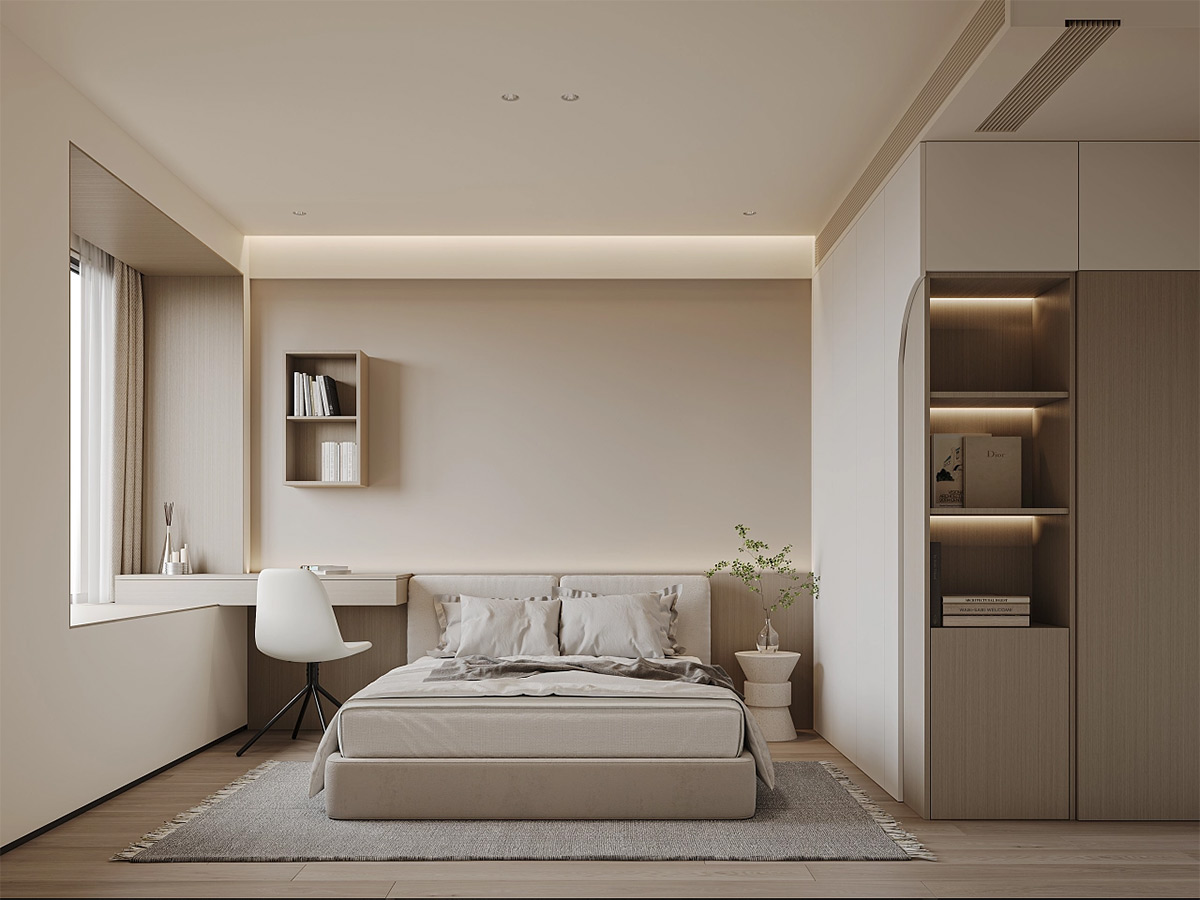
Cozy Neutrals
When it comes to fall color schemes, cozy neutrals are a timeless choice. These soft and comforting hues create a warm and inviting atmosphere that can be easily incorporated into any style of interior design.
A popular combination for cozy neutrals is a mix of warm beige, creamy whites, and touches of soft gray. This creates a light and airy feel while still maintaining a sense of warmth. Consider using these colors on walls, furniture upholstery, and textiles like curtains or throw blankets. Add in natural textures like wood or rattan to enhance the cozy vibe.
If you prefer a more rustic and earthy feel, opt for a color scheme inspired by natural elements. Think of warm taupes, charcoal grays, and toasted browns. This palette creates a sense of grounding and brings the outdoors inside. Use these colors in flooring, furniture finishes, and accessories like woven baskets or stone accents.
Cozy neutrals can also be paired with hints of metallics to add a touch of glamour. Incorporating shimmering gold or copper accents with warm neutrals creates a luxurious and sophisticated look. Consider using metallic finishes in light fixtures, decorative objects, or even in wall art to elevate your space.
For a timeless and elegant approach, consider a monochromatic color scheme using different shades of beige and taupe. This creates a visually cohesive and calming environment that is perfect for bedrooms or living rooms. Experiment with various textures and patterns to add interest and depth to the space.
Cozy neutrals are versatile and adaptable, allowing you to create a serene and comfortable atmosphere in your home. Whether you choose to go with a light and airy palette or a more rustic and earthy combination, incorporating cozy neutrals into your fall-inspired design will bring a sense of tranquility and relaxation to your space.
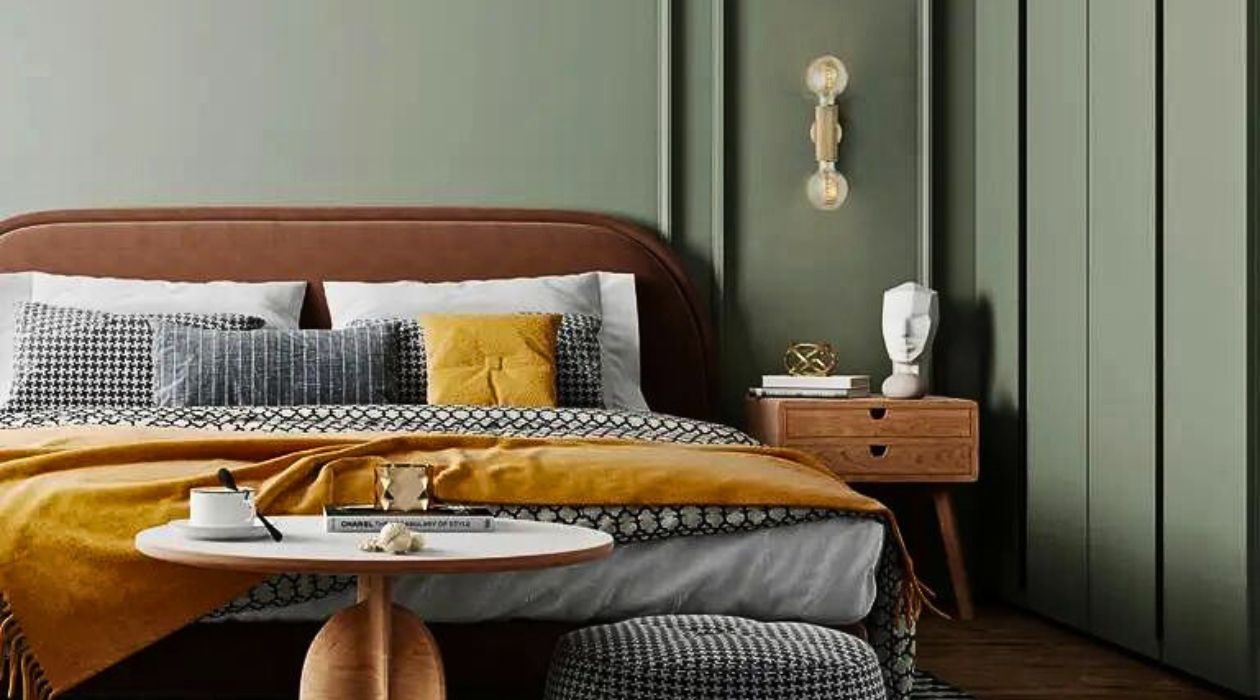
Harvest Golds
Harvest golds are the epitome of fall color schemes, evoking the warm and vibrant hues of the autumn season. These rich and golden tones add a sense of warmth, elegance, and sophistication to any space.
One popular combination for harvest golds is pairing mustard yellow with deep shades of brown. This creates a cozy and inviting color scheme reminiscent of falling leaves. Use mustard as an accent color in furniture upholstery, throw pillows, or curtains, and complement it with rich brown tones in flooring and wood finishes.
If you prefer a more luxurious and opulent feel, consider a combination of gold and rich jewel tones such as deep emerald green or royal purple. This creates a regal and vibrant color palette that adds drama and depth to your space. Use gold accents in lighting fixtures, decorative objects, or wall art to create a focal point.
For a softer and romantic look, pair soft golden yellows with blush pink or dusty rose. This creates a lovely and feminine color scheme that works well in bedrooms or living rooms. Incorporate these colors through bedding, drapes, and accessories like floral arrangements or decorative pillows.
Harvest golds can also be combined with neutral tones to create a balanced and versatile color palette. Pair golden yellows with creamy whites and light grays for a subtle and sophisticated look. This allows the golden hues to take center stage while keeping the overall atmosphere light and airy.
Whether you choose to go bold with rich mustard hues or opt for softer golden tones, incorporating harvest golds into your fall-inspired design will bring warmth, elegance, and a touch of luxury to your space.
Warm Oranges
When it comes to fall color schemes, warm oranges are a vibrant and energetic choice that embodies the essence of the season. These sunny hues bring a sense of warmth, optimism, and cheerfulness into any space.
A classic combination for warm oranges is pairing shades of tangerine and burnt orange with neutral tones like beige or cream. This creates a balanced and harmonious look that is perfect for living rooms or dining areas. Use the orange hues as accent colors in furniture upholstery, rugs, or artwork, and complement them with neutral shades in walls or flooring.
If you’re looking to make a bold statement, consider pairing warm oranges with rich chocolate brown or deep navy blue. This creates a dramatic color scheme that exudes sophistication and modernity. Use the warm oranges as pops of color in decor items like throw pillows, curtains, or statement pieces of furniture.
If you prefer a softer and more subtle look, consider combining warm oranges with soft blush pinks or light peach tones. This creates a feminine and romantic color palette that works well in bedrooms or reading nooks. Use the warm oranges as accents through bedding, drapes, or decorative accessories like vases or candles.
Warm oranges can also be used as a complementary color to cool blues or greens to create a vibrant and dynamic contrast. Pair shades of orange with aqua or teal for a refreshing and lively look. Incorporate these colors through artwork, accent walls, or decorative objects to create a focal point.
Whether you choose to go bold with a full orange color scheme or incorporate warm oranges as accents, adding this vibrant hue to your fall-inspired design will infuse your space with energy, warmth, and a touch of cheerfulness.
Rustic Browns
When thinking of fall color schemes, rustic browns immediately come to mind. These warm and earthy tones create a cozy and inviting atmosphere that is perfect for embracing the beauty of the autumn season. Utilizing rustic browns in your interior design adds a touch of natural elegance to your space.
A popular combination for rustic browns is pairing different shades of brown, such as chocolate, chestnut, and caramel. This creates a visually appealing color scheme that exudes warmth and harmony. Use these shades on furniture, flooring, or cabinetry to bring a rustic charm to your home.
For a more modern take on rustic browns, consider pairing them with shades of gray. Gray adds a contemporary touch while still maintaining a cozy vibe. Opt for lighter gray tones to keep the space feeling bright and airy, or choose darker charcoal shades for a more dramatic look. Incorporate these colors through wall paint, upholstery, or decor items like throw pillows or area rugs.
If you prefer a softer and more serene ambiance, pair rustic browns with creamy whites or soft beige tones. This creates a neutral color palette that is timeless and versatile. Use the rustic browns as grounding elements through wooden furniture or textured accents, while keeping the overall atmosphere light and soothing with the neutral hues.
Rustic browns can also be complemented with pops of color to create visual interest. Consider adding accents of deep red, burnt orange, or mustard yellow to create a focal point in your space. These warm and vibrant hues create a striking contrast against the rustic browns, bringing energy and excitement to the room.
Whether you choose to go for a full rustic brown color scheme or incorporate these warm hues as accents, embracing the beauty of rustic browns will infuse your space with a cozy, organic, and inviting feel that is perfect for the fall season.
Deep Burgundies
Deep burgundies are rich and luxurious hues that evoke a sense of sophistication and warmth in any space. Incorporating deep burgundy tones into your fall color scheme adds depth and drama, creating a cozy and inviting atmosphere.
A classic combination for deep burgundies is pairing them with shades of gold or mustard yellow. This creates a luxurious color palette reminiscent of autumn foliage. Use deep burgundy as the dominant color for walls or large furniture pieces, and complement it with pops of gold or mustard yellow in accents like throw pillows, curtains, or artwork.
If you prefer a more understated and elegant look, consider pairing deep burgundy with natural and neutral tones like beige or cream. This combination creates a sophisticated and timeless atmosphere that is perfect for living rooms or dining areas. Use deep burgundy as an accent color in upholstery fabrics, area rugs, or decorative accessories.
For a bold and dramatic approach, pair deep burgundy with shades of charcoal gray or black. This creates a striking contrast that exudes modernity and glamour. Incorporate deep burgundy in statement pieces like a velvet sofa or accent chair, and complement it with black or gray accents in lighting fixtures, artwork, or furniture details.
Deep burgundies can also be paired with shades of purple or plum for a rich and regal color combination. This creates a sense of opulence and depth in your space. Incorporate these colors in draperies, bedding, or decorative objects like vases or candles to create a cohesive look that brings a touch of sophistication to your interior.
Whether you choose to go bold with a full deep burgundy color scheme or incorporate it as accents, embracing the richness and warmth of deep burgundy tones will instantly elevate your fall-inspired design, adding an air of elegance and coziness to your space.
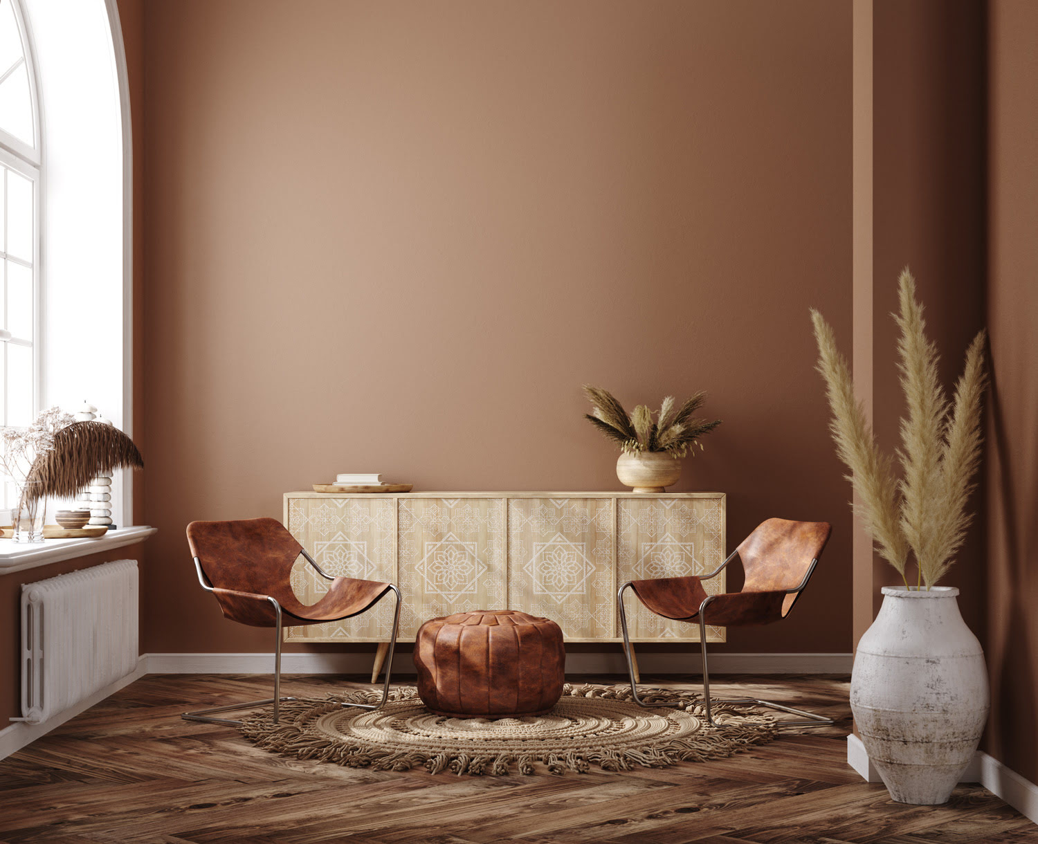
Terracotta Accents
Terracotta accents are a stunning addition to fall color schemes, adding warmth and earthiness to any space. These beautiful red-orange hues evoke a sense of rustic charm and natural beauty, creating a cozy and inviting atmosphere.
A popular combination for terracotta accents is pairing them with neutral tones like beige or cream. This creates a soft and serene color palette that is perfect for creating a calming environment. Use terracotta as accent colors in decorative accessories such as throw pillows, ceramic vases, or wall art. The warm earthy tones will bring a touch of nature indoors.
If you prefer a bolder look, consider pairing terracotta with shades of sage green or olive. This combination creates a harmonious and organic color palette reminiscent of autumn landscapes. Use terracotta as an accent color in upholstery fabrics, area rugs, or curtains, and complement it with natural green tones in plants or decorative elements.
For a more eclectic and bohemian feel, pair terracotta with vibrant patterns and colors inspired by Moroccan or Southwestern influences. Combine terracotta accents with deep blues, golden yellows, and rich teals to create a vibrant and lively ambiance. Incorporate these colors in textiles, such as throw blankets, pillows, or curtains, to add a touch of cultural flair to your space.
Terracotta accents can also be incorporated into a neutral color scheme to add warmth and visual interest. Pair terracotta with shades of gray or caramel for a sophisticated and contemporary look. Use terracotta as accent pieces like ceramic pottery or wall decor to create focal points within your space.
Whether you choose to go subtle with terracotta accents or use them as bold statement pieces, incorporating these warm and earthy hues into your fall-inspired design will bring a sense of natural beauty and rustic charm to your home.
Burnt Siennas
Burnt siennas are warm, reddish-brown hues that add depth and richness to fall color schemes. These earthy tones evoke a sense of warmth and coziness, creating a welcoming and inviting atmosphere in any space.
Pairing burnt siennas with creamy whites or soft beiges creates a neutral and serene color palette. This combination offers a timeless and versatile look that works well in various design styles. Use burnt sienna as an accent color through textiles like curtains, throw pillows, or area rugs. The warm reddish-brown hues will add a touch of sophistication to your space.
If you’re looking to create a more dramatic and bold ambiance, consider pairing burnt siennas with deep navy blues or dark grays. This creates a striking contrast and adds a sense of depth and intensity to your space. Incorporate burnt sienna through statement furniture pieces or wall accents, and complement it with the dark blues or grays in smaller decor items like artwork or decorative accessories.
Burnt siennas can also be combined with shades of mustard yellow or golden hues for a warm and vibrant color combination. This creates a lively and energetic atmosphere reminiscent of autumn leaves. Use burnt sienna as a dominant color in upholstery or wall paint, and incorporate the golden tones through decorative items like throw pillows, vases, or wall art.
For a more rustic and natural look, pair burnt siennas with organic textures and materials. Combine these warm hues with wood finishes, rattan furniture, or woven elements to create a cozy and earthy ambiance. The burnt sienna tones will enhance the natural aesthetic and bring a sense of warmth and grounding to your space.
Whether you choose to go with a subtle burnt sienna accent or incorporate it as a dominant color, embracing these warm and earthy tones will infuse your fall-inspired design with depth, warmth, and a welcoming energy that perfectly captures the essence of the season.
Pumpkin Spice Palette
The iconic flavors and colors of pumpkin spice are synonymous with the fall season. Incorporating a pumpkin spice palette into your interior design can capture the essence of autumn and create a warm and inviting atmosphere in your space.
A pumpkin spice palette typically includes shades of warm orange, soft brown, and hints of creamy white. This combination evokes the cozy and comforting feeling of sipping a pumpkin spice latte on a crisp autumn day.
One way to incorporate a pumpkin spice palette is by using warm orange tones as accent colors. Consider using pumpkin orange as an accent wall color or incorporating it in furniture upholstery, throw pillows, or curtains. Complement the warm oranges with soft brown tones in wood finishes or flooring to create a harmonious and inviting space.
Incorporating creamy white hues in a pumpkin spice palette adds a touch of balance and brightness. Use creamy white as a neutral backdrop on walls or for larger furniture pieces. This will help to create a sense of lightness and prevent the space from feeling too heavy. Incorporate creamy white in decorative accessories like candles, vases, or artwork to add contrast and create visual interest.
If you want to add depth to your pumpkin spice palette, consider adding richer brown tones. Chocolate brown or espresso hues can be incorporated through furniture pieces, area rugs, or decorative accents. These deeper browns will create a grounded and cozy atmosphere, complementing the warm orange and creamy white colors.
When it comes to textures, consider incorporating elements such as knitted blankets, plush rugs, and textured fabrics. These textures mimic the coziness of fall and enhance the overall ambiance of your pumpkin spice palette.
A pumpkin spice palette brings a sense of comfort, warmth, and nostalgia to your space. By incorporating warm orange, soft brown, and creamy white tones, you can create a fall-inspired design that captures the essence of the season and creates a cozy and inviting atmosphere in your home.
Cinnamon Brown Pairings
Cinnamon brown is a warm and inviting hue that exudes coziness and comfort. Pairing cinnamon brown with other complementary colors can create a harmonious and visually appealing fall color scheme in your interior design.
One classic combination for cinnamon brown is pairing it with shades of cream or ivory. This creates a warm and serene color palette that is perfect for creating a calming atmosphere in your space. Use cinnamon brown as an accent color through furniture upholstery, area rugs, or decorative accessories, while layering creamy neutrals in larger elements such as walls or flooring.
If you want to add depth and drama to your space, consider pairing cinnamon brown with shades of deep teal or turquoise. This creates a striking contrast that is both modern and inviting. Incorporate cinnamon brown as an accent color through throw pillows, curtains, or artwork, while using the teal or turquoise in smaller decor pieces or in accent walls to create focal points.
For a more earthy and grounded look, pair cinnamon brown with olive green or sage tones. This combination creates a natural and soothing color palette that brings a touch of the outdoors inside. Use cinnamon brown in upholstery fabrics, area rugs, or textured elements, while introducing olive or sage accents through plants, artwork, or decorative items.
Another stunning pairing for cinnamon brown is with golden yellow or mustard tones. This creates a warm and vibrant color combination reminiscent of fall foliage. Use cinnamon brown as a dominant color in larger furniture pieces or wall paint, while incorporating the golden yellow or mustard hues in smaller decor elements like throw blankets, vases, or textiles to add pops of color.
By pairing cinnamon brown with complementary colors like cream, teal, olive, or golden yellow, you can create a visually captivating and cozy fall color scheme in your interior design. Whether you choose to go subtle with accents or make a statement with bold contrasts, incorporating cinnamon brown into your space will bring a sense of warmth, comfort, and style.
When creating a fall color scheme, consider using warm tones like deep reds, burnt oranges, and rich browns to create a cozy and inviting atmosphere. Pair these colors with neutrals like cream or taupe for balance.
Maroon and Mustard
Maroon and mustard are a stunning combination that brings together the rich and deep tones of maroon with the vibrant warmth of mustard. This color pairing creates a bold and dynamic fall color scheme that instantly adds depth and character to any space.
Maroon, with its deep red undertones, adds a sense of sophistication and elegance to a room. When paired with mustard, it creates a striking contrast that is both visually appealing and inviting.
One way to incorporate maroon and mustard into your interior design is by using them as accent colors. Consider using maroon as an accent wall color or incorporating it through furniture upholstery or drapes. Introduce mustard as complementary accents in throw pillows, artwork, or decorative accessories. This allows the colors to stand out and create focal points within your space.
If you prefer a more balanced look, consider using maroon and mustard in equal proportions throughout the room. For example, you can paint the walls in a deep maroon and incorporate mustard-colored furniture or accent pieces. This creates a cohesive and harmonious color scheme that infuses the space with warmth and personality.
An alternative approach is to use maroon as the dominant color and mustard as a vibrant pop. For instance, you can paint the walls in maroon and incorporate mustard-colored accessories such as lampshades, decorative pillows, or artwork. This creates a more subdued backdrop with small bursts of energy and vibrancy.
When it comes to patterns and textures, consider incorporating elements that enhance the richness of maroon and mustard. Look for fabrics with intricate patterns or textures such as jacquard or velvet. These textures add depth and visual interest to the colors, further enhancing the overall aesthetic.
Maroon and mustard create a visually captivating and bold color combination that brings depth and warmth to any space. Whether you go for a balanced proportion or use them as accents, incorporating maroon and mustard into your fall-inspired design will infuse your interior with a sense of sophistication and vibrancy.
Golden Amber Combinations
Golden amber is a warm and lustrous hue that brings a sense of elegance and luxury to any space. Pairing golden amber with complementary colors creates a striking and visually captivating fall color scheme that exudes warmth and sophistication.
One beautiful combination for golden amber is pairing it with deep navy blue. This creates a bold and timeless color palette that balances richness with depth. Use golden amber as an accent color through textiles like throw pillows, curtains, or area rugs, while incorporating navy blue in larger pieces like furniture or accent walls to create a stunning contrast.
If you prefer a softer and more feminine look, consider pairing golden amber with blush pink or soft peach tones. This creates a romantic and delicate color palette that is perfect for bedrooms or sitting areas. Use golden amber as an accent color through bedding, drapes, or decorative accessories, while incorporating blush or peach tones in smaller decor items like throw blankets, vases, or artwork.
To create a vibrant and energetic atmosphere, pair golden amber with shades of deep burgundy or wine red. This combination creates a sense of opulence and warmth, reminiscent of the autumn season. Use golden amber as a dominant color in larger elements such as furniture or wall paint, while incorporating the deep burgundy or wine red accents through upholstery, decorative objects, or statement artwork.
For a more earthy and natural feel, pair golden amber with shades of olive green or warm brown. This creates a warm and inviting color palette inspired by nature. Use golden amber as an accent color in textiles like throw pillows or area rugs, while incorporating olive or brown tones in furniture finishes or natural elements like wood or rattan.
When working with golden amber, consider adding metallic accents such as gold or brass to enhance its opulence and shine. Incorporate these metallic finishes in lighting fixtures, decorative objects, or hardware to bring a touch of elegance and glamour to your space.
Golden amber combinations create a luxurious and visually captivating color scheme that adds warmth and sophistication to any interior design. Whether you choose to go bold with contrasting colors or create a softer and harmonious look, incorporating golden amber into your fall-inspired design will bring a radiant and elegant ambiance to your space.
Maple Leaf Inspirations
Maple leaves are iconic symbols of the fall season, with their vibrant and varied hues of red, orange, and yellow. Drawing inspiration from these beautiful leaves, incorporating a color scheme inspired by maple leaves can bring the warmth and beauty of autumn into your interior design.
Start by incorporating shades of deep red into your space. This can be achieved through accent walls, furniture upholstery, or decorative accessories. Shades like cranberry or ruby red capture the rich and bold colors found in maple leaves, adding a touch of vibrancy and energy to your room.
In addition to red, include warm tones of orange in your color scheme. Think shades like pumpkin or burnt orange. These hues mirror the fiery colors of maple leaves and create a sense of warmth and coziness in your space.To avoid overwhelming the room, use orange as accent colors through throw pillows, rugs, or artwork.
To complete the maple leaf-inspired color scheme, incorporate touches of golden yellow. This color represents the vibrant yellow hues found on autumn leaves. Golden yellow can be introduced through accessories such as lamps, curtains, or decorative accents. This adds a bright and cheerful element to the overall design.
For a more balanced and soothing look, combine the maple leaf-inspired colors with neutral tones. Consider incorporating shades of beige, cream, or taupe in your furniture, walls, or flooring. These neutral elements will complement the vibrant colors and create a harmonious and relaxed atmosphere.
When working with a maple leaf-inspired color scheme, it’s essential to find a balance between the different hues. Consider using the 60-30-10 rule. Allocate 60% of the space to the dominant color, 30% to the secondary color, and 10% to the accent color. This creates a visually pleasing and balanced look.
Additionally, incorporate natural elements and textures into your design to enhance the maple leaf-inspired theme. Materials like wood, woven baskets, or dried botanicals can bring in the organic elements often associated with autumn and the outdoors.
By drawing inspiration from the vibrant colors of maple leaves, you can create a stunning and inviting autumn-inspired color scheme in your home. Incorporating deep reds, warm oranges, and golden yellows balanced with neutral tones will infuse your space with the beauty and warmth of fall.
Espresso and Cream
If you’re looking for a sophisticated and timeless color combination for your fall-inspired interior design, consider incorporating espresso and cream tones. This pairing brings together the richness of deep brown with the lightness of creamy hues, creating a harmonious and elegant color scheme.
Start by using espresso as the dominant color in your space. This deep brown shade adds warmth and depth, creating a cozy and inviting ambiance. You can introduce espresso through furniture pieces, flooring, or accent walls. This creates a strong foundation for your design.
To balance the richness of espresso, incorporate cream tones as the secondary color. Cream brings a sense of lightness and softness to the space, effectively creating a bright and airy atmosphere. You can use cream for larger elements such as walls, curtains, or area rugs to provide a neutral backdrop that allows the espresso shades to stand out.
When working with espresso and cream, it’s important to incorporate a variety of textures to add visual interest. Consider using plush fabrics, such as velvet or faux fur, in accent pillows or blankets. Combine different materials like wood, glass, and metal to create depth and dimension in your space.
To add depth and a touch of contrast to your color scheme, consider incorporating shades of caramel or golden brown. These warm accents will complement the espresso and cream tones, adding visual interest and enhancing the overall warmth and elegance of the space. Use these colors in smaller decor items like artwork, vases, or decorative accessories.
As you plan your space, remember to find a balance in the distribution of colors. Consider using the 60-30-10 rule: allocate 60% of the space to the dominant color (espresso), 30% to the secondary color (cream), and 10% to the accent color (caramel or golden brown). This creates a visually pleasing and well-balanced composition.
The espresso and cream color combination creates a sophisticated and timeless ambiance in your fall-inspired design. The richness of espresso, combined with the lightness of cream, brings a sense of warmth and elegance to your space. By incorporating textures and accents in complementary tones, you can create a visually captivating and inviting atmosphere in your home.
Walnut and Chestnut Tones
For a warm and inviting fall color scheme, consider incorporating walnut and chestnut tones into your interior design. These rich and earthy hues add a sense of depth and sophistication, creating a cozy and timeless atmosphere in your space.
Start by incorporating walnut tones, which are deep and rich brown shades. Use them as the dominant color in your space. You can do this through furniture pieces, flooring, or cabinetry. Walnut adds warmth and elegance, creating a sense of grounding and stability in your design.
Complement the deep walnut tones with chestnut accents. Chestnut hues are medium to dark reddish-brown shades that bring a touch of warmth and vibrancy to your space. Use chestnut as accent colors through textiles like throw pillows, drapes, or area rugs. This adds visual interest and depth to your design scheme.
When working with walnut and chestnut tones, it’s essential to find a balance between the two. Aim for a harmonious distribution where walnut is the dominant color, and chestnut is used as warm and complementary accents. This creates a visually pleasing composition.
To further enhance the warm and inviting feel of your space, consider incorporating natural textures and materials. Wood finishes, rattan furniture, or woven elements can add a touch of nature and create an organic ambiance that complements the walnut and chestnut tones.
To balance the richness of the browns, incorporate lighter neutral tones. Consider using cream or beige as a backdrop color for walls or larger elements in your space. This brings a sense of lightness and contrast, allowing the walnut and chestnut tones to stand out and be the focal points.
When it comes to decor accessories, consider introducing touches of metallic accents like brass or copper. These warm metals add a touch of elegance and can be incorporated through lighting fixtures, decorative items, or hardware. They create a beautiful contrast against the walnut and chestnut tones.
The walnut and chestnut color combination creates a cozy and sophisticated atmosphere in your fall-inspired design. The deep browns of walnut, complemented by the warmth of chestnut and balanced with lighter neutrals, bring a timeless and inviting ambiance to your space. By incorporating natural textures and metallic accents, you can further enhance the richness and elegance of your design.
Mulberry Hues
If you’re looking for a rich and luxurious color scheme for your fall-inspired interior design, consider incorporating mulberry hues. These deep and velvety purples with hints of red and brown add a sense of opulence and sophistication to any space.
Start by using mulberry as the dominant color in your design. This deep hue creates a moody and dramatic ambiance, perfect for creating a cozy and elegant atmosphere. Consider painting an accent wall in mulberry or incorporating it through upholstery or drapes in your furniture.
Complement the mulberry tones with lighter shades of purple or mauve. These softer hues balance out the richness of mulberry, adding depth and dimension to your color scheme. Use them in smaller elements like throw pillows, rugs, or artwork to create visual interest and enhance the overall harmonious feel of the space.
Another stunning combination is pairing mulberry with shades of gold or metallic accents. The warm undertones of gold complement the deep purples, adding a touch of glamour and sophistication. Incorporate gold accents through lighting fixtures, decorative objects, or hardware to enhance the richness and heighten the overall elegance of the space.
To create a more balanced and soothing atmosphere, consider incorporating neutral tones such as cream, beige, or taupe. These neutrals provide a calm backdrop that allows the mulberry hues to stand out. Use them for larger elements like walls or flooring, and add touches of mulberry through accessories or smaller furniture pieces.
When working with mulberry hues, consider the importance of lighting in your space. Natural light can bring out the richness and depth of the color, while artificial lighting can create a warm and inviting ambiance. Experiment with different lighting options to accentuate the beauty of the mulberry tones in your space.
Whether you choose to go bold with a full mulberry color scheme or incorporate it as accents, embracing mulberry hues in your fall-inspired design will create an atmosphere of luxury and sophistication. The rich and velvety tones of mulberry, combined with complementary colors and metallic accents, add depth and elegance to your space, making it a truly captivating and inviting environment.
Copper and Bronze Accents
To create a warm and enchanting fall color scheme, consider incorporating copper and bronze accents into your interior design. These metallic hues add a touch of sophistication and timeless elegance to any space.
Copper and bronze are rich, warm colors that create a sense of depth and warmth in your design. Introduce copper and bronze through decorative elements such as lighting fixtures, hardware, or accessories. These accents will catch the light and add a captivating shimmer to your space.
Pair copper and bronze accents with neutral or earthy tones to create a balanced and harmonious color scheme. Shades like beige, cream, or taupe serve as the perfect backdrop, allowing the copper and bronze accents to shine. Use these neutral tones on walls, furniture, or larger decor items.
Incorporate warm neutrals like caramel or golden hues to enhance the warmth and richness of copper and bronze. These shades complement the earthy tones and create a cohesive and inviting ambiance. Add touches of caramel or golden accents through textiles, artwork, or decorative accessories.
For a dramatic and luxurious look, pair copper and bronze accents with deep jewel tones like emerald green or sapphire blue. This creates a bold contrast that exudes opulence and elegance. Incorporate these jewel tones through upholstery fabrics, accent walls, or decorative elements. The combination of the metallic accents with the rich jewel tones creates a captivating and unforgettable atmosphere.
When incorporating copper and bronze accents, consider the overall lighting of your space. Natural and artificial lighting can bring out the warmth and radiance of these metallic hues. Experiment with different lighting options to create a soft and inviting glow that enhances the copper and bronze tones.
Copper and bronze accents bring a sense of sophistication and beauty to your fall-inspired design. Whether you choose to go for a subtle addition or make them the focal point of your space, incorporating these warm metallic tones will infuse your interior with a touch of timeless elegance and create a captivating atmosphere for the season.
Warm Taupe Shades
For a versatile and timeless fall color scheme, consider incorporating warm taupe shades into your interior design. These soft and neutral hues create a sense of warmth and serenity, making them perfect for creating a cozy and inviting atmosphere in your space.
Start by using warm taupe as the base color in your design. This earthy and calming tone serves as a neutral backdrop that pairs well with a variety of other colors. Use warm taupe on walls, flooring, or larger furniture pieces to create a versatile foundation for your space.
Enhance the beauty of warm taupe with accents in similar neutral shades like cream, beige, or ivory. These tones complement the warm taupe and add a touch of lightness and brightness to the overall color palette. Incorporate these accents through textiles like throw pillows, curtains, or area rugs to create visual interest and depth.
If you prefer to introduce a contrast, consider pairing warm taupe with deep chocolate brown or rich espresso hues. These deeper brown tones create a sense of depth and warmth, adding a touch of sophistication to your space. Use chocolate brown or espresso accents through furniture upholstery, decorative accessories, or accent walls.
For a subtle and elegant look, combine warm taupe with muted pastel shades like blush pink or soft lavender. This creates a delicate and romantic color palette that exudes tranquility and grace. Incorporate the pastel hues as accents through artwork, bedding, or decorative items, while using warm taupe as the dominant color in larger elements of your design.
When working with warm taupe shades, consider incorporating textures to create visual interest. Experiment with materials like linen, wicker, or textured fabrics to add depth and a tactile element to your space. These textures enhance the overall cozy and inviting feel of the warm taupe color scheme.
Warm taupe shades create a versatile and timeless fall color scheme that brings a sense of warmth and serenity to your interior design. Whether you choose to go for a monochromatic look or incorporate contrasting accents, embracing warm taupe shades will create a cozy and harmonious atmosphere in your space.
Sunflower and Olive Pairings
For a vibrant and nature-inspired fall color scheme, consider incorporating sunflower yellow and olive green into your interior design. This combination brings together the sunny hues of sunflowers with the earthy tones of olive, creating a warm and inviting atmosphere in your space.
Start by using sunflower yellow as an accent color. This bright and cheerful hue adds a pop of vibrancy to your design. Use it in smaller doses to create focal points, such as through throw pillows, artwork, or decorative accessories. The sunflower yellow instantly infuses your space with energy and warmth.
Complement the sunflower yellow with olive green, a shade that represents the lush foliage of nature. Olive green brings a sense of calmness and grounding to the color scheme. Incorporate olive green through larger elements like furniture upholstery, area rugs, or curtains to create a balanced and harmonious look.
When working with sunflower and olive pairings, consider the distribution of colors to create visual balance. Aim for a harmonious blend where sunflower yellow serves as the accent color, while olive green acts as the dominant color. This creates a cohesive and well-balanced composition.
To create visual interest and depth within the color scheme, incorporate various textures and patterns. Consider using textiles like burlap, linen, or woven materials to add textural elements that enhance the organic and natural feel of the sunflower and olive combination.
An additional way to enhance the warmth and richness of the sunflower and olive color scheme is by incorporating natural elements. Bring in elements such as wooden furniture, basket weaves, or houseplants to bring a touch of nature indoors. These natural elements complement and accentuate the overall earthy and vibrant ambiance of the color palette.
Lastly, consider balancing the vibrancy of the sunflower yellow and olive green by complementing them with lighter neutral tones like cream, beige, or ivory. These neutrals provide a soft backdrop that allows the sunflower yellow and olive green to stand out and be the focal points of your space.
By incorporating the sunny hues of sunflower yellow and the earthy tones of olive green into your fall-inspired design, you can create a vibrant and inviting atmosphere. The combination of these colors brings warmth, energy, and a touch of nature to your space, making it feel cozy and reminiscent of the beautiful autumn season.
Read more: How To Design Home Decor Color Scheme
Fiery Reds and Yellows
To create a bold and vibrant fall color scheme, consider incorporating fiery reds and yellows into your interior design. These energetic and eye-catching hues evoke the warmth and vibrancy of autumn foliage, bringing a sense of excitement and energy to your space.
Start by using fiery red as a dominant color in your design. This intense and passionate hue creates a striking focal point and adds a sense of drama and depth. Consider using fiery red on an accent wall, in furniture upholstery, or through decorative accessories to infuse your space with a powerful burst of color.
Complement the fiery reds with vibrant yellows to amplify the energy and create a harmonious color scheme. Yellow brings a sense of joy and optimism to your space, representing the bright and cheerful hues of fall. Incorporate yellow through throw pillows, artwork, or accent furniture to create a cohesive and vibrant look.
To balance the intensity of the fiery reds and yellows, incorporate neutral or earthy tones like beige, cream, or brown. These colors provide a grounding and calming effect, creating a sense of balance within the color scheme. Use neutrals for larger elements such as walls, flooring, or furniture, allowing the fiery reds and yellows to stand out as accent colors in smaller decor items.
When working with fiery reds and yellows, consider the overall lighting in your space. Natural light enhances the vibrancy of the colors, creating a warm and inviting atmosphere, while artificial lighting can be used strategically to highlight specific areas or features. Experiment with different lighting fixtures or bulbs to find the perfect balance and enhance the fiery tones in your space.
While fiery reds and yellows create a bold statement, it’s essential to find a balance between the colors. Consider the 60-30-10 rule: allocate 60% of the space to the dominant color (fiery red), 30% to the secondary color (vibrant yellow), and 10% to a contrasting color or neutral tone. This creates a visually pleasing and well-balanced composition.
Incorporating fiery reds and yellows into your fall-inspired design brings a sense of vibrancy and energy to your space. Whether you choose to go bold with these colors or use them as accents, the fiery reds and yellows will infuse your interior with a joyful and dynamic ambiance, reflecting the beautiful shades of autumn.
Conclusion
Incorporating fall-inspired color schemes into your interior design is a wonderful way to create a warm and inviting atmosphere in your home. Whether you opt for earthy tones, autumnal reds, cozy neutrals, harvest golds, warm oranges, rustic browns, deep burgundies, terracotta accents, burnt siennas, pumpkin spice palettes, cinnamon brown pairings, maroon and mustard hues, golden amber combinations, maple leaf inspirations, espresso and cream shades, walnut and chestnut tones, mulberry hues, copper and bronze accents, warm taupe shades, sunflower and olive pairings, fiery reds and yellows, each color combination brings its own unique charm and character to your space.
Remember to find a balance between dominant colors, accent colors, and neutral tones to create a visually pleasing and harmonious composition. Pay attention to the lighting in your space, as it can significantly impact the vibrancy and warmth of the colors you choose.
Textures and natural elements play a vital role in enhancing the overall fall-inspired aesthetic. Incorporate materials like wood, woven textiles, or metallic accents to add depth, visual interest, and a touch of luxury to your design.
Ultimately, the goal is to create a space that reflects the beauty and coziness of the autumn season, where you can relax and enjoy the comforts of home. Whether you prefer a bold and dramatic color scheme or a more subtle and serene palette, the key is to infuse your interior design with your personal style and creativity.
By incorporating these fall color inspirations into your interior design, you can transform your space into a warm and inviting sanctuary that celebrates the beauty of the season year-round. So go ahead and embrace the charm and vibrancy of fall, and let your creativity guide you in creating a space that reflects your unique style and love for interior design.
Frequently Asked Questions about Fall Color Schemes: 21 Warm, Cozy Color Combinations To Love
Was this page helpful?
At Storables.com, we guarantee accurate and reliable information. Our content, validated by Expert Board Contributors, is crafted following stringent Editorial Policies. We're committed to providing you with well-researched, expert-backed insights for all your informational needs.
0 thoughts on “Fall Color Schemes: 21 Warm, Cozy Color Combinations To Love”