Home>Interior Design>The 5 Outdated Paint Trends That No Longer Excite Us
Interior Design
The 5 Outdated Paint Trends That No Longer Excite Us
Modified: August 28, 2024
Explore the interior design world and leave behind the 5 outdated paint trends that no longer excite us. Update your space with fresh and modern ideas.
(Many of the links in this article redirect to a specific reviewed product. Your purchase of these products through affiliate links helps to generate commission for Storables.com, at no extra cost. Learn more)
Introduction
When it comes to interior design, paint plays a crucial role in setting the tone and atmosphere of a space. The right color can transform a room, making it feel warm and inviting or cool and calming. Over the years, however, certain paint trends have come and gone, and what was once popular may now feel outdated and uninspired.
In this article, we will take a look at five paint trends that no longer excite us. These trends, while once popular, have lost their appeal due to evolving design aesthetics and changing preferences. If you are looking to refresh your space and want to avoid dated paint choices, keep reading to discover the paint trends you should avoid.
Key Takeaways:
- Outdated paint trends like beige walls and accent walls are no longer in vogue. Embrace modern alternatives like greige and balanced color schemes for a fresh and sophisticated look.
- Say goodbye to Tuscan-inspired colors and textured paint. Opt for lighter, more neutral palettes and alternative textures to create a timeless and visually appealing space.
Subtitle 1: Beige Walls
For many years, beige was the go-to color for interior walls. It was considered a safe and neutral option that would complement any decor. However, the popularity of beige walls has waned in recent years, as homeowners now seek more vibrant and exciting colors for their spaces.
Beige walls can often give a room a dated and uninspired look. They lack the personality and visual interest that other colors can bring. While beige can be a versatile backdrop for furniture and accessories, it can also create a lackluster and monotonous feel.
Instead of opting for beige, consider exploring other neutral paint colors that can still create a warm and inviting atmosphere while adding more depth to your space. Colors like greige (a mix of beige and gray), soft whites, or even pale pastels can offer a more modern and sophisticated alternative to beige walls.
Furthermore, using different textures, patterns, or wall treatments can inject visual interest into your space without relying solely on the color of the walls. Consider adding wallpaper, wainscoting, or textured plaster to create focal points and add dimension to your walls.
Overall, while beige walls were once a popular choice, they have become outdated in the world of interior design. By exploring alternative neutral colors and incorporating interesting textures, you can create a more visually appealing and up-to-date look for your home.
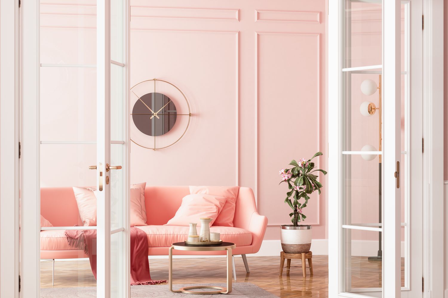
Subtitle 2: Accent Walls
Accent walls were once a popular way to add a pop of color or create a focal point in a room. The concept involved painting one wall in a bold or contrasting color while leaving the other walls a more neutral tone. However, this trend has lost its allure and is now considered outdated in the realm of interior design.
The idea of an accent wall was to create visual interest and draw attention to a particular area of the room. However, it often resulted in a disjointed and unbalanced look. Instead of creating a harmonious flow, accent walls can sometimes feel disconnected from the rest of the space.
Additionally, accent walls can limit your design options and make it difficult to change the overall look of the room. If you decide to change the color scheme or decor in the future, the accent wall may clash or feel out of place.
To achieve a more cohesive and modern look, consider using a balanced color scheme throughout the entire room. Instead of relying on a single accent wall, incorporate pops of color through accessories, artwork, and textiles. This will allow you to introduce color in a more flexible and versatile way, making it easier to update and change the look of the room as needed.
Furthermore, consider using other design elements to create focal points in your space. Instead of relying solely on paint, you can use architectural features, such as an interesting fireplace, a statement piece of furniture, or a unique lighting fixture, to draw attention and add visual interest.
By moving away from the accent wall trend and embracing a more cohesive design approach, you can achieve a modern and unified look for your space that will stand the test of time.
Subtitle 3: Tuscan-Inspired Colors
In the past, Tuscan-inspired colors were highly popular in interior design. These warm, earthy tones such as terracotta, olive green, and deep gold were often used to create a rustic and Mediterranean feel. However, this trend has now become outdated and no longer excites us.
The use of Tuscan-inspired colors can make a space feel heavy and dated. The rich, saturated hues can overwhelm a room and create a sense of visual clutter. Furthermore, these colors may not necessarily align with the overall design aesthetic or personal style preferences of modern homeowners.
To give your space a more contemporary and fresh look, consider opting for lighter and more neutral color palettes. Soft grays, cool blues, or creamy whites can create a light and airy atmosphere, making your space feel more open and inviting.
However, if you still have a fondness for the warmth and character of Tuscan-inspired colors, you can incorporate them in smaller doses as accent colors or through accessories and textiles. For instance, you can use throw pillows, rugs, or artwork featuring those colors to add a touch of warmth without overwhelming the space.
Remember, it’s all about balance and moderation. By using Tuscan-inspired colors sparingly and in combination with more contemporary shades, you can add a touch of nostalgia while still maintaining a modern and updated look.
Ultimately, the use of Tuscan-inspired colors has lost its appeal in the world of interior design. Embracing a fresher and more neutral color palette will give your space a timeless and sophisticated look that will remain relevant for years to come.
Tip: When choosing paint colors, opt for timeless neutrals like whites, grays, and beiges. These colors are versatile and can easily be updated with accessories and accents.
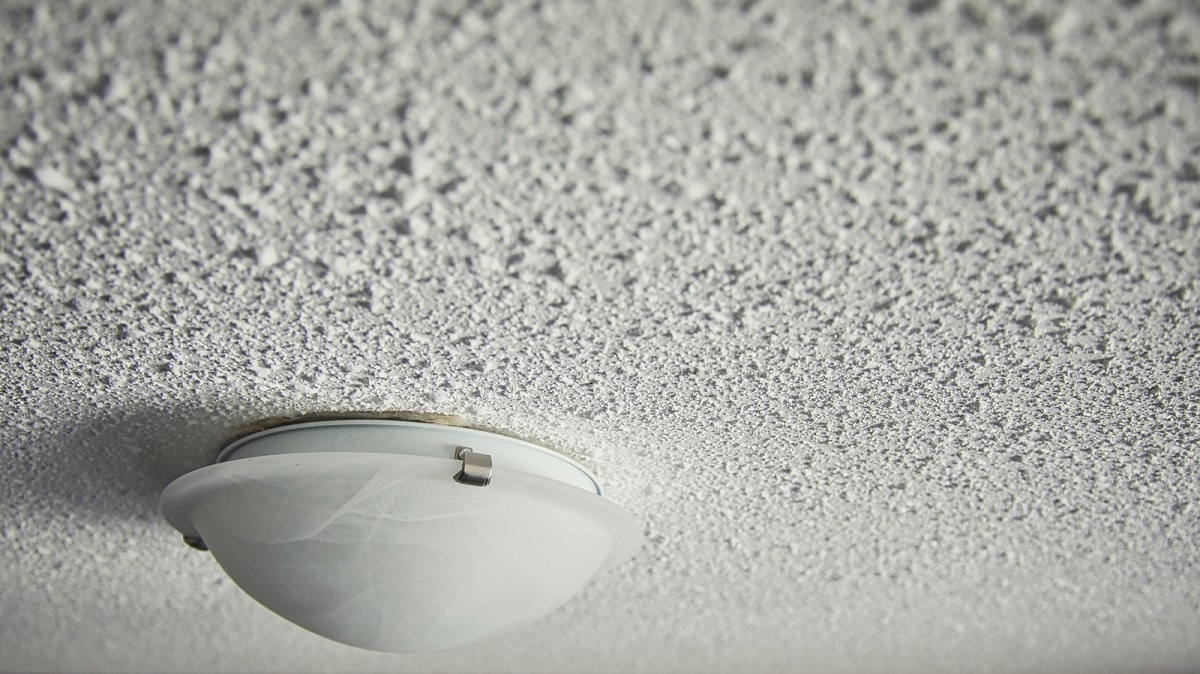
Subtitle 4: Textured Paint
Textured paint was once a popular choice for adding depth and visual interest to walls. From faux finishes to stucco-like textures, this trend aimed to create a tactile and unique look. However, this trend has now become outdated and no longer excites us as it once did.
Textured paint can be challenging to maintain and can quickly become a magnet for dust and dirt. Cleaning textured walls can be a cumbersome task, and over time, the texture may become worn or uneven, further detracting from the overall appearance of the room.
Moreover, textured paint can limit your design options and make it challenging to change the look and feel of a space. If you decide to update the decor or repaint the walls with a different color, the texture may interfere with achieving a smooth and uniform finish.
Instead of relying on textured paint, consider exploring alternative ways to add texture and visual interest to your walls. You can achieve a similar effect by incorporating textured wallpapers, such as grasscloth or embossed patterns. These options provide the flexibility to change the look of the room without the difficulty of repainting textured walls.
Furthermore, you can also consider using architectural elements, such as decorative panels, wood accents, or exposed brick, to add texture and dimension to your walls. These elements not only add visual interest but also create a unique and personalized touch to your space.
By moving away from textured paint and embracing alternative methods of adding texture, you can maintain a more versatile and visually appealing space that can easily evolve with your changing design preferences.
Subtitle 5: Bright and Bold Colors
Once upon a time, bright and bold colors were all the rage in interior design. Vibrant shades of red, orange, and electric blue filled rooms, aiming to create a statement and evoke a sense of energy and excitement. However, this trend has now lost its appeal and no longer entices us as it once did.
Using bright and bold colors excessively can overwhelm a space and create a visually chaotic environment. These intense hues can be visually exhausting and may not lend themselves well to creating a soothing and relaxing atmosphere in your home.
Instead of opting for a solely bright and bold color palette, consider using these shades more sparingly as accents. A pop of color in the form of throw pillows, artwork, or accessories can still create visual interest and make a statement without overwhelming the space.
When it comes to wall colors, consider choosing more subtle and muted tones. Soft pastels, neutral shades, or even earthy hues can create a soothing and sophisticated backdrop for your space. These colors provide a more timeless and versatile foundation, allowing you to easily change and update your decor as needed.
Remember, balance is key. By combining neutral and muted colors with pops of bright and bold accents, you can create a visually appealing and harmonious space that strikes the right balance between excitement and tranquility.
Ultimately, the trend of using bright and bold colors as the main palette for your space has become outdated in the world of interior design. Incorporating these colors in a more restrained and thoughtful manner will give your space a more modern and sophisticated look.
Conclusion
As the world of interior design evolves, certain paint trends that were once popular have become outdated and no longer excite us. Beige walls, accent walls, Tuscan-inspired colors, textured paint, and bright and bold colors have all lost their appeal in favor of more modern and versatile design choices.
By moving away from these dated paint trends, you can create a space that feels fresh, stylish, and timeless. Exploring alternative neutral colors, incorporating interesting textures, and using accent colors sparingly can help you achieve a more modern and sophisticated look for your home.
Remember, interior design is a reflection of personal style and should be a space that brings you joy and comfort. While trends come and go, it’s important to create a space that speaks to your unique preferences and makes you feel at home.
So, as you embark on your next interior design project, consider leaving behind these outdated paint trends and embracing the new possibilities that await you. Choose colors and design elements that resonate with you, create balance and harmony, and above all, make your space a place where you can truly thrive.
By staying aware of evolving design aesthetics and making conscious choices, you can create a home that stands the test of time and brings you endless joy and inspiration.
Frequently Asked Questions about The 5 Outdated Paint Trends That No Longer Excite Us
Was this page helpful?
At Storables.com, we guarantee accurate and reliable information. Our content, validated by Expert Board Contributors, is crafted following stringent Editorial Policies. We're committed to providing you with well-researched, expert-backed insights for all your informational needs.


0 thoughts on “The 5 Outdated Paint Trends That No Longer Excite Us”