Home>Interior Design>Retro Colors Are Making A Comeback: Designers Explain Why
Interior Design
Retro Colors Are Making A Comeback: Designers Explain Why
Modified: October 20, 2024
Discover why interior designers are embracing the revival of retro colors in their designs. Uncover the secrets behind this timeless trend.
(Many of the links in this article redirect to a specific reviewed product. Your purchase of these products through affiliate links helps to generate commission for Storables.com, at no extra cost. Learn more)
Introduction
Step into any home, browse through interior design catalogs, or scroll through design inspiration on social media, and you’ll notice a common thread – the resurgence of retro colors. From the vibrant hues of the 1960s to the pastel palettes of the 1980s, these nostalgic shades are making a comeback in the world of interior design.
Designers and homeowners alike are embracing the charm and character of retro colors, infusing spaces with a sense of nostalgia and style. But what is it about these colors from the past that continues to captivate us? Why do they hold such allure and appeal?
In this article, we’ll delve into the world of retro colors and explore the reasons behind their resurgence in popularity. We will uncover the emotional connections they evoke, their ability to make visuals stand out, and how they contribute to a sense of authenticity and familiarity in our modern lives.
So, get ready to embark on a journey through time and discover the enduring power of retro colors in interior design.
Key Takeaways:
- Embrace the nostalgia and individuality of retro colors to create visually captivating and emotionally resonant interior designs that stand out in a saturated digital world.
- Incorporate retro colors thoughtfully into modern design to infuse spaces with a sense of authenticity, familiarity, and personalized visual storytelling, evoking specific emotions and creating unique visual experiences.
The revival of retro colors
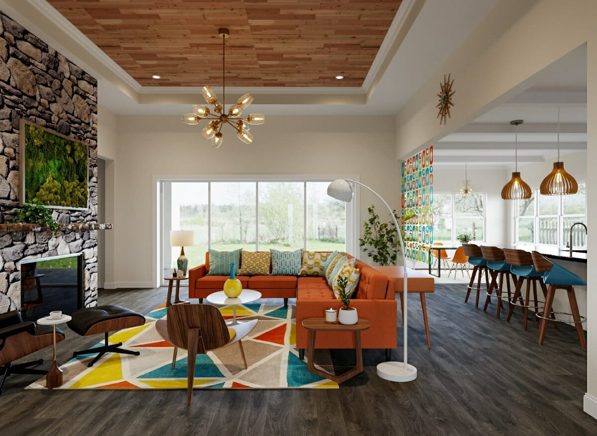
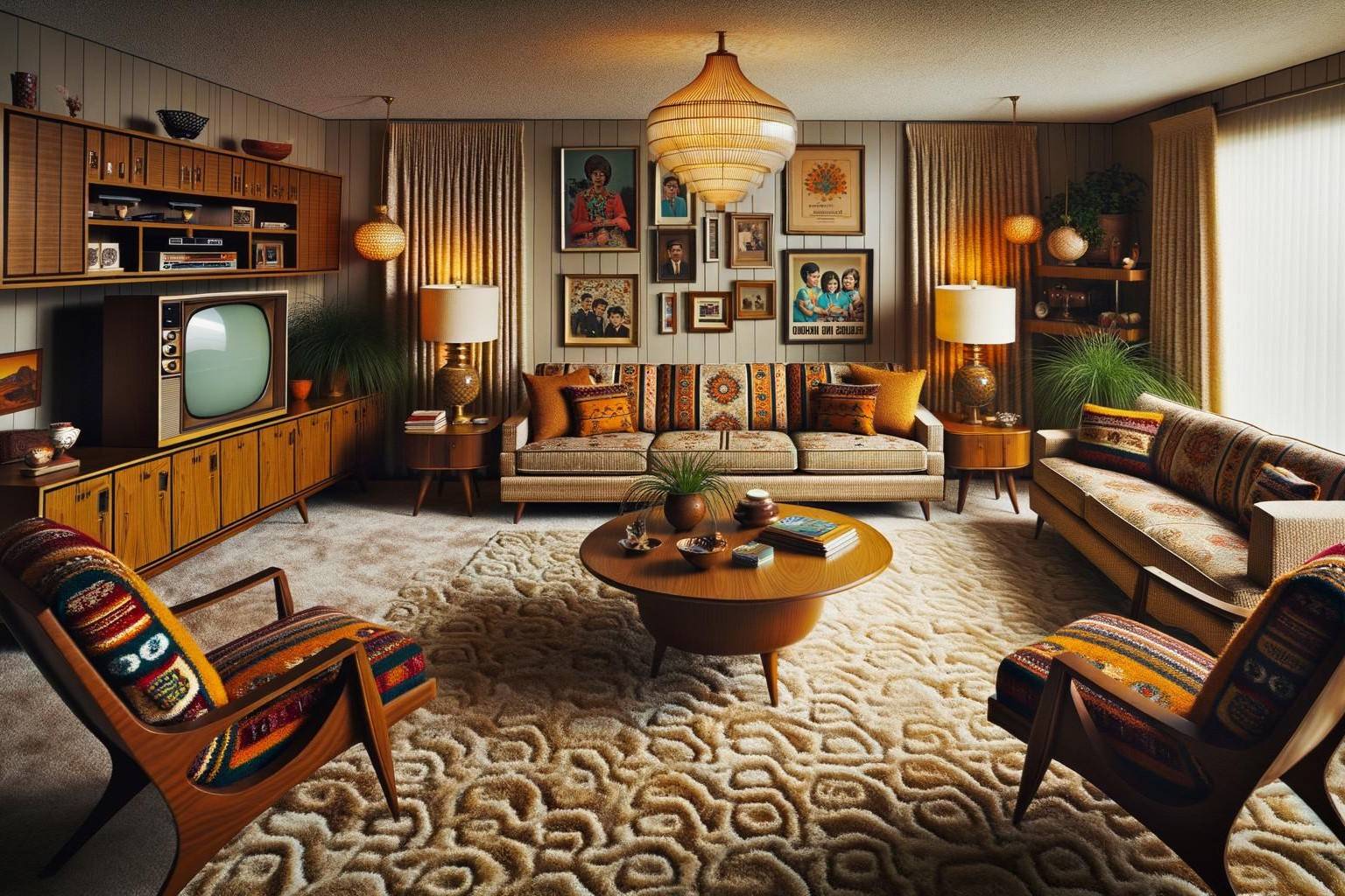
What was once considered outdated and old-fashioned has now become a hot trend in interior design. Retro colors, with their boldness and distinctive character, have made a remarkable comeback.
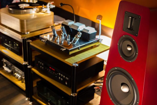
Designers are increasingly turning to the colors of the past to create unique and eye-catching interiors. From the groovy oranges and yellows of the 1970s to the muted earth tones of the 1950s, retro colors allow for endless possibilities when it comes to creating eclectic and visually appealing spaces.
One of the driving factors behind the revival of retro colors is the desire to break free from the monotony of modern design. In a world saturated with cookie-cutter interiors and minimalist aesthetics, retro colors offer a breath of fresh air. They inject personality, vibrancy, and a sense of individuality into our living spaces.
Furthermore, retro colors have the ability to transport us back in time, evoking memories of a bygone era. They provide a sense of nostalgia, reminding us of simpler times and triggering a longing for the past. This emotional connection is a powerful tool in interior design, as it allows us to create spaces that resonate with our personal histories and experiences.
The revival of retro colors can also be attributed to the cyclical nature of design trends. As the saying goes, “what goes around comes around.” In the world of design, trends often resurface with a fresh twist. Retro colors, with their inherent charm and uniqueness, have stood the test of time and continue to capture our imagination.
Moreover, the infusion of technology in our everyday lives has paradoxically fueled the longing for a simpler, more authentic past. Retro colors offer a comforting escape from the digital world, providing a sense of warmth and nostalgia that cannot be replicated by sleek and futuristic designs.
Whether it’s a bold accent wall in a vibrant 70s orange or a pastel color scheme that harkens back to the 1950s, the revival of retro colors has breathed new life into the world of interior design. Designers and homeowners are embracing the opportunity to create unique, visually striking, and emotionally resonant spaces.
Nostalgia: The driving force behind the trend
When we think of retro colors, we can’t help but feel a sense of nostalgia. They transport us back to a time when life was simpler, technology was less pervasive, and design aesthetics were bolder and more vibrant. Nostalgia, in all its wistfulness and longing, is the driving force behind the resurgence of retro colors in interior design.
Nostalgia is a universally powerful emotion that tugs at our heartstrings and elicits a longing for the past. It is deeply rooted in our human psychology and has a significant impact on our emotions and preferences. In the realm of design, nostalgia allows us to create spaces that evoke specific time periods, spark fond memories, and create a sense of comfort and familiarity.
One reason nostalgia is so alluring is that it offers an escape from the complexities of the modern world. In an era of rapid technological advancements and constant connectivity, the charm of the past beckons us with its simplicity and slower pace of life. Retro colors help us create environments that promote relaxation and a sense of calm, counteracting the fast-paced nature of our daily lives.
Moreover, nostalgia taps into our desire for authenticity. In a world filled with mass-produced items and generic designs, we long for objects and spaces that have a sense of history and character. Retro colors bring a touch of authenticity to our interiors, reminding us of a time when handcrafted details and unique design elements were prized.
Additionally, nostalgia acts as a bridge between generations. For those who lived through a particular time period, retro colors can evoke memories of their youth, creating a sense of connection to their past and a longing to share those experiences with younger generations. It allows for a sense of intergenerational bonding and an appreciation for the beauty and significance of design from different eras.
As designers and homeowners incorporate retro colors into their spaces, they are not just embracing a visual trend but also igniting a sense of nostalgia and fostering an emotional connection to the past. The enduring appeal of these colors lies in their ability to evoke memories, create a sense of comfort, and transport us to a time when life seemed simpler and more colorful.
Emotional connections: How retro colors evoke specific feelings
Colors have long been known to influence our emotions and evoke specific feelings. The same holds true for retro colors, which have a unique ability to connect with us on an emotional level and enhance the overall ambiance of a space.
One of the reasons retro colors evoke such strong emotions is their association with specific time periods and cultural movements. For example, the vibrant and psychedelic colors of the 1960s immediately bring to mind a sense of rebellion, freedom, and creativity. On the other hand, the soft pastel hues of the 1950s evoke feelings of nostalgia, innocence, and a sense of tranquility.
Each retro color palette carries its own emotional connotations, allowing designers and homeowners to create spaces that elicit specific moods and atmospheres. The bold and vibrant colors of the 1970s can infuse a space with excitement, energy, and a touch of avant-garde. Conversely, the earthy tones of the 1970s create a sense of grounding, warmth, and a connection to nature.
Retro colors not only evoke specific feelings but also have the power to positively impact our well-being. Certain hues, such as soft blues and greens reminiscent of the 1950s, have a calming effect and can promote relaxation and tranquility. Others, like the bright yellows and oranges of the 1970s, can stimulate creativity and inspire a sense of joy and playfulness.
In addition to their inherent emotional associations, retro colors also interact with other design elements to create powerful visual compositions. The juxtaposition of contrasting retro colors, such as bold blues and oranges, creates a dynamic and energetic visual impact. On the other hand, the harmonious combination of muted pastels can elicit a sense of serenity and elegance.
Ultimately, the emotional connections formed through retro colors allow us to personalize our living spaces and infuse them with a specific atmosphere. By intentionally selecting and incorporating these colors into our interiors, we have the ability to evoke a wide range of emotions and create tailored experiences for ourselves and others.
As the revival of retro colors continues to gain momentum, it is important to explore the emotional nuances that these colors bring to our living spaces. By considering the specific feelings and associations they evoke, designers and homeowners can harness the power of retro colors to create truly impactful and emotive interiors.
Stand out from the crowd: Unique visuals in a saturated digital world
In today’s digital age, we are constantly bombarded with visual content. With social media platforms and online design communities filled with countless images and inspiration, it can be challenging to create a space that truly stands out. This is where the power of retro colors comes into play.
Retro colors offer a refreshing break from the sea of neutrals and minimalistic palettes that dominate much of the current design landscape. Their bold and vibrant nature helps spaces grab attention and make a statement. In a world where it’s easy to get lost in the noise, using retro colors can be a strategic way to create a visual impact and stand out from the crowd.
These unique visuals are especially effective in the digital realm. Social media platforms like Instagram and Pinterest are flooded with a myriad of images, making it challenging for any single design to garner attention. However, a thoughtfully designed space that incorporates retro colors can capture the viewer’s interest and make a lasting impression.
Retro colors not only capture attention, but they also evoke a sense of personality and creativity. They allow designers and homeowners to express their individuality and create spaces that reflect their unique style and taste. In a saturated digital world, authenticity and uniqueness are highly valued, and retro colors provide a means to achieve that.
Another advantage of using retro colors to create unique visuals is their ability to create a sense of nostalgia and familiarity. As humans, we are naturally drawn to the familiar and find comfort in the nostalgic. By incorporating retro colors into our spaces, we tap into that innate desire for something that feels both new and familiar, capturing the attention and interest of viewers.
Moreover, retro colors can help create a sense of storytelling within a space. They can be used to evoke a specific era or cultural movement, telling a visual narrative and immersing people in a particular time or experience. This storytelling aspect adds depth and intrigue to a design, elevating it from being merely visually appealing to being a captivating visual journey.
Whether it’s a pop of 80s neon or a nod to the sleek mid-century modern aesthetic of the 1950s, incorporating retro colors into a design allows for the creation of unique visuals that capture attention, express individuality, and evoke a sense of familiarity and nostalgia.
In a world where visual content is constantly competing for attention, the use of retro colors offers a distinct advantage. By embracing these vibrant and unconventional hues, designers and homeowners can create visually stunning spaces that stand out from the crowd and leave a lasting impression in the saturated digital world.
When using retro colors, consider pairing them with modern elements to create a balanced and timeless look. This can help avoid a dated or overly nostalgic aesthetic.
Creating a sense of authenticity and familiarity
In an era of mass production and generic designs, there is an increasing desire for authenticity and a connection to the past. Retro colors play a significant role in creating a sense of authenticity and familiarity within our living spaces.
Authenticity is something that many of us strive for in our homes. We want our spaces to reflect our unique personalities and tell our individual stories. Retro colors enable us to achieve this by infusing our interiors with a sense of history and character.
By incorporating retro colors, we add a touch of nostalgia that recalls a specific era or cultural movement. Whether it’s the earthy tones of the 1970s or the bright pastel hues of the 1950s, these colors communicate a distinctive aesthetic and create an atmosphere that transports us to another time.
Furthermore, retro colors evoke a sense of familiarity. We often associate these hues with our own personal experiences or with images we’ve seen in vintage movies or photographs. This familiarity creates a sense of comfort and a feeling of being at ease within a space.
One of the reasons retro colors evoke such a strong sense of authenticity is their connection to craftsmanship and individuality. In the past, when paint colors were mixed by hand, there was more variation and nuance in the pigments used. This resulted in colors that were unique and couldn’t be easily replicated.
When we incorporate these retro colors into our interiors, we break free from the mass-produced and generic designs that have become so common. Instead, we create spaces that are distinct and showcase our appreciation for the beauty of handmade craftsmanship.
Furthermore, retro colors allow us to pay homage to our roots and cultural heritage. They can celebrate a specific time period or design movement that holds significance in our personal or collective history. By embracing these colors, we create a connection to the past and embrace the stories that have shaped us.
Creating a sense of authenticity and familiarity through retro colors is not just about following a trend; it is about creating spaces that feel true to who we are. By surrounding ourselves with colors that evoke a sense of nostalgia and individuality, we can create homes that reflect our unique identities and provide a haven of comfort and familiarity.
The influence of social media and digital platforms
In today’s digital age, social media platforms and online design communities have a profound influence on interior design trends. They shape our perceptions of what is visually appealing and set the stage for the popularity of certain aesthetics, including the resurgence of retro colors.
One of the significant drivers behind the revival of retro colors is the power of social media to disseminate design inspiration and trends on a global scale. Platforms like Instagram and Pinterest showcase an endless stream of beautifully curated interiors, and users can easily explore different color palettes, furniture styles, and design themes.
As users consume and engage with this visual content, they are exposed to a wide range of design aesthetics, including the use of retro colors. The widespread circulation and popularity of retro color schemes on social media contribute to the increasing demand for these hues in interior design.
Furthermore, social media platforms allow designers and homeowners to share their own creative endeavors and showcase spaces that incorporate retro colors. This sharing of unique and inspiring interiors sparks a ripple effect, inspiring others to embrace these colors and experiment with their own designs.
In addition to the impact of social media, digital platforms have made it easier than ever to access and experiment with different color palettes. Online platforms and software provide tools that allow users to virtually test out different colors in their interiors, giving them the confidence to explore unconventional color choices.
Social media and digital platforms have not only influenced the popularity of retro colors but have also played a role in shaping the way these colors are used. Designers and homeowners are now more inclined to juxtapose bold retro colors with neutral backgrounds or incorporate retro-color accents into modern design schemes.
The power of social media and digital platforms lies in their ability to connect people and create a sense of community around shared design interests. Design enthusiasts can join online communities, participate in discussions, and seek advice from others who are passionate about retro color schemes. This sense of community fosters creativity and encourages the exploration of unique design ideas.
As the influence of social media and digital platforms continues to grow, we can expect the popularity of retro colors to persist. The exposure to diverse design aesthetics, the inspiration shared by designers and homeowners, and the sense of community fostered by these platforms all contribute to the growing demand for retro colors in modern interior design.
Incorporating retro colors in modern design
The beauty of incorporating retro colors into modern design lies in the ability to create a harmonious blend of past and present. By infusing spaces with nostalgic hues, designers can add a touch of character and uniqueness to contemporary interiors.
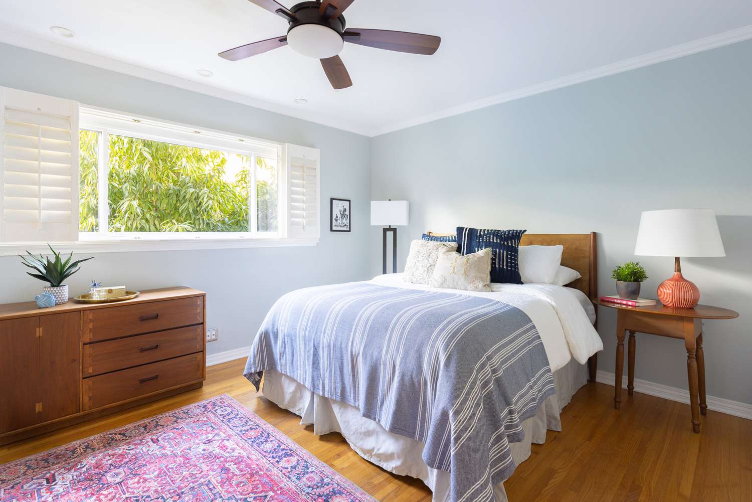
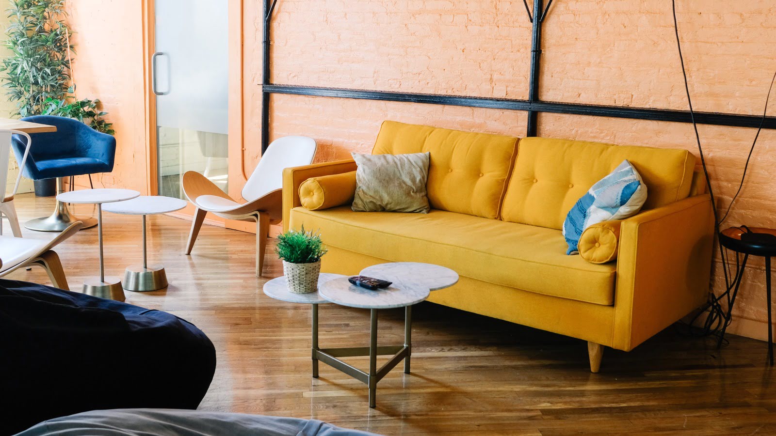
One way to incorporate retro colors is through accent pieces and accessories. By adding bold cushions, vibrant artwork, or retro-inspired furniture in standout colors, designers can infuse spaces with a pop of retro charm. These accents can act as focal points or create visual interest, adding depth and personality to an otherwise modern design.
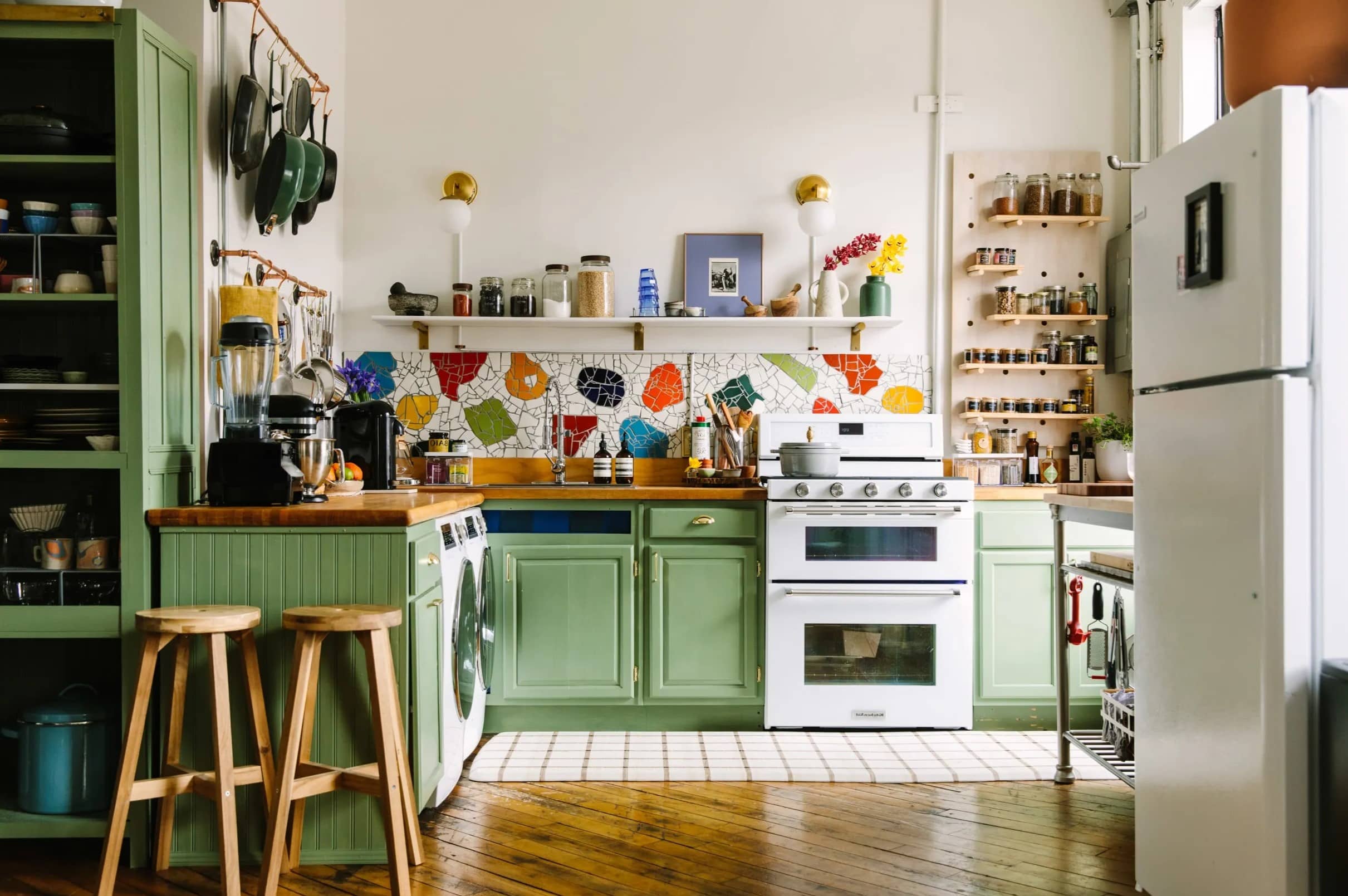
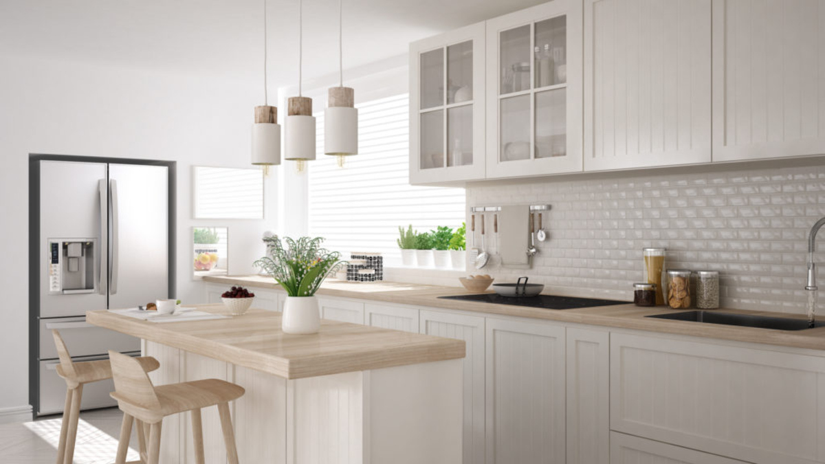
Another approach is to use retro colors as a backdrop in a neutral space. For example, a kitchen with sleek white cabinets and countertops can be instantly transformed by adding a retro-inspired backsplash in vibrant colors such as mint green or sunny yellow. This juxtaposition of modern and retro creates a visually striking effect and adds a touch of playfulness to the overall design.
Retro colors can also be incorporated through the use of wallpaper or wall paint. Wallpaper patterns, reminiscent of the 1960s or 1970s, can create a bold and statement-making feature in a living room or bedroom. Alternatively, painting a single wall or niche in a retro color can instantly breathe life into a space and add a dash of nostalgia.
When incorporating retro colors, it is important to consider the overall aesthetic and balance within the space. Retro colors can be vibrant and bold, so it’s essential to choose complementary colors and incorporate them strategically. Pairing retro colors with neutral hues or soft pastels can help create balance and prevent overwhelming the design.
Additionally, modern design often emphasizes clean lines and simplicity. To ensure a cohesive look, it’s important to incorporate retro colors in a thoughtful and intentional way. Whether it’s through furniture, accessories, or wall treatments, each element should be carefully chosen to enhance the overall design concept.
The key to successfully incorporating retro colors in modern design is finding a balance between old and new. Retaining the clean lines and minimalism of modern design while infusing spaces with retro colors creates a unique and visually captivating result – a fusion of the past and the present.
Ultimately, the incorporation of retro colors in modern design allows designers to tap into the nostalgia and charm of the past while creating contemporary spaces that are vibrant, visually engaging, and full of personality.
Tips for using retro colors effectively
Using retro colors in interior design can be a fun and exciting way to infuse your space with personality and nostalgia. To ensure that your use of retro colors is effective and visually appealing, consider the following tips:
- Start with a neutral base: To avoid overwhelming the space, begin with a neutral backdrop such as white or light grey walls. This will allow the retro colors to take center stage and create a balanced aesthetic.
- Choose a cohesive color palette: Select a retro color palette that complements each other and works well with the overall design concept. Harmonious combinations of bold and muted colors or analogous color schemes can create a visually pleasing result.
- Use retro colors as accents: Incorporate retro colors in smaller doses, such as through accent furniture, throw pillows, artwork, or accessories. This will add pops of color and create focal points without overwhelming the space.
- Create visual balance: Pair bold retro colors with neutral tones to create visual balance. For example, if you have a vibrant retro sofa, balance it with neutral flooring or walls to create a harmonious and visually pleasing contrast.
- Consider the size of the space: Keep in mind that bold retro colors can visually shrink a space. If you have a small room, consider using retro colors in smaller areas like an accent wall or furniture, or opt for softer retro pastel colors that create an airy and open feel.
- Mix retro with modern: Blend retro colors with contemporary elements to create a fusion of the past and present. Combining retro colors with sleek and minimalist furniture styles or modern finishes can result in a cohesive and balanced aesthetic.
- Pay attention to lighting: Retro colors can appear different under various lighting conditions. Consider how natural and artificial light will affect the colors in your space. Test the colors under different lighting conditions to ensure that they have the desired effect.
- Use retro patterns and textures: Don’t limit yourself to colors alone; retro patterns and textures can also create a nostalgic vibe. Consider incorporating retro-inspired wallpaper, textile patterns, or textured surfaces to add depth and visual interest to your space.
- Be mindful of personal preference: Ultimately, the choice of retro colors should reflect your personal taste and style. Select colors that speak to you and evoke the specific emotions and nostalgia you desire in your space. Trust your instincts and create a design that makes you feel happy and comfortable.
By considering these tips, you can effectively incorporate retro colors into your interior design, creating a visually captivating and nostalgic space that reflects your unique style and personality.
Conclusion
The resurgence of retro colors in interior design has brought a touch of nostalgia, vibrancy, and individuality to our living spaces. These colors from the past have proven to be a powerful tool for creating visually captivating and emotionally resonant designs.
By embracing retro colors, designers and homeowners can break free from the monotony of modern design and infuse their spaces with character, authenticity, and familiarity. These colors evoke specific feelings and evoke a sense of connection to different time periods, allowing us to create spaces that tell personal stories and reflect our individual identities.
The influence of social media and digital platforms has played a significant role in popularizing retro colors and sparking creativity within the design community. The sharing of inspiring interiors and the sense of community fostered by these platforms have contributed to the growing demand and experimentation with retro color schemes.
When incorporating retro colors, it’s important to strike a balance and consider the overall design aesthetic. Whether used as accent pieces, backdrops, or a cohesive color palette, retro colors should be thoughtfully integrated into the space to create a harmonious and visually appealing result.
Ultimately, the revival of retro colors in interior design allows us to escape the uniformity of modern aesthetics, embrace our love for nostalgia, and create unique visual experiences. By infusing spaces with these vibrant and nostalgic hues, we can evoke emotions, stand out from the crowd, and enjoy the beauty that comes from merging past and present.
So, let your creativity run wild and consider incorporating retro colors into your next interior design project. Explore the endless possibilities, embrace the nostalgia, and create spaces that are truly one-of-a-kind.
Frequently Asked Questions about Retro Colors Are Making A Comeback: Designers Explain Why
Was this page helpful?
At Storables.com, we guarantee accurate and reliable information. Our content, validated by Expert Board Contributors, is crafted following stringent Editorial Policies. We're committed to providing you with well-researched, expert-backed insights for all your informational needs.
0 thoughts on “Retro Colors Are Making A Comeback: Designers Explain Why”