Home>Interior Design>The Pillow Colors To Avoid In A Living Room
Interior Design
The Pillow Colors To Avoid In A Living Room
Modified: September 2, 2024
Avoid these pillow colors in your living room to create the perfect interior design. Discover the best color combinations for a stylish and harmonious space.
(Many of the links in this article redirect to a specific reviewed product. Your purchase of these products through affiliate links helps to generate commission for Storables.com, at no extra cost. Learn more)
Introduction
When it comes to interior design, every detail counts, including the colors of the pillows in your living room. The right choice of pillow colors can enhance the overall aesthetic and create a harmonious and inviting space. On the other hand, the wrong colors can disrupt the visual appeal and throw off the entire design concept.
Choosing the perfect pillow colors for your living room is not just about personal preference, but also about considering various factors such as the existing color palette, lighting, mood, and overall design style. By understanding these factors and avoiding certain colors, you can create a cohesive and visually pleasing living room that reflects your style and personality.
In this article, we will explore the importance of pillow colors in a living room and highlight the colors that are best avoided. So, let’s dive in.
Key Takeaways:
- Choose pillow colors wisely to create a visually balanced and harmonious living room. Avoid neon colors, overly dark hues, clashing colors, and excessive patterns to maintain a cohesive and inviting atmosphere.
- Consider existing color palette, lighting, mood, design style, and personal preference when selecting pillow colors. Opt for softer shades, balanced dark hues, harmonizing colors, and a mix of patterns for a visually pleasing living room.
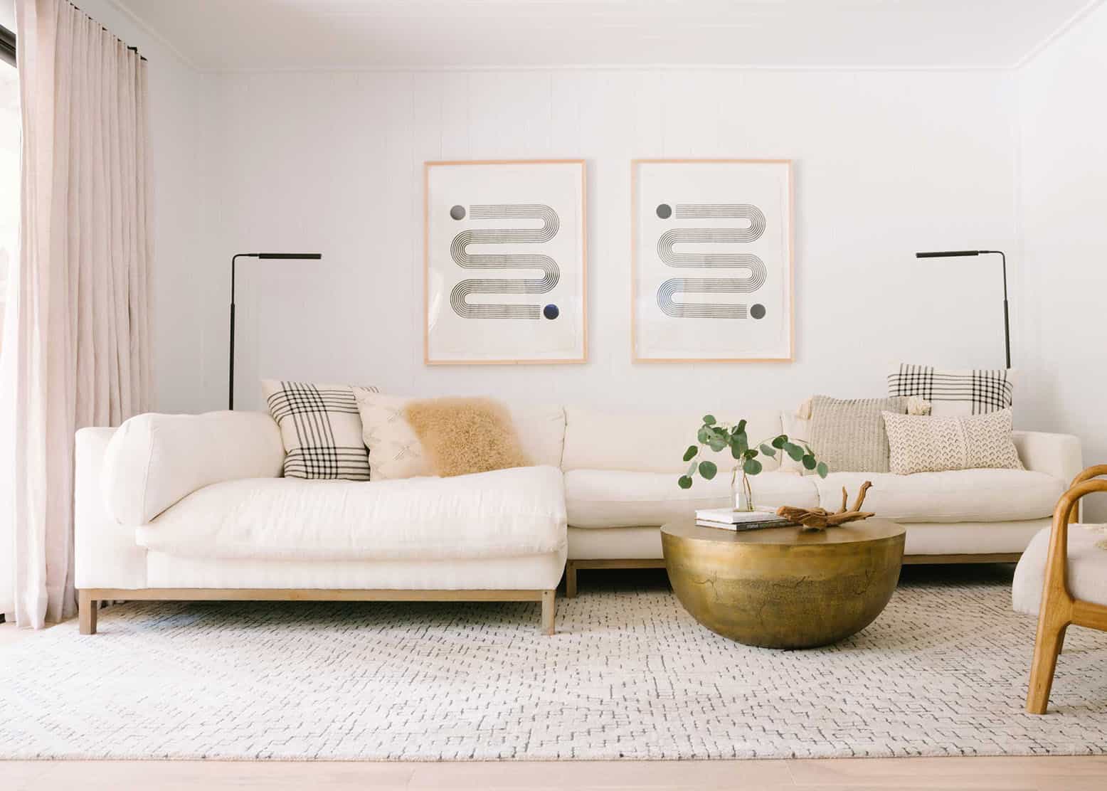
The Importance of Pillow Colors in a Living Room
Pillow colors play a crucial role in the overall design scheme of a living room. They can add depth, visual interest, and cohesiveness to the space. The right choice of colors can tie together different elements in the room, such as furniture, curtains, rugs, and wall color, creating a harmonious and inviting atmosphere.
Color has a powerful impact on our emotions and can greatly influence the mood of a space. A well-chosen color scheme can evoke feelings of calmness, warmth, vibrancy, or elegance. When it comes to the living room, it is essential to create an environment that reflects your personal style and promotes relaxation and comfort. Pillow colors can help achieve this by either complementing or contrasting with the existing color palette.
Additionally, pillows are versatile design elements that can be easily switched out or updated to reflect different seasons, trends, or occasions. By changing the colors of your pillows, you can instantly give your living room a fresh and updated look without having to invest in major design changes.
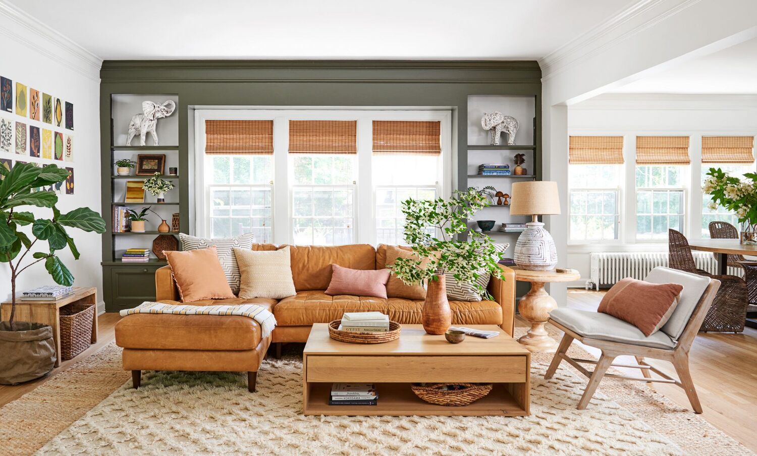
Moreover, pillows can act as accessories that bring texture and dimension to your living room. They can be used to introduce patterns, prints, and different fabric textures, adding visual interest and creating a focal point. The right combination of colors and textures can transform a plain sofa or armchair into a stylish and inviting seating area.
Ultimately, pillow colors play a vital role in setting the tone and atmosphere of your living room. By selecting colors that complement the overall design scheme and reflect your personal style, you can create a space that is visually pleasing, comfortable, and inviting for both you and your guests.
Factors to Consider When Choosing Pillow Colors
When selecting pillow colors for your living room, it’s important to consider several factors to ensure a cohesive and stylish design. Here are some key factors to keep in mind:
- Existing Color Palette: Take into account the colors already present in your living room, such as the wall color, furniture upholstery, and curtains. Choose pillow colors that complement and enhance these existing colors rather than clash or overpower them. Consider using complementary colors or shades from the same color family to create a harmonious look.
- Lighting: Consider the lighting in your living room. Natural light and artificial light sources can affect how colors appear. Cooler colors, such as blues and greens, can feel refreshing in well-lit spaces, while warmer colors, such as yellows and oranges, can create a cozy vibe in dimly lit areas. Take note of the lighting conditions in your living room before choosing pillow colors.
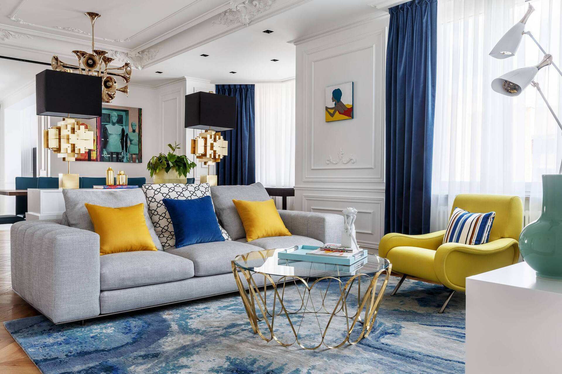
- Mood and Ambiance: Think about the mood you want to create in your living room. The color psychology can influence the atmosphere of the space. Soft, neutral tones like beige and pastels can create a calm and serene ambiance, while bold and vibrant colors like red and yellow can bring energy and vibrancy. Consider the desired mood and choose pillow colors that align with it.
- Design Style: Consider the overall design style of your living room. Different design styles call for different color schemes. For example, a modern and minimalist living room may benefit from a monochromatic color scheme with pops of bold colors, while a traditional living room may embrace rich, warm tones. Understand your design style and select pillow colors that complement it.
- Personal Preference: Ultimately, your personal preference and taste should guide your pillow color choices. Consider colors that you find visually appealing and that resonate with your style and personality. Don’t be afraid to experiment with different colors and combinations to create a unique and personalized look.
By considering these factors and finding the right balance between the existing color scheme, lighting, mood, design style, and personal preference, you can choose pillow colors that enhance the overall aesthetic of your living room and create a space that reflects your individuality and style.
Colors to Avoid in a Living Room
While there are numerous beautiful colors to choose from for your living room pillows, there are some colors that are best avoided as they can disrupt the overall design scheme or create an undesirable atmosphere. Here are a few colors to steer clear of:
- Neon Colors: Neon colors, such as fluorescent pinks, greens, and yellows, can be overwhelming and distracting in a living room. They tend to overpower the space and can create a visual imbalance. Instead, opt for softer shades or muted tones of these colors for a more pleasing and harmonious look.
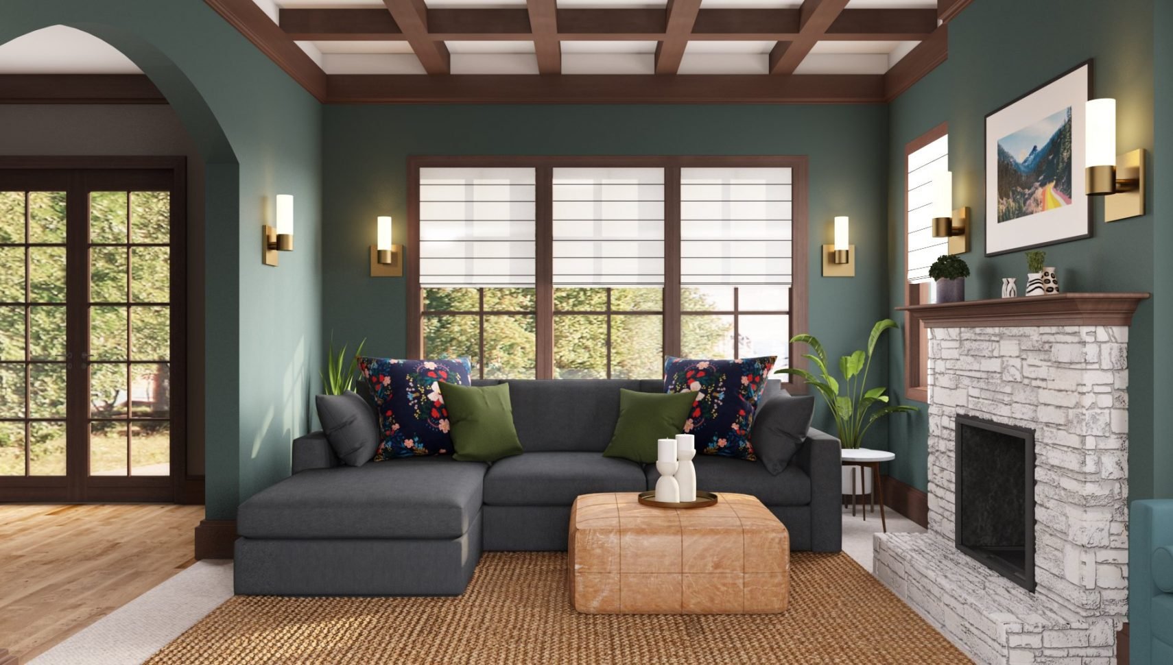
- Overly Dark Colors: While dark colors can add depth and sophistication, using overly dark hues for your pillows can make the living room feel gloomy and cramped. It’s best to balance dark colors with lighter shades or use them as accents rather than the main color. Dark colors can still be incorporated into the design through other elements like furniture or accessories.
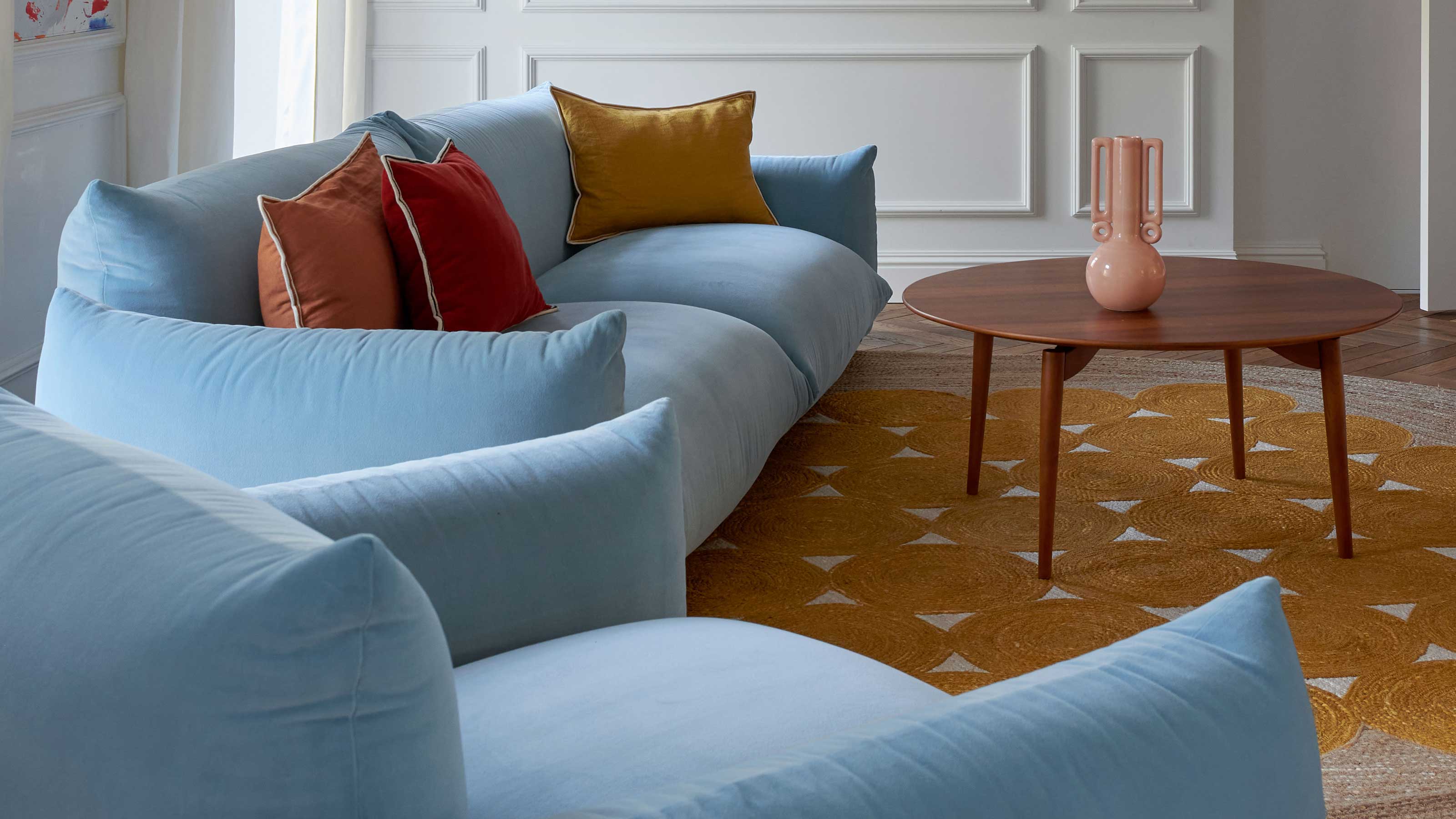
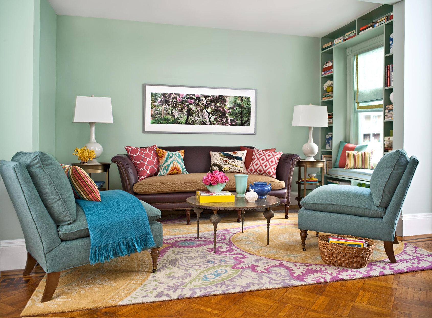
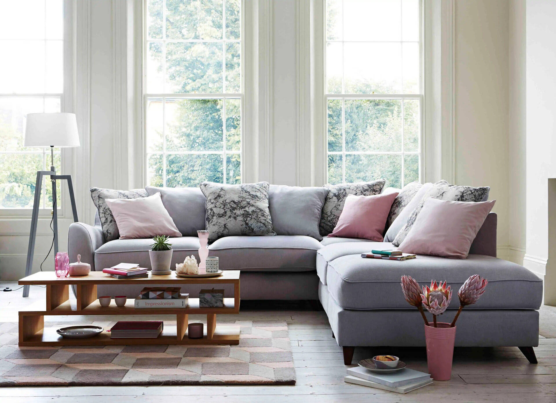
- Clashing Colors: Avoid choosing pillow colors that clash or create a jarring effect with the rest of the room’s color scheme. For example, pairing vibrant red pillows with a predominantly green color scheme can create a clashing effect. Instead, opt for colors that harmonize with the existing palette to maintain a cohesive and balanced look.
- Too Many Patterns and Prints: While patterns and prints can add visual interest, using too many different patterns on your pillows can create a chaotic and overwhelming look. It’s best to stick to one or two patterns and balance them with solid-colored pillows. This will allow the patterns to stand out without overwhelming the space.
Remember, these guidelines are not hard and fast rules but rather suggestions to help you create a visually appealing and harmonious living room. Ultimately, it’s important to choose pillow colors that align with your personal style and preferences. Don’t be afraid to experiment, mix and match colors, and trust your instincts to create a space that reflects your unique taste and creates a welcoming environment for relaxation and enjoyment.
Neon Colors
Neon colors are vivid, eye-catching, and certainly make a bold statement. However, when it comes to selecting pillow colors for your living room, neon colors are best avoided. Their intense brightness can easily overwhelm the space and disrupt the overall visual harmony.
Neon colors, such as fluorescent pinks, greens, oranges, and yellows, can create a jarring effect when used in large amounts. They tend to draw all the attention and can make the other elements in the room feel overshadowed and insignificant. In a living room where you want to create a cozy and inviting atmosphere, neon colors may not be the best choice.
However, this doesn’t mean you have to completely eliminate these vibrant colors from your design. If you are drawn to neon colors and want to incorporate them into your living room, consider using them as accent colors rather than as the main color of your pillows. For example, you can use a few small neon-colored pillows to add pops of brightness to a neutral or monochromatic color scheme. This way, the neon colors can serve as focal points and add visual interest without overpowering the space.
Additionally, consider opting for softer shades or pastel versions of neon colors. These toned-down versions still provide a touch of vibrancy without being as overwhelming. For instance, instead of a fluorescent pink pillow, you could choose a soft blush or dusty rose pillow, which will create a more relaxed and pleasing visual effect.
Remember, the goal is to create a harmonious and balanced living room design. If you do decide to incorporate neon colors, make sure to consider the existing color scheme, lighting, and mood of the room. And always keep in mind that less is often more when it comes to using vivid and intense colors in your living room pillows.
Avoid using bright or neon colors for pillows in a living room, as they can be overwhelming and distracting. Stick to more neutral or muted tones to create a calming and cohesive atmosphere.
Overly Dark Colors
While dark colors can add drama, elegance, and depth to a living room, using overly dark colors for your pillows can have a negative impact on the overall atmosphere of the space. Too much darkness can make the room feel gloomy, cramped, or even oppressive.
It’s important to strike a balance when incorporating dark colors into your living room design, especially when it comes to pillow colors. Instead of using pillows in deep, intense shades like black, charcoal gray, or navy blue, consider opting for lighter or mid-tone versions of these colors.
Using lighter shades of dark colors, such as a medium gray or a midnight blue, can provide the desired richness and depth without creating a heavy or somber look. These colors can still create a sense of sophistication while maintaining a balanced and inviting atmosphere.
Another approach to incorporating dark colors into your pillow selection is to use them as accent colors rather than as the dominant color. For example, you can choose pillows with a dark color trim or pattern to add interest and create a focal point. Pairing dark-colored pillows with lighter-colored pillows can also create a pleasing contrast and prevent the overall space from feeling too dark.
Remember to consider the lighting in your living room as well. If your space has limited natural light or lacks proper artificial lighting, using overly dark pillows could further darken the room. In such cases, it’s best to choose lighter colors that can help brighten the space and maintain a balanced visual appeal.
Ultimately, the key is to create a living room that feels welcoming and comfortable. While dark colors can add a touch of sophistication, it’s crucial to strike the right balance to avoid creating a living room that feels too heavy or gloomy. Always consider the existing color scheme and lighting conditions to ensure that your pillows contribute to a harmonious and visually pleasing space.
Clashing Colors
When it comes to choosing pillow colors for your living room, it’s important to consider how they interact with the existing color palette and ensure they don’t clash with other colors in the space. Clashing colors can create a chaotic and disjointed look, disrupting the overall harmony and aesthetic of the room.
When we talk about clashing colors, we’re referring to colors that are on opposite ends of the color spectrum or have a strong contrast. For example, pairing pillows in vibrant red with a predominantly green color scheme can create a jarring effect. Similarly, combining pillows in bright orange with a cool blue color scheme might not be visually pleasing.
To avoid clashing colors, it’s helpful to understand color theory and how different colors interact. One approach is to use a color wheel as a guide. Colors that are opposite each other on the wheel are considered complementary colors, and they can create a visually appealing contrast when used together. However, it’s important to use complementary colors sparingly to prevent the room from feeling too overwhelming.
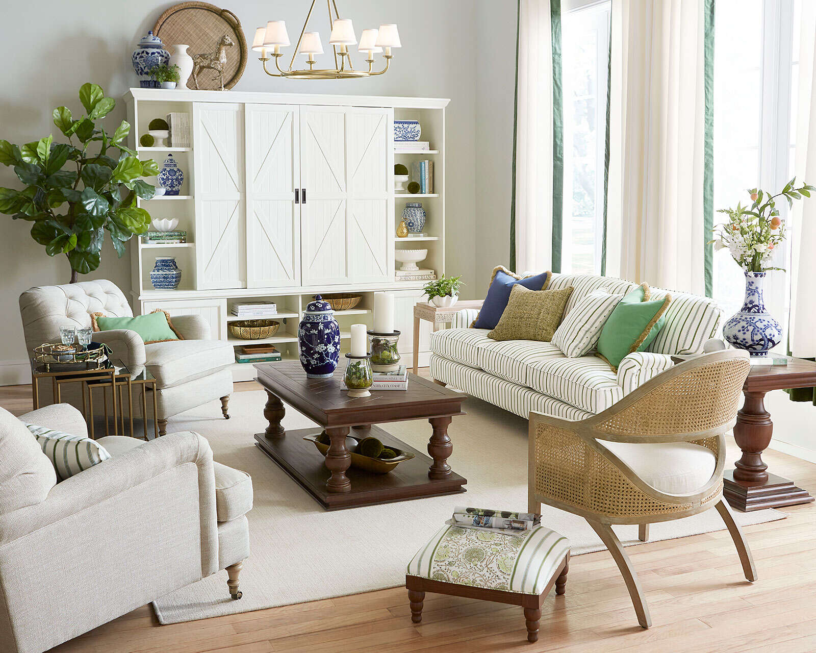
When selecting pillow colors, consider choosing colors that harmonize with the existing color scheme. Look for colors that are within the same color family or have similar undertones. For example, if your living room features warm earthy tones, such as browns and creams, opt for pillows in shades of warm neutrals like beige, tan, or taupe.
Additionally, consider using a color palette or theme as a guide. Creating a cohesive color scheme through pillows that echo the hues of other elements in the room, such as the artwork, rugs, or curtains, can help tie everything together and create a more harmonious aesthetic.
Remember, the goal is to create a living room that feels visually pleasing and balanced. Avoiding clashing colors ensures that your pillows contribute to the overall coherence and unity of the space. By considering the existing color palette and using color theory as a guide, you can select pillow colors that complement rather than clash, resulting in a more visually appealing and cohesive living room design.
Too Many Patterns and Prints
Pillows can add visual interest and texture to your living room, especially when incorporating patterns and prints. However, it’s important to exercise caution and avoid using too many patterns and prints as it can create a cluttered and overwhelming look.
When it comes to choosing pillow colors, consider using patterns and prints as accents rather than making them the main focus. Using a combination of solid-colored pillows and a few patterned ones can strike a balance and prevent the space from feeling too busy.
It’s also important to consider the scale of the patterns. Mixing different scales, such as large floral prints with small geometric patterns, can create a chaotic visual effect. Instead, try to have a mix of patterns with varying scales, ensuring that they complement each other without competing for attention.
When choosing patterns, keep in mind the overall design style of your living room. For example, if your space has a modern aesthetic, consider geometric patterns or abstract designs. For a traditional look, classic patterns like stripes, damask, or floral prints can be suitable.
Another way to approach patterns and prints is to consider the color palette. Opt for patterns that align with the existing color scheme of the room. This ensures that the patterns blend seamlessly with the rest of the elements in the space, creating a cohesive and visually pleasing look.
Lastly, be mindful of the textures of your pillows. Combining pillows with different textures, such as velvet, linen, or silk, can add depth and variety to the room. Mixing textures can be an alternative to using excessive patterns and prints, adding visual interest and tactile appeal without overwhelming the space.
Remember, the goal is to create a visually balanced and harmonious living room. By choosing a combination of solid-colored pillows and a few well-coordinated patterns or prints, you can enhance the overall aesthetic without creating a cluttered or chaotic look. Consider the scale of the patterns, the design style, the color palette, and the textures to strike the right balance for a visually pleasing and cohesive living room design.
Conclusion
The choice of pillow colors in a living room can greatly impact the overall design and atmosphere of the space. By taking into account various factors such as the existing color palette, lighting conditions, mood, design style, and personal preference, you can create a living room that is visually pleasing, balanced, and reflective of your individual style.
While there are no hard and fast rules when it comes to pillow colors, there are certain colors that are best avoided. Neon colors, overly dark colors, clashing colors, and an excessive use of patterns and prints can disrupt the harmony and create an undesirable look in your living room.
Instead of opting for neon colors, it’s recommended to choose softer shades or pastel versions of these vibrant hues. When using dark colors, consider using lighter or mid-tone versions to maintain a balanced and inviting atmosphere. To prevent clashing colors, choose colors that harmonize with the existing palette or follow a complementary color scheme. Lastly, be mindful of using too many patterns and prints, and instead use them as accents or mix them with solid-colored pillows.
Remember, these guidelines are meant to serve as a starting point and to help you make informed choices in selecting pillow colors. Ultimately, it’s your personal style and preferences that should guide your decision-making process. Don’t be afraid to experiment, trust your instincts, and have fun creating a living room that reflects your unique taste and creates a welcoming environment for relaxation and enjoyment.
So, go ahead and choose your pillow colors wisely, and watch as they transform your living room into a captivating and harmonious space.
Frequently Asked Questions about The Pillow Colors To Avoid In A Living Room
Was this page helpful?
At Storables.com, we guarantee accurate and reliable information. Our content, validated by Expert Board Contributors, is crafted following stringent Editorial Policies. We're committed to providing you with well-researched, expert-backed insights for all your informational needs.


0 thoughts on “The Pillow Colors To Avoid In A Living Room”