Home>Garden Essentials>How Many Colors To Put In A Garden Design
Garden Essentials
How Many Colors To Put In A Garden Design
Modified: October 20, 2024
Discover the perfect balance of colors for your garden design. Enhance your space with a multitude of vibrant hues and create a stunning outdoor oasis.
(Many of the links in this article redirect to a specific reviewed product. Your purchase of these products through affiliate links helps to generate commission for Storables.com, at no extra cost. Learn more)
Introduction
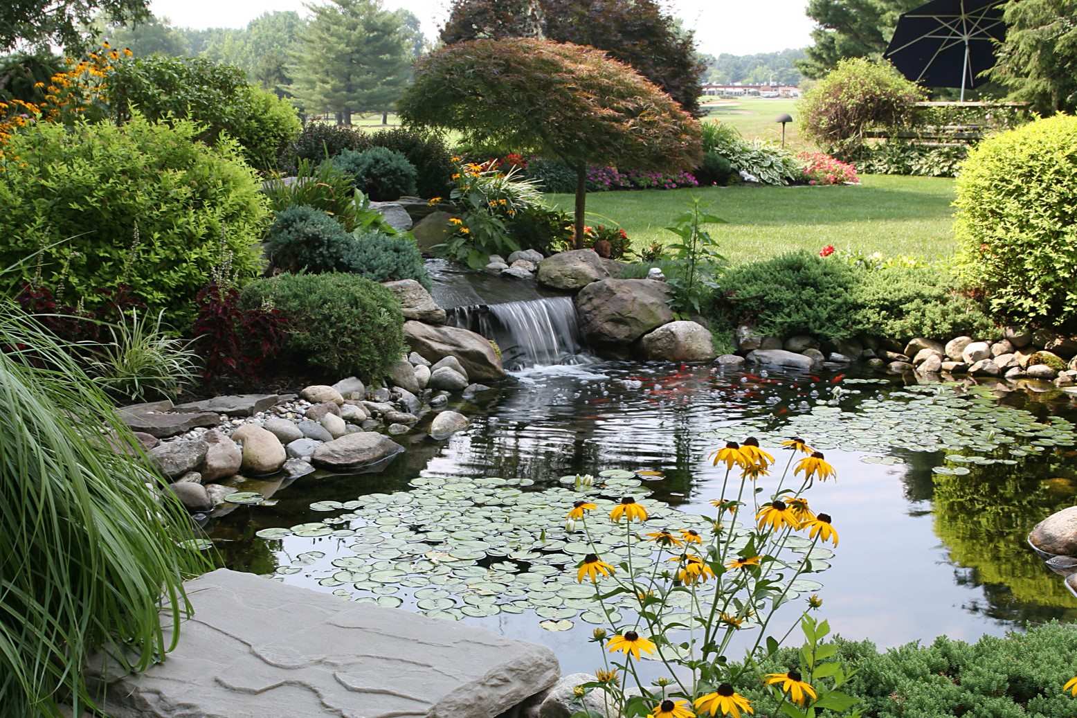
Welcome to the colorful world of garden design! Adding vibrant colors to your garden can transform it into a lively and inviting space. Colors play a crucial role in creating a visually appealing landscape and can evoke different emotions and moods. Whether you have a small backyard or a vast garden, understanding how to use colors effectively will help you create a stunning outdoor space that reflects your personal style.
In this article, we will delve into the importance of color in garden design and explore different factors to consider when choosing colors for your garden. We will also discuss various color schemes and how you can incorporate different shades and tones to create a harmonious and balanced garden design. Additionally, we will touch upon the use of focal points, accents, and seasonal color changes to enhance the overall aesthetic.
So let’s dive in and uncover the art of using colors in garden design!
Key Takeaways:
- Embrace the art of color in your garden to create a visually stunning and inviting outdoor space. Consider factors like climate, personal preference, and color schemes to design a garden that reflects your style and brings joy to your life.
- Utilize focal points, accents, and seasonal color changes to enhance the impact of color in your garden. Create balance and harmony by distributing colors evenly, using neutrals as a base, and embracing the beauty of nature’s ever-changing palette.
Importance of color in garden design
Color is a powerful tool in garden design as it has the ability to create different moods, evoke emotions, and bring life to your outdoor space. Understanding the importance of color will help you make informed decisions when designing your garden.
First and foremost, color can set the overall mood of your garden. Warm colors like red, orange, and yellow create a vibrant and energetic atmosphere, perfect for lively social gatherings. On the other hand, cool colors like blue, green, and purple create a calm and serene environment, ideal for relaxation and meditation. By strategically choosing colors, you can create a garden that aligns with your desired ambiance.
Furthermore, colors can also have a psychological impact on individuals. For example, yellow is associated with happiness and positivity, while green is often linked to growth and tranquility. By incorporating these colors into your garden design, you can create a space that uplifts and soothes the mind.
In addition to the emotional and psychological aspects, colors in garden design can also enhance the visual appeal of your landscape. A well-planned color scheme can create depth and dimension, making your garden visually captivating. By carefully selecting complementary or contrasting colors, you can draw attention to specific areas or features in your garden, creating visual focal points.
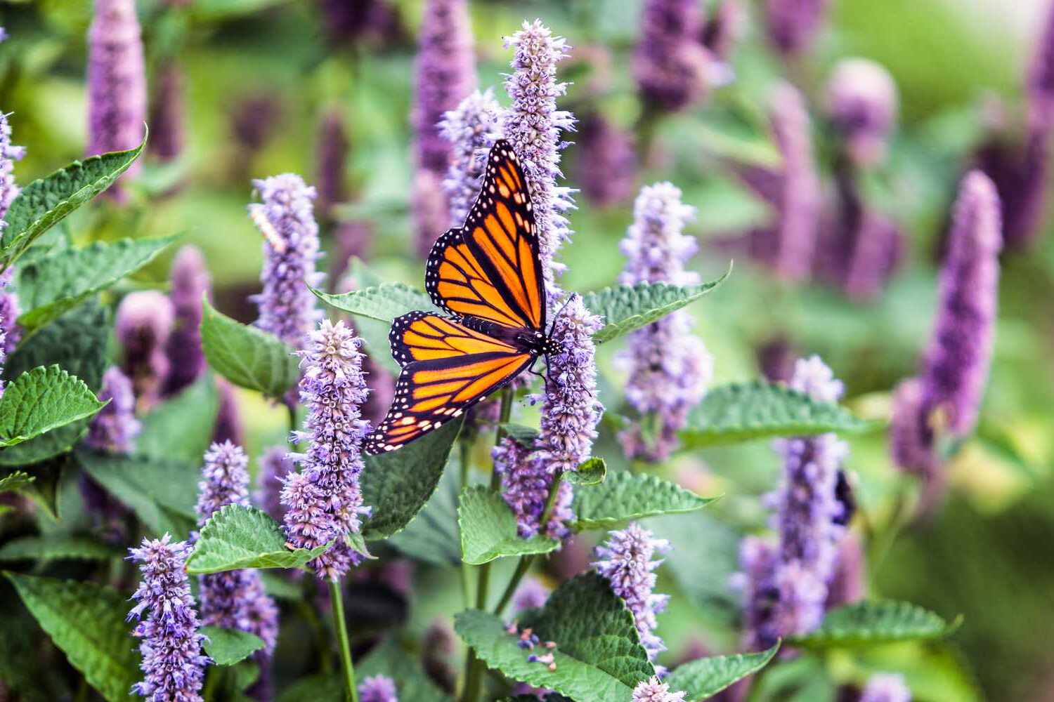
Moreover, color can play a crucial role in attracting wildlife like butterflies and birds to your garden. Certain colors, such as bright purples and yellows, are known to attract pollinators. By incorporating these colors into your garden, you not only create a visually stunning space but also contribute to the ecosystem by providing a habitat for these creatures.
Lastly, colors in garden design can reflect personal style and make a statement. Whether you prefer a vibrant and eclectic mix of colors or a more minimalist and cohesive palette, your choice of colors can represent your unique taste and personality.
Overall, colors are a vital element in garden design. They can set the mood, evoke emotions, enhance visuals, attract wildlife, and express individuality. By understanding the importance of color and how to use it effectively, you can create a garden that brings joy and beauty to your outdoor space.
Factors to consider when choosing colors for a garden design
When it comes to selecting colors for your garden design, there are several factors that you should take into consideration. By carefully evaluating these factors, you can create a cohesive and visually pleasing color scheme that suits your personal preferences and complements your outdoor space.
1. Climate and light conditions: The climate and light conditions of your region play a significant role in determining which colors will thrive in your garden. If you live in a hot and sunny area, you may want to choose colors that are less likely to fade, such as blues, purples, and silvers. On the other hand, if you have a shaded garden, vibrant colors like oranges and yellows can help brighten up the space.
2. Existing landscape: Consider the existing landscape elements in your garden, such as trees, shrubs, and hardscape materials. These features may have their own color palette that you need to take into account. Harmonizing your plant and flower colors with the existing elements will create a cohesive and integrated design.
3. Desired mood and style: Think about the overall mood and style you wish to achieve in your garden. Do you want a relaxing and zen-like space? Consider cooler hues like blues and greens. Are you looking for a vibrant and energetic atmosphere? Incorporate warmer tones such as reds, oranges, and yellows. Your color choices should align with the intended ambiance of your garden.
4. Personal preference: Your personal preference and taste should be a guiding factor in your color choices. Consider the colors that you are naturally drawn to and that resonate with you. Your garden should be a reflection of your personality and bring you joy.
5. Seasonal interest: Think about how your color choices will evolve throughout the seasons. Consider plants that will provide different blooms or foliage colors during different times of the year. This will ensure that your garden remains visually appealing and interesting all year round.
6. Complementary and contrasting colors: Explore color theory and learn about complementary and contrasting colors. Complementary colors are opposite each other on the color wheel, such as red and green or blue and orange. These combinations create a vibrant and harmonious effect. Contrasting colors, on the other hand, are adjacent to each other on the color wheel, such as blue and purple or yellow and orange. These combinations create a bold and eye-catching effect. Experiment with different combinations to create the desired impact.
By considering these factors and making thoughtful color choices, you can create a garden design that is visually stunning, harmonious, and tailored to your preferences. Remember to take into account the unique characteristics of your space and let your creativity shine through as you select the perfect colors for your garden.
Understanding color schemes in garden design
Color schemes in garden design refer to the combination of colors used to create a cohesive and visually pleasing aesthetic. Understanding different color schemes will help you choose the right colors for your garden and create a harmonious outdoor space. Let’s explore some common color schemes:
1. Monochromatic: This color scheme involves using variations of a single color. For example, shades of blue or tones of pink. Monochromatic schemes create a sense of harmony and simplicity in the garden, with a focus on texture and contrast rather than bold color contrasts. It can create a calm and tranquil atmosphere.
2. Analogous: Analogous color schemes involve using colors that are adjacent to each other on the color wheel. For example, shades of purple, blue, and green. This scheme creates a sense of continuity and flow, as the colors are closely related. Analogous schemes create a soothing and relaxed atmosphere in the garden.
3. Complementary: Complementary color schemes utilize colors that are opposite each other on the color wheel. For example, yellow and purple, or red and green. These combinations create a vibrant and contrasting effect, making each color stand out. Complementary schemes provide a bold and energetic atmosphere, drawing attention to specific areas or features in the garden.
4. Triadic: Triadic color schemes involve using three colors that are evenly spaced around the color wheel. For example, red, yellow, and blue. This scheme provides a dynamic and balanced look, as the three colors create a visually appealing contrast. Triadic schemes can bring a sense of excitement and playfulness to the garden.
5. Neutral: Neutral color schemes utilize colors such as white, gray, and brown. These colors provide a backdrop for other colors to stand out. Neutral schemes create a calm and sophisticated atmosphere, allowing the focus to be on the textures and forms of plants and other elements in the garden.
When choosing a color scheme for your garden, consider the mood and atmosphere you want to create. Monochromatic and analogous schemes are great for creating a serene and cohesive look, while complementary and triadic schemes add vibrancy and visual interest. Neutral schemes can create a timeless and elegant garden design.
Remember to also consider the color schemes of your home and outdoor surroundings, as the garden should complement the overall aesthetics of your property. By understanding different color schemes and their effects, you can create a visually stunning and harmonious garden that reflects your personal style and preferences.
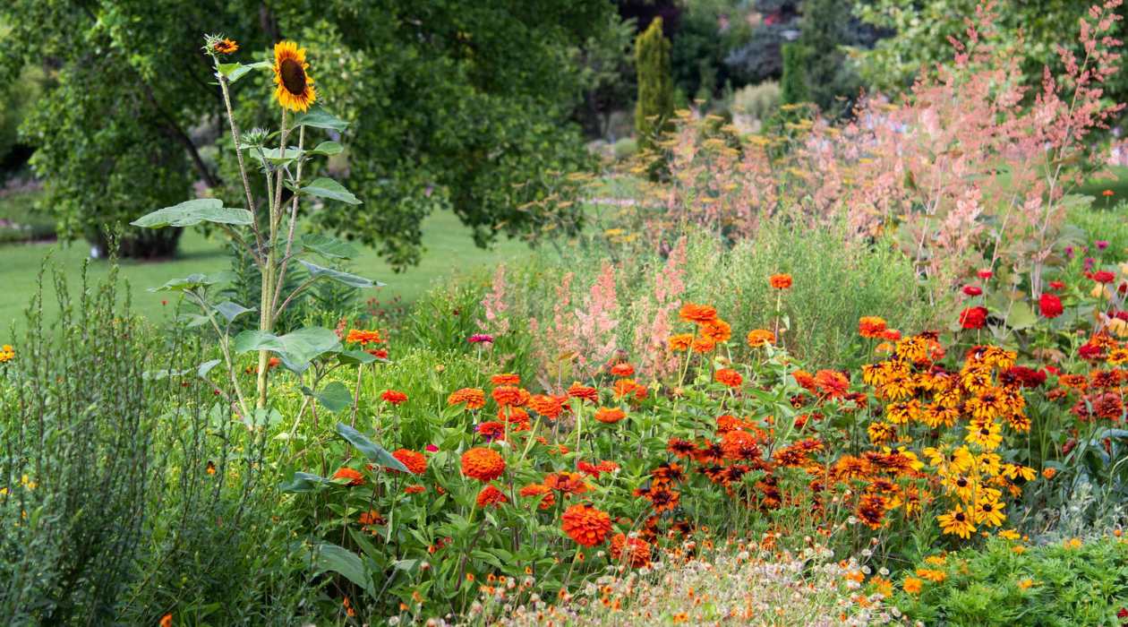
Complementary colors in garden design
In garden design, complementary colors play a significant role in creating visual interest and harmony. Complementary colors are pairs of colors that are opposite each other on the color wheel. When used together, they create a vibrant and striking contrast that can enhance the overall appeal of your garden. Let’s explore the concept of complementary colors and how they can be effectively utilized in garden design.
The primary complementary color pairs are:
- Red and Green
- Orange and Blue
- Yellow and Purple
Complementary colors create a visual balance and draw attention to specific areas or elements in your garden. By incorporating plants and flowers that feature these complementary colors, you can create a dynamic and eye-catching design.
One way to make use of complementary colors is by choosing plants or flowers that have petals or foliage in these contrasting hues. For example, pairing red roses with green foliage, orange marigolds with blue lobelia, or yellow daisies with purple lavender. The vibrant contrast between the colors will make each individual color stand out, adding visual drama to your garden.
Another technique is to use complementary colors in garden accessories and structures. For instance, adding a red bench against a green backdrop, placing orange pots next to blue-colored walls, or using yellow cushions on a seating area surrounded by purple flowers. By strategically placing complementary colors in your garden, you can create focal points and visually stunning areas that immediately catch the eye.
In addition to plants and accessories, complementary colors can also be utilized in hardscaping elements such as pathways, fences, and arbors. For example, a yellow brick pathway against a backdrop of purple flowers, or a blue trellis with orange climbing plants. These combinations create a sense of drama and interest, enhancing the overall aesthetic of your garden design.
Keep in mind that using complementary colors does not mean you have to use them in equal proportions. You can choose to have one dominant color in your garden and incorporate the complementary color as an accent. This approach helps create a sense of balance and avoids overwhelming the visual composition.
One important aspect to consider when using complementary colors is to maintain a cohesive and balanced design throughout your garden. Select plants and accessories that complement each other and create a harmonious overall look. Pay attention to the scale and proportion of each element to ensure that the colors are well-distributed and create a pleasing visual impact.
By understanding the concept of complementary colors and how they can be effectively utilized in garden design, you can create a visually stunning and harmonious outdoor space. Experiment with different combinations and have fun exploring the vibrant and striking effects that complementary colors can bring to your garden.
Read more: How To Design A Rock Garden
Choosing a color palette for your garden design
Choosing a color palette for your garden design is an exciting step that helps create a cohesive and visually appealing outdoor space. A well-chosen color palette sets the tone and atmosphere of your garden, enhancing its overall beauty and aesthetic. Here are some considerations to help you choose the perfect color palette for your garden.
1. Consider the style: Think about the overall style or theme you want to achieve in your garden. Are you aiming for a modern, minimalist look? Or do you prefer a cottage garden with a rustic charm? Different styles lend themselves to different color palettes. For example, a contemporary garden may favor a more monochromatic or subdued palette, while a cottage garden often features an abundance of vibrant and diverse colors.
2. Draw inspiration from nature: Look to the natural surroundings and consider the colors already present in your garden. Take note of the colors of existing trees, shrubs, and other plants. By choosing colors that are harmonious with the natural elements, you can create a seamless and integrated design. For example, if you have a lot of green foliage, consider incorporating complementary colors such as purples or yellows to create a striking contrast.
3. Think about the desired mood: Consider the atmosphere or mood you want to create in your garden. Do you desire a calm and serene space, or a vibrant and energetic environment? Cool colors like blues and greens evoke a sense of tranquility, while warm colors like reds and oranges elicit a lively and energetic atmosphere. Understanding the desired mood will help you choose colors that align with your intentions.
4. Choose a harmonious color scheme: Selecting colors that work well together is essential for achieving a harmonious and visually pleasing garden design. Start with a color wheel and consider different color combinations such as complementary, analogous, or monochromatic schemes. Complementary colors create a vibrant contrast, analogous colors create a sense of flow and harmony, and monochromatic schemes provide a serene and unified look. Experiment with different combinations to find the perfect palette for your garden.
5. Consider the seasons: Think about how your garden will change throughout the seasons. Plan for a color palette that will provide interest and beauty throughout the year. Incorporate colors that will bloom or change foliage during different seasons, ensuring that your garden remains visually appealing and dynamic. For example, include plants with vibrant spring blooms, a mix of colors during the summer, and warm autumn foliage.
6. Texture and foliage: Remember that color is not limited to flowers alone. Consider the textures and colors of foliage in your garden design. Different shades of green, variegated leaves, and plants with interesting textures can add depth and visual interest to your color palette.
7. Personal preference: Ultimately, your personal preferences should play a significant role in selecting the color palette for your garden. Choose colors that resonate with you and make you happy. Your garden should reflect your individual style and bring you joy every time you step outside.
By considering these factors and taking the time to choose a color palette that suits your style and preferences, you can create a visually stunning and cohesive garden design. Experiment with different combinations, be open to inspiration from nature, and let your creativity guide you as you create a beautiful outdoor space.
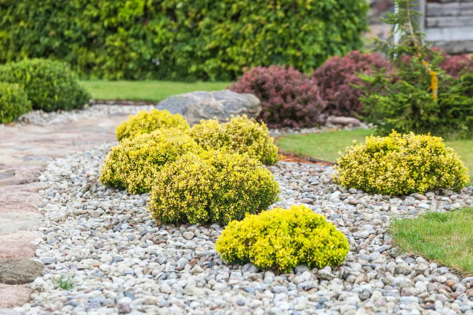
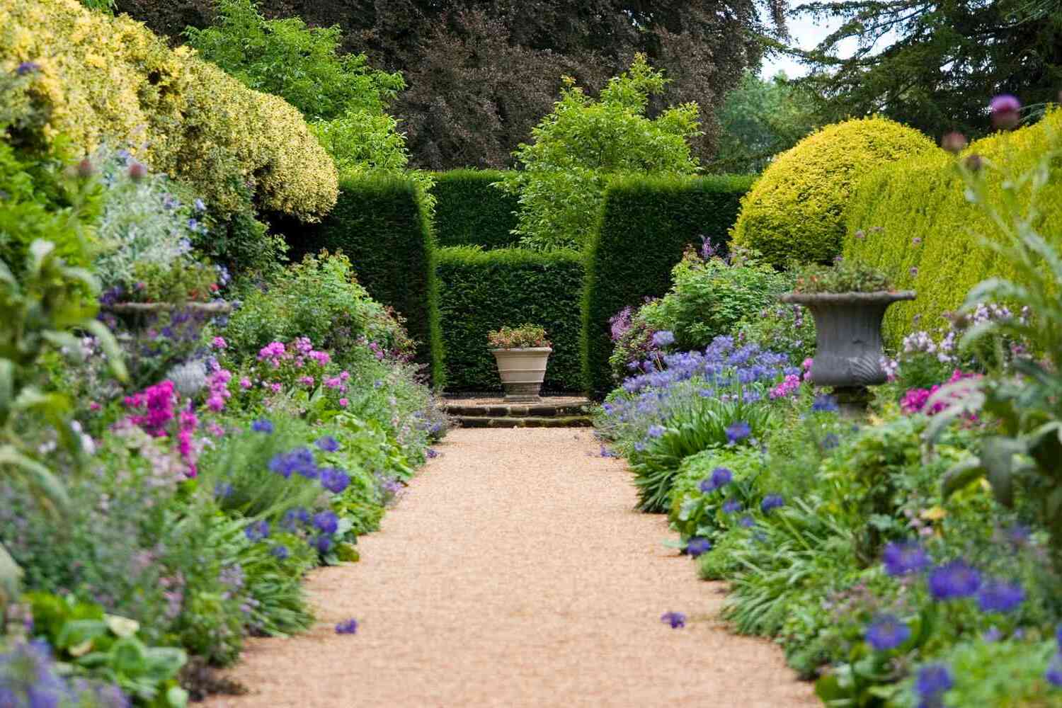
Consider using a maximum of 3-5 colors in your garden design to create a cohesive and harmonious look. Too many colors can be overwhelming, while a limited color palette can create a more visually appealing and balanced space.
Incorporating different shades and tones in garden design
When designing a garden, incorporating different shades and tones of colors is essential to create depth, visual interest, and a well-balanced aesthetic. Understanding how to use various shades and tones effectively will allow you to create a harmonious and captivating outdoor space. Here are some tips for incorporating different shades and tones in your garden design.
1. Start with a base color: Choose a dominant or base color that will set the tone for your garden. This color will serve as the foundation and anchor for your design. Consider the overall style and mood you want to achieve and select a color that complements your vision. For example, if you want a serene and calming garden, you may choose shades of blue or green as your base color.
2. Experiment with lighter and darker shades: Once you have your base color, explore different shades within that color family. Lighter shades of the color can create a sense of airiness and brightness, while darker shades add depth and richness. Incorporating a range of shades within your chosen color will bring dimension and complexity to your garden design.
3. Create contrast with complementary colors: To create visual interest and make your garden design pop, incorporate complementary colors that contrast with your base color. For example, if your base color is green, consider adding pops of red or purple. The contrast between these complementary colors will create an eye-catching and dynamic effect in your garden.
4. Use different tones for different areas: To create a sense of variety and break up your garden design, utilize different tones of your chosen colors in different areas. For instance, you can use lighter tones for your larger flower beds or open areas, and darker tones for smaller pots or decorative accents. This approach adds a layer of complexity and visual intrigue to your overall garden layout.
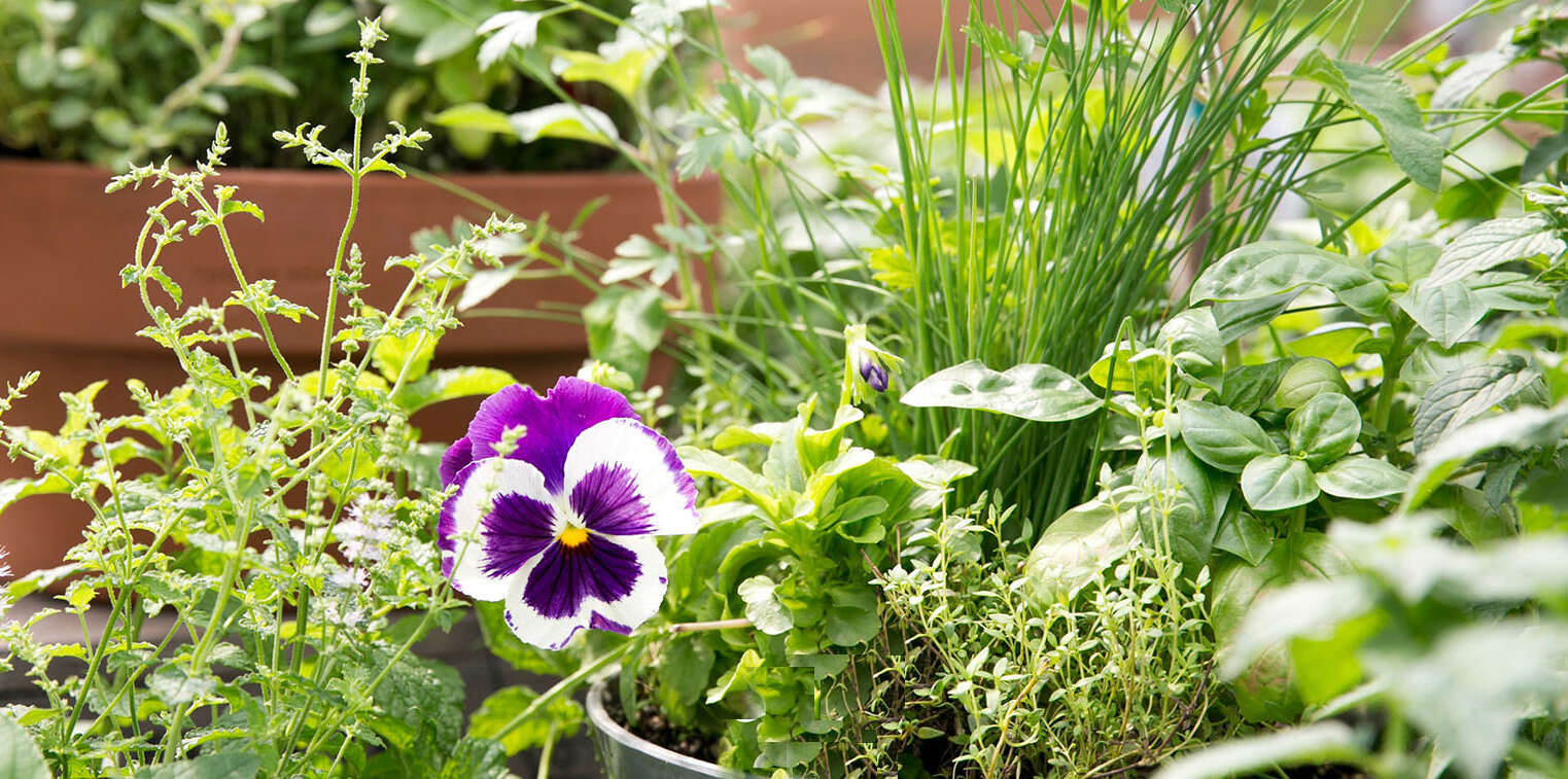
5. Consider the plant textures: Remember that color is not restricted to flowers alone. The foliage of plants also comes in a variety of shades and tones. Incorporate plants with different leaf colors and textures to add interest and diversity to your garden design. Variegated leaves, gray or silver foliage, or plants with burgundy or bronze tones can provide additional visual appeal.
6. Think about transitions and flow: When incorporating different shades and tones, consider how they transition and flow throughout your garden. Gradual transitions between colors create a sense of harmony and cohesion. Utilize gentle gradients or plant in a way that allows colors to blend seamlessly. This will create a visually appealing and balanced progression of colors as you navigate through your garden.
7. Consider the time of day: Keep in mind that different shades and tones can be affected by natural lighting during different times of the day. Some colors may appear more vibrant in direct sunlight, while others may appear softer in shade. Take note of how the colors in your garden transform under different lighting conditions and adjust accordingly for the desired effect.
Incorporating different shades and tones in your garden design allows you to create a visually captivating and multi-dimensional outdoor space. By selecting a base color, exploring different shades and tones, creating contrast with complementary colors, and considering plant textures, you can design a garden that is visually appealing and harmonious. Let your creativity guide you as you play with colors and bring your garden to life.
Using focal points and accents to enhance color in garden design
Focal points and accents are powerful design elements that can elevate the impact of color in your garden. By strategically incorporating focal points and accents, you can create visual interest, draw attention, and enhance the overall color scheme. Here are some tips on using focal points and accents to make color shine in your garden design.
1. Create focal points: Focal points are prominent features in your garden that attract immediate attention. They serve as visual anchors and can be used to showcase vibrant and eye-catching colors. Consider using focal points such as a brightly colored sculpture, a vibrant flowering tree, or a striking decorative element. By placing these focal points strategically, you can draw the eye and create a focal point that greatly enhances the color palette of your garden.
2. Use accent colors: Accents are smaller elements that add pops of color throughout your garden. They help to create visual interest and draw the eye to specific areas. Incorporate accents like colorful plant containers, decorative fences, or garden ornaments in contrasting hues. These accents provide a burst of color amidst the greenery and can help create a harmonious ensemble.
3. Consider seasonal changes: Utilize focal points and accents that change with the seasons. For example, have flowering plants that showcase different hues throughout the year. This allows you to incorporate a variety of colors as the seasons transition, keeping your garden vibrant and engaging all year round.
4. Strategic color placement: Place focal points and accents in areas where they will enhance the color scheme of your garden. If you have a predominantly cool-toned garden, consider placing a warm-toned accent piece to create contrast and visual interest. Conversely, if your garden features warm colors, use a cooler-toned accent to provide balance and harmony.
5. Highlight plant combinations: Use focal points and accents to emphasize specific plant combinations that showcase complementary or harmonious colors. For example, position an accent piece near a group of plants with flowers in complementary colors, or place a focal point next to a bed of plants that feature a pleasing color scheme. This draws attention to the beautiful combinations and enhances the visual impact.
6. Consider the scale: Be mindful of the scale of your focal points and accents to ensure they harmonize with the overall garden design. The size and placement of these elements should not overpower the surrounding plants but instead complement and enhance them. The goal is to create a cohesive and balanced composition.
7. Think beyond plants: Don’t limit focal points and accents to just plants and flowers. Consider incorporating colorful garden furniture, cushions, or outdoor rugs to add pops of color throughout the space. These elements can help tie the color scheme together and provide a welcoming and comfortable atmosphere.
By using focal points and accents strategically, you can draw attention to specific colors, create visual interest, and enhance the overall color palette of your garden. Consider the placement, scale, and complementary nature of these elements to achieve a visually stunning and harmonious garden design that bursts with color.
How to create balance and harmony with color in garden design
Creating balance and harmony with color is essential in garden design to create a visually pleasing and cohesive outdoor space. Balancing colors effectively helps create a sense of unity, while harmony ensures that colors work in concert with each other to create a pleasing aesthetic. Here are some tips on how to achieve balance and harmony with color in your garden design.
1. Start with a color scheme: Begin by selecting a color scheme or palette that suits your style and preferences. Choose colors that complement each other and create a harmonious atmosphere. Refer to color theory principles such as complementary or analogous colors to guide your selection.
2. Distribute colors evenly: Distribute colors throughout your garden design evenly to achieve balance. Avoid clustering too many plants or accents of the same color in one area, as it can create an unbalanced and chaotic look. Instead, spread colors evenly to ensure a visually cohesive and pleasing distribution.
3. Consider color proportions: Pay attention to the proportion of different colors in your garden design. Balance is not solely about equal amounts of each color, but rather creating visual equilibrium. Some colors may need to be used in smaller proportions to avoid overpowering the design, while others can be used more generously to create a focal point or anchor for the space.
4. Use neutrals as a base: Neutrals such as white, gray, or beige can serve as a base that helps balance and harmonize other colors in your garden. Use neutrals in hardscaping elements, garden furniture, or as a background for showcasing vibrant plants and flowers. This will create a visually calming effect and allow other colors to shine.
5. Create depth with layers: Layering colors can add depth and dimension to your garden design. Use plants and flowers with different shades and tones to create a layered effect. Place taller plants with darker colors towards the back and lighter shades towards the front. This creates a sense of depth and visual interest, bringing balance and harmony to your garden.
6. Consider the seasonality: Plan your color scheme to account for the changing seasons. Choose plants and flowers that bloom at different times of the year, ensuring that your garden remains visually appealing throughout the seasons. Pay attention to how colors shift and harmonize with each other as the seasons change, creating a dynamic and ever-evolving garden.
7. Use the rule of three: The rule of three is a design principle that suggests grouping colors in threes for a balanced and appealing composition. Choose three colors from your color palette and distribute them throughout your garden design. This creates a sense of rhythm and balance.
8. Consider the surrounding landscape: Take into account the colors and elements of the surrounding landscape when designing your garden. Consider the colors of neighboring buildings, fences, or natural features. Ensure that your color choices harmonize with the environment, creating a cohesive blend between your garden and the surroundings.
By following these tips, you can create a visually balanced and harmonious garden design that showcases the beauty and power of color. Remember to experiment, trust your instincts, and let your creativity guide you as you design your outdoor sanctuary.
Read more: How To Design A Cottage-Style Garden
Seasonal color changes in garden design
Seasonal color changes are a delightful aspect of garden design that adds depth and visual interest to your outdoor space. By incorporating plants and flowers that bloom or change foliage throughout the seasons, you can create a dynamic and ever-evolving garden that brings joy year-round. Let’s explore how to embrace seasonal color changes in your garden design.
Spring: Spring is a season of renewal and growth, characterized by vibrant blooms and fresh green foliage. Embrace the arrival of spring by planting bulbs and early-flowering perennials such as tulips, daffodils, and hyacinths. These flowers will add a burst of color and energy to your garden after the winter months. Incorporate plants with delicate pastel shades such as pink, lavender, and light yellow to enhance the soft and fresh atmosphere of spring.
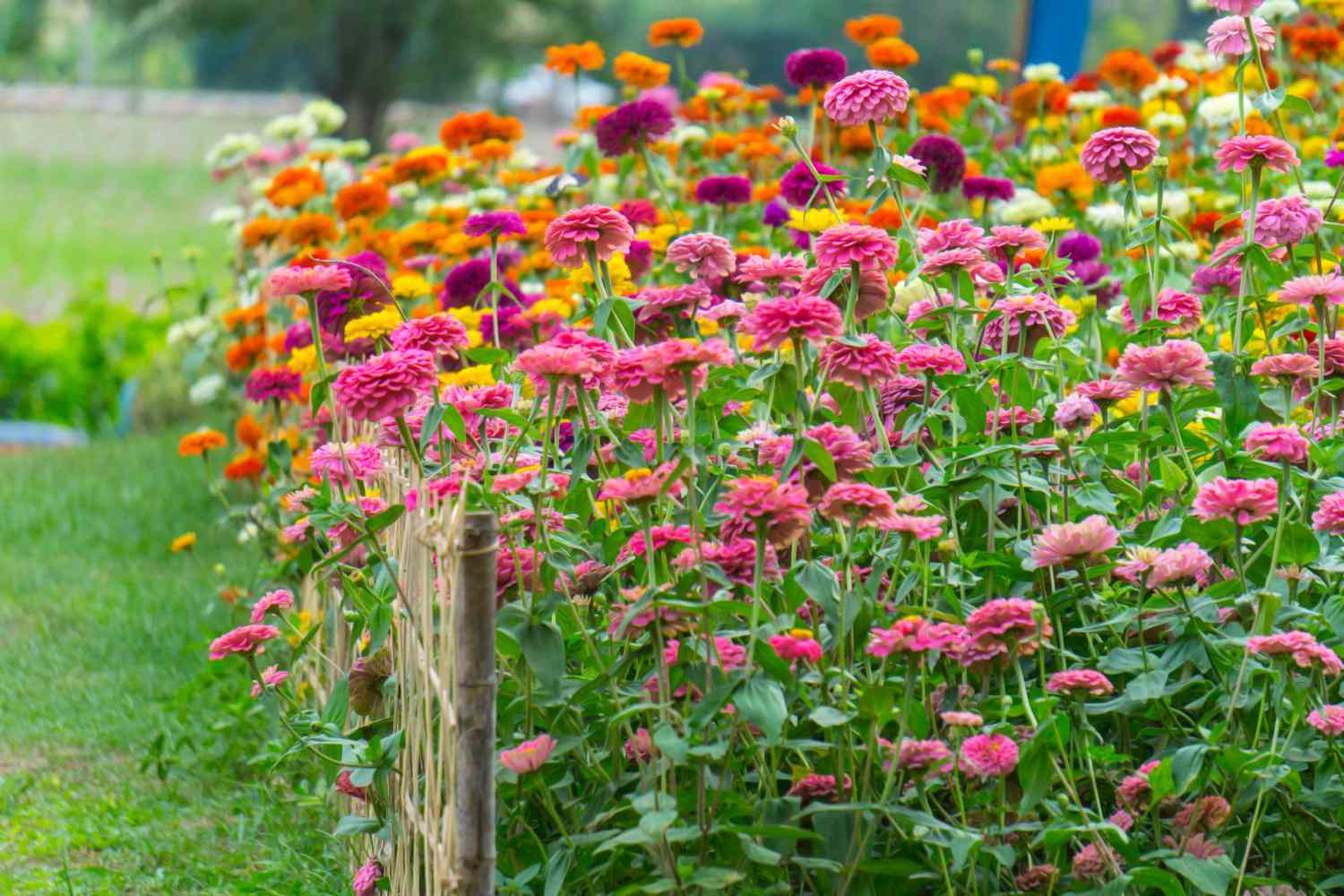
Summer: Summer is a season of abundance and vibrancy, with a wide array of colors to choose from. Embrace bold and vibrant hues such as fiery reds, sunny yellows, and rich purples. Plant flowering perennials and annuals like roses, sunflowers, and cosmos to create a dazzling display. Consider using contrasting colors to create dynamic combinations that catch the eye. Don’t forget to incorporate foliage plants with interesting textures and shades of green to provide a backdrop for the vibrant blooms.
Fall: Fall brings a riot of warm and earthy tones to the garden. Embrace the rich colors of autumn leaves by incorporating plants with foliage that changes to shades of red, orange, and gold. Consider planting trees such as Japanese maples or shrubs like burning bush for their stunning fall foliage. Add pops of color with late-blooming flowers such as chrysanthemums and asters in shades of deep purple, burgundy, and gold. These warm hues create a cozy and inviting atmosphere as the weather cools down.
Winter: While winter may be associated with a more muted color palette, there are still opportunities to add interest to your garden. Embrace the beauty of evergreen plants and their varying shades of green. Incorporate plants with interesting bark textures and colors, such as dogwood or birch trees. Introduce winter-blooming plants such as camellias or hellebores that add splashes of color during the colder months. Consider adding ornamental grasses that provide texture and movement even in the absence of vibrant blooms.
By embracing the changing seasons and incorporating plants that thrive during each time of year, you can create a garden that constantly surprises and delights. Plan your garden design with the understanding that certain areas will showcase different colors and textures throughout the seasons, creating a visually captivating and evolving landscape.
It is important to note that the specific plant choices and color variations will depend on your region’s climate and growing conditions. Consider researching and selecting plants that are suitable for your specific location to ensure success in achieving those seasonal color changes.
Remember to take into account the overall design principles, such as color palettes and proportion, to maintain harmony and balance in your garden. With thoughtful planning and a keen eye for seasonal color changes, you can create a garden that celebrates the natural beauty and wonders of each season.
Conclusion
Incorporating color into your garden design is an art form that can transform your outdoor space into a visually stunning and inviting sanctuary. Understanding the importance of color, considering factors such as climate and personal preference, and utilizing different color schemes are crucial steps in creating a garden that reflects your style and brings joy to your life.
By choosing a color palette that suits your desired mood, leveraging complementary colors, and incorporating different shades and tones, you can create a harmonious and balanced garden design. Focal points and accents provide opportunities to enhance the impact of color, drawing attention and creating visual interest. Furthermore, embracing seasonal color changes allows your garden to evolve with the ever-changing beauty of nature.
Remember to consider the surrounding landscape, pay attention to scale and proportion, and experiment with different combinations to find the perfect color balance. Balance and harmony can be achieved by distributing colors evenly, using neutrals as a base, creating depth with layering, and applying the rule of three.
Your garden should be a reflection of your personality, taste, and creativity. It should bring you joy and serve as a source of inspiration. As you embark on your garden design journey, embrace the artistry of color and let your imagination soar.
With careful consideration and a touch of artistry, you can create a garden that is not only visually captivating and harmonious but also a truly unique and personal outdoor oasis. Enjoy the process of designing your garden and take pleasure in the colorful beauty that will blossom right outside your door.
Frequently Asked Questions about How Many Colors To Put In A Garden Design
Was this page helpful?
At Storables.com, we guarantee accurate and reliable information. Our content, validated by Expert Board Contributors, is crafted following stringent Editorial Policies. We're committed to providing you with well-researched, expert-backed insights for all your informational needs.
0 thoughts on “How Many Colors To Put In A Garden Design”