Home>Interior Design>How Many Colors Should You Have In A Home? Designers Reveal
Interior Design
How Many Colors Should You Have In A Home? Designers Reveal
Modified: October 20, 2024
Discover how many colors you should incorporate in your home with insights from top designers. Enhance your interior design with the perfect color scheme.
(Many of the links in this article redirect to a specific reviewed product. Your purchase of these products through affiliate links helps to generate commission for Storables.com, at no extra cost. Learn more)
Introduction
Choosing the right color palette for your home is a crucial aspect of interior design. Colors have the power to evoke emotions, set the mood, and create a cohesive and harmonious living space. But how many colors should you have in your home? Designers weigh in on this question, providing insights and suggestions to help you make the right color choices.
When it comes to selecting colors for your home, it’s essential to consider not only aesthetics but also the psychology behind colors. Different colors have distinct psychological effects on individuals, influencing their mood, energy levels, and overall perception of a space. Understanding the psychology of colors can guide you in creating a home environment that promotes a desired ambiance.
Creating cohesion in your color palette is another crucial factor to consider. Cohesion ensures that the different colors used throughout your home complement each other and create a seamless flow. This cohesiveness enhances the overall visual appeal and harmony of the space, making it more inviting and comfortable.
The number of colors you should have in your home may vary depending on the size of the space and your personal preferences. However, designers generally suggest sticking to a limited color palette to maintain a unified look. Focusing on a few main colors and incorporating shades and tones within those colors can create a visually appealing and balanced home.
Now let’s delve into the specific recommendations from designers for different rooms in your home. Keep in mind that these suggestions are not strict rules but rather insightful guidelines that can help you make informed decisions and unleash your creativity in designing your dream home.
Key Takeaways:
- Choose a limited color palette based on the psychology of colors to create a cohesive and harmonious living space. Consider the purpose of each room and experiment with accent colors to add personality and visual interest.
- Harmonize colors between walls, furniture, and décor to create a visually pleasing and balanced home. Experiment with different colors, textures, and placements to reflect your personal style and create a unique and inviting space.
Read more: How Many Place Settings Should You Have
Considering the Psychology of Colors
When selecting colors for your home, it’s important to consider the psychological impact they can have on your mood and emotions. Different colors evoke different feelings, and understanding the psychology behind them can help you create a desired atmosphere in each room of your home.
Warm colors like red, orange, and yellow are known to stimulate energy and create a sense of warmth and coziness. These colors are perfect for areas where you want to evoke a lively and energetic atmosphere, such as the living room or dining area.
Cool colors like blue, green, and purple, on the other hand, have a calming effect and can promote relaxation and tranquility. These colors are ideal for bedrooms and spaces where you want to create a sense of peace and serenity.
Neutral colors, such as white, beige, and gray, are versatile and can create a sense of balance and sophistication. These colors serve as a great base palette and can be complemented with pops of color in the form of furniture, accessories, or accent walls.
It’s also important to consider the cultural associations and personal preferences associated with different colors. For example, red is often associated with luck and prosperity in some cultures, while yellow may symbolize happiness and optimism. Take these cultural references into account when choosing colors to create an environment that resonates with your own beliefs and values.
Another aspect to consider is the effect of natural light on colors. Natural light can significantly influence how colors appear in a space. Rooms with abundant natural light can handle darker and bolder colors, while rooms with limited natural light may benefit from lighter tones to create a sense of brightness and openness.
Ultimately, the psychology of colors can guide your color choices and help you create a home environment that reflects your desired ambiance. Experiment with different colors and observe how they make you feel in different spaces of your home.
The Importance of Cohesion in Color Palette
Creating cohesion in your color palette is essential for achieving a harmonious and visually appealing home. A cohesive color palette ensures that the different colors used throughout your home work together seamlessly, creating a sense of unity and balance.
When designing your color palette, it’s important to choose a consistent theme or color scheme that will be carried throughout your home. This can be based on a specific color family, such as cool tones or warm tones, or it can be centered around a particular theme, such as coastal or farmhouse.
By establishing a cohesive color palette, you can create a sense of flow as you move from one room to another. This flow is particularly important in open floor plans where rooms are interconnected, as it allows for a visually pleasing and cohesive experience.
One way to achieve cohesion is by using a neutral color as a base and then incorporating pops of color through accents and accessories. This allows for flexibility and versatility, as you can easily change and update the accent colors without having to repaint entire walls or make major changes.
Another approach is to use varying shades or tones of the same color throughout your home. This creates a sophisticated and unified look that is visually pleasing. For example, if your base color is blue, you can incorporate lighter shades of blue in one room and darker shades in another room.
Consider the transition areas between rooms when establishing your color palette. Hallways, staircases, and entryways should have a cohesive color flow that seamlessly connects the different spaces.
It’s also important to take into account the architectural features and existing elements in your home. Work with the colors of your flooring, countertops, and cabinetry to ensure they complement the chosen color palette. This will create a cohesive look that ties everything together.
Remember that cohesion in your color palette doesn’t mean that everything has to match perfectly. Adding contrasting colors can create visual interest and prevent your space from looking too monotonous. Just make sure that the contrasting colors still complement the overall color scheme.
In summary, establishing a cohesive color palette is crucial for creating a visually pleasing and harmonious home. By choosing a consistent theme or color scheme, considering the architectural features, and maintaining a flow between rooms, you can achieve a cohesive look that reflects your personal style and creates a welcoming atmosphere.
The Role of Different Rooms
Each room in your home serves a different purpose and has unique requirements when it comes to color choices. Understanding the role of different rooms can help you make informed decisions on how to incorporate colors effectively to enhance their function and create the desired ambiance.
The living room is often considered the social hub of the home, where family and friends gather to relax and entertain. The color palette for the living room should promote a warm, inviting, and comfortable atmosphere. Neutral tones, such as beige or light gray, can serve as a base, while incorporating pops of color through accent pillows, artwork, or rugs can introduce personality and vibrancy.
The bedroom is a personal sanctuary where you seek rest and relaxation. Calming and soothing colors are ideal for this space. Soft blues, greens, or lavenders can create a serene and tranquil environment. Avoid using bold and vibrant colors that may disrupt your sleep or make the space feel too energetic.
The kitchen is often the heart of the home, where meals are prepared and shared. A bright and clean color palette is commonly used in kitchens to create an airy and inviting atmosphere. White or light-colored cabinets combined with neutrals like gray or beige can create a timeless and classic look. You can then add pops of color through backsplashes, kitchen accessories, or even colorful appliances to inject personality and excitement.
The bathroom is a space of relaxation and rejuvenation. Colors that evoke a spa-like atmosphere, such as light blues, greens, or neutrals, are popular choices. These colors can create a sense of serenity and freshness. Adding natural elements like wood or plants can further enhance the calming ambiance.
When choosing colors for children’s rooms, it’s essential to consider their age, preferences, and the room’s functionality. Bright and vibrant colors are often favored by children, as they can stimulate their creativity and energy. However, it’s important to balance these colors with neutral tones to create a harmonious and calming environment.
Keep in mind that while there are general color recommendations for each room, these suggestions can be adapted to reflect your personal style and preferences. The most important factor is to create a space that fulfills the intended purpose of the room and resonates with the individuals using it.
Ultimately, understanding the role of different rooms can guide you in selecting the right colors to enhance their function and create the desired atmosphere. Consider the purpose of each room and the emotions you want to evoke when making color choices, and don’t be afraid to experiment and add your personal touch to make each space truly unique.
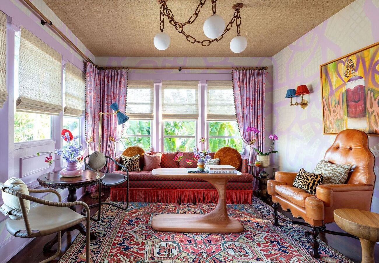
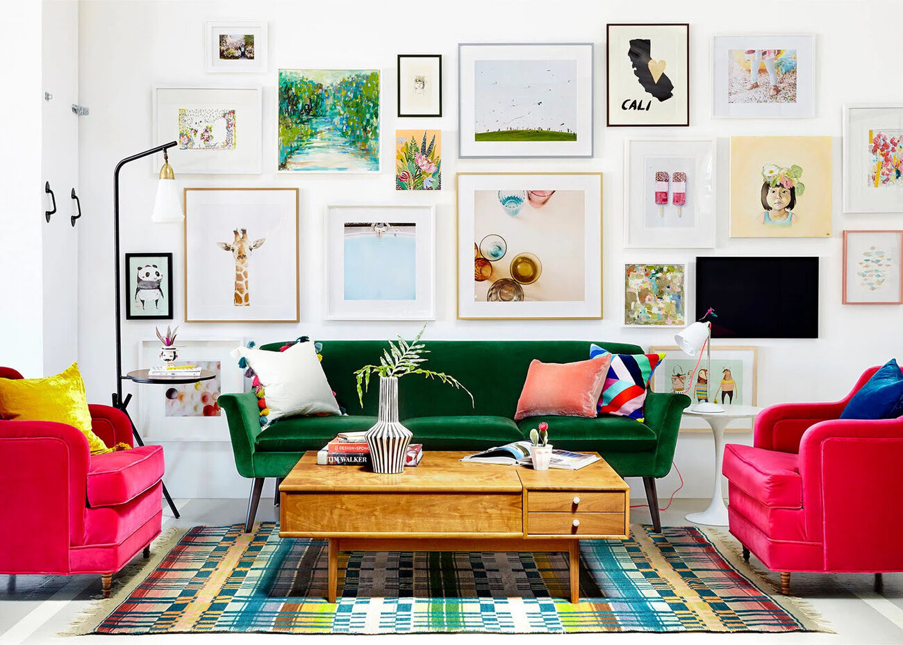
Designers’ Suggestions for Living Rooms
The living room is a central gathering space in any home, and the color palette plays a crucial role in setting the mood and atmosphere. Here are some designers’ suggestions for choosing colors for your living room:
- Neutral Base: Start with a neutral base color for the walls. Shades of white, beige, or light gray provide a timeless and versatile canvas that allows you to easily change the look and feel of the space with different accent pieces.
- Pops of Color: Add pops of color through furniture, artwork, and accessories. Bold colors like deep blue, burgundy, or emerald green can make a statement and add visual interest to the room.
- Contrasting Elements: Create contrast in the room by incorporating both warm and cool tones. Pair warm colors like rust orange or mustard yellow with cooler shades like navy or teal to create a balanced and inviting space.
- Texture and Patterns: Experiment with textures and patterns to add depth and visual appeal. Incorporate textured fabrics, patterned rugs, or wallpaper to create a layered and dynamic look.
- Natural Elements: Incorporate natural elements like wood, stone, or plants to bring a sense of warmth and connection to nature. These elements can add texture and create a tranquil and inviting atmosphere.
- Lighting: Consider the lighting in the room when choosing colors. Natural light can enhance certain colors, while artificial lighting can have a different effect. Test colors in different lighting conditions to ensure they create the desired ambiance.
Ultimately, the color palette for your living room should reflect your personal style and create a space that is welcoming, comfortable, and aesthetically pleasing. Don’t be afraid to experiment with different colors and combinations to find what resonates with you.
Designers’ Suggestions for Bedrooms
The bedroom is a personal sanctuary where you seek rest and relaxation. When it comes to choosing colors for your bedroom, designers recommend creating a soothing and serene atmosphere. Here are some suggestions to consider:
- Cool and Calming Tones: Choose colors on the cooler end of the spectrum, such as soft blues, greens, or lavenders. These hues have a calming effect that can promote relaxation and restful sleep.
- Neutral Base: Start with a neutral base color for the walls, such as light gray or beige. These neutral tones provide a subtle and versatile backdrop that allows you to easily change the mood with different bedding and accessories.
- Soft and Subtle Accent Colors: Incorporate soft and subtle accent colors to add dimension and interest. Think pastel shades or muted tones of colors like pink, yellow, or green. These colors can create a gentle and soothing ambiance without overwhelming the space.
- Minimalistic Approach: Consider a minimalistic approach to keep the bedroom clutter-free and promote a sense of tranquility. Limit the number of colors used to create a clean and visually cohesive look.
- Natural Elements: Bring in natural elements like wood accents or potted plants to create a connection to nature and add a touch of warmth. These elements can contribute to a relaxing and inviting atmosphere.
- Soft Lighting: Pay attention to the lighting in your bedroom. Soft and warm lighting can enhance the calming effect of the colors. Consider using dimmable lights or utilizing bedside lamps with warm-toned bulbs.
Remember, the colors you choose for your bedroom should reflect your personal style and preference. It’s important to create a space that promotes relaxation and allows you to unwind after a long day. Experiment with different color combinations and textures until you find the perfect balance that creates a serene and cozy environment for a good night’s sleep.
When choosing colors for your home, aim for a cohesive palette of 3-5 colors. This will create a harmonious and balanced look throughout your space.
Designers’ Suggestions for Kitchens
The kitchen is often considered the heart of the home, where meals are prepared and shared. When it comes to selecting colors for your kitchen, designers suggest creating a bright and inviting atmosphere while keeping functionality in mind. Here are some recommendations to consider:
- Bright and Clean Colors: Opt for bright and clean colors to create an airy and fresh feel in the kitchen. White or light-colored cabinets combined with neutral tones like gray or beige can make the space feel open and spacious.
- Pops of Color: Add pops of color through accessories, backsplashes, or even colorful appliances. Vibrant reds, blues, or yellows can inject personality and visual interest into the space without overwhelming it.
- Contrasting Elements: Create visual contrast by incorporating a mix of light and dark colors. Combining white cabinets with a darker island or adding a dark-colored countertop to a light-colored kitchen can create a striking and balanced look.
- Natural Elements: Introduce natural elements like wood or stone to add warmth and texture to the kitchen. Incorporate wooden cabinets or a stone backsplash to create a sense of connection to nature.
- Reflective Surfaces: Use reflective surfaces, such as glass tiles or mirrored accents, to bounce light around the kitchen and make the space feel larger and brighter.
- Consider the Floor: Take into account the color of the flooring when selecting kitchen colors. Ensure that the floor color complements the chosen color scheme and creates a cohesive look.
It’s also important to keep the practicality of the kitchen in mind when choosing colors. Consider the ease of cleaning and maintenance when selecting materials and finishes. Additionally, ensure that the colors chosen for the kitchen coordinate with the adjacent rooms to create a cohesive flow throughout the home.
Ultimately, the color palette for your kitchen should reflect your personal style and create a space that is both functional and visually appealing. Experiment with different color combinations and textures to achieve a kitchen that is bright, inviting, and a joy to cook and gather in.
Designers’ Suggestions for Bathrooms
The bathroom is a space of relaxation and rejuvenation. When choosing colors for your bathroom, designers recommend creating a soothing and spa-like ambiance. Here are some suggestions to consider:
- Light and Neutral Tones: Opt for light and neutral tones to create a clean and fresh look in the bathroom. Shades of white, beige, or pale gray can make the space feel open and airy.
- Add a Touch of Nature: Incorporate natural elements like soft greens, blues, or earthy tones to create a connection to nature. These colors can enhance the spa-like atmosphere and promote a sense of calmness.
- Soft and Serene Accent Colors: Add soft and serene accent colors to create visual interest. Soft pastels like light blue, blush pink, or pale lavender can add a subtle pop of color without overwhelming the space.
- Consider Tile Selection: Pay attention to the color and texture of tiles used in the bathroom. Light-colored tiles in shades of white or cream can create a timeless and classic look, while textured tiles can add depth and visual interest.
- Natural and Soft Lighting: Incorporate natural and soft lighting to create a warm and inviting ambiance. Consider installing dimmable lights or using wall sconces with warm-toned bulbs to enhance relaxation.
- Reflection and Mirrors: Use mirrors strategically to reflect light and make the bathroom appear larger. Mirrored cabinets or adding a large, well-placed mirror can help create a spacious and airy feel.
- Keep it Simple: Maintain a clean and clutter-free bathroom to promote a sense of tranquility. Consider a minimalist approach to keep the focus on the colors and textures used.
Remember, the colors you choose for your bathroom should create a calming and rejuvenating environment. Experiment with different color combinations and textures to find the perfect balance that enhances your overall sense of well-being and relaxation in this personal space.
Incorporating Accent Colors
When designing your home’s color palette, incorporating accent colors adds a touch of personality and visual interest to the space. Accent colors are vibrant hues that are used sparingly to create focal points and make certain elements stand out. Here are some tips for incorporating accent colors:
- Choose a Color Scheme: Start by selecting a color scheme for your home. This could be a combination of 2-3 main colors that will be used consistently throughout the space. These main colors will serve as the foundation for your design.
- Consider the Mood: Think about the mood or atmosphere you want to create in each room. Choose accent colors that evoke the desired emotion. For example, vibrant reds or yellows can create a lively and energetic atmosphere, while deep blues or purples can create a calm and soothing ambiance.
- Use Strategic Placement: Incorporate accent colors strategically to draw attention to specific areas or elements in the room. This could be through colorful furniture pieces, vibrant artwork, or bold accessories.
- Create Color Balance: Consider the proportion of accent colors used. Too much of a bold color can overwhelm the space, while too little can make it seem insignificant. Aim for a balanced distribution of accent colors that complements the overall color scheme.
- Add Texture: Consider using accent colors through textured elements like patterned pillows, textured wallpaper, or woven rugs. This can add depth and visual interest to the space, making the accent colors even more impactful.
- Experiment with Complementary Colors: Explore the color wheel to find complementary colors that work well together. Complementary colors are opposite each other on the color wheel and can create a striking visual impact when placed side by side. For example, pairing a deep purple accent with a vibrant chartreuse can create a complementary color scheme that adds drama to the space.
- Consider Seasonal Changes: Keep in mind that accent colors can be changed seasonally to reflect different moods and themes. For example, warm, earthy tones in the fall and winter can be replaced with bright and lively colors during spring and summer.
Remember, incorporating accent colors allows you to add flair and personality to your home while complementing the overall color scheme. Experiment with different colors, textures, and placements to create visual interest and make your living space truly unique and inviting.
Harmonizing Colors with Furniture and Décor
Harmonizing colors between your walls, furniture, and décor is essential to create a cohesive and visually pleasing space. When done right, it can elevate the overall design and make your home feel balanced and harmonious. Here are some tips for harmonizing colors:
- Consider the Undertones: Pay attention to the undertones of the colors you choose. Whether it’s warm or cool undertones, make sure they complement each other. Matching undertones can create a seamless look, while contrasting undertones can add depth and interest.
- Create Contrast: Mix light and dark colors to create contrast and visual interest. If you have light-colored walls, consider incorporating darker furniture pieces or accessories to create balance. Conversely, if your walls are darker, lighter furniture pieces can help brighten up the space.
- Choose a Dominant Color: Select a dominant color that will be the main focus in the room. This color should appear in various elements, such as larger furniture pieces or major decorative pieces. This dominant color will tie the room together and create a cohesive look.
- Use Color Wheels or Schemes: Utilize color wheels or color schemes to guide your choices. Analogous colors (colors that are next to each other on the wheel) can create a harmonious and pleasing combination. Complementary colors (colors opposite each other on the wheel) can create a bold and striking contrast.
- Consider the Style: Take into account the style and theme of your home when selecting furniture and décor. Traditional styles often incorporate rich and warm colors, while modern and contemporary styles tend to use a more neutral color palette. Ensure that the colors you choose align with the overall style.
- Repeat Colors: Repeat specific colors throughout the room to create unity. For example, if you have blue walls, incorporate blue accents in cushions, artwork, or vases to tie the room together.
- Take Natural Light into Account: Keep in mind how natural light interacts with colors. Colors can appear different in varying levels of natural light. Test colors in different lighting conditions to ensure they harmonize and create the desired effect.
Remember that achieving color harmony is a balancing act. It’s important to experiment and trust your eye. Don’t be afraid to mix and match colors, textures, and patterns to create a unique and harmonious space that reflects your personal style and creates a welcoming and cohesive environment in your home.
Conclusion
Choosing the right colors for your home is a critical aspect of interior design. By considering the psychology of colors and creating a cohesive color palette, you can transform your living space into a harmonious and visually appealing environment. Designers’ suggestions for different rooms provide valuable insights into how colors can be used effectively to enhance the function and atmosphere of each space.
From the living room to the bedroom, kitchen, and bathroom, each room has its own unique requirements when it comes to color choices. By understanding the purpose of each room and the emotions you want to evoke, you can select colors that create the desired ambiance.
Incorporating accent colors can add personality and visual interest to your home. These vibrant hues can be strategically placed to create focal points and make certain elements stand out, while maintaining a balance with the overall color scheme.
Additionally, harmonizing colors with your furniture and décor is crucial for a cohesive and visually pleasing space. By considering undertones, creating contrast, and choosing a dominant color, you can achieve a harmonious look that ties everything together.
In the end, remember that selecting colors for your home should be a reflection of your personal style and preferences. Experiment with different colors, textures, and placements to create a unique and inviting space that brings you joy and comfort.
With the right color choices, you can transform your home into a sanctuary that not only captivates the eye but also nurtures your well-being.
Frequently Asked Questions about How Many Colors Should You Have In A Home? Designers Reveal
Was this page helpful?
At Storables.com, we guarantee accurate and reliable information. Our content, validated by Expert Board Contributors, is crafted following stringent Editorial Policies. We're committed to providing you with well-researched, expert-backed insights for all your informational needs.


0 thoughts on “How Many Colors Should You Have In A Home? Designers Reveal”