Home>Interior Design>Should Curtains Be Lighter Or Darker Than Walls?
Interior Design
Should Curtains Be Lighter Or Darker Than Walls?
Modified: August 30, 2024
Discover the perfect interior design balance for your space. Should curtains be lighter or darker than walls? Find out in this comprehensive guide.
(Many of the links in this article redirect to a specific reviewed product. Your purchase of these products through affiliate links helps to generate commission for Storables.com, at no extra cost. Learn more)
Introduction
Choosing the right curtain color for your walls is a crucial decision when it comes to interior design. Curtains not only serve a functional purpose of blocking out light and providing privacy but also play a significant role in enhancing the overall aesthetic appeal of a room. They have the power to transform a space, adding depth, warmth, and personality.
When it comes to deciding whether curtains should be lighter or darker than the walls, there is no one-size-fits-all answer. It largely depends on the desired effect you want to achieve in your space and the specific characteristics of the room. In this article, we will explore the importance of curtain color, factors to consider when making a choice, and the impact of light and dark colored curtains on walls.
By understanding these concepts, you will be equipped with the knowledge to make informed decisions that create a harmonious and visually striking interior design.
Key Takeaways:
- Curtain color choice is crucial for interior design, impacting room size, mood, and overall aesthetic. Consider factors like wall color, room size, and natural light to create a harmonious and visually appealing space.
- Practical considerations, such as light and privacy, maintenance, and resale value, are essential when choosing curtain colors. Striking a balance between aesthetics and functionality ensures a well-designed and functional space.
The Importance of Choosing the Right Curtain Color
When it comes to designing a room, the color scheme is one of the most critical elements to consider. The curtain color plays a vital role in tying together the various design elements, including the walls, furniture, and accessories. It has the potential to elevate the overall ambience and create a cohesive and visually pleasing space.
Firstly, the curtain color can greatly impact the perceived size of a room. Light-colored curtains, such as whites, creams, or pastels, have a brightening effect and tend to make a space feel more open and spacious. On the other hand, dark-colored curtains, like deep blues, rich browns, or charcoal grays, can create an intimate and cozy atmosphere but may also make a room appear smaller.
In addition to size perception, curtain color can also influence the overall mood and emotion evoked in a room. For example, light and airy curtains can create a serene and calming ambiance, perfect for bedrooms or spaces dedicated to relaxation. On the contrary, bold and vibrant curtain colors can inject energy and excitement into a room, making it ideal for areas such as living rooms or entertainment spaces.
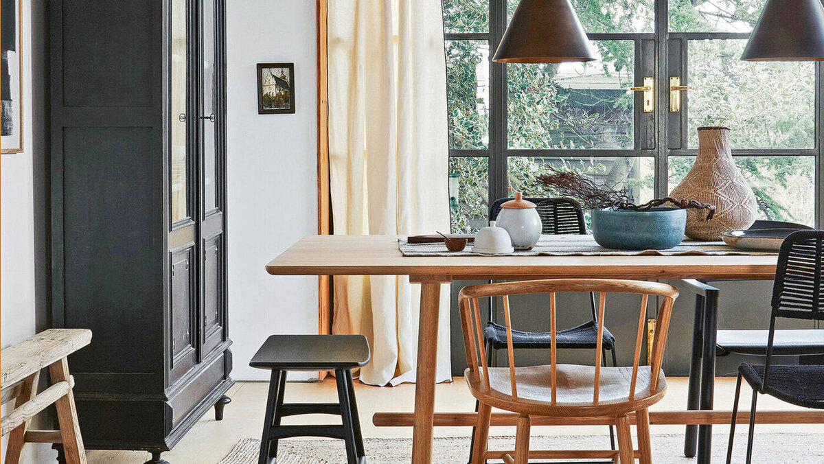
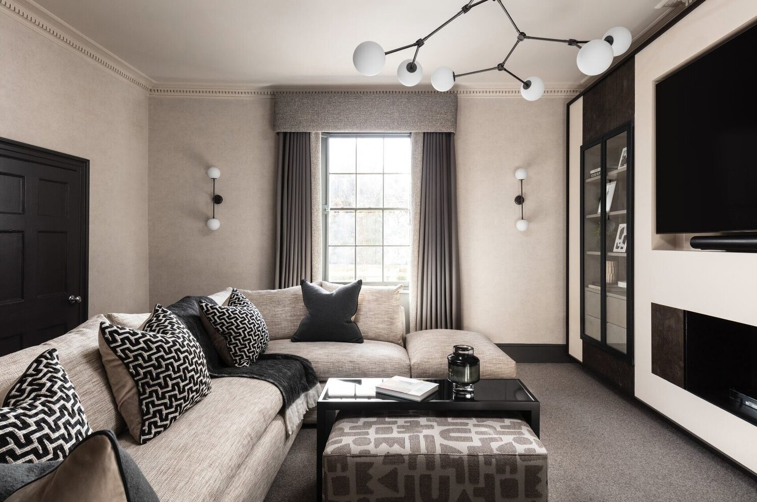
Moreover, curtain color has the ability to enhance or complement the existing color scheme of the walls. On one hand, choosing curtains that are slightly lighter or darker than the walls can add depth and dimension to the space while maintaining a cohesive look. On the other hand, selecting curtains that contrast with the wall color can create a dramatic statement and serve as a focal point within the room.
Ultimately, the right curtain color can bring balance, harmony, and personality to a room. It can tie together different design elements, create a specific mood, amplify the space, and reflect your personal style. Taking the time to carefully choose the curtain color will surely pay off in creating a visually stunning and inviting interior.
Factors to Consider When Choosing Curtain Color
Choosing the right curtain color requires careful consideration of several factors to ensure a harmonious and visually appealing result. Here are some key factors to keep in mind when making your decision:
- Wall color: Consider the color of your walls when selecting curtain color. Decide whether you want the curtains to blend in with the walls or make a distinct contrast. Matching or complementing the wall color can create a cohesive look, while contrasting colors can add visual interest and make a statement.
- Room size: Take into account the size of the room when choosing curtain color. For smaller rooms, lighter-colored curtains can help create an illusion of space and make the room feel more open. Darker-colored curtains can work well in larger rooms, adding warmth and coziness.
- Natural light: Consider the amount of natural light in the room. Rooms with ample natural light can benefit from lighter-colored curtains, as they allow the sunlight to filter through and create an airy atmosphere. If you want to control the amount of light entering the room, consider using curtains with light-filtering or blackout properties.
- Room function: Think about the purpose of the room when selecting curtain color. For a peaceful bedroom, choosing soft, calming colors can promote relaxation. For a vibrant living room or entertainment space, bold and vibrant curtain colors can add energy and create a focal point.
- Existing color scheme: Take into account the colors of the furniture, flooring, and accessories in the room. Consider whether you want the curtain color to complement or contrast with the existing color scheme. Harmonizing the curtain color with other elements in the room can create a cohesive and balanced look.
- Personal preference: Ultimately, your personal preference and style should play a significant role in the decision-making process. Consider your personal taste and the atmosphere you want to create in the room. Choose a curtain color that resonates with you and reflects your unique aesthetic.
By taking these factors into consideration, you can make a well-informed decision when it comes to choosing the right curtain color. Remember that there are no strict rules, and the most important thing is to create a space that feels inviting and reflects your personal style.
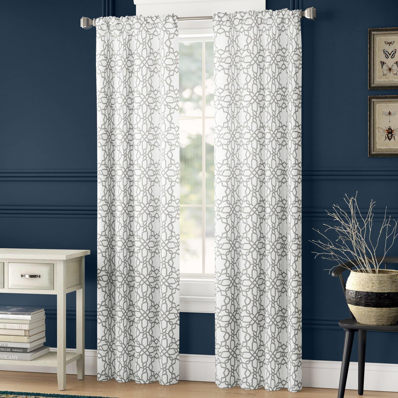
The Impact of Light Colored Curtains on Walls
Light colored curtains can have a significant impact on the overall look and feel of a room. Here are some ways in which light colored curtains can influence the walls:
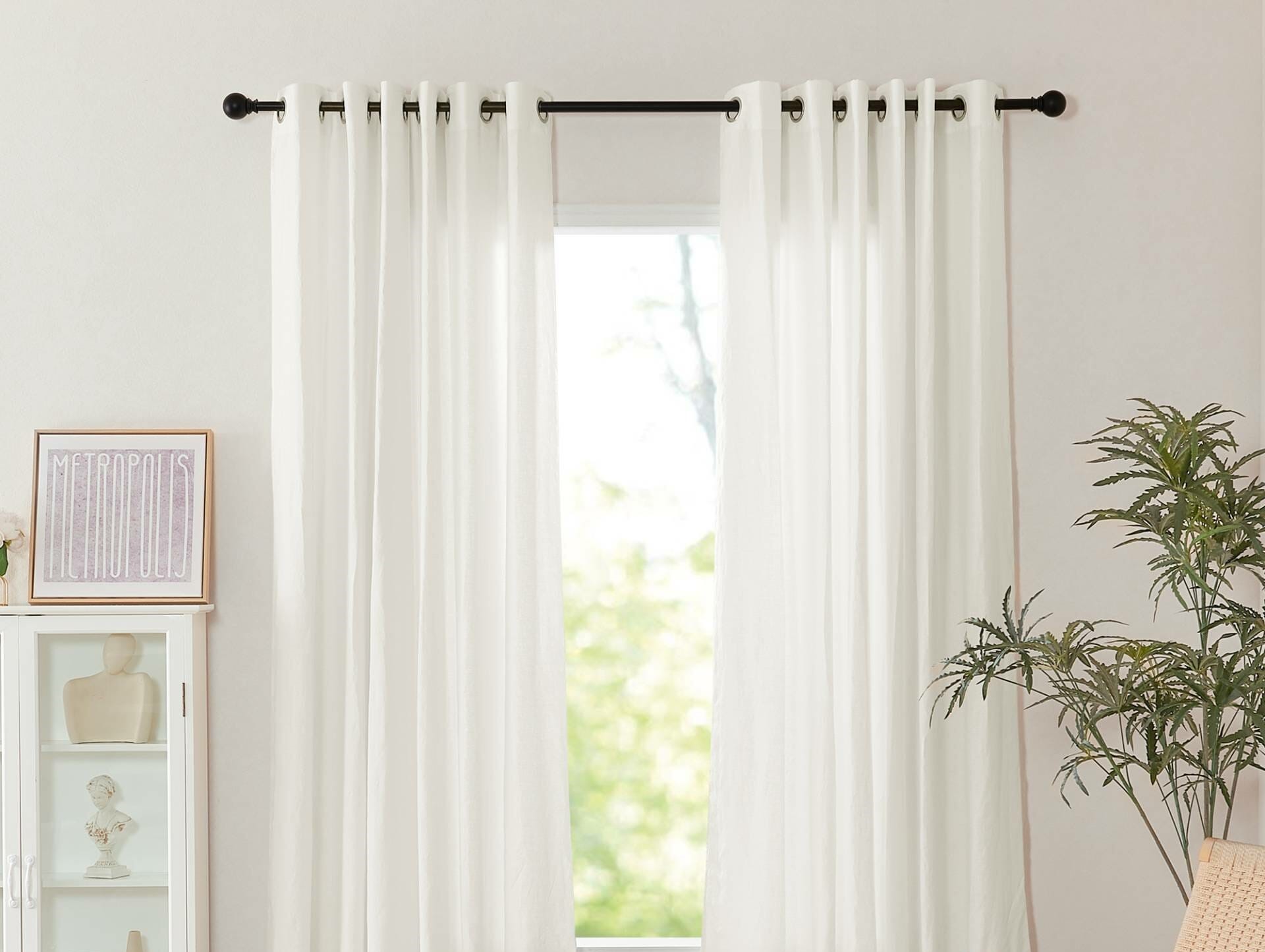
- Enhancing natural light: Light-colored curtains, such as whites, creams, or pastels, have the ability to maximize the natural light in a room. They allow sunlight to filter through, brightening up the space and creating an airy and inviting atmosphere.
- Creating an illusion of space: Light-colored curtains have a visually expanding effect. They can make a room appear larger and more open, which is especially beneficial for smaller rooms or spaces with limited natural light. Light colors reflect light, making the walls recede and giving the perception of spaciousness.
- Providing a clean and fresh look: Light colored curtains have a clean and fresh aesthetic that can bring a sense of calmness and tranquility to a room. They create a neutral backdrop that allows other design elements, such as furniture and accessories, to stand out.
- Complementing wall color: Light colored curtains can easily complement a variety of wall colors. They can blend in seamlessly with neutral wall tones, creating a cohesive and harmonious look. They also serve as a backdrop, allowing the attention to be drawn to other focal points in the room, such as artwork or statement furniture.
- Creating a soft and elegant ambiance: Light colored curtains have a timeless and elegant appeal. They can create a soft and gentle ambiance that is perfect for bedrooms or spaces dedicated to relaxation. Light curtains can evoke a sense of peace and serenity, making them a popular choice for creating a soothing atmosphere.
It is important to note that while light colored curtains offer many benefits, they may require more frequent cleaning or maintenance due to their susceptibility to stains and visible wear. However, with proper care and maintenance, the impact of light colored curtains on walls can greatly enhance the overall aesthetic and atmosphere of a room.
The Impact of Dark Colored Curtains on Walls
Dark colored curtains can create a bold and dramatic statement in a room. Here are some ways in which dark colored curtains can impact the walls:
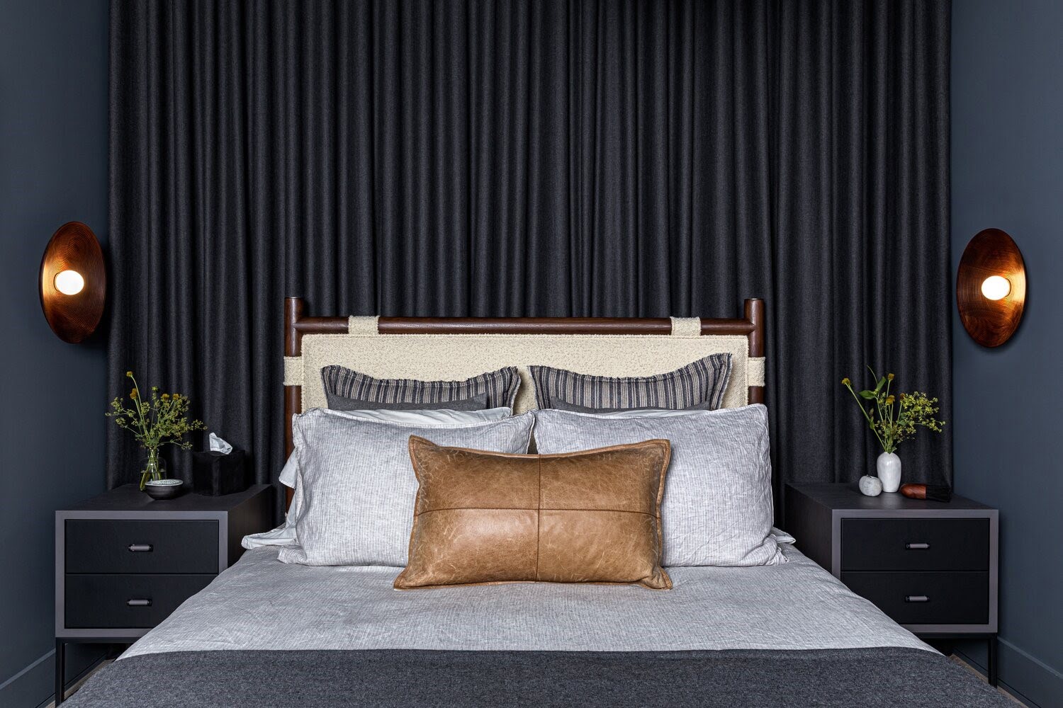
- Adding depth and richness: Dark colored curtains, such as deep blues, rich browns, or charcoal grays, can add depth and richness to a space. They create a sense of luxury and sophistication, making a room feel elegant and refined.
- Creating a cozy atmosphere: Dark colored curtains have a cozy and intimate vibe. They can create a sense of warmth and comfort, especially in larger rooms or spaces that need a touch of coziness. These curtains can make a room feel more inviting and comfortable, perfect for areas such as living rooms or bedrooms.
- Making a focal point: Dark colored curtains can serve as a striking focal point in a room. They draw attention and become a statement piece, adding visual interest and personality. Dark curtains can anchor a space and create a bold focal point that complements the overall design scheme.
- Creating contrast: Dark colored curtains can create a striking contrast with lighter walls. This contrast can provide visual interest and create a dynamic and balanced look in the room. The dark curtains can act as a frame for the lighter walls, adding drama and depth to the overall design.
- Enhancing privacy: Dark colored curtains can provide enhanced privacy, as they are less likely to allow light to pass through. They are ideal for rooms where privacy is a priority, such as bedrooms or bathrooms.
While dark colored curtains offer many benefits, it is important to consider the overall color scheme and lighting conditions of the room. Dark curtains can absorb light, so it is important to ensure that the room has enough natural or artificial lighting to maintain a balanced and comfortable atmosphere.
Additionally, dark colored curtains may have a tendency to fade over time, especially if exposed to direct sunlight. It is important to consider the quality of the curtains and their ability to withstand fading in order to ensure longevity.
Ultimately, the impact of dark colored curtains on walls can add sophistication, create a warm and cozy ambiance, and make a strong visual statement. Consider the specific needs and design goals of your space to determine if dark colored curtains are the right choice for you.
Curtains can be lighter or darker than walls, depending on the desired effect. Lighter curtains can make a room feel more spacious, while darker curtains can add warmth and coziness. Consider the overall mood and style you want to achieve in the room when choosing curtain colors.
Matching Curtain Color to Wall Color
Matching curtain color to wall color is a popular approach in interior design. This technique creates a cohesive and harmonious look in a room. Here are some considerations when matching curtain color to wall color:
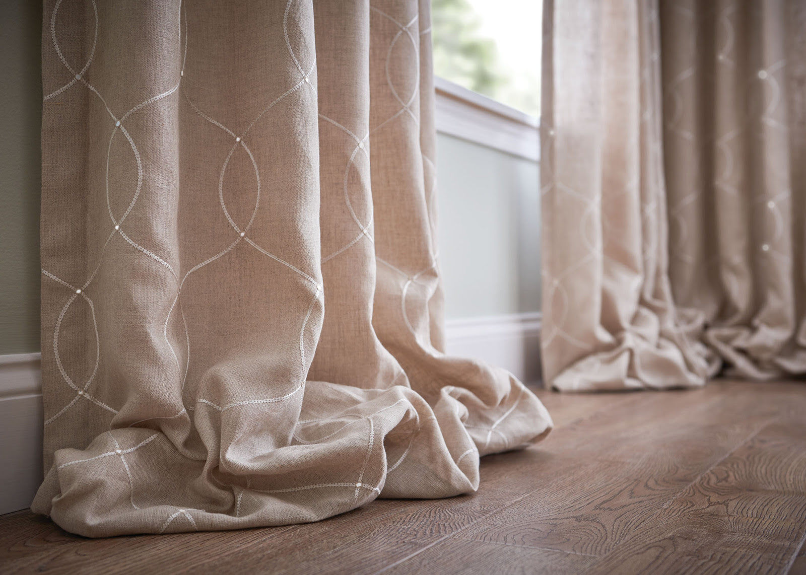
- Tonal Matching: Tonal matching involves choosing curtains that are slightly lighter or darker than the wall color. This creates a subtle variation in shades that adds depth and interest to the room. For example, if the walls are painted in a light blue shade, consider selecting curtains in a slightly darker or lighter blue to create a tonal match.
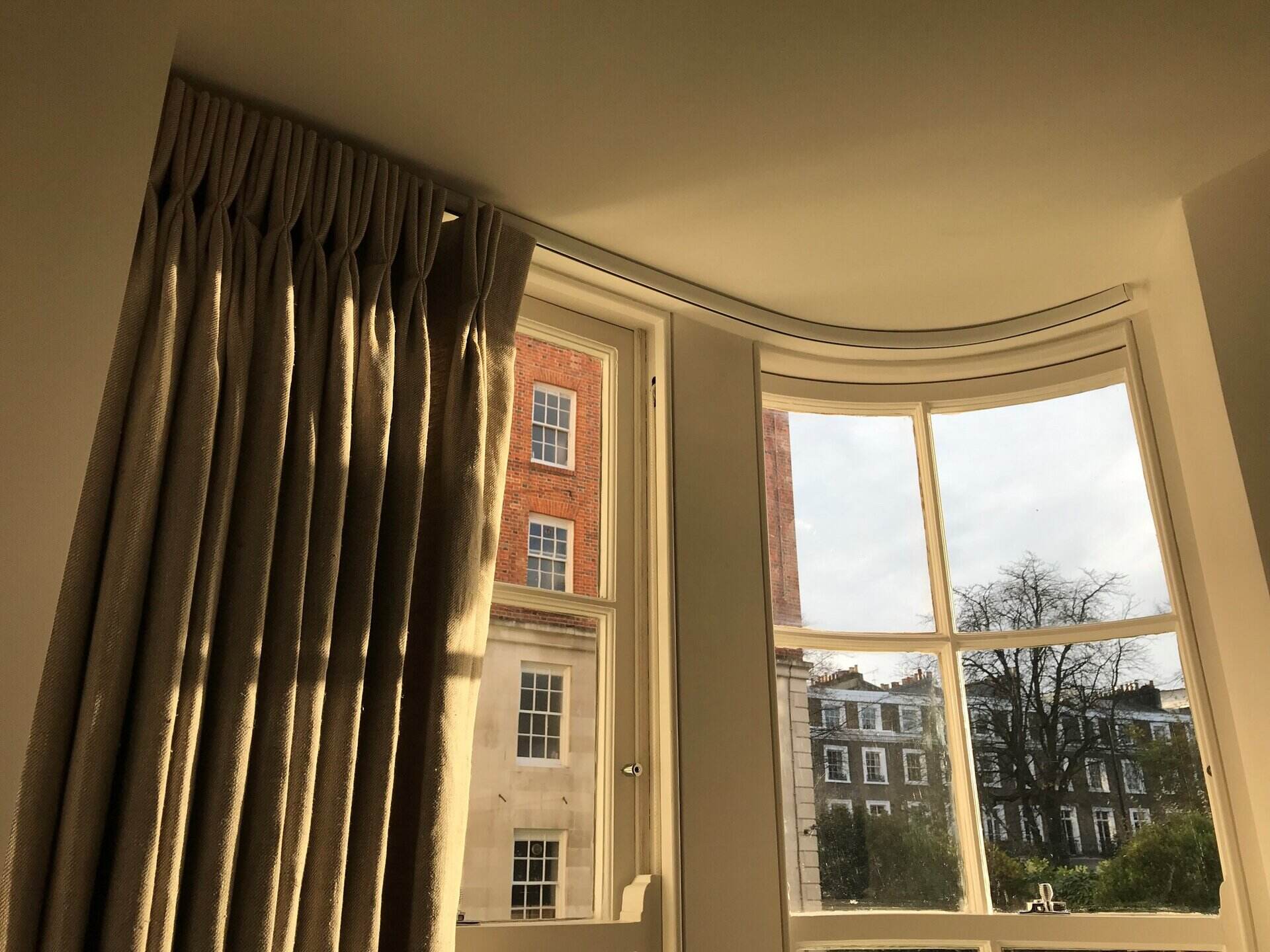
- Monochromatic Matching: Monochromatic matching involves selecting curtains in the same color family as the wall color. This creates a unified and seamless look. For example, if the walls are painted in a warm beige, choose curtains in a similar beige shade or a complementary undertone to achieve a monochromatic match.
- Complementary Matching: Complementary matching involves choosing curtain colors that are opposite or contrasting to the wall color on the color wheel. This creates a dynamic and visually striking effect. For example, if the walls are painted in a soft green, consider selecting curtains in a complementary shade such as a deep red or rust color.
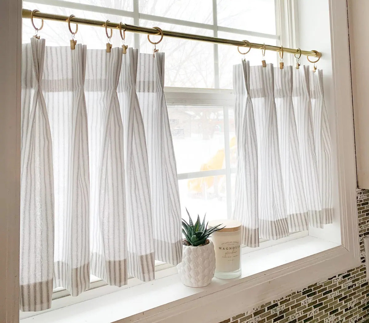
- Neutral Matching: Neutral matching involves choosing curtains in neutral colors that complement any wall color. Neutral-colored curtains, such as whites, creams, grays, or taupes, can seamlessly blend with various wall colors and create a quiet and sophisticated backdrop in the room.
- Pattern Matching: Matching curtain patterns to the wall color can create a cohesive and coordinated look. For example, if the walls have a textured or patterned finish, consider selecting curtains with a similar pattern or texture to tie the design elements together.
Matching curtain color to wall color can bring a sense of unity and balance to a room. It creates a seamless flow and allows other design elements, such as furniture and accessories, to shine. Keep in mind that texture, fabric, and lighting conditions can also influence the overall impact of the matched curtain and wall colors.
However, it’s important to note that matching curtain color to wall color is not the only option. Contrasting curtain colors can create a bold statement, while other design techniques, such as color blocking or using complementary colors from the color wheel, can add visual interest and creativity.
Consider the specific characteristics of your room, your desired ambiance, and your personal style when deciding whether to match or contrast curtain color to wall color. Ultimately, the goal is to create a space that reflects your taste and enhances the overall aesthetic of your home.
Creating Contrast with Curtain Color
Creating contrast with curtain color is a design technique that adds visual interest and depth to a room. By intentionally selecting curtain colors that contrast with the wall color, you can create a striking and dynamic look. Here are some ways to create contrast with curtain color:
- Light and Dark Contrast: One of the simplest ways to create contrast is by choosing curtains in a significantly lighter or darker shade than the wall color. For example, if the walls are painted in a light gray, opt for curtains in a deep charcoal or black to create a bold contrast that catches the eye.
- Color Wheel Contrast: Using colors that are opposite each other on the color wheel can create a vibrant and energizing contrast. For instance, pairing curtains in deep blue with walls painted in a warm orange shade can create a captivating and visually striking combination.
- Complementary Contrast: Choosing curtain colors that are complementary to the wall color can create a harmonious yet contrasting effect. Complementary colors are located directly opposite each other on the color wheel. For example, if the walls are a soft green, consider curtains in a complementary shade of deep red or burgundy.
- Pattern or Print Contrast: Contrasting curtain colors through patterns or prints can add a touch of personality and creativity. For instance, if the walls are a solid neutral shade, choose curtains with a bold geometric pattern or a floral print to create contrast and make a statement.
- Texture Contrast: Another way to create contrast is through the use of texture in curtains. If the walls have a smooth and plain finish, consider choosing curtains with a textured fabric such as linen or velvet. The contrasting texture can add depth and interest to the room.
Creating contrast with curtain color can be a powerful design technique that adds visual impact and focal points to a room. However, it is important to strike a balance and not overwhelm the space. Make sure to consider other elements in the room, such as furniture, accessories, and lighting, to ensure a cohesive and harmonious overall design.
Experimenting with contrasting curtain colors allows you to showcase your personal style, create a unique look, and make a bold statement. Whether you opt for light and dark contrast, use the color wheel, or play with patterns and textures, creating contrast with curtain color can truly transform the atmosphere and aesthetic of your space.
Achieving Balance with Curtain Color
Achieving balance with curtain color is essential in interior design. It involves selecting curtain colors that harmonize with the overall color scheme of a room and create a sense of equilibrium. Here are some tips for achieving balance with curtain color:
- Consider the 60-30-10 Rule: The 60-30-10 rule is a guideline that suggests using 60% of the dominant color (walls), 30% of a secondary color (furniture), and 10% of an accent color (curtains and accessories). This rule ensures a well-balanced color palette in which the curtain color complements and enhances the other elements in the room.
- Coordinate with the Dominant Color: If your room has a dominant color, such as a bold accent wall or vibrant furniture, choose curtain colors that coordinate with it. This creates a sense of unity and balance. For example, if your accent wall is a deep blue, consider selecting curtains in a complementary shade or a lighter or darker variation of blue.
- Choose Neutrals: Neutral-colored curtains, such as whites, creams, grays, or taupes, can provide a sense of balance in any room. They act as a subtle backdrop and allow other design elements to take center stage. Neutrals can complement both bold and soft color schemes, creating a harmonious and versatile look.
- Consider the Undertones: When choosing curtain color, pay attention to the undertones in your room’s color scheme. For example, if your walls have warm undertones, select curtains with similar warm undertones to create a cohesive and balanced look.
- Balance Patterns and Textures: If your room features patterned or textured walls or furniture, opt for curtains with a more subdued color and simpler design. This helps balance the visual complexity and prevents the room from appearing overly busy.
Achieving balance with curtain color is not just about color coordination but also about creating visual harmony. Consider the size of the room, the amount of natural light, and the overall mood you wish to achieve. It’s important to experiment and trust your instincts as you strive for a well-balanced and aesthetically pleasing design.
Remember that achieving balance with curtain color is a subjective process, influenced by personal taste and style. Use your intuition and consider the overall feel you want to create in the room. By finding a harmonious balance, your curtain color will contribute to a beautiful and well-designed space.
Practical Considerations for Curtain Color Choices
While the aesthetic impact of curtain color is important, it’s also crucial to take practical considerations into account when making your color choices. Here are some practical factors to consider when selecting curtain colors:
- Light and Privacy: Consider the level of natural light in the room and the desired privacy. Light-colored curtains allow more light to filter through, creating a brighter and more open atmosphere. However, they may not offer as much privacy during the day. On the other hand, darker-colored curtains provide better privacy while blocking more light.
- Maintenance and Durability: Think about how practical the curtain color is in terms of maintenance and durability. Light-colored curtains may show dirt, stains, or wear more easily, requiring more frequent cleaning. Dark-colored curtains, while more forgiving in terms of stains, may show fading over time when exposed to direct sunlight.
- Resale Value: If you’re considering the potential resale value of your home, neutral-colored curtains tend to have broader appeal. They provide a blank canvas for potential buyers to envision their own style and color preferences in the space. Neutral colors also make it easier to stage the home for sale.
- Seasonal Adaptability: Think about how well the curtain color will adapt to different seasons and interior design trends. Neutral or timeless colors are more versatile and can easily accommodate seasonal or style changes through other decor elements such as pillows, rugs, or accessories.
- Longevity: Consider the long-term impact of the curtain color choice. While you may be drawn to a trendy or bold color at the moment, think about whether it will still be appealing in the years to come. Opting for a classic and timeless curtain color can ensure its longevity and prevent the need for frequent updates.
When selecting curtain colors, it’s important to strike a balance between aesthetics and practicality. Take into account the specific characteristics of your space, your lifestyle, and your preferences. By considering practical factors alongside the visual impact, you can choose curtain colors that not only enhance the overall design but also cater to your functional needs and long-term satisfaction.
Conclusion
Choosing the right curtain color for your walls is a crucial aspect of interior design that can significantly impact the overall look and feel of a room. Whether you opt for matching, contrasting, or balancing curtain colors, it’s important to consider both aesthetic appeal and practical considerations.
Light colored curtains can enhance the natural light, create a sense of openness, and contribute to a fresh and serene ambiance. They can also complement wall colors and provide a clean and timeless look. On the other hand, dark colored curtains add depth and richness, create a cozy atmosphere, and make a bold statement. They can also serve as a contrasting element that adds drama and focal points to a space.
When selecting curtain colors, factors such as wall color, room size, natural light, and personal preference should be taken into account. Matching curtain color to wall color can create a cohesive and harmonious look, while contrasting colors can add visual interest and excitement. Balancing curtain color involves considering the overall color scheme, texture, and patterns in the room to achieve equilibrium.
Practical considerations, such as light and privacy, maintenance, resale value, seasonal adaptability, and longevity, should not be overlooked. By finding the right balance between practicality and aesthetics, you can make informed curtain color choices that enhance the functionality and visual appeal of your space.
In conclusion, curtain color is an essential element of interior design that can transform a room. Whether you choose light or dark colors, matching or contrasting shades, or focus on achieving balance, be sure to consider your personal style, the specific characteristics of the room, and practical factors. By doing so, you can create a visually striking, functional, and inviting space that reflects your unique taste and enhances your daily living experience.
Excited to bring more personality into your living space? Whether you're sprucing up a rented home or just craving a change, our next piece offers invaluable advice. Dive into our article on "decorating tips" where we share the top strategies that transformed a rental property into a cozy, stylish haven. Perfect for anyone looking to refresh their environment without breaking the bank or compromising on style!
Frequently Asked Questions about Should Curtains Be Lighter Or Darker Than Walls?
Was this page helpful?
At Storables.com, we guarantee accurate and reliable information. Our content, validated by Expert Board Contributors, is crafted following stringent Editorial Policies. We're committed to providing you with well-researched, expert-backed insights for all your informational needs.


0 thoughts on “Should Curtains Be Lighter Or Darker Than Walls?”