Home>Interior Design>Cool Color Schemes: What They Are And How To Use Them
Interior Design
Cool Color Schemes: What They Are And How To Use Them
Modified: January 19, 2024
Learn how to use cool color schemes in interior design to create a visually stunning space. Discover the latest trends and techniques for incorporating vibrant hues into your home.
(Many of the links in this article redirect to a specific reviewed product. Your purchase of these products through affiliate links helps to generate commission for Storables.com, at no extra cost. Learn more)
Introduction
Color plays an integral role in interior design, helping to create unique atmospheres and evoke specific emotions. Choosing the right color scheme can significantly impact the overall look and feel of a space. Whether you’re redecorating a room, designing a website, or creating a graphic, understanding color schemes and how to use them effectively is essential.
In this article, we will explore different color schemes and learn how to harness their power in interior design. We will delve into the monochromatic, analogous, complementary, triadic, split complementary, and tetradic color schemes. Additionally, we will discuss how these color schemes can be applied to websites, graphic design, and, of course, interior design.
So, if you’re ready to embark on a colorful journey through the world of design, let’s dive in!
Key Takeaways:
- Embrace the power of color schemes to evoke emotions, create visual interest, and convey messages effectively in interior design, graphic design, and web design. Understanding color theory and applying the principles can elevate design projects to new heights.
- From the calming elegance of monochromatic schemes to the vibrant energy of complementary colors, each color scheme offers unique characteristics and sets a distinct tone for design. By carefully selecting and applying color schemes, you can create visually stunning and cohesive projects that leave a lasting impression.
Understanding Color Schemes
Before we explore the different color schemes, it’s important to have a basic understanding of what they are. A color scheme is a selection of colors that are strategically chosen to create a harmonious and visually appealing combination.
There are several types of color schemes, each with its own unique characteristics and use cases. Let’s take a closer look at some of the most commonly used color schemes:
- Monochromatic Color Scheme: The monochromatic color scheme involves using different shades, tints, and tones of a single color. It creates a cohesive and calming effect, making it a popular choice for creating a peaceful and elegant ambiance.
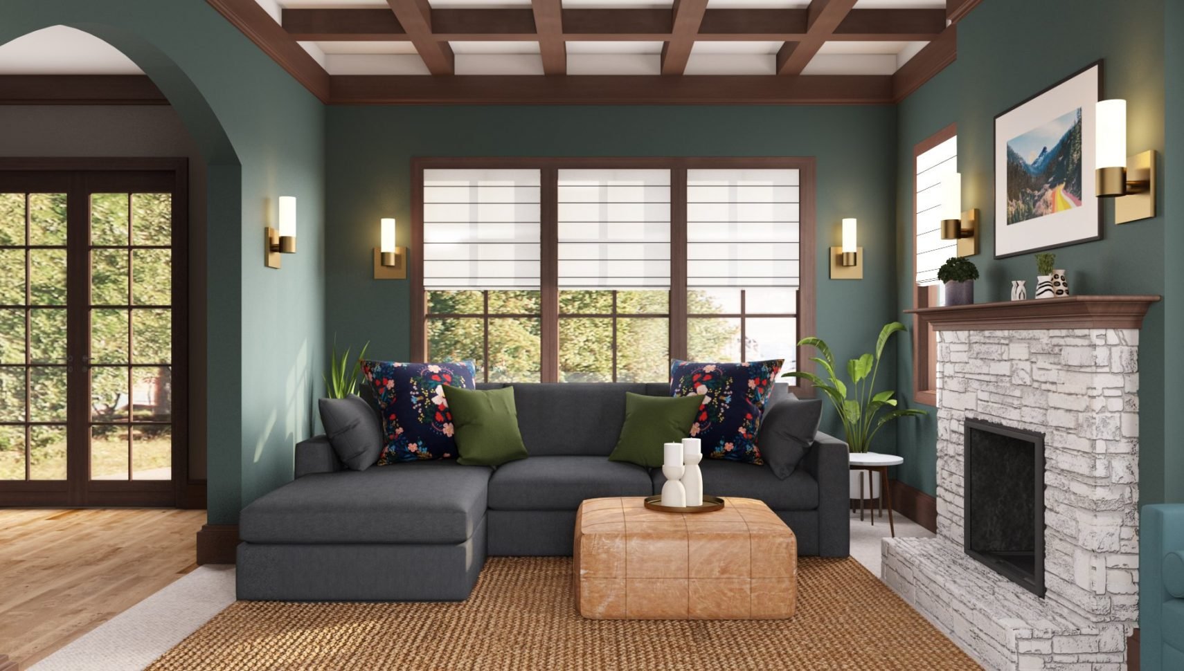
- Analogous Color Scheme: The analogous color scheme uses colors that are adjacent to each other on the color wheel. This scheme creates a harmonious and balanced look, often seen in nature. It is ideal for creating a soothing and relaxed atmosphere.
- Complementary Color Scheme: The complementary color scheme consists of colors that are opposite each other on the color wheel. This scheme creates a high contrast and vibrant effect, making it attention-grabbing and visually appealing. It is often used to create a bold and energetic feel.
- Triadic Color Scheme: The triadic color scheme involves using three equally spaced colors on the color wheel. This scheme offers a balanced and vibrant combination, allowing for a range of color choices while maintaining overall harmony.
- Split Complementary Color Scheme: The split complementary color scheme is a variation of the complementary scheme. It uses one base color and two colors adjacent to its complementary color on the color wheel. This scheme provides a harmonious balance with a touch of contrast.
- Tetradic Color Scheme: The tetradic color scheme, also known as the double complementary scheme, uses two sets of complementary colors. This scheme offers a wide variety of color combinations and allows for a visually striking and dynamic design.
Understanding these color schemes is crucial when it comes to creating a well-designed and cohesive space. Each scheme has its own unique characteristics and can evoke different moods and emotions. By carefully selecting and combining colors, you can create a visually stunning and harmonious environment.
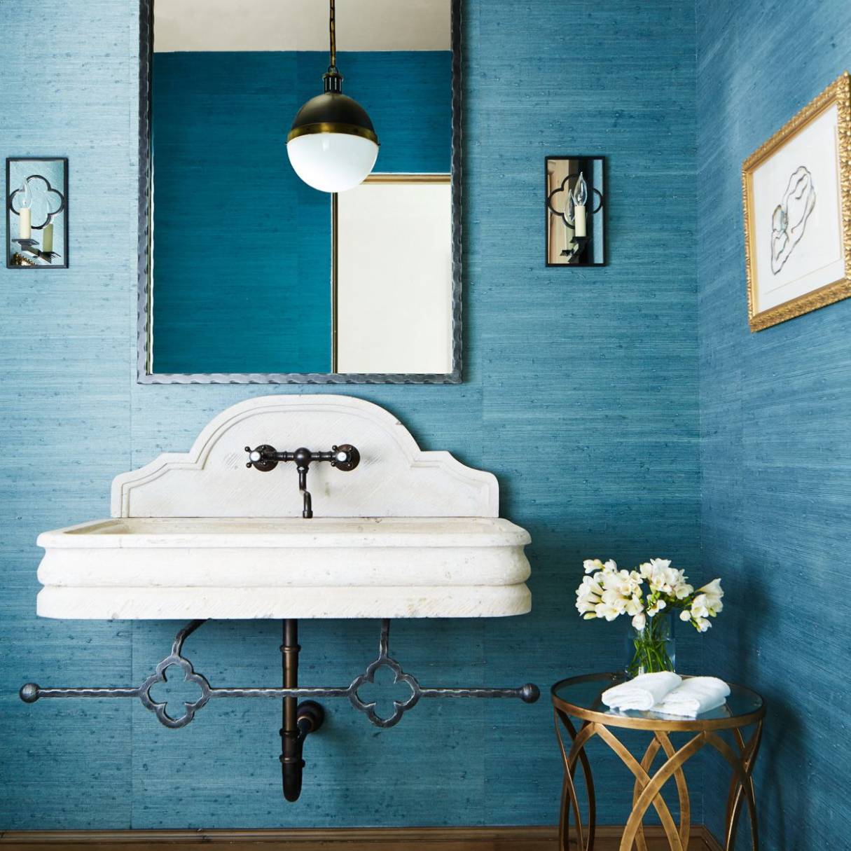
Monochromatic Color Scheme
The monochromatic color scheme is a popular choice in interior design for its simplicity and elegance. It involves using different shades, tints, and tones of a single color to create a cohesive and harmonious look.
When using a monochromatic color scheme, it’s important to vary the intensity and saturation of the chosen color. This creates visual interest and prevents the space from appearing monotonous or flat. For example, if you’re using shades of blue, you can incorporate navy blue, sky blue, and baby blue to create depth and dimension.
One of the advantages of a monochromatic color scheme is its versatility. It can be easily adapted to suit any style or aesthetic. From modern and minimalist designs to classic and traditional interiors, a monochromatic color scheme can be applied in various settings.
The monochromatic color scheme also has a calming and soothing effect on a space. It creates a sense of harmony and balance, making it an excellent choice for bedrooms, living rooms, and any area where relaxation is a priority.
When working with a monochromatic color scheme, it’s important to consider the different elements in the room. For example, you can use different textures, materials, and patterns to add visual interest and prevent the space from feeling flat. Incorporating accents in a neutral color or metallic tones can also enhance the overall look.
Remember that lighting plays a crucial role in showcasing the different shades of the chosen color. Natural light can bring out the subtle variations and highlights, while artificial lighting can create mood and ambiance.
Whether you’re going for a monochromatic scheme in a specific room or throughout your entire home, it’s important to carefully select the right color. Take into consideration the mood you want to create and the existing elements in the space. Explore different shades and experiment with the intensity and saturation to find the perfect balance.
By utilizing a monochromatic color scheme, you can achieve a clean, sophisticated, and visually impactful design that will stand the test of time.
Analogous Color Scheme
The analogous color scheme is a versatile and harmonious choice for interior design. It involves using colors that are adjacent to each other on the color wheel. This color scheme creates a sense of unity and balance while offering a range of possibilities for color combinations.
When working with an analogous color scheme, you can choose a primary color and incorporate the colors on either side of it. For example, if you have chosen blue as your primary color, you can include shades of green and purple in your design.
The analogous color scheme is often found in nature, evoking a sense of tranquility and serenity. It is perfect for creating a soft and soothing atmosphere in spaces such as bedrooms, bathrooms, and relaxation areas.
One way to create depth and interest with an analogous color scheme is by varying the intensity and saturation of the chosen colors. For example, you can use a muted or pastel version of the primary color as a backdrop and incorporate brighter shades as accent colors.
Another way to add visual interest is by incorporating different textures and patterns in the analogous color scheme. This can be achieved through textiles, wallpapers, or accessories that feature the chosen colors.
When applying an analogous color scheme, it’s important to pay attention to the proportions of the different colors. One color should dominate while the others play supporting roles. You can experiment with different ratios to find the right balance and create the desired effect.
Lighting also plays a crucial role in showcasing the beauty of an analogous color scheme. Natural light can bring out the subtleties and nuances of the colors, while artificial lighting can be used to create ambiance and highlight specific areas.
Remember to consider the existing elements in the space when choosing an analogous color scheme. Consider the furniture, flooring, and other fixed elements to ensure a cohesive and harmonious design. You can use the color wheel as a guide to help you select the best combinations for your space.
By utilizing an analogous color scheme, you can create a visually pleasing and cohesive design that brings a sense of tranquility and harmony to your space.
Complementary Color Scheme
The complementary color scheme is a bold and eye-catching choice in interior design. It involves using colors that are directly opposite each other on the color wheel. This color scheme creates a high contrast and vibrant effect, making it attention-grabbing and visually appealing.
When working with a complementary color scheme, it’s important to understand the dynamics between the colors. The contrasting nature of complementary colors creates a sense of excitement and energy. The primary colors used in this scheme are red and green, blue and orange, and yellow and purple.
In a complementary color scheme, one color typically takes center stage, while the other serves as an accent color to create balance. For example, you can use a dominant red color and incorporate touches of green as accents.
This color scheme is commonly used when you want to create a focal point or draw attention to a specific area in a room. It can be especially effective in areas such as dining rooms, where you want to create a lively and vibrant atmosphere.
While working with a complementary color scheme, it’s important to find the right balance. Using equal amounts of both complementary colors can result in a visually overwhelming effect. Instead, focus on using one color as the dominant hue and the other as an accent or complementary element.
One of the advantages of a complementary color scheme is its versatility. You can adjust the intensity and saturation of the colors to create different moods or styles. For example, using muted or pastel versions of the complementary colors can create a more subtle and sophisticated look.
Lighting also plays a crucial role in showcasing the beauty of a complementary color scheme. Natural light can bring out the vibrancy and intensity of the colors, while artificial lighting can be used strategically to highlight specific elements or create a desired ambiance.
When using a complementary color scheme, consider the existing elements in the space. The furniture, flooring, and other fixed elements should complement the chosen colors to create a cohesive and harmonious design.
The complementary color scheme offers an exciting and dynamic approach to interior design. By carefully selecting and balancing the contrasting colors, you can create a visually striking and energetic space that commands attention.
Triadic Color Scheme
The triadic color scheme is a vibrant and balanced choice in interior design. It involves using three equally spaced colors on the color wheel to create a harmonious combination. This color scheme offers a wide range of color choices while maintaining overall harmony.
When working with a triadic color scheme, it’s important to choose colors that are evenly spaced on the color wheel. Common examples of triadic color schemes include red, blue, and yellow or orange, green, and purple.
The triadic color scheme creates a visually appealing and dynamic look, making it a popular choice for creating bold and lively spaces. It offers a good balance between contrast and harmony, allowing each color to stand out while maintaining overall unity.
One approach to using a triadic color scheme is to designate one color as the dominant hue and use the other two as supporting accents. For example, if blue is the primary color, you can use red and yellow as complementary accent colors in smaller doses.
Another approach is to use all three colors in equal proportions to create a more balanced and evenly distributed look. This can create a vibrant and energetic atmosphere, perfect for playful and creative spaces.
When working with a triadic color scheme, consider the proportions and intensity of each color. You can experiment with different ratios to find the right balance and create the desired effect. Pay attention to the dominant color and use the other two colors to enhance and complement it.
Lighting plays a significant role in showcasing the beauty and vibrancy of a triadic color scheme. Natural light can bring out the subtleties and nuances of the colors, while artificial lighting can be used to create focal points or add warmth to specific areas.
When incorporating a triadic color scheme, consider the existing elements in the space. The furniture, flooring, and other fixed elements should complement the chosen colors to create a cohesive and harmonious design.
The triadic color scheme offers a balanced and vibrant approach to interior design. By strategically selecting and combining three equally spaced colors, you can create a visually stunning and dynamic space that exudes creativity and harmony.
Split Complementary Color Scheme
The split complementary color scheme is a variation of the complementary scheme that offers a harmonious balance with a touch of contrast. It involves using one base color and two colors adjacent to its complementary color on the color wheel.
When working with a split complementary color scheme, it’s important to select one dominant color from the base color and use the other two colors as accent colors. For example, if the base color is blue, you can use orange and yellow-orange as complementary accent colors.
This color scheme creates a visually interesting and dynamic look while maintaining a sense of balance and harmony. It offers more variety and versatility compared to a traditional complementary color scheme.
One advantage of a split complementary color scheme is the ability to create depth and dimension in a space. By using three colors instead of two, you can add visual interest and prevent the design from appearing flat or one-dimensional.
When incorporating a split complementary color scheme, consider the proportions and intensity of each color. The dominant base color should take center stage, while the two complementary accent colors are used to enhance and complement it.
One approach to using a split complementary color scheme is to apply the base color to larger areas such as walls or furniture, and use the complementary accent colors in smaller doses through accessories or textiles.
Lighting also plays a crucial role in showcasing the beauty of a split complementary color scheme. Natural light can bring out the nuances and undertones of the colors, while artificial lighting can be used strategically to highlight specific areas or create a desired ambiance.
When incorporating a split complementary color scheme, consider the existing elements in the space. The furniture, flooring, and other fixed elements should complement the chosen colors to create a cohesive and harmonious design.
The split complementary color scheme offers a balanced and visually appealing approach to interior design. By carefully selecting and combining one base color and two complementary accent colors, you can create a harmonious and dynamic space that captures attention while maintaining overall unity.
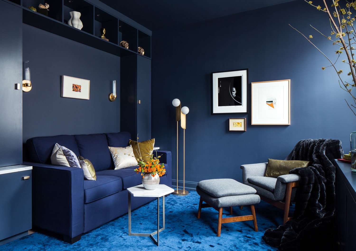
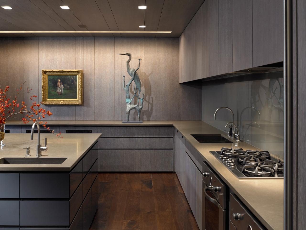
When using cool color schemes, consider using a combination of blues, greens, and purples to create a calming and soothing atmosphere. Stick to a limited color palette to avoid overwhelming the space.
Tetradic Color Scheme
The tetradic color scheme, also known as the double complementary scheme, is a dynamic and vibrant choice in interior design. It involves using two sets of complementary colors, creating a wide variety of color combinations and a visually striking and dynamic design.
When working with a tetradic color scheme, it’s important to choose two pairs of colors that are evenly spaced on the color wheel. For example, you can use blue and orange, and green and red as your complementary pairs.
The tetradic color scheme offers a high level of contrast while maintaining overall harmony. This allows for a diverse range of color choices that can create a bold and energetic design.
One approach to using a tetradic color scheme is to designate one color as the dominant hue and use the other three colors as supporting accents. For example, if blue is the primary color, you can use orange, green, and red as complementary accent colors in smaller doses.
Another approach is to use all four colors in equal proportions to create a balanced and evenly distributed look. This can create a visually striking and vibrant atmosphere, perfect for creating a lively and energetic space.
When working with a tetradic color scheme, consider the proportions and intensity of each color. You can experiment with different ratios to find the right balance and create the desired effect. Pay attention to the dominant color and use the other three colors to enhance and complement it.
Lighting plays an important role in showcasing the beauty and vibrancy of a tetradic color scheme. Natural light can bring out the subtleties and nuances of the colors, while artificial lighting can be used to create focal points or add warmth to specific areas.
When incorporating a tetradic color scheme, consider the existing elements in the space. The furniture, flooring, and other fixed elements should complement the chosen colors to create a cohesive and harmonious design.
The tetradic color scheme offers a vibrant and visually stimulating approach to interior design. By carefully selecting and combining two sets of complementary colors, you can create a visually striking and dynamic space that captures attention and creates a lively atmosphere.
Using Color Schemes in Design
Color schemes play a fundamental role in design, whether it’s for interior design, graphic design, or website design. They have the power to evoke specific emotions and create a cohesive and visually appealing look. Understanding how to effectively use color schemes can greatly enhance the impact and success of your designs.
When using color schemes in design, it’s important to consider the mood and atmosphere you want to create. Different color schemes can evoke different emotions and set the tone for a space or design project.
For example, a monochromatic color scheme can create a sense of elegance and sophistication, making it ideal for formal or minimalist designs. On the other hand, a complementary color scheme can create a vibrant and energetic ambiance, perfect for creating a bold statement.
When selecting a color scheme, it’s crucial to understand the psychology behind colors. Certain colors can evoke specific emotions and have cultural or personal associations. For instance, blue is often associated with calmness and tranquility, while red is associated with passion and energy.
Another important consideration when using color schemes in design is balance. It’s essential to find the right balance between the different colors to create a visually pleasing and cohesive look. This can be achieved by allocating dominant and accent colors, varying the intensity and saturation of the colors, and considering the proportions in which they are used.
Color schemes can also help create hierarchy in design. By using contrasting or complementary colors for important elements, such as headlines or call-to-action buttons, you can draw attention and guide the viewer’s eye where it is intended to go.
Furthermore, color schemes can be used to create visual harmony and unity between different elements in a design. By using consistent color combinations throughout a space or project, you can create a sense of cohesiveness and coherence that ties everything together.
It’s important to note that color schemes should also take into consideration the target audience and the purpose of the design. Different colors and combinations may have different cultural or personal interpretations, so it’s crucial to align the color scheme with the intended message or brand identity.
Whether you’re designing a website, creating graphics, or decorating a room, harnessing the power of color schemes can greatly enhance the impact and effectiveness of your designs. Take the time to explore different color schemes, experiment with combinations, and consider the emotions and atmosphere you want to convey. With thoughtful and intentional use of color schemes, you can create visually stunning and impactful designs that resonate with your audience.
Applying Color Schemes to Websites
Color schemes play a crucial role in web design, as they can greatly impact the overall look, feel, and user experience of a website. The right color scheme can capture attention, set the tone, and convey the brand personality effectively. Let’s explore some tips for applying color schemes to websites:
1. Understand the brand: Start by understanding the brand identity and values that need to be conveyed through the website. Consider the brand colors, tone, and target audience, and choose a color scheme that aligns with these factors.
2. Use the color wheel: The color wheel is a valuable tool for creating harmonious color schemes. Explore different color relationships such as complementary, analogous, or triadic combinations, and select a scheme that best suits the purpose and mood of the website.
3. Pay attention to contrast: Contrast is key for readability and visual hierarchy on a website. Use contrasting colors for important elements such as headers, navigation menus, or call-to-action buttons to make them stand out. Ensure that the background and text colors have enough contrast for easy readability.
4. Less is more: Stick to a limited color palette to maintain a cohesive and clean design. Typically, two or three primary colors, along with a neutral color, can work well. Avoid using too many colors that may overwhelm the website and distract the user.
5. Consider color psychology: Different colors evoke different emotions and associations. Take into account the psychology of colors and how they align with the purpose and message of the website. For example, blue is often associated with trust and professionalism, while green can evoke a sense of nature and freshness.
6. Use color to enhance usability: Color can also be used to guide users through the website and highlight important elements. Consistently using certain colors for links, buttons, or interactive elements can help users understand their purpose and navigate the site more easily.
7. Test for accessibility: It’s essential to consider the accessibility aspect of color schemes. Ensure that the chosen colors meet the accessibility guidelines, providing sufficient contrast for users with visual impairments. There are online tools available to test the color contrast ratio and ensure compliance with accessibility standards.
8. Be consistent: Consistency is important to create a cohesive and memorable website. Once you have chosen a color scheme, use it consistently across all pages and elements. This helps in establishing brand recognition and user familiarity.
By applying these tips and carefully considering the color scheme, you can create visually appealing and engaging websites that effectively convey the desired message and provide a positive user experience.
Applying Color Schemes to Graphic Design
Color is a powerful tool in graphic design, as it can evoke emotions, communicate messages, and create a visual impact. Applying the right color scheme to graphic design projects can enhance the overall effectiveness and aesthetics. Here are some tips for applying color schemes to graphic design:
1. Understand the purpose and audience: Before selecting a color scheme, it’s important to understand the purpose of the graphic design project and the target audience. Different colors can convey different meanings and emotions, so choose a color scheme that aligns with the intended message and resonates with the audience.
2. Consider the medium: The color scheme may vary depending on the medium of the graphic design project. Colors may appear differently on print materials compared to digital designs. Consider how the colors will translate across different platforms and adjust the color scheme accordingly.
3. Create harmony and contrast: A well-designed color scheme should have a balance of harmony and contrast. Harmonious colors create a cohesive and pleasing appearance, while contrasting colors can create visual interest and draw attention to certain elements. Experiment with different combinations to find the right balance.
4. Use color to communicate hierarchy: Colors can be used to create hierarchy and guide the viewer’s attention. Bright or saturated colors can attract attention, while muted or neutral colors can create a more subtle effect. Use color to emphasize important elements or create a visual flow throughout the design.
5. Use color psychology: Colors have psychological associations and can elicit specific emotions or responses. Consider the meanings and cultural implications of different colors. For example, warm colors like red and orange can convey energy and urgency, while cool colors like blue and green can evoke a sense of calm and tranquility.
6. Consider color combinations: Explore different color combinations like complementary, analogous, or triadic schemes to create visually appealing designs. Use a color wheel or online resources to experiment with different harmonious combinations. Keep in mind that the chosen color scheme should align with the desired mood and message of the design.
7. Pay attention to color contrast and legibility: Ensure that the chosen color scheme provides sufficient contrast for easy readability. Text should be easy to read against the background color. Test the design in different lighting conditions to ensure that the colors maintain their legibility and clarity.
8. Be consistent: Consistency is key when applying color schemes to graphic design. Use the chosen color scheme consistently throughout the design project to create a unified and coherent look. Consistent use of colors helps in building brand recognition and visual harmony.
By applying these tips and considering the purpose, medium, psychology, and hierarchy, you can create visually appealing and effective designs that effectively communicate your intended message and leave a lasting impact on the audience.
Applying Color Schemes to Interior Design
Color schemes are a fundamental aspect of interior design, as they can greatly influence the atmosphere, mood, and overall aesthetic of a space. Applying the right color scheme to interior design projects can create a cohesive and visually pleasing environment. Here are some tips for applying color schemes to interior design:
1. Understand the purpose and function: Before selecting a color scheme, consider the purpose and function of the space. Different colors can evoke different emotions and suit different activities. For example, calming and muted tones are often chosen for bedrooms, while vibrant and energetic colors work well in spaces designed for social gatherings or creativity.
2. Consider natural and artificial lighting: Lighting plays a crucial role in how colors are perceived in a space. Consider the intensity and direction of natural light, as well as the type and placement of artificial lighting. Test the colors under different lighting conditions to ensure they maintain their desired effect.
3. Create a focal point: Use color to create a focal point in the room. This can be achieved by using a bold or contrasting color on one wall or in a specific area. The focal point draws attention and adds visual interest to the space.
4. Balance and harmony: Choose a color scheme that creates a sense of balance and harmony in the space. For example, a monochromatic scheme using different shades and tints of a single color creates a calm and cohesive look. Alternatively, an analogous scheme using colors adjacent to each other on the color wheel offers a harmonious and visually pleasing combination.
5. Consider the size of the space: Colors can visually alter the perception of space. Lighter colors tend to make a space feel larger and more open, while darker colors can create a more intimate and cozy atmosphere. Consider the size of the space and select colors accordingly.
6. Experiment with textures and materials: Combine colors with various textures and materials to add depth and visual interest to the design. Play with different textures in furnishings, flooring, and accessories to enhance the overall aesthetic of the space.
7. Consider the existing elements: Take into account the existing elements in the space, such as furniture, flooring, and architectural features. The color scheme should complement these elements to create a cohesive and harmonious design.
8. Test before committing: Prior to finalizing the color scheme, test paint samples or fabric swatches in the space. Colors can appear different in different lighting conditions and alongside other elements. Evaluating the colors in the actual space helps ensure they achieve the desired look.
By considering the purpose, lighting, balance, size, textures, existing elements, and testing before committing, you can apply color schemes effectively to interior design. The right color scheme can transform a space, leaving a lasting impression and creating a harmonious and visually captivating environment.
Conclusion
Color schemes are a vital element of design, whether it’s in interior design, graphic design, or web design. They have the power to evoke emotions, create visual interest, and convey messages effectively. By understanding different color schemes and how to apply them strategically, you can enhance the impact and success of your design projects.
From the monochromatic serenity to the boldness of complementary colors, each color scheme offers unique characteristics and sets a distinct tone for the design. Understanding the psychology and associations of colors is essential in selecting the right color scheme that aligns with the message, purpose, and target audience of the project.
Whether you’re applying color schemes to interior design, graphic design, or web design, there are key principles to keep in mind. Creating balance and harmony within the color scheme is crucial, whether it’s through variations in intensity, value, or proportion. Consistency in using the color scheme throughout the project helps in establishing visual harmony and brand recognition.
Consideration of lighting, both natural and artificial, is paramount in showcasing the true beauty and impact of the chosen colors. Testing the color scheme in the intended environment allows for adjustments and ensures that the desired effect is achieved.
Ultimately, color schemes are a powerful tool in design, allowing for the creation of visually stunning and cohesive projects that evoke specific emotions and leave a lasting impression. By understanding color theory and applying the principles effectively, you can elevate your design projects to new heights.
So, embrace the world of colors, unleash your creativity, and let your designs come to life with carefully chosen and thoughtfully applied color schemes.
Frequently Asked Questions about Cool Color Schemes: What They Are And How To Use Them
Was this page helpful?
At Storables.com, we guarantee accurate and reliable information. Our content, validated by Expert Board Contributors, is crafted following stringent Editorial Policies. We're committed to providing you with well-researched, expert-backed insights for all your informational needs.


0 thoughts on “Cool Color Schemes: What They Are And How To Use Them”