Home>Interior Design>What Is The Best Color For A Nursery? Design Experts And Sleep Psychologists Advise
Interior Design
What Is The Best Color For A Nursery? Design Experts And Sleep Psychologists Advise
Modified: October 20, 2024
Discover the best color for a nursery with guidance from interior design experts and sleep psychologists. Enhance your child's environment with the perfect interior design choices.
(Many of the links in this article redirect to a specific reviewed product. Your purchase of these products through affiliate links helps to generate commission for Storables.com, at no extra cost. Learn more)
Introduction
Designing a nursery is an exciting and important task for expectant parents. It’s where their little one will sleep, play, and grow, so creating a nurturing and comforting environment is crucial. One key element that significantly influences the overall ambiance and mood of a nursery is the color scheme.
Color has a remarkable ability to evoke emotions and impact our psychological state. In fact, numerous studies have shown that color can affect our mood, behavior, and even sleep patterns. So, choosing the right color for a nursery goes beyond mere aesthetics.
In this article, we will explore the importance of color in nursery design and delve into the factors to consider when choosing the best color for your baby’s room. We will also gather insights from design experts and sleep psychologists to guide you in making the optimal color choices for your nursery.
Safety considerations
When selecting a color for the nursery, it’s important to consider safety. Opting for low-VOC (volatile organic compound) or zero-VOC paint is key, as it reduces the risk of harmful chemicals being released into the air. It is also advisable to choose paint that is easy to clean and resistant to stains and bacteria growth.
Gender-neutral options
While traditional gender-specific colors like pink for girls and blue for boys are still popular, many parents are now opting for gender-neutral color schemes. Shades of yellow, green, gray, or beige can create a versatile and inclusive space that can adapt as your child grows.
Cultural and personal preferences
Cultural backgrounds and personal tastes may also influence color choices for the nursery. Some cultures associate specific colors with symbolic meanings, while others may have traditional preferences. It’s essential to consider these factors and incorporate them into your nursery design if they hold significance for you and your family.
In the next sections, we will dive into expert advice on the best colors for a nursery, covering calming and soothing options for promoting better sleep, stimulating and energizing colors for daytime play, and creating a visually appealing and harmonious color scheme. Let’s get started!
Key Takeaways:
- Create a nurturing nursery with calming colors like soft blue, lavender, and pale green to promote better sleep and relaxation for your baby.
- Incorporate vibrant colors such as red, yellow, and orange for stimulating play areas, while prioritizing safety with low-VOC paints and non-toxic materials.
Importance of color in nursery design
The color scheme you choose for your nursery can greatly impact the overall atmosphere and ambiance of the room. Colors have the power to stimulate or soothe, energize or relax. Understanding the influence of color psychology can help you create a space that promotes a sense of calm and comfort for your little one.
When selecting a color for the nursery, there are several factors to consider:
1. Safety considerations: The safety of your baby should always be a top priority. Opt for paints that are low in VOC (volatile organic compounds) or VOC-free to minimize harmful emissions. Choose non-toxic and washable paint options to ensure a healthy and hygienic environment for your child.
2. Gender-neutral options: Traditionally, colors like pink and blue have been associated with gender-specific nurseries. However, many parents are now opting for gender-neutral color schemes. Shades of yellow, green, gray, or beige can create a versatile and inclusive space that can be enjoyed by any child.
3. Cultural and personal preferences: Your cultural background and personal preferences may influence your color choices. Certain colors may hold special meaning in your culture or have personal significance to you. Incorporating these colors into the nursery design can add a deeper sense of meaning to the space.
4. Room size and lighting: Consider the size of the nursery and the amount of natural light it receives. Lighter colors can make a small room appear larger and brighter, while darker colors can create a cozy and intimate atmosphere. If the room lacks natural light, choosing lighter hues can help brighten the space.
5. Emotional impact: Different colors evoke different emotions. Consider the mood you want to create in the nursery. Soft, pastel colors like lavender, light blue, or pale yellow can create a calming and serene environment, while bold, vibrant colors like red, orange, or bright green can add energy and playfulness.
6. Longevity: Think about how the color scheme will grow with your child. While a nursery typically serves as a baby’s room, choosing colors that can transition easily into a toddler or young child’s room can save you the hassle of repainting in the near future.
Remember, there are no hard and fast rules when it comes to choosing the color for your nursery. Ultimately, it should be a space that reflects your style, suits your child’s needs, and creates a calming and nurturing environment. Consider these factors as guidelines to help you make informed decisions and create the perfect color palette for your little one’s sanctuary.
Safety considerations for nursery colors
When selecting colors for your nursery, it is essential to prioritize safety to ensure a healthy and nurturing environment for your baby. Consider the following safety considerations when choosing nursery colors:
1. Low-VOC or VOC-free paint: Traditional paint often contains volatile organic compounds (VOCs), which can release harmful fumes into the air. These fumes can have adverse effects on both adults and infants, causing respiratory issues and allergies. Opt for paints labeled as low-VOC or VOC-free to minimize the emission of these harmful chemicals.
2. Non-toxic materials: Ensure that the paint and any other materials used in the nursery, such as wallpaper or wall decals, are non-toxic. Look for products that are specifically labeled as child-friendly or safe for nurseries.
3. Washable and durable finishes: Babies can be messy, and spills or accidents are common in a nursery. Choose paint finishes that are easy to clean and resistant to stains and bacterial growth. Eggshell or semi-gloss finishes are often recommended for nursery walls, as they can be wiped clean without damaging the paint.
4. Lead-free paint: If you live in an older home, it’s crucial to check for lead-based paint. Lead is highly toxic and poses serious health risks to infants and young children. Test the nursery walls for lead and, if necessary, take necessary steps to remove or encapsulate the lead-based paint.
5. Avoid allergenic materials: Some individuals may have allergies or sensitivities to certain materials, including paints. Opt for hypoallergenic paints or seek the advice of a healthcare professional if you have concerns about potential allergies in your baby.
6. Adequate ventilation: When painting the nursery, ensure proper ventilation by opening windows and using fans to circulate fresh air. This will help dissipate any lingering paint fumes and create a healthier environment for your baby.
It is also important to consider safety beyond the paint itself. For example, if you choose to use wallpaper or wall decals, make sure they are securely attached and cannot be easily peeled off by young children. Ensure that any furniture or accessories in the nursery meet safety standards and are free from harmful substances.
By keeping these safety considerations in mind, you can create a visually appealing and safe nursery environment for your baby to thrive in. Always consult with professionals and follow recommended guidelines to ensure the best possible outcome for your child’s well-being.
Gender-neutral color options for the nursery
Traditionally, nursery colors have been associated with gender-specific stereotypes, such as pink for girls and blue for boys. However, many parents today are opting for gender-neutral color schemes that go beyond these traditional norms. Gender-neutral colors can create a versatile and inclusive space that can be enjoyed and appreciated by any child. Here are some gender-neutral color options for your nursery:
1. Yellow: Yellow is a cheerful and bright color that is often associated with happiness and optimism. It can create a warm and inviting atmosphere in the nursery. Opt for soft, pastel shades of yellow for a soothing and calming effect, or go for bold and vibrant shades for a more energetic and playful feel.
2. Green: Green is a color closely connected with nature, symbolizing growth, harmony, and renewal. It is a versatile color that can be used as a primary color or as an accent. Soft shades of green, such as mint or sage, can create a serene and tranquil environment, while bolder shades like lime or emerald can add an element of vibrancy to the space.
3. Gray: Gray has become increasingly popular as a gender-neutral color choice for nurseries. It is a versatile and sophisticated color that provides a neutral backdrop for other colors and textures. Shades of gray can range from soft and subtle to deep and dramatic, allowing you to create a variety of aesthetics in the nursery.
4. Beige: Beige is a classic neutral color that exudes warmth and simplicity. It pairs well with a wide range of colors, making it easy to incorporate into any nursery design. Beige can create a calming and timeless atmosphere, providing a peaceful environment for your little one.
5. White: White is a clean and fresh color that can make a nursery feel spacious and airy. It creates a blank canvas for other colors and allows you to add pops of color through furniture, accessories, or artwork. White also symbolizes purity and innocence, making it a fitting choice for a nursery.
Remember, gender-neutral doesn’t mean boring or dull. You can still add visual interest and depth to the nursery by incorporating various textures, patterns, and contrasting colors. You can also play with different shades and tones within each color to create a dynamic and visually appealing space.
When choosing a gender-neutral color scheme, consider the overall vibe and theme you want to create in the nursery. Whether you prefer a soft and soothing atmosphere or a vibrant and energetic space, there are plenty of gender-neutral color options to fit your vision and create a warm and welcoming environment for your baby.
Cultural and personal preferences in nursery color choices
When it comes to designing a nursery, cultural and personal preferences can play a significant role in color choices. Our cultural backgrounds and personal experiences shape our perception of colors and the emotions they evoke. Incorporating these preferences into the nursery design can add a meaningful touch and create a space that resonates with your family’s values and traditions.
1. Cultural influences: Different cultures often associate certain colors with symbolic meanings or cultural traditions. For example, in many Asian cultures, red is considered a lucky and auspicious color, symbolizing good fortune and celebration. In contrast, in some Middle Eastern cultures, blue is associated with protection and warding off evil spirits. Understanding the cultural significance of colors in your heritage can help guide your color choices and add a deeper layer of meaning to your nursery design.
2. Personal experiences: Personal experiences and memories can also shape our preferences for certain colors. For instance, if you have fond memories of spending time in nature, you may be drawn to earthy tones like greens and browns. If you have a passion for the beach, you might lean towards shades of blue to evoke a sense of tranquility and serenity. Consider incorporating colors that hold personal significance for you and your family to create a nursery that feels truly special and reflective of your journey.
Now let’s explore the best colors for a nursery, according to design experts. While personal preferences and cultural influences are essential, design experts offer insights into colors that can create a harmonious and visually appealing nursery environment.
1. Calming and soothing colors: Soft pastel shades such as light blues, lavenders, and pale greens are often recommended for nursery spaces. These colors have a calming and soothing effect, promoting relaxation and better sleep for your baby. They create a gentle and serene ambiance that can help create a peaceful environment for your little one.
2. Stimulating and energizing colors: While soothing colors are ideal for creating a peaceful sleeping environment, it’s also essential to have areas in the nursery that stimulate your baby’s senses during daytime play. Brighter and more vibrant colors like yellows, oranges, and vibrant greens can add energy and excitement to the space. Use these colors strategically in play areas or accent pieces to create an engaging and stimulating atmosphere.
3. Creating a visually appealing color scheme: Design experts often advise creating a cohesive and visually appealing color scheme in the nursery. This can be achieved by using a combination of complementary colors, analogous shades within the same color family, or a monochromatic palette with varying shades of a single color. Incorporating contrasting colors and textures can add visual interest and create a well-balanced and harmonious design.
Incorporating your cultural and personal preferences into the nursery color choices, along with the guidance of design experts, can help you create a nursery that is not only visually pleasing but also deeply meaningful. It’s an opportunity to reflect your family’s unique identity and create a space your baby will love and cherish as they grow.
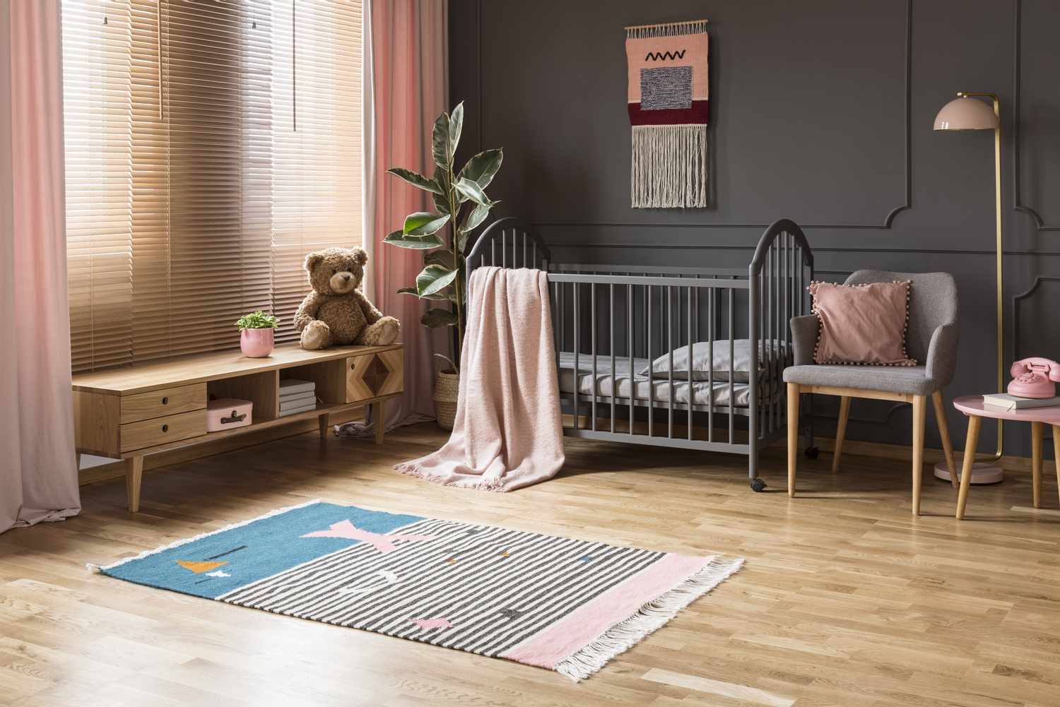
Calming and soothing color options for promoting better sleep
Creating a calming and soothing environment is crucial for promoting better sleep in the nursery. The right color choices can help create a serene and peaceful atmosphere that encourages relaxation and a restful night’s sleep for your baby. Here are some calming and soothing color options to consider:
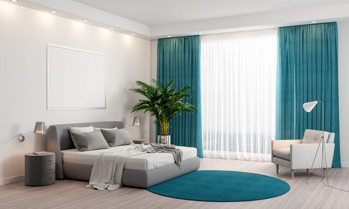
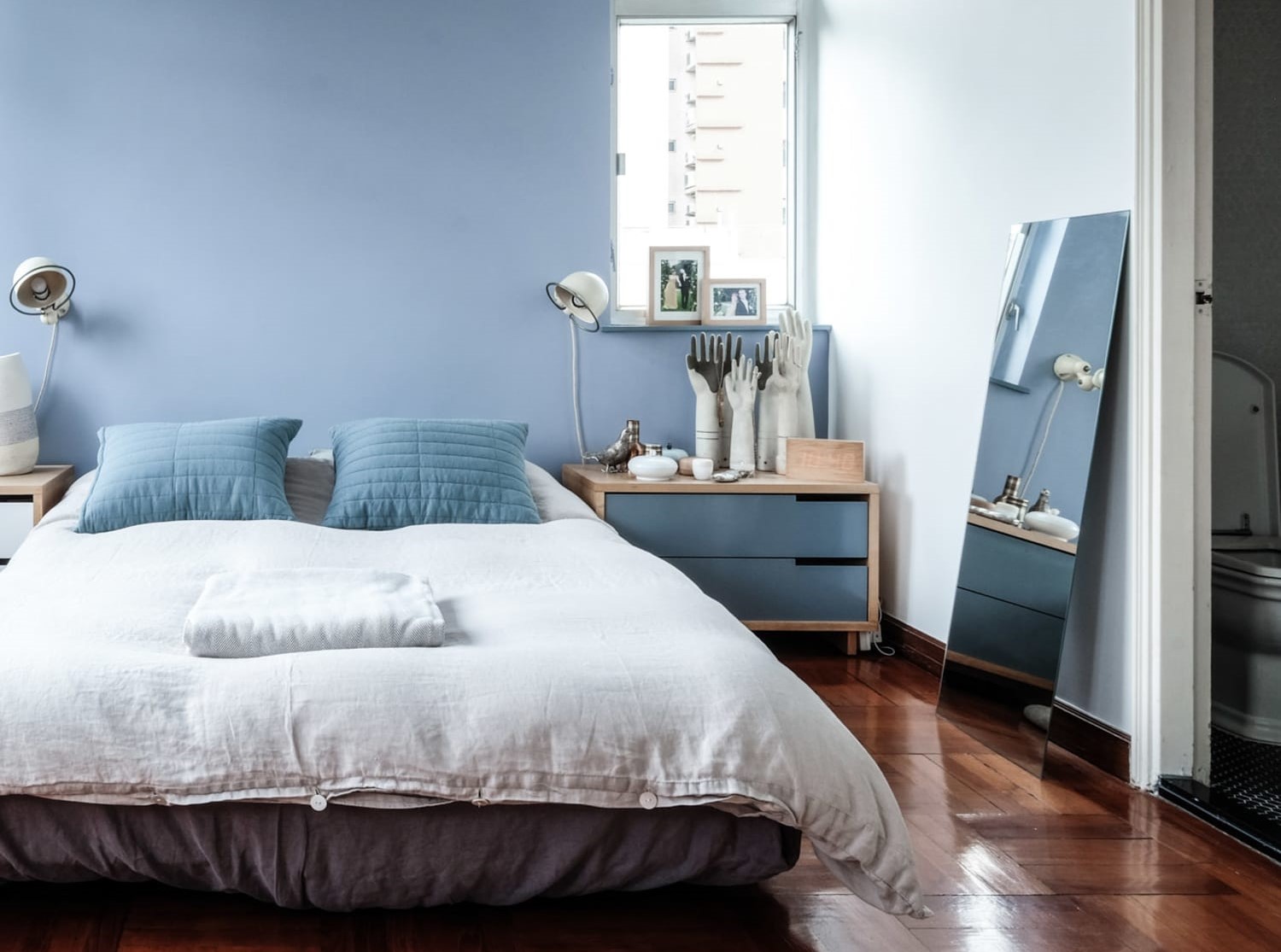
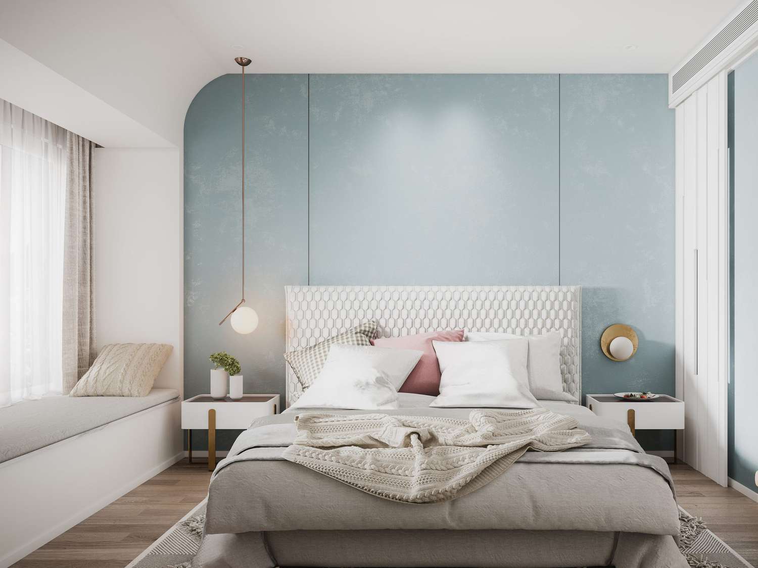
1. Light blue: Soft shades of blue are often associated with tranquility and a sense of calm. Blue has a naturally calming effect on the mind and can help to lower blood pressure and heart rate. Consider using light blue hues on the nursery walls or incorporating blue accents through bedding, curtains, or accessories.
2. Lavender: Lavender is known for its soothing and relaxing qualities. It has been found to promote better sleep and help reduce anxiety levels. Whether it’s through lavender-colored paint, wallpaper, or bedding, incorporating this gentle and serene color into the nursery can create a peaceful atmosphere conducive to sleep.
3. Pale green: Green is a color that symbolizes nature, growth, and harmony. Pale and muted shades of green can evoke a sense of tranquility and promote a feeling of balance and calmness. Consider using soft green tones in the nursery decor, such as curtains, rugs, or wall art, to create a soothing and refreshing atmosphere.
4. Soft gray: Gray is a versatile and neutral color that can create a peaceful and serene ambiance in the nursery. Choose a light or warm gray shade to avoid creating a cold or sterile environment. Incorporate gray through paint, furniture, or textiles to create a calming backdrop that complements other soothing elements in the room.
5. Pale yellow: Yellow is associated with happiness and positivity. Soft and pale yellow shades can create a warm and welcoming atmosphere in the nursery. It is a color that can promote a sense of optimism and comfort. Consider using subtle touches of yellow in the nursery through accents like pillows, wall decals, or artwork.
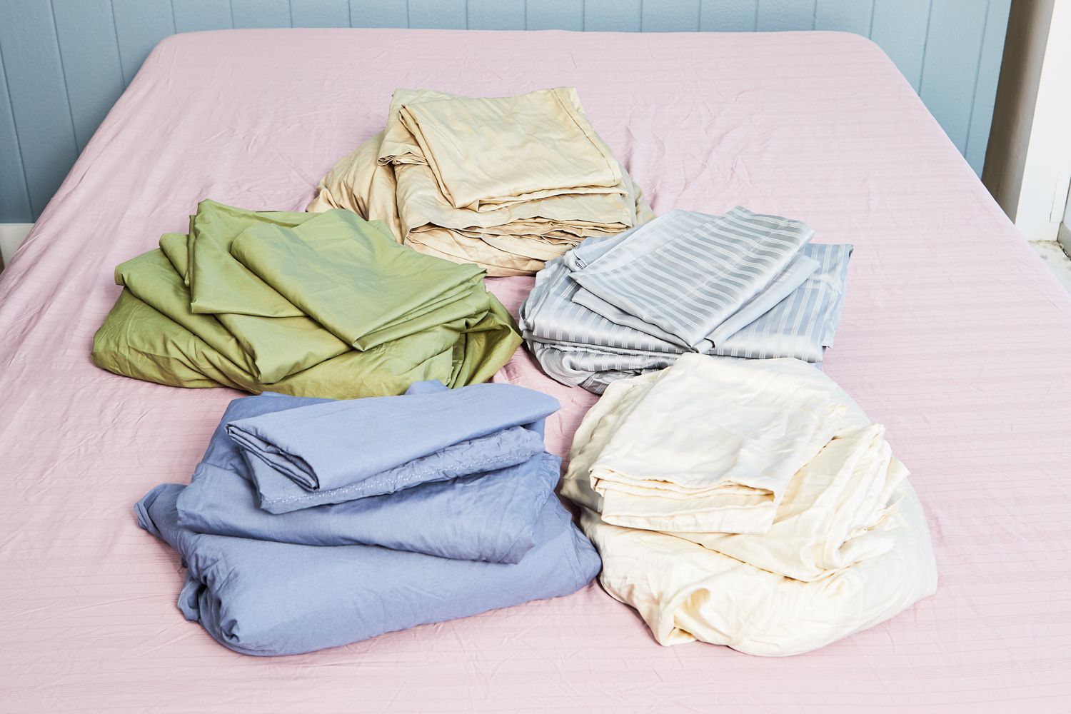
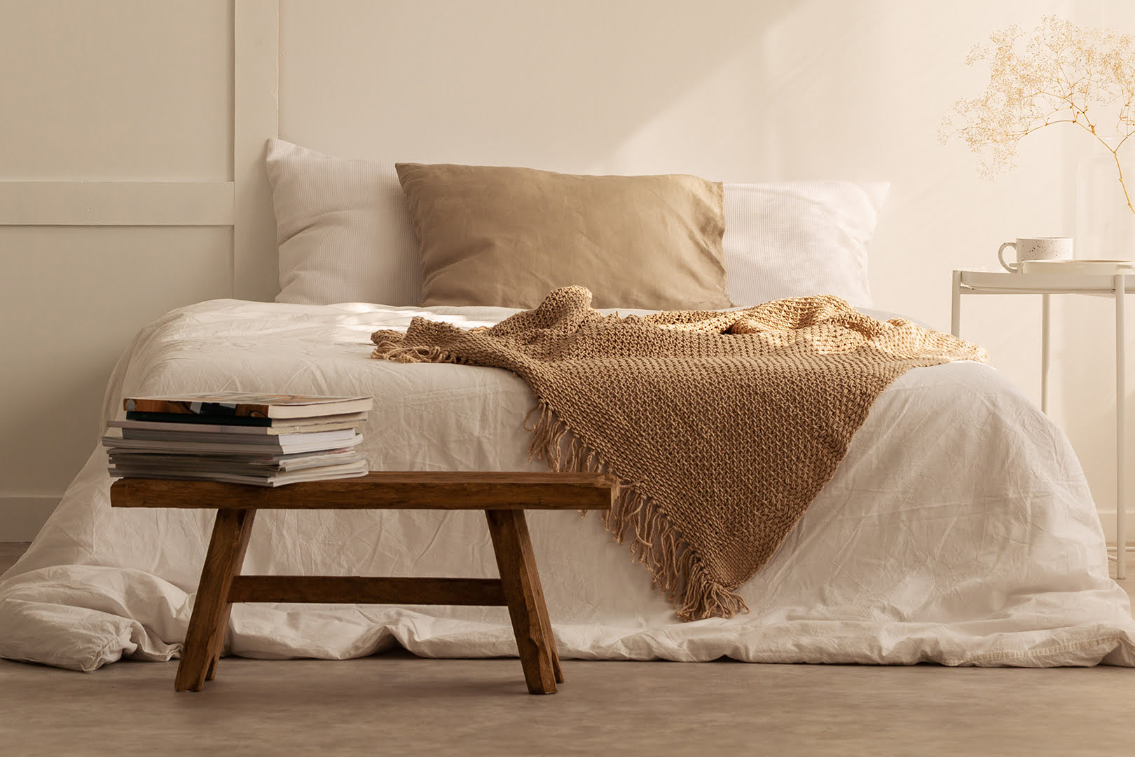
6. Cream or off-white: Cream or off-white colors convey a sense of purity and tranquility. These neutral tones can create a serene backdrop, allowing other elements in the nursery, such as furniture or decor, to stand out. Incorporate cream or off-white through paint, curtains, or bedding for a soothing and timeless look.
Remember to consider the overall lighting in the nursery as it can influence the perception of color. Soft and warm lighting, such as dimmable lamps or string lights, can further enhance the calming effect of the chosen colors.
Incorporating these calming and soothing colors into your nursery can help create a peaceful and restful environment for your baby. Combine them with other elements, such as soft lighting, cozy textures, and comforting scents, to create the perfect sleep sanctuary for your little one.
Consider using soft, calming colors like pastel blues, greens, or lavenders for a nursery. These colors promote a soothing and relaxing environment, which can help babies and parents alike get better sleep.
Stimulating and energizing color options for active daytime play
Creating a nursery that stimulates and energizes your baby during daytime play is essential for their growth and development. The right color choices can promote a sense of excitement, curiosity, and engagement. Here are some stimulating and energizing color options to consider for active daytime play in the nursery:
1. Vibrant red: Red is an intense and energizing color that captures attention and stimulates activity. It is associated with energy, passion, and excitement. Incorporate red through accent walls, furniture, or playful accessories to create a vibrant and stimulating atmosphere in areas designated for play.
2. Sunny yellow: Yellow is a color that symbolizes happiness, optimism, and energy. It can create a warm and cheerful ambiance in the nursery, perfect for active playtime. Incorporate shades of sunny yellow through rugs, toys, or wall art to add a lively and energetic touch to the space.
3. Bright orange: Orange is a vibrant and lively color that stimulates creativity and enthusiasm. It can create a warm and inviting atmosphere that encourages exploration and play. Use pops of bright orange through pillows, curtains, or decor to create a visually stimulating environment that ignites your baby’s imagination.
4. Energetic green: While soft green tones can promote a calm and soothing environment for sleep, bright and vibrant shades of green can be energizing and invigorating during playtime. Incorporate lively green accents through wallpaper, wall decals, or play mats to create a fresh and stimulating atmosphere.
5. Playful purple: Purple is a color associated with creativity and imagination. It can inspire a sense of wonder and spark imaginative play. Use shades of purple for a playful and stimulating effect in areas like reading corners or play nooks. Incorporate purple through cushions, curtains, or accent walls to create an environment that encourages exploration and creativity.
6. Dynamic blue: While soft blues are calming and promote better sleep, deeper and more vibrant shades of blue can evoke a sense of adventure and stimulate cognitive development. Consider using darker blue shades as accents or in designated play areas to create a space that sparks curiosity and exploration.
When incorporating these stimulating colors, balance is key. Introduce them as accents or through interchangeable elements that can be adjusted based on your baby’s activity level and mood. It is also important to create a comfortable and safe play area with soft surfaces, age-appropriate toys, and adequate supervision to ensure your baby’s safety.
By incorporating these stimulating and energizing colors into your nursery design, you can create an engaging and dynamic space that supports your baby’s active playtime and fosters their cognitive and physical development. Remember to follow your baby’s cues and create a balance between active play and soothing relaxation in their nursery space.
Creating a visually appealing and harmonious nursery color scheme
Designing a nursery is not just about selecting colors; it’s about creating a visually appealing and harmonious color scheme that brings the whole room together. A well-thought-out color scheme can enhance the overall aesthetics and create a cohesive and inviting space for your baby. Here are some tips for creating a visually appealing and harmonious nursery color scheme:
1. Choose a color palette: Select a color palette that consists of two to three main colors. This palette will serve as the foundation for the entire nursery design. Consider using colors that complement each other and create a harmonious balance. You can choose shades from the same color family for a monochromatic scheme, or opt for complementary or analogous colors for a more dynamic look.
2. Use the 60-30-10 rule: Follow the 60-30-10 rule to distribute color proportions effectively. This rule suggests dedicating 60% of the room to a dominant color, 30% to a secondary color, and 10% to an accent color. This ensures a balanced distribution of colors throughout the nursery and prevents overwhelming or mismatched color combinations.
3. Consider the color wheel: The color wheel can be a helpful tool when choosing colors that harmonize well together. Colors that are adjacent to each other on the color wheel, such as blue and green or purple and pink, create a harmonious and calming effect. Colors that are opposite each other on the color wheel, such as blue and orange or yellow and purple, create a vibrant and dynamic contrast.
4. Play with shades and tones: Incorporate variations of your chosen colors by using different shades and tones. This adds depth and visual interest to the nursery design. For example, if you have chosen a soft blue as the dominant color, consider using lighter shades of blue for the walls and darker shades for furniture or accessories.
5. Consider the nursery’s function: Take into account the nursery’s function when selecting colors. Determine whether it will be primarily used for sleep, play, or both. For a sleep-focused nursery, choose calming and soothing colors. For a play-centric space, opt for more stimulating and energizing colors. By aligning the color scheme with the nursery’s purpose, you create a visually cohesive environment that supports its intended function.
Now let’s explore insights from sleep psychologists on nursery colors and their impact on your baby’s sleep patterns:
1. Soft and muted colors: According to sleep psychologists, soft and muted colors are ideal for promoting a calm and peaceful sleep environment. Colors like pastel blues, lavenders, and gentle greens create a soothing atmosphere that can aid in the transition to sleep and promote better sleep quality.
2. Avoid overly stimulating colors: Sleep psychologists recommend avoiding bright and bold colors, especially in the immediate sleep area. These vibrant colors can be too stimulating for a baby and may hinder their ability to relax and fall asleep. Save the more energizing colors for play areas or as accents in the nursery.
3. Keep it simple: A cluttered or overly busy nursery can be visually distracting and prevent your baby from feeling calm and settled. Sleep psychologists suggest keeping the color scheme and overall design of the nursery simple and minimalistic. This helps create a serene and uncluttered space that promotes relaxation and tranquility.
By combining these design principles with insights from sleep psychologists, you can create a visually appealing and harmonious nursery color scheme that supports your baby’s sleep patterns and overall well-being. Remember to consider your personal preferences and the specific needs of your baby when making color choices, and the result will be a nursery that is both visually pleasing and conducive to restful sleep.
Impact of different colors on infant sleep patterns
Colors have a powerful influence on our emotions and can significantly impact our well-being, including our sleep patterns. While the effects of colors on sleep can vary from person to person, there are some general insights into how different colors may affect infant sleep patterns. Here are some color influences to consider:
1. Blue: Blue is often associated with calmness and serenity, making it a popular choice for creating a soothing sleep environment. Research suggests that blue can help lower blood pressure and heart rate, promoting a sense of relaxation and better sleep quality. Soft, pastel shades of blue, in particular, are believed to be most effective in creating a calming atmosphere.
2. Green: Green is a color associated with nature and harmony. Similar to blue, green has a calming effect on the mind and body, making it a suitable color choice for promoting restful sleep. Light shades of green, such as sage or mint, can create a tranquil ambiance in the nursery, providing a soothing environment for your baby.
3. Lavender: Lavender is well-known for its calming and sedative properties. The scent of lavender has been shown to have a positive impact on sleep, and the color lavender can also contribute to a relaxing sleep environment. Light purple or lavender hues can create a serene atmosphere, promoting a sense of peace and tranquility for your baby.
4. Neutral tones: Neutral colors like beige, cream, or soft gray can create a subtle and serene sleep environment. These colors create a calm and unobtrusive backdrop, providing a sense of tranquility in the nursery. They also allow for easy adaptation as your baby grows and the room’s function changes over time.
5. Pink: Pink is often associated with feelings of comfort and warmth. Lighter shades of pink can create a gentle and soothing ambiance, providing a sense of security and relaxation for your baby. However, it is worth noting that some studies suggest pink may stimulate excitement and activity in some individuals, so it is essential to consider your baby’s individual response.
While these colors are commonly associated with promoting better sleep, it is important to note that individual preferences and reactions can vary. Some babies may respond better to certain colors than others. It’s crucial to observe your baby’s behavior and sleep patterns in response to different colors to determine what works best for them.
Additionally, it’s essential to maintain a healthy sleep environment with other factors such as temperature, lighting, and noise levels. Creating a calm and comfortable sleep environment with the right colors, along with other sleep-promoting practices, can contribute to better sleep patterns for your baby.
As every baby is unique, it’s essential to pay attention to your baby’s individual response to different colors and adjust accordingly. By creating a sleep space with colors that promote a sense of relaxation and tranquility, you can help establish a peaceful and restful atmosphere that supports healthy sleep patterns for your little one.
Enhancing baby’s sleep quality with the right color choices
The color scheme you choose for your baby’s nursery goes beyond aesthetics. It has the power to influence mood, emotions, and even sleep patterns. By selecting the right colors, you can enhance your baby’s sleep quality and create a nurturing environment for their growth and development. Here are some key takeaways for enhancing your baby’s sleep quality with the right color choices:
1. Calming and soothing colors: Colors like soft blue, lavender, and pale green have a calming effect on the mind and body. Implementing these colors in the nursery can promote relaxation, lower stress levels, and create an environment conducive to better sleep.
2. Stimulating and energizing colors: For daytime play, vibrant colors like red, yellow, orange, and green can create a lively and engaging atmosphere. These colors can stimulate your baby’s senses, encourage exploration, and support their cognitive and physical development during active play.
3. Creating a harmonious color scheme: Consider cultural influences, personal preferences, and the nursery’s function when choosing a color scheme. Incorporate colors that hold significance for your family and create a visually appealing and harmonious environment. Follow design principles such as the 60-30-10 rule and consider colors on the color wheel to create a balanced and cohesive nursery design.
4. Safety considerations: Prioritize safety by choosing low or zero-VOC paints, non-toxic materials, and washable finishes. Ensure proper ventilation during painting and use lead-free paint if necessary. Creating a safe environment contributes to your baby’s well-being and promotes better sleep quality.
5. Individual preferences and observations: Every baby is unique, and their response to colors may vary. Observe your baby’s behavior and sleep patterns in response to different colors to tailor the nursery to their individual needs. Keep in mind that the impact of colors can be subjective, and it is important to create an environment that suits your baby’s personality and preferences.
In conclusion, the colors you choose for your baby’s nursery can have a significant impact on their sleep quality and overall well-being. By incorporating calming and soothing colors for sleep and stimulating colors for play, you can create a balanced and supportive environment. Consider your personal preferences, cultural influences, and the nursery’s function when selecting a color scheme. Pay attention to your baby’s individual responses and adjust accordingly. By taking these considerations into account and creating a safe and visually appealing nursery, you can help your baby sleep better, grow well, and thrive in their early years.
Combining expert advice for the best color options in a nursery
When it comes to choosing the best color options for a nursery, combining expert advice can help you create an optimal environment that promotes sleep, creativity, and overall well-being for your baby. By considering insights from design experts and sleep psychologists, you can make informed decisions and create a nurturing and visually appealing nursery. Here’s how you can combine expert advice for the best color options:
1. Safety considerations: Start by prioritizing safety. Choose low or zero-VOC paints, non-toxic materials, and washable finishes. This ensures a healthy and hygienic environment for your baby.
2. Gender-neutral and cultural preferences: Incorporate gender-neutral color options to create an inclusive space that can adapt as your child grows. Consider cultural influences and personal preferences to add meaningful touches to the nursery.
3. Calming and soothing colors for sleep: Design experts and sleep psychologists recommend soft and muted shades of blue, lavender, and green for promoting better sleep. These colors create a calming atmosphere and help your baby relax.
4. Stimulating and energizing colors for play: Design experts suggest incorporating vibrant colors like red, yellow, orange, and green in play areas or as accents for active daytime play. These colors can stimulate your baby’s senses and encourage exploration and creativity.
5. Creating a visually appealing color scheme: Follow design principles like the 60-30-10 rule, which involves distributing colors proportionally, and using the color wheel to choose complementary or analogous colors. This creates a visually appealing and harmonious nursery design.
6. Individual responses and observations: Keep in mind that every baby is unique, and their response to colors may vary. Observe your baby’s behavior and adjust the color choices based on their individual preferences and reactions.
By integrating expert advice and considering the specific needs of your baby, you can create the perfect color palette for your nursery. Remember to balance soothing and stimulating colors, prioritize safety, and create a visually pleasing and harmonious environment. Ultimately, the best color options for a nursery are those that create a nurturing space where your baby can thrive, sleep peacefully, and explore the world around them.
Frequently Asked Questions about What Is The Best Color For A Nursery? Design Experts And Sleep Psychologists Advise
Was this page helpful?
At Storables.com, we guarantee accurate and reliable information. Our content, validated by Expert Board Contributors, is crafted following stringent Editorial Policies. We're committed to providing you with well-researched, expert-backed insights for all your informational needs.


0 thoughts on “What Is The Best Color For A Nursery? Design Experts And Sleep Psychologists Advise”