Home>Storage Ideas>Kitchen Storage>7 Lessons We’ve Learnt About Designing A White Kitchen That’s Packed With Interest
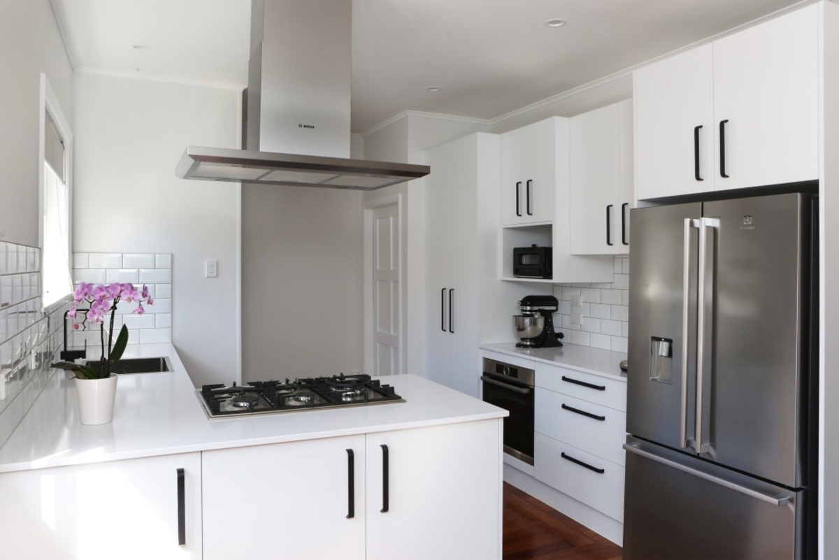

Kitchen Storage
7 Lessons We’ve Learnt About Designing A White Kitchen That’s Packed With Interest
Modified: August 28, 2024
Discover 7 priceless lessons for designing a white kitchen filled with captivating charm and clever kitchen storage ideas.
(Many of the links in this article redirect to a specific reviewed product. Your purchase of these products through affiliate links helps to generate commission for Storables.com, at no extra cost. Learn more)
Introduction
Creating a beautiful and functional kitchen is a dream for many homeowners. One popular design trend that never goes out of style is a white kitchen. The clean and timeless look of white cabinetry and countertops can brighten up any space and make it feel more spacious. However, a common misconception is that a white kitchen can be dull or lack visual interest. But fear not! We’ve discovered seven valuable lessons about designing a white kitchen that’s packed with interest, style, and character.
By implementing these lessons, you can transform your white kitchen into a stunning and captivating space that reflects your personal style. So, let’s delve into these design tips and unleash the potential of your kitchen storage area!
Key Takeaways:
- Transform your white kitchen into a captivating space by mixing different shades of white, incorporating patterns, playing with light and shadow, and adding unexpected elements for visual interest and personality.
- Elevate your white kitchen with contrasting materials, unexpected accents, and attention to detail. Create a visually stunning space that reflects your personal style and leaves a lasting impression.
Read more: 7 Lessons In Modern Farmhouse Style That The Designer Of This Elegant Kitchen Wants Us To Learn
Lesson 1: Adding Contrasting Materials and Textures
One of the easiest ways to add visual interest to a white kitchen is by incorporating contrasting materials and textures. By combining different surfaces and finishes, you can create a dynamic and layered design that grabs attention.
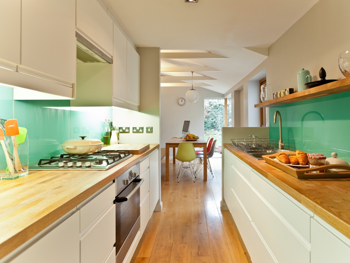
Start by choosing a countertop material that complements the white cabinetry. Consider options like quartz, marble, or butcher block to add warmth and depth to the space. Additionally, incorporate a contrasting backsplash material, such as subway tiles or mosaic patterns, to create a focal point and add texture.
Another way to introduce contrasting materials is through the choice of flooring. Opt for hardwood, tile, or even a patterned rug to add visual interest and break up the white color scheme.
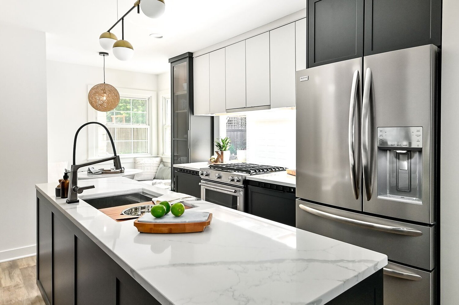
Moreover, don’t underestimate the power of incorporating different hardware finishes. Mix metals like stainless steel, brass, or matte black to create a striking contrast against the white backdrop.
Remember, the key to successfully incorporating contrasting materials and textures is to strike a balance. Avoid overwhelming the space by ensuring that each element complements and enhances the overall design.
Lesson 2: Incorporating Patterns and Prints
Adding patterns and prints is another fantastic way to bring life and interest into a white kitchen. Whether it’s through backsplash tiles, wallpaper, or even fabrics, patterns can inject personality and visual appeal.
Consider using geometric patterns for a modern and sleek look or opt for floral prints to add a touch of whimsy and freshness. Stripes can create a sense of movement and visual interest, while intricate patterns can add a touch of elegance and sophistication.
When it comes to incorporating patterns and prints, the key is to find the right balance. Too much can be overwhelming, while too little may fail to make an impact. Explore different options and experiment with small accents, such as curtains, cushions, or kitchen towels, before committing to larger installations.
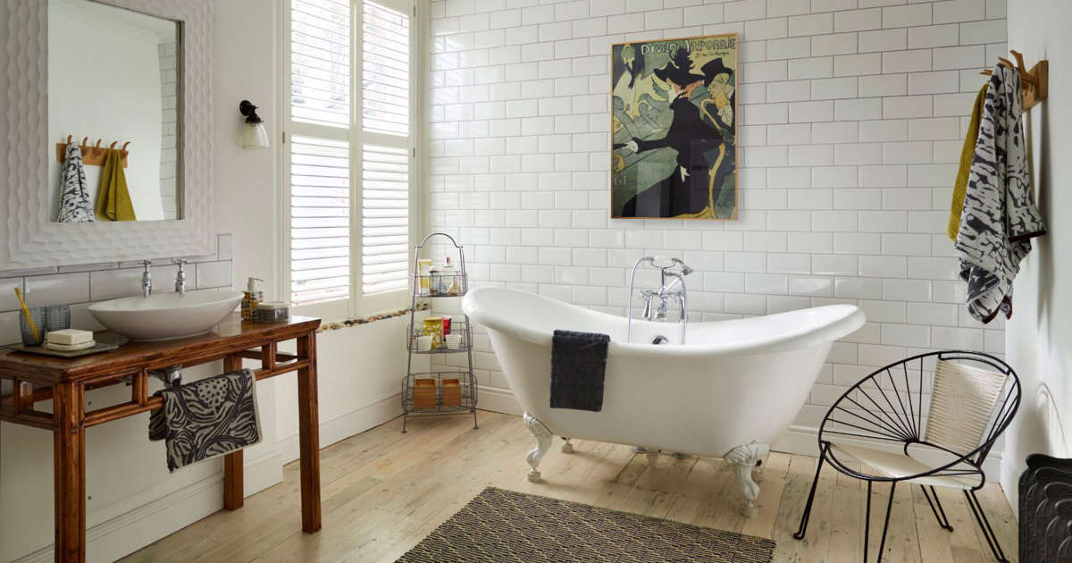
Keep in mind that patterns and prints work best as accents to highlight specific areas or create focal points. For example, a bold patterned backsplash can add drama and become the centerpiece of the kitchen, while patterned bar stools or chair covers can add interest to the dining area.
By incorporating patterns and prints, you can break up the monotony of a white kitchen, infuse it with personality, and create a visually stunning space that is both inviting and captivating.
Lesson 3: Playing with Light and Shadow
Lighting is a crucial element in any kitchen design, and when it comes to a white kitchen, it becomes even more essential. Playing with light and shadow can add depth and dimension to the space, making it more visually intriguing.
Start by maximizing natural light. Large windows or skylights can flood the space with sunlight, creating a bright and airy atmosphere. If natural light is limited, consider installing recessed lights or pendant lights to illuminate different areas of the kitchen.
Moreover, experiment with different lighting fixtures to create unique effects. Under-cabinet lighting can add a soft glow and highlight your kitchen storage area, while task lighting over the cooking area provides ample light for food preparation.
Create contrast by incorporating statement light fixtures, such as chandeliers or pendant lights, that serve as eye-catching focal points. These fixtures not only provide necessary illumination but also add a touch of elegance and charm to the overall design.
Another way to play with light and shadow is by using reflective surfaces. Consider incorporating a mirrored backsplash or metallic accents to bounce light around the kitchen, creating an illusion of a larger and brighter space.
By strategically utilizing different lighting techniques and incorporating reflective elements, you can transform your white kitchen into a captivating and dynamic area that plays with light and shadow, creating an inviting atmosphere.
Lesson 4: Mixing Different Shades of White
While a white kitchen may initially seem monotonous, mixing different shades of white can add depth and interest to the design. By incorporating various tones and hues, you can create a visually appealing and harmonious color palette.
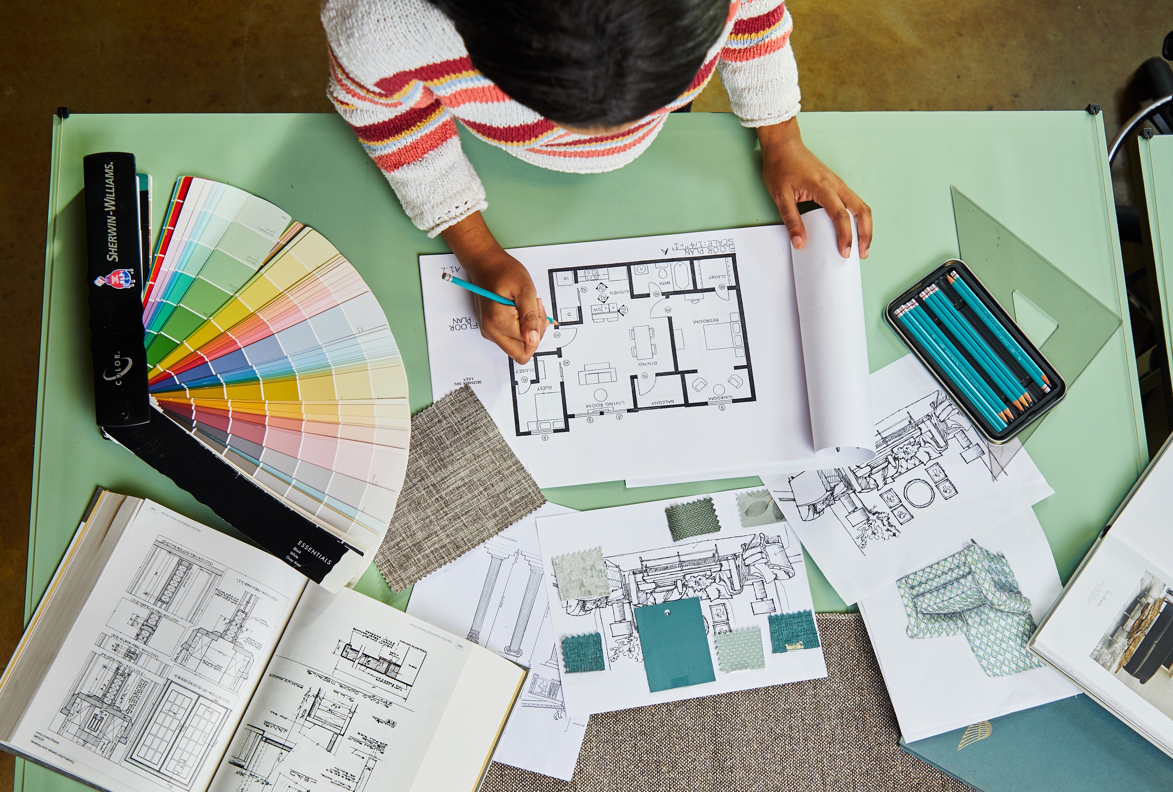
Start by selecting a primary shade of white for your cabinetry and countertops. This can range from bright white to off-white or even creamy tones. Then, consider introducing complementary shades in other elements of the kitchen, such as the walls, backsplash, or furniture.
For instance, you can choose a slightly warmer white for the walls to create a subtle contrast with the cabinetry. Alternatively, opt for a darker shade of white for the backsplash tiles to add texture and visual interest.
Don’t overlook the power of accessorizing with different shades of white as well. Incorporate decorative objects, such as vases, bowls, or dishware, in varying shades of white to create a curated and cohesive look.
The key to successfully mixing different shades of white is to ensure that they are complementary and create a sense of harmony. Consider testing different combinations before making a final decision.
By mixing different shades of white, you can add depth, create dimension, and infuse your kitchen with a subtle yet captivating look that goes beyond a monochrome design.
When designing a white kitchen, consider adding texture and contrast through materials like wood, metal, or stone to create visual interest and depth.
Lesson 5: Incorporating Different Styles and Accents
Introducing different styles and accents into a white kitchen can elevate its design and add a touch of personality. Embracing contrasting elements can create a visually engaging and unique space.
Consider incorporating elements from different design styles to create an eclectic aesthetic. For example, pair modern white cabinetry with vintage-inspired hardware or mix rustic details with sleek countertops.
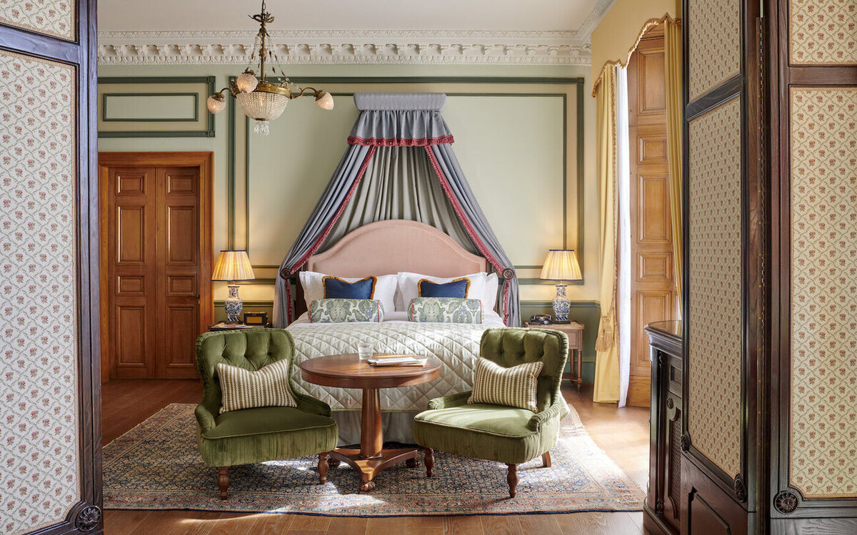
Add accents inspired by different cultures or eras to bring a sense of diversity and intrigue to the space. Incorporate decorative items, artwork, or even furniture pieces from various styles to create a visually compelling kitchen.
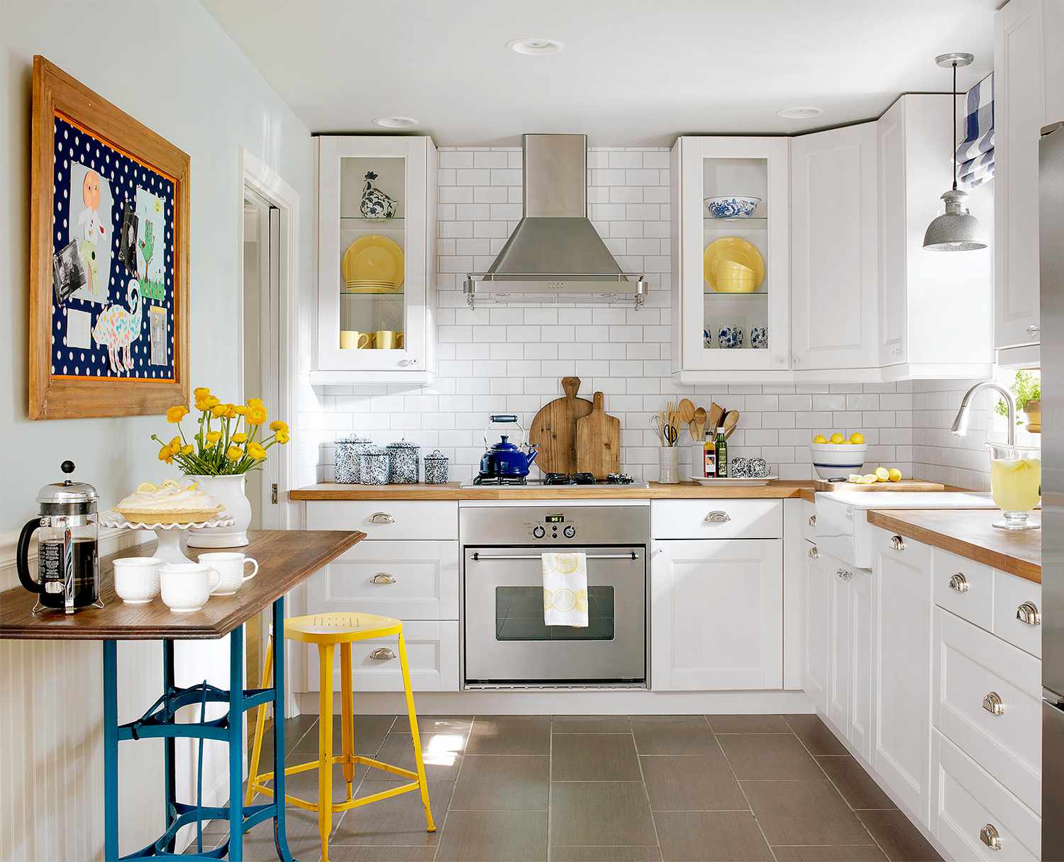
Introduce unexpected elements, such as pops of color or statement pieces, to create focal points and draw attention. An accent wall in a vibrant hue, colorful bar stools, or a bold piece of artwork can add excitement and interest to an otherwise white-dominated kitchen.
Remember to strike a balance and ensure that the different styles and accents complement each other rather than create a chaotic or disjointed look. The key is to find a cohesive and harmonious blend that reflects your personal taste.
By incorporating different styles and accents, you can transform your white kitchen into a captivating space that uniquely reflects your personality and design sensibilities.
Lesson 6: Paying Attention to Details and Finishes
When it comes to designing a white kitchen that’s packed with interest, paying attention to the details and finishes is crucial. These small elements can make a significant impact on the overall look and feel of the space.
Start by carefully selecting the hardware for your cabinetry and drawers. Choose knobs, handles, or pulls that complement the style of your kitchen and add a touch of elegance or charm. Matte black finishes can create a modern and sleek look, while brass or chrome finishes can bring a touch of sophistication.
Consider incorporating decorative moldings or trimwork to add architectural details and visual interest. Crown molding, beadboard panels, or shiplap can elevate the design and create a more luxurious feel.
Pay attention to the finishes of the fixtures and appliances as well. Stainless steel appliances can create a sleek and modern look, while matte finishes can add a touch of sophistication. Similarly, choose faucets and sinks that complement the style of your kitchen and add a functional yet stylish element.
Don’t overlook the importance of carefully selecting accessories and decor for your white kitchen. Choose items that add character and personalization, such as colorful dishware, unique storage containers, or decorative plants. These small touches can enhance the overall aesthetic and make the space feel more lived-in and inviting.
By paying attention to the details and finishes, you can elevate the design of your white kitchen and create a space that is not only visually appealing but also reflects your attention to quality and craftsmanship.
Lesson 7: Adding Elements of Surprise
Adding elements of surprise is the final lesson in our quest to design a white kitchen that’s packed with interest. These unexpected touches add a sense of intrigue and make the space truly unique.
Consider incorporating a statement piece or a focal point that grabs attention. It could be a bold-colored kitchen island, a vintage chandelier, or a stunning piece of artwork. This unexpected element will become a conversation starter and add a wow factor to your kitchen.
Another way to add surprise is by incorporating hidden storage solutions. Incorporate pull-out drawers or hidden compartments within your cabinetry to maximize storage space and keep your kitchen clutter-free. This hidden functionality will impress your guests and enhance the overall functionality of your kitchen.
Don’t be afraid to mix materials that are not commonly associated with a kitchen. For example, consider using reclaimed wood for your shelves or adding a touch of natural stone to your countertop. These unexpected materials add texture and create an intriguing juxtaposition within the white space.
Lastly, incorporate unique and eye-catching accessories and decor. Choose items that reflect your personal style and interests. It could be quirky utensil holders, vintage-inspired signage, or vibrant artwork. These small surprises add character and make the space feel more personal and inviting.
By adding elements of surprise, you can transform your white kitchen into an exciting and captivating space that continuously delights and surprises both you and your guests.
Conclusion
Designing a white kitchen doesn’t mean sacrificing interest and style. With the right approach and attention to detail, you can transform your kitchen storage area into a captivating space that reflects your personal taste and leaves a lasting impression.
Throughout our lessons, we’ve explored various strategies to add interest to a white kitchen. By incorporating contrasting materials and textures, incorporating patterns and prints, playing with light and shadow, mixing different shades of white, incorporating different styles and accents, paying attention to details and finishes, and adding elements of surprise, you can create a truly unique and visually appealing kitchen.
Remember, it’s all about balance and finding what works for you. Don’t be afraid to experiment and think outside the box. Incorporate elements that reflect your personality and create a space that makes you feel inspired and joyful.
So, embrace the versatility of a white kitchen and let your creativity shine. With these lessons in mind, you can transform your kitchen space into a stunning and functional area that will be the heart of your home for years to come.
Frequently Asked Questions about 7 Lessons We've Learnt About Designing A White Kitchen That's Packed With Interest
Was this page helpful?
At Storables.com, we guarantee accurate and reliable information. Our content, validated by Expert Board Contributors, is crafted following stringent Editorial Policies. We're committed to providing you with well-researched, expert-backed insights for all your informational needs.



0 thoughts on “7 Lessons We’ve Learnt About Designing A White Kitchen That’s Packed With Interest”